What is Burj Khalifa Tower?什么是 Burj Khalifa Tower?
Altitude becomes authority — the Burj Khalifa design system distills the visual experience of twilight at the base of the world's tallest tower into a palette of desert-night navy, silver-glass cladding, and hairline gold that climbs without end.高度即权威——哈利法塔设计系统将黄昏时分仰望世界最高建筑的视觉体验,提炼为沙漠夜蓝、银色玻璃幕墙与无尽向上攀升的发丝金线。
Burj Khalifa Tower in briefBurj Khalifa Tower 速览
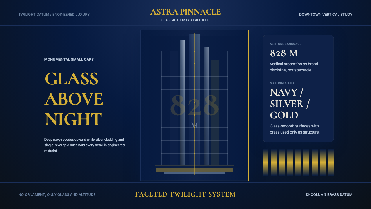
The Burj Khalifa design system takes its visual logic from the tower itself — a structure that tapers through progressive setbacks as it rises, shedding mass and accumulating lightness until its spire dissolves into sky. Translated into two-dimensional work, this logic becomes a vertical hierarchy of weight: heavy, dark grounds at the base of a composition give way to progressively lighter, more luminous elements as the eye travels upward. The overall mood is one of engineered grandeur — opulent in material quality, restrained in ornament.哈利法塔设计系统从建筑本体汲取视觉逻辑——这座塔楼在上升过程中通过逐级退台不断收分,剥落体量、积累通透,直至塔尖消融入天际。转化为二维语言,这一逻辑变成垂直方向的重量层级:构图底部以沉厚的深色底面为基础,随着视线向上移动,逐渐过渡至更轻盈、更发光的元素。整体氛围是工程意义上的宏大——材质质感奢华,装饰极度克制。
Color in this system operates through extreme contrast and deliberate scarcity. Deep navy — the color of Dubai sky just after sunset, dense enough to absorb light rather than reflect it — serves as the primary field. Against this ground, silver registers as the luminous surface of the tower's glass-and-aluminum cladding, catching available light with a metallic precision that reads simultaneously as contemporary and eternal. Gold appears last and least often, functioning structurally rather than decoratively: a single hairline rule, a title set in small capitals, a threshold marking the boundary between content zones. It never floods a surface; it marks a line.这套系统中的色彩通过极端对比与刻意稀缺发挥作用。深邃的夜蓝——迪拜日落后天空的颜色,浓重到吸收光线而非反射——作为主要底色存在。在这片底色之上,银色以塔楼玻璃与铝合金幕墙发光表面的姿态呈现,以金属般的精确度捕捉光线,同时读起来既现代又永恒。金色最后出现,也出现得最少,以结构性而非装饰性的方式发挥功能:一条单独的发丝线,一个以小型大写字母排版的标题,一道标记内容区域边界的门槛。它从不漫溢一个表面,它只标记一条线。
The system's character is vertical. Proportions favor tall, narrow forms over wide horizontal bands. Whitespace is architectural — not merely breathing room but the visual equivalent of the tower's open sky plaza, deliberate and load-bearing. Every element is held to a standard of finish that reads as engineered rather than hand-made: smooth gradients of tone rather than abrupt shifts, precision rather than expressiveness, weight rather than warmth.这套系统的气质是垂直的。比例偏向高窄形态而非宽阔横带。留白是建筑式的——不仅仅是呼吸空间,而是塔楼开放天空广场的视觉等价物,刻意且承重。每个元素都被要求达到一种工程感而非手工感的完成度标准:色调的平滑过渡而非突兀转变,精确而非表现性,分量而非温度。
See the Burj Khalifa Tower design system查看 Burj Khalifa Tower 完整设计系统
Where does Burj Khalifa Tower come from?Burj Khalifa Tower 从何而来?
The Burj Khalifa was designed by Adrian Smith of Skidmore, Owings and Merrill beginning in 2003, with structural engineering led by Bill Baker. Construction ran from 2004 to 2010, and at its opening the tower stood as the tallest human-made structure in history, surpassing the previous record-holder by a substantial margin. The project was conceived as the centerpiece of Downtown Dubai, a master-planned urban district built largely on reclaimed desert, and it was intended from inception to function simultaneously as real estate, infrastructure, and global symbol. Its name honors Sheikh Khalifa bin Zayed Al Nahyan, ruler of Abu Dhabi and president of the UAE, who provided the financial support that allowed the project to complete after the 2008 global financial crisis threatened to halt construction.哈利法塔由Skidmore, Owings and Merrill的建筑师阿德里安·史密斯(Adrian Smith)自2003年起主持设计,结构工程由比尔·贝克(Bill Baker)领衔。建筑于2004年至2010年间施工,竣工时以相当大的优势超越前一纪录保持者,成为人类历史上最高的建筑结构。该项目被设想为迪拜市中心的核心——一个主要建于回填沙漠之上的规划城区——从一开始便被定位为同时承担房地产、基础设施与全球象征三重功能。塔楼以阿联酋总统、阿布扎比统治者谢赫·哈利法·本·扎耶德·阿勒纳哈扬(Sheikh Khalifa bin Zayed Al Nahyan)命名,后者在2008年全球金融危机威胁建设进程时提供了使项目得以完成的财政支持。
Smith's design draws from two overlapping sources: the traditional geometry of Islamic architecture and the engineering science of supertall structures. The tower's floor plan is a modified Y-shape derived from the Hymenocallis flower, a botanical form whose triple-armed radial symmetry distributes load efficiently while providing maximum perimeter — and therefore maximum glazed surface — at every floor. As the tower rises, each of the three wings steps back in a spiraling pattern, reducing wind load and breaking up the vortex-shedding effect that causes supertall buildings to sway. This aerodynamic tapering is not stylistic convention but structural necessity converted into aesthetic language.史密斯的设计汲取自两个相互叠加的来源:伊斯兰建筑传统几何与超高层建筑工程科学。塔楼平面为改良Y形,源自蜘蛛兰(Hymenocallis)花朵的植物形态——这种三臂放射对称在有效分散荷载的同时,为每一楼层提供了最大周长,进而实现最大玻璃幕墙面积。随着塔楼上升,三翼各自以螺旋形式逐级退台,降低风荷载并打破超高层建筑引发摇摆的漩涡脱落效应。这种气动收分并非风格惯例,而是结构必要性转化为美学语言的结果。
The construction itself represented an extension of computational facade engineering into territory that had not previously been attempted at this scale. The exterior cladding system — nearly twenty-six thousand individual glass panels and aluminum-and-stainless-steel spandrel panels — was designed to withstand ambient temperatures that swing from desert cold to extreme heat, and to resist the sand-laden winds characteristic of the Gulf region. The reflective quality of the glass was specified not for appearance but for solar management: the cladding system reduces the thermal load on the building's interior while producing the silver luminosity that defines the tower's visual character at distance.施工本身代表着计算机辅助幕墙工程在此前从未尝试的规模上的延伸。外部幕墙系统——近两万六千块独立玻璃板与铝合金及不锈钢横档板——被设计为能够承受沙漠地区从寒冷到极热的大幅温差,以及海湾地区特有的携沙劲风。玻璃的反射特性并非出于美观考量,而是为了太阳能管理:幕墙系统在降低建筑内部热负荷的同时,产生了那种在远处确定了塔楼视觉特征的银色光泽。
The design system that takes the Burj Khalifa as its source draws not from any single architectural drawing or branded guideline but from the phenomenological experience of the building: the color of sky behind glass at altitude, the geometry of the setback profiles viewed from below, the quality of a hairline structural seam catching light against a deep shadow. In this sense, the design system is an act of translation — from a physical experience of scale and material into a set of visual principles applicable to screen, print, and presentation work. The visual language that results belongs to a contemporary luxury category that is neither purely minimalist nor decorative: it is monumental, and it is precise.以哈利法塔为源头的设计系统并非来自某张具体的建筑图纸或品牌指南,而是来自建筑的现象学体验:高空中玻璃后方天空的色彩,从下方仰视退台轮廓时的几何关系,一条结构缝在深阴影背景下捕捉光线时的质感。从这个意义上说,设计系统是一种翻译行为——将对尺度与材料的物理体验转化为一套可应用于屏幕、印刷与演示作品的视觉原则。由此形成的视觉语言属于一种既非纯粹极简主义也非装饰主义的当代奢华类别:它是纪念碑式的,同时是精确的。
What defines the Burj Khalifa Tower look?Burj Khalifa Tower 的视觉特征是什么?
Color Field色彩底场
The dominant ground is a deep desert-night navy — a blue so dark it reads almost as black until adjacent to true black, at which point its blue-teal undertone becomes visible. This is not a corporate navy or a fashion indigo; it is saturated from within and dense enough to give objects set against it a quality of floating in controlled darkness. Silver occupies the middle register as the color of light reflected off engineered surfaces — glass, polished aluminum, water at dusk. Gold is the most restricted hue in the system, used only where a structural accent is required, and it is always hairline in weight: a rule, a separator, a small-cap title. It never appears as a fill color.主导底色是深邃的沙漠夜蓝——一种深到与纯黑并置前几乎读作黑色、而一旦比较便露出蓝绿底色的蓝。这不是企业海军蓝或时尚靛蓝;它从内部饱和,足够浓重,使置于其上的物体呈现出漂浮于可控黑暗中的质感。银色占据中间层次,是光线从工程表面——玻璃、抛光铝、黄昏水面——反射出的颜色。金色是系统中限制最严格的色相,仅在需要结构性强调时出现,且始终以发丝般的重量呈现:一条线,一个分割符,一个小型大写标题。它从不作为填充色出现。
Verticality and Proportion垂直性与比例
Compositions favor tall, narrow proportions that echo the tower's silhouette. Layout containers, text columns, image frames, and card components are oriented vertically whenever the format permits. Horizontal elements, when they appear, are thin — a rule, a data bar, a navigation divider — and serve to create rest points within a predominantly vertical reading movement, not to compete with the upward thrust of the overall composition. This proportional preference is not arbitrary; it consistently reinforces the primary metaphor of ascent.构图偏向呼应塔楼轮廓的高窄比例。只要格式允许,版面容器、文字栏、图像框与卡片组件均垂直排列。横向元素一旦出现,便是纤细的——一条线,一个数据条,一个导航分割符——在以垂直为主的阅读运动中创造停顿点,而非与整体构图向上的推力竞争。这种比例偏好并非任意为之;它持续强化了上升这一核心隐喻。
Light and Luminosity光与发光性
The system treats luminosity as the primary signal of importance. Elements that need to attract attention are not made larger or bolder in the conventional sense; they are made lighter — given a silver or near-white tonal value that causes them to emerge from the dark ground as if lit from within. This approach reverses the conventional dark-on-light reading convention and rewards careful calibration: too many bright elements collapse the hierarchy, while too few produce a composition that feels inert and unlit. The ideal is a single point of maximum luminosity — a title, a key figure, a featured image — with all surrounding elements stepping back in a controlled gradient of tone.系统将发光性视为重要性的首要信号。需要吸引注意的元素并非以常规方式放大或加粗;而是被点亮——赋予银色或接近白色的色调值,使其如同从内部发光般从暗色底面中浮现。这种方式颠覆了传统的深色-浅色底阅读惯例,需要精心校准:过多明亮元素会瓦解层级,过少则产生静止而未被照亮的构图感。理想状态是单一的最大发光点——一个标题、一个关键数字、一张特色图像——周围所有元素以受控的色调梯度依次退后。
Typography and Monumental Weight字体排印与纪念碑式分量
Display type in this system carries the weight of carved inscription rather than printed text. Small capitals — classically proportioned letterforms rendered at reduced height — are used for titles and section headers, giving them authority without requiring aggressive point sizes. The contrast between display type (classical, architectural, weighted with historical association) and body type (geometrically precise, neutral, efficient) mirrors the contrast between the tower's ornamental spire and its functional curtain-wall body. Line spacing is generous; text is never crowded. Each line of type is a horizontal element in a vertical composition and is treated accordingly.这套系统中的展示性字体承载着雕刻铭文而非印刷文本的分量。小型大写字母——以缩小高度呈现的经典比例字形——用于标题与章节标头,在不需要攻击性字号的情况下赋予其权威感。展示字体(古典的、建筑感的、承载历史联想的分量)与正文字体(几何上精确、中性、高效)之间的对比,映射了塔楼装饰性塔尖与功能性幕墙主体之间的对比。行间距宽裕;文字从不拥挤。每一行文字是垂直构图中的一个横向元素,并被如此对待。
Structural Ornament结构性装饰
Decoration in this system is always structural. The gold hairline rule does not embellish; it defines a boundary. A thin separator between content zones is not there for visual interest; it is there because two zones need a defined threshold. This principle is closely related to the architecture it references: the Burj Khalifa's setback profiles, the exposed structural fins on its exterior, the geometry of its crown — all are engineering decisions that happen to produce visual beauty. In design work, every decorative-seeming element should be able to justify its presence through function. If it cannot, it should be removed.这套系统中的装饰始终是结构性的。金色发丝线不是装饰;它定义边界。内容区域之间的纤细分割符并非为了视觉趣味而存在;它存在是因为两个区域需要一个明确的门槛。这一原则与它所参照的建筑密切相关:哈利法塔的退台轮廓、外立面上外露的结构鳍片、塔冠的几何形态——这些都是恰好产生视觉美感的工程决策。在设计作品中,每一个看似装饰的元素都应能通过功能为其存在作辩护。若不能,它就应当被移除。
Surface Finish and Precision表面完成度与精确性
The system demands a quality of finish that reads as engineered rather than crafted by hand. Edges are crisp, not soft. Tonal transitions, where they occur, are smooth and controlled rather than abrupt. Components align precisely and are never left to settle through visual intuition alone; the underlying grid is never decorative. This precision is not clinical coldness — it is the precision of a curtain-wall system engineered to millimeter tolerances across hundreds of meters of facade. The effect should feel intentional down to the smallest detail, as if any imprecision would compromise the structural logic of the whole.这套系统要求一种读起来是工程制造而非手工打造的完成度品质。边缘锋利,而非柔和。色调过渡(若出现)是平滑可控的,而非突兀的。组件精确对齐,从不仅凭视觉直觉安置;底层网格从不是装饰性的。这种精确性不是临床式的冷漠——它是一套幕墙系统在数百米立面上以毫米级公差完成工程的精确性。效果应该在最小细节层面都感觉是刻意为之的,仿佛任何不精确都会破坏整体的结构逻辑。
Dark-Field Composition暗底场构图
Unlike most contemporary digital design systems that default to light backgrounds, this system is primarily dark. The dark field is not a mode or an option; it is the canonical state, reflecting the fact that the tower's most memorable appearance is against the Dubai night sky or twilight. Working on a dark field reverses many conventional design decisions: contrast is achieved through lightness rather than darkness, hierarchy is expressed through luminosity rather than size alone, and the primary challenge is maintaining clarity without introducing so many bright elements that the darkness collapses. The dark field creates a sense of depth and controlled drama that is the system's most distinctive characteristic.与大多数默认为浅色背景的当代数字设计系统不同,这套系统以深色为主。深色底场不是一种模式或选项;它是经典状态,反映了塔楼最令人难忘的外观是在迪拜夜空或黄昏背景下出现这一事实。在深色底场上工作颠覆了许多常规设计决策:对比度通过明亮度而非黑暗度来实现,层级通过发光性而非仅靠尺寸来表达,主要挑战是在不引入过多明亮元素以至黑暗崩塌的情况下维持清晰度。深色底场创造出一种深度感与受控戏剧性,这是整套系统最具辨识度的特征。
See the Burj Khalifa Tower design system查看 Burj Khalifa Tower 完整设计系统
Who shaped Burj Khalifa Tower?谁塑造了 Burj Khalifa Tower?
Adrian Smith served as design architect at Skidmore, Owings and Merrill and was the principal designer of the Burj Khalifa. His design synthesized two demanding constraints: the structural requirements of a supertall building and the cultural expectation that the tower reference Islamic architectural tradition. The Y-shaped plan derived from the Hymenocallis flower form, the spiraling setback sequence, and the faceted crown were all Smith's formal contributions. After completing the Burj Khalifa, Smith founded his own practice, where he continued working on supertall projects, including the planned Jeddah Tower in Saudi Arabia, which was designed to surpass the Burj Khalifa in height.阿德里安·史密斯担任Skidmore, Owings and Merrill的设计建筑师,是哈利法塔的主创设计师。他的设计综合了两项苛刻的约束:超高层建筑的结构要求,以及塔楼应参照伊斯兰建筑传统的文化期望。源自蜘蛛兰花形的Y形平面、螺旋退台序列与切面塔冠,均是史密斯的形式贡献。完成哈利法塔后,史密斯创立了自己的事务所,继续从事超高层项目,包括计划超越哈利法塔高度的沙特阿拉伯吉达塔。
Bill Baker served as structural engineering partner at Skidmore, Owings and Merrill and is credited with the buttressed core system that makes the Burj Khalifa's height possible. The buttressed core — a central hexagonal shaft supported by three buttressing wings — distributes the lateral wind loads that would otherwise make a structure of this height impossible to build economically. Baker's structural innovation directly produced the tower's distinctive silhouette: the three-winged tapering form is not an aesthetic preference applied to a conventional structural frame but the visible expression of the structural logic itself. Baker has described the design process as one in which structure and architecture were developed simultaneously rather than sequentially.比尔·贝克担任Skidmore, Owings and Merrill的结构工程合伙人,以使哈利法塔高度成为可能的扶壁核心筒系统而著称。扶壁核心筒——一个由三个扶壁翼支撑的中央六边形筒体——分散了侧向风荷载,否则这一高度的建筑将无法以经济可行的方式建造。贝克的结构创新直接产生了塔楼独特的轮廓:三翼收分形态并非施加于常规结构框架上的美学偏好,而是结构逻辑本身的可见表达。贝克曾描述,这一设计过程是结构与建筑同步而非顺序发展的。
Sheikh Khalifa bin Zayed Al Nahyan, ruler of Abu Dhabi and president of the United Arab Emirates, provided the financial intervention that allowed the Burj Khalifa to complete construction after the 2008 global financial crisis threatened to halt the project. The tower was named in his honor at completion in January 2010, having previously been known as Burj Dubai during construction. His role in the project's completion made the tower's naming not merely a diplomatic gesture but a recognition that the building's existence as a finished structure was contingent on Abu Dhabi's support — a fact that itself reflects the political geography of the UAE.阿联酋总统、阿布扎比统治者谢赫·哈利法·本·扎耶德·阿勒纳哈扬在2008年全球金融危机威胁建设进程时提供了财政介入,使哈利法塔得以完成施工。塔楼于2010年1月竣工时以其名字命名,此前在建设期间一直被称为迪拜塔。他在项目完成中扮演的角色,使塔楼的命名不仅仅是一个外交姿态,更是对建筑作为完工结构的存在有赖于阿布扎比支持这一事实的承认——这一事实本身也折射出阿联酋的政治地理格局。
Mohamed Ali Alabbar, chairman of Emaar Properties, was the development authority behind the Burj Khalifa and the broader Downtown Dubai master plan. Emaar commissioned the project in the early 2000s as the centerpiece of what would become one of the most ambitious urban development projects in modern history — a district built largely from scratch on desert land, incorporating the Dubai Mall, the Dubai Fountain, and extensive residential and hotel towers. Alabbar's role was to translate a political and economic ambition — the repositioning of Dubai as a global city — into a specific architectural and real estate program, and the Burj Khalifa was its clearest single expression.迪拜地产(Emaar Properties)主席穆罕默德·阿里·阿拉巴尔(Mohamed Ali Alabbar)是哈利法塔及更宏观的迪拜市中心总体规划背后的开发主导力量。Emaar在2000年代初委托该项目,将其作为现代历史上最具雄心的城区开发项目之一的核心——一个大部分从沙漠用地上从头建起的区域,纳入了迪拜购物中心、迪拜喷泉与大量住宅及酒店塔楼。阿拉巴尔的角色是将一种政治与经济抱负——将迪拜重新定位为全球城市——转化为具体的建筑与房地产方案,而哈利法塔是这一方案最清晰的单体表达。
How do you use Burj Khalifa Tower today?今天怎么用 Burj Khalifa Tower?
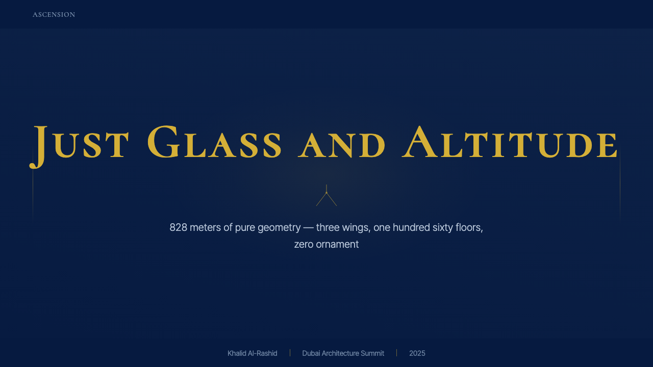
The Burj Khalifa design system is well-suited to presentation work where authority, exclusivity, and monumental scale are the desired impression. For cover slides, the system's strongest move is a full-bleed deep navy ground with a single silver or white title set in small capitals, positioned in the lower third of the frame — a compositional echo of looking up at something vast. A hairline gold rule above or below the title is the only additional element required; everything else is controlled darkness. Content slides should maintain the dark ground but reduce the luminosity of supporting elements to a mid-toned silver-gray, reserving near-white for the single most important piece of information per slide. Data slides become stark and powerful when bar charts and numerical figures are rendered in silver against navy, with gold hairlines marking key thresholds or reference lines.哈利法塔设计系统非常适合以权威感、独特性与纪念碑式规模为期望印象的演示文稿。对于封面页,系统最有力的做法是以全出血深夜蓝底面为背景,以小型大写字母排版的单一银色或白色标题置于画面下三分之一处——这是仰望某个庞然之物时的构图回响。标题上方或下方的一条发丝金线是唯一需要的附加元素;其余一切都是受控的黑暗。内容页应维持深色底面,但将辅助性元素的亮度降至中调银灰,将接近白色的色调保留给每张幻灯片中最重要的单一信息。当柱状图与数字以银色呈现于夜蓝底面、以发丝金线标记关键阈值或参考线时,数据页变得朴素而有力。
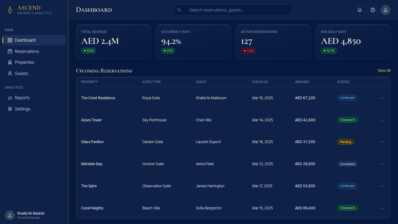
For web user interfaces, the system is best applied to products in the luxury, financial, real estate, or enterprise analytics categories — contexts where the dark field reinforces perceptions of depth, security, and sophistication. Dashboard interfaces built in this language use deep navy as the primary background, silver-toned cards and panels that appear to float above the ground, and gold-hairline separators between functional zones. Interactive states — hover, selected, active — are expressed through increased luminosity rather than color change: an element brightens when activated rather than changing hue. Navigation is typographic, using small capitals for primary labels, with no icon decoration beyond minimal geometric indicators.对于网页用户界面,该系统最适合奢侈品、金融、房地产或企业分析类产品——在这些场景中,深色底场强化了深度感、安全感与精致感的认知。以此语言构建的仪表板界面使用深夜蓝作为主要背景,银调卡片与面板悬浮于底面之上,功能区域之间以发丝金线分隔。交互状态——悬停、选中、激活——通过发光度提升而非色相变化来表达:元素在激活时变亮,而非变色。导航是字体式的,主要标签使用小型大写字母,除最小化几何指示符外无图标装饰。
For editorial and marketing applications, the system supports the visual vocabulary of luxury brand communication — annual reports, property marketing materials, financial product prospectuses, and conference keynote decks. The characteristic move in editorial work is the alternation between full-dark spreads (content on a navy ground) and near-white spreads (dark type on a pale silver-gray or cream ground) — the rhythm mirrors the tower's day and night appearances. Pull quotes and section headings are set in small capitals with hairline gold rules as punctuation. Marketing materials benefit from the system's poster-like quality: a single large image or geometric element commanding a full field, with the headline and subhead occupying a narrow column to one side in precise typographic hierarchy.对于编辑与营销应用,该系统支持奢侈品牌传播的视觉词汇——年报、房产营销材料、金融产品说明书与会议主题演讲幻灯片。编辑工作的典型做法是全深色跨页(夜蓝底色上的内容)与接近白色跨页(浅银灰或奶油底面上的深色文字)之间的交替——这种节奏映射了塔楼白昼与夜晚的两种形态。引言与章节标题以小型大写字母排版,以发丝金线作为标点。营销材料受益于系统的海报感:一个单一的大型图像或几何元素主导整个底场,标题与副标题以精确的字体层级占据一侧的窄栏。
The system also performs strongly in financial and data-heavy communication where the dark field gives numerical content an authoritative, instrument-panel quality. Pricing tables, comparison charts, and technical specifications feel precise and considered rather than clinical when the dark-field palette is applied consistently. The key discipline is maintaining the scarcity of gold: in a table with many rows, gold hairlines should appear only at the most structurally significant divisions — total rows, category headers — not as repeated decoration throughout.该系统在金融与数据密集型传播中也表现强劲,深色底场赋予数字内容一种权威的仪器面板质感。当深色底场色板被一致应用时,定价表、对比图表与技术规格感觉精确且经过深思熟虑,而非临床冷漠。关键纪律是保持金色的稀缺性:在一张有许多行的表格中,发丝金线应只出现在结构上最重要的分隔处——合计行、类别标题——而非作为重复装饰贯穿始终。
A common mistake when applying this system is treating the dark ground as an invitation to use gold expansively. Authentic application uses gold with extreme restraint — one hairline rule per composition, a single accent on one word in a title, never as a fill color for a button or a card background. A second common error is softening the system with warm lighting effects, glows, or diffused drop shadows that suggest natural illumination. The system's character depends on the absence of simulated light sources; luminosity is achieved through tonal value, not through bloom or haze. Any warmth introduced undermines the engineered precision that is the style's defining quality.应用这套系统时最常见的错误是将深色底场理解为大量使用金色的邀请。真实的应用以极度克制的方式使用金色——每个构图中一条发丝线,标题中某一个词的单一强调,从不作为按钮或卡片背景的填充色。第二个常见错误是以暖光效果、光晕或漫射投影柔化系统,这些效果暗示自然光源的存在。系统的气质依赖于模拟光源的缺席;发光性通过色调值而非光晕或朦胧来实现。任何引入的温暖感都会破坏作为这种风格决定性品质的工程精确性。
See the Burj Khalifa Tower design system查看 Burj Khalifa Tower 完整设计系统
Burj Khalifa Tower — FAQBurj Khalifa Tower · 常见问题
Is this system appropriate for light-background applications?这套系统适合用于浅色背景应用吗?
The system can be inverted to a near-white or pale silver-gray ground, but the dark field is the canonical form and should be used wherever the format and audience permit. When inverted, the navy becomes a dark typographic color used for headlines and structural rules, silver becomes a subtle mid-tone for secondary text and dividers, and gold remains a hairline accent used even more sparingly than on the dark ground. A fully inverted light version reads as refined and precise but loses the sense of depth and controlled drama that is the dark-field system's primary emotional register. Consider the light variant for extended reading contexts — long reports, documentation, multi-page editorial — where sustained dark-field reading would impose visual fatigue.系统可以反转至接近白色或浅银灰底面,但深色底场是经典形态,应在格式与受众允许的情况下尽量使用。反转时,夜蓝成为用于标题与结构线条的深色字体色,银色成为二级文字与分隔符的微妙中间调,金色仍作为发丝强调保留,且使用比在深色底面上更为克制。完全反转的浅色版本读起来精致而精确,但失去了深色底场系统作为主要情感基调的深度感与受控戏剧性。请考虑在延伸阅读场景中使用浅色变体——长篇报告、文档、多页编辑内容——在这些场景中持续的深色底场阅读会带来视觉疲劳。
How does this system differ from generic luxury dark-mode design?这套系统与一般奢侈品深色模式设计有何不同?
Generic luxury dark-mode design tends to rely on gold fills, glowing gradients, soft ambient shadows, and texture overlays — techniques that simulate material richness by imitating the appearance of gold leaf, velvet, or polished marble. The Burj Khalifa system explicitly excludes these approaches. Its gold is structural and hairline; its silver is the color of reflected light on glass, not a simulated metallic texture; its shadows, where they exist, are hard-edged and geometric rather than ambient and atmospheric. The distinction is between simulated luxury and engineered precision. One borrows the visual vocabulary of precious materials; the other derives its authority from exactness of form and control of luminosity.一般的奢侈品深色模式设计倾向于依赖金色填充、发光渐变、柔和环境阴影与纹理叠加——这些技术通过模仿金箔、天鹅绒或抛光大理石的外观来模拟材料丰富性。哈利法塔系统明确排除了这些方式。它的金色是结构性且发丝般的;它的银色是光线在玻璃上反射的颜色,而非模拟的金属纹理;它的阴影(若出现)是硬边几何式的,而非环境氛围式的。区别在于模拟奢华与工程精确之间的差异。前者借用贵重材料的视觉词汇;后者从形态的精确性与发光度的控制中获得权威感。
What kinds of products or brands should avoid this system?哪些产品或品牌应当避免使用这套系统?
The system is poorly suited to products or contexts that depend on warmth, organic texture, approachability, or cultural playfulness. Consumer food brands, children's education products, wellness and health applications, community platforms, and any product positioning around accessibility or inclusivity will find the system's severity works against the brand's core values. The dark field and the architectural precision carry implicit messages — exclusivity, distance, authority — that are assets in the right context and liabilities in others. A fintech product serving retail investors might find the system conveys unwelcome complexity; a platform designed to feel collaborative or communal will read as cold under this palette. The test is whether the product's values align with the system's values, not whether the aesthetic is technically well-executed.该系统不适合依赖温暖感、有机质感、亲近感或文化趣味性的产品或场景。消费品食品品牌、儿童教育产品、健康应用、社区平台,以及任何围绕无障碍性或包容性定位的产品,都会发现系统的严肃性与品牌核心价值相悖。深色底场与建筑式精确性传递着隐含信息——独特性、距离感、权威性——这些在合适的场景中是资产,在其他场景中则是负担。一个面向零售投资者的金融科技产品可能发现该系统传递了令人不安的复杂感;一个设计为协作或社区感的平台在这套色板下会读起来冰冷。检验标准是产品的价值观是否与系统的价值观对齐,而非美学是否在技术层面执行得精良。
Can the system accommodate photography or illustration?这套系统能容纳摄影或插画吗?
Photography works well within the system when it is treated as a tonal element rather than a documentary record. Images shot at dusk, at altitude, through glass, or in conditions of dramatic contrast — deep shadows against silver or white highlights — integrate naturally with the palette. Photography should be processed to increase contrast and reduce mid-tone warmth; a slight blue or cool-neutral cast reinforces the system's color logic. Images are best used full-field, bled to edges, without decorative borders or drop shadows. Illustration is rarely appropriate in this system; when figurative or diagrammatic elements are needed, they should be reduced to flat geometric forms in the system's palette colors, rendered with the same precision as the typographic and layout elements. Organic, hand-drawn, or textural illustration styles are incompatible with the system's values.当摄影被当作色调元素而非纪录性记录处理时,它在系统中表现良好。在黄昏拍摄、在高空拍摄、透过玻璃拍摄,或在戏剧性对比条件下拍摄的图像——深阴影对比银色或白色高光——自然地融入色板。摄影应当被处理为增加对比度、减少中间调暖色;轻微的蓝调或冷中性色偏强化了系统的色彩逻辑。图像最好作为全底场使用,出血至边缘,没有装饰性边框或投影。在这套系统中插画很少适用;当需要具象或图示性元素时,应将它们简化为系统色板颜色的平面几何形态,以与字体排印和版面元素相同的精确度呈现。有机的、手绘的或质感风格的插画与系统的价值观不兼容。
How should animation and motion be approached in this system?在这套系统中应如何处理动效与动态?
Motion in this system should reference the tower's physical qualities: slow, controlled, inevitable. Transitions are not playful or elastic; they are linear or gently eased, suggesting weight moving through resistance. The primary motion vocabulary is vertical — elements enter from below and settle upward, or exit upward and disappear. Reveals of content should feel like something being uncovered from darkness rather than appearing from nothing; a panel emerging from a navy ground is more appropriate than a panel fading in from transparent. Gold hairlines should not animate independently; they should appear with the elements they define, not before or after. Speed should generally be slower than typical digital animation conventions — unhurried, monumental, suggesting that what is being shown is worth waiting for.这套系统中的动效应参照塔楼的物理特质:缓慢、受控、不可回避。转场并非欢快或弹性的;它们是线性或轻缓缓出的,暗示重量在阻力中移动。主要动效词汇是垂直的——元素从下方进入并向上安定,或向上退出并消失。内容的揭示应感觉像是从黑暗中被揭开,而非从虚无中出现;一个面板从夜蓝底面中浮现比从透明淡入更为合适。发丝金线不应独立动画;它们应与它们所定义的元素同时出现,而非在之前或之后。速度通常应慢于典型的数字动画惯例——从容、纪念碑式,暗示正在展示的内容值得等待。
Related design styles相关设计风格
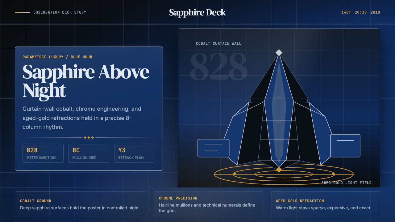 Emirati Burj Khalifa Sapphire (2010)Commanding height, controlled light. Sapphire glass, chrome grid, aged-gold g…高度压迫,光线克制。蓝宝石玻璃、铬色网格与陈金光。
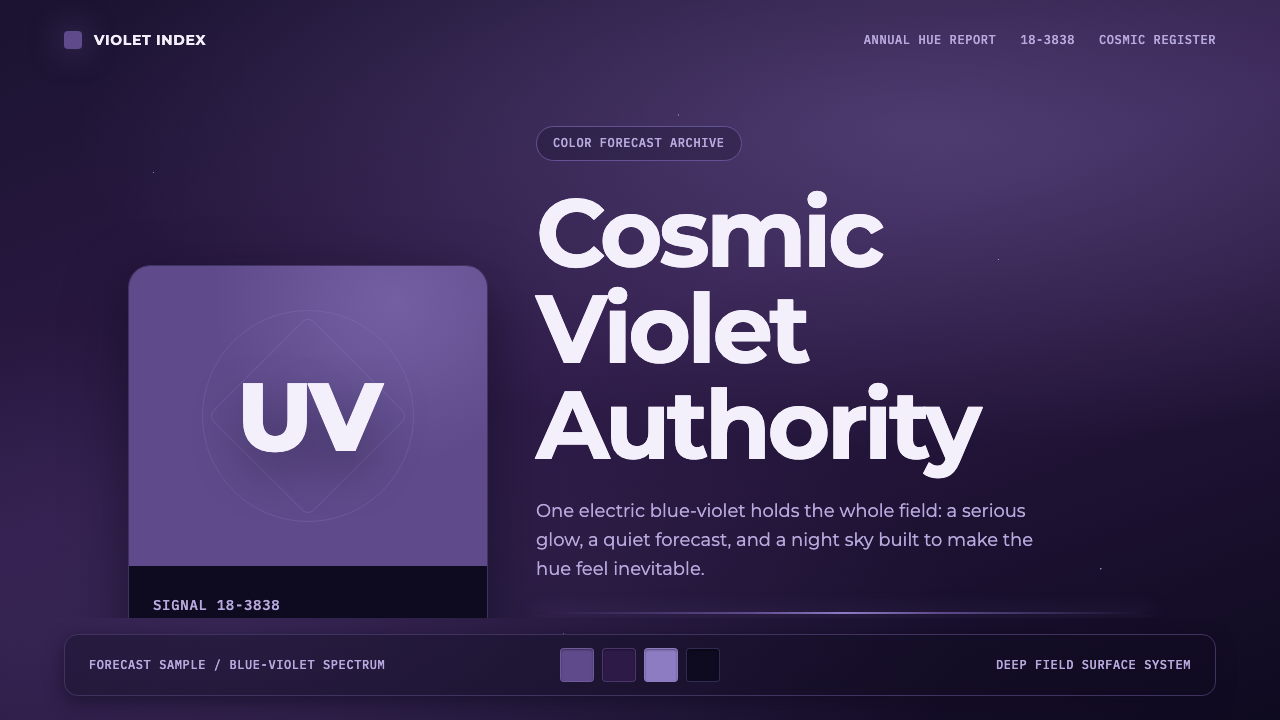 Pantone Ultra VioletCosmic authority. Ultra Violet glows through chip blocks, Montserrat, and dee…宇宙感权威。紫色卡片、Montserrat 与深靛星云托起光感。
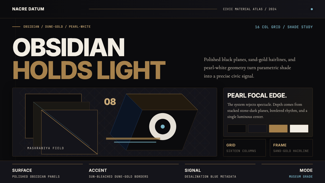 Qatari Pearl Modern Architecture 2024Monumental restraint. Obsidian panels, sand-gold gridlines, pearl-white geome…克制的纪念性:黑曜石面板、沙金网格与珍珠白几何。
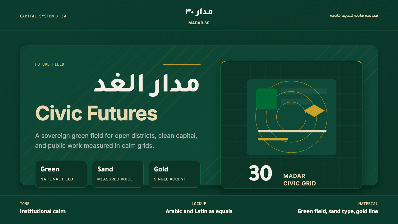 Riyadh Vision 2030Sovereign futurism. National green, sand type, and gold hairlines hold a calm…主权感的未来主义:国旗绿、沙色字与金色细线构成沉静双语网格。
 2001 — A Space OdysseyAbsolute restraint. Black void, white monolith geometry, one HAL-red signal.绝对克制:黑色虚空、白色巨石几何、唯一的 HAL 红信号。
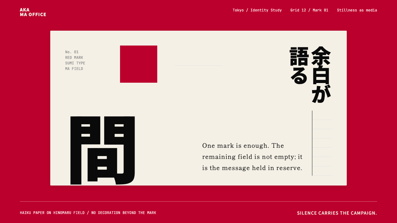 Dentsu Tokyo CreativeSilence does the selling. Hinomaru red, sumi type, and empty columns carry th…以静制胜:日之丸红、墨黑字体与空列共同承托标记。