What is Riyadh Vision 2030?
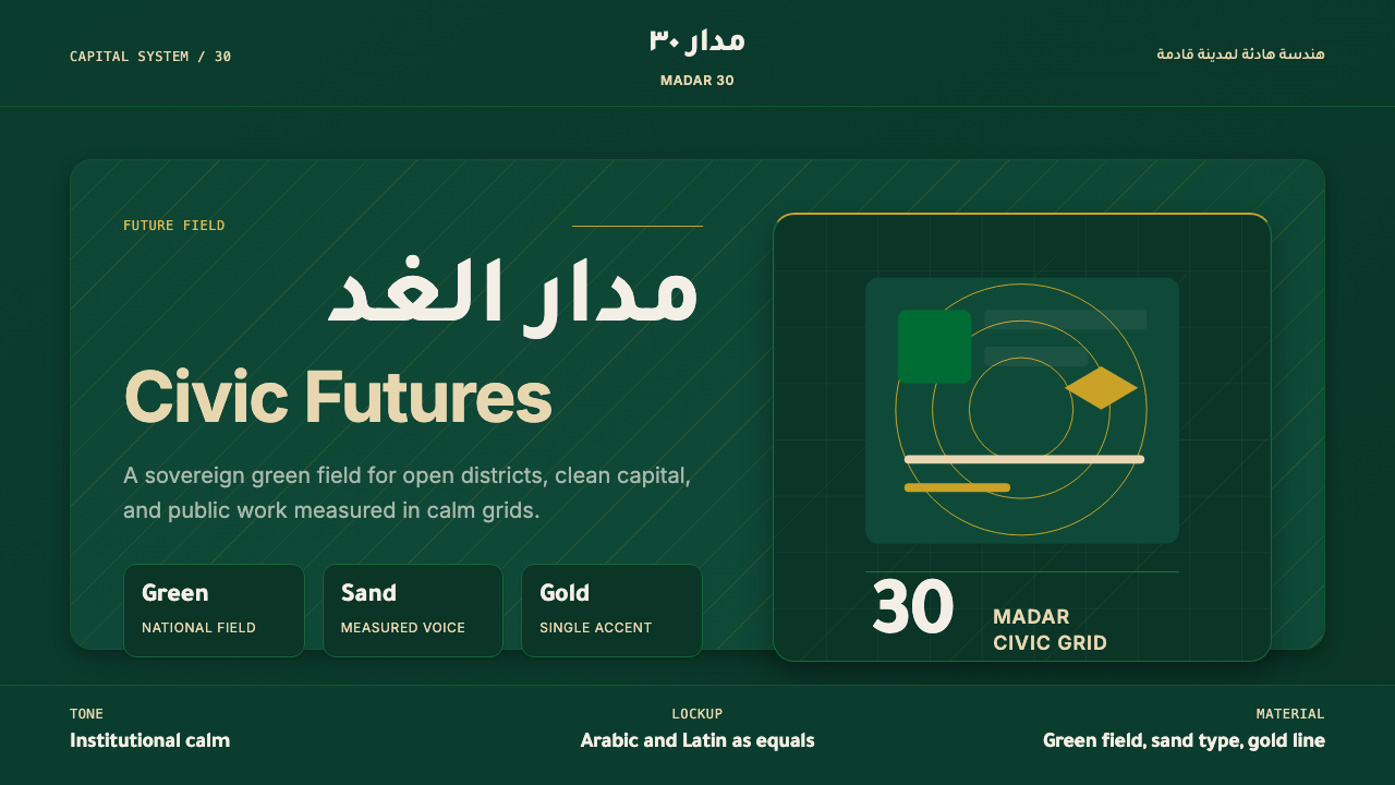
Riyadh Vision 2030 is a state remaking its own image — deep national green, warm desert sand, and restrained gold, disciplined into a calm bilingual grid.
Riyadh Vision 2030 in brief
Gulf Modern Riyadh 2030 is the design language emerging from Saudi Arabia's Vision 2030 program — the visual identity shared, in spirit if not in a single official style guide, by NEOM, the Public Investment Fund (PIF), and the Royal Commission for Riyadh City (RCRC). It reads as institutional futurism: a palette of deep national green, warm sand, and quiet gold, arranged with the confidence of a sovereign wealth fund rather than the flourish of a tourism brochure.
The style's central move is subtraction. Where a certain outsider imagination of the Gulf reaches for gilded arabesque and dense ornamental pattern, this system reaches for negative space. Surfaces are flat and calm; texture, where it exists at all, is a single faint gradient or a whisper of paper grain — never a repeating motif. The result feels premium the way a bank vault feels premium: through restraint, not embellishment.
Its signature device is the bilingual lockup — Arabic and Latin type set side by side or stacked, each script given equal visual weight rather than one serving as a subtitle to the other. This is not a cosmetic bilingualism; it is a structural claim that the identity is built for two audiences simultaneously, a global investor class and a domestic public, and that neither reading of it is the translation.
Where does Riyadh Vision 2030 come from?
The style's origin is a date, not a decade: April 25, 2016, when Deputy Crown Prince Mohammed bin Salman unveiled Saudi Vision 2030, a national plan to restructure the economy away from oil dependency toward tourism, technology, entertainment, and finance. A design language followed the policy, not the other way around — the visual identity had to communicate, at a glance, that the kingdom's institutions were modern and built for global capital, not merely wealthy.
Three institutions translated that mandate into visible form. The Public Investment Fund, the sovereign wealth vehicle bankrolling the transformation, needed an identity that would sit comfortably next to Wall Street in a pitch deck. NEOM — the planned trillion-dollar megacity on the Red Sea coast, announced in 2017 — needed something placeless, that looked like it belonged to no particular country. The Royal Commission for Riyadh City, tasked with the capital's own urban and cultural expansion, needed an identity that could unify dozens of unrelated projects under one calm visual umbrella.
What these three converged on, largely independently but under the same cultural pressure, was a rejection of two older Gulf design habits: the ornamental maximalism sometimes used in tourism marketing, and the generic glass-tower futurism any oil economy reached for to look modern in the 1990s and 2000s. In their place came something closer to contemporary nation-branding as practiced for Gulf sovereign funds and Olympic bids — flat, restrained, equally at home in a PDF deck, airport signage, or an investor roadshow.
The style also draws, more quietly, on a longer thread of modern Arabic type design — decades of effort by type designers to build geometric Arabic typefaces at true visual parity with Latin sans-serifs, rather than squeezed into a Latin-designed grid as an afterthought. Vision 2030's bilingual lockups only work because that groundwork existed; without it, the two-script balance the style depends on would not be achievable.
What defines the Riyadh Vision 2030 look?
Color
The palette centers on a deep, almost black-green drawn from the national flag, paired with warm desert sand as a secondary ground and a restrained, muted gold used only as a hairline accent — never as a fill. Pure white and near-black serve as neutrals. Saturated or playful secondary hues are avoided entirely; gold in particular is rationed so tightly that its scarcity is what gives it weight.
Typography and Bilingual Lockups
Modern geometric sans-serifs anchor both scripts — a contemporary Arabic typeface sits alongside a Latin sans of comparable weight and proportion, set so that neither dominates. Lockups favor generous letter-spacing and a calm, unhurried scale relationship between headline and body rather than dramatic size contrast. The typographic mood sits closer to a museum wall label than a billboard: confident but never shouting.
Space and Composition
Generous negative space is the system's most consistent signature. Compositions favor a single dominant element — a wordmark, a large numeral, a lone geometric motif — set against an expanse of empty ground, with supporting information pushed to a quiet margin. This is a deliberate choice: emptiness reads as confidence and permanence here, the visual equivalent of a long pause before an important sentence, and it is one of the clearest ways this style distinguishes itself from denser Gulf design traditions.
Geometric Line Motifs
Where the system does introduce a decorative element, it takes the form of a spare geometric line motif — a single thin arc, an angular fold, a repeating linear pattern reduced almost to a texture rather than a picture. These motifs are quiet references to architectural or calligraphic tradition rather than literal ornament: they gesture toward Islamic geometric pattern-making without reproducing its density, appearing as a faint watermark rather than a field-filling pattern.
Materiality and Surface
Surfaces are engineered to feel premium and flat rather than premium and ornate. Where texture appears, it is limited to a faint paper grain or a fine, almost imperceptible gradient suggesting depth without simulating any physical material. Glossy, heavily reflective, or richly patterned surfaces — the visual shorthand for luxury in some other Gulf design traditions — are avoided in favor of a matte, paper-like calm that reads as institutional rather than commercial.
Grid and Hierarchy
Layouts sit on a calm, evenly-spaced grid designed to hold two scripts of different structural rhythm without either one breaking the system. Hierarchy is established primarily through scale and position rather than color contrast, since color is used too sparingly to carry organizational weight on its own. The grid tends to feel wide and generous rather than dense, in keeping with the system's overall preference for room to breathe over information density.
Restraint as Signal
Every element of the system ultimately serves a single rhetorical goal: signaling that authority no longer needs to announce itself through visible richness. Gold is present but rationed; pattern is present but reduced to a hairline; color is present but limited to three notes. This is restraint used as a status signal rather than a budget constraint — the opposite move from ornamental maximalism, but aimed at the same underlying goal of projecting legitimacy and permanence.
Who shaped Riyadh Vision 2030?
The national policy framework unveiled in April 2016 is not a design document, but it is the origin point for the entire visual language: every institution that adopted this aesthetic did so in response to the mandate to present the kingdom's economy as modern, diversified, and globally investable. The design system exists because the policy needed a visible face.
As the sovereign wealth fund financing Vision 2030's diversification agenda, PIF needed an identity able to sit credibly alongside international financial institutions in investor materials. Its visual output — calm, green-and-sand, gold used sparingly — set an early template for institutional restraint that other Vision 2030-aligned bodies subsequently echoed.
Announced in 2017 as a planned trillion-dollar megacity on the Red Sea coast, NEOM pushed the style toward its most placeless and futuristic extreme, favoring flat surfaces, expansive negative space, and an identity built to read as belonging to no single national tradition — fitting for a project marketed as a blank-slate future city rather than an extension of existing Saudi urban culture.
Tasked with coordinating the capital's own urban and cultural expansion under Vision 2030, RCRC applied the style at civic scale — unifying disparate construction, transit, and cultural projects under one calm identity so that Riyadh's rapid, simultaneous transformation would read as a single coherent narrative rather than a scatter of unrelated developments.
A decades-long movement among Arab and international type designers to build geometric, sans-serif Arabic typefaces capable of true visual parity with Latin sans-serifs is the quiet technical precondition for this entire style. Without mature bilingual type pairs, the Vision 2030 aesthetic's signature move — the equal-weight bilingual lockup — would not be achievable.
How do you use Riyadh Vision 2030 today?
Gulf Modern Riyadh 2030 transfers well to any context that needs to read as institutional, forward-looking, and quietly wealthy rather than loud or exotic — which makes it a natural fit for finance, national or civic branding, and any product positioning itself as a serious long-term undertaking rather than a consumer novelty.
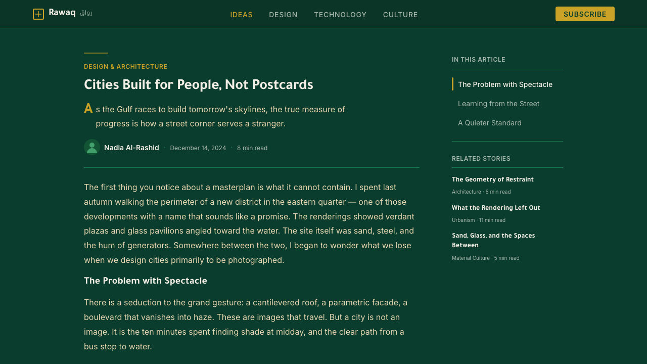
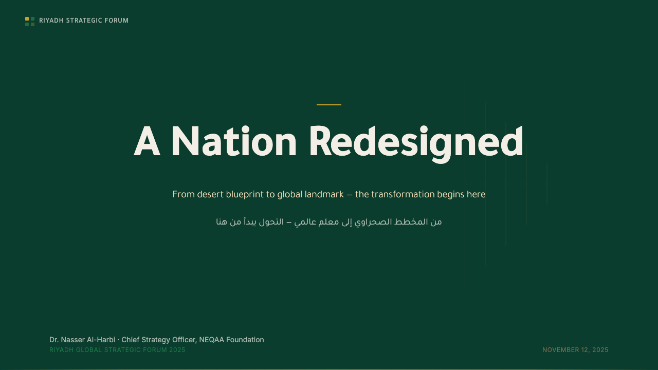
For presentation cover slides, the style rewards a single dominant gesture against generous empty ground: a large green or sand field, a restrained gold hairline or geometric line motif in one corner, and a bilingual title where Arabic and Latin type carry equal weight rather than one subordinate to the other. Content and data slides stay equally spare — one organizing grid line, two text tiers separated by scale rather than color, and charts rendered in flat sand-and-green tones with gold reserved for a single highlighted data point.
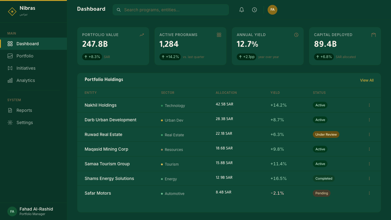
For web interfaces, the style suits dashboards and pricing pages that need to project institutional trust — sovereign fund portals, government service platforms, enterprise financial tools. The approach: a calm, evenly-spaced grid, a near-white or sand background, deep green reserved for primary actions and key headers, and gold used only as a rare accent marking a premium tier, never as a background fill or a repeated UI element. Card components stay flat and matte; avoid glossy gradients or heavy drop shadows that would read as generic tech-startup polish rather than sovereign calm.
For editorial and marketing work, the style supports long-form material that wants to feel authoritative rather than persuasive — annual reports, national branding campaigns, investment prospectuses. Layouts favor a narrow, unhurried text measure, wide margins used for pull-quotes or bilingual captions, and section breaks marked by a plain rule rather than decorative dividers. Full-bleed sand-or-green feature spreads work well as chapter openers, provided each contains only one focal element.
The most common mistake in applying this style is over-using gold — treating it as a general accent rather than a scarce mark of distinction. Authentic Vision 2030-aligned work spends gold on perhaps one element per composition: a hairline, a small icon, a single emphasized word. A second frequent error is crowding the bilingual lockup, either by shrinking one script to fit the other's rhythm or by adding decorative flourishes around the type — both undermine the calm, structural confidence that is the entire point of the system.
Riyadh Vision 2030 — FAQ
Is this the same as traditional Islamic geometric design?
No, though it is a distant relative. Traditional Islamic geometric pattern-making is dense, repeating, and field-filling — entire surfaces built from interlocking tessellated forms. Gulf Modern Riyadh 2030 borrows only the faintest gesture toward that tradition, a single thin line motif or a small graphic accent, and otherwise commits to open, empty ground. Think of it as a quiet nod to that lineage rather than an application of it — restraint replaces density as the operative principle.
Why does the style avoid gold as a dominant color if gold reads as luxurious?
Because the system's target audience — global institutional investors and a modern domestic public — associates heavy gold with an older, more decorative idea of Gulf wealth that Vision 2030 is explicitly trying to move past. Rationing gold to a hairline or a single accent achieves the opposite effect: it signals that the wealth and authority being communicated no longer need to prove themselves through visible richness. Scarcity, in this system, does the work that abundance used to do.
How central is the bilingual Arabic–Latin lockup, really — can the style work in a single language?
The bilingual lockup is close to the defining device of the style, since it encodes the system's core claim — built for two audiences at once, with neither treated as primary. A single-language application can still borrow the palette, the negative space, and the restrained gold accenting and read as clearly related to this style, but it loses the specific rhetorical move that distinguishes Vision 2030's identity from generic minimalist nation-branding. Where possible, even a single-language layout should reserve visual space as if a second script belonged there.
Does this style suit consumer or entertainment products, or is it strictly institutional?
It is strongly weighted toward institutional and civic contexts — finance, government platforms, national branding, large-scale urban development — where the goal is to project authority, permanence, and calm. It struggles where playfulness, warmth, or sensory abundance are called for, since its vocabulary is built around restraint rather than delight. A consumer entertainment product borrowing this style should expect it to read as serious and premium, not fun.
How does this style differ from generic 'glass tower' Gulf futurism used in the 1990s and 2000s?
Older Gulf futurism relied on generic markers of modernity — glass, chrome, sweeping renderings of skyscrapers — that could belong to any oil economy signaling progress, with little that was culturally specific. Gulf Modern Riyadh 2030 is deliberately more restrained and more specific: the national green is not interchangeable with any other color, the bilingual lockup ties the identity to a particular linguistic reality, and the line motifs gesture toward a real design lineage rather than generic sci-fi gloss. It is futurism with a signature, not futurism as a category.
Related design styles
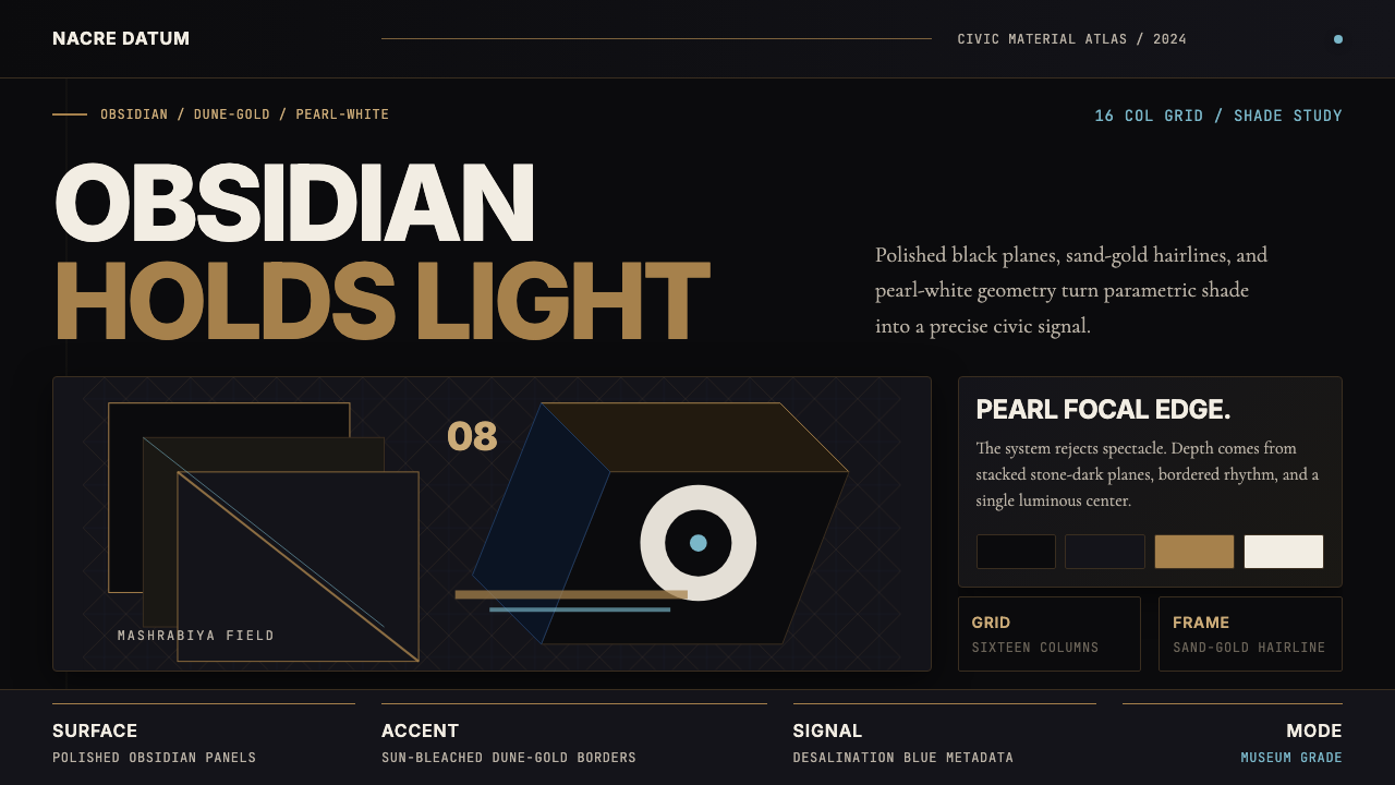 Qatari Pearl Modern Architecture 2024Monumental restraint. Obsidian panels, sand-gold gridlines, pearl-white geome…
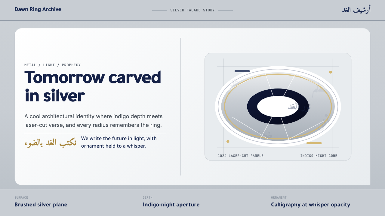 Dubai Museum of the FutureTechnological luxury feels poetic. Silver metal, indigo depth, and Amiri call…
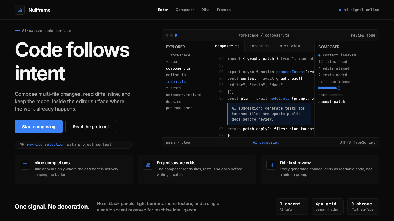 Cursor IDEAI-first code editor. Pure dark surfaces, off-white text, electric blue reser…
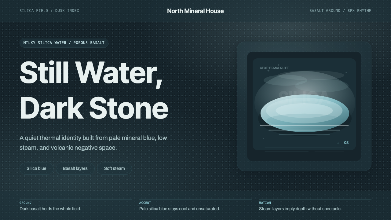 Glacial Teal LagoonQuiet feels elemental. Basalt darks and milky silica blue drift in a low-cont…
 NEOM Mirror FuturismPermanently unweathered. Chrome-white grids and ultramarine seams stage a CGI…
 Resend 2024Clean code becomes brand. Pure black, JetBrains Mono, and one green delivered…