Design style guide设计风格指南
What is NEOM Mirror Futurism?什么是 NEOM Mirror Futurism?
NEOM Mirror Futurism is the visual language of a megacity that exists only in CGI — chrome-white grids, ultramarine seams, and architectural scale so vast that it erases human presence entirely.NEOM镜面未来主义是一座仅存于CGI之中的巨型城市的视觉语言——铬白网格、群青色缝线、以及大到足以将人的存在完全抹去的建筑尺度。
NEOM Mirror Futurism in briefNEOM Mirror Futurism 速览
NEOM Mirror Futurism is the design aesthetic developed for and around the NEOM megacity project — a five-hundred-billion-dollar Saudi Arabian development announced in 2017 and projected to be partially complete by 2030. The style is defined by its origin: every image, every rendering, every brand touchpoint was created before a single permanent structure existed. This is a visual language conjured entirely from future-tense aspiration, and it looks like it.NEOM镜面未来主义是为NEOM巨型城市项目所开发的设计美学——这个耗资五千亿美元的沙特阿拉伯项目于2017年宣布,预计在2030年前部分竣工。这种风格由其起源所定义:每一张图像、每一张渲染图、每一个品牌触点,都在第一栋永久性建筑建成之前便已创作完毕。这是一种完全从未来时态的抱负中召唤出来的视觉语言,它的面貌正是如此。
The aesthetic vocabulary is drawn from architectural visualization pushed to its outermost extreme: mirror-clad surfaces reflecting empty desert sky, ultramarine accent lines scoring the boundaries between structure and void, type scaled to the dimensions of building facades. Color is restricted to a narrow and deliberately inhuman register — whites that are too white, blues that carry no warmth whatsoever, reflective surfaces that return the environment without absorbing it. The effect is of a place that has not yet been touched by anyone.这套美学词汇来自被推向极致的建筑可视化:镜面覆层的表面映照着空旷的沙漠天空,群青色强调线划定结构与虚空之间的边界,字体被缩放至建筑立面的尺度。色彩被限制在一个狭窄而刻意非人性化的区间——白得过分的白,不带丝毫温度的蓝,反射环境而不吸收它的镜面。效果是一个尚未被任何人触碰过的地方。
What makes NEOM Mirror Futurism a coherent design language, rather than simply a collection of flashy architectural renders, is its internal consistency. The same spatial logic — extreme emptiness, mirror-plane reflections, a horizon line treated as an absolute edge — runs through brand materials, motion graphics, model photography, and the project's visual communications at every scale. It is a total aesthetic environment designed to make the impossible feel authoritative.让NEOM镜面未来主义成为一种连贯设计语言而非一堆华丽建筑渲染图的,是它的内在一致性。同一套空间逻辑——极度的空旷、镜面反射、被视为绝对边界的地平线——贯穿于品牌材料、动态图形、模型摄影,以及该项目在各个尺度上的视觉传播。这是一个被设计来让不可能之事显得具有权威性的完整美学环境。
See the NEOM Mirror Futurism design system →查看 NEOM Mirror Futurism 完整设计系统 →
Where does NEOM Mirror Futurism come from?NEOM Mirror Futurism 从何而来?
The NEOM project was announced by Crown Prince Mohammed bin Salman in October 2017 as a cornerstone of Saudi Vision 2030 — the kingdom's program to diversify its economy away from petroleum dependency. The site chosen was the Tabuk Province in northwest Saudi Arabia, along the Red Sea coast near the Gulf of Aqaba: a region of extraordinary topographic drama, with granite mountains descending directly to crystalline water. From the start, the project's identity was visual before it was physical. An entire brand language had to be invented for a city that would not exist for years.NEOM项目由王储穆罕默德·本·萨勒曼于2017年10月宣布,作为沙特「2030愿景」的核心支柱——这是沙特王国推动经济多元化、摆脱石油依赖的国家战略。选定的地点是沙特阿拉伯西北部塔布克省的红海沿岸,靠近亚喀巴湾:这一区域地形壮观,花岗岩山脉直接俯冲入晶莹剔透的海水。从一开始,项目的身份认同就先于实体存在而成为视觉事实。一套完整的品牌语言必须被发明出来,服务于一座数年后才会存在的城市。
The visual aesthetic that emerged was shaped by the project's two dominant ambitions: to signal radical discontinuity from existing urban precedents, and to communicate directly to an international audience of sovereign wealth funds, technology companies, and global media. Traditional Gulf architectural ornament — the geometric tile patterns, the arabesque, the mashrabiya screen — was entirely excluded. In its place came a vocabulary drawn from high-end architectural visualization software: clean environmental reflections, spectral light effects, and a color palette that reads as technological rather than regional.由此浮现的视觉美学由项目的两大主导野心所塑造:一是表明与现有城市先例的彻底断裂,二是直接向主权财富基金、科技公司和全球媒体等国际受众传达信号。海湾建筑传统装饰——几何瓷砖图案、阿拉贝斯克纹样、穿孔木格窗——被完全排除在外。取而代之的是一套从高端建筑可视化软件中提炼的词汇:干净的环境反射、光谱性光效,以及一套读来属于技术而非地域的色彩系统。
The style's most distinctive element — the mirror-clad surface — was crystallized in The Line, NEOM's most publicized component: a linear city one hundred and seventy kilometers long, whose two facing facades would be clad in mirrored glass from ground to apex. When renderings of The Line were released in 2022, the imagery was immediately absorbed into global visual culture as shorthand for a particular strain of utopian speculation: authoritarian in scale, pristine in surface, and conspicuously devoid of the evidence of ordinary life.这套风格最具辨识度的元素——镜面覆层——在「线形城市」(The Line)中得到凝聚:这是NEOM最广为人知的组成部分——一座一百七十公里长的线性城市,其两侧对向立面从地基到顶端全部覆以镜面玻璃。当「线形城市」的渲染图于2022年发布时,这些图像立刻被全球视觉文化所吸收,成为一种特殊乌托邦想象的速记符号:规模上的威权主义,表面的洁净无瑕,以及对日常生活痕迹的刻意抹除。
Key design contributors included starchitect firms such as Thom Mayne's Morphosis and Zaha Hadid Architects, alongside the project's in-house visual communications teams. The visualization work drew on AI-augmented rendering pipelines that were then at the cutting edge of architectural presentation, producing images at resolutions and with surface fidelity previously impossible outside of feature-film visual effects. This production context left its mark on the aesthetic: the images look the way they do partly because of the tools that made them, and those tools were optimized for visual spectacle at the expense of quotidian legibility.主要设计参与方包括汤姆·梅恩的Morphosis和扎哈·哈迪德建筑事务所等明星建筑师团队,以及项目内部的视觉传播团队。可视化工作借助当时处于建筑呈现前沿的AI增强渲染流程完成,产出的图像分辨率和表面精度在此前只有商业电影特效才能实现。这一制作背景在美学上留下了烙印:这些图像之所以呈现出这般面貌,部分原因在于制作它们的工具——而那些工具是以视觉奇观为优化目标的,代价是放弃了日常生活的可读性。
What defines the NEOM Mirror Futurism look?NEOM Mirror Futurism 的视觉特征是什么?
Mirror Surfaces and Reflective Logic镜面与反射逻辑
The defining material of NEOM Mirror Futurism is not a material at all — it is the act of reflection. Every major surface in the visual system is conceived as a mirror: it shows the sky, the desert, the adjacent void, but offers no texture or grain of its own. This creates a paradoxical visual effect in which the most prominent element in any composition is simultaneously present and transparent, massive and weightless. The mirror surface makes no claim to warmth or habitation; it asserts pure presence.NEOM镜面未来主义的决定性材质根本不是材质——而是反射这一行为本身。视觉系统中所有主要表面都被构想为镜面:它们呈现天空、沙漠、毗邻的虚空,却不提供任何属于自身的纹理或质感。这造成了一种矛盾的视觉效果:构图中最突出的元素同时是在场的与透明的,巨大的与无重量的。镜面不主张温度或居住性;它只主张纯粹的存在。
Ultramarine as Structural Accent群青作为结构性强调色
Against the dominant white-and-mirror ground, a single deep blue — carrying the cool, spectral intensity of ultramarine — functions as the system's primary accent. It appears at junctions: where surfaces meet, where the built form meets the landscape, where one zone transitions to another. Unlike accent colors in conventional brand systems, this blue does not signal interactivity or call-to-action; it signals seam, boundary, and precision. It is the color of an engineered edge.在主导性的白色与镜面底面上,单一的深蓝——承载着群青色冷峻而光谱性的强度——作为系统的主要强调色发挥作用。它出现在交接处:表面相遇的地方、建构形态与地景接触的地方、一个区域过渡到另一个区域的地方。与传统品牌系统中的强调色不同,这种蓝色不表示交互性或行动召唤;它表示缝线、边界与精度。这是一种工程化边缘的颜色。
Architectural-Scale Typography建筑尺度的字体排印
Text in NEOM Mirror Futurism is not sized for reading — it is sized for viewing. Logotypes, project names, and marketing statements are set at a scale that implies they would need to be seen from a significant distance to be legible. This creates an unusual effect in print and screen contexts: the letterforms feel monumental even at standard display sizes, as though the viewer is always positioned far below the information. The type style tends toward geometric sans-serif forms with extraordinarily wide tracking, amplifying the sense of vast, unpopulated space.NEOM镜面未来主义中的文字不是为了阅读而设计的尺度——而是为了观看。标志、项目名称和营销陈述被设置在一种隐含着需要从相当距离才能辨认的尺度。这在印刷和屏幕语境中产生了一种不寻常的效果:字形即使在标准展示尺寸下也显得纪念碑式,仿佛观者始终处于信息的遥远下方。字体风格倾向于字符间距极宽的几何无衬线形态,放大了广阔而无人居住的空间感。
Void as Composition虚空即构图
The most consistent compositional choice in the NEOM visual system is the deliberate preservation of vast empty zones — not as negative space in the classical sense, but as active subject matter. Sky occupies two-thirds of a frame; horizon line is placed very high or very low; foreground surfaces extend to the edge of the image with no figures, vehicles, or vegetation to provide scale. This emptiness is the point: it communicates a space not yet scaled to human beings, a landscape that is fundamentally pre-inhabited.NEOM视觉系统中最一致的构图选择是刻意保留大面积的空旷区域——不是古典意义上的负空间,而是主动的主题内容。天空占据画面三分之二;地平线被置于极高或极低处;前景表面延伸至画面边缘,没有人物、车辆或植被提供比例参照。这种空旷正是核心所在:它传达了一个尚未被缩放至人类尺度的空间,一个从根本上尚未有人居住的景观。
CGI Light and the Absence of WeatheringCGI光线与风化的缺席
All surfaces in NEOM Mirror Futurism exist in a state of permanent newness. There is no patina, no erosion, no stain from use. The light source behaves like a rendering engine's default — high and directional, producing clean shadows without diffusion. This refusal of weathering is not incidental but deliberate: it signals that the project described exists outside of ordinary time, in a perpetual moment of completion. The photorealistic fidelity of the images makes this uncanny quality more, not less, pronounced.NEOM镜面未来主义中的所有表面都存在于永恒的崭新状态。没有包浆,没有侵蚀,没有使用留下的污渍。光源的行为方式如同渲染引擎的默认设置——高位定向光,产生干净而不扩散的阴影。这种拒绝风化的做法并非偶然,而是刻意为之:它传达出所描述的项目存在于普通时间之外,处于一个永恒的竣工时刻。图像的照片级写实感让这种诡异品质变得更加突出,而非减弱。
Scale Without Human Reference没有人类参照的尺度
A consistent and striking aspect of NEOM visual materials is the near-total absence of human figures. When people appear at all, they are silhouetted at extreme distance, functioning as scale indicators rather than as individuals with legible presence. The effect of their near-absence is to make the built environment the protagonist of every image: the architecture speaks for itself, at a volume that no human presence could compete with. The viewer understands the scale abstractly, without ever being invited to inhabit it.NEOM视觉材料中一个一贯而引人注目的特征是人物的近乎完全缺席。即便有人物出现,也是在极远距离上的剪影,作为尺度指示符而非具有可辨认在场感的个体。其近乎缺席的效果是让建构环境成为每张图像的主角:建筑以一种任何人类存在都无法与之竞争的音量自行言说。观者在抽象层面理解其规模,却从未被邀请去居住其中。
Chromatic Restraint and Technological Coolness色彩克制与技术性冷感
Beyond the ultramarine accent, the palette is almost entirely achromatic: the dominant tones are variants of white, silver, and the grey-blue cast of clear desert sky. Warmth is systematically excluded. Where earth tones from the actual landscape — the red-orange of the Tabuk granite, the ochre of sand — appear in context, they are treated as a foil to be contrasted against rather than harmonized with. The effect reads as technological rather than climatic, cosmopolitan rather than regional.除了群青色强调之外,色板几乎完全是无色彩的:主导色调是白色、银色,以及晴朗沙漠天空的蓝灰色调的各种变体。温暖感被系统性地排除。当来自真实地景的土色调——塔布克花岗岩的红橙色、沙地的赭石色——出现在背景中时,它们被当作对比衬托而非和谐要素来处理。整体效果读来属于技术性的而非气候性的,属于国际化的而非地域性的。
See the NEOM Mirror Futurism design system →查看 NEOM Mirror Futurism 完整设计系统 →
Who shaped NEOM Mirror Futurism?谁塑造了 NEOM Mirror Futurism?
As Crown Prince and the primary architect of Saudi Vision 2030, Mohammed bin Salman is the initiating force behind NEOM and the direct client for the aesthetic system it spawned. His decision to position NEOM as a global cultural and technological statement — rather than as a conventional real-estate development — determined that the project would need a visual identity capable of competing on a world stage. The grandiosity of the visual language reflects the grandiosity of the political ambition it was designed to embody.作为王储和沙特「2030愿景」的主要设计者,穆罕默德·本·萨勒曼是NEOM背后的发起力量,也是其所催生的美学系统的直接委托方。他将NEOM定位为全球文化与技术宣言而非常规房地产开发的决定,决定了该项目需要一套能够在世界舞台上与人竞争的视觉身份。视觉语言的宏大正是它所被设计来体现的政治抱负的宏大。
As NEOM's chief executive, Al-Nasr has been responsible for translating the Crown Prince's vision into an operational organization with a coherent brand identity. Under his leadership, NEOM developed the visual communications infrastructure — the style guidelines, the rendering pipelines, the multi-project brand architecture — that gives the NEOM aesthetic its internal consistency across The Line, Sindalah, Aqaba, and the project's other components. He has been the public face of the brand's ambitious claims about what the city will eventually be.作为NEOM首席执行官,纳赫米·阿尔-纳斯尔负责将王储的愿景转化为拥有连贯品牌身份的运营组织。在他的领导下,NEOM建立了视觉传播基础设施——风格指南、渲染流程、多项目品牌架构——使NEOM美学在「线形城市」、辛达拉岛、亚喀巴及其他各子项目间保持内在一致性。他一直是品牌关于城市未来形态之宏大主张的公众代言人。
The Pritzker Prize-winning architect and founder of Morphosis brought to NEOM a design sensibility already disposed toward extreme formal ambition and deconstructivist surface complexity. Mayne's participation lent the project a degree of international architectural credibility and contributed to the visual language of fractured, angled surfaces that give the NEOM aesthetic its sense of tectonic dynamism — the idea that the forms are in motion, or have been arrested mid-movement.普利兹克奖得主、Morphosis事务所创始人汤姆·梅恩为NEOM带来了已然倾向于极端形式野心与解构主义表面复杂性的设计感性。梅恩的参与赋予了项目一定程度的国际建筑可信度,并为NEOM美学的断裂、斜切表面视觉语言作出了贡献——正是这些表面赋予了NEOM美学以构造动感:形态仿佛处于运动之中,或被定格在运动的半途。
The London-based practice, continuing its work after the death of its founder in 2016, contributed architectural designs to several NEOM components. The firm's signature approach — fluid, continuously curved forms that reject orthogonal geometry — introduced a counterpoint to the mirror-plane rigidity of The Line's visual identity. ZHA's work within the NEOM system demonstrates how the project's visual language accommodates both the hard-edged mirror logic and the parametric fluid forms that characterized early twenty-first century prestige architecture.这家伦敦事务所在其创始人于2016年去世后延续工作,为NEOM多个子项目提供了建筑设计。事务所的标志性做法——流动的、持续弯曲的形态,拒绝正交几何——为「线形城市」视觉身份的镜面平面刚硬感引入了对位。ZHA在NEOM系统中的工作展示了该项目的视觉语言如何同时容纳硬边镜面逻辑和参数化流体形态——后者是二十一世纪初声望建筑的标志。
Unlike most historical design movements, the NEOM aesthetic was produced not by a single named designer or studio but by large internal and external visualization teams working with AI-augmented rendering pipelines. These teams — drawing on software capable of generating photorealistic environmental reflections, spectral lighting, and atmospheric haze at scales impossible through conventional rendering — are the primary authors of the NEOM visual language in its most widely circulated form. The namelessness of this authorship is itself characteristic of the style: production infrastructure, not individual creative signature.与大多数历史设计运动不同,NEOM美学不是由某位具名设计师或工作室单独产出的,而是由大型内外部可视化团队借助AI增强渲染流程共同生产的。这些团队——借助能够以传统渲染无法实现的规模生成照片级写实环境反射、光谱性光照和大气雾霾的软件——是NEOM视觉语言在其传播最广形式上的主要作者。这种作者身份的匿名性本身就是这种风格的特征:生产基础设施,而非个体创作签名。
How do you use NEOM Mirror Futurism today?今天怎么用 NEOM Mirror Futurism?
NEOM Mirror Futurism is one of the most visually striking contemporary aesthetics available for design work, but it is also one of the most context-dependent. Its power derives from a specific emotional register — vast aspiration, technological authority, deliberate inhuman scale — and that register will be productive in some contexts and actively counterproductive in others. The first question to ask before applying this style is not how, but whether: does the project genuinely benefit from appearing monumental, pristine, and uninhabited?NEOM镜面未来主义是当代设计实践中视觉冲击力最强的美学之一,但它也是最依赖语境的美学之一。其力量来自一种特定的情感音域——宏大的抱负、技术性的权威、刻意的非人类尺度——这种音域在某些语境中富有成效,在其他语境中则会产生明确的反效果。在应用此风格之前,首先要问的不是如何应用,而是是否应该应用:该项目是否真的能从显得纪念碑式、洁净无瑕、无人居住中获益?
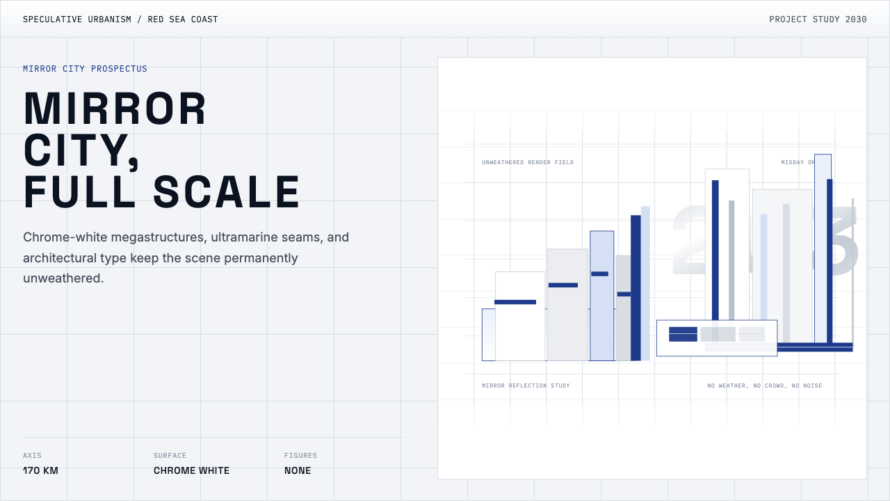
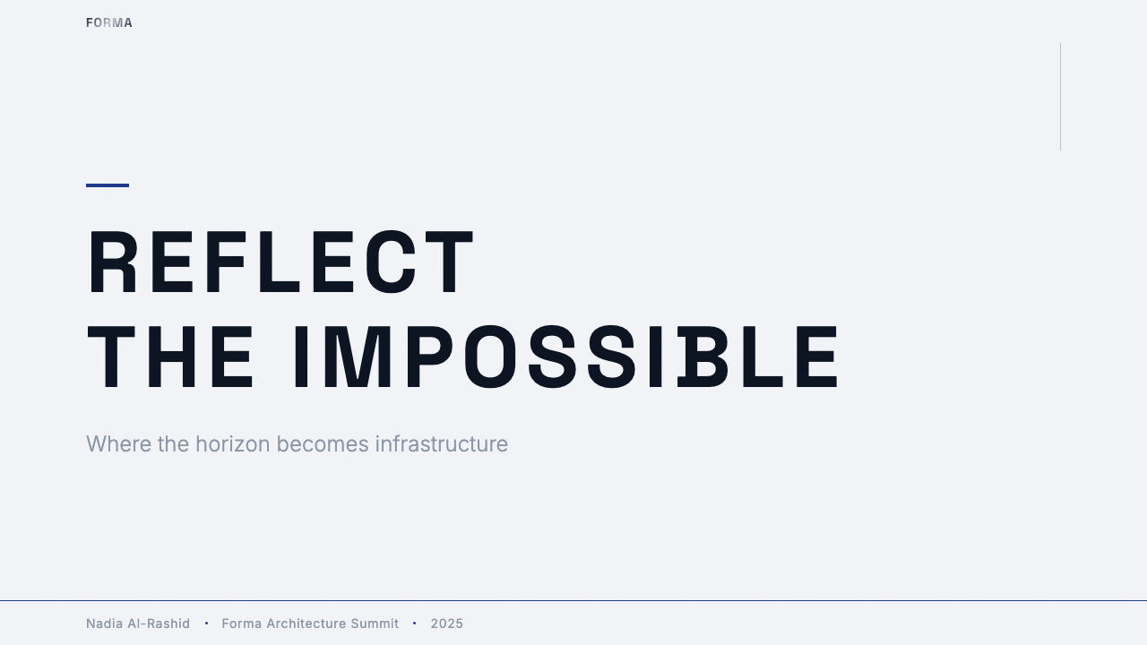
For presentation slides, the style works best when the presenter wishes to communicate institutional ambition or strategic vision rather than operational detail. A cover slide using this aesthetic should feature an expansive, near-empty composition — ideally with a strong horizontal line (representing horizon or division) against which a single block of wide-tracked type is placed. Content slides should maintain generous empty zones; resist the urge to fill every region. Data visualizations should be treated as architectural objects: large, geometric, with ultramarine-toned accent lines marking key thresholds. The most common mistake is overcrowding — the style collapses when human-scale density is introduced.对于演示文稿,这种风格在演讲者希望传达机构抱负或战略愿景而非运营细节时效果最佳。使用这套美学的封面页应呈现宽广、近乎空旷的构图——理想情况下有一条强烈的水平线(代表地平线或分割)作为背景,对应放置一块字符间距极宽的单行文字。内容页应保持充裕的空旷区域;抵制填满每个区域的冲动。数据可视化应被当作建筑对象处理:大尺寸、几何化,以群青色调强调线标示关键阈值。最常见的错误是过度拥挤——一旦引入人类尺度的密度,这种风格就会崩溃。
For web interfaces, this aesthetic is appropriate for hero sections and landing pages of projects that position themselves as paradigm-shifting: infrastructure, platforms, frontier technology, institutional investment. Dashboard and utility interfaces are poorly served by it — the style's emptiness reads as absence of information rather than elegant restraint when the user's primary task is data monitoring. If applied to a pricing or tier page, use the reflective surface logic to create sharp visual distinction between tiers rather than gradual differentiation; each option should feel like a distinct architectural zone.对于网页界面,这套美学适合将自身定位为范式转变的项目的主视觉区和落地页:基础设施、平台、前沿技术、机构投资。仪表板和工具性界面则不适合——当用户的主要任务是数据监控时,这种风格的空旷感会被读为信息的缺席而非优雅的克制。若应用于定价或等级页面,使用反射性表面逻辑在不同等级之间创造鲜明的视觉区分,而非渐进式差异化;每个选项都应感觉像一个独立的建筑区域。
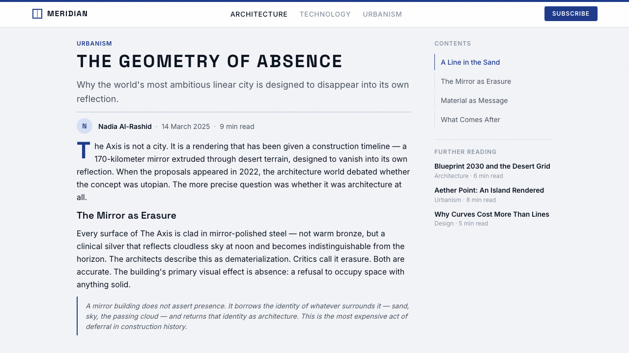
For editorial and marketing contexts, NEOM Mirror Futurism works well for long-form feature coverage, brand manifesto documents, and annual reports targeting sophisticated institutional audiences. The visual language projects authority and forward-orientation. A spread layout might use a nearly full-bleed image with a high horizon line, type reversed out in white against the deep tones of the sky zone, and an ultramarine rule marking the transition between image and text. Avoid applying the style to content about warmth, community, or everyday human experience — the gap between form and subject will be dissonant.对于编辑和营销语境,NEOM镜面未来主义适合面向精明机构受众的长篇专题报道、品牌宣言文件和年度报告。这套视觉语言传达权威性和前瞻取向。一个对开页版面可以使用近乎满版出血的图像,搭配高位地平线,文字在天空区域的深色调上白色反白,群青色线条标示图像与文字之间的过渡。避免将此风格应用于关于温暖、社区或日常人类经验的内容——形式与主题之间的落差将产生不和谐感。
A critical mistake when working with this aesthetic is introducing organic or warm elements in an attempt to make it more approachable. Earth tones, rounded forms, photographic imagery of people in close-up, or soft-shadow components all work against the style's fundamental logic. If the goal is approachability, a different aesthetic is the right choice. Applied with full commitment, however — and in contexts that genuinely call for its particular blend of spectacle and authority — NEOM Mirror Futurism produces visual communication of considerable power.应用这套美学时的致命错误是引入有机或温暖元素以试图使其更具亲近感。土色调、圆润形态、人物特写摄影、或柔阴影组件都与这种风格的基本逻辑相悖。若目标是亲近感,正确的选择是另一套美学。然而,以充分的承诺应用它——并在真正需要其独特的奇观与权威组合的语境中——NEOM镜面未来主义能产出相当有力量的视觉传播。
See the NEOM Mirror Futurism design system →查看 NEOM Mirror Futurism 完整设计系统 →
NEOM Mirror Futurism — FAQNEOM Mirror Futurism · 常见问题
Is NEOM Mirror Futurism a legitimate design movement or just marketing imagery for a single project?NEOM镜面未来主义是一种合法的设计运动,还是只是单个项目的营销图像?
It is both, and the tension between those two descriptions is part of what makes it interesting. As a brand identity, it was commissioned to serve a specific project. But the visual language it developed — the mirror-surface logic, the ultramarine seam, the vast uninhabited compositions — has been absorbed into broader conversations about futurist urbanism, Gulf-state aesthetics, and AI-augmented visualization. It has influenced how other large-scale infrastructure projects present themselves visually, and it has entered the vocabulary of speculative design and world-building imagery. Whether it achieves the status of a named historical movement will depend partly on whether NEOM itself is eventually realized, but as a coherent aesthetic system it warrants serious study.两者都是,而这两种描述之间的张力正是其有趣之处。作为品牌身份,它是为服务特定项目而委托创作的。但它所发展的视觉语言——镜面逻辑、群青色缝线、宏大的无人构图——已被吸收进关于未来主义城市主义、海湾国家美学和AI增强可视化的更广泛对话中。它影响了其他大型基础设施项目在视觉上呈现自身的方式,并进入了投机性设计和世界构建图像的词汇库。它是否最终获得具名历史运动的地位,部分取决于NEOM本身是否最终得以实现;但作为一套连贯的美学系统,它值得认真研究。
How does this style differ from earlier futurist movements like Italian Futurism or Googie?这种风格与意大利未来主义或Googie等早期未来主义运动有何不同?
Italian Futurism was animated by speed, violence, and the body in motion — it was fundamentally human-centric, celebrating the merger of human will with machine force. Googie architecture, emerging from postwar American car culture, was exuberant, vernacular, and designed to be comprehended at sixty miles per hour. NEOM Mirror Futurism shares neither the human-centrism of the former nor the popular accessibility of the latter. Its relationship to speed is abstract — the project is about long-term static presence, not movement. Its audience is institutional rather than popular. Where Googie wanted to delight a driver, NEOM wants to impress a sovereign wealth fund.意大利未来主义由速度、暴力和运动中的身体所驱动——它从根本上是以人为中心的,颂扬人类意志与机械力量的融合。Googie建筑兴起于战后美国汽车文化,热情洋溢、通俗化,被设计为以时速一百公里行驶时也能一眼领会。NEOM镜面未来主义既不具有前者的人类中心主义,也不具有后者的大众可及性。它与速度的关系是抽象的——该项目关于长期静态的存在,而非运动。它的受众是机构性的而非大众性的。Googie想要取悦一个驾驶者,NEOM想要打动一个主权财富基金。
Can this style work for smaller-scale or consumer-facing projects?这种风格能用于较小规模或面向消费者的项目吗?
With significant adaptation, yes — but the adaptation required is so substantial that the result should probably not be described as NEOM Mirror Futurism. The core difficulty is scale: the style's emotional logic depends on the viewer feeling small relative to what they are looking at. At product or application scale, the vast empty zones become awkward voids, and the absence of human warmth reads as unfriendly rather than authoritative. What can be borrowed productively are individual elements: the ultramarine accent logic, the mirror-surface treatment for hero images, or the extreme type tracking. These can be incorporated into a broader visual system without committing to the full aesthetic.经过大幅改编是可以的——但所需的改编如此巨大,以至于结果可能不应再被称为NEOM镜面未来主义。核心困难在于尺度:这种风格的情感逻辑依赖于观者感到自己相对于所观看之物而言是渺小的。在产品或应用尺度上,宏大的空旷区域变成了尴尬的空洞,而人类温暖感的缺席被读为不友好而非权威性的。可以富有成效地借鉴的是单独元素:群青色强调逻辑、主视觉图像的镜面处理、或极宽字符间距排版。这些元素可以被整合进更广泛的视觉系统,而无需对完整美学作出全面承诺。
What is the relationship between this aesthetic and the actual architecture being built?这套美学与正在建设中的实际建筑之间是什么关系?
The relationship is, by necessity, speculative — NEOM is still largely unbuilt, and the gap between the rendered image and the realized structure is substantial by any historical measure. The visual language was developed before there was physical architecture to photograph, which means it reflects aspirations rather than actualities. As construction progresses, the inevitable introduction of weather, scale inconsistency, material variation, and human occupation will produce a built environment that diverges from the rendering aesthetic. How the brand adapts its visual language to that gap — or whether it acknowledges the gap at all — will be one of the more interesting design questions of the coming decade.这种关系在本质上是投机性的——NEOM仍在很大程度上未建成,渲染图像与实现建筑之间的差距以任何历史标准衡量都是巨大的。视觉语言是在没有实体建筑可供拍摄之前就开发出来的,这意味着它反映的是抱负而非现实。随着建设推进,天气、尺度不一致、材料变异和人类居住的不可避免引入,将产生一个偏离渲染美学的建成环境。品牌将如何使其视觉语言适应这一落差——或者它是否会承认这一落差——将是未来十年最有趣的设计问题之一。
Is this style politically neutral to use, or does applying it carry connotations?使用这种风格在政治上是中立的吗?还是应用它会附带某些含义?
It is not politically neutral, and designers using it should be aware of its connotations. The aesthetic was created to communicate the ambitions of an authoritarian state using the visual register of technological progressivism — a juxtaposition that critics have noted. The conspicuous absence of human figures has been read as a form of visual erasure of the communities and labor that would be displaced or employed by the project. Using this aesthetic in unrelated contexts does not automatically import those specific critiques, but the style does carry associations with megaproject ambition, institutional power, and the aestheticization of scale that designers should consciously engage with rather than ignore.它并不是政治中立的,使用它的设计师应当了解其所携带的含义。这套美学是用技术进步主义的视觉音域来传达一个威权国家的抱负而创作的——批评者已经注意到了这种并置。人物的刻意缺席被解读为一种视觉抹除——抹除那些因该项目而被迁移或被雇用的社区和劳动力。在无关语境中使用这套美学并不会自动引入那些具体批评,但这种风格确实携带着与超大型项目野心、机构权力以及规模美学化相关的联想——设计师应当有意识地面对这些联想,而非将其忽视。
Related design styles相关设计风格
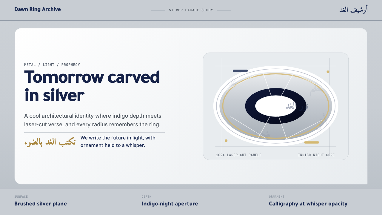 Dubai Museum of the FutureTechnological luxury feels poetic. Silver metal, indigo depth, and Amiri call…科技奢华带着诗意:银色金属、靛蓝深度与 Amiri 书法构成环面。
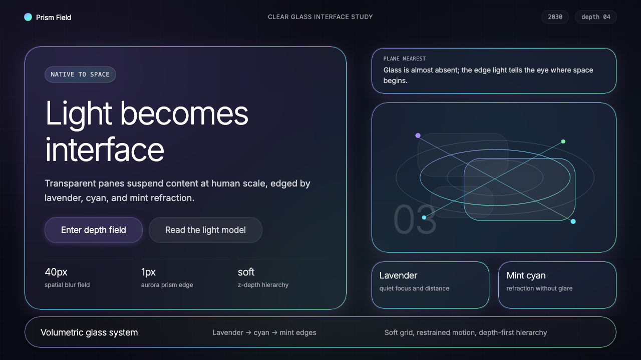 Vision Pro Spatial UI (2030)Structured light, not software. Deep navy glass panels glow with lavender-cya…结构化光感,不像软件。深夜蓝玻璃面板,以薰衣草-青-薄荷边缘发光。
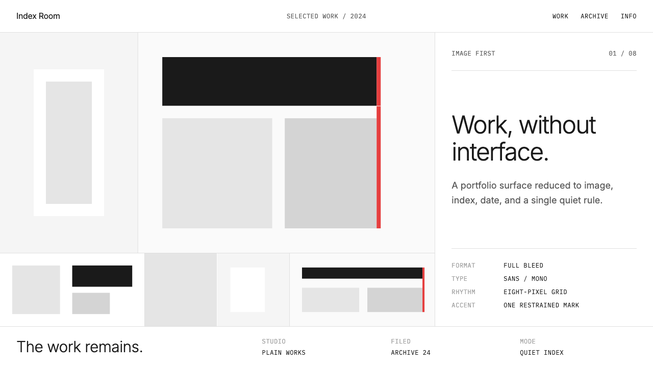 Cargo Collective PortfolioInterface disappears. White space, full-bleed blocks, mono metadata and hairl…界面退场:留白、全出血块面、等宽元数据与极细线。
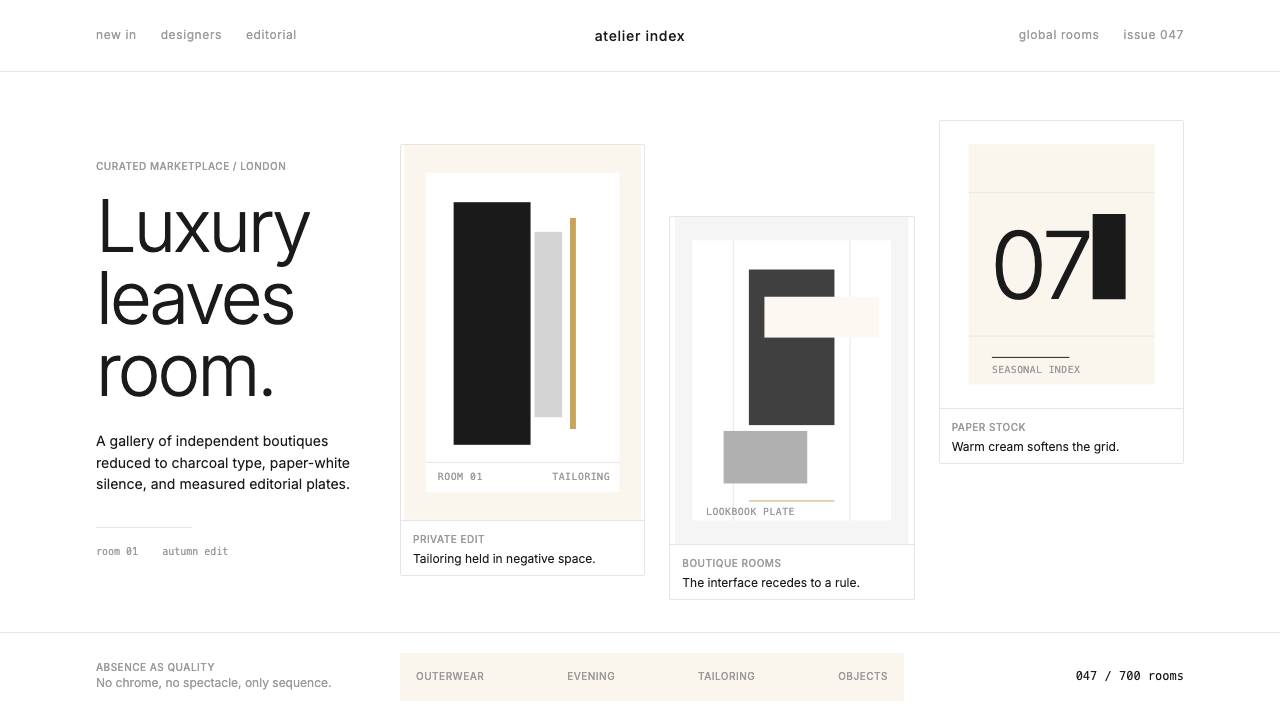 FarfetchLuxury as absence. Charcoal type, white canvas, and hairline editorial plates.奢华即留白。炭灰字、纯白画布与发丝线编辑图版。
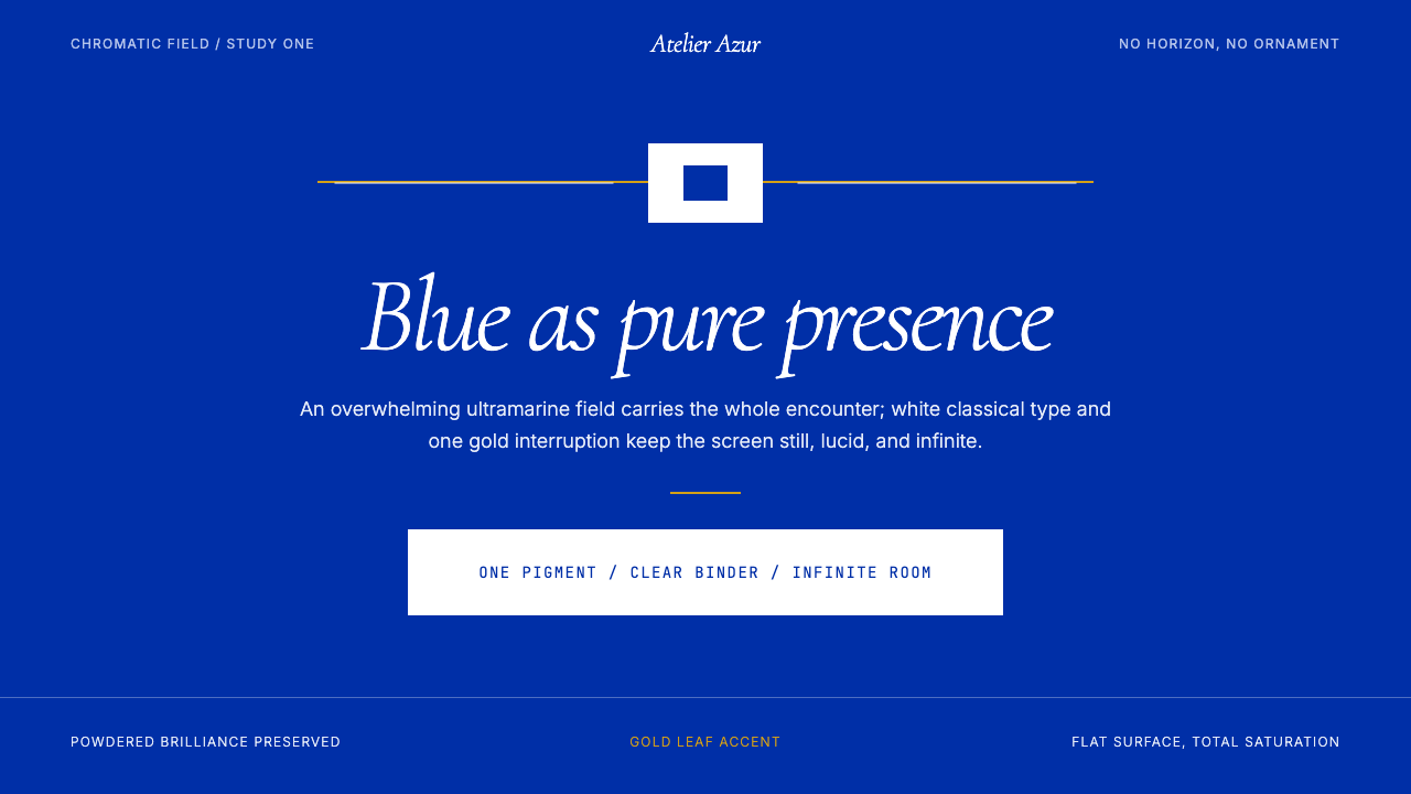 Klein Blue (IKB)Color becomes the content. Pure ultramarine field, white italic serif, one go…色彩即内容:纯群青场域、白色斜体衬线与一线金色。
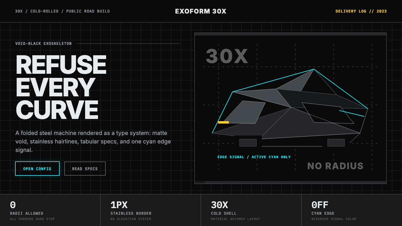 Tesla Cybertruck Stainless (2023)Refusal made material. Void black, stainless hairlines, cyan edges, faceted I…拒绝曲线:虚空黑、不锈钢发丝线、电子青边与棱面 Inter。