Design style guide设计风格指南
What is Dubai Museum of the Future?什么是 Dubai Museum of the Future?
The Museum of the Future turns a building into a manifesto — its silver torus wrapped in laser-cut Arabic poetry rewrites what a public institution can look like at the edge of tomorrow.迪拜未来博物馆将一座建筑变成宣言——银色环面上以激光雕刻的阿拉伯诗文,重新定义了公共机构在时代前沿应有的面貌。
Dubai Museum of the Future in briefDubai Museum of the Future 速览
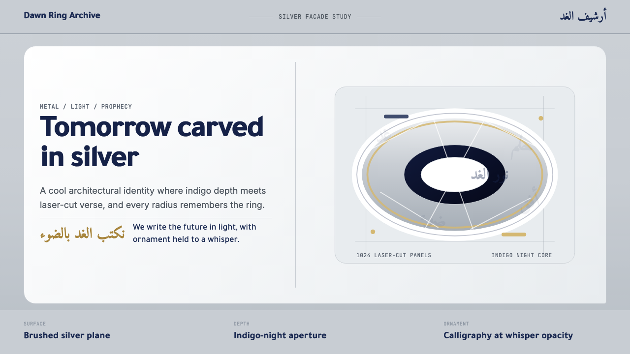
The Museum of the Future design system is a visual language derived from one of the twenty-first century's most ambitious architectural gestures. Opened on February 22, 2022, the museum occupies a luminous torus — a donut-shaped structure clad in over a thousand stainless-steel facade panels, each incised with verses from Arabic poetry authored by Sheikh Mohammed bin Rashid Al Maktoum, Dubai's ruler. The building has no solid façade in the conventional sense; it reads instead as a calligraphic skin stretched over engineered steel and glass, simultaneously monumental and weightless.迪拜未来博物馆设计系统是一套从二十一世纪最宏大建筑姿态之一中提炼出的视觉语言。博物馆于2022年2月22日落成,主体为一座环面结构——一个甜甜圈形建筑,外覆逾千块不锈钢幕墙面板,每块面板上均以激光雕刻有迪拜统治者谢赫·穆罕默德·本·拉希德·阿勒马克图姆所作的阿拉伯诗句。建筑没有传统意义上的实心立面;它呈现为一层书法外皮,绷覆于经工程设计的钢与玻璃之上,同时兼具纪念碑式的宏大与近乎失重的轻盈。
Translated into digital form, this language yields a system of cool, polished surfaces layered with ornamental depth. Brushed silver tones carry the building's metallic luminosity into interface backgrounds and structural containers. A rich, dark indigo — recalling the Gulf sky at night before city lights fully claimed it — provides the depth register against which silver and white components float. Calligraphic forms appear not as headline typography but as decorative overlays at low opacity, referencing the building's engraved poetry without claiming typographic authority.转化为数字语言,这套语言形成了一套以冷调抛光表面为底、装饰性深度为层的系统。拉丝银色调将建筑的金属光泽带入界面背景与结构性容器。一种丰富而深沉的靛蓝——令人联想到城市灯光尚未完全占据之前的海湾夜空——提供了深度层,让银色与白色组件在其上漂浮。书法形态并非以标题字体的方式出现,而是以低透明度的装饰叠层呈现,在不主张字体权威的前提下,引用建筑上的雕刻诗文。
What distinguishes this aesthetic from generic luxury tech or Arabic modernism is its fundamental tension: it is simultaneously futurist and deeply rooted. The building's curves are the product of parametric computational engineering, yet every curve also traces the path a written Arabic letter might take. The design system inherits this duality — it does not pretend the future is culturally neutral, and it does not use heritage as nostalgic decoration. Instead, it places both registers in the same composition and asks them to coexist.将这套美学与泛泛的科技奢华或阿拉伯现代主义区别开来的,是其内在的根本张力:它同时是未来主义的,又深深扎根于传统。建筑的曲线是参数化计算工程的产物,然而每一条曲线也描摹着阿拉伯书写字母可能划出的轨迹。这套设计系统继承了这种双重性——它不假装未来是文化中性的,也不将传统作为怀旧装饰。它将两种语境置于同一构图之中,让它们共存。
See the Dubai Museum of the Future design system →查看 Dubai Museum of the Future 完整设计系统 →
Where does Dubai Museum of the Future come from?Dubai Museum of the Future 从何而来?
The museum's origins lie in a 2017 commission by the Dubai Future Foundation, the government entity established to position Dubai as a global hub for innovation and forward-thinking governance. The commission went to Killa Design, led by British-Lebanese architect Shaun Killa, who had already shaped Dubai's skyline through a series of landmark towers. Killa's proposal for the museum was unconventional from the outset: rather than a rectilinear cultural institution, he proposed a torus — a form that has no beginning and no end, a loop that evokes both continuity and transformation.博物馆的起源可追溯至2017年由迪拜未来基金会发出的委托——这是迪拜政府设立的专门机构,旨在将迪拜打造为全球创新与前瞻治理的中心。委托方选择了由英国黎巴嫩裔建筑师肖恩·基拉(Shaun Killa)领导的基拉设计事务所。基拉此前已以一系列地标性高塔塑造了迪拜天际线。他对博物馆的提案从一开始就别具一格:他提议以环面——一种无始无终、循环往复、同时唤起延续性与变革性的形态——取代常规的矩形文化机构。
The structural challenge of realizing the torus was substantial. The building has no internal columns supporting its elliptical ring; the entire structure is self-supporting through a sophisticated steel exoskeleton. The facade panels — 1,024 in total, each unique and laser-cut from stainless steel — were designed in close collaboration between the architects and structural engineers, with the panel geometry precisely calculated to carry structural load while holding the calligraphic text. The poetry, written by Sheikh Mohammed, was selected partly for semantic resonance and partly for its graphic potential: Arabic calligraphy in the Naskh and Thuluth traditions has intrinsic geometric qualities that make it naturally compatible with parametric surface engineering.实现环面结构所面临的工程挑战极为艰巨。建筑没有支撑其椭圆形环体的内部立柱;整个结构完全依赖精密的钢质外骨骼自承重。1,024块外立面板每块独一无二,均以不锈钢激光切割而成,由建筑师与结构工程师密切合作设计,面板几何形态经精确计算,既承担结构荷载,又容纳书法文字。谢赫·穆罕默德所作诗文的选择,一半出于语义共鸣,一半出于图形潜力:纳斯赫体与苏鲁斯体传统下的阿拉伯书法本身具有固有的几何品质,使其与参数化曲面工程天然相容。
Shaun Killa worked alongside exhibition designer Atelier Brückner, a Stuttgart-based studio whose immersive interior experiences have shaped science museums and world expositions worldwide. Atelier Brückner was responsible for the museum's internal journey — five floors organized around speculative futures in space, health, ecology, urban life, and wellbeing. The interior aesthetic extends the exterior vocabulary inward: curved corridors lined with luminous screens, surfaces that shift between metallic and organic registers, and light systems designed to evoke both deep space and Gulf sunlight. The interior is as much scenography as it is architecture.肖恩·基拉与展览设计事务所布吕克纳工作室(Atelier Brückner)并肩合作——这家总部位于斯图加特的工作室曾以沉浸式室内体验为世界各地的科学博物馆和世界博览会塑造内容。布吕克纳工作室负责博物馆内部的叙事旅程——围绕太空、健康、生态、城市生活与福祉等推测性未来议题组织的五个楼层。室内美学将外部词汇向内延伸:以发光屏幕覆盖的弧形走廊、在金属与有机感之间切换的表面,以及旨在同时唤起深邃宇宙与海湾阳光的灯光系统。室内既是建筑,也是场景设计。
The building sits at a precise location on Sheikh Zayed Road in the Emirates Towers district, deliberately positioned so that it is framed by the two Emirates Towers when viewed from certain angles — a composition that sets historic prestige against twenty-first century ambition. When UAE leadership selected the February 22 opening date, the date itself was part of the statement: 22.02.2022, a palindrome, reinforcing the building's own formal logic of symmetry and the circular. From its first day of operation, the museum became not only a cultural institution but a photographic landmark, its torus recognizable across social media worldwide as an icon of the Gulf's aspirational self-image.建筑选址精确定于谢赫扎耶德路阿联酋塔区,刻意安置于从特定角度望去恰好被两座阿联酋塔楼框定的位置——这一构图将历史性的尊贵与二十一世纪的雄心并置。当阿联酋领导层选定2022年2月22日作为开幕日期时,日期本身即构成陈述:22.02.2022是一个回文数,强化了建筑自身对称与循环的形式逻辑。博物馆从开幕之日起便不仅是文化机构,更成为摄影地标——其环面形象在全球社交媒体上迅速传播,成为海湾地区理想自我形象的标志性符号。
What defines the Dubai Museum of the Future look?Dubai Museum of the Future 的视觉特征是什么?
Surface and Luminosity表面与光泽
The dominant material register is brushed metal — cool, directional, and precision-engineered. Unlike polished chrome, which reflects its environment chaotically, a brushed surface has a controlled directionality to its sheen. In the digital translation of this aesthetic, surfaces are rendered with a subtle grain that catches implied light from a consistent angle. This controlled luminosity reads as technological confidence rather than flashy showmanship: it signals that something has been machined to tight tolerances, not decorated.主导性的材质语境是拉丝金属——冷调、具有方向感、经精密工程加工。与混乱反射环境的抛光铬面不同,拉丝表面的光泽具有受控的方向性。在这套美学的数字转化中,表面呈现出一种细腻纹理,以固定角度捕捉暗示性的光线。这种受控光泽被解读为科技自信,而非浮夸的炫耀:它传达出某种经精密公差加工而成的品质感,而非装饰性堆砌。
Calligraphic Depth书法深度
Arabic calligraphy appears as a structural layer within the visual system, not as typographic text. At low opacity, calligraphic forms create a dimensional middle ground between solid surfaces and empty space — like the ghost of writing preserved inside the material itself. This technique mirrors the building's actual construction, where verses are literally cut through the metal skin to let light pass. In digital application, calligraphic overlays add ornamental richness without competing with functional typography or compromising legibility.阿拉伯书法以结构层而非排版文字的形式出现在这套视觉系统中。以低透明度呈现时,书法形态在实体表面与空白空间之间创造出一种维度性的中间地带——如同书写本身保存于材质内部的幽灵。这一技法与建筑实际构造相互呼应:诗句被真实地切穿金属外皮,以让光线透过。在数字应用中,书法叠层增添装饰性丰富感,同时不与功能性排版竞争,也不损害可读性。
Indigo Depth Register靛蓝深度层
The deep indigo that grounds the system carries multiple resonances simultaneously. It evokes the Gulf night sky at its deepest, before sunrise or after sunset fully completes. It carries the historical weight of lapis lazuli and indigo trade routes through the Arab world. And it functions structurally as a near-black that reads as more contemplative and spatial than black itself — a void that has atmosphere rather than one that simply absorbs. Against this indigo ground, silver and white components take on a quality of floating emergence.为整套系统奠基的深靛蓝同时承载多重共鸣。它唤起海湾夜空最深邃的时刻——日出前或日落后天光完全褪尽时。它承载着青金石与靛蓝贸易路线横贯阿拉伯世界的历史重量。在结构功能上,它充当一种近黑的底色,但比纯黑更具沉思感与空间感——这是一种有气氛的虚空,而非单纯吸光的消亡。以这种靛蓝为底,银色与白色组件呈现出漂浮涌现的质感。
Curved and Pill-Shaped Components弧形与胶囊形组件
The building's defining form is its torus — a closed curve with no corners, no termination, and no hierarchy of directions. This formal logic flows into the digital component vocabulary as rounded, pill-shaped buttons, cards with generous corner radii, and containers whose edges suggest continuation rather than termination. Sharp rectangular components would read as architecturally dishonest to this system; every boundary has a curve that speaks to the building's fundamental geometry.建筑的标志性形态是其环面——一条无角、无终止、无方向层级的封闭曲线。这种形式逻辑流入数字组件词汇,化为圆润的胶囊形按钮、具有大圆角半径的卡片,以及边缘暗示延续而非终止的容器。锐角矩形组件在这套系统中将显得建筑上的不诚实;每一处边界都有一条曲线,与建筑的根本几何语言对话。
Restrained Color Accent克制的色彩点缀
The system is not colorful in the conventional sense. The dominant tones are achromatic — silver, near-white, and the deep blue-black of indigo — with color appearing only as a precise accent at high-value moments: an active state, a critical alert, a call-to-action. When color does appear, it tends toward warm gold or cool luminous white rather than saturated primaries. This restraint gives the rare moments of color significant weight: when a warm gold accent emerges from a sea of cool silver and indigo, it reads as genuinely exceptional rather than merely decorative.这套系统并不以通常意义上的丰富色彩为特征。主导色调是消色差的——银色、近白色与靛蓝的深蓝近黑——色彩仅在高价值时刻作为精确点缀出现:活跃状态、关键提示、行动号召。当色彩出现时,往往倾向于暖金色或冷调的发光白,而非饱和的原色。这种克制赋予稀少的色彩时刻以相当的分量:当一抹暖金色从冷调银色与靛蓝的海洋中浮现,它被解读为真正的例外,而非单纯的装饰。
Poetry as Structure诗文即结构
In the building, poetry is not applied to the surface as decoration — it is the surface. The calligraphic text constitutes the structural skin of the facade; remove the words and the building loses its outer form. This principle of language as load-bearing material translates into the digital system as a high investment in copy and naming. Labels, headers, and microcopy are crafted with the care given to visual elements because in this system, the text is part of the architecture. Placeholder language or filler copy is antithetical to the spirit of the system.在这座建筑中,诗文并非作为装饰被施加于表面——它本身就是表面。书法文字构成立面的结构外皮;抹去文字,建筑便失去其外在形态。这种语言作为承重材料的原则,转化为数字系统中对文案与命名的高度投入。标签、标题与微文案以视觉元素所受到的审慎加以打磨,因为在这套系统中,文字是建筑的组成部分。占位语言或填充性文案与这套系统的精神背道而驰。
Futurism Grounded in Place扎根于地方的未来主义
Unlike generic futurist aesthetics that borrow from science fiction or Silicon Valley visual culture, this system is geographically anchored. Its materials, proportions, and ornamental vocabulary derive from a specific building in a specific city, reflecting both the architectural traditions of the Gulf region and the particular ambitions of Dubai in the early 2020s. The system reads as future-facing without being placeless — it carries the heat and light and ambition of its origin, and any application of it will feel slightly different from other futurist systems precisely because of this rootedness.与借鉴科幻小说或硅谷视觉文化的泛化未来主义美学不同,这套系统具有明确的地理锚点。其材质、比例与装饰词汇均源自特定城市中的特定建筑,折射出海湾地区的建筑传统以及2020年代初期迪拜的特定抱负。这套系统呈现为面向未来却不失地方感——它携带着原产地的热度、光线与雄心;任何对它的应用都将因这种根植性而与其他未来主义系统略有不同。
See the Dubai Museum of the Future design system →查看 Dubai Museum of the Future 完整设计系统 →
Who shaped Dubai Museum of the Future?谁塑造了 Dubai Museum of the Future?
The British-Lebanese principal of Killa Design led the architectural concept and design of the museum from the 2017 commission through its 2022 opening. Killa's decision to propose a torus — structurally demanding and formally unconventional — rather than a safer rectilinear landmark was the defining creative choice of the project. His background working across London, the Gulf, and East Asia gave him fluency in both the commercial ambitions of Dubai's development culture and the expressive possibilities of contemporary facade engineering. He has become one of the key figures associated with the Gulf's distinctive approach to landmark architecture as national brand statement.基拉设计事务所的英国黎巴嫩裔主持建筑师,从2017年的委托到2022年的落成,全程主导博物馆的建筑概念与设计。基拉提出以环面取代更为稳妥的矩形地标的决定——这在结构上极具挑战性,在形式上打破常规——是这个项目最具决定性的创意选择。他横跨伦敦、海湾与东亚的执业背景,使他同时深谙迪拜开发文化的商业抱负与当代立面工程的表现可能。他已成为与海湾地区将地标建筑作为国家品牌陈述这一独特路径相关联的核心人物之一。
Dubai's ruler and the UAE's Prime Minister authored the Arabic poetry inscribed on the building's facade, making him a direct creative contributor to the museum's most distinctive visual element. His verse — 'The future belongs to those who can imagine it, design it, and execute it. It isn't something you await, but something you create' — is visible on the building's outer skin and encapsulates the institutional ambition the museum was designed to express. His involvement signals that this is not a project where political patronage simply funds artistic vision; here the patron's own words became the building's surface.迪拜统治者兼阿联酋总理亲自撰写了铭刻于建筑外立面的阿拉伯诗文,使他成为博物馆最具标志性视觉元素的直接创作者。他的诗句——「未来属于那些能够想象它、设计它、执行它的人。它不是你等待的东西,而是你创造的东西」——清晰可见于建筑外皮,并提炼了这座博物馆所要表达的机构抱负。他的参与表明,这不是一个政治赞助人只是为艺术愿景提供资金的项目;在这里,赞助人自身的文字成为建筑的表面。
The Stuttgart-based experience design studio was responsible for the museum's interior journey — the five thematic floors exploring speculative futures in space, health, ecology, cities, and wellbeing. Atelier Brückner's practice spans world expositions, science museums, and branded environments across Europe and the Middle East, and they brought to the project a rigorous approach to immersive spatial narrative. The interior they created is as compositionally deliberate as any designed surface: light, material, and movement are orchestrated to guide visitors through a sequence of atmospheric registers, from the vast darkness of an simulated cosmos to the organic warmth of imagined future ecosystems.这家总部位于斯图加特的体验设计工作室负责博物馆的室内叙事旅程——围绕太空、健康、生态、城市与福祉等推测性未来主题组织的五个楼层。布吕克纳工作室的实践横跨欧洲和中东的世界博览会、科学博物馆与品牌环境,他们为这一项目带来了对沉浸式空间叙事的严谨方法。他们打造的室内空间在构图上与任何设计表面一样刻意:光线、材质与动线被精心编排,引导访客经历一系列大气层级的转换——从模拟宇宙的浩瀚黑暗,到想象中未来生态系统的有机温暖。
The Chairman of the Dubai Future Foundation, the government entity that commissioned and oversees the museum, Bin Lahej was central to establishing the institutional framework within which the building could be realized. The Dubai Future Foundation was itself a novel kind of governmental organization — one explicitly tasked with prototyping futures and exploring emerging technologies at a national scale. His leadership defined the brief: not a traditional museum that conserves the past, but one that actively models possible futures, an orientation that shaped every aspect of the architectural and spatial program.迪拜未来基金会主席——委托并监管博物馆的政府机构负责人。本·拉赫吉对于建立使该建筑得以实现的机构框架发挥了核心作用。迪拜未来基金会本身是一种新型政府组织——明确被授权在国家层面上试验未来形态、探索新兴技术。他的领导定义了这份设计任务书:不是一座保存过去的传统博物馆,而是主动建模可能的未来——这一方向塑造了建筑与空间方案的每一个层面。
The realization of the museum's torus required close collaboration between multiple engineering disciplines — structural, facade, and environmental — working in tandem with the architects. The exoskeleton that supports the ring without internal columns, the precision laser-cutting of 1,024 unique facade panels, and the integration of calligraphic text into load-bearing surfaces were all engineering challenges that had never been solved at this scale. The project is as much an achievement of applied engineering as it is of architecture, and the design system it produced reflects this: it is a system where material capability and ornamental ambition are not in tension but are the same gesture.博物馆环面的实现需要多个工程学科之间的密切协作——结构、立面与环境工程师与建筑师并肩工作。在没有内部立柱的情况下支撑环形体的外骨骼、对1,024块独一无二的立面板进行精密激光切割,以及将书法文字整合进承重表面——这些工程挑战均属首次在这一规模下被解决。这个项目在应用工程层面的成就与建筑层面同等重要,它所产生的设计系统也因此具有鲜明特质:这是一套材料能力与装饰抱负并非相互对立、而是同一姿态的系统。
How do you use Dubai Museum of the Future today?今天怎么用 Dubai Museum of the Future?
The Museum of the Future design system rewards thoughtful application and resists superficial use. Its visual language is derived from a specific architectural and cultural context — Gulf futurism, Arabic calligraphic tradition, parametric engineering — and that context gives it its authority. Applying it well means understanding what the system is actually communicating: that precision and poetry can coexist, that technological ambition and cultural heritage are not opposites, and that material restraint can produce emotional impact. Without that understanding, the visual elements become mere decoration.迪拜未来博物馆设计系统奖励用心的应用,抵制浅表化的挪用。它的视觉语言源于特定的建筑与文化语境——海湾未来主义、阿拉伯书法传统、参数化工程——正是这种语境赋予它权威。良好地应用它意味着理解这套系统实际上在传达什么:精密与诗意可以共存,科技雄心与文化传承并非对立,材质上的克制可以产生情感冲击。缺乏这种理解,视觉元素便沦为单纯的装饰。
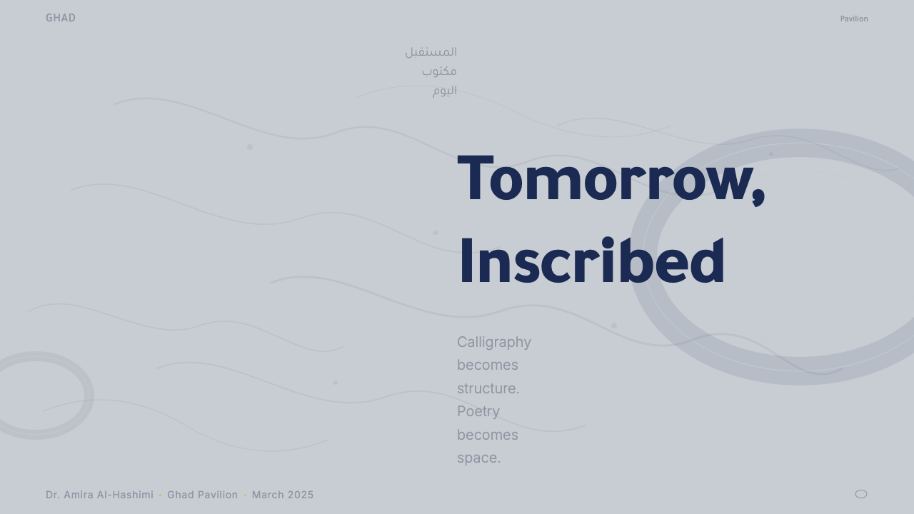
For presentation slides, this system works best for forward-looking content: annual reports, strategic visions, technology roadmaps, or any context where the audience should feel they are glimpsing something not yet fully arrived. A cover designed within this system typically centers a dominant architectural or abstract form on an indigo or deep background, with a title rendered in a clean, generous typeface that holds space rather than demanding it. Content slides should use the cool silver register for backgrounds, with text in near-white or white, and reserve any warm accent tones for the single most important data point or conclusion on each slide. Calligraphic motifs, if used, should appear in the corner or background at very low opacity — present but not competing.对于演示文稿,这套系统最适合面向未来的内容:年度报告、战略愿景、技术路线图,或任何应让受众感到自己正在窥见某种尚未完全降临之物的场合。在这套系统中设计的封面页,通常将一个主导性的建筑或抽象形态置于靛蓝或深色背景的中心,标题以干净而慷慨的字体呈现,以占据空间而非强索空间的姿态落字。内容页应以冷调银色系为背景,文字使用近白或纯白,将任何暖色调点缀保留给每张幻灯片上最重要的单一数据点或结论。书法母题若使用,应以极低透明度出现于角落或背景——在场而不竞争。
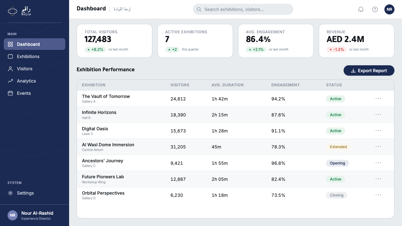
For web interfaces and dashboards, the system is well suited to environments where authority and technical capability are core values: enterprise SaaS platforms, financial dashboards, government digital services, museum or institutional websites, and any product positioning itself as operating at the frontier of its field. The approach emphasizes a dark or cool-neutral foundation, generous negative space, and a component vocabulary dominated by rounded forms. Navigation should be typographic and restrained; interactive states announce themselves through luminosity changes rather than color shifts. Data visualization within this system takes on a cool diagrammatic quality — charts rendered in silver and white tones against dark grounds, with a single accent for the most critical metric.对于网页界面与仪表板,这套系统适合权威感与技术能力是核心价值的环境:企业级SaaS平台、金融仪表板、政府数字服务、博物馆或机构网站,以及任何将自身定位为在所在领域前沿运作的产品。方法强调深色或冷调中性的底层基础、慷慨的留白,以及以圆润形态为主的组件词汇。导航应以字体为主且克制;交互状态通过光泽变化而非色彩转换来宣告自身。这套系统中的数据可视化呈现出冷调的示意图品质——图表以银色与白色调在深色底面上呈现,单一点缀色用于最关键的指标。
For editorial and marketing work, this system carries weight appropriate to announcements, launches, and moments that claim significance. A marketing page in this register uses full-width photographic or rendered imagery of the museum or its architectural vocabulary as a visual anchor, with headline copy that reaches for the poetic — short, declarative, and spaced to breathe. Feature blocks should alternate between deep indigo grounds and near-white or silver grounds, maintaining the visual temperature contrast that the building itself creates between its interior and exterior. Call-to-action elements should be rare and restrained, not stacked or repeated, because the system's authority depends on knowing when to speak and when to hold silence.对于编辑与营销内容,这套系统承载着适合公告、发布与声索重要性时刻的分量。在这种语境下的营销页面,以博物馆建筑或其词汇的全宽摄影或渲染图像作为视觉锚点,标题文案力求诗意——简短、断言式、以留白呼吸。特性区块应在深靛蓝底与近白或银色底之间交替,维持建筑本身在内外之间创造的视觉温度对比。行动号召元素应当稀少而克制,不可层叠或重复,因为这套系统的权威感依赖于知道何时开口、何时保持沉默。
A common mistake when working with this system is to oversaturate the calligraphic overlay or to use it as a headline element, which immediately flattens it into generic Islamic pattern decoration. The calligraphy gains its power precisely from being withheld — seen through, not read directly. Similarly, mistaking the system's aspirational tone for permission to use bombastic language or aggressive visual hierarchy undermines what makes it distinctive. This is a system of confidence, not aggression; of measured revelation, not spectacle for its own sake. Its quieter moments carry more authority than its loudest ones.使用这套系统时最常见的错误是过度饱和地使用书法叠层,或将其作为标题元素,这会立即将其拉平为泛化的伊斯兰图案装饰。书法的力量恰恰来自于被克制的呈现——被透视,而非被直接阅读。同样,将这套系统的抱负性基调误读为使用夸张语言或攻击性视觉层级的许可,会破坏其独特性所在。这是一套自信而非攻击的系统;是有节制的揭示,而非为了奇观而奇观。它最安静的时刻,往往比最响亮的时刻更具权威。
See the Dubai Museum of the Future design system →查看 Dubai Museum of the Future 完整设计系统 →
Dubai Museum of the Future — FAQDubai Museum of the Future · 常见问题
Is this style only appropriate for technology or innovation-themed projects?这种风格只适合科技或创新主题的项目吗?
The museum itself is a cultural and civic institution, not a technology company, and its design language reflects that breadth. The system is appropriate for any context where the tension between heritage and futurity is a live theme — cultural institutions, arts organizations, national or regional brand identity, high-end hospitality, and urban development projects can all find genuine alignment with it. The system struggles in contexts that require warmth and approachability above all else, such as consumer products aimed at families or wellness applications where softness is a primary signal. Its authority can also feel too heavy for playful or experimental products that need to feel lightweight and provisional.博物馆本身是文化与公民机构,而非科技公司,其设计语言也反映了这种广度。这套系统适合任何传统与未来性之间的张力是鲜活主题的语境——文化机构、艺术组织、国家或地区品牌标识、高端酒店业与城市开发项目都能与它找到真实的契合。在需要将温暖感与亲和力置于一切之上的语境中,如面向家庭的消费产品或以柔软感为主要信号的健康应用,这套系统会显得力不从心。对于需要感觉轻盈、暂定的玩味性或实验性产品,它的权威感也可能显得过于沉重。
How does this design system relate to other contemporary Gulf or Middle Eastern aesthetics?这套设计系统与其他当代海湾或中东美学有何关联?
The Gulf region has produced multiple distinct contemporary design languages in the past two decades. Saudi Vision 2030 materials tend toward a more austere geometric modernism. Qatari cultural institution design, as seen in institutions designed by Jean Nouvel and I.M. Pei, often works with abstracted desert geometry and a warmer material palette. This system is distinctive in its combination of explicit calligraphic layering with precision-industrial metallic surfaces — it is the most explicitly material and literary of the major Gulf design languages. It shares with the broader tradition a rejection of the European classical canon as a reference point and a commitment to using Arabic script as a primary visual element rather than a secondary cultural marker.海湾地区在过去二十年间产生了多种截然不同的当代设计语言。沙特「2030愿景」的视觉材料倾向于更为简朴的几何现代主义。卡塔尔文化机构设计——如让·努维尔与贝聿铭设计的机构所见——往往运用抽象的沙漠几何与更为温暖的材质色板。这套系统因其将明确的书法叠层与精密工业金属表面相结合而独树一帜——它是主要海湾设计语言中在材质与文学性上最为外显的一种。它与更广泛的传统共享一种取向:拒绝以欧洲古典规范作为参照点,并将阿拉伯文字作为主要视觉元素而非次要文化标记。
Can the system be adapted for light-background interfaces?这套系统可以适配浅色背景界面吗?
Yes, and a light variant is arguably closer to the building's daytime exterior — the steel panels appear silver-white in direct Gulf sunlight, and the calligraphic cutouts cast sharp dark shadows on interior surfaces. A light version would use near-white or warm silver grounds, with the indigo appearing as an accent or primary text color rather than a background. The calligraphic overlay works equally well at low opacity on light grounds, reading as a warm gray or cool shadow. What must be preserved in the light variant is the cool metallic directionality — warm beige or cream grounds would shift the system toward a heritage aesthetic rather than the technological-poetic register that defines it.可以,而且浅色变体可以说更接近建筑白天的外立面——在直射的海湾阳光下,钢制面板呈现为银白色,书法镂空在室内表面投射出锐利的深色阴影。浅色版本将使用近白或暖银色底,靛蓝作为点缀或主要文字色出现,而非底色。书法叠层以低透明度置于浅色底面上同样有效,呈现为暖灰或冷调阴影。在浅色变体中必须保留的是冷调金属方向感——暖米色或奶油色底面会将系统推向传统美学,而非定义它的科技诗意语境。
How should calligraphic elements be sourced or generated for this style?这种风格中的书法元素应如何取材或生成?
The building's calligraphy is in the Thuluth and Naskh traditions — classical forms with centuries of established conventions for proportion, stroke weight, and letter connection. Using authentic calligraphic forms matters for this system; generic display Arabic fonts or algorithmically generated letterforms will not carry the same visual authority. Existing calligraphic artwork by recognized Arabic calligraphers, adapted with permission, offers the most direct route to authenticity. Failing that, commissioning a contemporary Arabic calligrapher to produce custom letterforms for the system is the appropriate approach. What should be avoided is treating any Arabic text in a standard digital typeface as a calligraphic element — legibility and calligraphic expressiveness serve different purposes, and confusing them produces neither.建筑上的书法属于苏鲁斯体与纳斯赫体传统——这些古典形态在比例、笔画粗细与字母连接方面有着数百年确立的规范。在这套系统中使用真实的书法形态至关重要;通用的展示性阿拉伯字体或算法生成的字形将无法承载同等的视觉权威。经授权改编自知名阿拉伯书法家的现有书法作品,是通达真实性最直接的途径。若不可得,委托当代阿拉伯书法家为这套系统创作定制字形是适当的做法。应当避免的是将标准数字字体呈现的任何阿拉伯文字视为书法元素——可读性与书法表现力服务于不同目的,混淆两者将导致两者皆失。
How does the system handle motion and animation?这套系统如何处理动效与动画?
Motion in this system should mirror the building's own temporal quality: slow, deliberate, and weighted. The torus moves differently at different times of day as Gulf light rakes across its surface — it does not flash or pulse, but shifts register gradually. Interface animations within this system favor long easing curves, slow fades, and transitions that feel like the surface of a material changing temperature rather than a digital state flipping. Calligraphic overlays, if animated, should drift at very low speed — suggesting the ghost of movement rather than active animation. What should be avoided is rapid, bouncy, or staccato motion, which would introduce a levity incompatible with the system's fundamental gravity.这套系统中的动效应当镜像建筑本身的时间品质:缓慢、刻意、有分量。随着海湾光线掠过环面表面,建筑在一天中的不同时刻呈现出不同的样貌——它不闪烁,不脉冲,而是缓缓地改变层次。这套系统中的界面动画倾向于长缓动曲线、慢淡入淡出,以及感觉像材料表面改变温度而非数字状态翻转的过渡。书法叠层若有动效,应以极低速漂移——暗示动态的幽灵而非主动的动画。应当避免的是快速、弹跳或短促的动效,这将引入一种与系统根本的庄重感不相容的轻浮。
Related design styles相关设计风格
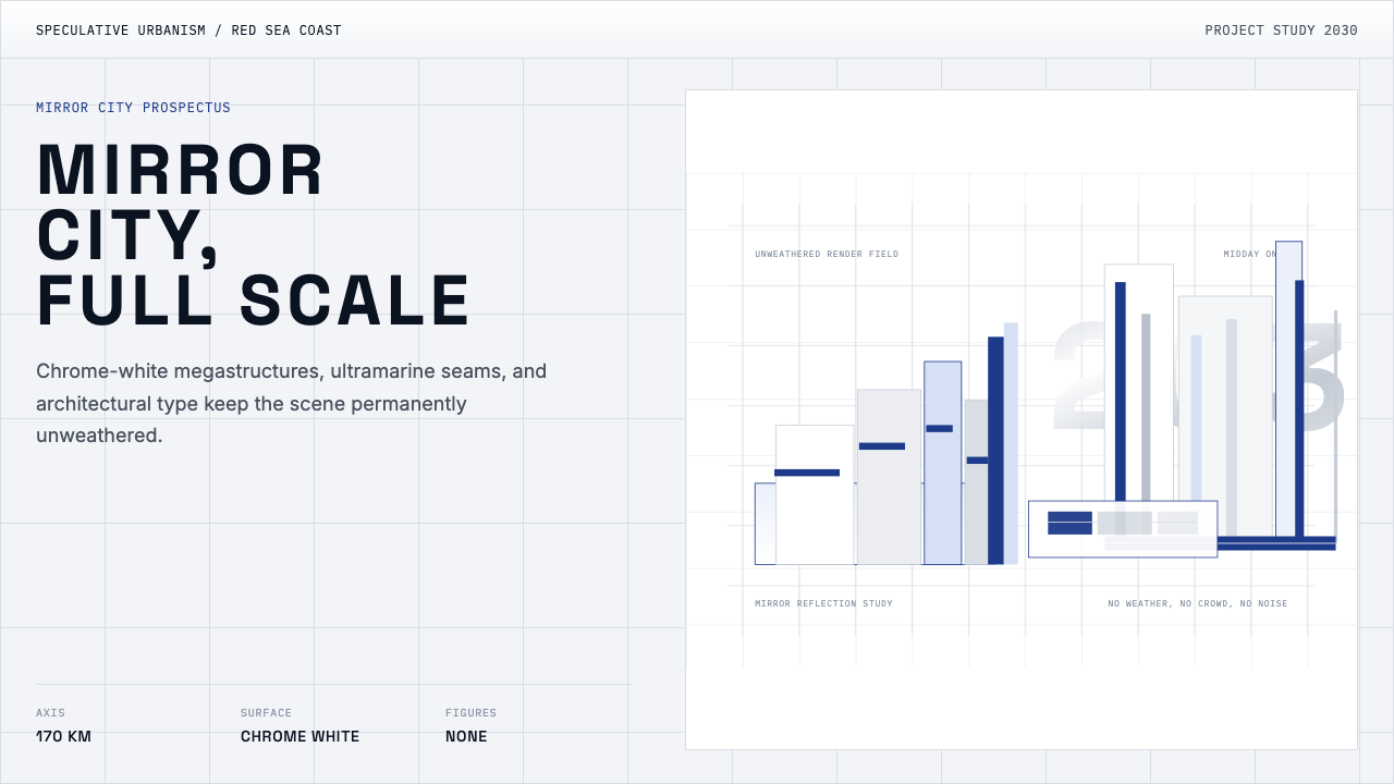 NEOM Mirror FuturismPermanently unweathered. Chrome-white grids and ultramarine seams stage a CGI…永不风化。铬白网格配群青缝线,像一座 CGI 巨城。
 Cursor IDEAI-first code editor. Pure dark surfaces, off-white text, electric blue reser…以 AI 为核心的代码编辑器:近乎纯黑背景、柔白文字、唯一的电光蓝色专为 AI…
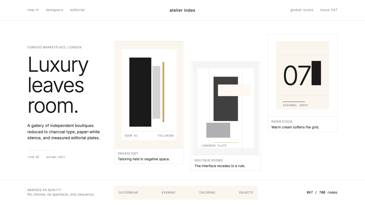 FarfetchLuxury as absence. Charcoal type, white canvas, and hairline editorial plates.奢华即留白。炭灰字、纯白画布与发丝线编辑图版。
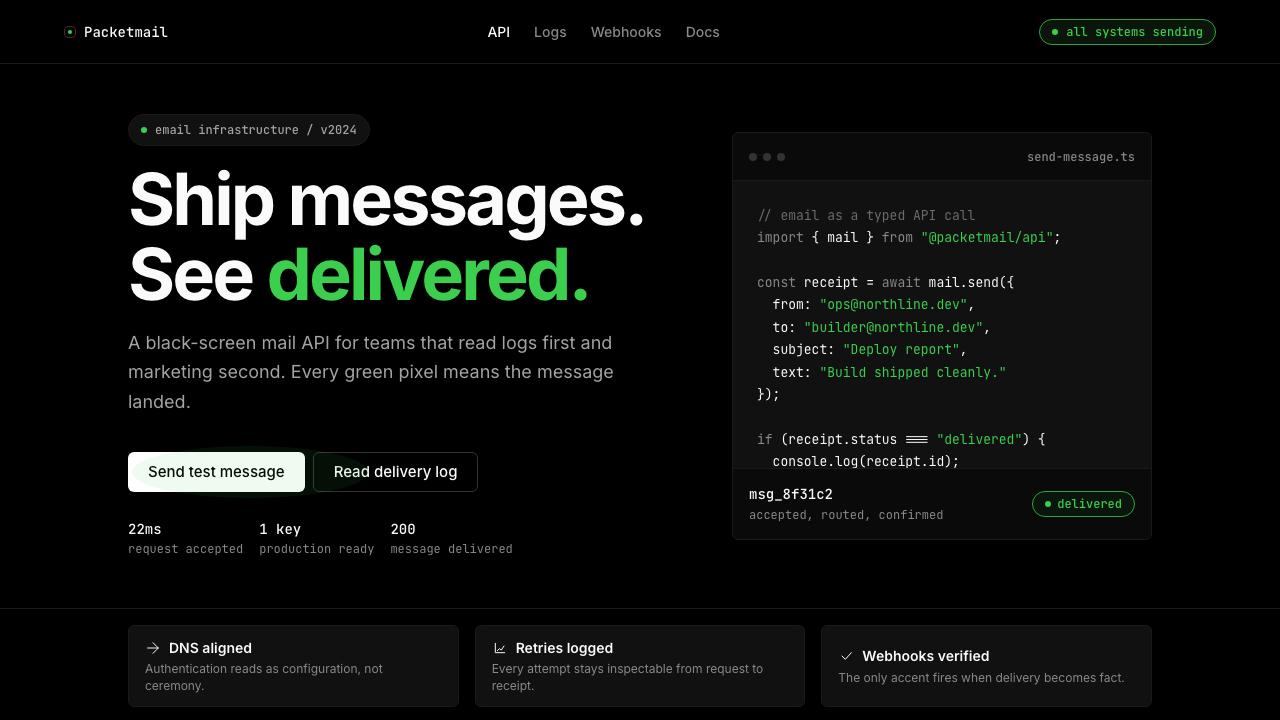 Resend 2024Clean code becomes brand. Pure black, JetBrains Mono, and one green delivered…品牌像 clean code:纯黑、JetBrains Mono、唯一送达绿。
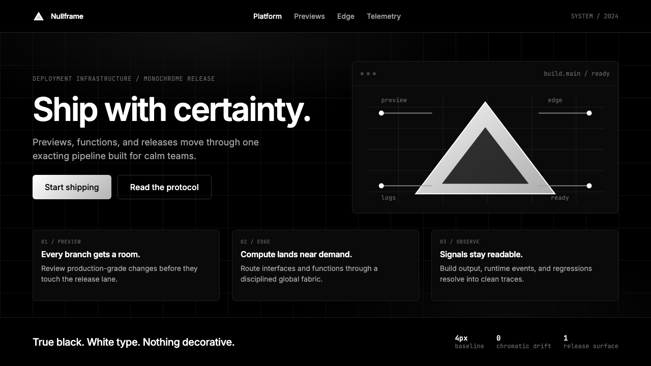 Vercel 2024Developer luxury by subtraction. Pure black, white Inter, rigid grid, triangu…以删减塑造开发者奢侈感:纯黑白、Inter 字体与刚性网格构成三角发布符号。
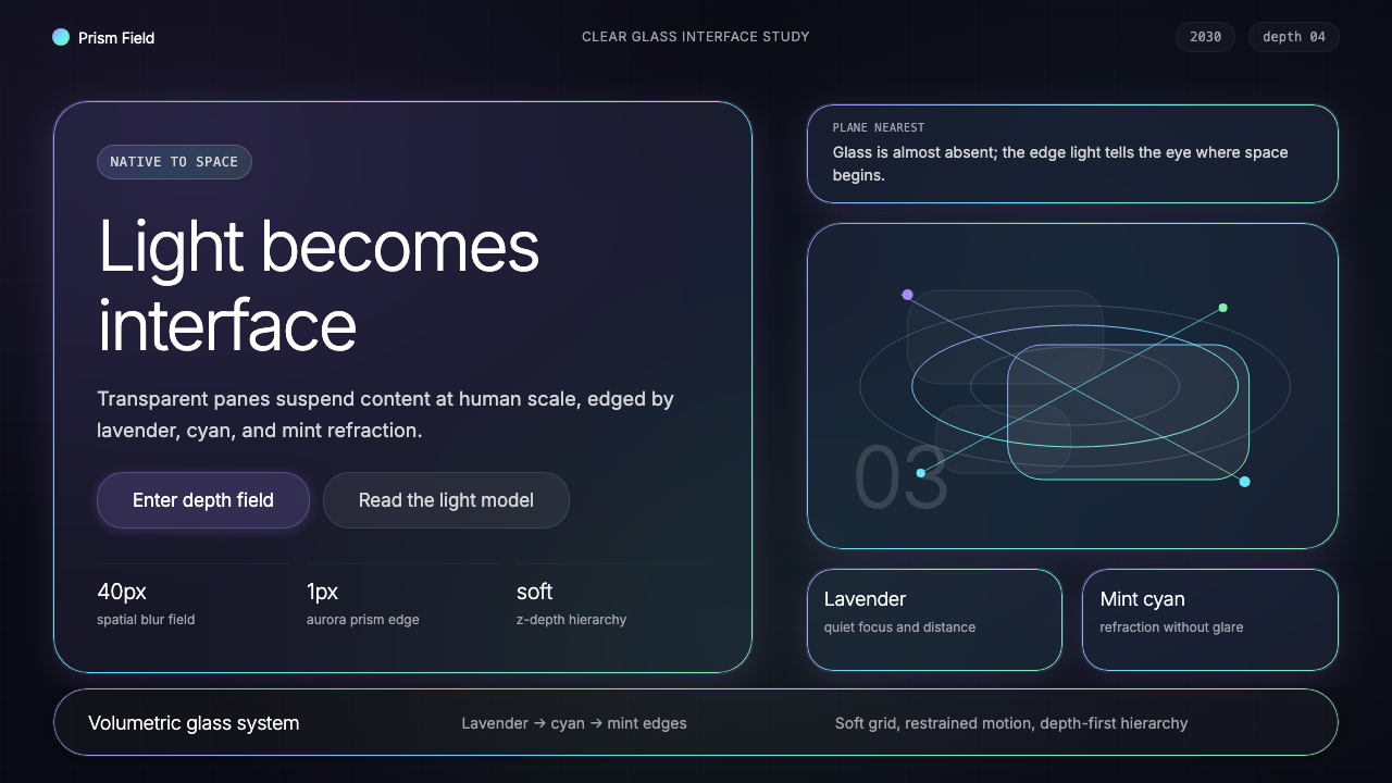 Vision Pro Spatial UI (2030)Structured light, not software. Deep navy glass panels glow with lavender-cya…结构化光感,不像软件。深夜蓝玻璃面板,以薰衣草-青-薄荷边缘发光。