What is Qatari Pearl Modern Architecture 2024?
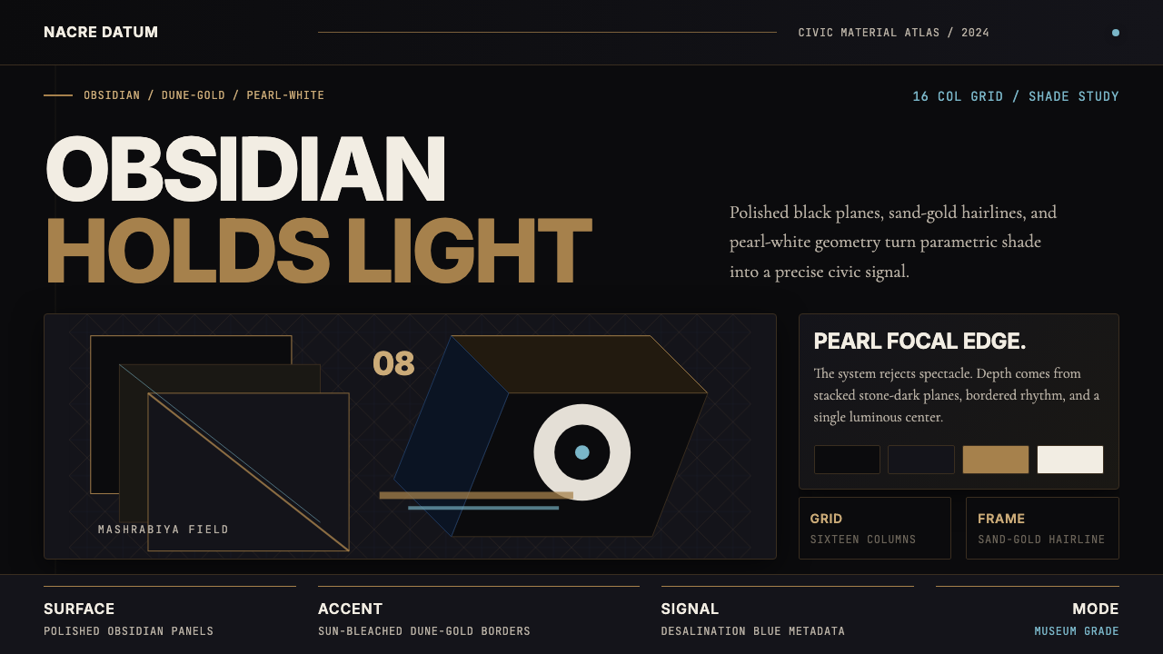
Qatar's civic building boom fused Islamic geometric tradition with parametric engineering to forge a national visual language of obsidian depth, dune-gold materiality, and pearl-white luminosity.
Qatari Pearl Modern Architecture 2024 in brief
Qatari Pearl Modern Architecture is a design language born from the emirate's unprecedented civic expansion between the 2010s and 2024. It synthesizes the geometric rigor of classical Islamic ornament — the interlocking stars, octagonal grids, and Mashrabiya lattice screens that have governed the region's visual culture for centuries — with the precision of contemporary parametric design tools and the material ambitions of Gulf modernism. The result is a vocabulary that feels simultaneously ancient and entirely contemporary.
At its core, the system is defined by three tonal anchors: a deep, polished darkness that recalls obsidian stone or mirror-finish cladding; a warm, sun-bleached gold that references dune surfaces and historic sand-brick construction; and a luminous, near-white tone suggestive of pearls, the Gulf's historic treasure before oil. These three tones are not mere decoration — they carry the weight of cultural memory and national identity, making the system immediately legible as distinctly Qatari even in purely digital contexts.
The style sits at a productive tension between monumental and intimate. The architecture that inspired it operates at civic scale — museums, towers, entire planned districts — yet its geometric patterns and material transitions reward close inspection. This same dual register translates naturally into digital and editorial design: broad, commanding compositions that reveal intricate detail when examined more carefully.
Where does Qatari Pearl Modern Architecture 2024 come from?
Qatar's architectural transformation began in earnest following the 2008 financial crisis, which paradoxically accelerated Gulf state investment in civic infrastructure and cultural institutions. The ruling Al Thani family, guided by Sheikha Al-Mayassa Al-Thani as the driving force behind Qatar Museums, commissioned a series of landmark buildings intended to position Doha as a global cultural capital. The ambition was explicitly national: to develop a visual identity for modern Qatar that honored Islamic heritage while asserting technological mastery and contemporary ambition.
The foundational project of this visual language was I.M. Pei's Museum of Islamic Art, completed in 2008 after the architect spent six months traveling the Islamic world studying historical geometry. Pei's building — a precisely articulated sequence of octagonal and cubic volumes in creamy limestone — drew on the geometric abstraction of early Islamic architecture without quoting it directly. Its shadow play, its handling of light through faceted surfaces, and its monumental restraint established the aesthetic DNA that subsequent projects would amplify. Jean Nouvel's National Museum of Qatar, completed in 2019, extended this language dramatically: its interlocking disc-like volumes — derived computationally from the crystal geometry of the desert rose mineral — created a structure that appears simultaneously geological and engineered, ancient and radically new.
Doha Tower, designed by Jean Nouvel and completed in 2012, added the third key element: the Mashrabiya. Traditional Mashrabiya are carved wooden lattice screens used in Islamic architecture to filter light, provide shade, and maintain privacy while allowing ventilation. Nouvel's tower wraps a fifty-story glass cylinder in a full-height parametric Mashrabiya façade — a feat of computational engineering that transformed a centuries-old domestic craft tradition into civic-scale ornament. The tower's steel-cobalt accent tones, emerging from the mirror-finish metalwork of its skin, introduced an industrial precision into the vocabulary that had been absent from earlier historicist Gulf architecture.
The 2022 FIFA World Cup and the concurrent development of Lusail City brought this aesthetic to its fullest expression at urban scale. Stadium facades, transit infrastructure, pedestrian networks, and public art installations across Msheireb Downtown, West Bay, Education City, and Pearl-Qatar were coordinated under a coherent visual identity that drew directly on the tripartite material palette — obsidian, sand-gold, pearl — and the Mashrabiya-derived geometric grammar. By 2024, this language had migrated into Qatari digital design, government communications, and brand identity systems, crystallizing as a style with global recognizability rooted in specific cultural geography.
What defines the Qatari Pearl Modern Architecture 2024 look?
Tonal Architecture
The palette is built from three culturally charged tones: a near-black depth that reads as obsidian or polished dark stone, a warm sand-gold that evokes sun-drenched dune surfaces and historic masonry, and a luminous pearl-white that references the Gulf's pre-oil economic heritage. These tones are not interchangeable accents — each carries specific cultural meaning and compositional weight. The dark ground dominates large surfaces, the sand-gold articulates structure and edges, and the pearl-white marks points of focal emphasis or illuminated reveal.
Geometric Grammar
The formal vocabulary is drawn directly from classical Islamic geometric pattern-making: interlocking star polygons, octagonal lattice grids, and the modular geometry of Mashrabiya screens. These patterns are not applied as surface decoration — they are structural in origin, derived from systems of geometric subdivision that historically governed everything from tile work to muqarnas vaulting. In contemporary application, the geometry operates at multiple scales simultaneously, from macro-level compositional divisions down to fine detail at the level of individual ornamental cells.
Material Luminosity
The architecture that inspired this system is characterized by high-quality surface finishes: polished limestone, mirror-finish metal cladding, and precision-cut geometric stonework that catches and redirects light. In digital translation, this quality becomes a controlled play of surface sheen — surfaces that appear to have depth and reflectivity without simulating photographic realism. Transitions between tones carry the quality of architectural threshold — the moment a shadow lifts and reveals an illuminated surface beneath.
Parametric Precision
The key projects of this architectural movement — the National Museum's desert-rose discs, Doha Tower's Mashrabiya skin — were designed using computational tools that generated complex geometries from relatively simple underlying rules. This parametric logic is intrinsic to the style's character: repetition with controlled variation, pattern that appears organic but is mathematically precise, structures that look different from every angle because each angle reveals a different state of the underlying geometric rule. Compositions governed by this logic have an internal consistency that distinguishes them from decorative pastiche.
Monumental Restraint
Despite the visual richness of its geometric patterning, this style is not maximalist — it is selective and deliberate. Ornament is concentrated at specific moments: the entrance threshold, the transition between structural bays, the cornice line. Large surfaces are left austere, allowing the patterned elements to read as event and emphasis rather than texture. This selectivity translates into digital contexts as a discipline of restraint: decorative geometry is deployed sparingly, at moments of compositional importance, against backgrounds of controlled depth.
Steel-Cobalt Accent
Beyond the three primary tonal anchors, a cool steel-cobalt register appears as a precision accent, derived from the mirror-finish metal cladding visible across Doha's West Bay skyline. This tone functions as a signal of technological modernity within an otherwise warm and historic palette. It appears selectively — on interactive elements, data highlights, or structural dividers — and its presence indicates function and precision rather than decoration. The contrast between the warm sand-gold and the cool steel-cobalt is one of the system's most characteristic visual tensions.
Cultural Specificity
This is a style with a precise geographic and cultural origin, and that specificity is a feature rather than a limitation. Unlike modernist movements that aspired to universal applicability, Qatari Pearl Modern Architecture is unapologetically rooted in a particular heritage — one that includes Islamic geometry, Gulf material culture, and the ambitious nation-building project of twenty-first century Qatar. Applied in appropriate contexts, this cultural grounding gives compositions an authority and authenticity that generic corporate modernism cannot replicate.
Who shaped Qatari Pearl Modern Architecture 2024?
Pei's Museum of Islamic Art (2008) is the stylistic anchor of the entire movement. Before beginning the design, Pei spent six months traveling the Islamic world studying historic architecture, ultimately concluding that the purest expression of Islamic geometric abstraction was to be found in the ninth-century Ibn Tulun Mosque in Cairo. The resulting building — a precisely articulated stack of cubic and octagonal volumes in creamy limestone, set on an artificial island in Doha Bay — established the visual DNA of deep material tones, precise geometric articulation, and monumental restraint that subsequent projects amplified. At ninety-one years old when the project was completed, it was among the last major commissions of his career.
Nouvel contributed two defining buildings to Qatar's architectural vocabulary: Doha Tower (2012) and the National Museum of Qatar (2019). Doha Tower's full-height parametric Mashrabiya façade transformed a traditional domestic privacy screen into a fifty-story engineering statement, introducing the vocabulary of computational Islamic ornament to civic architecture. The National Museum went further still, deriving its entire formal logic from the geometry of desert rose crystals — a parametric process that generated hundreds of interlocking disc volumes that appear simultaneously geological and designed. Together, the two buildings established that Gulf modernism could be technically ambitious and culturally specific at the same time.
As chairperson of Qatar Museums, Sheikha Al-Mayassa is the cultural policy intelligence behind Qatar's architectural transformation. Her institutional vision — to build not just buildings but a coherent national cultural identity expressed through world-class architecture and art collection — unified the commissioning decisions that produced the National Museum, Mathaf: Arab Museum of Modern Art, and the ongoing development of the M7 design and innovation hub. Without this curatorial direction, the material and formal consistency that makes this a recognizable style rather than a collection of individual buildings might never have emerged.
The masterplanning team behind Lusail City brought the architectural language of individual landmark buildings into coherent urban-scale application. Lusail — a planned city designed for approximately 200,000 residents north of Doha — coordinated the geometric grammar, material palette, and tonal identity of the broader architectural movement across transit infrastructure, public realm design, signage systems, and stadium environments. The 2022 World Cup's Lusail Iconic Stadium, designed by Foster + Partners, used this coordination to produce a built environment that could serve as the backdrop for a global broadcast event while remaining legible as distinctly Qatari.
How do you use Qatari Pearl Modern Architecture 2024 today?
Qatari Pearl Modern Architecture translates into digital and editorial design with natural authority in contexts where monumental weight, cultural prestige, and sophisticated material richness are appropriate. Its dark grounds, structured geometry, and warm accent tones make it unusually well-suited to premium presentations, government and institutional communications, luxury brand identity, and event branding for international civic occasions. The key to successful application is understanding the system's internal hierarchy — darkness is the ground, geometry is the structure, and luminosity is the reward.
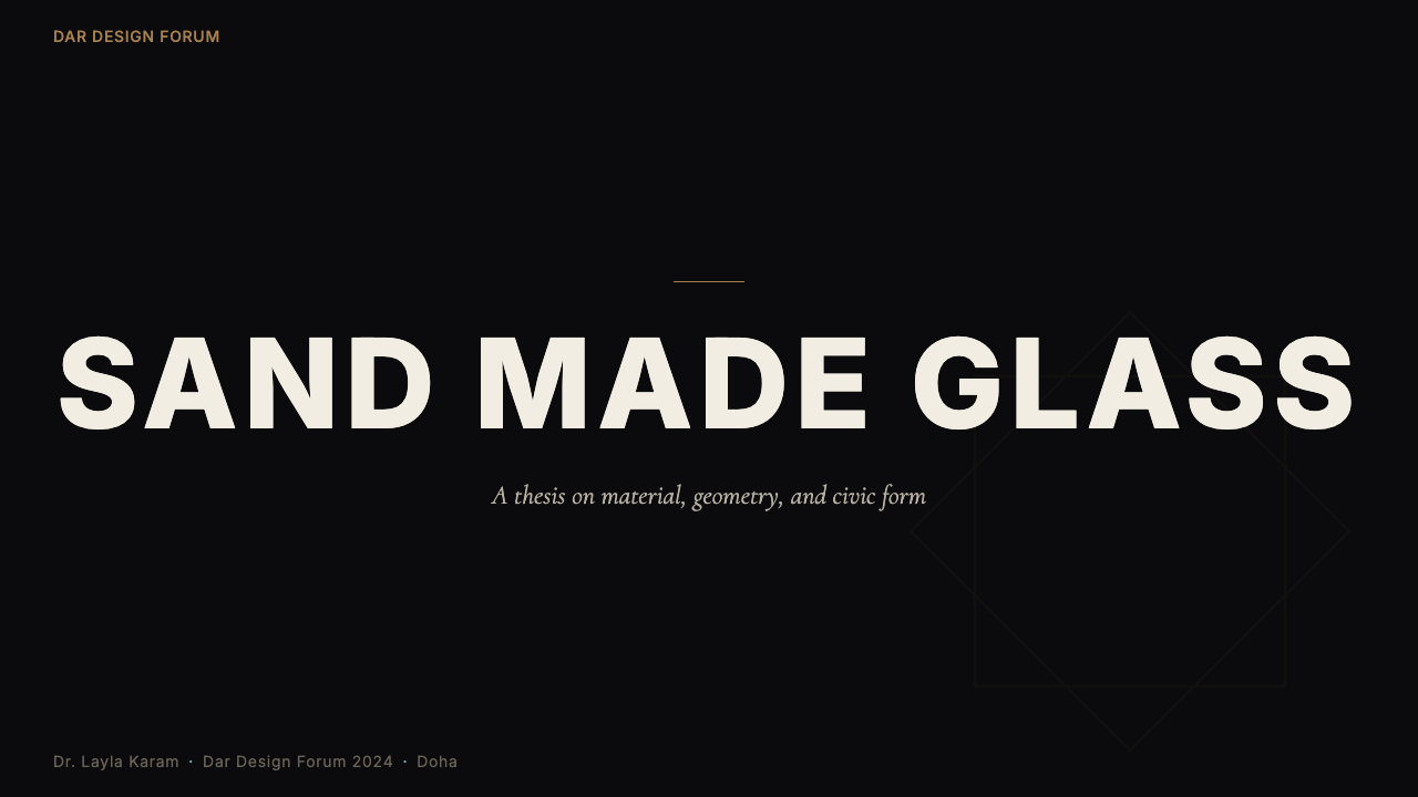
For presentation slides, the style performs best when the deck is treated as an architectural surface rather than a document. Cover slides work well with a deep, near-black ground, a central geometric element derived from Mashrabiya or star-polygon grammar placed at full bleed, and a title in a clean, high-contrast letterform. The sand-gold register handles hierarchy differentiation — chapter titles, section labels — while the pearl-white tone marks the most critical callout or data point on any given slide. Content slides should maintain generous negative space: the geometry does enough visual work that crowding reads as confusion rather than richness.
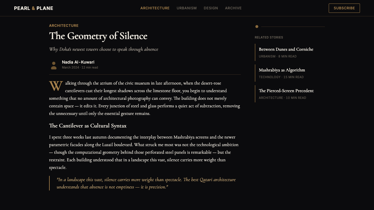
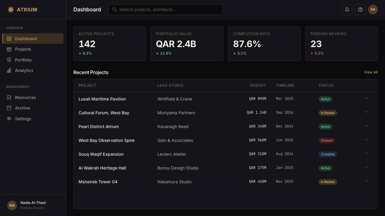
For web interfaces, this system is most appropriate for institutional, governmental, or premium e-commerce contexts — situations where conveying authority, care, and cultural specificity matters more than approachability or playfulness. On a dashboard or pricing page, the dark ground provides an immediately premium register; the geometric border treatments and sand-gold structural lines replace generic dividers and add visual intelligence without decoration for its own sake. Interactive states should use the steel-cobalt accent, reserving the warm sand-gold for navigational and structural hierarchy and pearl-white for primary action elements.
In editorial and marketing contexts, the style's poster-like geometry and deep tonal contrast handle full-bleed headline moments exceptionally well. Magazine cover treatments, event identity systems, and campaign graphics benefit from the style's monumental composure: a single dominant geometric motif, a restricted palette held with discipline, and typography that respects the negative space the geometry opens up rather than filling every available area. The system supports bilingual presentations naturally — the geometric logic of Arabic calligraphic tradition and the visual weight of Arabic script complement the style's proportional grammar in ways that few Western-derived design systems manage.
A common mistake when applying this style is treating the geometric patterning as wallpaper — tiling a Mashrabiya motif across every background surface regardless of compositional purpose. Authentic application concentrates geometric complexity at moments of structural emphasis: a header band, a section divider, a focal frame. Large interior surfaces remain comparatively austere. Similarly, using sand-gold and pearl-white simultaneously at high saturation across multiple elements collapses the system's tonal hierarchy. The discipline is to choose one of the three tones as dominant for any given composition and allow the other two to appear as structural punctuation rather than equal partners.
Qatari Pearl Modern Architecture 2024 — FAQ
How does this style relate to broader Islamic geometric design traditions?
Qatari Pearl Modern Architecture is not a revival of classical Islamic geometric design — it is a contemporary reinterpretation that uses the grammar of Islamic geometry while applying it through computational design methods that would have been impossible before the twenty-first century. Classical Islamic geometric patterns were generated through compass-and-straightedge construction and repeat units hand-applied by craftspeople. The Doha Tower Mashrabiya and the National Museum's disc arrays were generated parametrically, using geometric rules as algorithms. The visual relationship is clear, but the production logic is entirely different — which is why these buildings look new even when they are clearly rooted in historical tradition.
Is the dark background fundamental to the style, or can it be applied with a light ground?
The deep dark ground is central to the system's cultural logic — it references polished stone and the nocturnal shadow effects of Mashrabiya screens filtering desert light. A light-ground inversion is possible but changes the feel considerably. On a pale or cream ground, the sand-gold loses its luminosity against darkness and instead reads as aged or antiqued, while the pearl-white focal points dissolve. The steel-cobalt accent gains contrast and comes forward. A light-ground version of this system tends to read as more archival or documentary — appropriate for research, heritage communications, or printed matter — rather than the monumental and authoritative register the dark version projects.
Can this style work for a technology product that has no connection to Qatar or the Gulf?
Yes, but with awareness. Design styles migrate — Bauhaus principles are now applied globally by designers who have never visited Germany, and Japanese wabi-sabi aesthetics appear in Scandinavian product design. The question is whether the values the style embodies align with what the product needs to communicate. Qatari Pearl Modern Architecture conveys monumental authority, material sophistication, cultural depth, and a productive tension between historical rootedness and technological precision. A technology product seeking to communicate premium quality, serious purpose, and international ambition can legitimately draw on these qualities. The misstep would be to borrow the superficial elements — dark backgrounds, geometric borders — without engaging the underlying discipline of the system.
How should typography be handled within this system?
Typography in this system should complement rather than compete with the geometric architecture of the layouts. The geometric patterns carry significant visual weight; type needs to be confident enough to hold its own without becoming another layer of ornamental complexity. Letterforms that are clean, wide-set, and generous in their proportions work well — they echo the monumental scale of the buildings without mimicking their ornamentation. For Arabic text, the system is unusually accommodating: the proportional logic of Arabic letterforms and the rhythmic density of Arabic text sit naturally within the Mashrabiya-derived geometric structure. Bilingual settings should allow each script to breathe — avoid condensing either language to force identical line lengths.
What kinds of projects should avoid this style?
This style is poorly suited to contexts requiring warmth, approachability, or sensory lightness. Consumer-facing applications where the user experience depends on friendliness and ease — social apps, children's platforms, wellness products, casual retail — will find the system's monumental gravity works against engagement. The dark grounds and formal geometry can feel oppressive in content-heavy editorial contexts where readers need to spend extended time on the page. Healthcare and crisis communications contexts are also poor fits: the style's prestige and distance are the opposite of the reassurance and accessibility those contexts require. Finally, any project where the cultural specificity of the style might feel incongruous or appropriative — contexts where neither the product nor its intended audience has a meaningful relationship to Gulf culture — deserves careful reflection before proceeding.
Related design styles
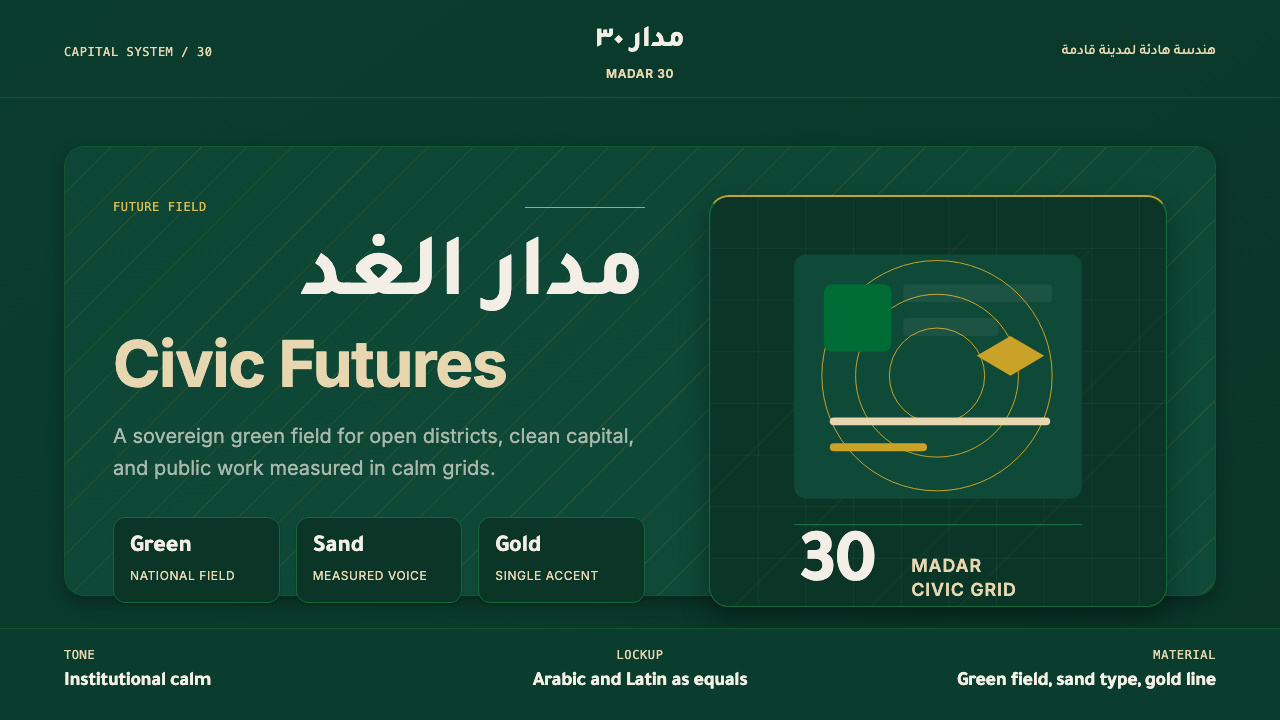 Riyadh Vision 2030Sovereign futurism. National green, sand type, and gold hairlines hold a calm…
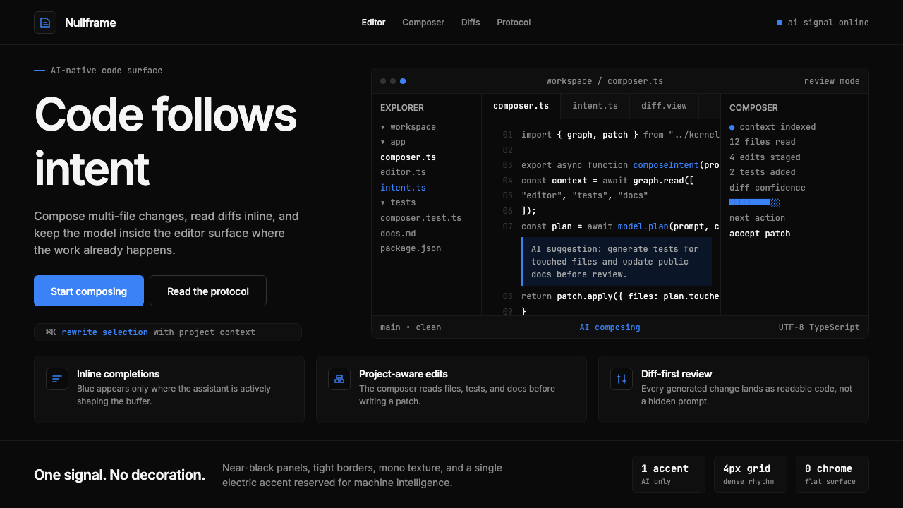 Cursor IDEAI-first code editor. Pure dark surfaces, off-white text, electric blue reser…
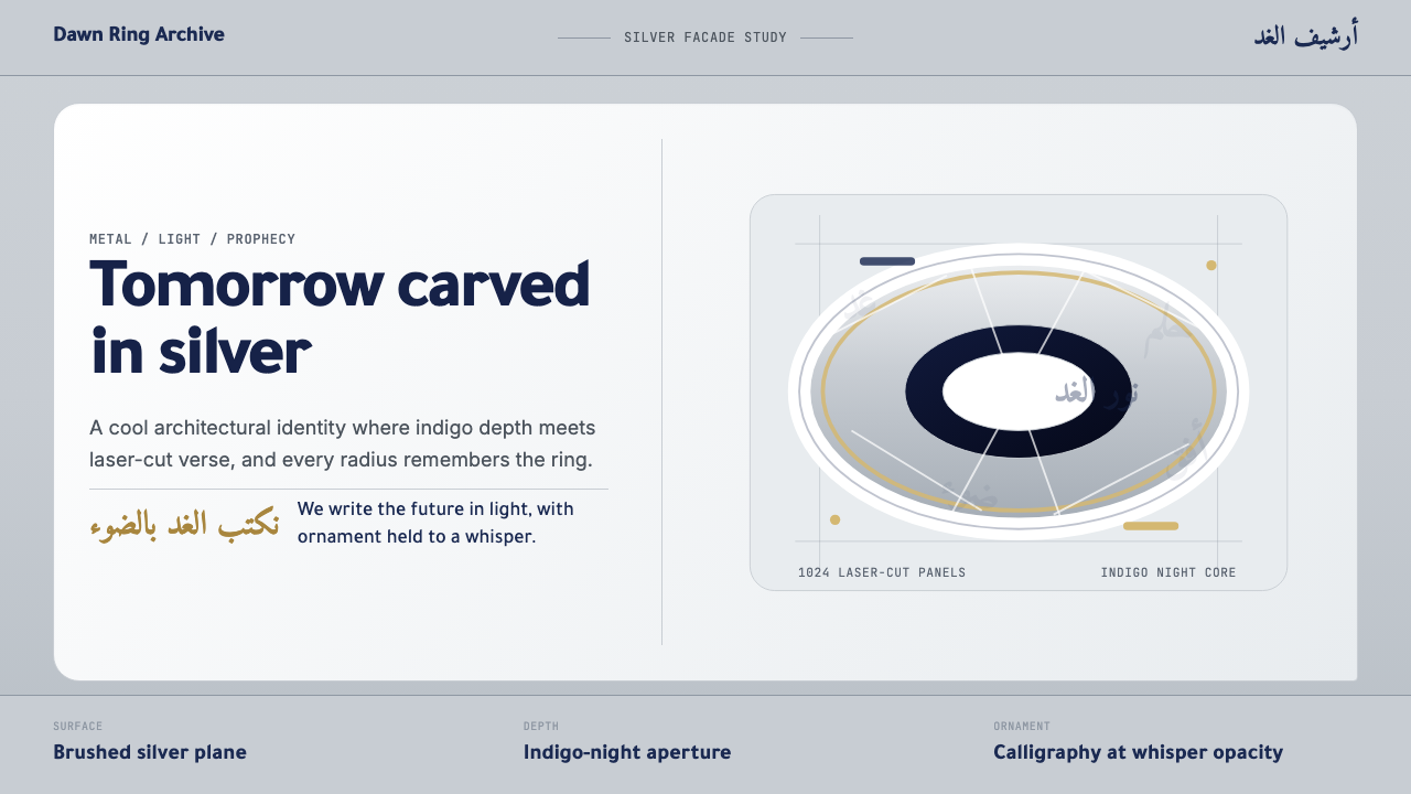 Dubai Museum of the FutureTechnological luxury feels poetic. Silver metal, indigo depth, and Amiri call…
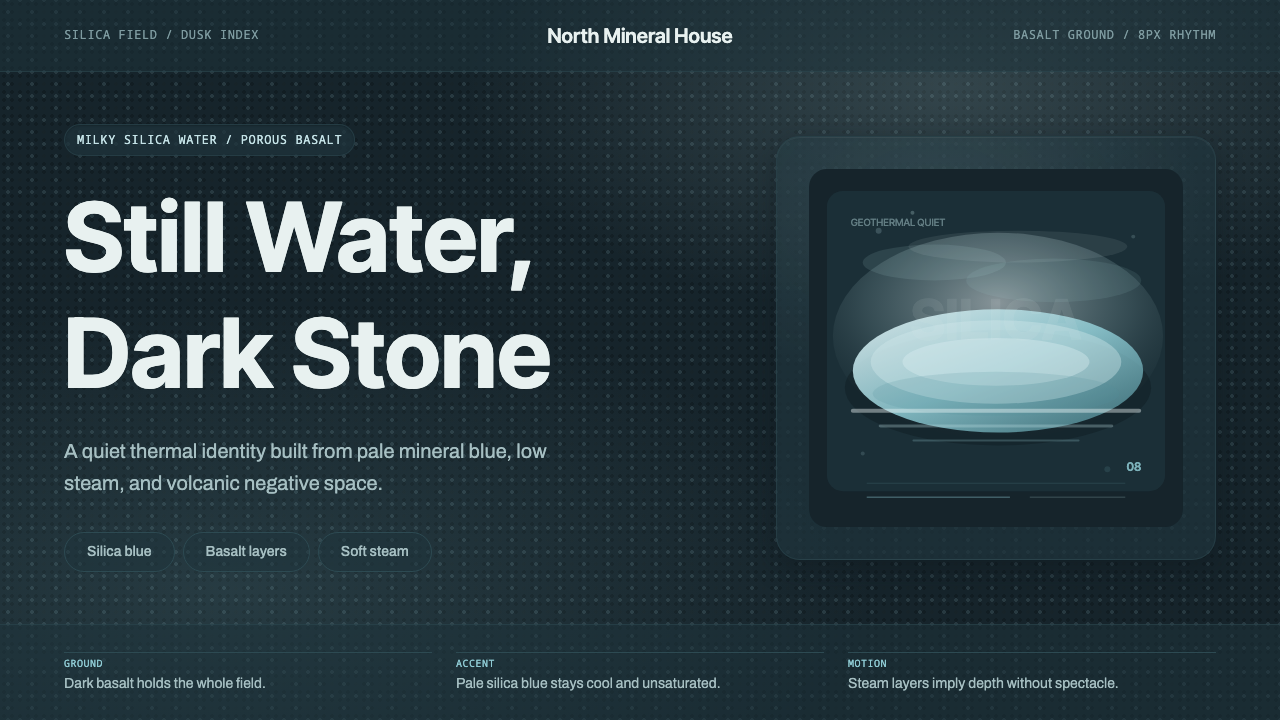 Glacial Teal LagoonQuiet feels elemental. Basalt darks and milky silica blue drift in a low-cont…
 Resend 2024Clean code becomes brand. Pure black, JetBrains Mono, and one green delivered…
 Vercel 2024Developer luxury by subtraction. Pure black, white Inter, rigid grid, triangu…