What is Fly.io Edge-Compute Purple?什么是 Fly.io Edge-Compute Purple?
Fly.io distilled edge-cloud infrastructure into a visual creed: one saturated purple, deep black, monospace code blocks, and the quiet authority of a terminal that never sleeps.Fly.io 把边缘云基础设施浓缩成一套视觉信条:一种饱和的紫色、深黑底面、等宽代码块,以及一台永不休眠的终端所特有的沉静权威。
Fly.io Edge-Compute Purple in briefFly.io Edge-Compute Purple 速览
Fly.io Edge-Compute Purple is the visual identity of the developer-cloud platform that runs full-stack applications in regions physically close to their users. Its defining characteristic is restraint raised to a discipline: a single saturated violet hue commands every surface — buttons, node markers, active states, and calls to action — while everything else recedes into deep black or near-neutral dark grays. The result is a visual system that feels simultaneously sparse and high-energy, the way a terminal window looks when something important is actually happening.Fly.io 边缘计算紫是这家开发者云平台的视觉身份——该平台将全栈应用部署到物理上贴近用户的全球边缘节点。这套设计的核心特征是将克制提炼为一种纪律:一种饱和的紫罗兰色统治所有可交互表面——按钮、节点标记、激活状态与行动号召——其余一切退入深黑或接近中性的深灰。由此产生的视觉系统感觉同时稀疏又充满能量,就像终端窗口里真正有重要事情发生时的那种感觉。
The aesthetic belongs to the 2020s wave of developer-tooling brands that chose darkness and chromatic commitment over the safe neutrality of white SaaS. Where those cautious alternatives hedge with pastel accents and soft shadows, Fly.io Edge-Compute Purple plants its flag: electric violet on deep black, modernist sans-serif type at every scale, and monospace code blocks that blur the line between marketing surface and technical documentation. The world map dotted with glowing region markers — each one a live deployment node — functions both as product diagram and visual anchor.这套美学属于2020年代开发者工具品牌浪潮的一部分——这批品牌选择了深色背景与色彩承诺,而非白色SaaS设计的安全中立。那些谨慎的替代方案用粉彩点缀和柔和阴影来对冲风险,而Fly.io边缘计算紫选择插旗:深黑底上的电紫,各个尺度上的现代无衬线字体,以及让营销表面与技术文档之间界限模糊的等宽代码块。全球地图上散布的发光节点标记——每一个都代表一个实时部署区域——既是产品示意图,也是视觉锚点。
The system is opinionated about what it refuses. There are no rainbow accent palettes, no light-mode defaults offered as a softer alternative, no decorative serif typefaces invoking heritage or warmth. Cards have sharp or minimally rounded corners. Shadows, where they appear, carry a purple tint that connects them back to the dominant hue rather than neutralizing them. Every choice argues for the same thing: that infrastructure software should look like what it is — precise, always-on, and fundamentally honest about its nature.这套系统对自己拒绝什么有明确立场。没有彩虹点缀色板,没有以浅色模式作为更温和的备选,没有借助衬线字体唤起传统感或温度感的装饰性选择。卡片有锐利或极小圆角。阴影若出现,则带有紫色调,将其与主导色调关联而非中和。每一个选择都在论证同一件事:基础设施软件应该呈现它本来的样子——精确、永在线,以及对自身本质的根本诚实。
See the Fly.io Edge-Compute Purple design system查看 Fly.io Edge-Compute Purple 完整设计系统
Where does Fly.io Edge-Compute Purple come from?Fly.io Edge-Compute Purple 从何而来?
Fly.io was founded in 2017 in Chicago by Kurt Mackey, Thomas Ptacek, and Michael Dwan. The company's original proposition was developer-centric: run applications at the network edge, in dozens of regions simultaneously, with the operational simplicity that had previously been available only to large engineering organizations. From the beginning, the platform's identity was inseparable from its audience — software engineers who read documentation more carefully than they read marketing copy, and who treated visual noise as an indicator of conceptual confusion.Fly.io由Kurt Mackey、Thomas Ptacek与Michael Dwan于2017年在芝加哥创立。公司的原始主张以开发者为中心:以原本只有大型工程组织才能实现的运营简洁性,将应用同时运行在全球数十个边缘节点。从一开始,平台的身份就与它的受众不可分割——这些软件工程师阅读文档比阅读营销文案更仔细,他们将视觉噪音视为概念混乱的指征。
The current visual identity took its definitive form around 2022 to 2024, as Fly.io grew its regional footprint and competed directly with established cloud providers. The timing matters: this was a moment when developer tooling had fragmented into two opposing aesthetics. One camp leaned into warm, approachable design — friendly gradients, playful illustration, rounded everything — trying to reduce the perceived intimidation of infrastructure software. The other camp moved toward darkness and technical seriousness, signaling competence through visual austerity. Fly.io chose the second path and committed to it without compromise.当前视觉身份在2022至2024年间形成了决定性形态,彼时Fly.io正在扩展区域布局,并与成熟云服务商展开直接竞争。时机很重要:这是开发者工具美学分裂为两种对立取向的时刻。一派倾向温暖、平易的设计——友好的渐变、趣味插图、圆润的一切——试图降低基础设施软件在感知上的威慑感。另一派转向深色与技术严肃性,通过视觉简省传递能力信号。Fly.io选择了第二条路,并且毫不妥协地走到底。
The choice of deep black as the dominant ground was not merely stylistic. Dark-mode interfaces had become the preferred working environment for a significant proportion of professional developers by the early 2020s. Building the primary brand experience in dark mode — rather than treating it as a secondary option toggled from light — sent a clear signal about whose workflow the platform was designed for. The saturated purple accent, planted directly on that dark ground, reads as an active system indicator: the color of a process that is running, a deployment that is live, a region that is responding.将深黑作为主导底色并非纯粹的风格选择。到2020年代初,深色模式界面已成为相当大比例的专业开发者的首选工作环境。将主要品牌体验建立在深色模式之上——而非把它当作从浅色切换过去的次选项——清晰地传达了这个平台是为谁的工作流设计的。饱和紫色强调色直接落在深黑底面上,读起来像一个活跃的系统指示器:一个正在运行的进程,一个实时上线的部署,一个正在响应的区域,其对应的颜色。
The typography choices reinforced the positioning. Modernist sans-serif typefaces with the neutral precision associated with technical documentation replaced any warmer or more expressive alternatives. Monospace code presentation was elevated from a secondary element — the small block of copy-paste instructions tucked at the bottom of a marketing page — to a primary design component given the same visual weight as headlines. This decision reflects the audience: developers do not distinguish sharply between reading about a product and reading the product itself. The code block is not evidence of what the platform can do; it is the platform making its case directly.字体选择强化了这种定位。带有中性精确感的现代无衬线字体——这种精确感与技术文档相关联——取代了任何更温暖或更富表现力的备选方案。等宽代码呈现被从次要元素的位置——营销页面底部那一小块复制粘贴指令——提升为主要设计组件,获得与标题同等的视觉权重。这个决定反映了受众的特点:开发者不会在阅读关于产品的内容和阅读产品本身之间做出明确区分。代码块不是平台能力的佐证,而是平台直接陈述自己的方式。
What defines the Fly.io Edge-Compute Purple look?Fly.io Edge-Compute Purple 的视觉特征是什么?
Color色彩
The palette is built on a single saturated violet-purple that sits at the warm edge of the blue-violet spectrum — vivid enough to hold its own against deep black backgrounds, disciplined enough to avoid sliding into neon excess. Every interactive element, active state, and navigational indicator draws from this one hue. Secondary surfaces use stepped dark grays rather than secondary accent colors; the result is a system that reads as monochromatic in all but the decisive purple moments. Purple-tinted shadows connect component depth to the dominant hue rather than introducing neutral grays.色板建立在单一饱和的紫罗兰色上,这个颜色位于蓝紫光谱的暖侧——足够鲜艳,可以在深黑底面上自持,又足够克制,不会滑向霓虹的过度。每一个可交互元素、激活状态与导航指示都来自这同一色相。次级表面使用分级深灰而非次级点缀色;结果是一个在决定性的紫色时刻之外读起来如同单色的系统。带紫调的阴影将组件深度与主导色调关联,而非引入中性灰。
Typography字体排印
Modernist sans-serif faces at multiple scales carry the entire typographic hierarchy. Headlines are set at generous scale with restrained letter-spacing; body text is compact and dense, reflecting the reading habits of an audience accustomed to documentation and code. Monospace type is treated as a first-class typographic element — given the same visual prominence as headings, styled with a subtly differentiated dark background to evoke the terminal, and never buried as a footnote. The overall text texture is tight, confident, and reads as engineered rather than styled.多个尺度上的现代无衬线字体承载全部排印层级。标题以宽裕的字号设置,字间距克制;正文紧凑而密集,反映了习惯于阅读文档与代码的受众的阅读习惯。等宽字体被视为一等排印元素——获得与标题相同的视觉显著性,以细微区分的深色背景样式唤起终端感,从不被埋没为脚注。整体文字质感紧实、自信,读起来像工程出来的,而非设计出来的。
Surface and Depth表面与深度
Depth is constructed through stepped dark surfaces rather than light-and-shadow simulation. Cards and panels sit one tone above the base background; modals and overlays step up another tone; interactive elements gain a purple-tinted glow on hover or focus. Corners are sharp or carry only a minimal radius — enough to read as intentional rather than default, not enough to suggest softness or approachability. The overall volumetric effect is that of layered panels in a control room rather than floating cards in a consumer application.深度通过分级深色表面而非光照阴影模拟来构建。卡片与面板比基底背景亮一级;模态框与覆盖层再亮一级;可交互元素在悬停或聚焦时获得带紫调的光晕。圆角锐利或只有极小弧度——足以让人读出是刻意为之,而非系统默认,却不足以传递柔和或亲和感。整体立体效果更像控制室中分层面板,而非消费类应用中漂浮的卡片。
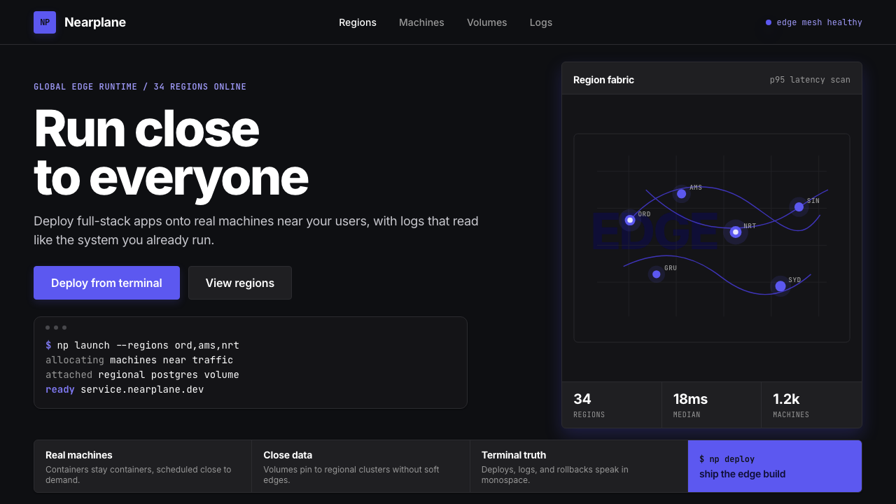
The Region Map区域地图
A world map dotted with glowing deployment markers serves as the system's most characteristic recurring motif. The markers pulse or glow in the dominant purple, against a dark cartographic ground that suppresses national borders and geography in favor of infrastructure topology. This motif works as product diagram, hero image, and brand element simultaneously — it communicates global reach, real-time operation, and the physical reality of edge computation in one image. When adapted for presentations or marketing materials, it functions as an immediately recognizable visual signature.一张散布着发光部署标记的世界地图是这套系统中最具特征的反复出现母题。标记以主导紫色的光晕闪烁,映衬在深色地图底色上,这种底色压制了国界与地理特征,转而凸显基础设施拓扑。这个母题同时作为产品示意图、主视觉与品牌元素发挥功能——在一张图像里传达全球覆盖、实时运营与边缘计算的物理现实。当被适配为演示文稿或营销素材时,它作为一个即时可辨认的视觉签名发挥作用。
Code as Content代码即内容
Terminal output and code snippets are compositional elements, not supporting footnotes. They occupy the same visual weight as marketing headlines, are formatted with syntax distinction that makes them readable at a glance, and are styled with background differentiation that evokes the physical terminal without simulating it literally. This treatment reflects the platform's conviction that the developer audience reads code before it reads prose — the code block earns its hierarchical position not despite being technical, but because of it.终端输出与代码片段是构图元素,而非配角注释。它们与营销标题占据同等视觉权重,以可一目了然阅读的语法区分格式化,并以背景区分样式唤起实体终端感,而不是字面模拟它。这种处理方式反映了平台的信念:开发者受众在阅读散文之前先阅读代码——代码块获得其层级位置,不是尽管技术性如此,而恰恰是因为技术性如此。
Motion and State动效与状态
Interactive states — hover, focus, active, loading — are communicated through the purple accent changing intensity or extending into a controlled glow, rather than through positional shifts or color changes that introduce new hues. Loading states evoke terminal spinners rather than consumer-grade progress bars. The motion vocabulary is short, purposeful, and never decorative: a button darkens when pressed, an indicator pulses when a process is running, a connection line draws when a region comes online. Every animated element models the system's actual behavior rather than performing enthusiasm.交互状态——悬停、聚焦、激活、加载——通过紫色强调色改变强度或延伸为受控光晕来传达,而非通过引入新色相的位置偏移或颜色变化。加载状态唤起终端旋转指示符,而非消费级进度条。动效词汇短小、有目的,从不装饰性:按钮按下时变深,指示器在进程运行时脉冲,连接线在区域上线时绘出。每一个动画元素模拟系统的实际行为,而非表演热情。
Information Density信息密度
Layouts are denser than typical consumer SaaS — more data points per viewport, tighter line heights, narrower margins relative to content. This is a deliberate design value, not an oversight: the target audience is comfortable with dense information environments because they spend their working hours in terminals, editors, and monitoring dashboards. Whitespace is used to create reading rhythm and visual hierarchy, not to add breathing room as a substitute for meaningful content. Empty areas in the layout signal importance through contrast, not absence.版面比典型消费类SaaS更密集——每屏更多数据点,更紧的行高,相对于内容更窄的边距。这是刻意为之的设计价值观,而非疏忽:目标受众对密集信息环境感到自在,因为他们工作时间都在终端、编辑器与监控仪表板中度过。留白用于创造阅读节奏和视觉层级,而非作为有意义内容的替代品来增加呼吸感。版面中的空白区域通过对比传达重要性,而非传达缺席。
See the Fly.io Edge-Compute Purple design system查看 Fly.io Edge-Compute Purple 完整设计系统
Who shaped Fly.io Edge-Compute Purple?谁塑造了 Fly.io Edge-Compute Purple?
Co-founder and CEO of Fly.io, Mackey's product thinking is inseparable from the platform's visual identity. His public writing on infrastructure, developer experience, and the economics of edge computing established the philosophical foundation from which the visual language grew. Under his leadership, Fly.io chose to target sophisticated engineering teams rather than lowering the technical barrier — a strategic decision that directly permitted the visual system's austerity and density.Fly.io联合创始人兼CEO,Mackey的产品思维与平台视觉身份不可分割。他关于基础设施、开发者体验与边缘计算经济学的公开写作,建立了视觉语言由此生长的哲学基础。在他的领导下,Fly.io选择瞄准成熟工程团队,而非降低技术门槛——这一战略决策直接允许了视觉系统的简省与密度。
Co-founder and security researcher whose background in systems security and network infrastructure shaped Fly.io's deeply technical positioning. The platform's refusal to soften its interface for non-technical audiences reflects the founding team's conviction that infrastructure software should be designed for the people who understand it. Ptacek's security-first perspective also influenced the visual system's emphasis on clarity and explicit state representation over decorative ambiguity.联合创始人兼安全研究员,其在系统安全与网络基础设施领域的背景塑造了Fly.io深度技术化的定位。平台拒绝为非技术受众软化界面,反映了创始团队的信念:基础设施软件应该为理解它的人而设计。Ptacek以安全为先的视角也影响了视觉系统对清晰度和显式状态表示的强调,而非装饰性的模糊。
Co-founder whose technical contributions to the platform's distributed systems architecture shaped the product reality that the visual language had to communicate. The region-map motif and the emphasis on live operational state in the interface both reflect the underlying infrastructure model Dwan helped design: a network of independent nodes, each representing a running application close to a user population, visible and queryable in real time.联合创始人,其对平台分布式系统架构的技术贡献塑造了视觉语言必须传达的产品现实。区域地图母题与界面中对实时运营状态的强调,都反映了Dwan参与设计的底层基础设施模型:一个由独立节点构成的网络,每个节点代表一个在特定用户群附近运行的应用,实时可见且可查询。
The visual system that crystallized between 2022 and 2024 represents the mature statement of the Fly.io aesthetic. This iteration committed fully to the dark-first, single-accent approach and elevated monospace code blocks to first-class design components. It is this system that established Edge-Compute Purple as a recognizable design language in the developer-tooling space — one that has influenced how other infrastructure platforms signal technical seriousness through chromatic and typographic restraint.在2022至2024年间定型的视觉系统,代表了Fly.io美学的成熟表达。这一版本完全致力于深色优先、单一强调色的方法,并将等宽代码块提升为一等设计组件。正是这套系统将边缘计算紫确立为开发者工具领域一种可辨认的设计语言——一种影响了其他基础设施平台如何通过色彩和排印的克制来传递技术严肃性的语言。
Fly.io Edge-Compute Purple emerged within a broader 2020s movement of developer-infrastructure platforms — including Vercel, Railway, Render, and others — that treated visual identity as a product signal rather than a marketing exercise. Within this movement, Fly.io represents the most monochromatic and terminal-referencing position: less expressive variety than competitors, more chromatic discipline, and a stronger identification with the actual working environment of its users. Its visual influence on the category has been measurable.Fly.io边缘计算紫诞生于2020年代更广泛的开发者基础设施平台运动之中——包括Vercel、Railway、Render等——这些平台将视觉身份视为产品信号,而非营销练习。在这场运动中,Fly.io代表着最单色调、最呼应终端的立场:比竞争对手更少的表现性变化,更多的色彩纪律,与用户实际工作环境更强的认同感。它对该品类的视觉影响是可测量的。
How do you use Fly.io Edge-Compute Purple today?今天怎么用 Fly.io Edge-Compute Purple?
Fly.io Edge-Compute Purple is purpose-built for technical audiences and performs best when the content genuinely reflects infrastructure, developer tooling, data systems, or any domain where precision and competence are primary values. Applying it correctly requires accepting its core principle: visual restraint is not a limitation but a form of argument. The single-accent approach communicates that the system knows what matters and has eliminated everything that does not.Fly.io边缘计算紫是为技术受众量身打造的,在内容真正反映基础设施、开发者工具、数据系统或任何以精确性与能力为首要价值观的领域时表现最佳。正确应用它需要接受其核心原则:视觉克制不是局限,而是一种论证形式。单一强调色的方法传达的是:这套系统知道什么重要,并且已经消除了所有不重要的东西。
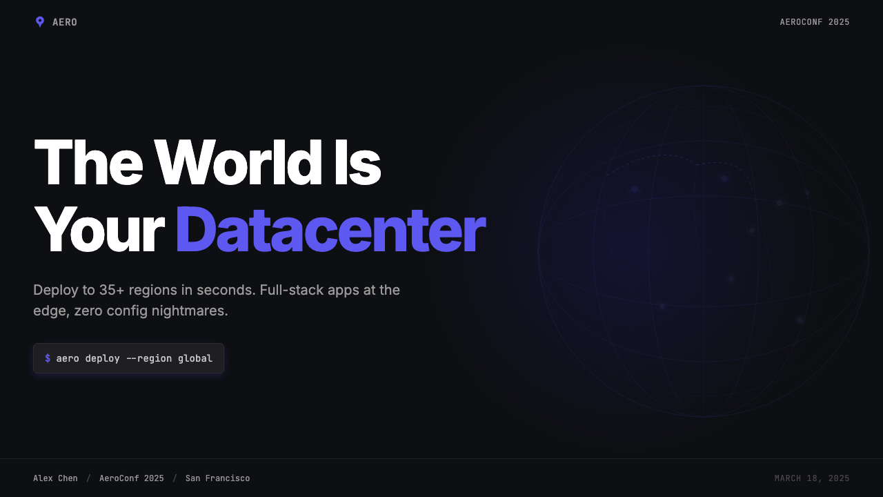
For presentation slides, the style works well across both cover and content formats. A cover slide benefits from using the purple accent on a single dominant element — a network diagram, a region map, a typographic lock-up — against a dark field, with the title set in clean sans-serif at significant scale. Content slides should treat information density as a feature: data tables, code samples, and architecture diagrams sit as primary content, not as supporting material. Data visualizations — latency charts, throughput graphs, availability maps — adopt the style's palette naturally, with the purple accent marking the active or highlighted series and grays carrying the comparison data.对于演示文稿幻灯片,这种风格在封面与内容两种格式上都表现出色。封面幻灯片适合将紫色强调色用于单一主导元素——网络示意图、区域地图、字体锁定构图——映衬在深色背景上,标题以清晰的无衬线字体在显著尺度上设置。内容幻灯片应当将信息密度视为一种特色:数据表格、代码示例与架构图作为主要内容而非辅助材料呈现。数据可视化——延迟图表、吞吐量图、可用性地图——自然地融入这套风格的色板,紫色强调色标记激活或高亮的系列,灰色承载对比数据。
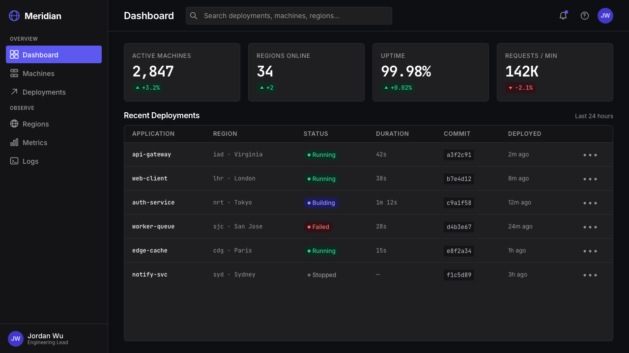
For web UI, dashboards, and product interfaces, the system's real-time operational aesthetic translates directly. Use the deepest background tone as the base, step up one tone for primary panels and cards, and step up again for modals or focus areas. Reserve the purple accent for every interactive or stateful element: active navigation items, selected rows, focus rings, progress indicators, and primary action buttons. Ghost buttons and secondary actions should live in the gray range without touching the accent. Pricing pages benefit from the style's natural authority: tier differentiation through accent color on the recommended plan, with sharp-edged cards and dense feature lists signaling that this is a product for people who read specifications.对于网页用户界面、仪表板与产品界面,这套系统的实时运营美学可以直接转化。以最深的背景色调作为基底,上升一个色调用于主面板和卡片,再上升一个色调用于模态框或焦点区域。将紫色强调色保留给每一个可交互或有状态的元素:激活的导航项、选中行、聚焦环、进度指示器与主要操作按钮。幽灵按钮与次要操作应存在于灰色范围内,不触碰强调色。定价页面得益于这套风格固有的权威性:通过推荐套餐上的强调色实现级别区分,锐利边角的卡片与密集功能列表传达这是一款为阅读规格说明书的人准备的产品。
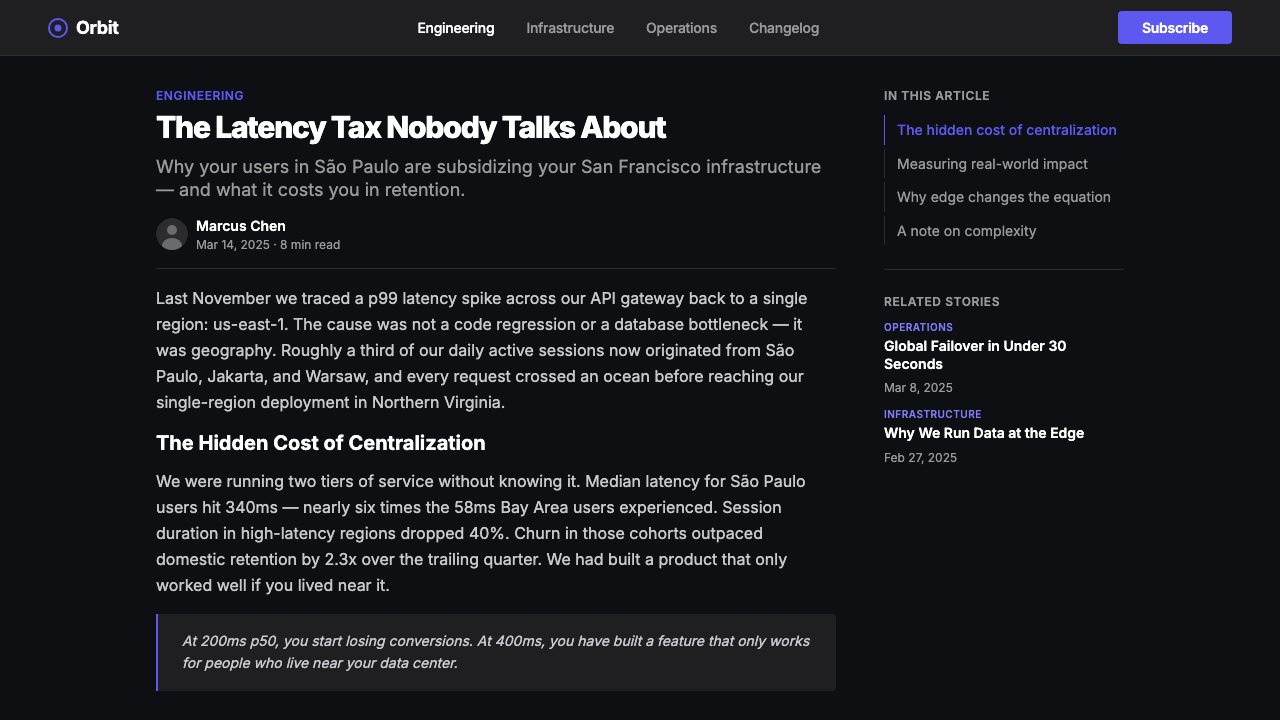
For editorial and marketing content — landing pages, documentation headers, blog post layouts, developer relations materials — the system's code-as-content principle is its most distinctive contribution. Place code blocks and terminal output as visual anchors alongside headlines, not as subordinate elements below the fold. Feature sections alternate between full-width dark panels and panel-within-dark-page layouts; the purple accent appears in icon fills, underlines on active navigation, and in illustration elements that represent infrastructure nodes or connection paths. Avoid decorative illustration styles that conflict with the technical register; geometric diagrams and schematic linework are the appropriate illustration vocabulary.对于编辑与营销内容——落地页、文档标题、博客文章版式、开发者关系材料——这套系统的「代码即内容」原则是其最具辨识度的贡献。将代码块和终端输出作为视觉锚点与标题并置,而非作为折叠以下的从属元素。特色区块在全宽深色面板与深色页面内嵌面板布局之间交替;紫色强调色出现在图标填充、激活导航下划线,以及代表基础设施节点或连接路径的图示元素中。避免与技术语域相冲突的装饰性插图风格;几何示意图与示意线稿是恰当的插图词汇。
A common mistake when adapting this style is importing additional accent colors to add variety or warmth. A second bright color — even a complementary one — immediately dismantles the single-accent logic that gives the system its identity. If color variety is needed to communicate additional meaning (alert states, severity levels, status categories), use the purple accent at varying opacity levels or intensity rather than introducing new hues. Similarly, switching to a light-mode version of the layout by inverting to white backgrounds loses the terminal reference that makes the style coherent; if light-mode output is required, treat it as a distinct design problem rather than a simple inversion.改编这种风格时最常见的错误是引入额外的强调色来增加变化或温度感。第二种明亮颜色——即使是互补色——会立刻瓦解赋予这套系统身份的单一强调色逻辑。如果需要色彩变化来传达额外含义(警示状态、严重程度、状态分类),请使用不同不透明度或强度的紫色强调色,而非引入新色相。同样,通过反转为白色背景来切换到浅色模式版面,会失去让这种风格具有连贯性的终端参照;如果需要浅色模式输出,应将其视为一个独立的设计问题,而非简单的颜色反转。
See the Fly.io Edge-Compute Purple design system查看 Fly.io Edge-Compute Purple 完整设计系统
Fly.io Edge-Compute Purple — FAQFly.io Edge-Compute Purple · 常见问题
Is this style usable for non-developer audiences?这种风格可以用于非开发者受众吗?
With significant adaptation, yes — but be clear-eyed about the trade-offs. The style's authority and seriousness translate well to any context where technical credibility is valued: fintech dashboards, data-heavy reports, infrastructure procurement materials, and enterprise software interfaces. It struggles in contexts where approachability, warmth, or consumer-facing friendliness are primary values: food and lifestyle brands, children's products, wellness applications, or any context where the user's emotional state matters more than their professional confidence. Forcing the style onto misaligned content tends to read as cold or intimidating rather than authoritative.经过重大调整,可以——但要对取舍保持清醒认识。这套风格的权威性与严肃性在任何技术可信度受重视的场景中都有良好迁移性:金融科技仪表板、数据密集型报告、基础设施采购材料与企业软件界面。它在亲和性、温度感或面向消费者的友好性是首要价值观的场景中则力不从心:食品与生活方式品牌、儿童产品、健康应用,或任何用户情感状态比专业自信更重要的场景。将这种风格强加于错位内容,往往会读出冷漠或威慑感,而非权威感。
How does Edge-Compute Purple differ from generic dark-mode design?边缘计算紫与一般深色模式设计有何不同?
Generic dark-mode design typically inverts a light-mode layout: white becomes dark gray, black type becomes light gray, and accent colors remain unchanged. Edge-Compute Purple is built dark-first — the deep black ground is the design's foundation, not a recolored surface. The critical differences are the single-accent discipline (generic dark-mode often retains a full range of accent colors), the elevation of code and terminal elements to first-class visual components, and the region-map motif that grounds the aesthetic in a specific product reality. Most dark interfaces are consumption experiences; this one models an operational system.一般深色模式设计通常是对浅色模式版面的反转:白色变为深灰,黑色文字变为浅灰,强调色保持不变。边缘计算紫是以深色为先构建的——深黑底面是设计的基础,而非重新着色的表面。关键差异在于单一强调色纪律(一般深色模式通常保留完整的强调色范围)、将代码与终端元素提升为一等视觉组件,以及将美学锚定于具体产品现实的区域地图母题。大多数深色界面是消费体验;这一种模拟的是一个运营中的系统。
Can the style be adapted for light-background output, such as printed reports or white-background slides?这种风格可以被改编用于浅色背景输出,比如打印报告或白底幻灯片吗?
Yes, but treat it as a systematic translation rather than a simple inversion. The purple accent carries well onto white or very light gray grounds — it retains its identity as an active, technical color even in light contexts. The challenge is the code-block treatment: on dark backgrounds, the monospace block has a natural container defined by the surface contrast; on white, it needs an explicit light-gray or very pale background fill to read as distinct. Typography should remain modernist and sans-serif. The region-map motif can be adapted with a lighter geographic ground and darker node markers. Expect the light variant to feel less atmospheric and more utilitarian — that is appropriate for the print or document context.可以,但应将其视为系统性转译,而非简单反转。紫色强调色在白色或非常浅的灰色底面上迁移性良好——即使在浅色语境中,它也保留了作为活跃技术色的身份感。挑战在于代码块的处理:在深色背景上,等宽块由表面对比度自然定义容器;在白色背景上,它需要明确的浅灰或极浅背景填充才能读出区别感。排版应保持现代主义无衬线风格。区域地图母题可以用更浅的地理底色和更深的节点标记来改编。预期浅色版本感觉更少氛围感、更多实用性——这对于打印或文档语境是恰当的。
How should the style handle illustration and iconography?这种风格应如何处理插图与图标?
Illustration should be schematic and geometric — network diagrams, infrastructure topology maps, architectural flow charts — rather than expressive or figurative. Human figures, organic shapes, and isometric 3D illustrations conflict with the style's terminal-derived flatness. Iconography should be geometric and line-based, drawn at consistent weights that match the body type, and colored either in the purple accent for active or interactive icons, or in mid-range gray for inactive or informational ones. Filled icon styles work better than outlined ones on dark backgrounds. Avoid illustrative icon sets with personality — the visual register here is closer to technical documentation than to a consumer app store.插图应该是示意性和几何性的——网络图、基础设施拓扑图、架构流程图——而非表达性或具象的。人物形象、有机形状与等轴3D插图与这套风格源自终端的平面性相冲突。图标应该是几何性和线条性的,以与正文字体匹配的一致字重绘制,对于激活或可交互图标以紫色强调色着色,对于非激活或信息性图标以中级灰着色。在深色背景上,填充图标样式比描边图标表现更好。避免带有个性的插图式图标集——这里的视觉语域更接近技术文档,而非消费类应用商店。
Does the style work for team presentations that mix Fly.io-branded content with general technical slides?这种风格适合将Fly.io品牌内容与通用技术幻灯片混合的团队演示吗?
Yes — this is one of the style's strongest applications. Because the system is built on typographic clarity and information density rather than decorative motifs, it accommodates a wide range of technical content naturally. Architecture diagrams, benchmarking data, operational runbooks, post-incident reviews, and API documentation all sit comfortably within the visual system. The key discipline is maintaining the single-accent rule across non-branded slides: resist the urge to introduce additional colors to make charts or diagrams feel more expressive. The monochromatic discipline is what keeps a heterogeneous deck feeling coherent.是的——这是这套风格最强的应用场景之一。由于这套系统建立在排印清晰度与信息密度上,而非装饰性母题,它能自然地容纳广泛的技术内容。架构图、基准测试数据、运营手册、事后复盘报告与API文档都能舒适地存在于这套视觉系统之中。关键纪律是在非品牌幻灯片上也保持单一强调色原则:抵制引入额外颜色来让图表或示意图感觉更富表现力的冲动。单色调纪律正是让异质性幻灯片集感觉连贯的原因。
Related design styles相关设计风格
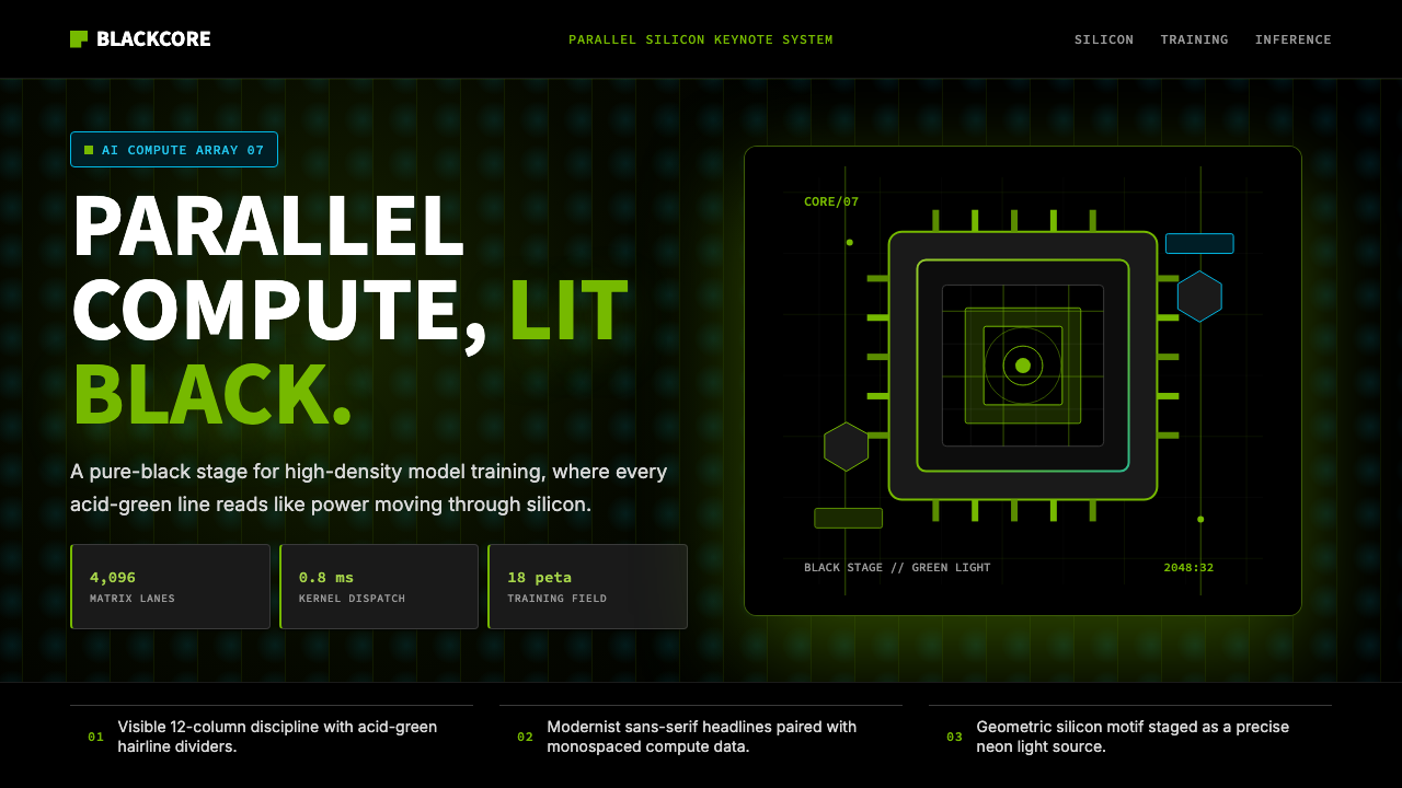 NVIDIA GPU Green-BlackPure black turns compute theatrical. Acid green hairlines and chip geometry s…纯黑让算力成舞台。酸绿细线与芯片几何制造光感。
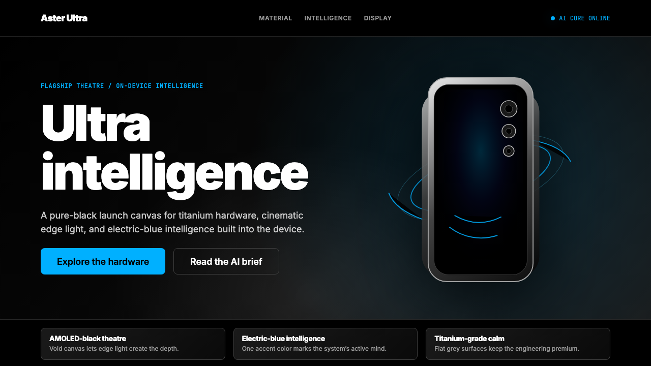 Samsung GalaxyTech-luxury goes black. Electric blue cuts through AMOLED void and titanium-g…科技奢华坠入纯黑。电光蓝切开AMOLED黑场与钛灰几何。
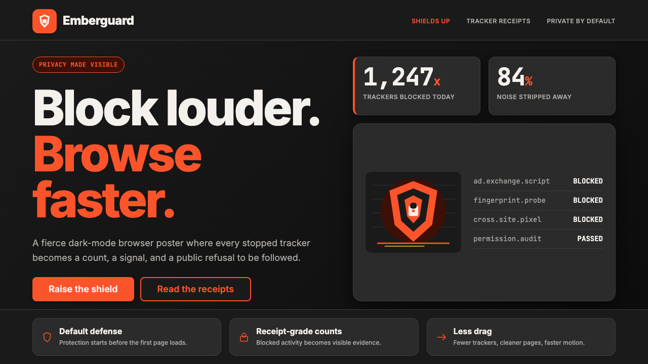 Brave Browser Lion OrangePrivacy gets loud. Lion-orange counters and shield geometry cut through warm…隐私变成宣言:狮橙计数与盾牌几何刺破暖炭黑。
 Cursor IDEAI-first code editor. Pure dark surfaces, off-white text, electric blue reser…以 AI 为核心的代码编辑器:近乎纯黑背景、柔白文字、唯一的电光蓝色专为 AI…
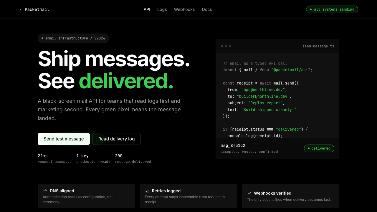 Resend 2024Clean code becomes brand. Pure black, JetBrains Mono, and one green delivered…品牌像 clean code:纯黑、JetBrains Mono、唯一送达绿。
 Vercel 2024Developer luxury by subtraction. Pure black, white Inter, rigid grid, triangu…以删减塑造开发者奢侈感:纯黑白、Inter 字体与刚性网格构成三角发布符号。