What is NVIDIA GPU Green-Black?什么是 NVIDIA GPU Green-Black?
Pure black turns compute theatrical — acid green hairlines and chip geometry stage the glow of the AI era's most recognizable hardware brand.纯黑让算力成舞台——酸性绿细线与芯片几何,共同制造了 AI 时代辨识度最高的硬件品牌的发光质感。
NVIDIA GPU Green-Black in briefNVIDIA GPU Green-Black 速览
NVIDIA GPU Green-Black is the visual identity system of the world's leading GPU and AI chipmaker — a strict two-tone discipline of acid green against pure black that has become the de facto aesthetic of high-performance computing, AI research, and the data-center era. It is a dark, cinematic, technically inflected style whose authority comes from its absolute commitment to a single chromatic relationship: the aggressive luminosity of the brand green floating against a field of total darkness.英伟达 GPU 绿黑风格,是全球领先的 GPU 与 AI 芯片制造商的视觉识别系统——一套将酸性绿对抗纯黑的严格双色规范,已成为高性能算力、AI 研究与数据中心时代的标志性美学。这是一种深沉、富有电影感、技术气息浓郁的风格,其权威感来自对单一色彩关系的绝对承诺:品牌绿的侵略性发光感悬浮于一片彻底的暗色之上。
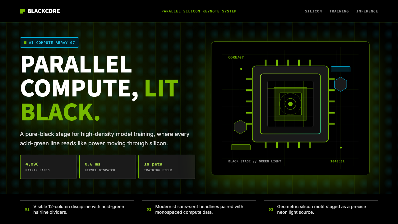
The style is built on chiaroscuro. Everything that is not black is green, and everything that is not green recedes into black. Typographic elements are spare and geometric — a cold, rationalist sans-serif that reads more like instrument-panel labeling than editorial warmth. Where imagery appears, it is almost always rendered: three-dimensional silicon wafers, chip die photographs, particle-light glows, holographic architectural blueprints of GPU logic. Photography of people exists but is used sparingly; the dominant subject is the machine itself.这套风格建立在明暗对照法之上。非黑即绿,非绿即退入黑暗。字体元素简洁而几何——一种冷峻、理性主义的无衬线字体,读来更像仪器面板上的标注,而非编辑性的温度。图像出现时,几乎永远是渲染物:三维硅晶圆、芯片裸片照片、粒子光效、GPU 逻辑架构的全息蓝图。人物摄影存在,但使用克制;主角永远是机器本身。
What distinguishes NVIDIA Green-Black from other dark tech aesthetics is its sense of contained spectacle. This is not the quiet darkness of a premium consumer product; it is the dramatic darkness of a concert stage or a particle accelerator visualization — an environment designed to make a single glowing element feel monumental. The palette and compositional logic communicate high-performance compute, engineering precision, and futuristic gravitas without ever relying on decoration. Every element earns its place by functioning as signal.英伟达绿黑风格区别于其他深色科技美学之处,在于它那种被控制的奇观感。这不是高端消费品的安静黑暗,而是演唱会舞台或粒子加速器可视化的戏剧性黑暗——一个专为让单一发光元素显得宏大而设计的环境。色板与构图逻辑传达的是高性能算力、工程精度与未来感庄重,从不依赖任何装饰。每个元素都以发挥信号功能来赢得自己的位置。
See the NVIDIA GPU Green-Black design system查看 NVIDIA GPU Green-Black 完整设计系统
Where does NVIDIA GPU Green-Black come from?NVIDIA GPU Green-Black 从何而来?
NVIDIA was founded in 1993 in Santa Clara, California, by Jensen Huang, Chris Malachowsky, and Curtis Priem — three engineers who believed that the emerging market for 3D graphics processing would reshape computing. The company's early visual identity was conventional tech-company branding of the era: green was present but as part of a broader palette, not yet the monolithic discipline it would become. The GeForce line, launched in 1999, began to consolidate the green-and-black association in gaming hardware and marketing, as GPU boxes and product launches increasingly committed to the color pair as a signal of graphics power.英伟达于1993年在美国加利福尼亚州圣克拉拉由黄仁勋、克里斯·马拉科夫斯基与柯蒂斯·普里姆三位工程师共同创立,他们相信新兴的三维图形处理市场将重塑计算格局。公司早期的视觉识别是那个时代典型的科技公司品牌形象:绿色虽然存在,但只是更宽泛色板的一部分,尚未成为后来那种整体性的规范。1999年推出的 GeForce 系列开始在游戏硬件与营销中固化绿黑配色的关联——GPU 包装盒与产品发布活动越来越将这对颜色组合作为图形算力的信号。
The decisive shaping event was CUDA, introduced in 2007. NVIDIA's parallel computing platform turned the GPU from a graphics chip into a general-purpose scientific computing engine, and the company began repositioning itself — both commercially and visually — as an infrastructure company rather than a consumer peripheral maker. The visual identity tightened: green became more saturated and specific, black became more absolute, and the typographic system leaned harder into geometric precision. The GTC (GPU Technology Conference), launched in 2009, became the annual stage on which this identity was performed at scale — a darkened arena filled with rendered chip architectures and Jensen Huang, almost always in his black leather jacket, presenting against vast green-lit backdrops.决定性的塑造事件是2007年推出的 CUDA。这套并行计算平台将 GPU 从图形芯片转变为通用科学计算引擎,英伟达开始在商业与视觉层面重新定位自身——不再是消费外设制造商,而是基础设施公司。视觉识别随之收紧:绿色变得更为饱和与特定,黑色变得更加绝对,字体系统向几何精准性进一步倾斜。2009年创立的 GTC(GPU 技术大会)成为每年以大规模方式演绎这套识别系统的舞台——一座被渲染芯片架构图案填满的暗色场馆,以及几乎永远身穿黑色皮夹克、在大幅绿光背景前登台的黄仁勋。
The AI boom that began around 2017 — driven by deep learning breakthroughs and NVIDIA's hardware being the computational substrate — transformed the brand from a gaming-adjacent identity to a symbol of the AI era itself. H100 and A100 GPU launches in the early 2020s were accompanied by marketing materials that pushed the visual language to its most refined state: extremely dark backgrounds with near-zero ambient light, green glows that appeared to emanate from chip surfaces, and particle-light effects borrowed from cinematic visual effects pipelines. The style crossed over from product marketing into broader cultural visibility as NVIDIA became one of the world's most valuable companies.约从2017年开始的 AI 浪潮——由深度学习突破与英伟达硬件作为算力底座共同驱动——将这个品牌从游戏相邻的身份转变为 AI 时代本身的符号。2020年代初期 H100 与 A100 GPU 的发布,伴随着将这套视觉语言推至最精炼状态的营销物料:极度黑暗的背景、几近为零的环境光、仿佛从芯片表面向外辐射的绿色光晕,以及从电影视效流程中借来的粒子光效。随着英伟达跻身全球最有价值的公司之列,这套风格从产品营销渗透至更广泛的文化能见度中。
David Kirk, NVIDIA's longtime chief scientist, and the broader engineering culture he represented, also shaped the aesthetic indirectly: the preference for technical exactness, for showing the actual hardware rather than metaphorical stand-ins, for treating chip architecture as something beautiful in its own right — all of this fed into a visual identity that treats rendered silicon as legitimate art. By the mid-2020s, the GTC keynote stage had become a recognizable cultural artifact in its own right, and the NVIDIA green-on-black system had been absorbed into the visual shorthand of AI and compute culture broadly.英伟达长期首席科学家大卫·柯克及其代表的工程师文化,也间接塑造了这套美学:对技术精确性的偏好,对展示真实硬件而非比喻性替代物的坚持,以及将芯片架构本身视为美丽事物的态度——所有这一切都滋养了一套将渲染硅晶视为合法艺术形式的视觉识别系统。到2020年代中期,GTC 主题演讲舞台本身已成为一件可辨识的文化器物,英伟达绿黑系统也被广泛纳入 AI 与算力文化的视觉简语之中。
What defines the NVIDIA GPU Green-Black look?NVIDIA GPU Green-Black 的视觉特征是什么?
The Two-Color Absolute双色绝对律
The NVIDIA palette is structurally binary: the brand's signature acid green and pure black are not simply dominant colors — they are the only colors. The green is a concentrated, almost electric lime-adjacent hue that sits at the aggressive edge of visibility, engineered to read as luminous against any dark ground. Black is not a default or a neutral; it is the active negative space that gives the green its charge. Secondary colors — grays, whites, blues — appear only as typographic or structural elements and never compete with the primary relationship.英伟达的色板在结构上是二元的:品牌标志性的酸性绿与纯黑不只是主色调——它们是仅有的颜色。这种绿是一种浓缩的、近乎电气质感的青柠相邻色,处于可见度的侵略性边缘,被设计成在任何深色底面上都读来发光。黑色不是默认值或中性色,而是赋予绿色能量的主动负空间。次级色彩——灰色、白色、蓝色——仅作为字体或结构性元素出现,从不与主色关系竞争。
Cinematic Darkness电影感黑暗
The black in NVIDIA's system is not a background color in the conventional sense — it is an environment. Compositions are staged as if under dramatic lighting: subjects emerge from darkness rather than sitting on a surface. This cinematic approach borrows from theatrical lighting design, where a performer is made monumental by the void around them. In NVIDIA's visual language, the chip, the render, or the headline is that performer. The darkness is not absence; it is context.英伟达系统中的黑色不是传统意义上的背景色——它是一种环境。构图如同在戏剧性灯光下布景:主体从黑暗中浮现,而非置于某个表面上。这种电影感手法借鉴了舞台灯光设计——表演者被周围的虚空映衬得宏大。在英伟达的视觉语言中,芯片、渲染图或标题文字就是那位表演者。黑暗不是缺席,而是语境。
Glow and Particle Light光晕与粒子光效
A defining characteristic of the mature NVIDIA aesthetic — particularly from the AI-boom years onward — is the presence of radiated light effects: soft green glows emanating from chip surfaces, particle streams suggesting energy or data in motion, and volumetric fog-like atmospheric depth. These are not decorative embellishments; they function as the system's version of warmth and dimensionality. The glow communicates that something powerful is active inside the object. It is performance made visible.成熟期英伟达美学的一个决定性特征——尤其是 AI 浪潮年代以后——是辐射性光效的存在:从芯片表面向外辐射的柔和绿色光晕、暗示能量或数据流动的粒子流,以及体积雾气般的大气深度感。这些不是装饰性点缀,它们是这套系统中温度与维度感的替代物。光晕传达的是:物体内部有强大的力量正在运作。这是被可视化的性能。
Geometric Modernist Sans-Serif几何现代主义无衬线字体
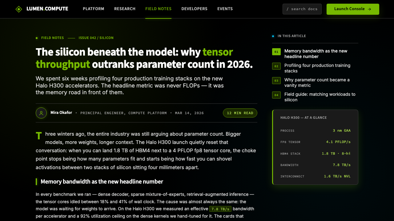
Typography in the NVIDIA system is cold, precise, and engineered — a geometric sans-serif that echoes instrument panels and technical documentation rather than humanist editorial traditions. Letter-spacing tends toward the open and deliberate; headlines are set with authority and weight. The typographic system communicates institutional precision: this is a company that measures in nanometers. Hierarchy is established through scale and weight contrast, not through decorative variation or color-coding beyond the two-color system.英伟达系统中的字体排印冷峻、精确、工程感十足——一种几何无衬线字体,呼应的是仪器面板与技术文档,而非人文主义编辑传统。字母间距趋向宽松而审慎,标题以权威感与字重设置。字体系统传达的是机构精度:这是一家以纳米为单位衡量事物的公司。层级通过尺度与字重对比建立,而非通过装饰性变化或超出双色系统的色彩编码来实现。
Rendered Silicon as Subject渲染硅晶作为主体
Unlike most technology brands, which use metaphorical imagery — abstract networks, speed lines, clouds — NVIDIA consistently foregrounds the actual hardware as its primary visual subject. Three-dimensional renderings of GPU die layouts, photographic close-ups of circuit board topography, and architectural visualizations of chip logic appear as the system's equivalent of portraiture. This choice is not incidental: it reflects the engineering culture's conviction that the hardware itself is the achievement, and that its geometry is beautiful.与大多数使用比喻性图像(抽象网络、速度线、云朵)的科技品牌不同,英伟达始终将真实硬件置于视觉主体的前景。GPU 裸片布局的三维渲染、电路板地形的摄影特写、芯片逻辑的架构可视化,作为这套系统中肖像画的等价物出现。这一选择并非偶然:它反映了工程师文化的信念——硬件本身就是成就,其几何形态是美丽的。
Spectacle Composition奇观构图
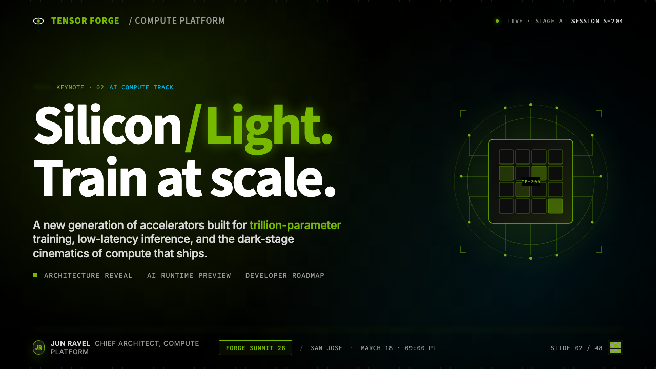
NVIDIA compositions frequently employ wide, cinematic aspect ratios and staged depth — a foreground element illuminated against a receding dark environment, with scale used to convey power. This is the compositional logic of the concert stage or the science fiction film frame: a single object or figure given monumental scale through its relationship to surrounding void. In marketing applications, this means full-bleed dark layouts where the product render or headline occupies a dramatically oversized portion of the available space.英伟达的构图频繁采用宽幅、电影感的画面比例与分层景深——前景元素在退后的暗色环境中被点亮,以尺度传达力量。这是演唱会舞台或科幻电影画面的构图逻辑:单一物体或人物通过与周围虚空的关系获得宏大的尺度感。在营销应用中,这意味着满幅深色版面,其中产品渲染图或标题文字占据画面空间中戏剧性地超比例的部分。
Controlled Accent Discipline受控强调律
Despite the visual drama, the NVIDIA system is extremely restrained in its use of the accent color. Green appears as hairlines, typographic highlights, glowing edges, and small geometric indicators — never as large filled areas competing with the black ground. When green does fill a larger region, it is almost always as a gradient dissolving back to black, maintaining the luminous-against-dark relationship rather than creating two equal-weight color fields. This discipline is what keeps the system from reading as garish rather than dramatic.尽管视觉效果戏剧化,英伟达系统在强调色的使用上极为克制。绿色以细线、字体高光、发光边缘与小几何指示符的形式出现——从不作为与黑色底面竞争的大面积填充区域。即便绿色填充了较大区域,几乎也总是以渐变方式消融回黑色,维持发光体对深色背景的关系,而非制造两个等重的色彩场。这种自律正是让这套系统读来戏剧感十足而非俗气的原因。
See the NVIDIA GPU Green-Black design system查看 NVIDIA GPU Green-Black 完整设计系统
Who shaped NVIDIA GPU Green-Black?谁塑造了 NVIDIA GPU Green-Black?
Co-founder and long-serving CEO of NVIDIA, Huang has become as much a part of the brand's visual identity as the green-and-black palette itself. His signature black leather jacket — worn at nearly every GTC keynote and major product launch since the early 2010s — functions as a human extension of the brand's chromatic discipline. The jacket is not a costume; it is a consistent visual signal that collapses the distance between the brand and its leadership. Huang's theatrical presentation style — darkened arenas, dramatic pauses, reveals of chip architectures as if they were works of art — defined the GTC as a cultural event and established the cinematic register that NVIDIA's visual identity now operates in.英伟达联合创始人兼长期 CEO,黄仁勋已和绿黑色板本身一同成为品牌视觉识别的组成部分。他标志性的黑色皮夹克——自2010年代初起几乎每场 GTC 主题演讲与重大产品发布都如此着装——作为品牌色彩规范的人体延伸而存在。皮夹克不是戏服,而是一个持续的视觉信号,消弭了品牌与领导者之间的距离。黄仁勋戏剧化的演讲风格——暗色场馆、戏剧性停顿、将芯片架构如艺术品般揭幕——将 GTC 定义为一场文化事件,并确立了英伟达视觉识别如今所运作的电影化基调。
Co-founder and longtime hardware engineering leader at NVIDIA, Malachowsky represents the engineering culture that shaped the brand's insistence on treating actual silicon as a visual subject. The company's consistent choice to foreground chip architecture renderings — rather than abstract metaphors — in its marketing reflects the engineering team's conviction that the hardware is the story. This is a rare case where engineering culture directly determined aesthetic strategy.英伟达联合创始人与长期硬件工程负责人,马拉科夫斯基代表了塑造品牌坚持将真实硅晶作为视觉主体的工程师文化。公司在营销中始终将芯片架构渲染图置于前景——而非抽象比喻——这一贯彻的选择,反映了工程团队的信念:硬件本身就是故事。这是工程师文化直接决定美学策略的罕见案例。
NVIDIA's longtime Chief Scientist and a key figure in the CUDA architecture's development, Kirk exemplifies the technical intellectual culture that gave the brand its authority. His public presence — academic papers, technical talks, and explanations of GPU architecture to non-specialist audiences — helped position NVIDIA not merely as a manufacturer but as a knowledge institution. This institutional character is embedded in the visual identity's cold precision and its preference for showing technical truth rather than aspirational lifestyle.英伟达长期首席科学家,CUDA 架构开发的核心人物,柯克代表了赋予品牌权威性的技术知识分子文化。他的公开存在——学术论文、技术演讲、向非专业受众解释 GPU 架构——帮助将英伟达定位为不仅是制造商,更是知识机构。这种机构特性被嵌入视觉识别系统的冷峻精准中,以及其偏好展示技术真相而非理想化生活方式的取向里。
The third co-founder, Priem served as NVIDIA's original chief technical officer and was instrumental in designing the company's first GPU architectures. His early technical decisions — particularly the commitment to a graphics-first architecture that would prove extensible to scientific computing — created the product line that would eventually generate the AI-era revenues making NVIDIA one of the world's most valuable companies. The brand's visual language is ultimately a representation of what his early engineering choices made possible.第三位联合创始人,普里姆担任英伟达首任首席技术官,在设计公司早期 GPU 架构方面发挥了关键作用。他早期的技术决策——尤其是对图形优先架构的承诺,这一架构后来证明可以延伸至科学计算——创造了产品线,并最终产生了 AI 时代的营收,使英伟达跻身全球最有价值的公司之列。这套品牌视觉语言,从根本上是对他早期工程选择所成就之事的视觉呈现。
How do you use NVIDIA GPU Green-Black today?今天怎么用 NVIDIA GPU Green-Black?
NVIDIA GPU Green-Black is among the most legible dark-mode design systems to borrow from, because its logic is structural: two colors, one relationship, one compositional principle. Applying it correctly requires absolute fidelity to the binary palette. The moment a third color enters the system — a warm gray, a blue accent, a white field — the acid-green-against-black tension dissipates and the look becomes generic dark tech. Before beginning any application of this style, establish the rule: background is black, type is green or white, everything else recedes.英伟达 GPU 绿黑是最易于借鉴的深色模式设计系统之一,因为它的逻辑是结构性的:两种颜色、一种关系、一个构图原则。正确应用它,要求对二元色板绝对忠诚。一旦第三种颜色进入系统——暖灰色、蓝色强调色、白色区块——酸性绿对黑的张力就会消散,整体观感退化为泛化的深色科技风。在着手应用这套风格之前,先确立规则:背景是黑色,文字是绿色或白色,其余一切退入黑暗。
For presentation slides, the style is best suited to cover pages, section dividers, and data visualizations — contexts where drama serves the communication. A cover slide in this style should treat the entire slide as a stage: title and subtitle in cold geometric type against a near-total black field, with a single green accent element (a hairline rule, a glowing chip render, a geometric mark) anchoring the composition. Avoid centering everything symmetrically; offset the title toward a third of the slide and let the dark space do work. Content slides require restraint — the full theatrical treatment is for moments of emphasis, not for every page of body text. Data visualizations thrive in this palette: bar charts and line graphs rendered in green against black read with immediate clarity and a sense of technical authority.对于演示文稿,这套风格最适合封面页、章节分隔页与数据可视化——戏剧感服务于传达的场合。这种风格下的封面页应当将整张幻灯片视为舞台:标题与副标题以冷峻几何字体置于近乎全黑的底面上,单一绿色强调元素(细线、发光的芯片渲染、几何标记)锚定构图。避免将所有元素居中对称放置;将标题偏移至幻灯片的三分之一处,让黑色空间发挥作用。内容页需要克制——完整的戏剧性处理用于强调时刻,而非每一页正文。数据可视化在这套色板中表现出色:黑底绿色柱状图与折线图读来清晰有力,带有技术权威感。
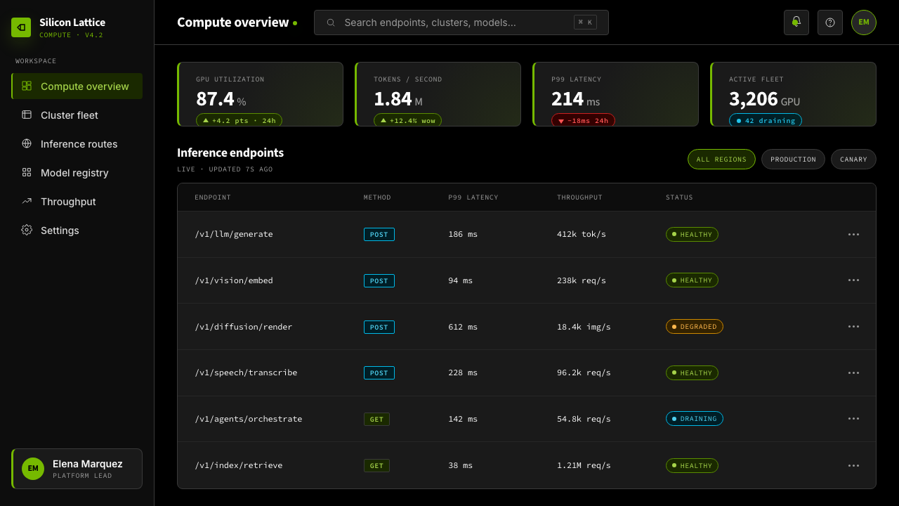
For web interfaces, the system is well-matched to dashboards, product specification pages, and developer-facing documentation where the user expects technical density and precision. The approach: commit fully to a dark background, use a cool near-white for body text rather than pure white (which can create too-harsh contrast at reading length), and deploy the green exclusively for interactive states, progress indicators, system-status signals, and primary calls to action. Navigation should be typographic and minimal — no decorative iconography beyond functional indicators. Pricing pages benefit from the style's implicit authority: plans and tiers differentiated by the presence or intensity of green accents rather than by color-coding with multiple hues.对于网页界面,这套系统与仪表板、产品规格页和面向开发者的文档最为匹配——用户在这些场景中期待技术密度与精准性。方法如下:彻底采用深色背景,正文使用冷调近白而非纯白(纯白在阅读长度下对比过于刺眼),将绿色专门用于交互状态、进度指示器、系统状态信号与主要行动号召。导航应字体性、极简——除功能性指示符外无装饰图标。定价页面受益于这套风格隐含的权威感:套餐与等级通过绿色强调的有无或强弱来区分,而非以多种色调的色彩编码来实现。
For editorial and marketing work, the style is most powerful in large-format contexts: conference visuals, digital out-of-home, full-page advertisements, and event branding. The compositional logic of a massive dark field with a single luminous subject is precisely suited to large screens and physical signage. For editorial layouts, treat body text as a grid-bound element that the dark background serves rather than competes with — narrow columns of cool-toned type against darkness, with green reserved for pull quotes, section labels, or byline accents. Marketing materials should lean into the rendered-silicon aesthetic: show the actual product or its architectural representation rather than a lifestyle metaphor.对于编辑与营销内容,这套风格在大幅面场景中最为有力:会议视觉、数字户外广告、全版面广告与活动品牌。大面积深色底面配单一发光主体的构图逻辑,与大屏幕和实体标牌天然契合。对于编辑版面,将正文视为网格约束元素,让深色背景服务于它而非与之竞争——窄列冷调文字对抗黑暗,绿色保留给引言摘录、章节标签或署名强调。营销物料应倾向于渲染硅晶美学:展示真实产品或其架构呈现,而非生活方式比喻。
The most common mistake when applying NVIDIA Green-Black is treating the accent green as a fill color rather than a light source. In authentic applications, the green glows — it has soft halos at edges, it appears to emanate from surfaces rather than coat them. When the green is used as a flat fill over large areas — like a solid green button taking up a third of a card, or a green header bar — the system loses its distinctive luminous character and reads as a simple two-color scheme. The second common mistake is under-committing to darkness: adding gray gradients or secondary backgrounds to break up the dark field undermines the all-or-nothing drama that makes the style recognizable. Trust the black.应用英伟达绿黑时最常见的错误,是将强调绿当作填充色而非光源来使用。在真实应用中,绿色是发光的——它在边缘有柔和的光晕,它看起来从表面向外辐射,而非覆盖在表面上。当绿色作为大面积平铺填充使用时——比如占据卡片三分之一的纯色绿色按钮,或绿色标题栏——这套系统就失去了其独特的发光特质,读来只是一套简单的双色方案。第二个常见错误是对黑暗承诺不足:添加灰色渐变或次级背景来打破深色底面,会破坏让这套风格可辨识的那种全有或全无的戏剧性。信任那片黑。
See the NVIDIA GPU Green-Black design system查看 NVIDIA GPU Green-Black 完整设计系统
NVIDIA GPU Green-Black — FAQNVIDIA GPU Green-Black · 常见问题
Is this style appropriate for non-tech industries, or is it too branded to NVIDIA?这套风格适合非科技行业吗?还是说它与英伟达的关联太强?
The green-on-black system is strongly associated with NVIDIA, but the underlying visual logic — dark ground, single luminous accent color, cinematic composition, technical type — is a transferable design language used across gaming, cybersecurity, data analytics, financial technology, and defense industries. What you are borrowing is the general register of high-stakes technical authority in a dark environment, not a NVIDIA trademark. The specific acid green is the most brand-proximate element; substituting it with another high-saturation accent color — electric blue, deep amber, bright cyan — maintains the system's structural logic while moving away from direct NVIDIA association. The more you keep the exact hue, the more the viewer's eye will read NVIDIA.绿黑系统与英伟达的关联确实很强,但底层的视觉逻辑——深色底面、单一发光强调色、电影感构图、技术性字体——是一套可移植的设计语言,广泛用于游戏、网络安全、数据分析、金融科技与国防行业。你所借鉴的是深色环境中高风险技术权威的整体基调,而非英伟达的商标。特定的酸性绿是最接近品牌的元素;用另一种高饱和强调色替代它——电蓝色、深琥珀色、亮青色——可以在保持系统结构逻辑的同时,远离与英伟达的直接关联。你保留原有色调越多,观者的眼睛就越会读取英伟达。
How do you make this style work in a light-mode context?如何让这套风格在浅色模式下运作?
The honest answer is that this style is fundamentally a dark-mode system, and a light-mode inversion compromises its essential character. The acid green that reads as luminous against black reads very differently — agitated, slightly acidic, hard to control — against white or cream. If a light-mode version is required, the most coherent approach is to treat it as a separate visual identity rather than a direct inversion: use the dark green as a type and structural-line color on a warm white background, reduce the glow effects entirely, and let the typographic precision carry the technical register. Expect a significantly different visual result — calm and technical rather than cinematic and dramatic.诚实的回答是,这套风格从根本上是一套深色模式系统,浅色模式的反转会损害其本质特性。在黑色底面上读来发光的酸性绿,在白色或奶油色底面上读来截然不同——焦躁、略带酸感、难以控制。如果必须提供浅色模式版本,最连贯的做法是将其视为独立的视觉识别,而非直接反转:将深绿色用作暖白底面上的字体与结构线条颜色,完全减少光晕效果,让字体精准性承载技术基调。预期会得到截然不同的视觉结果——冷静而技术性,而非电影感与戏剧性。
Can this style work for a consumer product, or is it only for B2B and developer audiences?这套风格能用于消费品吗?还是只适合 B2B 与开发者受众?
NVIDIA itself has used the style successfully for consumer-facing gaming products — the GeForce RTX line, gaming laptops, and gaming accessories — demonstrating that the style can operate in consumer contexts when the consumer in question is a gaming enthusiast who equates darkness and green luminosity with performance and power. The style is aspirational for that specific consumer segment. It struggles with consumer audiences that prioritize approachability, warmth, or lifestyle aspiration over technical authority — health and wellness, food, family products, anything where the brand's job is to feel welcoming rather than impressive. The question to ask is whether your consumer audience reads darkness and technical precision as desirable signals or as barriers to entry.英伟达本身已将这套风格成功用于面向消费者的游戏产品——GeForce RTX 系列、游戏笔记本电脑与游戏外设——证明了当目标消费者是将黑暗与绿色发光等同于性能与力量的游戏发烧友时,这套风格能够在消费品场景中运作。对那个特定的消费者细分群体,这套风格是带有向往感的。它在优先考虑亲和力、温度感或生活方式向往而非技术权威的消费者受众中则力不从心——健康养生、食品、家庭产品,以及任何品牌工作是让人感到受欢迎而非令人印象深刻的场景。要问的问题是:你的目标消费者是否将黑暗与技术精准性读作令人向往的信号,还是读作门槛。
What is the biggest mistake designers make when applying this style?设计师应用这套风格时最常犯的错误是什么?
Over-greening. New practitioners see the NVIDIA palette and interpret it as permission to use the accent color generously — green headers, green card backgrounds, green filled buttons, green text at body size. The result is a layout that feels like a gaming peripheral accessory rather than the technical authority the brand represents. In NVIDIA's own best-executed work, the green is almost always a minority element by area: a thin hairline, a glowing edge, a small badge, a percentage of a gradient. The ratio of black to green is approximately what you would find between a concert stage and the spotlight on it. The spotlight is the point; it would not be the spotlight if it lit everything equally.过度使用绿色。初次接触英伟达色板的设计师会将其理解为大方使用强调色的许可——绿色标题、绿色卡片背景、绿色填充按钮、正文大小的绿色文字。结果是一个版面读来像游戏外设配件,而非品牌所代表的技术权威。在英伟达自身最成功的执行案例中,绿色按面积几乎永远是少数元素:一条细线、一个发光边缘、一个小徽章、渐变的某个百分比。黑色与绿色的比例,大约是演唱会舞台与其上的聚光灯之间的比例。聚光灯才是重点;如果它平等地照亮一切,它就不会是聚光灯了。
How does this style handle imagery of people, and should human subjects appear in compositions?这套风格如何处理人物图像?构图中应该出现人物主体吗?
Human subjects appear in NVIDIA's visual system, but they are almost always subordinated to the technical drama rather than centered as lifestyle subjects. Jensen Huang himself is the most prominent exception — in keynote contexts, his presence is the event. For general marketing and communication work, people appear in ways consistent with the dark-cinematic compositional logic: lit dramatically against dark backgrounds, often photographed from angles that create geometric tension, and rarely smiling in the conventional consumer-advertising sense. If you are applying this style and need to include people, treat them as elements in the technical environment rather than as warm human anchors. Skin tones will shift under the green color grading, which is acceptable — the goal is integration with the system, not naturalistic reproduction.人物主体在英伟达的视觉系统中出现,但几乎总是从属于技术性戏剧,而非作为生活方式主体居中呈现。黄仁勋本人是最显著的例外——在主题演讲场合,他的存在本身就是事件。对于一般营销与传播工作,人物以符合深色电影感构图逻辑的方式出现:在深色背景前以戏剧性灯光打亮,通常以制造几何张力的角度拍摄,按传统消费者广告标准来看极少微笑。如果你在应用这套风格时需要纳入人物,将其视为技术性环境中的元素,而非温暖的人文锚点。肤色在绿色色彩分级下会发生偏移,这是可以接受的——目标是与系统融合,而非自然主义再现。
Related design styles相关设计风格
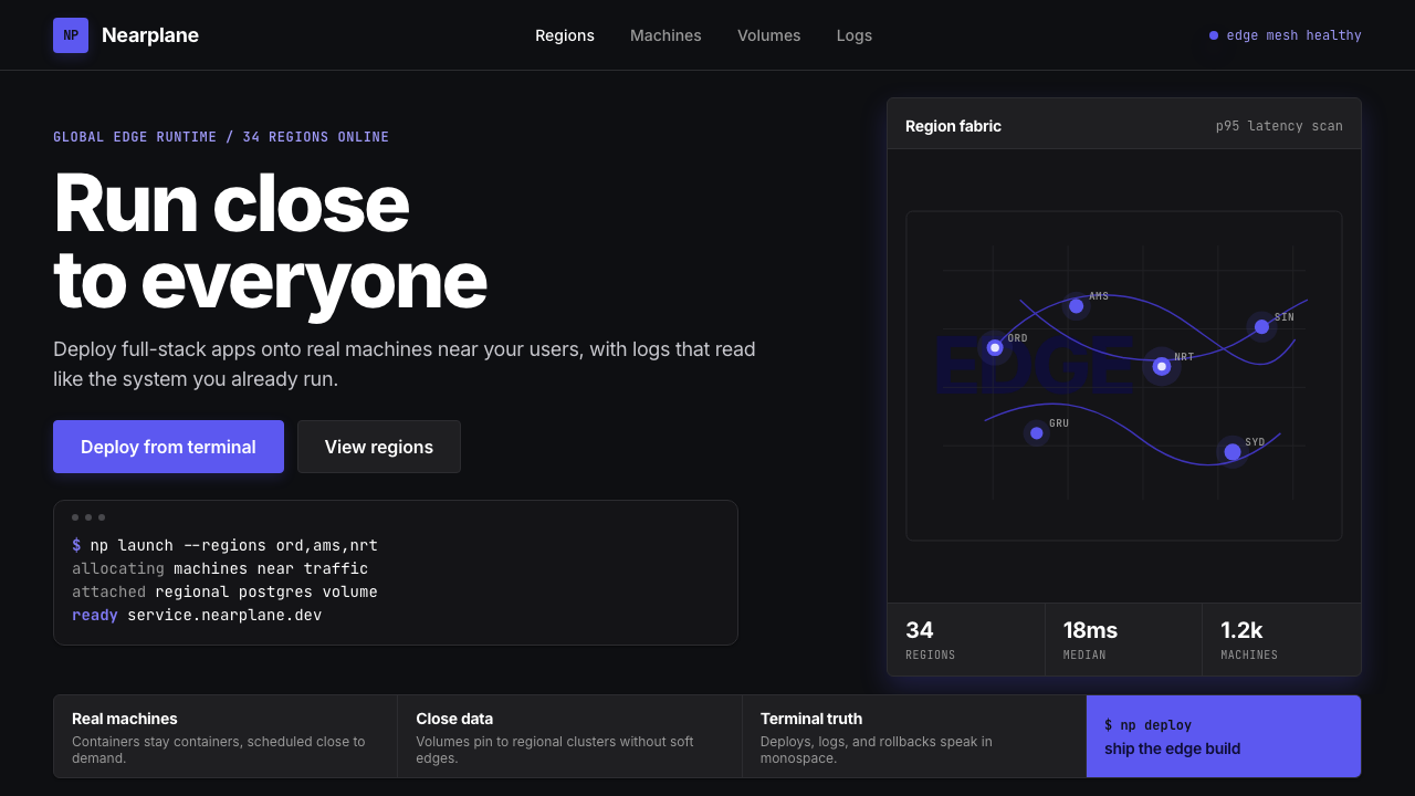 Fly.io Edge-Compute PurpleEdge-cloud with discipline. Electric purple nodes, Inter type, and terminal b…克制的边缘云:深黑底、电紫节点、Inter 字体与终端块。
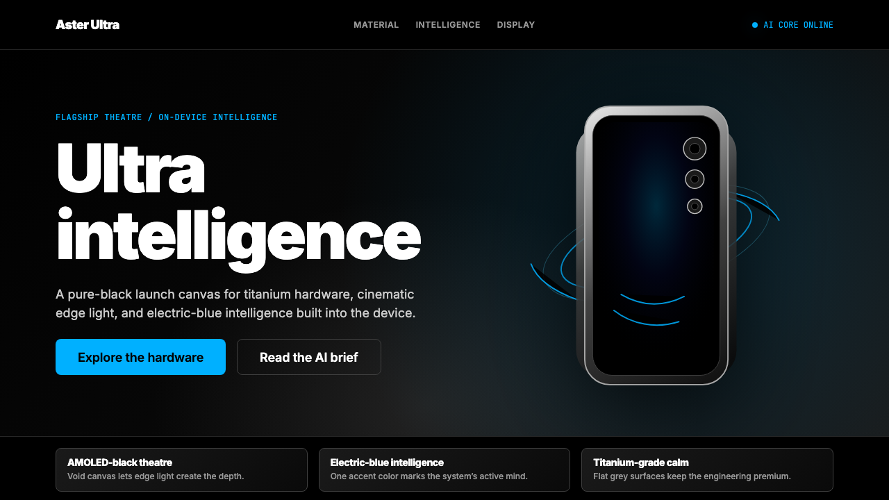 Samsung GalaxyTech-luxury goes black. Electric blue cuts through AMOLED void and titanium-g…科技奢华坠入纯黑。电光蓝切开AMOLED黑场与钛灰几何。
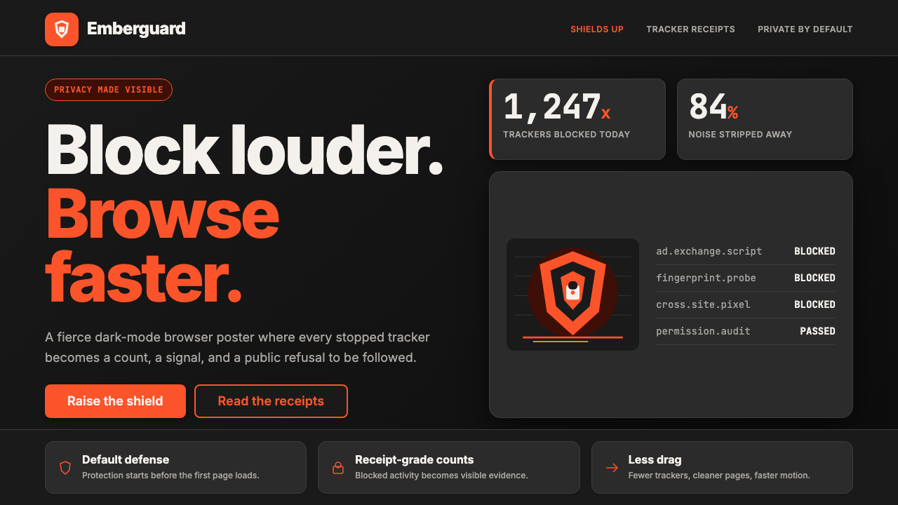 Brave Browser Lion OrangePrivacy gets loud. Lion-orange counters and shield geometry cut through warm…隐私变成宣言:狮橙计数与盾牌几何刺破暖炭黑。
 Cursor IDEAI-first code editor. Pure dark surfaces, off-white text, electric blue reser…以 AI 为核心的代码编辑器:近乎纯黑背景、柔白文字、唯一的电光蓝色专为 AI…
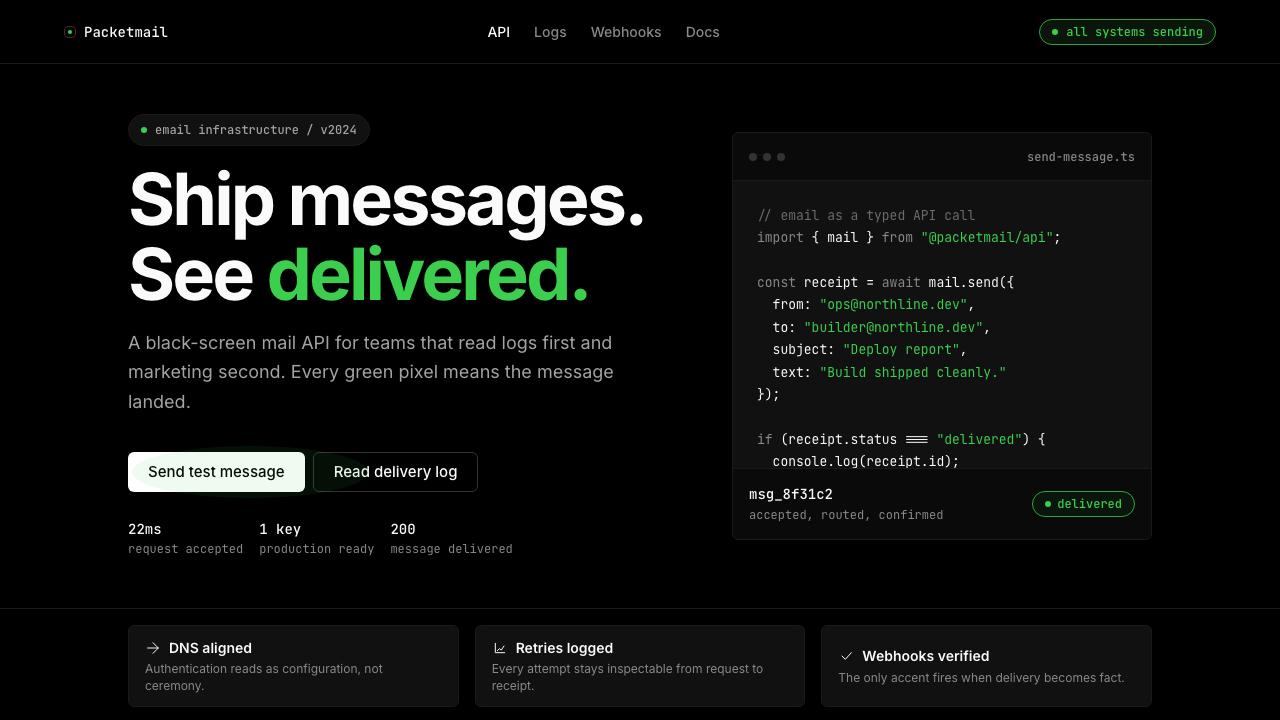 Resend 2024Clean code becomes brand. Pure black, JetBrains Mono, and one green delivered…品牌像 clean code:纯黑、JetBrains Mono、唯一送达绿。
 Vercel 2024Developer luxury by subtraction. Pure black, white Inter, rigid grid, triangu…以删减塑造开发者奢侈感:纯黑白、Inter 字体与刚性网格构成三角发布符号。