What is Samsung Galaxy?什么是 Samsung Galaxy?
Samsung Galaxy turns the smartphone screen into a stage — pure black void, electric-blue intelligence, and titanium-cool geometry performing tech-luxury at stadium scale.三星Galaxy把智能手机屏幕变成了一座舞台——纯黑虚空、电光蓝智能与钛金属几何,在体育场规模上演绎科技奢华。
Samsung Galaxy in briefSamsung Galaxy 速览
Samsung Galaxy is a visual identity system born from over a decade of flagship smartphone competition and refined into its most concentrated form during the Galaxy AI era of 2024. Its design language speaks in three registers simultaneously: the profound darkness of AMOLED display technology, the precision of titanium and aerospace-grade materials, and the electric pulse of artificial intelligence made visible as color. Together these registers produce a brand aesthetic that is simultaneously luxurious and technical — closer in spirit to a high-end audio brand or a performance automobile than to most consumer electronics.三星Galaxy是一套视觉识别体系,历经十余年旗舰智能手机竞争的锤炼,在2024年Galaxy AI时代达到其最凝练的形态。它的设计语言同时在三个维度发声:AMOLED显示技术的深邃黑暗,钛金属与航空级材料的精密质感,以及人工智能以色彩形式呈现的电光脉冲。这三重维度共同构建出一种兼具奢华与技术感的品牌美学——其精神气质更接近高端音频品牌或性能跑车,而非大多数消费电子产品。
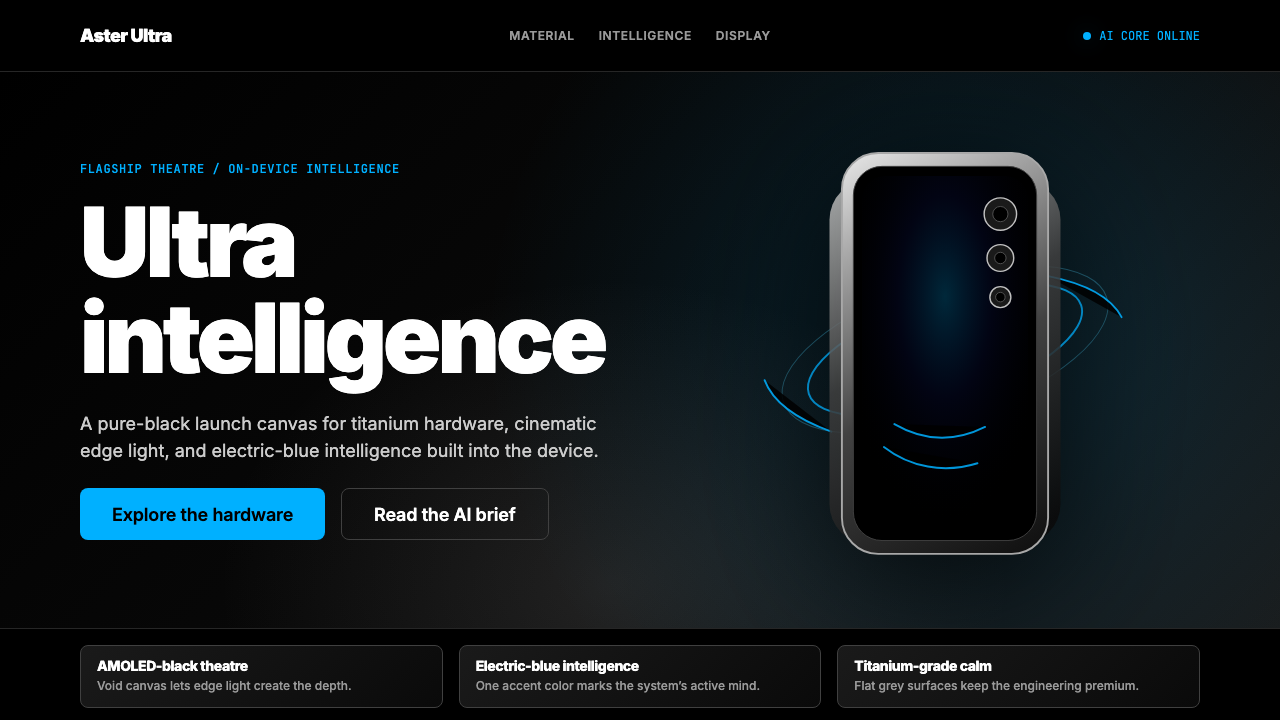
At its core, the Galaxy visual language is a system of controlled drama. Deep, absolute black is not an absence but an active material — the AMOLED panel's ability to produce true zero-light pixels means black carries physical weight in a way that liquid-crystal displays cannot replicate. Against this black, electric blue functions as a signal of intelligence: thin strokes, orbital rings, and radiating lines that suggest energy contained in hardware. Titanium grey and cool metallic tones occupy the middle ground, communicating precision engineering without the flashiness of gold or the coldness of pure silver.Galaxy视觉语言的核心是一套受控的戏剧感。深邃而绝对的黑色不是缺席,而是一种主动的材料——AMOLED面板制造真正零光子像素的能力,赋予了黑色一种液晶屏幕无法复制的物理重量。在这片黑色之上,电光蓝作为智能的信号出现:纤细的线条、轨道环和辐射线,暗示着封印在硬件内部的能量。钛灰色与冷调金属光泽占据中间地带,传递精密工程的信息,却没有金色的浮华或纯银的寒意。
Typography in the Galaxy system is unapologetically massive. Headlines expand to fill entire viewports at extreme weights, treating letterforms as architectural elements rather than text. This approach — borrowed partly from stadium advertising and partly from Korean pop culture's tradition of bold graphic spectacle — ensures that even at the scale of a billboard or a broadcast screen, the message lands with the same force as it does on a phone display. The result is a design system that scales from five-centimeter device bezels to five-meter exhibition walls without losing its essential character.Galaxy体系中的字体排印毫不掩饰地追求巨大尺度。标题在极重字重下扩展填满整个视口,将字形当作建筑元素而非文本来处理。这种手法——部分借鉴自体育场广告,部分源自韩国流行文化大胆图形奇观的传统——确保无论是在广告牌还是广播屏幕的尺度上,信息都能以与手机显示屏上同等的冲击力传达。最终形成的是一套能从五厘米设备边框无缝扩展至五米展览墙面、始终保持核心气质的设计系统。
See the Samsung Galaxy design system查看 Samsung Galaxy 完整设计系统
Where does Samsung Galaxy come from?Samsung Galaxy 从何而来?
The Samsung Galaxy product line was launched in 2010, when Samsung introduced the original Galaxy S as a direct challenge to Apple's iPhone. The early Galaxy visual identity was unsettled — borrowing liberally from then-dominant interface conventions, navigating the constraints of Android customization, and searching for a distinctive brand voice in a market Apple had largely defined. Through the early 2010s, Samsung's design language evolved pragmatically: glossy surfaces, rounded forms, and a palette that shifted with each product generation rather than cohering into a system.三星Galaxy产品线于2010年推出,彼时三星发布原始Galaxy S,直接挑战苹果iPhone。早期Galaxy视觉识别缺乏稳定性——自由借鉴当时主流的界面惯例,在安卓定制的限制中摸索,在一个很大程度上由苹果定义的市场里寻找独特的品牌声音。整个2010年代初期,三星的设计语言以务实的态度演进:光泽表面、圆润形态,色板随每一代产品更迭,而非凝聚为一套系统。
The decisive shift toward the current Galaxy visual language began around 2018 and accelerated through the S20 and S21 series, as Samsung's industrial design team in Seoul moved the hardware toward flatter, more architectural forms. The introduction of the Ultra tier in 2020 — with its S Pen integration and camera array treated as a deliberate design statement rather than an engineering necessity — signaled that Samsung was positioning Galaxy as a luxury technology object rather than a commodity smartphone. The visual language followed the hardware: darker backgrounds, more restrained color use, and photography that treated devices as sculpture.向当前Galaxy视觉语言的决定性转变始于2018年前后,随着S20和S21系列的推出而加速——首尔的三星工业设计团队将硬件推向更加平整、更具建筑感的形态。2020年Ultra系列的引入——其S Pen整合以及被作为刻意设计声明而非工程必要性的摄像头阵列——标志着三星将Galaxy定位为奢华科技物件而非商品化智能手机。视觉语言跟随硬件:更深邃的背景、更克制的用色,以及将设备当作雕塑对待的产品摄影。
The Galaxy AI era of 2024, announced with the S24 series at Samsung's Unpacked event in San Jose, crystallized this trajectory into a complete visual identity. The introduction of on-device artificial intelligence — circle-to-search, live translation, generative editing — demanded a visual language capable of making invisible computation feel tangible and trustworthy. Electric blue, already present as an accent in earlier Galaxy materials, became the primary signal for AI features: a color that reads as neither the cold blue of corporate technology nor the warm blue of consumer apps, but as something charged and precise.2024年的Galaxy AI时代,随着三星在圣何塞Unpacked发布会上推出S24系列而正式确立,将这一轨迹凝固为完整的视觉身份。设备端人工智能的引入——圈选搜索、实时翻译、生成式编辑——需要一套能让不可见的计算感觉真实可信的视觉语言。电光蓝,在此前的Galaxy物料中已作为强调色存在,成为AI功能的主要信号色:这种蓝色既不像企业技术的冷蓝,也不像消费类应用的暖蓝,而是一种充满电荷感与精准感的颜色。
The geographic and cultural roots of the Galaxy visual language are inseparable from Seoul's position in global consumer culture. Samsung's brand and design teams operate from the city that also produces some of the most visually sophisticated entertainment media in the world — the scale, boldness, and cinematic production values of Korean pop culture's visual output are legible in Galaxy marketing, from the monumental scale of launch events to the theatrical lighting of product photography. This is not coincidence: the design language deliberately draws on the tradition of spectacle that Korean creative industries have developed over decades, translating it into a technology brand context where drama and precision must coexist.Galaxy视觉语言的地理与文化根源与首尔在全球消费文化中的地位密不可分。三星的品牌与设计团队在这座城市运作——而这座城市同时也产出了世界上视觉最为精密的娱乐媒体。韩国流行文化视觉产出的规模、大胆与电影级制作价值,在Galaxy营销物料中清晰可辨,从发布活动的纪念碑式规模,到产品摄影的剧场式打光,无不如此。这并非巧合:这套设计语言刻意汲取了韩国创意产业数十年积累的奇观传统,将其转化为科技品牌的语境,在那里戏剧感与精准度必须共存。
What defines the Samsung Galaxy look?Samsung Galaxy 的视觉特征是什么?
AMOLED Black as MaterialAMOLED黑色作为材料
The Galaxy palette treats black not as a neutral backdrop but as an active, physical material. This distinction matters: the deep black of an AMOLED display carries an optical weight that printed black or LCD-simulated black cannot replicate, and the Galaxy visual system is calibrated to this specific quality. Compositions are built outward from black, with every other element — metallic highlight, electric accent, typographic mass — existing in relationship to it rather than on top of it. When the same design is reproduced in lighter contexts, the entire spatial logic shifts, and compensatory adjustments are necessary.Galaxy色板将黑色视为一种主动的、有物理质感的材料,而非中性背景。这一区别至关重要:AMOLED显示屏的深邃黑色携带着一种印刷黑色或液晶模拟黑色无法复制的视觉重量,而Galaxy视觉系统正是针对这种特定品质而校准的。构图从黑色向外生长,其他所有元素——金属高光、电光强调色、排印质量——都与黑色建立关系,而非简单地叠加在其上。当同一设计在更浅色的语境中复现时,整个空间逻辑会随之改变,需要相应的补偿调整。
Electric Blue as Intelligence Signal电光蓝作为智能信号
Blue in the Galaxy system is not decorative — it carries functional meaning. Saturated and slightly shifted toward cyan, this electric blue reads as energy made visible: it appears on AI feature callouts, on interactive indicators, on orbital diagrams representing connectivity, and on the glowing rings and lines in product photography that suggest the device is alive with computation. Used sparingly and consistently, it functions as a punctuation mark — the moment where the design tells you something intelligent is happening. Overuse destroys this signal value; the system depends on restraint.在Galaxy体系中,蓝色不是装饰性的——它承载功能性含义。这种高饱和度、略微偏向青色的电光蓝,作为可见化的能量出现:见于AI功能标注、交互指示符、表征连接性的轨道图,以及产品摄影中暗示设备正在进行计算的发光环与线条。克制而一致地使用,它的功能如同标点符号——设计在这一刻告诉你:有智能正在发生。过度使用会摧毁这种信号价值;整个系统依赖于这种克制。
Titanium and Metallic Texture钛金属与金属质感
Between the absolute black and the electric accent sits a range of cool metallic tones — the brushed, slightly warm silver of titanium hardware and the cooler grey of aerospace engineering. These tones are rendered in the visual identity through gradients that simulate anisotropic reflection: light that shifts directionally across a surface, as it does on machined metal, rather than as a uniform highlight. This specific texture communicates precision manufacturing and signals that the object has been made with the same care as a watch movement or a camera lens — luxury associations that distinguish Galaxy from competitors who rely on plastic or unfinished aluminum.在绝对黑色与电光强调色之间,存在一系列冷调金属色——钛金属硬件略带暖意的拉丝银,以及航空工程更冷的灰调。这些色调在视觉识别中通过模拟各向异性反射的渐变来呈现:光线在表面上随方向变化,如同在机加工金属上一样,而非均匀高光。这种特定质感传递了精密制造的信息,暗示该物件是以制表机芯或相机镜头同等的精心程度打造的——这些奢侈品联想将Galaxy与那些依赖塑料或未精加工铝材的竞争者区别开来。
Monumental Typography纪念碑式排印
Headlines in the Galaxy design language operate at extremes of scale and weight. Type fills the viewport — not as a layout decision but as an architectural one, treating the letterform itself as the visual event. This approach requires typefaces with strong geometric construction and extreme optical performance at large sizes; the Samsung One typeface was developed partly to satisfy these requirements across the multilingual demands of a global brand. The scale also creates a specific reading experience: at very large sizes, letters become shapes before they become words, and the viewer moves from overall composition to legible message as they focus in.Galaxy设计语言中的标题字以极端的尺度与字重运作。文字填满视口——不是一种版面决定,而是一种建筑决定,将字形本身视为视觉事件。这种方式要求字体具备强劲的几何构造和在大尺寸下的极佳光学表现;Samsung One字体的开发部分正是为了满足这些要求,同时应对全球品牌多语言的需求。这种尺度同时创造了一种特定的阅读体验:在极大尺寸下,字母在成为文字之前先成为形状,观看者随着聚焦而从整体构图移向可读信息。
Cinematic Product Photography电影级产品摄影
Galaxy product photography treats the device as a protagonist in a narrative rather than an object on display. Devices float in deep space, illuminated by controlled, directional light that emphasizes material boundaries — the edge where glass meets titanium, the optical geometry of the camera array. Glowing halos and light trails are added in post-production to suggest energy emanating from the hardware. The compositional language borrows from science fiction film design and high-end automotive photography: isolation, drama, and a sense that the object under observation is capable of more than it is currently revealing.Galaxy产品摄影将设备视为叙事中的主角,而非展示中的物件。设备漂浮于深邃的空间中,被受控的方向性光线照亮,强调材料边界——玻璃与钛金属相接的边缘,摄像头阵列的光学几何。发光光晕与光轨在后期制作中添加,暗示硬件散发的能量。构图语言借鉴自科幻电影设计与高端汽车摄影:隔离感、戏剧感,以及一种被观察物体尚未完全展现其能力的神秘感。
Spatial Depth and Layering空间纵深与层次叠加
Unlike design systems that enforce flatness as a principle, the Galaxy visual language actively constructs depth — but does so through precise means. Layers are separated by sharp light and shadow rather than by soft blur or elevation values. Foreground elements have hard, specular edges; background elements are dark and recede into the void. This creates a theatrical sense of space, as if the composition is a stage set lit for maximum drama rather than a document designed for readability. The technique works at its best in video and animation, where movement through layers reinforces the sense of engineered depth.与将平面性作为原则的设计系统不同,Galaxy视觉语言主动构建纵深——但通过精确的手段来实现。层次之间以清晰的光影分离,而非以柔和模糊或高度值分隔。前景元素有清晰的镜面边缘;背景元素暗沉,消隐入虚空。这营造出一种剧场式的空间感,仿佛构图是为最大戏剧效果而打光的舞台布景,而非为可读性而设计的文档。这种技法在视频与动效中表现最佳,穿越层次的运动强化了精密工程式纵深的感觉。
Restrained Accent Economy克制的强调色经济
The Galaxy system uses its electric blue accent with a discipline that is as important as its presence. In a composition dominated by black and metallic tones, a single vivid accent carries enormous visual weight — and the system leverages this by deploying the accent only at moments of semantic importance: a feature name, an interactive affordance, a product tier callout. Accent overuse collapses this hierarchy instantly; the viewer's eye can no longer distinguish signal from decoration. Designers applying this system must develop a deliberate economy of emphasis, treating the accent color as a finite resource to be spent, not an aesthetic default.Galaxy体系使用电光蓝强调色时的纪律感,与该色彩的存在同等重要。在以黑色与金属色调为主导的构图中,单一一抹鲜明强调色承载着巨大的视觉重量——系统通过只在语义重要的时刻部署强调色来利用这一特性:功能名称、交互可供性、产品层级标注。强调色的过度使用会即刻瓦解这一层级;观看者的眼睛再也无法区分信号与装饰。应用这套系统的设计师必须建立一种刻意的强调经济学,将强调色视为有限资源来支出,而非美学默认值。
See the Samsung Galaxy design system查看 Samsung Galaxy 完整设计系统
Who shaped Samsung Galaxy?谁塑造了 Samsung Galaxy?
TM Roh became President and Head of Samsung's Mobile eXperience division in 2019, overseeing the hardware and software direction of the Galaxy product line during its most significant design repositioning. Under his leadership, Samsung moved the Galaxy brand decisively upmarket — introducing the Ultra tier, deepening the integration between hardware design and software identity, and overseeing the 2024 Galaxy AI launch that crystallized the current visual language. Roh has been the most visible executive advocate for treating Galaxy as a luxury technology brand rather than a volume smartphone business.TM Roh于2019年出任三星移动体验事业部总裁兼负责人,在Galaxy产品线最重要的设计重新定位期间主导了硬件与软件方向。在他的领导下,三星将Galaxy品牌果断向高端市场推进——引入Ultra系列,深化硬件设计与软件身份的整合,并主导了2024年Galaxy AI的发布,将当前视觉语言凝固成形。Roh是将Galaxy视为奢华科技品牌而非走量智能手机业务的最具代言性的高管倡导者。
The Samsung global brand team, working from Suwon and Seoul, is responsible for the visual identity system that underpins all Galaxy marketing and product communication. This team's work includes the development of Samsung One — the bespoke typeface commissioned to satisfy the demands of the Galaxy design language at monumental scale across Latin, Korean, and other scripts — and the systematic definition of the AMOLED black palette, the electric blue AI accent color, and the metallic texture vocabulary. Their work represents one of the most significant corporate identity investments in Korean industrial history.三星全球品牌团队在水原和首尔运营,负责支撑所有Galaxy营销与产品传播的视觉识别系统。该团队的工作包括Samsung One字体的开发——这款定制字体的委托正是为了在拉丁文、韩文及其他文字中满足Galaxy设计语言在纪念碑式尺度上的需求——以及对AMOLED黑色色板、电光蓝AI强调色与金属质感词汇的系统性定义。这项工作代表了韩国工业史上最重要的企业视觉识别投入之一。
Samsung Design Seoul is the in-house design organization responsible for the holistic product experience of Galaxy devices — the intersection of physical industrial design, software interface, and brand communication. Designers at SDS have navigated the complex challenge of creating a coherent visual identity across a product portfolio that includes budget devices, flagship phones, foldables, tablets, and wearables. The consistency of the Galaxy visual language across this range — the ability of a consumer to recognize a Galaxy device from its design alone — represents the cumulative output of the SDS team's work over multiple product generations.三星首尔设计中心(SDS)是负责Galaxy设备整体产品体验的内部设计组织——物理工业设计、软件界面与品牌传播的交汇点。SDS的设计师们应对了一项复杂挑战:在涵盖入门机型、旗舰手机、折叠屏、平板与可穿戴设备的产品组合中创造连贯的视觉识别。Galaxy视觉语言在这一范围内的一致性——消费者仅凭设计即可辨认Galaxy设备的能力——代表了SDS团队历经多个产品世代的累积成果。
The 2024 Galaxy AI campaign represents the most concentrated and deliberate expression of the Galaxy visual language to date. The creative direction — applied across global broadcast, digital, and out-of-home channels simultaneously — deployed the electric blue AI accent as a narrative device: a color that appeared wherever AI capability was being demonstrated, creating a visual shorthand that trained audiences to associate the hue with intelligence before any feature was explained. The campaign's visual coherence, maintained across dozens of markets and multiple languages, demonstrates the maturity of the Galaxy design system as a global communication tool.2024年Galaxy AI广告战役代表了迄今为止Galaxy视觉语言最集中、最刻意的表达。这一创意方向——同时应用于全球广播、数字与户外渠道——将电光蓝AI强调色作为叙事装置部署:每当展示AI能力时,这种颜色就会出现,在任何功能被解释之前,就已训练受众将这种色调与智能联系起来。这场战役在数十个市场、多种语言中保持的视觉连贯性,证明了Galaxy设计系统作为全球传播工具的成熟度。
How do you use Samsung Galaxy today?今天怎么用 Samsung Galaxy?
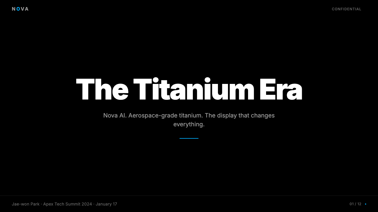
The Galaxy design language translates effectively to presentation work when its core logic is preserved: deep backgrounds, a restrained palette of near-black, cool metallic mid-tones, and a single vivid accent deployed sparingly. Cover slides work well with full-bleed dark fields where the title typography operates at maximum weight and scale, letterforms expanding to claim the entire frame. Supporting visuals — product renders, orbital diagrams, abstract light-trail imagery — float in the dark field rather than sitting in bounded containers. The impression should be cinematic: the slide is a frame of a film, not a page in a document.当其核心逻辑得到保留时,Galaxy设计语言能有效地转化为演示文稿作品:深色背景、由近黑色、冷调金属中间色与单一鲜明强调色构成的克制色板,强调色被节制地部署。封面页适合采用全出血深色底面,标题排印以最大字重和尺度运作,字形扩展以占据整个画面。辅助视觉——产品渲染图、轨道图、抽象光轨图像——漂浮于深色底面中,而非置于有边界的容器里。整体印象应当是电影式的:幻灯片是一帧电影画面,而非文档中的一页。
Content slides in this system require discipline. The natural temptation is to match the cover's dramatic weight throughout, but this exhausts the viewer — drama requires contrast, and contrast requires restraint on the majority of pages. Body content slides should reduce the visual intensity: lighter type weights, more generous spacing, content organized on a clear grid. The vivid accent appears only at moments of genuine semantic emphasis — a key statistic, a product tier name, an action item — not as ambient decoration. Data visualizations in this system are most effective when treated as product photography: bars and lines rendered with the same precision as a hardware edge, thin and deliberate, against a dark ground.这套系统中的内容页需要纪律感。自然的诱惑是在整个演示中保持封面的戏剧性重量,但这会令观看者疲惫——戏剧感需要对比,而对比需要在大多数页面上保持克制。正文内容页应降低视觉强度:更轻的字重、更充裕的间距、内容在清晰网格上组织。鲜明强调色只在真正具有语义重要性的时刻出现——关键数据、产品层级名称、行动项——而非作为环境装饰。这套系统中的数据可视化在被当作产品摄影处理时最为有效:柱形与线条以与硬件边缘同等的精准度渲染——纤细而刻意,置于深色底面上。
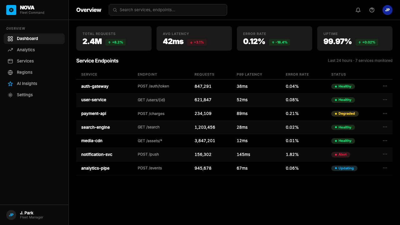
For web interfaces and dashboards, the Galaxy approach produces work that reads as authoritative and technologically precise. The system is well-suited to analytics platforms, security products, developer tools, and any interface where the user needs to feel that the software is as capable and as engineered as the most sophisticated hardware. Apply a dark or near-dark base, use cool metallic tones for secondary elements, and reserve the vivid accent for interactive states and critical alerts. Card components work well with visible border highlights rather than soft shadows — the edge is structural, not atmospheric. Navigation and labeling should be direct and typographically clean, with no decorative iconography beyond functional geometric indicators.对于网页界面与仪表板,Galaxy方式产出的作品读来权威而技术精准。这套系统非常适合分析平台、安全产品、开发工具,以及任何用户需要感受到软件与最精密硬件同等能力与工程水准的界面。应用深色或近深色底面,将冷调金属色用于次要元素,将鲜明强调色保留给交互状态与关键警报。卡片组件配合可见边框高光而非柔和阴影效果更好——边缘是结构性的,而非氛围性的。导航与标签应直接、排印清晰,除功能性几何指示符外无装饰性图标。
In editorial and marketing contexts, the Galaxy language supports a very specific kind of authority — technological, aspirational, and global rather than warm or approachable. Feature announcements, product launch pages, and technology editorial that wants to signal capability and precision are natural fits. Full-bleed dark hero sections with monumental type sit above more detailed content sections where the visual intensity relaxes. Accent colors in calls to action should remain consistent with the overall system rather than switching to a warmer or higher-contrast alternative. Marketing materials that need to communicate AI capability specifically can adopt the orbital and radiating-line motifs that the Galaxy system uses to visualize intelligence — but these should feel engineered, not decorative.在编辑与营销语境中,Galaxy语言支持一种非常特定的权威感——技术性的、充满抱负的、全球化的,而非温暖或平易近人的。功能发布、产品上市页面,以及希望传递能力与精准感的科技编辑内容,都是天然的契合场景。全出血深色英雄区块配以纪念碑式排印,置于视觉强度放松的更详细内容区块之上。行动号召中的强调色应与整体系统保持一致,而非切换为更暖或更高对比度的替代方案。需要专门传达AI能力的营销物料可以采用Galaxy系统用于可视化智能的轨道与辐射线母题——但这些应感觉是工程化的,而非装饰性的。
The most common mistake when applying Galaxy-influenced design is the loss of restraint: using the electric accent across too many elements, rendering metallic textures too uniformly across all surfaces, or filling every composition with the full range of the palette simultaneously. The system's drama depends entirely on the ratio of darkness to accent — once that ratio collapses into visual noise, the effect reads not as tech-luxury but as dated consumer electronics. A second common error is applying the deep-black, AMOLED-first logic to contexts where it creates contrast issues: light-background interfaces, print, or low-brightness display environments require careful adaptation rather than direct transposition of the dark-field rules.应用Galaxy启发设计时最常见的错误是克制感的丧失:将电光强调色使用于过多元素,将金属质感过于均匀地渲染于所有表面,或将色板的全部范围同时填满每一个构图。这套系统的戏剧感完全依赖于黑暗与强调色之间的比例——一旦这一比例崩溃为视觉噪音,效果读来便不再是科技奢华,而是过时的消费电子。第二个常见错误是将深黑色、AMOLED优先的逻辑应用于它会产生对比度问题的语境:浅色背景界面、印刷品或低亮度显示环境,需要仔细适配,而非直接照搬深色底面规则。
See the Samsung Galaxy design system查看 Samsung Galaxy 完整设计系统
Samsung Galaxy — FAQSamsung Galaxy · 常见问题
Can Galaxy design work on a light or white background?Galaxy设计语言能在浅色或白色背景上使用吗?
The system was built for dark backgrounds, and transposing it to white or cream requires substantive adaptation rather than a simple inversion. On a light ground, the electric blue accent loses much of its drama — it reads as a pleasant corporate accent rather than a signal of charged intelligence. The metallic tones also lose their contrast relationship with the background and may appear flat. A light-background adaptation works best when it treats the system as a family of cool, precise tones — slate greys, brushed silvers, and a desaturated or deeper blue as the accent — rather than attempting to replicate the drama of the AMOLED dark-field original. Think of it as the same product in daylight rather than in a darkened theatre.这套系统是为深色背景而建立的,将其转置到白色或奶油色背景上需要实质性的适配,而非简单的色调反转。在浅色底面上,电光蓝强调色失去了大部分戏剧感——它读来像是令人愉悦的企业强调色,而非充满电荷的智能信号。金属色调也失去了与背景的对比关系,可能显得平淡。浅色背景的适配版本最有效的方式是:将这套系统视为一组冷调、精准的色调家族——石板灰、拉丝银,以及更暗或去饱和的蓝色作为强调色——而非试图在浅色底面上复制AMOLED深色底面的戏剧感。可以把它理解为同一件产品在日光下而非在幽暗剧场中的呈现。
How does Galaxy design differ from other dark-mode tech aesthetics?Galaxy设计语言与其他深色模式科技美学有何不同?
Several major technology brands have developed dark-first design languages, but Galaxy is distinguished by a specific combination of elements: the AMOLED-calibrated depth of its black (deeper and more absolute than most dark interfaces), the electric-blue accent specifically coded to mean artificial intelligence rather than simply 'technology', and the cinematic scale of its typography and photography. Competitor dark-mode systems tend toward softer greys, warmer neutral tones, or rely on gradient-heavy depth simulation. Galaxy is drier, colder, and more architectural — it has more in common with the visual language of precision instruments or aerospace design than with the warm-dark aesthetic of entertainment streaming platforms or the gradient-rich dark UI of audio applications.几个主要科技品牌都开发了以深色为优先的设计语言,但Galaxy以一种特定的元素组合脱颖而出:其黑色经过AMOLED校准的深度(比大多数深色界面更深、更绝对),专门编码为代表人工智能而非单纯「技术」的电光蓝强调色,以及其排印与摄影的电影级尺度。竞争对手的深色模式系统倾向于更柔和的灰色、更温暖的中性色调,或依赖富含渐变的纵深模拟。Galaxy更干燥、更冷峻、更具建筑感——它与精密仪器或航空航天设计的视觉语言的共同点,多于与娱乐流媒体平台的温暖深色美学或音频应用渐变丰富的深色界面的共同点。
Is the monumental type scale essential, or can Galaxy design work with more moderate typography?纪念碑式的字体尺度是否不可或缺,还是说Galaxy设计语言可以在更适中的排印中运作?
The monumental scale is one of the most distinctive aspects of the Galaxy system, but it is not universally mandatory — it is a device appropriate to certain moments, not a rule for every element. In practice, the system operates across a wide range of scales: marketing materials and launch communications use typography at extreme sizes, but product interfaces and documentation use more measured, functional type hierarchies. What is essential is not the extreme scale itself but the contrast principle that motivates it: within any composition, the ratio between the largest and smallest typographic elements should be dramatic. Whether that means a very large headline and a small body, or a medium headline and a very small caption, the system's energy comes from the tension between scales, not from absolute size.纪念碑式的尺度是Galaxy系统最具标志性的方面之一,但它并非在所有情况下都是强制性的——它是适用于特定时刻的手法,而非每个元素的规则。实践中,这套系统在广泛的尺度范围内运作:营销物料与发布传播使用极大尺寸的排印,但产品界面与文档则使用更为克制的功能性字体层级。本质上不可或缺的不是极端尺度本身,而是驱动它的对比原则:在任何构图中,最大与最小排印元素之间的比例都应当是戏剧性的。无论是非常大的标题配以小号正文,还是中等标题配以非常小的说明文字,这套系统的能量来自尺度之间的张力,而非绝对大小。
What kinds of products or brands should avoid the Galaxy visual language?哪些类型的产品或品牌应该避免使用Galaxy视觉语言?
The Galaxy language is optimized for products where precision, power, and technological sophistication are the primary brand values. It is poorly suited to contexts that require warmth, accessibility, or cultural softness: healthcare applications where patients need reassurance, children's products, food and beverage brands where sensory richness matters, wellness services, community platforms, and any brand positioning that depends on approachability over authority. The design language's coldness and architectural scale can also create accessibility challenges — very dark backgrounds with fine metallic detail push contrast ratios in ways that may not meet accessibility standards without careful calibration. Brands built on heritage, craft, or natural materials will also find the Galaxy system's technological industrial aesthetic fundamentally incompatible with their identity.Galaxy语言针对精准、力量与技术精密性是主要品牌价值的产品而优化。它不适合需要温暖感、可及性或文化柔和度的语境:需要给患者以安心感的医疗健康应用、儿童产品、感官丰富性至关重要的食品与饮料品牌、健康服务、社区平台,以及任何品牌定位依赖亲切感而非权威感的场景。这套设计语言的冷峻感与建筑式尺度也可能带来无障碍挑战——在非常深色的背景上配以精细的金属细节,对比度比值的处理方式可能未经仔细校准便无法满足无障碍标准。建立在传承、工艺或天然材料之上的品牌,也会发现Galaxy系统的技术工业美学与其身份根本不相容。
How should the orbital and radiating-line motifs be used without becoming clichéd?应如何使用轨道与辐射线母题,才能避免沦为陈腐套路?
The orbital rings, radiating lines, and particle-trail motifs that appear throughout Galaxy AI communications are functional at their best — they visualize invisible processes, make computation visible, and give form to the concept of intelligence distributed through hardware. They become clichéd when used generically as 'tech decoration' rather than in direct relationship to a specific capability being communicated. The discipline is to use them only when they are earning their place: when the visual is explaining something about connectivity, computation, or spatial awareness, the motif supports the communication. When it is simply filling visual space or signaling 'this is technology' without further specificity, it contributes noise rather than meaning. Applied sparingly and with clear semantic intent, these motifs remain powerful; applied liberally, they collapse into the visual vocabulary of every undifferentiated tech brand.贯穿Galaxy AI传播物料的轨道环、辐射线与粒子轨迹母题,在其最佳状态下是有功能性的——它们可视化不可见的过程,使计算变得可见,赋予分布于硬件中的智能概念以形态。当它们被泛泛地用作「科技装饰」,而非与正在传达的具体能力建立直接关系时,便会沦为陈腐套路。纪律在于:只有当它们正在赢得自己的位置时才使用——当视觉正在解释某种关于连接性、计算或空间感知的内容时,这一母题支持传达。当它只是填充视觉空间,或在没有进一步具体性的情况下只是发出「这是科技」的信号时,它带来的是噪音而非意义。克制地使用并具有清晰的语义意图,这些母题保持强大;大量使用,则会崩溃为每一个缺乏差异化的科技品牌的视觉词汇。
Related design styles相关设计风格
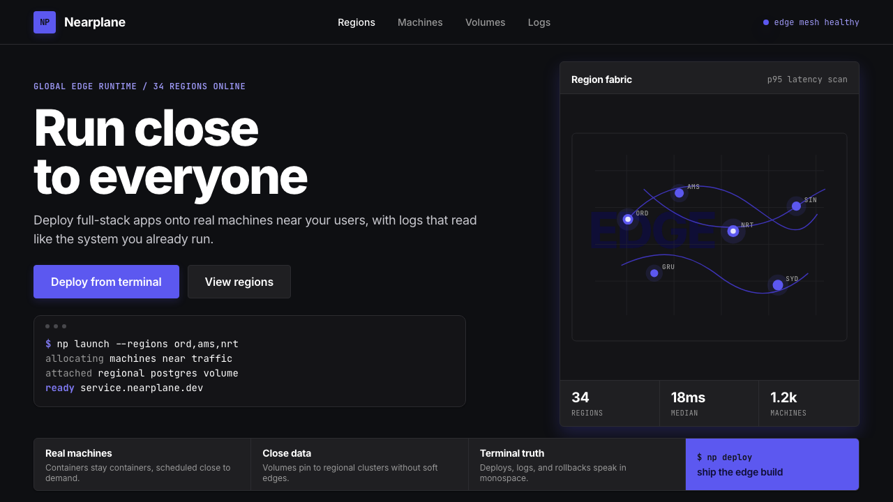 Fly.io Edge-Compute PurpleEdge-cloud with discipline. Electric purple nodes, Inter type, and terminal b…克制的边缘云:深黑底、电紫节点、Inter 字体与终端块。
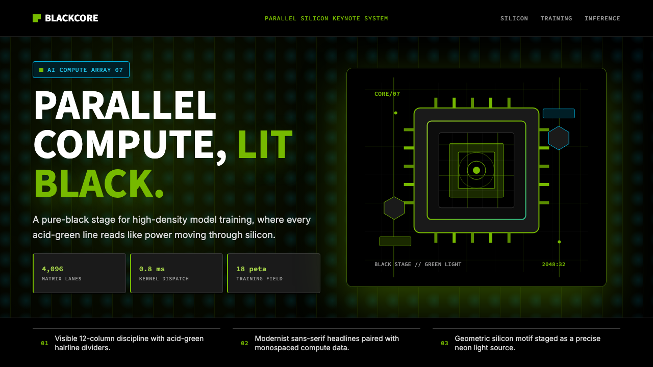 NVIDIA GPU Green-BlackPure black turns compute theatrical. Acid green hairlines and chip geometry s…纯黑让算力成舞台。酸绿细线与芯片几何制造光感。
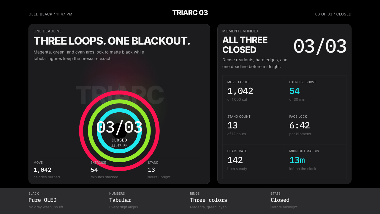 Apple Fitness Rings Closed (2024)Midnight feels exact. Magenta, green, and cyan rings lock onto OLED black.午夜像被校准。洋红、绿、青三环锁在黑底上。
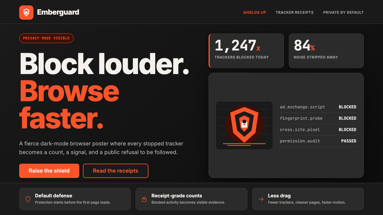 Brave Browser Lion OrangePrivacy gets loud. Lion-orange counters and shield geometry cut through warm…隐私变成宣言:狮橙计数与盾牌几何刺破暖炭黑。
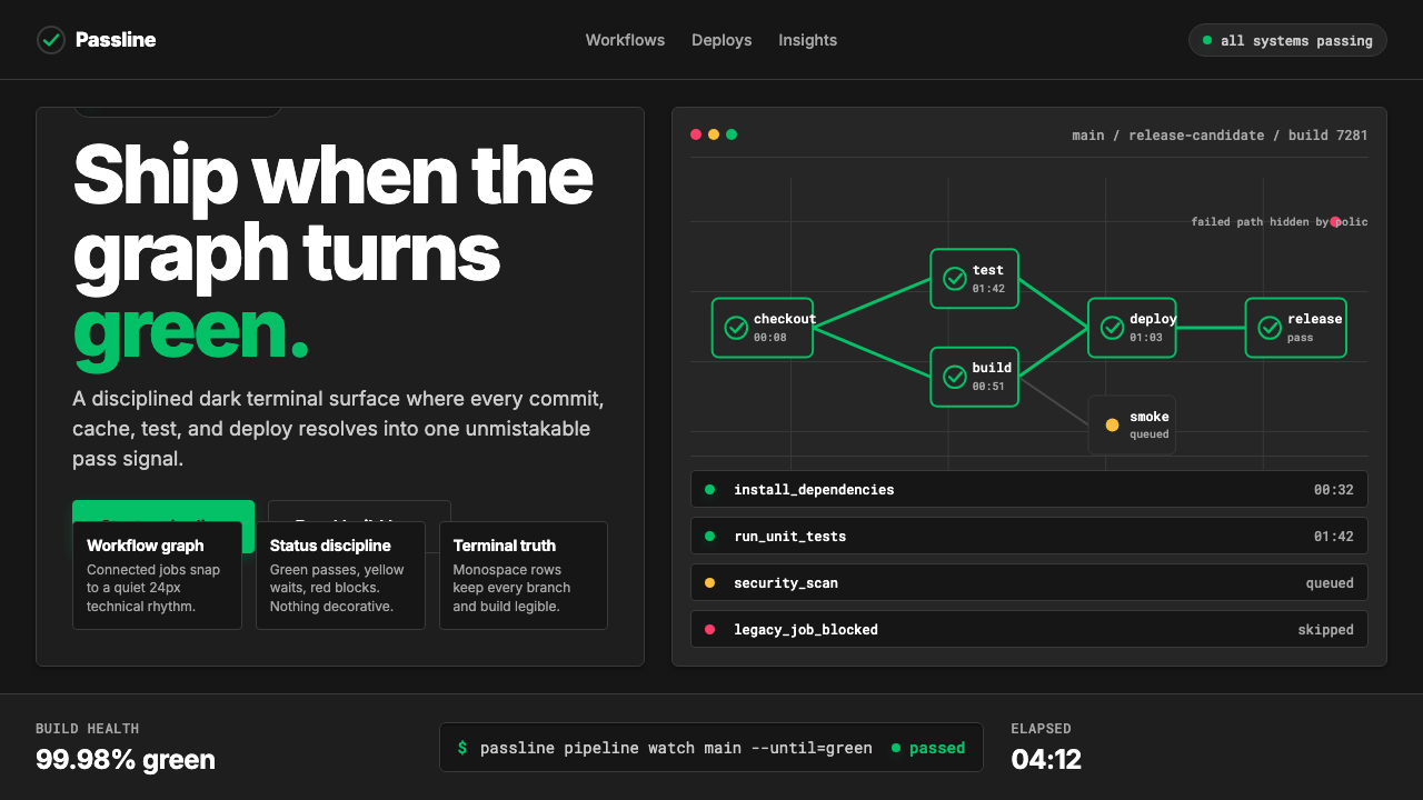 CircleCI Pipeline-GreenConfidence goes green. Emerald status lines cut through terminal-black pipeli…信心变绿。翠绿状态线切过终端黑流水线网格。
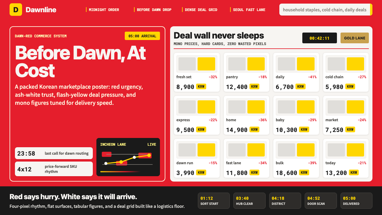 Coupang Rocket DeliveryUrgency made trustworthy. Rocket red, flash yellow, mono prices and packed gr…可信的紧迫感。火箭红、闪黄价格与密集网格推进速度。