What is Dune Arrakis (Villeneuve)?什么是 Dune Arrakis (Villeneuve)?
Denis Villeneuve's Dune gave science fiction a new visual law: monumental silence, sand-ochre plains, and a single cold spice-blue accent against infinite dark.维伦纽瓦的《沙丘》为科幻美学立下了新的视觉律令:纪念碑式的沉默、沙赭色的旷野,以及无尽黑暗中唯一一点冷冽的香料蓝。
Dune Arrakis (Villeneuve) in briefDune Arrakis (Villeneuve) 速览
The Dune Arrakis visual style is the cinematic design language developed for Denis Villeneuve's 2021 and 2024 adaptations of Frank Herbert's novel. It is defined by three chromatic forces — the warm sand-ochre of the desert planet Arrakis, the deep saturated blue of the spice melange, and the near-absolute darkness that surrounds them both — combined with brutalist architectural forms, vast scaleless interiors, and letter-spaced geometric sans-serif typography that reads like carved stone.沙丘·厄拉科斯视觉风格,是维伦纽瓦为2021年和2024年改编弗兰克·赫伯特原著所发展出的电影设计语言。它由三种色彩力量构成:沙漠星球厄拉科斯的暖沙赭、香料混合体的深沉饱和蓝、以及包裹着前两者的近乎绝对的黑暗——结合粗野主义建筑形态、无垠无尺度的室内空间,以及字距极宽的几何无衬线字体,读来如同凿刻在石壁上的铭文。
What separates this aesthetic from generic dark science fiction is its studied restraint. There is almost no visual noise: no glowing readouts crowding the frame, no lens flare, no kinetic ornamentation. Every composition is organized around monumental flat planes — a sand dune that fills the frame edge to edge, a concrete wall that suggests a cliff face, a shadow line so precise it functions as a layout edge. Production designer Patrice Vermette and cinematographer Greig Fraser constructed an environment where scale itself is the primary expressive tool, and that same principle translates directly to interface and graphic design.这套美学与泛泛的黑暗科幻风格的根本区别,在于它刻意的克制。几乎没有视觉噪音:没有挤满画面的发光读数,没有镜头光晕,没有动态的装饰元素。每一个构图都组织在纪念碑式的大平面之上——一座沙丘从边到边铺满画框,一面混凝土墙暗示着峭壁,一条阴影线精确到可以充当版面边界。制作设计师帕特里斯·维尔梅特和摄影指导格雷格·弗雷泽建构了一个以尺度本身作为首要表现工具的环境,而这一原则可以直接移植到界面和平面设计中。
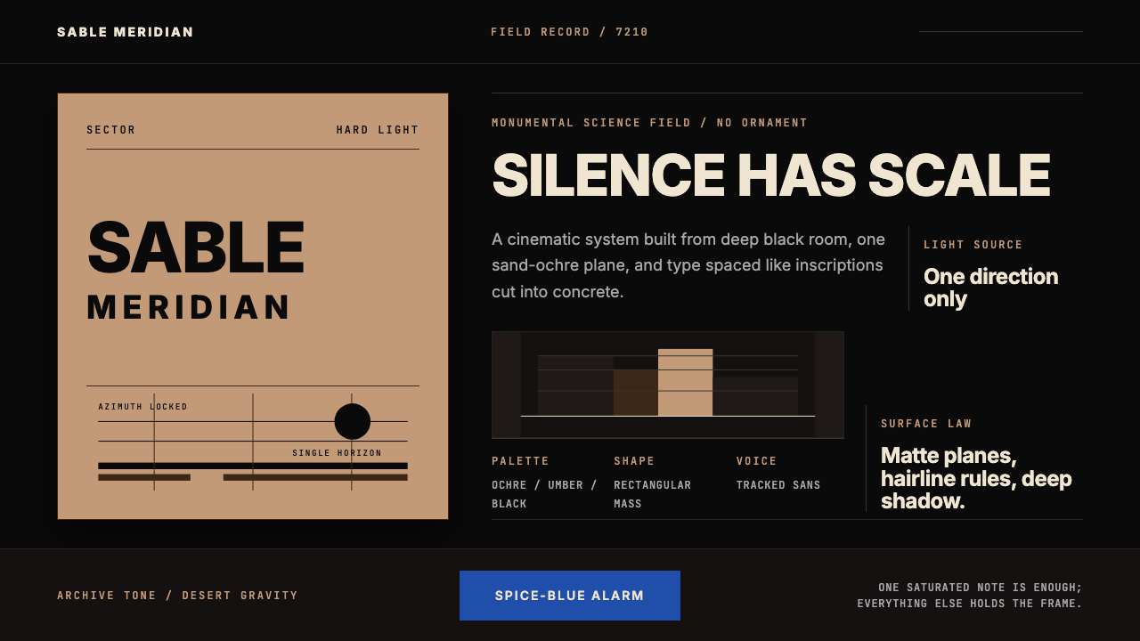
Applied to digital work, the style operates as a severe dark-ground system. A large field of deep near-black holds the composition; a measured band of sand-ochre introduces warmth and structure; a single spice-blue element signals urgency, interaction, or data. Typography is spaced wide and set in geometric forms with no serifs, evoking the inscribed titles in the film's opening sequences. Nothing competes for attention. Everything earns its place by mass and precision rather than by variety or decoration.应用于数字作品时,这种风格以严苛的深底系统运作。大面积深黑持握整个构图;一道沙赭色横带引入温度与结构;一颗香料蓝元素传递紧迫、互动或数据信号。字体以宽字距排布,采用无衬线几何字形,令人联想到影片片头序列中的铭刻标题。没有什么在争夺注意力,一切都以质量和精确度赢得它的位置,而非依靠多样性或装饰。
See the Dune Arrakis (Villeneuve) design system查看 Dune Arrakis (Villeneuve) 完整设计系统
Where does Dune Arrakis (Villeneuve) come from?Dune Arrakis (Villeneuve) 从何而来?
Frank Herbert's Dune was published in 1965 and won the inaugural Nebula Award for Best Novel in 1966. Its visual world — the ochre deserts of Arrakis, the feudal-industrial architecture of House Atreides, the ceremonial robes of the Fremen — was described in precise ecological and anthropological terms rather than in the speculative-baroque vocabulary of most science fiction of the period. Herbert's Arrakis was austere by design: a planet where every calorie of moisture and every gram of resource was meaningful, and where that scarcity shaped culture, architecture, and clothing into forms that were functional before they were beautiful.弗兰克·赫伯特的《沙丘》出版于1965年,并于1966年荣获首届星云奖最佳长篇小说奖。其视觉世界——厄拉科斯的赭色沙漠、亚崔迪家族的封建-工业建筑、弗雷曼人的礼仪长袍——以精确的生态学与人类学语言描绘,而非当时大多数科幻小说惯用的奇观-巴洛克风格。赫伯特的厄拉科斯在设计上是严苛的:一颗每一卡路里的水分和每一克资源都意义重大的星球,而这种稀缺性将文化、建筑与服装塑造成了先于美学而具备功能的形态。
Denis Villeneuve began developing his adaptation in the mid-2010s with a deliberate mandate to reject the visual conventions of blockbuster science fiction. He assembled a core creative team centered on production designer Patrice Vermette and cinematographer Greig Fraser. Vermette drew on brutalist and modernist architecture — particularly the concrete monumentalism of Soviet-era civic buildings and the severe geometric forms of Louis Kahn and Marcel Breuer — to design the interiors and exteriors of Giedi Prime, Caladan, and Arrakis. The guiding principle was scale without ornament: surfaces that implied immense constructive effort while refusing decorative finish.维伦纽瓦于2010年代中期开始筹备改编,带着一个明确的使命:拒绝商业科幻电影的视觉惯例。他以制作设计师帕特里斯·维尔梅特和摄影指导格雷格·弗雷泽为核心组建创作团队。维尔梅特借鉴粗野主义与现代主义建筑——尤其是苏联时期公共建筑的混凝土纪念性,以及路易·卡恩与马塞尔·布劳耶的严苛几何形态——来设计基地普莱姆、卡拉丹与厄拉科斯的室内外空间。指导原则是:无装饰的尺度——那些表面暗示着巨大的建造努力,却拒绝任何装饰性的收尾。
Greig Fraser's cinematography translated Vermette's sets into a color language of deliberate restriction. The Arrakis sequences were shot to emphasize a narrow warm spectrum — sandy ochres, burnt siennas, the pale gold of morning light — punctuated by the cold teal-blue of the spice itself or of interior artificial lighting. Fraser avoided digital color grading techniques that would introduce saturation complexity; the palette reads as austere because it was captured austerely. This approach earned Fraser the Academy Award for Best Cinematography for Part One in 2022.格雷格·弗雷泽的摄影将维尔梅特的布景转化为有意限制的色彩语言。厄拉科斯场景的拍摄强调一个狭窄的暖色谱——沙质赭色、焦赭棕、清晨阳光的淡金——以香料本身或室内人工照明的冷蓝绿色作为间歇性点缀。弗雷泽避免了会引入饱和度复杂性的数字调色技术;整个色板之所以读来严苛,是因为它被严苛地捕捉。这一方式使弗雷泽荣获2022年第一部第94届奥斯卡最佳摄影奖。
Hans Zimmer's score extended the visual language into sound. Zimmer assembled non-Western instruments, invented new vocal techniques, and worked with artist Chas Smith to eliminate the harmonic richness associated with conventional orchestral science fiction scoring. The result was music that felt geological rather than emotional — a sound design parallel to Vermette's surfaces and Fraser's light. The integration of visual, architectural, and sonic restraint across all departments produced a coherent total aesthetic that was immediately recognizable and entirely unlike its predecessors. It is this total-system coherence — not any single element — that makes the Dune Arrakis style a genuinely referenceable design language.汉斯·季默的配乐将视觉语言延伸至声音维度。季默汇集了非西方乐器,发明了新的声乐技术,并与艺术家查斯·史密斯合作,消除了传统管弦乐科幻配乐中惯有的和声丰富性。结果是一种感觉如地质般而非情感性的音乐——一种与维尔梅特的表面和弗雷泽的光线相平行的声音设计。视觉、建筑与声音上跨所有部门的一体化克制,产生了一套连贯的整体美学,它立即可被识别,又与所有前人截然不同。正是这种全系统的一致性——而非任何单一元素——使沙丘厄拉科斯风格成为一套真正可被参照的设计语言。
What defines the Dune Arrakis (Villeneuve) look?Dune Arrakis (Villeneuve) 的视觉特征是什么?
Color色彩
The palette is built on three notes held in severe proportion: a deep warm near-black as the dominant ground, a sand-ochre drawn from Arrakis desert light as the primary structural accent, and a saturated spice-blue reserved for moments of urgency, highlight, or data signal. These three tones almost never appear in equal measure; the dark ground is always majority, the ochre is used structurally but sparingly, and the blue is a single note that commands attention precisely because it is rare. Secondary warm tones — dusty sienna, pale sand — can appear as subordinate surface variation, but they remain within the warm spectrum and never compete with the blue.色板建立在以严格比例持守的三个音调之上:深暖近黑作为主导底色,取自厄拉科斯沙漠光线的沙赭色作为主要结构性强调,饱和的香料蓝则专为紧迫、高亮或数据信号时刻而保留。这三种色调几乎从不等量出现:深底始终占多数,赭色结构性地使用但很节制,而蓝色是单一音符,正是因为稀少而命令注意力。次级暖调——灰赭、淡沙——可以作为次要表面变化出现,但始终保持在暖色谱内,绝不与蓝色竞争。
Typography字体排印
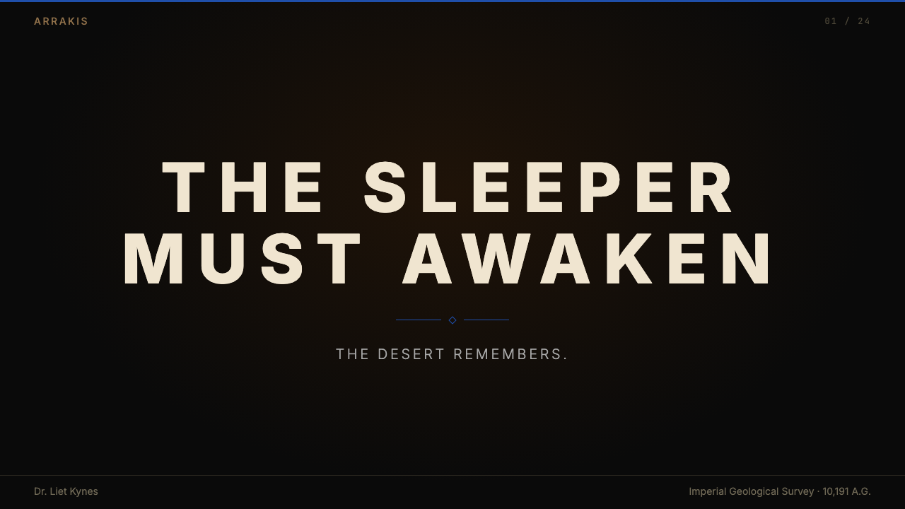
Type in this style is geometric and sans-serif, set at tracking levels wide enough to suggest engraved or architectural lettering rather than printed text. The spacing is not a casual style choice — it references the inscribed titling that appears in the film's chapter headings, which reads as stone-cut monument script. Hierarchy is achieved through scale contrast and weight, not through typeface variety: a headline stands at a dramatically larger size than body text, creating a relationship that feels architectural rather than editorial. All-capitals settings reinforce the monumental register. Type color is almost always the lightest available tone — near-white or pale sand — against the dark ground.这种风格中的字体是几何无衬线字形,字距拉伸到足以令人联想到铭刻或建筑文字而非印刷文本的宽度。这种间距不是随意的风格选择——它参照了影片章节标题中出现的铭刻标题字,读来如同石凿的纪念碑文字。层级通过尺度对比和字重实现,而非通过字体多样性:标题以远大于正文的尺寸矗立,创造出一种建筑性而非编辑性的关系。全大写设置强化了纪念碑式的语调。字体颜色几乎总是最浅的可用色调——近白或淡沙——置于深底之上。
Form and Surface形态与表面
Shapes are massive, rectilinear, and flat. The compositional language borrows directly from the film's brutalist architecture: horizontal bands of solid tone function as structural beams, large dark rectangles hold space the way a concrete wall holds a courtyard, and thin ruled lines serve as precise joints between planes. There is no rounding, no softening of corners, and no organic or curved form unless the curve is deliberate and large-scale — a dome that reads as monumental rather than decorative. Texture, where it appears, is subtle and material-honest: the grain of sand, the surface variation of aged concrete, never applied as decoration but as evidence of process.形态巨大、矩形且平直。构图语言直接借鉴了影片的粗野主义建筑:纯色调的横向色带起着结构横梁的作用,大面积深色矩形以混凝土墙围合庭院的方式持守空间,细规则线充当平面之间精确的接缝。没有圆角,没有对边缘的柔化,没有有机或弧形形态——除非该曲线是刻意的、大尺度的,且读来如纪念碑而非装饰。纹理(若出现)是微妙且材质诚实的:沙粒的颗粒感,陈年混凝土的表面变化,从不作为装饰施加,而是作为过程的证据。
Light and Shadow光线与阴影
Lighting in this style is highly directional and harsh — a single strong source that produces crisp shadow edges with minimal fill. There are no ambient glow effects, no soft diffused lighting halos, no gradient backgrounds that simulate atmospheric depth. Shadows read as solid dark shapes rather than as semi-transparent overlays. This mirrors Fraser's cinematographic approach: light comes from one direction, defines mass, and then steps off abruptly into dark. The result is a visual language where contrast does the work of both hierarchy and atmosphere.这种风格中的光线方向性强、硬朗——单一强光源产生清晰阴影边缘,补光极少。没有环境光晕效果,没有柔和漫射光晕,没有模拟大气深度的渐变背景。阴影读来是实心深色形状,而非半透明叠加层。这映照了弗雷泽的摄影方式:光从一个方向来,定义质量,然后骤然退入黑暗。结果是一套视觉语言,让对比度同时承担层级与氛围的工作。
Scale and Negative Space尺度与负空间
Perhaps the defining characteristic of the Dune Arrakis style is its willingness to leave enormous areas of the composition empty. A figure at the base of a vast wall, a single line of type in the lower quarter of a page, a data point floating in a dark field — all of these reflect the film's compositional logic, in which human scale is persistently dwarfed by environmental scale. This is not minimalism for its own sake; it is a deliberate power relationship built into the layout. Empty space communicates weight, not absence. The viewer or user is meant to feel the scale of what they are encountering.也许沙丘厄拉科斯风格最决定性的特征,是它甘愿让构图的巨大区域保持空旷。一个人物在巨墙底端,一行字体在页面的下四分之一处,一个数据点漂浮在深色域中——所有这些都反映了影片的构图逻辑,在其中人类尺度被环境尺度持续矮化。这不是为了极简而极简;这是植入版面的刻意权力关系。空白空间传递的是重量,而非缺席。观看者或用户应当感受到他们所面对的事物的尺度。
Zero Ornament零装饰
No decorative borders, no illustrative flourishes, no icon families, no badge shapes with rounded corners and gradient fills. If an element cannot be justified by structural or communicative necessity, it should not exist. This discipline is stricter than generic minimalism because it has a thematic rationale: the world of Arrakis does not permit waste. Every calorie of energy in the desert world is meaningful, and the design language inherits this ecology. What survives the edit is not sparse — it is necessary.没有装饰性边框,没有插图式花饰,没有图标家族,没有带圆角和渐变填充的徽章形状。如果一个元素无法以结构性或传达性的必要为正当理由,它就不应存在。这种自律比泛泛的极简主义更为严苛,因为它有主题上的根据:厄拉科斯的世界不允许浪费。沙漠世界里每一卡路里的能量都意义重大,而设计语言继承了这种生态学。经过剪辑后留存下来的,不是稀疏——而是必需。
Monumental Alignment纪念碑式对齐
Compositions are precisely aligned to an underlying structural grid with the rigidity of engineered architecture. Elements sit flush to implied vertical and horizontal axes; there are no casual placements or optical-only adjustments that would introduce softness. Asymmetry is permitted and common, but it is the asymmetry of a building floorplan — purposeful and non-negotiable — not the playful asymmetry of editorial design. This strictness is part of what gives the style its sense of authority and inevitability.构图以工程建筑的刚性精确对齐到下层结构网格。元素齐平于隐含的垂直和水平轴线;没有随意的放置或纯光学调整,那会引入柔软性。不对称是允许且常见的,但它是建筑平面图的不对称——有目的、不可协商——而非编辑设计的趣味性不对称。这种严格性是这种风格给人以权威感和必然性的原因之一。
See the Dune Arrakis (Villeneuve) design system查看 Dune Arrakis (Villeneuve) 完整设计系统
Who shaped Dune Arrakis (Villeneuve)?谁塑造了 Dune Arrakis (Villeneuve)?
The Quebec-born director came to Dune after Arrival (2016) and Blade Runner 2049 (2017), both of which demonstrated his commitment to austere visual environments in genre filmmaking. His directorial mandate for Dune was to create a science fiction film that felt as ancient and inevitable as myth rather than speculative and technological. This mandate governed every aesthetic decision: the refusal of visible technology for its own sake, the preference for mass and surface over gadgetry and detail, and the insistence that the audience feel the physical weight of the world.这位魁北克出生的导演在执导《沙丘》前拍摄了《降临》(2016)和《银翼杀手2049》(2017),这两部作品均展示了他对类型电影中严苛视觉环境的坚持。他为《沙丘》设定的导演使命是:创作一部感觉上如同神话般古老而必然、而非推测性与技术性的科幻电影。这一使命统摄了每一个美学决定:拒绝为炫耀而炫耀可见的技术,偏好质量与表面而非小工具与细节,以及坚持让观众感受到这个世界的物理重量。
Vermette served as production designer for both parts of Villeneuve's Dune. His approach was rigorously research-based: he studied brutalist and modernist architecture extensively, made reference visits to locations in the Middle East and North Africa, and developed a design vocabulary for each faction — the cold industrial geometry of the Harkonnen, the warm eroded monumentalism of the Atreides, the functional austerity of Fremen dwelling — that was architecturally coherent across every scale from cutlery to city. Vermette's work earned him the Academy Award for Best Production Design for Part One.维尔梅特担任维伦纽瓦《沙丘》两部的制作设计师。他的方法以严格的研究为基础:深入研究粗野主义和现代主义建筑,赴中东和北非地区参考考察,并为每个派系发展出一套设计词汇——哈克南的冷工业几何,亚崔迪的温暖侵蚀纪念碑式,弗雷曼居所的功能性简朴——从餐具到城市的每个尺度上保持建筑的一致性。维尔梅特的工作为他赢得了第一部的奥斯卡最佳制作设计奖。
Fraser's cinematographic choices are responsible for the precise color language of the Dune films more than any other single decision. His choice to restrict the warm-to-blue contrast, to shoot with lenses that preserved diffraction and surface complexity rather than eliminating them, and to compose within extreme aspect ratios that emphasized horizontal scale, produced images that feel simultaneously intimate and vast. Fraser's work on Dune established a visual register for serious science fiction cinema that has since been widely referenced by directors and cinematographers seeking to move the genre away from the blue-and-orange blockbuster palette.弗雷泽的摄影选择比任何其他单一决策都更直接地决定了《沙丘》电影的精确色彩语言。他选择限制暖色到蓝色的对比,使用保留衍射和表面复杂性而非消除它们的镜头拍摄,并在强调横向尺度的极端宽高比内构图,产生了同时感觉亲密而又浩渺的影像。弗雷泽在《沙丘》上的工作为严肃科幻电影建立了一种视觉音域,此后被广泛参照,成为寻求将类型从蓝橙商业大片调色板中引领出来的导演和摄影师的参考。
Zimmer's score for Dune is significant to the visual style because it demonstrates that the aesthetic restraint of the films extended beyond image. Zimmer's deliberate elimination of conventional harmonic richness — achieved through the use of non-Western instruments, invented vocal techniques, and close collaboration with experimental artist Chas Smith — produced a sonic environment that paralleled Vermette's surfaces and Fraser's light. The score does not swell with emotion at moments of spectacle; it recedes into frequency and texture, reinforcing the style's core principle that scale is expressed through subtraction, not addition.季默为《沙丘》创作的配乐对视觉风格的意义在于:它证明了影片的美学克制延伸到了影像之外。季默通过使用非西方乐器、发明声乐技术,以及与实验艺术家查斯·史密斯的密切合作,刻意消除了传统和声丰富性,创造出一种与维尔梅特的表面和弗雷泽的光线相平行的声音环境。配乐在奇观时刻不以情感澎湃,而是退入频率与质感,强化了这种风格的核心原则:尺度通过减法而非加法来表达。
How do you use Dune Arrakis (Villeneuve) today?今天怎么用 Dune Arrakis (Villeneuve)?
The Dune Arrakis style is well-suited to a specific category of high-stakes digital product: anything that benefits from projecting gravity, authority, and controlled precision. It works for enterprise software dashboards where density of information must coexist with visual calm, for premium pricing or feature-comparison pages where hierarchy and trust are paramount, and for any editorial or marketing context where the primary goal is to make the viewer feel the weight of what they are looking at before they read a word. It is not a warm style, a consumer style, or an approachable style — it is a style that communicates consequence.沙丘厄拉科斯风格非常适合特定类别的高风险数字产品:任何受益于展示庄重、权威和受控精确性的事物。它适用于信息密度必须与视觉平静并存的企业软件仪表板,适用于层级与信任至关重要的高端定价或功能对比页面,以及任何编辑或营销场景——在那里,首要目标是让观看者在读到任何文字之前就感受到他们所看到的事物的重量。它不是一种温暖、消费者向或亲切的风格——它是一种传递分量的风格。
For presentation slides, apply the Arrakis logic at both cover and content scale. A cover slide benefits from a near-full-bleed dark ground with a single band of sand-ochre anchoring the lower or upper third, and a title set in wide-tracked capitals at commanding scale, positioned with deliberate asymmetry — not centered. Content slides should treat each frame as a monumental surface: one dominant visual element (a chart, a photograph treated as a flat plane, a large number), one or two lines of supporting type at a fraction of the dominant element's scale, and large areas of dark ground left intentionally untouched. Data slides gain significantly from applying the spice-blue accent to highlight a single key data point, while keeping the rest of the chart in the sand-ochre and near-neutral range.对于演示文稿,在封面和内容尺度上都应用厄拉科斯逻辑。封面幻灯片适合接近满版的深色底面,以一道沙赭色横带锚定下三分之一或上三分之一,标题以宽字距大写字体置于支配性的尺度上,用刻意的不对称定位——而非居中。内容幻灯片应将每一帧视为纪念碑式表面:一个主导视觉元素(图表、被视为平面的照片、一个大数字),一到两行支持性文字以主导元素尺度的一小部分设置,大面积深色底面有意地保持未动。数据幻灯片通过将香料蓝强调应用于突出单一关键数据点获益匪浅,同时保持图表其余部分在沙赭和近中性范围内。
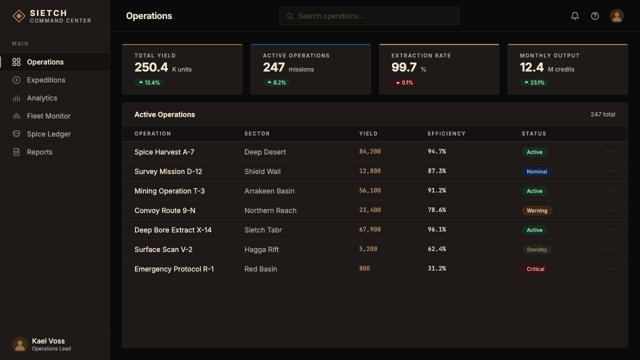
For web interfaces and dashboards, the style demands structural commitment. Define the grid tightly, use the dark ground as the default surface, and introduce sand-ochre as the primary navigation and structural tone — top bars, section dividers, key labels. Reserve spice-blue exclusively for interactive states, alerts, live data indicators, and primary call-to-action elements. Card components should have sharp edges and no border-radius rounding; divider lines should be precise and thin. Avoid icon libraries that introduce rounded or friendly forms — if icons are necessary, use geometric line forms that feel engineered rather than illustrated. The style works particularly well for financial data interfaces, monitoring systems, and any product where the user needs to trust that the information is authoritative and complete.对于网页界面和仪表板,这种风格要求结构性承诺。紧密定义网格,以深色底面作为默认表面,引入沙赭色作为主要导航和结构性色调——顶部栏、分区分隔线、关键标签。将香料蓝专门保留给交互状态、警示、实时数据指示器和主要行动号召元素。卡片组件应有锋利边缘且无边框圆角;分割线应精确而细薄。避免引入圆润或友好形态的图标库——如果必须使用图标,应选用感觉如工程制图而非插图的几何线条形式。这种风格特别适合金融数据界面、监控系统,以及任何用户需要信任信息具有权威性和完整性的产品。
For editorial and marketing applications, the style supports long-form hierarchy with great efficiency. Feature pages work well with alternating full-width blocks — dark ground for body content and testimonials, brief sand-ochre bands to separate major sections — with spice-blue reserved for interactive links and primary navigation calls. Photography, when used, should be treated as a flat architectural element: cropped to strong geometric shapes, desaturated toward the warm palette, and positioned flush to layout edges rather than centered with breathing room. Marketing headlines benefit from the wide-tracked all-caps treatment; they should feel inscribed rather than typeset.对于编辑和营销应用,这种风格以极高的效率支持长篇层级。功能页面适合交替使用全宽区块——深色底面用于正文内容和证言,简短的沙赭色横带分隔主要版块——香料蓝保留给交互链接和主要导航行动。摄影(若使用)应被视为平面建筑元素:裁切为强几何形状,向暖色调去饱和,紧贴版面边缘定位而非留有呼吸空间的居中。营销标题受益于宽字距全大写处理;它们应感觉是铭刻的,而非排版的。
The most common mistake when applying this style is treating it as generic dark mode with a yellow or blue accent. Authentic Arrakis design is not dark mode — it is an entirely constructed visual ecology with specific tonal relationships that must be observed. Three failures recur: first, introducing rounded corners or soft shadows that break the brutalist hardness; second, over-saturating the spice-blue until it reads as an electric accent color rather than a cold, deep mineral tone; third, using the dark ground as an excuse to reduce contrast until type becomes difficult to read. The style demands that contrast be maintained at a high level — the dark ground is not murky, it is precise — and that every element be positioned with architectural deliberateness, not approximation.应用这种风格时最常见的错误,是将它当作带有黄色或蓝色强调的泛泛暗色模式。真实的厄拉科斯设计不是暗色模式——它是一套完整构建的视觉生态系统,有必须遵守的特定色调关系。三种失败反复出现:第一,引入圆角或软阴影,破坏粗野主义的硬朗感;第二,将香料蓝过度饱和,直到它读来像电光强调色而非冷、深的矿物色调;第三,将深色底面当作降低对比度直到字体难以阅读的借口。这种风格要求以高水平维持对比度——深色底面不是模糊的,它是精确的——每个元素都应以建筑般的刻意性定位,而非近似。
See the Dune Arrakis (Villeneuve) design system查看 Dune Arrakis (Villeneuve) 完整设计系统
Dune Arrakis (Villeneuve) — FAQDune Arrakis (Villeneuve) · 常见问题
Is this style the same as dark mode?这种风格和暗色模式是同一回事吗?
No. Dark mode is a system-level preference that inverts a light interface to preserve legibility in low-light environments. The Dune Arrakis style is a deliberate visual ecology in which the dark ground is expressive rather than accommodating — it communicates scale, gravity, and authority. The tonal relationships between the dark ground, the sand-ochre structural accent, and the spice-blue highlight are fixed and meaningful; they are not arbitrary color choices applied to a pre-existing light-mode layout. Applying the style correctly means designing from the dark ground up, not inverting a light design and calling it done.不是。暗色模式是一种系统级偏好,它将浅色界面反转以在低光环境下保持可读性。沙丘厄拉科斯风格是一套刻意的视觉生态系统,在其中深色底面是表现性的而非适应性的——它传递尺度、庄重和权威。深色底面、沙赭色结构强调和香料蓝高亮之间的色调关系是固定且有意义的;它们不是应用于既有浅色模式版面的随意色彩选择。正确应用这种风格意味着从深色底面开始设计,而非反转浅色设计后就宣告完成。
Can the style be used for consumer-facing products?这种风格可以用于面向消费者的产品吗?
With caution. The style's severity and monumental quality project authority and weight, which are valuable in contexts where the user needs to trust that what they are looking at is serious and complete. For consumer-facing products that prioritize warmth, playfulness, or invitation — food, wellness, lifestyle, children's services — the style will read as cold or alienating. It performs well in premium, technical, or high-stakes consumer contexts: luxury goods with a utilitarian ethos, high-end audio or optical equipment, financial services targeting a sophisticated audience, or travel and hospitality brands seeking to communicate scale and exclusivity rather than warmth.需要谨慎。这种风格的严苛性和纪念碑式品质传递权威和重量,这在用户需要信任所看到的事物是严肃且完整的场景中是有价值的。对于优先考虑温暖、趣味或邀请感的面向消费者的产品——食品、健康、生活方式、儿童服务——这种风格将被解读为冷漠或令人疏远。它在高端、技术性或高风险的消费者场景中表现良好:具有功能主义气质的奢侈品、高端音频或光学设备、针对成熟受众的金融服务,或寻求传递尺度和排他性而非温暖感的旅行和酒店品牌。
How does this style differ from other sci-fi design aesthetics like Alien or Blade Runner?这种风格与《异形》或《银翼杀手》等其他科幻设计美学有何不同?
The key difference is restraint in the warm direction rather than cool industrial complexity. Alien and its successors (the Ridley Scott industrial-gothic school) are rich in surface texture, mechanical detail, and a narrative of decay and organic threat — their palette is predominantly cool with warm accents used to signal danger. Blade Runner's neo-noir visual language is dense, layered, and heavily atmospheric, with glowing neon layered over rain and darkness. Dune Arrakis is none of these: it is vast, dry, and emptied of complexity rather than crowded with it. The ochre is warm and mineral, not cool; the forms are architectural and massive, not mechanical and intricate; the darkness is open and scaleless, not atmospheric and enclosed.关键区别在于向暖色方向的克制,而非冷工业复杂性。《异形》及其后继者(雷德利·斯科特的工业哥特流派)在表面质感、机械细节和衰败与有机威胁的叙事上非常丰富——它们的色板以冷色为主,暖色强调用于信号危险。《银翼杀手》的黑色电影视觉语言密集、分层且大气十足,霓虹光晕叠加在雨水和黑暗之上。沙丘厄拉科斯则截然不同:它是浩瀚、干燥、从复杂性中被清空,而非被复杂性填满。赭色是温暖且矿物质的,而非冷冽的;形态是建筑性和巨大的,而非机械性和精巧的;黑暗是开放且无尺度的,而非大气性和封闭的。
What is the correct role for the spice-blue accent?香料蓝强调色的正确作用是什么?
Spice-blue is the system's alarm tone — its highest-urgency, highest-rarity signal. In the film, blue appears on the spice melange itself, in the Fremen's eyes after prolonged exposure, and in the artificial lighting of interior spaces that contrast against the desert exterior. In a digital product, it should function as the singular interactive and alert color: primary call-to-action buttons, active navigation states, critical data thresholds, live indicators. It should never be used for decoration, background fills, or general category differentiation. The ratio of spice-blue to dark ground in a composition should be low — close to the ratio of a single eye in a close portrait — and its saturation should remain in the deep, cold mineral range rather than the bright electric range.香料蓝是系统的警示音调——它的最高紧迫度、最高稀缺性信号。在影片中,蓝色出现在香料混合体本身上,出现在长期接触后弗雷曼人的眼睛里,以及出现在与沙漠外部形成对比的室内空间人工照明中。在数字产品中,它应作为唯一的交互和警示色:主要行动号召按钮、激活导航状态、关键数据阈值、实时指示器。它绝不应用于装饰、背景填充或一般类别区分。构图中香料蓝与深色底面的比例应当很低——接近特写肖像中单只眼睛的比例——其饱和度应保持在深沉、冷冽的矿物色范围内,而非明亮的电光范围。
Is the style appropriate for light-background layouts?这种风格适合浅色背景的版面吗?
A light inversion is possible but changes the style's essential character significantly. On a pale sand or off-white ground, with dark type and ochre structural elements, the brutalist gravity largely disappears and the result reads closer to a warm modernist style than to Arrakis. If a light version is required — for print contexts, for accessibility reasons, or for mixed light-and-dark systems — the most faithful approach is to treat the light-ground version as a secondary surface only: use it for body text blocks and data tables, then return to the dark ground for headers, full-width feature sections, and any moment where the full authority of the style needs to be felt. A purely light Arrakis layout is a contradiction in terms: the darkness is not a preference, it is the desert night that makes the desert day meaningful.浅色反转版本是可能的,但会显著改变这种风格的本质特征。在淡沙色或米白色底面上,配合深色文字和赭色结构元素,粗野主义的庄重感基本消失,结果读来更接近温暖的现代主义风格而非厄拉科斯。如果需要浅色版本——出于印刷场景、无障碍原因或混合浅深色系统——最忠实的方法是将浅底版本仅作为次级表面使用:用于正文文本块和数据表格,然后在标题、全宽特性版块以及任何需要感受这种风格完整权威性的时刻回归深色底面。纯粹浅色的厄拉科斯版面本身就是一个矛盾:黑暗不是一种偏好,它是使沙漠白昼有意义的沙漠夜晚。
Related design styles相关设计风格
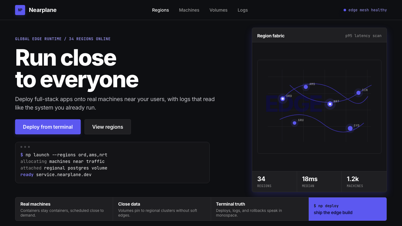 Fly.io Edge-Compute PurpleEdge-cloud with discipline. Electric purple nodes, Inter type, and terminal b…克制的边缘云:深黑底、电紫节点、Inter 字体与终端块。
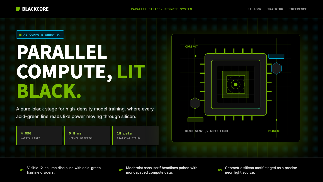 NVIDIA GPU Green-BlackPure black turns compute theatrical. Acid green hairlines and chip geometry s…纯黑让算力成舞台。酸绿细线与芯片几何制造光感。
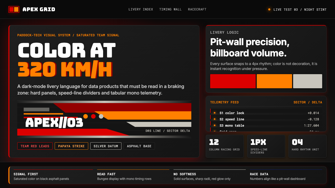 F1 Formula One LiverySpeed is legible. Ferrari red and papaya speed-lines cut through black teleme…速度清晰可读:红与木瓜橙速度线切开黑色遥测面板。
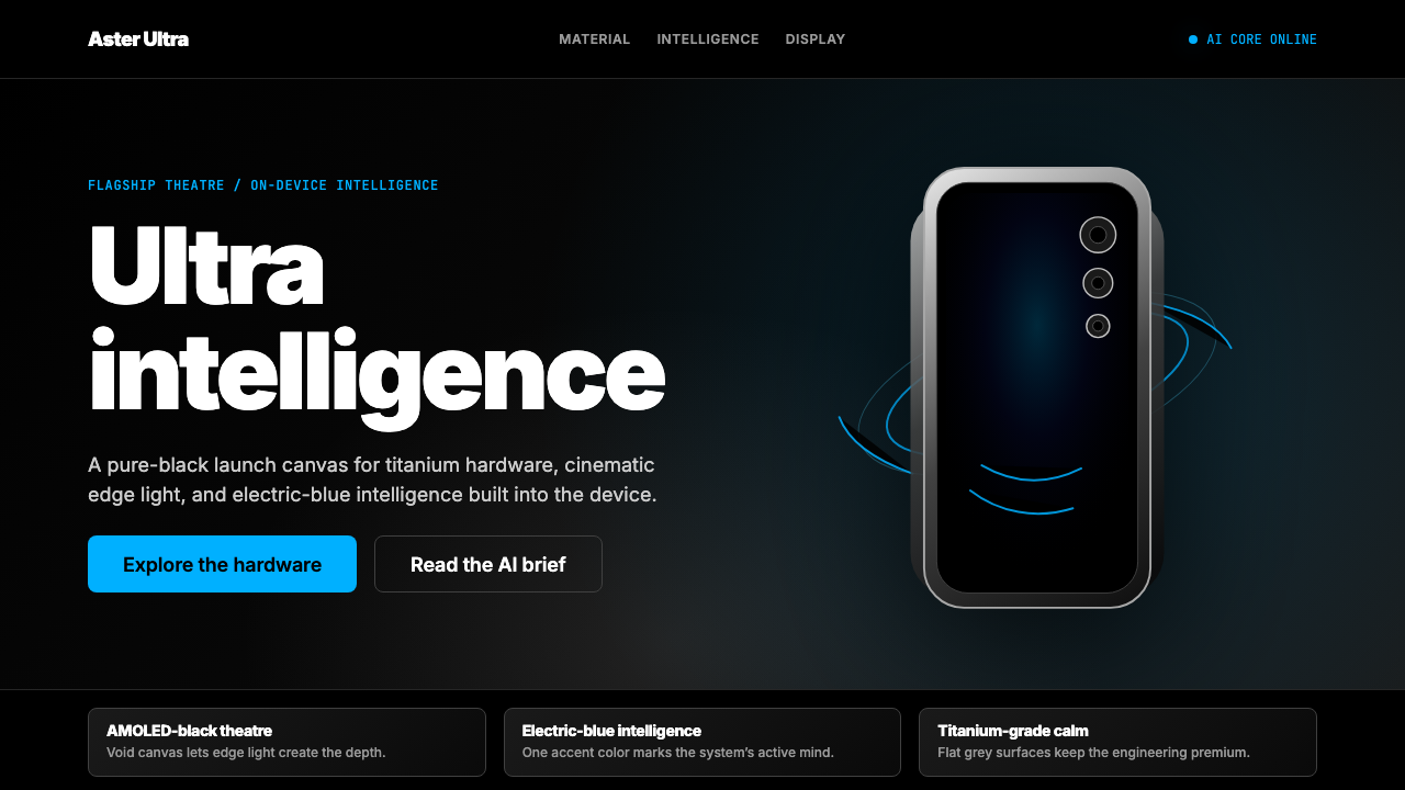 Samsung GalaxyTech-luxury goes black. Electric blue cuts through AMOLED void and titanium-g…科技奢华坠入纯黑。电光蓝切开AMOLED黑场与钛灰几何。
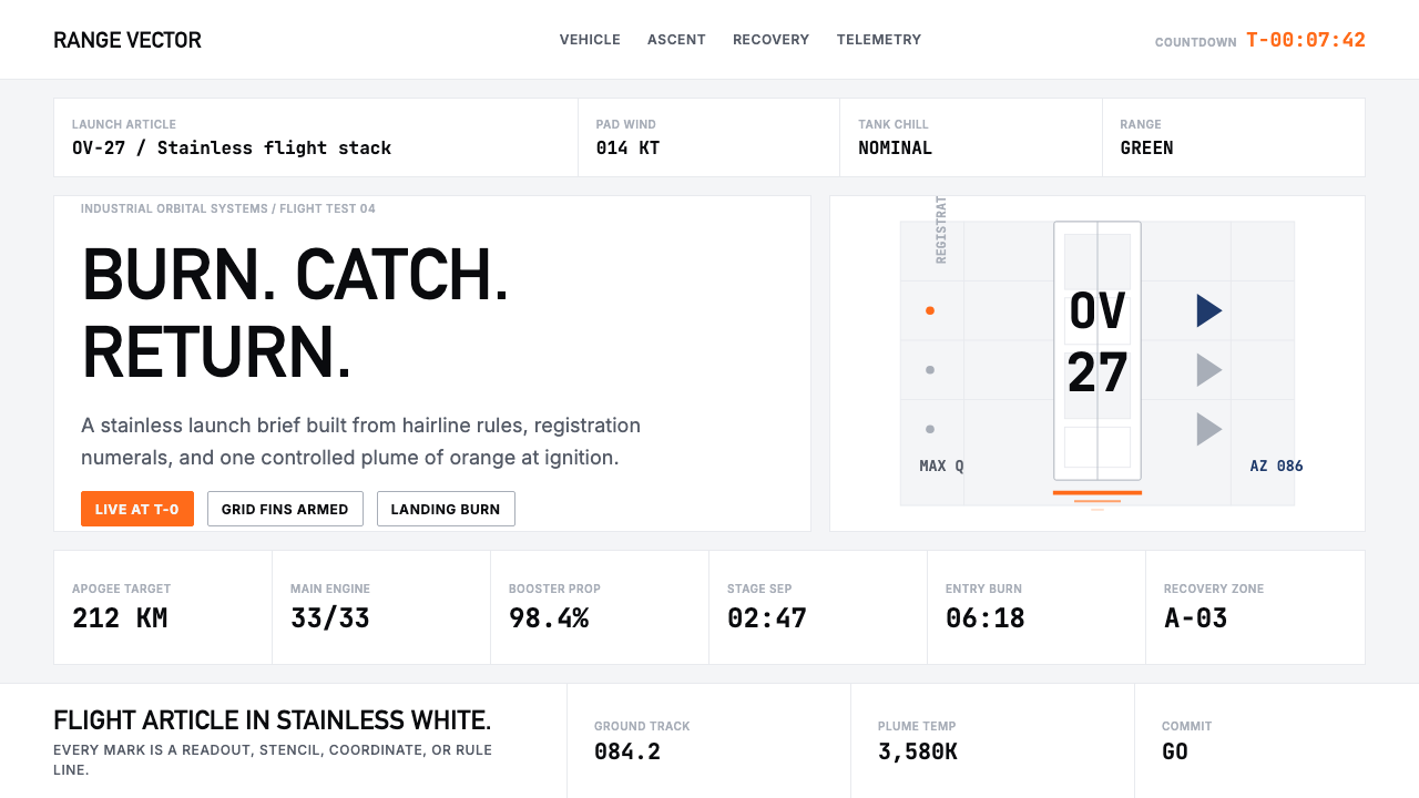 SpaceX Starship / FalconOrbital restraint. Stainless white grids, DIN-like type, and one orange burn…轨道级克制:不锈钢白网格、DIN式字体,一道橙色燃烧线。
 2001 — A Space OdysseyAbsolute restraint. Black void, white monolith geometry, one HAL-red signal.绝对克制:黑色虚空、白色巨石几何、唯一的 HAL 红信号。