Design style guide设计风格指南
What is SpaceX Starship / Falcon?什么是 SpaceX Starship / Falcon?
SpaceX turned orbital rocketry into a visual doctrine — industrial white, a single searing accent, and lettering precise enough to survive reentry.SpaceX 将轨道火箭发射变成了一套视觉教条——工业白,一道灼烧强调色,以及足以承受重返大气层的精准字符。
SpaceX Starship / Falcon in briefSpaceX Starship / Falcon 速览
The SpaceX Starship / Falcon visual language is aerospace industrialism distilled into a design system. Its governing logic is engineering necessity: surfaces are white because thermal management and inspection demand it, lettering follows FAA stencil standards because legibility at distance matters, and the single orange accent traces the thermal signature of Raptor engines burning at full thrust. Nothing is applied for appearance alone.SpaceX 星舰与猎鹰的视觉语言,是航空航天工业主义提炼成的设计系统。它的支配逻辑是工程必要性:表面是白色,因为热管理与目视检查要求如此;字符遵循FAA模板标准,因为远距离可读性至关重要;而那道唯一的橙色强调色,是猛禽发动机全推力燃烧时热焰信号的轮廓。没有任何元素是单纯为外观而添加的。
This is a system built around restraint through constraint rather than restraint through taste. Where Bauhaus stripped ornament as a philosophical position, SpaceX stripped it as an operational requirement. The outcome looks similar — clean surfaces, tight geometry, one charged accent — but the logic underneath is empirical rather than ideological. The aesthetic did not precede the engineering; it emerged from it.这是一套以约束实现克制的系统,而非以品味实现克制。包豪斯将装饰视为哲学立场而剥除,SpaceX 则将装饰视为操作需求而剥除。结果看起来相近——洁净的表面、紧凑的几何、一个充满张力的强调色——但底层逻辑是实证主义的,而非意识形态的。这种美学并非先于工程而存在,而是从工程中浮现出来的。
What makes the visual language remarkable is how coherently it reads across wildly different scales. The same grammar that governs a mission patch governs the entire flank of a two-hundred-meter-tall stacked vehicle: tight sans-serif stencil numerals, a high-contrast logo on uninterrupted white, and the concentrated heat of orange appearing exactly once. Scale amplifies the system rather than breaking it.使这套视觉语言令人瞩目的,是它在截然不同的尺度上保持的高度一致性。支配一枚任务徽章的语法,同样支配着一枚两百米高堆叠飞行器的整个侧面:紧凑的无衬线模板数字,高对比度标志置于不间断的白色之上,橙色热焰仅出现一次。尺度放大了这套系统,而没有瓦解它。
See the SpaceX Starship / Falcon design system →查看 SpaceX Starship / Falcon 完整设计系统 →
Where does SpaceX Starship / Falcon come from?SpaceX Starship / Falcon 从何而来?
SpaceX was founded in 2002 in Hawthorne, California, by Elon Musk with the stated purpose of making humanity multiplanetary. The visual identity that emerged in the company's first decade was utilitarian to the point of austerity: a wordmark in compressed geometric type, white vehicles bearing registration numbers stenciled in sizes dictated by federal aviation regulation, and minimal graphic presence beyond what regulatory compliance demanded. The first Falcon 1 launches from Kwajalein Atoll in 2006 and 2008 established the visual template — brushed metal and matte white, numbers large enough to read from a ground station.SpaceX 于2002年由埃隆·马斯克在加州霍桑创立,声明目标是使人类成为多星球物种。在公司成立的头十年里,浮现的视觉识别系统朴素到近乎苦涩:一个以压缩几何字体排列的文字标志,白色飞行器上以联邦航空法规规定尺寸喷涂的注册编号,以及在合规要求之外几乎为零的图形存在。2006年和2008年从夸贾林环礁进行的首批猎鹰1号发射确立了视觉模板——拉丝金属与哑光白,数字大到足以从地面站读取。
The Falcon 9, introduced in 2010, refined this language into something more deliberate. As reusability became the central engineering goal — the ambition to land a booster on a drone ship in the open ocean — the vehicle's visual identity began to carry more conscious weight. The drone ships themselves received names drawn from Iain M. Banks's Culture novels: Just Read the Instructions, Of Course I Still Love You. The naming convention signaled something about SpaceX's self-conception: technically serious but culturally aware, operating in a register where audacity and precision coexist.2010年推出的猎鹰9号将这套语言提炼得更加自觉。随着可复用性成为核心工程目标——在公海无人驳船上回收助推器的抱负——飞行器的视觉识别开始承载更有意识的重量。无人驳船本身获得了取自伊恩·班克斯《文化》系列小说的命名:「只读指令」、「当然我仍然爱你」。这种命名惯例透露出SpaceX对自身的一种定位:技术上严肃,文化上有感知力,在一个大胆与精准共存的频道上运作。
The current visual identity crystallized around 2020 to 2024, as Starship entered active testing at Boca Chica, Texas — a stretch of Gulf Coast that SpaceX informally renamed Starbase. The Starship's stainless-steel hull, polished to a mirror finish, introduced a new visual element: the vehicle itself became reflective. Dawn photography of Starship on the pad — the hull catching pink light, frost condensing on cryogenic fuel lines — produced images that circulated globally and became inseparable from the brand. The visual language absorbed this photographic quality: the system now includes an awareness of how industrial materials perform under extreme lighting conditions.当前的视觉识别在2020至2024年前后定型,彼时星舰在德克萨斯州博卡奇卡——SpaceX 非正式地将其更名为星际基地——进入了密集测试阶段。星舰的不锈钢船体经过镜面抛光处理,引入了一个全新的视觉元素:飞行器本身成了反光体。黎明时分星舰在发射台上的摄影作品——船体接住粉色晨光,低温燃料管路上凝结着霜花——产生了在全球流传的图像,并与品牌形象融为一体。视觉语言吸收了这种摄影质感:这套系统如今包含了对工业材料在极端光照条件下如何表现的意识。
Key context for understanding the aesthetic: SpaceX operates in parallel from three geographic poles — Hawthorne for engineering, Boca Chica for Starship testing and launch, Cape Canaveral for Falcon 9 and Falcon Heavy orbital operations. Each site contributes its own visual register to the brand's accumulated imagery. Hawthorne is machined aluminum and fluorescent-lit factory floor. Boca Chica is pre-dawn mist over the Gulf and a Starship catching sunrise. Cape Canaveral is nighttime launch photography, a booster threading back through the atmosphere in a controlled ballistic arc, twin sonic booms cracking over the coast as legs deploy. The visual system must work across all three contexts, and it does — because its core grammar has no contextual dependencies.理解这种美学的关键背景:SpaceX 同时从三个地理极点运营——霍桑负责工程,博卡奇卡负责星舰测试与发射,卡纳维拉尔角负责猎鹰9号与猎鹰重型的轨道操作。每个基地都为品牌的积累图像贡献了自己的视觉语调:霍桑是机加工铝件与日光灯照亮的工厂车间;博卡奇卡是墨西哥湾上黎明前的薄雾与接住日出的星舰;卡纳维拉尔角是夜间发射摄影——助推器穿过大气层沿受控弹道弧线折返,双声爆在海岸上空炸响,起落架展开的刹那。这套视觉系统必须跨越所有三种语境运作,而它确实做到了——因为它的核心语法没有任何语境依赖性。
What defines the SpaceX Starship / Falcon look?SpaceX Starship / Falcon 的视觉特征是什么?
Surface and Palette表面与色板
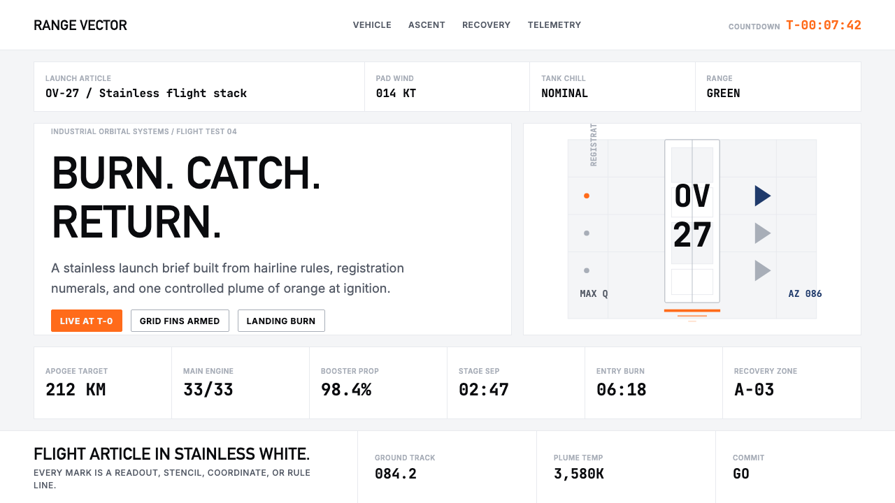
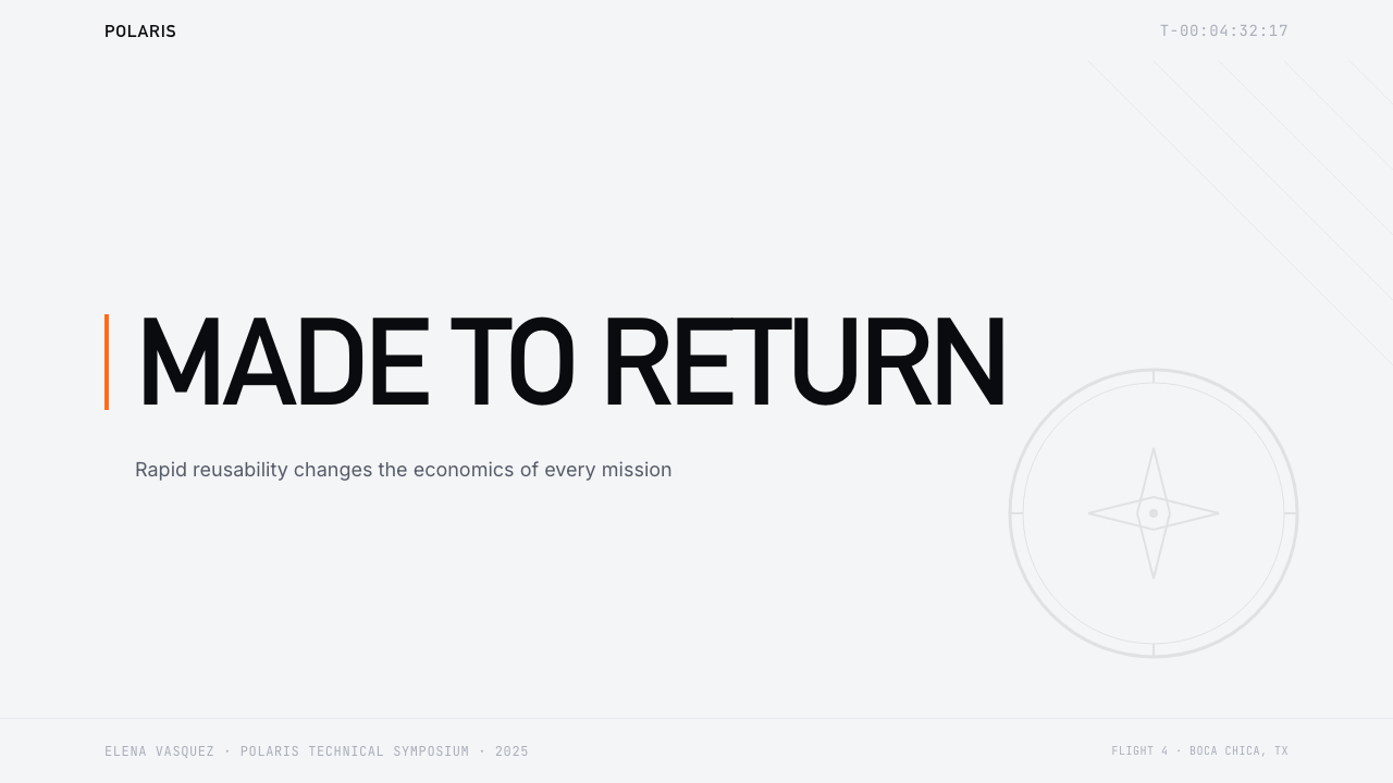
The dominant field is white — not the warm off-white of architectural minimalism, but the cool, slightly reflective white of industrial-grade coatings and polished stainless steel. Against this field, a single accent of deep, saturated orange appears: the color of a Raptor plume at full thrust, of heated ceramic tile edges, of hazard markings on launch-pad infrastructure. This two-tone restraint is absolute. Secondary colors — safety yellows, mechanical reds, corporate grays — appear only in documentary photography of the physical environment, never in the intentional graphic layer.主导底面是白色——不是建筑极简主义温暖的米白,而是工业级涂层与抛光不锈钢那种冷峻、略带反光的白。在这个底面上,一道深邃、饱和的橙色强调色出现:那是猛禽发动机全推力时的火焰颜色,是被加热的陶瓷隔热瓦边缘的颜色,是发射台基础设施上危险标志的颜色。这种双色克制是绝对的。辅助色——安全黄、机械红、企业灰——仅出现在物理环境的纪实摄影中,绝不进入有意为之的图形层。
Typography字体排印
The letterforms are tight, compressed geometric sans-serifs — in spirit close to the highway and aviation signage tradition where character shapes must survive distance, speed, and variable lighting conditions. The typeface in use carries no historical sentiment; it reads as a functional specification rather than a stylistic choice. Numerals dominate the typographic texture of the vehicle surface itself: FAA registration stencils, mission numbering, countdown clocks. These are set at whatever size the regulatory or operational need dictates, which at Starship scale means characters that dwarf a standing human.字形紧凑、压缩,属于几何无衬线类型——在精神上接近公路与航空标识的传统,那里的字符形态必须在距离、速度与可变光照条件下保持可读。所用字体没有任何历史情感;它读起来像一份功能规格而非风格选择。数字主导着飞行器表面的字体纹理:FAA注册编号模板、任务序号、倒计时时钟。这些数字以法规或操作需求所指定的任何尺寸排列,在星舰的规模上,这意味着字符高度可以让一个站立的人相形见绌。
Geometry and Structure几何与结构
The visual grammar is cylindrical and radial — a reflection of the vehicles themselves. Unlike the square-and-triangle vocabulary of Bauhaus, the SpaceX system is organized around circles and vertical columns. The Starship's diameter defines the compositional module; everything — logos, text, grid lines implied by panel seams — relates to this circular cross-section. In two-dimensional applications, this translates to centered radial compositions for mission patches and tightly vertical text stacks for infographics and vehicle designations.视觉语法是圆柱形与放射状的——这反映了飞行器本身的形态。不同于包豪斯的正方形与三角形词汇,SpaceX 的系统围绕圆形与垂直柱状组织。星舰的直径定义了构图模块;一切——标志、文字、舱板接缝暗示的网格线——都与这个圆形截面发生关联。在二维应用中,这转化为任务徽章的居中放射式构图,以及信息图表与飞行器命名的紧凑垂直文字堆叠。
Material Texture材料质感
The visual system is unusually material-aware. Stainless steel in multiple finishes — mirror-polished, brushed horizontal, brushed vertical — appears as a surface element with its own information density: weld seams, panel boundaries, thermal protection patterns. These are not decorative; they are the skin of a functional object made visible. In the design language, this principle extends to valuing visible production marks, structural joints, and finish variation as compositional elements rather than imperfections to be smoothed away.这套视觉系统对材料有着不寻常的敏感度。多种表面处理的不锈钢——镜面抛光、水平拉丝、垂直拉丝——作为表面元素出现,具有自身的信息密度:焊缝、舱板边界、热防护图案。这些不是装饰性的;它们是一个功能性物体的外皮,被赋予了可见性。在设计语言中,这一原则延伸为将可见的生产痕迹、结构接点与表面变化视为构图元素,而非需要被抹平的瑕疵。
Scale and Proportion尺度与比例
Few visual systems must operate coherently from the scale of a wristwatch mission patch to the scale of a fully stacked launch vehicle visible from fifty kilometers. The SpaceX system achieves this through extreme economy: almost no elements exist that do not scale cleanly. The wordmark, the vehicle registration, the mission number — each is a single typographic element with no accompanying texture or decoration that would degrade at either extreme. This scalar discipline is a product of real-world requirements, not design philosophy, but the effect is visually powerful.很少有视觉系统需要从腕表尺寸的任务徽章到从五十公里外可见的完整堆叠发射载具的尺度上保持一致性。SpaceX 的系统通过极度的经济性实现了这一点:几乎没有任何元素不能干净地缩放。文字标志、飞行器注册编号、任务序号——每一个都是单一的字体元素,没有在极端尺度下会退化的配套纹理或装饰。这种尺度纪律是现实世界需求的产物,而非设计哲学,但效果在视觉上极具力量。
Light and Photography光线与摄影
Perhaps uniquely among commercial design languages, the SpaceX system has been shaped by photography as much as by graphic intention. The dawn-on-stainless images — Starship reflecting a deep-orange sunrise against a blue Gulf horizon — created a visual idiom that the brand subsequently absorbed and reinforced. Cryogenic condensation, plume illumination, the hard shadow of a booster leg on a drone-ship deck: these photographic elements are now part of the brand's visual vocabulary. The design system implicitly acknowledges that its most powerful moments are not designed but captured.在商业设计语言中也许是独一无二的:SpaceX 的系统被摄影塑造的程度不亚于图形意图。星舰在不锈钢上映照深橙色日出、对抗墨西哥湾蓝色地平线的黎明图像,创造了一种视觉习语,品牌随后吸收并强化了它。低温冷凝、火焰光晕、助推器起落架腿在无人驳船甲板上投下的硬影:这些摄影元素如今已成为品牌视觉词汇的一部分。这套设计系统隐含地承认,它最有力量的时刻不是被设计出来的,而是被捕捉到的。
Information Density信息密度
SpaceX mission graphics — patches, infographics, trajectory diagrams — operate at high information density but maintain visual clarity through disciplined hierarchy. A mission patch typically carries the vehicle type, mission number, payload operator, orbit type, and booster flight number within a compact circular field. The hierarchy is managed entirely through scale and placement: the largest element is always the mission-defining datum, the smallest are supporting metadata. No decorative borders, no tonal backgrounds, no gradient fills mediate between the data and the viewer.SpaceX 的任务图形——徽章、信息图表、轨道示意图——以高信息密度运作,但通过严格的层级保持视觉清晰。一枚任务徽章通常在紧凑的圆形区域内承载飞行器类型、任务序号、有效载荷运营方、轨道类型和助推器飞行次数。层级完全通过尺度与位置管理:最大的元素始终是定义任务的核心数据,最小的是支持性元数据。没有装饰性边框,没有色调背景,没有渐变填充在数据与观看者之间居中调停。
See the SpaceX Starship / Falcon design system →查看 SpaceX Starship / Falcon 完整设计系统 →
Who shaped SpaceX Starship / Falcon?谁塑造了 SpaceX Starship / Falcon?
As founder and chief executive, Musk established the visual and cultural register of SpaceX — the combination of technical seriousness and pop-cultural irreverence visible in drone-ship naming, mission patch humor, and the decision to launch a personal sports car as the Falcon Heavy test payload. His public communications about the company, conducted through social media at a pace and informality unusual for aerospace, extended the brand's visual language into a textual register: hyperbolic, data-dense, and visually punctuated by photography of vehicles rather than product renders.作为创始人兼首席执行官,马斯克确立了SpaceX的视觉与文化频道——技术严肃性与流行文化无畏感的结合,体现在无人驳船命名、任务徽章的幽默感,以及将一辆私人跑车作为猎鹰重型测试载荷发射的决定。他通过社交媒体以对航空航天而言不同寻常的速度与随意性进行的公开传播,将品牌的视觉语言延伸至文字语调:夸张的、数据密集的,以飞行器照片而非产品渲染图作为视觉标点。
Mueller founded SpaceX's propulsion department and led the development of the Merlin and Raptor engine families — the hardware whose visual signature most defines the aesthetic. The Raptor's distinctive plume coloration at different throttle levels, the thermal glow of engine bells during static fire tests at Boca Chica, and the ring-of-fire geometry of a Starship's full-engine-count ignition: these are Mueller's engineering translated into visual spectacle. The design language could not exist without the specific properties of the engines it represents.穆勒创立了SpaceX推进部门,并主导了猎鹰与猛禽发动机系列的研发——这些硬件的视觉特征最深刻地定义了这种美学。猛禽在不同节流阶段独特的羽流颜色,博卡奇卡静态点火测试中发动机喷管的热焰光晕,以及星舰满发动机数量点火时的火环几何形态:这些是穆勒的工程学转化成的视觉奇观。如果没有这些发动机的特定物理属性,这套设计语言将无从存在。
Koenigsmann served as SpaceX's vice president of build and flight reliability and was the public face of mission control during many live broadcasts — an almost accidental contributor to the brand's visual identity through his on-camera presence at the console. The mission-control aesthetic, broadcast to millions via SpaceX's live streams, established a visual grammar for the company's working culture: banks of monitors, flight controllers in black jackets with the SpaceX wordmark, and the measured technical cadence of launch commentary that made industrial process legible as drama.柯尼希斯曼担任SpaceX建造与飞行可靠性副总裁,并在众多直播任务中担任任务控制中心的公众面孔——几乎是以无意识的方式,通过他在摄像机前操控台旁的存在,为品牌的视觉识别做出了贡献。通过SpaceX直播流传播给数百万观众的任务控制中心美学,为公司的工作文化确立了视觉语法:成排的监视器,穿着印有SpaceX文字标志黑色夹克的飞控人员,以及将工业流程变成戏剧的从容技术发射解说。
Krebs led SpaceX's design team during the period when the visual identity consolidated into its current form. The refinement of the wordmark — from earlier versions toward the present compressed geometric form — occurred under design leadership that understood the system's context: a brand whose primary visual output is live video of machinery operating at the edge of physical possibility, where graphic design must coexist with spectacle rather than compete with it. The discipline of not overdoing it is itself a design achievement.克雷布斯在视觉识别整合成当前形式的时期领导了SpaceX的设计团队。文字标志的精炼——从早期版本向现在的压缩几何形式演进——发生在理解这套系统语境的设计领导力之下:一个主要视觉输出是机器在物理可能性边缘运作的实时视频的品牌,图形设计必须与奇观共存,而非与之竞争。克制、不过度的纪律本身就是一项设计成就。
The Scottish science fiction author whose Culture novel series provided the names for SpaceX's drone ships — Just Read the Instructions, Of Course I Still Love You, A Shortfall of Gravitas — is not a designer, but his influence on the brand's cultural layer is real. Banks's Culture universe describes a post-scarcity civilization where vast intelligent machines carry out enormous tasks with casual competence and dark humor. The naming convention signals SpaceX's self-positioning: technically serious enough to land boosters on moving ocean platforms, culturally playful enough to name those platforms after jokes made by fictional spacecraft.这位苏格兰科幻作家的《文化》系列小说为SpaceX的无人驳船提供了命名——「只读指令」、「当然我仍然爱你」、「引力短缺」——他不是设计师,但他对品牌文化层的影响是真实的。班克斯的文化宇宙描述了一个后稀缺文明,在那里,巨大的智能机器以随意的胜任力与黑色幽默执行着宏大的任务。这种命名惯例透露出SpaceX的自我定位:技术上严肃到足以在移动的海上平台上回收助推器,文化上又顽皮到以虚构宇宙飞船讲的笑话来命名那些平台。
How do you use SpaceX Starship / Falcon today?今天怎么用 SpaceX Starship / Falcon?
Applying the SpaceX Starship / Falcon aesthetic to designed work requires understanding its core operating principle: the visual language earns its authority through visible necessity. Elements that look like they belong there because they have to — stencil numerals, mission identifiers, the single accent color borrowed from exhaust heat — read as genuine. Elements that imitate the surface without functional grounding read as costume. The distinction matters more here than in most styles because the aesthetic is legible precisely because its original context is so specific.将SpaceX 星舰与猎鹰的美学应用于设计工作,需要理解其核心运作原则:这套视觉语言的权威性来自可见的必要性。那些看起来因为不得不在那里而存在的元素——模板数字、任务标识符、从废气热量借来的单一强调色——读起来是真实的。仅仅模仿表面而没有功能基础的元素,读起来像是戏服。这一区分在这里比在大多数风格中更为重要,因为这种美学之所以清晰可读,恰恰是因为它的原始语境如此特定。
For presentation slides, the style works most powerfully when the content is technical, data-heavy, or stakes-forward. Cover slides should commit to the two-color discipline: a dominant white or near-black field, one accent element in a concentrated orange-adjacent tone, and a single typographic statement in tight compressed letterforms. Data slides work as mission-control dashboards — dense but hierarchically organized, with every metric labeled in the same register as the others. Avoid the temptation to add a second accent color for variety; the system's power comes from the restraint. If information variety is needed, use scale and placement rather than color.对于演示文稿,这种风格在内容具有技术性、数据密集或利害攸关时最具力量。封面幻灯片应当遵守双色纪律:主导白色或接近黑色的底面,一个接近橙色的强调色元素,以及一行紧凑压缩字形的单一字体声明。数据幻灯片作为任务控制仪表板处理——密集但层级组织清晰,每个指标以相同的语调标记。避免为追求多样性而添加第二种强调色的诱惑;这套系统的力量来自克制。如果需要信息多样性,请使用尺度与位置,而非色彩。
For web interfaces, the style suits products with a technical audience where authority and precision are desired values: developer tools, analytics platforms, infrastructure dashboards, and any context where the user's trust depends on the interface communicating reliability. Apply the surface language literally: white or very dark background, one concentrated accent, tight geometric type, and generous empty space that mirrors the scale of the systems being represented. Avoid soft shadows, rounded corners at large radii, and any surface treatment that implies warmth or approachability — these undercut the system's specific authority. Hard-edged components, precise alignment, and visible structure are the correct choices.对于网页界面,这种风格适合面向技术受众、权威性与精确性是期望价值的产品:开发者工具、分析平台、基础设施仪表板,以及任何用户信任依赖于界面传达可靠性的语境。字面应用这套表面语言:白色或非常深的背景,一种集中的强调色,紧凑的几何字体,以及映照所表示系统规模的慷慨空白。避免柔和阴影、大圆角半径,以及任何暗示温暖或亲和力的表面处理——这些都会削弱这套系统特定的权威感。硬边组件、精确对齐与可见结构才是正确的选择。
For editorial and marketing work, the aesthetic operates in the poster register — meant to be read at a distance and retained after a single impression. A full-bleed vehicle photograph with a single line of tight stencil type can carry enormous communicative weight. Infographics benefit from the mission-patch logic: complex information (trajectory, timeline, vehicle components) organized within a defined geometric field, with hierarchy managed through scale alone and the accent color appearing exactly once to mark the most critical datum. Marketing pages should resist the urge to visualize the vehicles through illustration; documentary photography is the correct choice, and the design language exists to frame it rather than to replace it.对于编辑与营销工作,这种美学在海报语态中运作——意在从远处被阅读,并在单次印象后被记住。一张全出血飞行器照片配上一行紧凑的模板字体,可以承载巨大的传达重量。信息图表受益于任务徽章逻辑:复杂信息(轨道、时间线、飞行器组件)在定义的几何域内组织,层级仅通过尺度管理,强调色恰好出现一次以标记最关键的数据。营销页面应当抵制通过插图来可视化飞行器的冲动;纪实摄影才是正确的选择,设计语言存在的目的是框架摄影,而非取代它。
A common mistake when applying this style is treating the orange accent as a highlight color to be used liberally for calls to action, hover states, and notification badges. In the source material, the orange appears once per composition — it is the plume, the exhaust, the one point of maximum thermal energy. Using it across multiple elements simultaneously destroys the visual logic that gives it meaning. Reserve the accent for the single most important interactive or informational element in any given view. If everything is accented, nothing is.应用这种风格时最常见的错误,是将橙色强调色视为可以自由用于行动号召、悬停状态和通知徽章的高亮色。在原始素材中,橙色在每个构图中只出现一次——它是羽流,是废气,是最大热能的那一个点。同时在多个元素上使用它,会摧毁赋予它意义的视觉逻辑。将强调色保留给任何给定视图中单个最重要的交互性或信息性元素。如果一切都被强调,则什么都没有被强调。
See the SpaceX Starship / Falcon design system →查看 SpaceX Starship / Falcon 完整设计系统 →
SpaceX Starship / Falcon — FAQSpaceX Starship / Falcon · 常见问题
Is this a design system or just a visual identity?这是一套设计系统,还是只是一种视觉识别?
It functions as both, but the distinction matters for application. As a visual identity, it governs how the company presents itself — wordmark, vehicle livery, mission patches, broadcast graphics. As a design system for application elsewhere, it offers a set of transferable principles: two-tone palette discipline, typographic compression, material-aware surface treatment, and the hard discipline of using accent color once and only once per composition. The second is more useful for designers, because the principles are extractable without requiring access to the specific hardware that generated them.它兼具两者的功能,但这一区分对于应用而言很重要。作为视觉识别,它支配着公司呈现自身的方式——文字标志、飞行器涂装、任务徽章、直播图形。作为可应用于其他地方的设计系统,它提供了一套可移植的原则:双色板纪律、字体压缩、材料感知的表面处理,以及每个构图中强调色只出现一次的严格纪律。后者对设计师更有用,因为这些原则是可抽取的,无需访问生成它们的特定硬件。
How does this relate to other aerospace visual identities like NASA or Boeing?这与NASA或波音等其他航空航天视觉识别有何关联?
NASA's identity — the worm logotype, the blue-and-white federal color scheme, the red swoosh of the meatball — carries institutional weight accumulated over decades and communicates through the language of a federal agency: measured, historically aware, conservative by necessity. Boeing's commercial identity is corporate modernism, closer to an airline than a space company. SpaceX sits in a different register: commercial, technically specific, and visually aggressive in the way that startup culture is aggressive — not through decoration, but through the confidence of understatement. The orange accent is doing work that NASA's color scheme distributes across many elements.NASA的识别——蠕虫字体标志、蓝白色联邦配色、肉球徽标的红色弧线——承载着数十年积累的机构重量,通过联邦机构的语言传达:从容、历史感知、出于必要的保守。波音的商业识别是企业现代主义,更接近一家航空公司而非太空公司。SpaceX 处于不同的频道:商业的、技术上具体的,以及以初创文化特有的方式视觉上具有攻击性——不是通过装饰,而是通过低调的自信。那道橙色强调色在做的工作,是NASA的配色方案分散到众多元素上才能完成的工作。
Does the style work for non-technical brands or softer subject matter?这种风格适用于非技术类品牌或较柔和的主题吗?
Rarely, and usually not well. The SpaceX visual language derives its authority from a very specific set of associations: physical scale, engineering precision, extreme environmental conditions, and operational consequence. Applying it to a consumer product, a food brand, a wellness service, or any context where warmth and approachability are desired values will produce a mismatch between visual tone and product intention. The exception is products that want to borrow the authority of engineering culture — certain fintech platforms, developer tools, high-performance athletic equipment. There, the alignment is real and the style works. The test is whether the product's values genuinely overlap with the style's values, not whether the colors and type look interesting.很少,通常效果不好。SpaceX 的视觉语言从一套非常特定的联想中获得权威:物理规模、工程精确性、极端环境条件和操作后果。将其应用于消费品、食品品牌、健康服务,或任何温暖感与亲和力是期望价值的语境,将在视觉调性与产品意图之间产生错配。例外是那些想要借用工程文化权威的产品——某些金融科技平台、开发者工具、高性能运动装备。在那里,契合是真实的,这种风格能够奏效。测试标准是产品的价值观是否真的与风格的价值观重叠,而不是那些颜色和字体看起来是否有趣。
What is the most common failure mode when designers apply this style?设计师应用这种风格时最常见的失败模式是什么?
Over-decoration of a system that earns its authority through under-decoration. Designers unfamiliar with the source material tend to add complexity — gradient overlays on the white field, a second accent color for variety, soft-shadow card components, illustrated rocket shapes used as decorative elements. Each addition individually seems harmless; together they rebuild the visual noise that the style exists to eliminate. The other common failure is using the orange at high saturation across multiple elements, which converts a structural focal point into a generic highlight system. Study the source material not for what is present but for what is absent.对一个通过低装饰性获得权威的系统进行过度装饰。不熟悉原始素材的设计师倾向于增加复杂性——在白色底面上叠加渐变,为多样性添加第二种强调色,使用柔阴影卡片组件,将火箭形状图示作为装饰元素。每个单独添加看起来无害;合在一起,它们重建了这种风格存在于消除的视觉噪音。另一个常见失败是在多个元素上以高饱和度使用橙色,这将一个结构性焦点转化为通用的高亮系统。研究原始素材,不是看有什么在场,而是看有什么缺席。
How should the photographic element of the style be handled in contexts without access to original imagery?在无法获取原始图像的语境中,应如何处理这种风格的摄影元素?
The photographic layer of the SpaceX visual system — dawn light on stainless steel, plume photography, landing burns against a dark sky — is inseparable from the brand because it documents real events. When applying the system in other contexts, the honest approach is to not simulate this layer at all, and instead lean harder into the typographic and structural elements. A design that commits fully to tight stencil type, a white field, one accent, and rigorous geometry will read as coherently within this tradition as one that tries to approximate launch photography and fails. The photographic warmth is earned by actually launching rockets; everything else in the system earns its place through discipline.SpaceX 视觉系统的摄影层——不锈钢上的黎明光线、羽流摄影、黑暗天空中的着陆燃烧——与品牌不可分割,因为它记录的是真实事件。在其他语境中应用这套系统时,诚实的做法是完全不模拟这一层,而是更加依赖字体与结构性元素。一个完全投身于紧凑模板字体、白色底面、一种强调色与严格几何的设计,在这一传统中的可读性,与一个试图近似发射摄影却失败了的设计相比,不会有任何逊色。摄影的温度是真正发射火箭换来的;这套系统中的其他一切,都是通过纪律赢得自己的位置的。
Related design styles相关设计风格
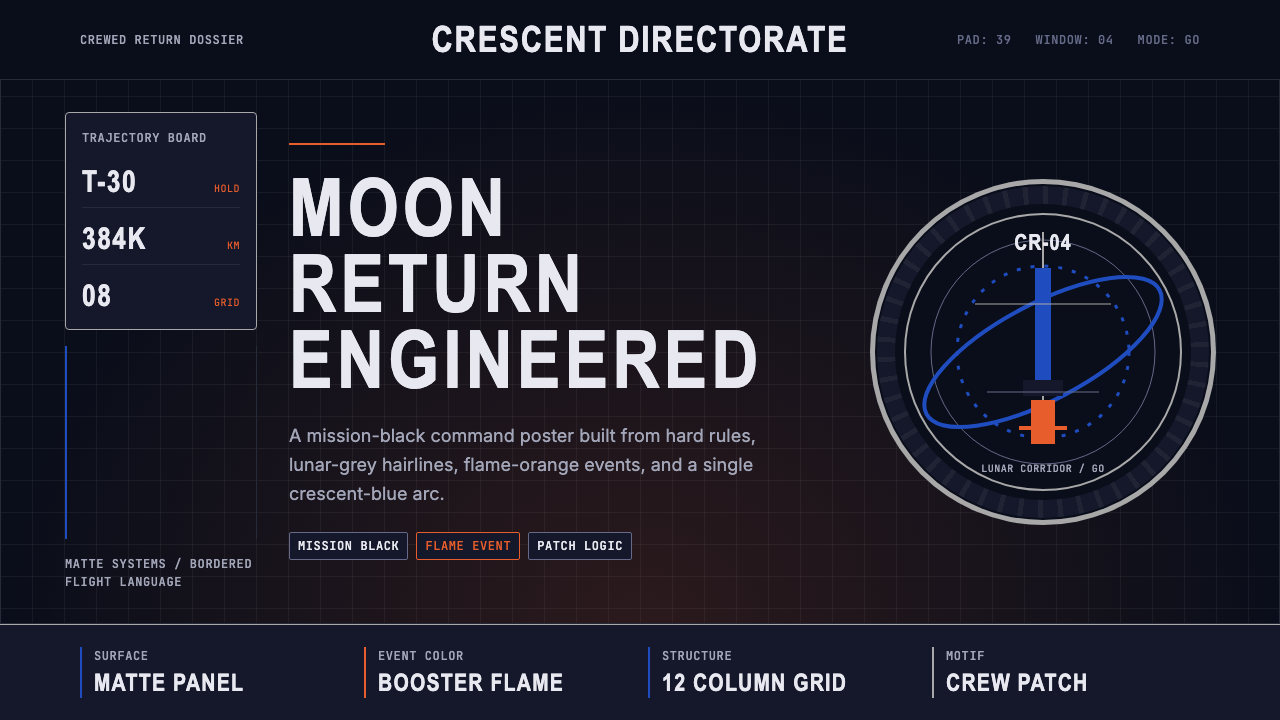 NASA Artemis ProgramCrewed return, engineered. Mission black, crescent-blue arc, flame orange, ri…载人回归的工程感:任务黑、蓝色弧线、火焰橙与刚性网格。
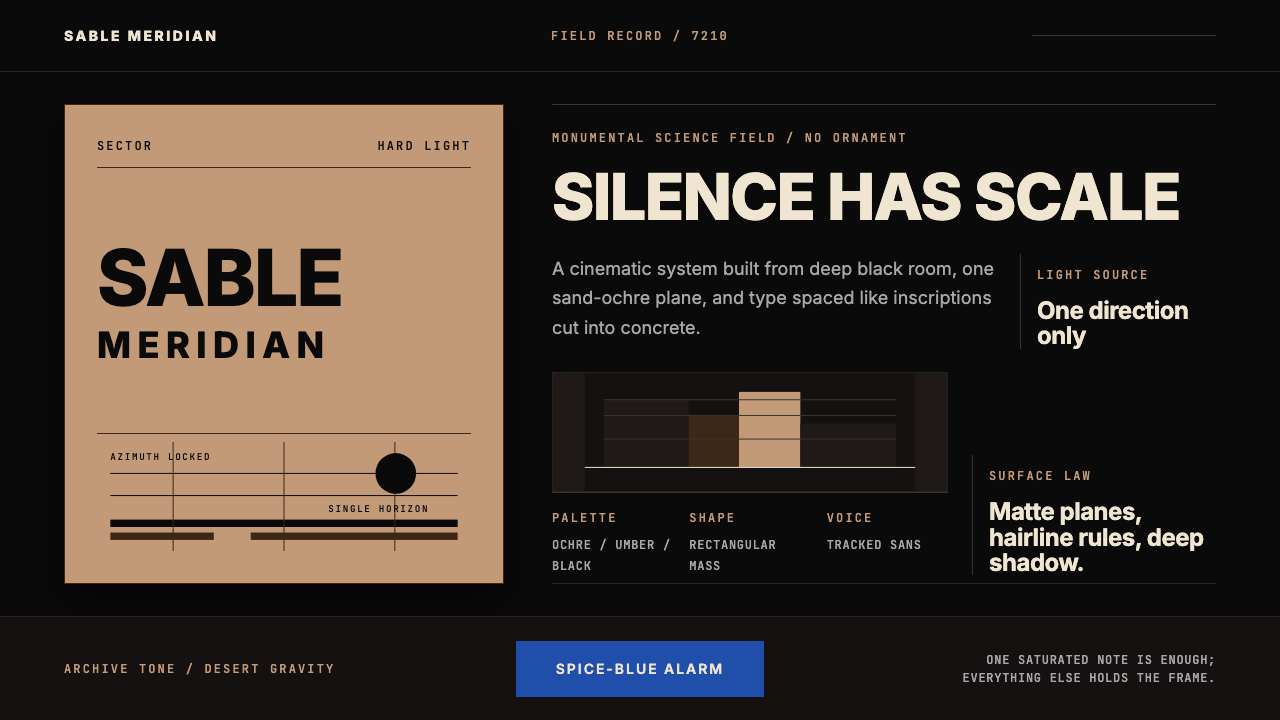 Dune Arrakis (Villeneuve)Silence has scale. Sand-ochre slabs, spice-blue alarm, and tracked Inter on b…沉默自有尺度:沙赭巨块、香料蓝警讯与黑底宽字距 Inter。
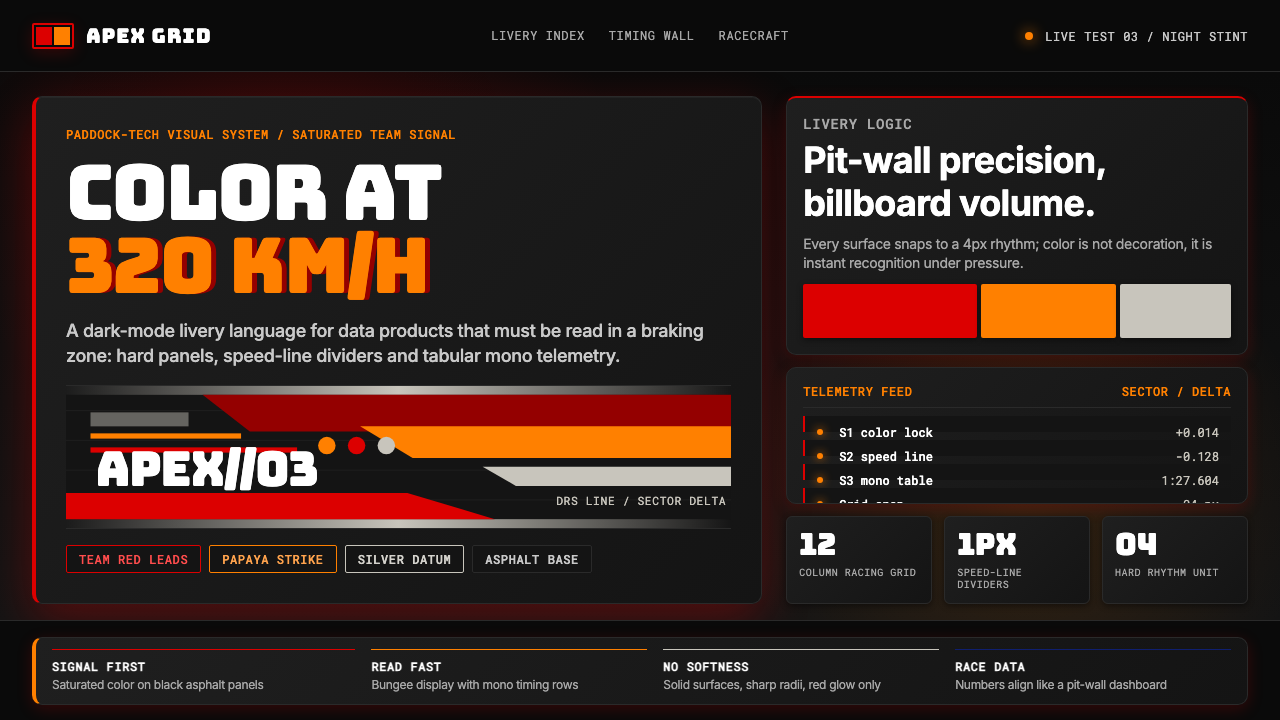 F1 Formula One LiverySpeed is legible. Ferrari red and papaya speed-lines cut through black teleme…速度清晰可读:红与木瓜橙速度线切开黑色遥测面板。
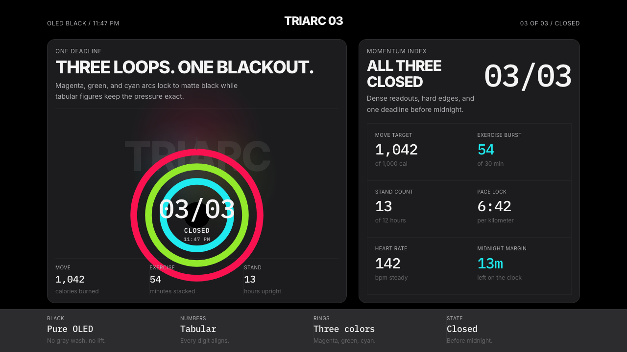 Apple Fitness Rings Closed (2024)Midnight feels exact. Magenta, green, and cyan rings lock onto OLED black.午夜像被校准。洋红、绿、青三环锁在黑底上。
 Fly.io Edge-Compute PurpleEdge-cloud with discipline. Electric purple nodes, Inter type, and terminal b…克制的边缘云:深黑底、电紫节点、Inter 字体与终端块。
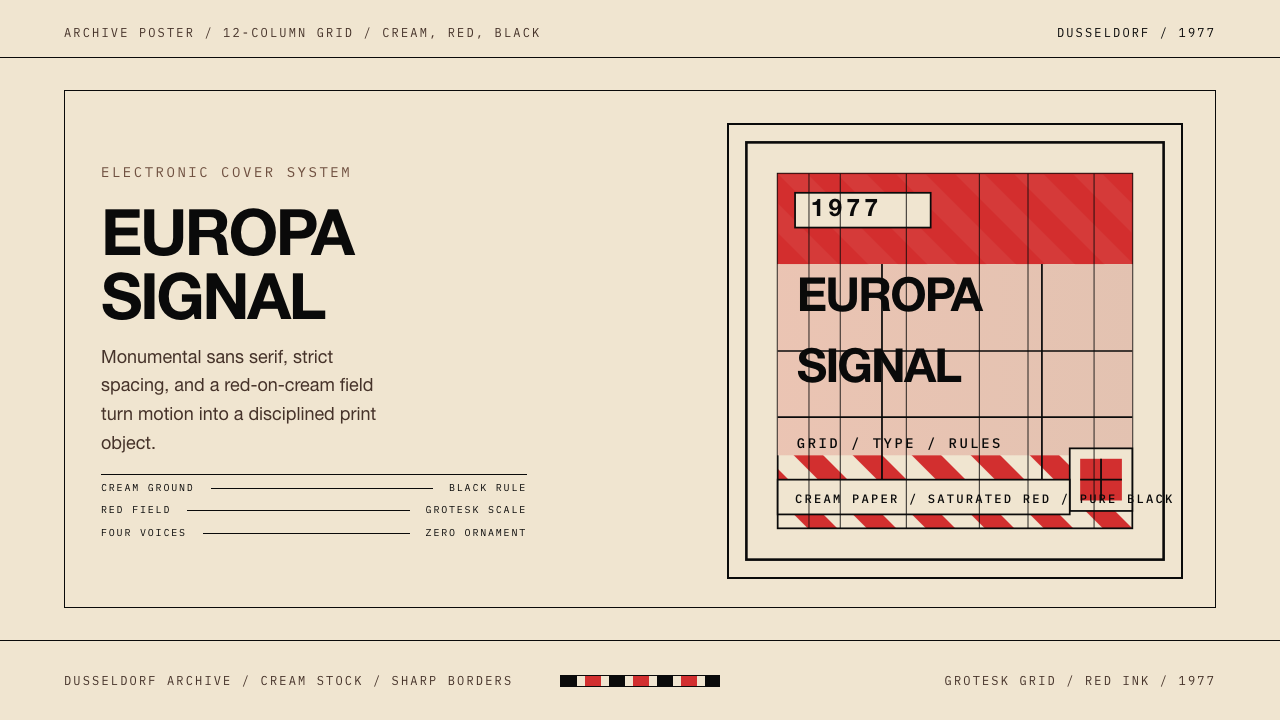 Kraftwerk Trans-Europa ExpressStark precision rules. Cream, red, and black lock the cover into a strict gri…克制而锋利:奶油、红、黑与严格网格锁住整张封面。