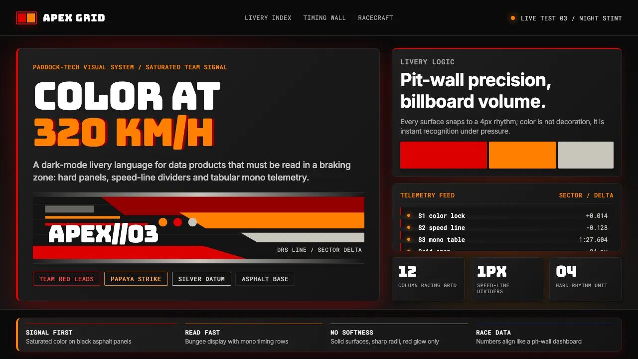
About F1 Formula One Livery
F1 livery design is the loudest visual language in motorsport: ten teams, ten saturated colors, each one fighting for instant recognition at 320 km/h. Ferrari-red, McLaren-papaya, Mercedes-silver and Red Bull-navy aren't accents — they're the team's identity, applied with engineering discipline to every sidepod, helmet, hospitality wall and television graphic.
The aesthetic pairs hot team color against deep-black asphalt, with Wieden+Kennedy's 2018 "F1" wordmark setting the typographic standard: chunky aerodynamic display, tight tracking, telemetry mono. It feels like a paddock — sleek tech-racing photography, speed-line dividers, and data tables that read like a pit-wall dashboard.
- Origin
- International — FIA-sanctioned; 24 race weekends across five continents
- Era
- Founded 1950 (first FIA World Championship); Liberty Media ownership 2017+; W+K 2018 rebrand; ongoing
- Key figures
- Bernie Ecclestone · Lewis Hamilton · Max Verstappen · Ayrton Senna
- Movements
- International motorsport canon · Drive to Survive cultural explosion · Liberty Media era
F1 Formula One Livery design spec
Colors
Typography
The other 11 sections — buttons, cards, spacing, motion, techniques and more — open once you unlock. Download the DESIGN.md or send it to your AI in one click. Unlock once, yours forever.
Sign up nowStyles similar to F1 Formula One Livery
Also inspired by brands & products, with a close feel.
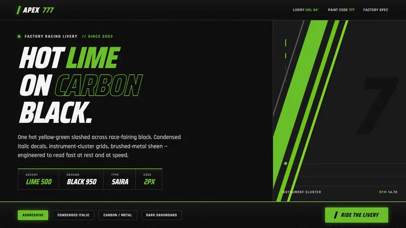 Kawasaki Racing Lime GreenFactory-livery aggression. Hot Kawasaki lime slashed across carbon black in condensed italic decals.
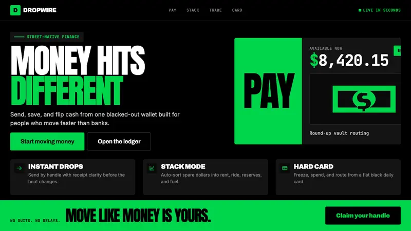 Cash App 2024Fintech that talks like a record label. Pure black, dollar-bill green, type at billboard scale.
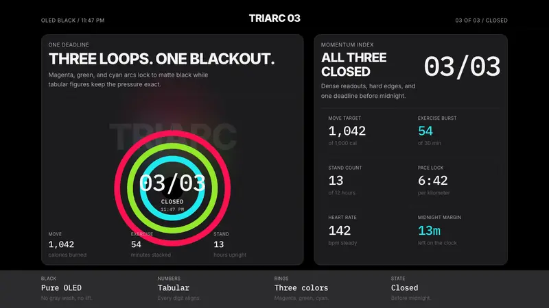 Apple Fitness Rings Closed (2024)Midnight feels exact. Magenta, green, and cyan rings lock onto OLED black.
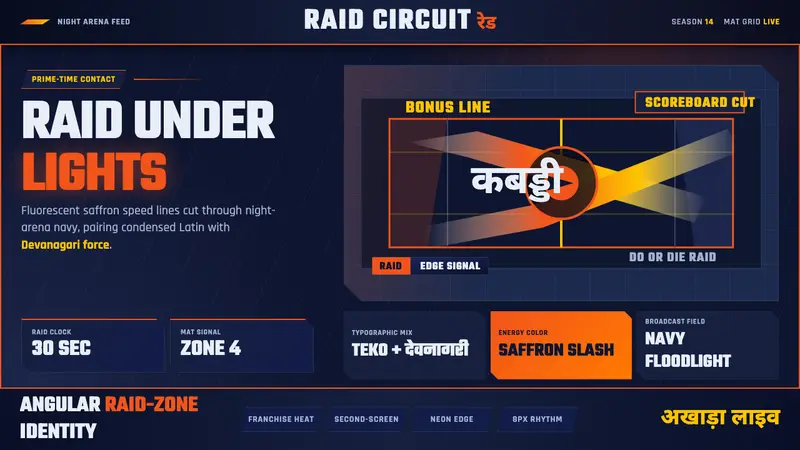 Pro Kabaddi LeagueBroadcast electricity. Saffron slashes, navy court grids, and Devanagari type collide.