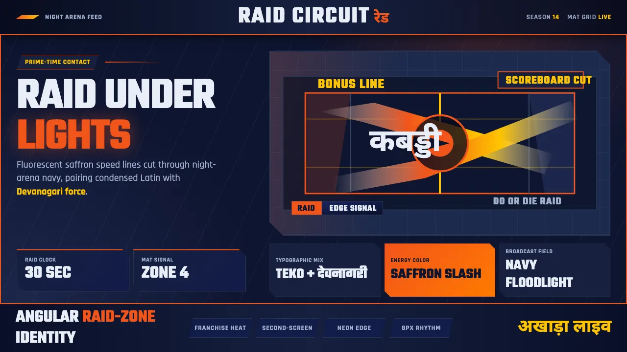
About Pro Kabaddi League
The Pro Kabaddi League took a two-thousand-year-old South Asian contact sport and rebuilt it for prime-time television. Launched in 2014 by Mashal Sports with Star Sports, its visual language is pure broadcast electricity: fluorescent saffron-orange energy graphics slashing across dark night-arena navy, modern Devanagari display lettering standing shoulder-to-shoulder with condensed Latin sans, and motion streaks that trace a raider's lunge across the mat.
This is not the dusty earth-tone romance of "ancient village" kabaddi. It is floodlit, angular, and loud — raid-zone court lines, neon-edged team chips, and diagonal speed graphics tuned for the second screen. The system speaks fluent regional identity through type and color while feeling unmistakably like a modern franchise sports brand.
- Origin
- India — Mumbai and franchise cities nationwide
- Era
- 2010s–now (PKL founded 2014; current broadcast look ~2020–2024)
- Key figures
- Mashal Sports · Star Sports broadcast design team · Pardeep Narwal · Pawan Sehrawat
- Movements
- Indian sports-league branding · Modern broadcast graphics · Devanagari display typography
Pro Kabaddi League design spec
Colors
Typography
The other 11 sections — buttons, cards, spacing, motion, techniques and more — open once you unlock. Download the DESIGN.md or send it to your AI in one click. Unlock once, yours forever.
Sign up nowStyles similar to Pro Kabaddi League
Also inspired by brands & products, with a close feel.
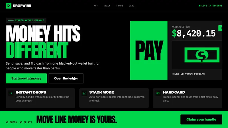 Cash App 2024Fintech that talks like a record label. Pure black, dollar-bill green, type at billboard scale.
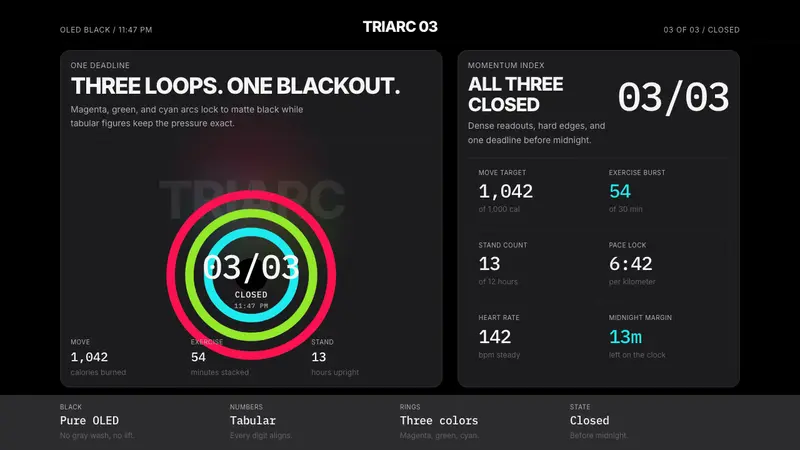 Apple Fitness Rings Closed (2024)Midnight feels exact. Magenta, green, and cyan rings lock onto OLED black.
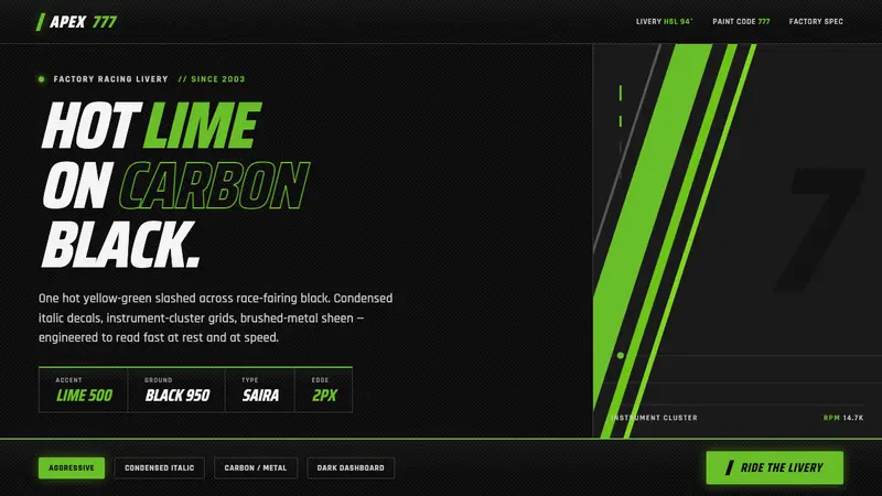 Kawasaki Racing Lime GreenFactory-livery aggression. Hot Kawasaki lime slashed across carbon black in condensed italic decals.
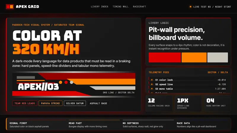 F1 Formula One LiverySpeed is legible. Ferrari red and papaya speed-lines cut through black telemetry panels.