What is Pro Kabaddi League?
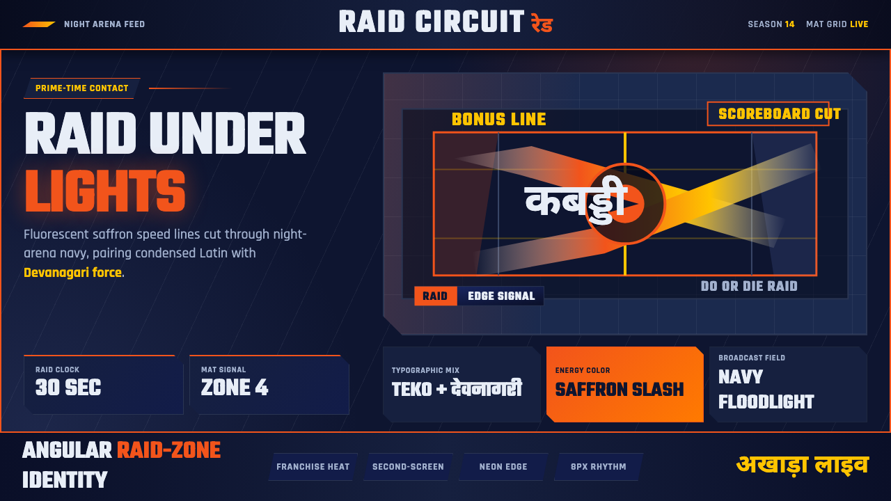
Pro Kabaddi League took a two-thousand-year-old village sport and re-armed it as prime-time television — saffron energy graphics, night-arena navy, and Devanagari display type built for the second screen.
Pro Kabaddi League in brief
Pro Kabaddi League (PKL) is the broadcast identity built for India's modern kabaddi franchise league, launched in 2014 by Mashal Sports in partnership with Star Sports. Its visual language is not the earth-toned, dusty-courtyard nostalgia that kabaddi's ancient roots might suggest. It is floodlit, angular, and unapologetically loud: fluorescent saffron-orange slashes cut across a dark navy ground, motion streaks trace a raider's lunge across the mat in real time, and team chips glow with neon-edged outlines built to survive a jumbotron and a phone screen at once.
The system's defining move is putting modern Devanagari display lettering shoulder-to-shoulder with condensed Latin sans-serif type, at equal visual weight. Neither script is treated as a subtitle or an afterthought to the other. This is a style built to declare regional identity — Indian, specifically North and South Indian sporting culture — while reading, at a glance, as a thoroughly contemporary global sports-broadcast product, no different in production polish from a Premier League graphics package or an NBA scoreboard bug.
Structurally, the look borrows from the vocabulary of stadium lighting and court-side signage rather than from print or editorial design. Diagonal cuts stand in for the raid lines painted on a kabaddi mat. Chip-shaped badges echo the sport's zone markings. Everything is built to move — this is a style native to broadcast graphics packages, scoreboard overlays, and highlight-reel lower-thirds, not to a static poster.
Where does Pro Kabaddi League come from?
Kabaddi itself is ancient — a contact team sport with roots that trace back more than two thousand years across South Asia, played under different regional names (hu-tu-tu, chedugudu, sadugudu) long before anyone thought to televise it. A raider crosses into the opposing team's half chanting the word 'kabaddi' in a single breath, tags as many defenders as possible, and sprints back before the breath runs out, while defenders try to tackle and hold the raider down first. It is a sport of village fairgrounds and school playgrounds, traditionally played on open earth with minimal equipment — precisely the aesthetic the Pro Kabaddi League deliberately abandoned.
The league was founded in 2014 by Mashal Sports, a sports management company, in a joint venture with the Star Sports television network. The founding bet was that kabaddi — despite its ancient, low-production-value image — could be repackaged with the same franchise-league machinery that had made cricket's Indian Premier League (launched 2008) a commercial phenomenon: city-branded franchises, players bought at televised auctions, cheerleaders, prime-time slots, and a broadcast graphics package built from scratch rather than inherited from decades-old amateur federation branding.
That broadcast graphics package is the actual subject of this style. Star Sports' design team built a visual system for PKL with no real precedent to draw on — unlike cricket or football, kabaddi had never been produced at this scale before, so there was no existing 'PKL look' to modernize. The team essentially invented a sports-broadcast identity that could carry an indigenous South Asian sport into the same visual register as Formula 1 graphics or WWE entrance packages: dark arena backdrops, saturated accent color, kinetic type, and lower-thirds built for constant motion.
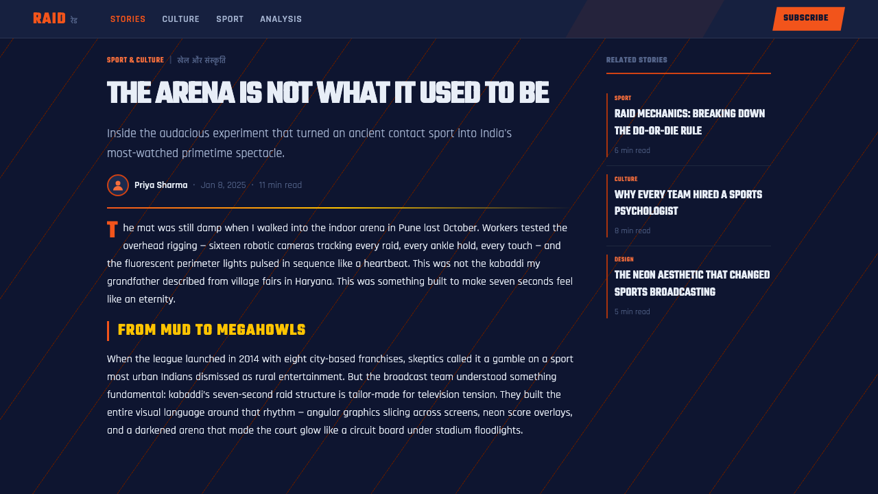
The league's stars became inseparable from the brand's rise. Raiders like Pardeep Narwal (nicknamed 'Dubki King' for his signature diving raid technique) and Pawan Sehrawat became recognizable television personalities in a way village-fairground players never had been, and the broadcast style — names lit up in saffron against navy, stat overlays tracking raid points in real time — is inseparable from how a generation of Indian viewers now first encounters the sport.
What defines the Pro Kabaddi League look?
Color
The palette is built around a fluorescent, high-chroma saffron-orange as the primary energy color, set against a deep night-arena navy that reads almost black under broadcast lighting. This is not the muted, earthy saffron of traditional textile or festival color — it is a screen-forward orange chosen because it cuts through dark backgrounds and survives compression on a television feed. Secondary accents appear sparingly, mostly to differentiate franchise identities within chip-shaped badges, but navy-and-saffron is the system's constant signature.
Typography
Two scripts share the stage at equal weight: a bold, geometric Devanagari display face for team names and event branding in Hindi, paired with a heavily condensed Latin sans-serif for English labels and stat callouts. The condensation is functional as much as stylistic — broadcast lower-thirds have limited horizontal space, and a tightly tracked, narrow letterform lets more information fit into a scoreboard strip without shrinking to illegibility. Both scripts favor extreme boldness over restraint; thin or light weights essentially do not appear anywhere in this system.
Motion Graphics
This is fundamentally a broadcast-motion style rather than a static one — its native habitat is the scoreboard overlay, the raid-in-progress tracker, and the highlight-reel transition, not the printed page. Diagonal speed-streak elements trail behind moving graphics to simulate the velocity of a raider's lunge. Chip-shaped score and team badges slide and snap into position rather than simply appearing. Any static application of this style (a poster, a static web banner) should still imply motion through diagonal cuts and directional streaks, because stillness reads as a betrayal of the style's core identity.
Diagonal Geometry
Nearly every structural element is cut on an angle rather than aligned to a horizontal or vertical grid. This traces back to the raid lines and zone markings painted on a kabaddi court, which the broadcast designers translated into angled panel dividers, slashed color blocks behind team names, and diagonally cropped photography. The angle is consistently aggressive rather than subtle — closer to a 15-to-30-degree slash than a gentle skew — because the goal is to read as kinetic energy at a glance, not as refined asymmetry.
Chip and Badge Forms
Team identities and score displays are packaged into rounded, pill-shaped or hexagonal chip forms with a glowing neon-style outline, rather than plain rectangular boxes. This chip vocabulary functions the way a jersey number or a court-side sign functions in other sports — a quickly scannable unit of identity — and its slightly rounded, badge-like geometry softens the otherwise sharp, angular system just enough to keep it feeling athletic and wearable rather than purely mechanical.
Contrast and Glow
Because the system is built for dark-arena broadcast conditions, nearly every graphic element relies on strong luminance contrast rather than subtle tonal variation. Saffron and white elements are frequently given a soft outer glow to simulate the way light behaves under stadium floodlighting and on LED perimeter boards, an effect closer to neon signage than to print-based highlight or shadow. This glow is used functionally, to keep foreground information legible against the dark ground, not merely decoratively.
Photography and Action Imagery
Player photography leans heavily on frozen mid-action moments — a raider mid-lunge, a defender mid-tackle — shot or selected specifically for dynamic diagonal body lines that echo the system's angled graphic panels. Images are typically cut out against the navy ground or bled to the edge of a diagonal panel rather than placed in a neutral rectangular frame, so that the athlete's body becomes another angled shape within the composition rather than a separate photographic insert.
Who shaped Pro Kabaddi League?
Mashal Sports is the sports management company that founded and continues to operate the Pro Kabaddi League, in joint venture with Star Sports. The company's founding bet was that kabaddi could support the same franchise-league commercial machinery — city-branded teams, televised player auctions, prime-time broadcast slots — that had already proven itself with cricket's Indian Premier League, and that a sport with an ancient, low-production-value image could be given an entirely new visual identity built from scratch for television.
The in-house and partner design team behind Star Sports built the actual PKL graphics package, working essentially without precedent — kabaddi had no prior high-production broadcast identity to modernize or reference. Their work translated court-side elements (raid lines, zone markings) into a diagonal, high-glow motion-graphics language, and paired modern Devanagari display type with condensed Latin sans-serif at equal visual weight, a decision that gave the league a distinctly regional identity without sacrificing the polish of a global sports broadcast product.
Narwal, nicknamed 'Dubki King' for his signature diving raid technique, became one of the league's most recognizable faces and one of the highest point-scorers in PKL history. His rise alongside the league's broadcast identity illustrates how thoroughly PKL's visual system and its star players became mutually reinforcing — stat overlays tracking his raid points in real time, his name lit in saffron against navy, made the graphics package as central to his fame as his athletic performance.
Sehrawat is another of the league's marquee raiders, whose televised performances helped cement PKL's broadcast graphics — the saffron-on-navy color language, the diagonal motion streaks, the chip-style scoreboards — as the default way a generation of Indian viewers now encounters kabaddi for the first time, supplanting whatever mental image of the sport existed before the league's 2014 launch.
How do you use Pro Kabaddi League today?
Pro Kabaddi League's visual system transfers well to any context that wants to feel live, urgent, and screen-native, but it demands commitment to motion and glow — applying it as a flat, static color scheme misses the point of the style entirely.
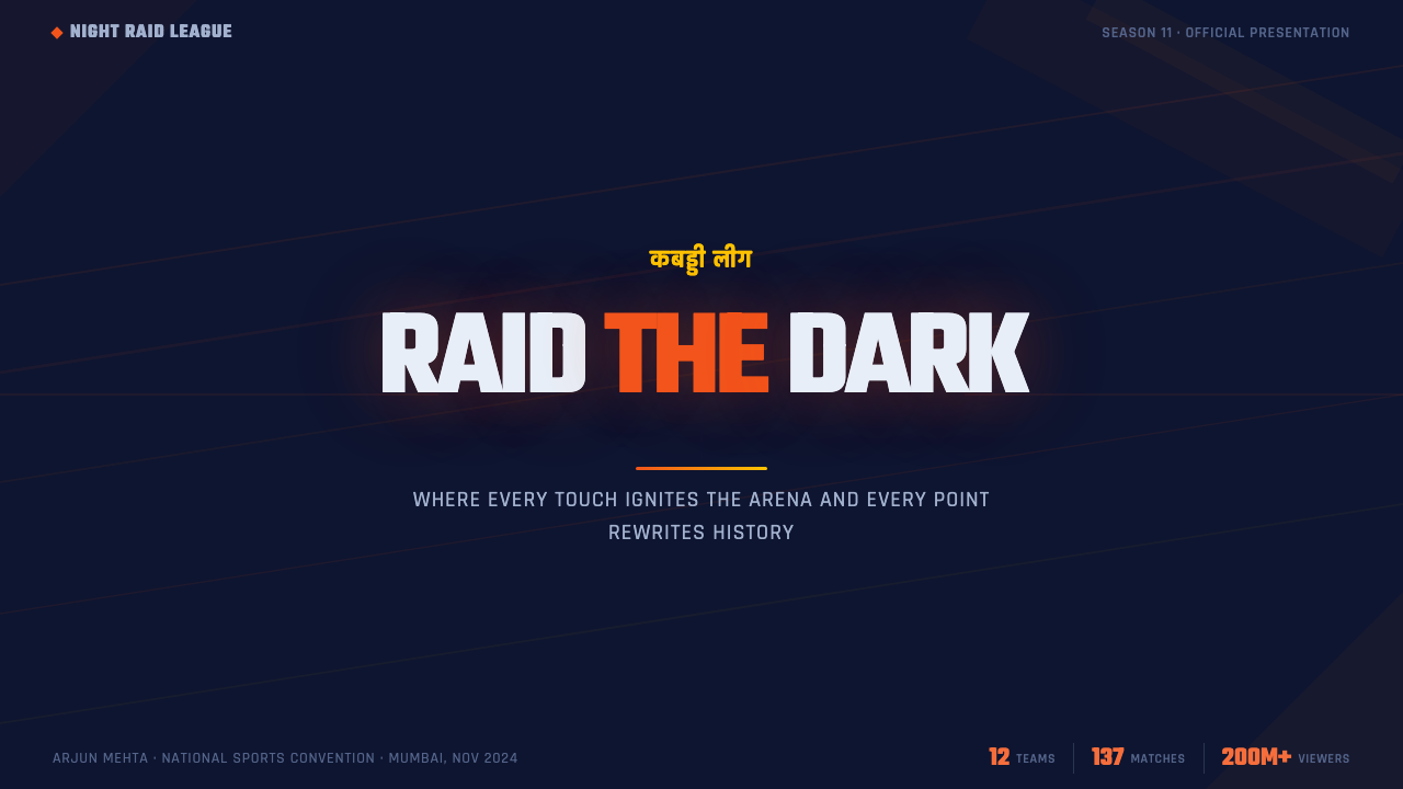
For presentation cover slides, the style rewards a bold diagonal composition: a slashed saffron panel cutting across a navy field, with the title set in heavily condensed type at high contrast, mimicking a scoreboard bug or team-reveal broadcast graphic. Content and data slides should lean into the chip-and-badge vocabulary — stat callouts packaged in rounded, glow-edged pill shapes rather than plain tables, and charts rendered with diagonal-cut segments rather than straight rectangular bars, so a data slide reads like a live sports overlay rather than a spreadsheet export.
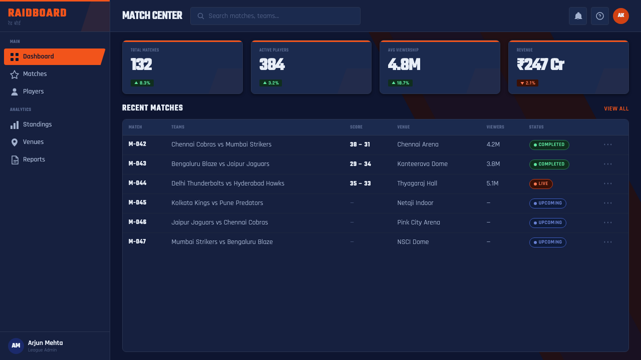
For web UI, this style is a strong match for dashboards and pricing pages that want to feel energetic and competitive rather than calm and neutral — think fantasy-sports products, live-score apps, or gamified analytics tools. Dark navy should serve as the dominant background, with saffron reserved specifically for primary actions, live-status indicators, and tier or rank differentiation, never used as a general body-text or background color. Card components benefit from the same glowing chip-edge treatment used in the broadcast graphics, and any real-time data point should carry a motion cue — a pulse, a streak, a snap-into-place animation — to stay true to the style's broadcast-native identity.
For editorial and marketing work, the style suits sports-adjacent, youth-oriented, or high-energy consumer brands well: match-day recap pages, athlete profile features, ticket and merchandise promotions. Headlines should be set in heavily condensed, bold type reminiscent of a scoreboard, with diagonal color-block dividers standing in for the section rules a calmer editorial style might use. Full-bleed action photography, cropped along a diagonal rather than a rectangular frame, reinforces the kinetic feel throughout a marketing page.
A common mistake when applying this style is treating it as generic 'sporty orange and navy' without the motion, glow, and diagonal cut that actually define it — a flat orange-and-navy palette with horizontal grids and no neon-edge treatment reads as a generic sports template, not as Pro Kabaddi League's specific broadcast identity. Equally important is respecting the dual-script balance: using Devanagari purely as decoration while treating Latin type as the 'real' content contradicts the style's founding principle that both scripts carry equal weight and equal authority.
Pro Kabaddi League — FAQ
Is this the same as generic 'sports branding' or 'esports' style?
No. Generic sports branding and esports aesthetics tend to be built from a broad, interchangeable vocabulary — angular shapes, bold type, high-saturation accent colors — that could belong to almost any league or game. Pro Kabaddi League's style is specific: it is defined by the saffron-and-navy pairing tied to its actual broadcast footage, by the deliberate equal-weight pairing of Devanagari and Latin display type, and by a diagonal vocabulary that traces back to the literal raid lines and zone markings on a kabaddi court. Strip out the dual-script typography and the kabaddi-specific motion cues, and what's left is generic esports styling, not this style.
Can this style work in a light-background layout?
It is possible but works against the style's core identity, which depends on the contrast between saturated saffron and a near-black navy ground to simulate stadium floodlighting. On a white or light background, the neon-glow treatment loses its functional purpose — glow only reads as glow against darkness — and the system starts to look like a generic orange-accent brand rather than a broadcast graphics package. If a lighter application is necessary, it works best confined to a dark navy panel or card floating on the light page, preserving the dark-ground contrast in miniature rather than abandoning it.
Why does the style insist on treating Devanagari and Latin type as equally important?
Because the league's core positioning was to make an indigenous South Asian sport feel like a first-class modern broadcast product on its own terms, not a regional curiosity subtitled for a global audience. Treating Devanagari as decorative flourish and Latin as the 'real' informational layer would replicate exactly the hierarchy PKL's founders were trying to overturn. Equal visual weight between the two scripts is a design decision that carries the same intent as the franchise-league business model itself: parity with, not imitation of, already-established global sports broadcasting.
How should motion be handled if the output has to be a static image?
Static applications should imply motion rather than abandon it. Diagonal cuts, directional speed-streaks trailing off the edge of a shape, and action photography frozen mid-lunge all read as kinetic even without actual animation, because they borrow visual cues the eye already associates with movement. A static poster or banner that uses only flat color blocks and horizontal alignment, with no diagonal energy anywhere in the composition, will read as a generic sports palette rather than as this specific broadcast-derived style.
What kinds of products or brands should avoid this style?
This style struggles anywhere that calls for calm, trust, or understatement — financial services, healthcare, professional B2B tools, or luxury goods will all find the style's aggressive glow and shouting contrast actively work against the desired tone. It is also a poor fit for content that wants to feel timeless or archival, since the look is explicitly tied to a specific decade of broadcast technology (LED perimeter boards, jumbotron-era graphics) rather than to a classic or historical design tradition. It succeeds specifically where energy, urgency, and live competition are the desired feeling.
Related design styles
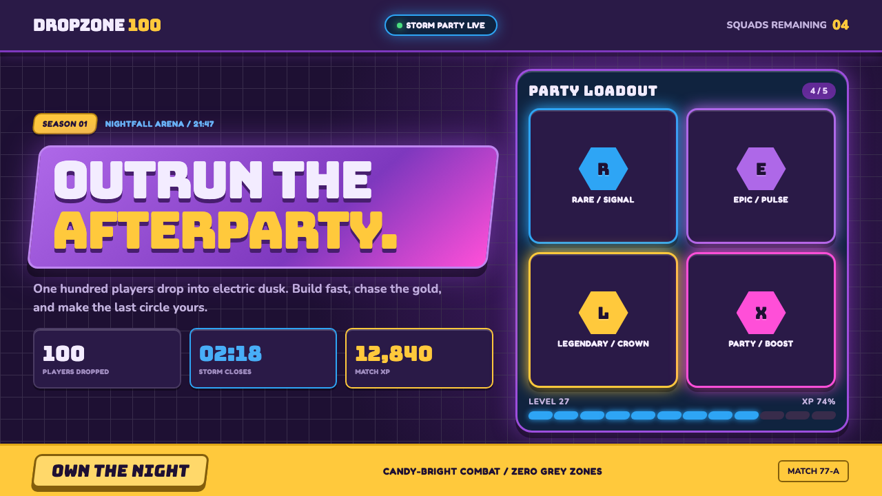 Fortnite (2017 Battle Royale)Battle royale becomes a neon party. Chunky caps and rarity glows electrify st…
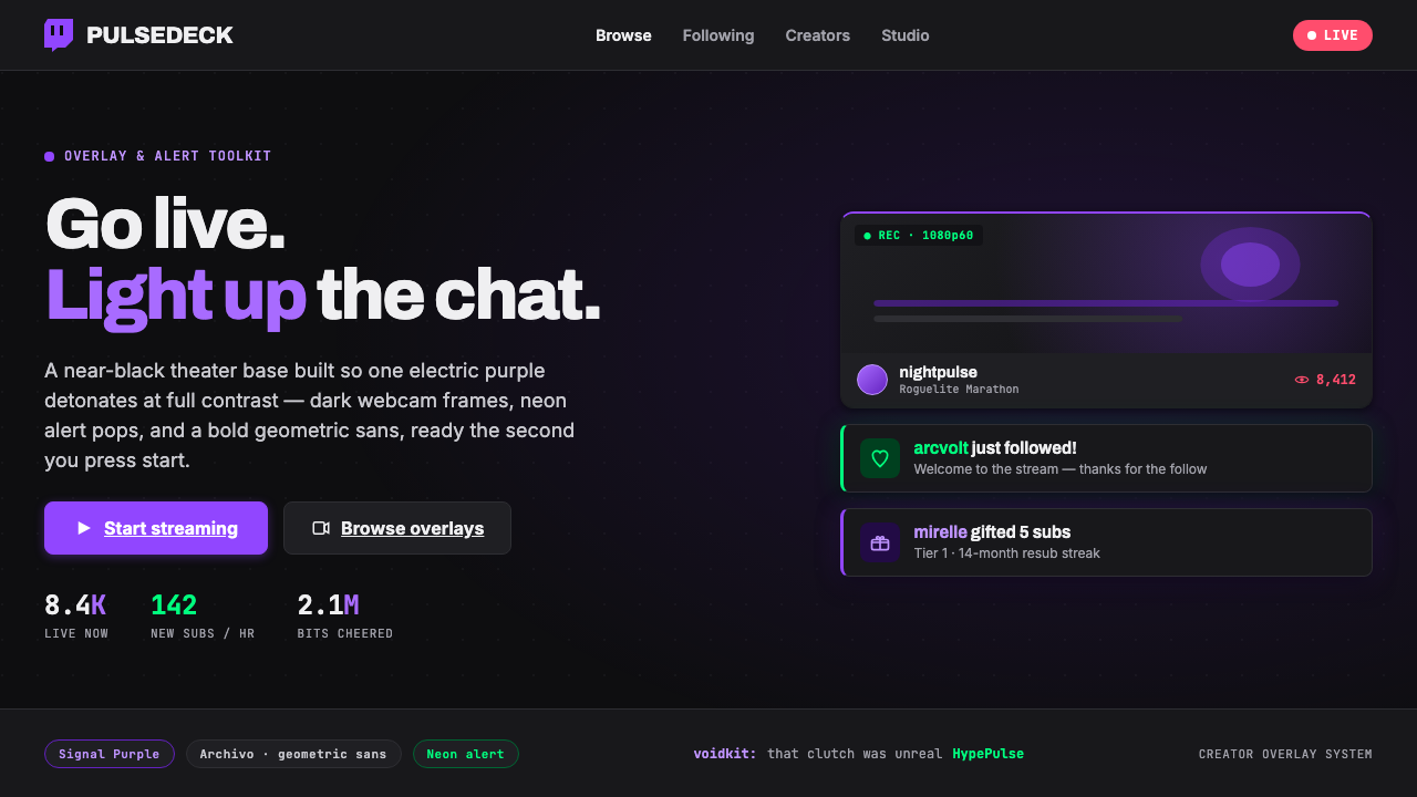 Twitch Streamer OverlayNear-black theater base, one electric purple. Dark webcam frames, neon alert…
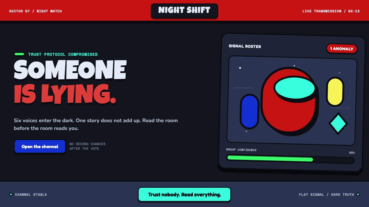 Among Us (crewmate space)Trust is ready to break. Loud capsule colors cut through a navy void with har…
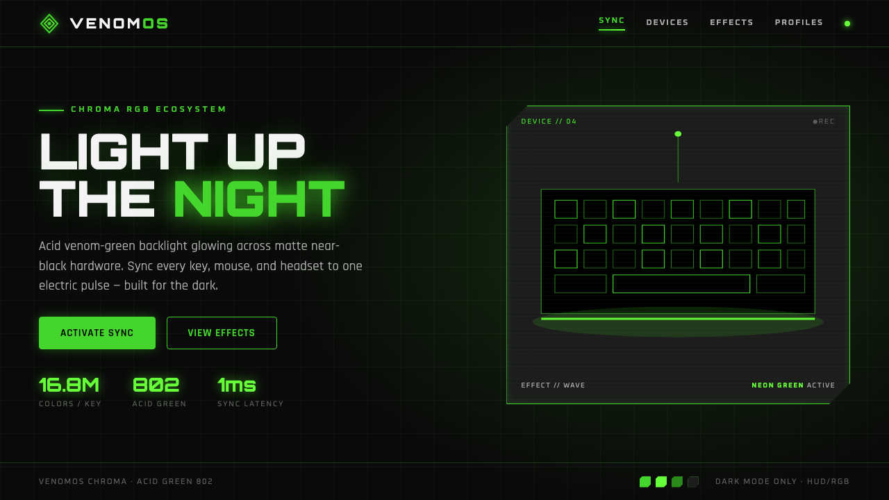 Razer Chroma GreenEsports gear at night. Acid Pantone-802 green burns on matte black via RGB gl…
 Altered CarbonNeon screams off noir. Magenta glass, cyan scanlines, and stacked vertical si…
 Blade Runner 2049Noir with tectonic weight. Orange dust, cyan hairlines, and monumental Inter…