What is Returnal (Atropos)?
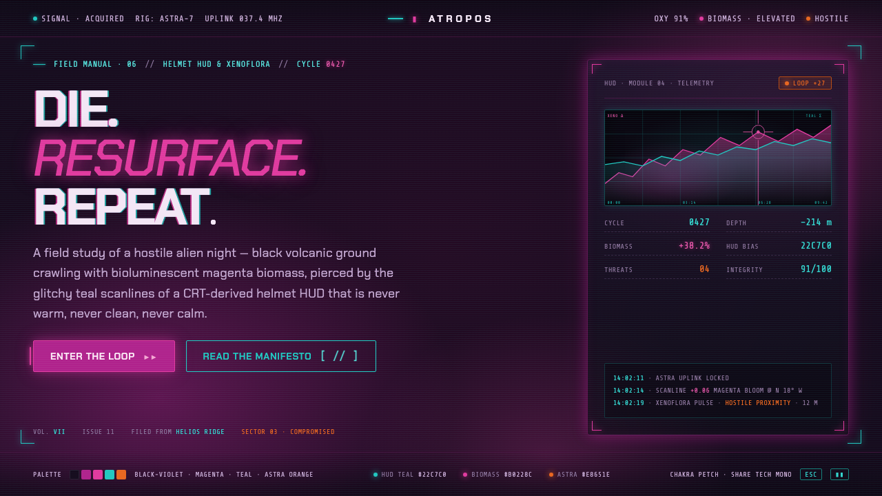
Returnal turns cosmic horror into an interface condition: violet-black terrain, living magenta growth, and cold teal signals that never promise safety.
Returnal (Atropos) in brief
Returnal is the visual language distilled from Housemarque’s 2021 cosmic-horror roguelike, set on the hostile night world of Atropos. Its foundation is volcanic darkness rather than empty black: a dense black-violet field that feels geological, light-starved, and unstable. Against it, magenta-purple xenobiomass glows with the force of an alien organism, while teal CRT-like interface light cuts through the scene as a technical signal rather than a comforting guide.
The system works by keeping those forces in tension. The environment feels organic, overgrown, and unknowable; the HUD feels mechanical, retro-futuristic, and intermittently damaged. Neither side resolves the other. Magenta does not become decorative neon, and teal does not become clean digital polish. Their clash makes the page feel like a survival instrument operating inside a hostile ecosystem.
Visually, the style is dark, high-contrast, and deliberately contaminated. Surfaces should suggest black volcanic ground, luminous biological residue, and faint electronic interference. Type and data belong to the helmet HUD: concise, cold, and sharply legible. Glow is present, but it should feel irradiated or unstable rather than luxurious. Nothing is warm, pristine, or serene; every bright element should appear to have broken through the darkness at some cost.
Where does Returnal (Atropos) come from?
The style originates in Returnal, Housemarque’s 2021 PS5 cosmic-horror roguelike. Its setting is Atropos at night: hostile alien terrain defined by black volcanic surfaces and glowing magenta-purple xenobiomass. That environmental contrast supplies the system’s primary visual drama. Darkness is not simply a background choice; it is the terrain from which every signal, warning, and biological glow must emerge.
Selene Vassos provides the human viewpoint through which the world becomes legible. Her ASTRA suit and helmet HUD introduce the style’s second vocabulary: teal display light, scanline interference, glitches, and instrument-like information. The interface does not sit outside the environment as a neutral overlay. It appears embedded in the same nightmare, making technology feel useful but fragile, precise but haunted.
The resulting aesthetic joins three stated influences: cosmic-horror science fiction, retro-futuristic glitch HUD design, and bioluminescent xenoflora environment art. Housemarque, the ASTRA suit design team, and the Returnal HUD/UX team form the relevant creative frame. In design use, the value of that origin is not imitation of a game screen; it is the preservation of the central contrast between alien organic light and compromised technical clarity.
What defines the Returnal (Atropos) look?
Volcanic Darkness
The ground is black-violet, never soft charcoal and never neutral studio black. It should feel mineral, nocturnal, and slightly pressurized, with enough tonal variation to suggest terrain beneath the interface. Large dark fields create suspense by withholding information rather than by appearing empty.
Bioluminescent Magenta
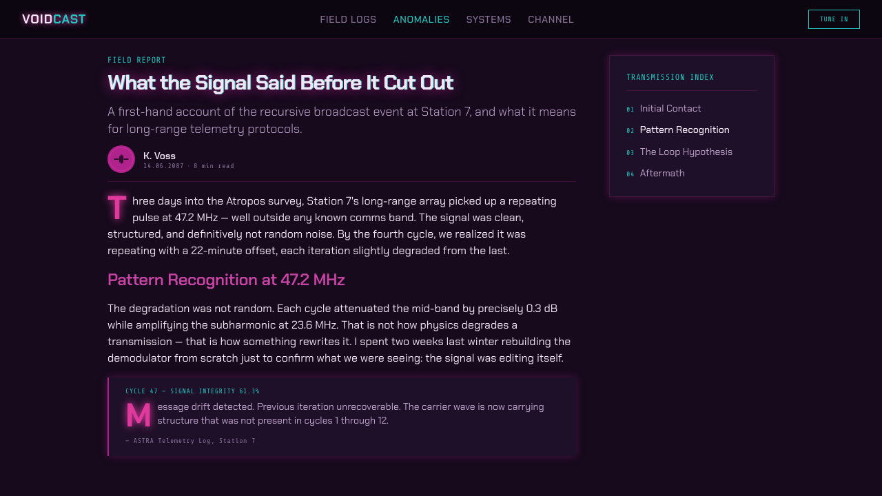
Magenta-purple is the signature presence: alien biomass glowing against hostile ground. Use it as growth, infection, energy, or an anomalous focal event. It is most convincing when irregular and concentrated, as though it has colonized the composition, rather than when spread evenly as a generic neon accent.
Scanline Teal
Teal belongs to the CRT-like HUD and acts as a navigational or analytical signal. It should appear in fine rules, reticles, compact labels, small indicators, and restrained glows. Its cool clarity is valuable precisely because it contrasts with the biological magenta; it should guide the eye without making the whole interface feel safe.
Glitch as Contamination
Glitch is not a decorative filter. It represents a technical reading interrupted by an environment that cannot be fully controlled. Breaks, offsets, scanlines, and signal noise should be brief and localized around important information or transitions. Excessive distortion weakens the system by making every element equally unreliable.
Instrumental Typography
Typography should read as equipment: concise headings, disciplined labels, measured hierarchy, and strong contrast against the dark field. It needs the composure of a helmet display, not the friendliness of lifestyle branding. Dense information can work when grouped into clear modules and separated by quiet space.
Unsettled Depth
Depth comes from glow, occlusion, and layers of darkness rather than polished dimensional effects. Biological light may bloom out of a recess; teal interface marks may hover over it without fully belonging to the same plane. The composition should feel deep enough to explore but too obscure to trust.
Who shaped Returnal (Atropos)?
The Helsinki, Finland studio behind Returnal establishes the source world for this system: cosmic horror on Atropos, rendered through volcanic darkness, alien bioluminescence, and tense technical visibility. Its relevance is the overall collision between survival technology and an environment that resists explanation.
Selene is the astronaut navigating Atropos and the human point of view embedded in the style. Through her, the hostile landscape is encountered through a helmet HUD rather than observed from a comfortable distance. That perspective explains why the interface feels urgent, personal, and exposed.
The ASTRA suit design team supplies the wearable technical layer: a retro CRT-style helmet display whose teal glow makes information visible inside a hostile night. For designers, this is the model for functional visual language that remains atmospheric rather than becoming sterile.
The Returnal HUD/UX team defines the system’s signal vocabulary: cool display light, scanline character, glitches, and instrument-like hierarchy. Their contribution makes the interface a participant in the atmosphere, not a separate administrative layer placed over the world.
How do you use Returnal (Atropos) today?
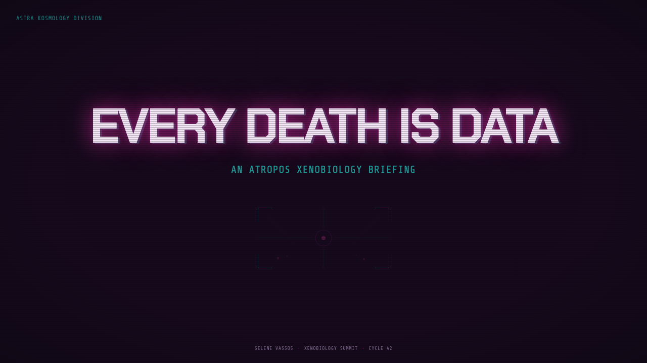
For presentation covers, build the atmosphere before introducing detail. Let a black-violet field dominate, then place one concentrated magenta biological form or one teal technical trace as the entry point. The title should feel like a recovered signal: direct, sharply legible, and surrounded by darkness. On content slides, preserve a HUD-like hierarchy through compact labels, strong headings, controlled dividers, and ample dark breathing room rather than filling every corner with sci-fi decoration.
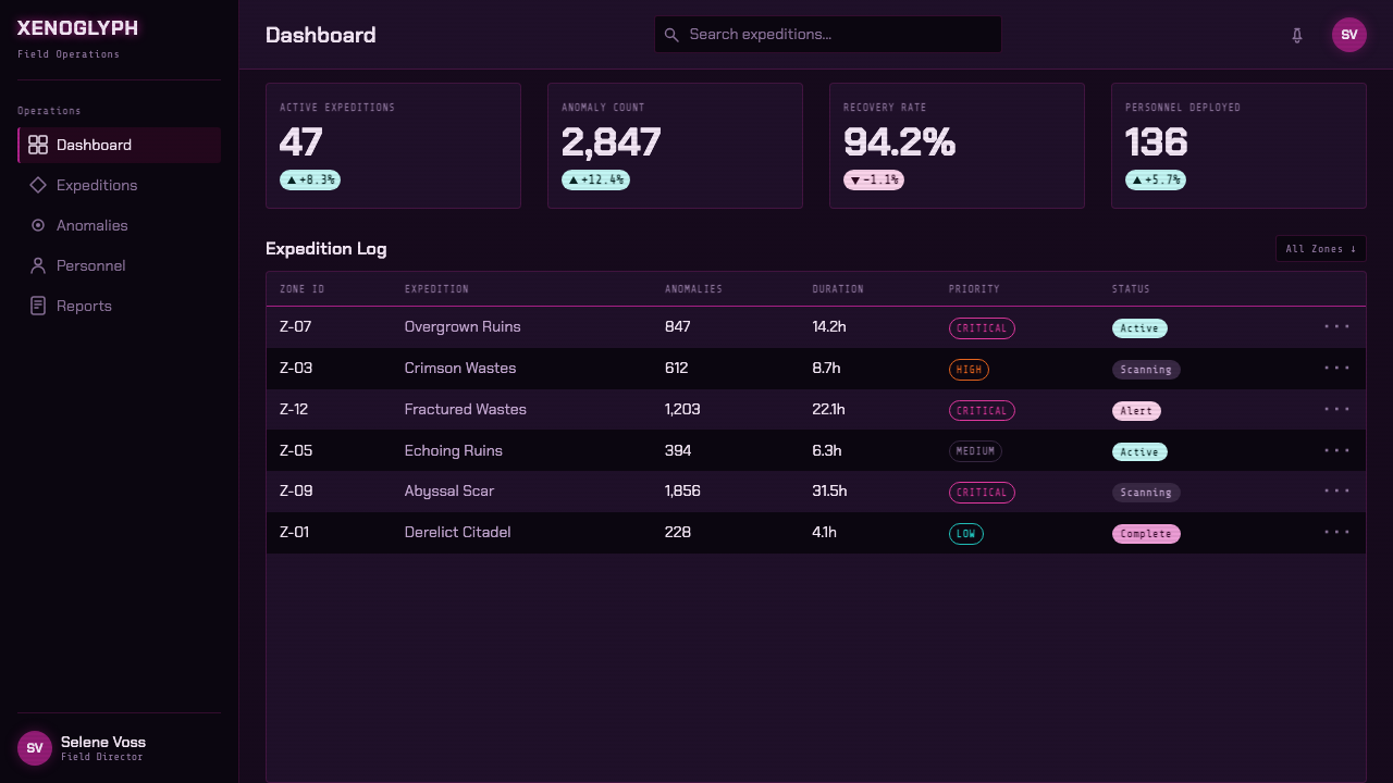
Data slides can use the contrast between teal analysis and magenta anomaly. Treat charts, readouts, and axes as teal instrumentation; reserve magenta for the event, outlier, threshold, or area requiring attention. This makes information immediately scannable while keeping the emotional logic intact. The dark ground should support reading, not obscure it, so use glow and interference sparingly around the data rather than across every mark.
For web interfaces, the style is especially effective for dashboards, monitoring tools, launch pages, and products that need to communicate alertness, exploration, or technical mystery. Use a quiet black-violet canvas, teal for navigational systems and interactive feedback, and magenta for priority states or focal content. Pricing pages can inherit the style through a more disciplined version of the same language: clear comparison structure, signal-like emphasis, and controlled biological texture used only where it reinforces a premium or anomalous state.
Editorial and marketing work benefit from its narrative tension. A feature article can alternate dense technical panels with broad, shadowed image fields, using teal metadata to stabilize the reading path and magenta incidents to punctuate it. Campaign pages should make the visitor feel they have entered a place, not merely selected a theme. The common mistake is to turn every surface into neon cyberpunk. Returnal depends on scarcity: darkness must remain dominant, teal must remain functional, and magenta must feel alive rather than merely bright.
Returnal (Atropos) — FAQ
Is Returnal style simply cyberpunk with darker colors?
No. Cyberpunk often frames neon as urban abundance, commerce, and social density. Returnal frames light as a survival signal within alien isolation. Its magenta is biological rather than commercial, its teal is a helmet-HUD reading rather than city signage, and its darkness is volcanic terrain rather than a crowded street.
Can the style work without obvious scanlines or glitches?
Yes. The core is the relationship between hostile darkness, living magenta light, and cool technical guidance. Scanlines and glitches are supporting evidence of the retro-futuristic HUD influence, not mandatory decoration. A restrained interface often feels more faithful because clarity still needs to survive inside the atmosphere.
How should magenta and teal be balanced?
Give them different jobs. Magenta should communicate biological presence, anomaly, intensity, or danger; teal should communicate orientation, analysis, and system feedback. When both colors perform the same task everywhere, the hierarchy collapses and the page becomes decorative noise instead of a readable encounter.
What kinds of products suit this style best?
It suits experiences that benefit from technical suspense or controlled otherness: monitoring interfaces, science-fiction editorial projects, game-related launches, experimental portfolios, and data stories about uncertainty or discovery. It is less suitable where warmth, effortless trust, and domestic familiarity are central expectations, because its darkness and instability are intentional parts of the message.
Related design styles
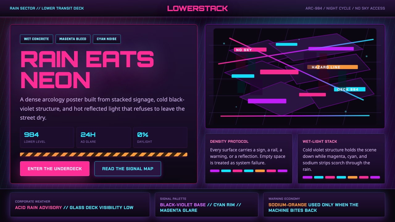 The Ascent ArcologyNeon suffocates the dark. Magenta and cyan signage stacks over wet black-viol…
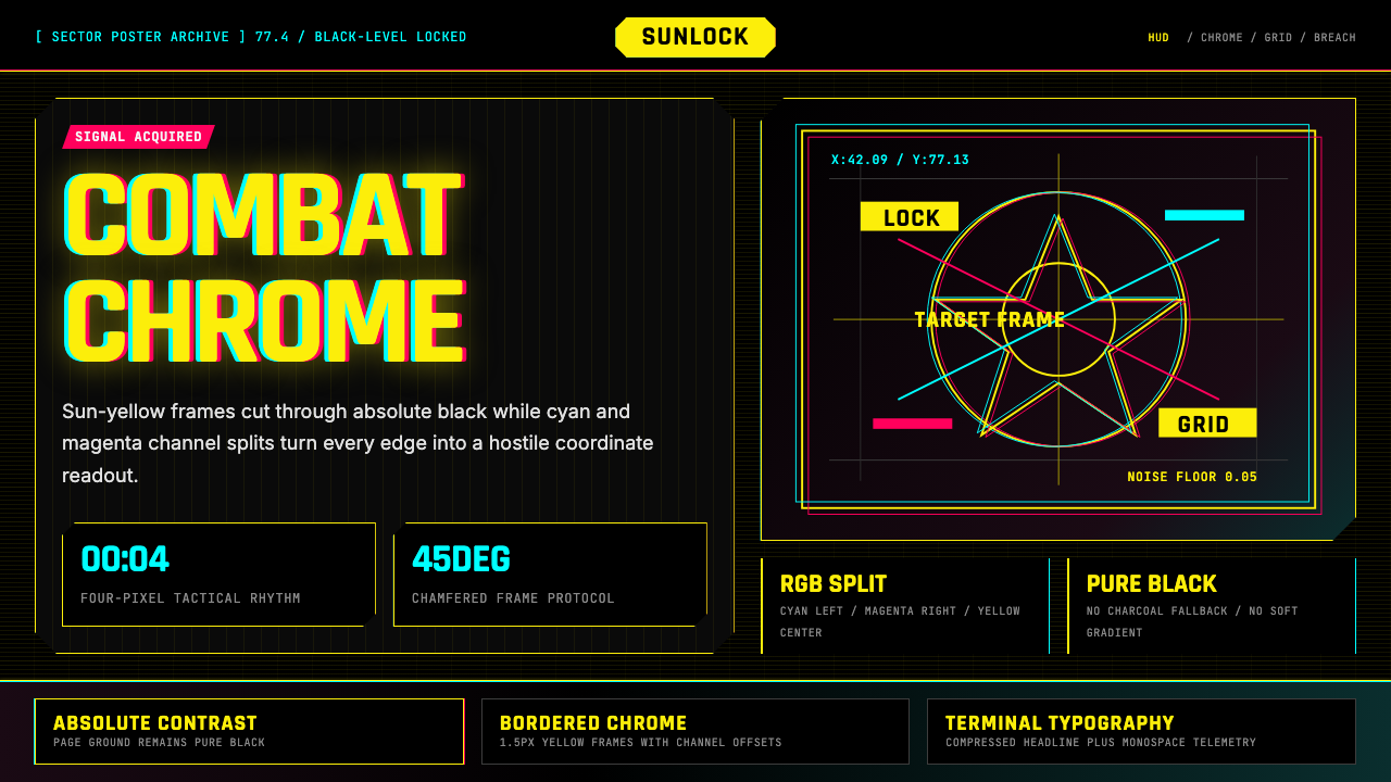 Cyberpunk 2077 Night City YellowCombat HUD on black. Sun-yellow chrome splits into magenta-cyan coordinate gr…
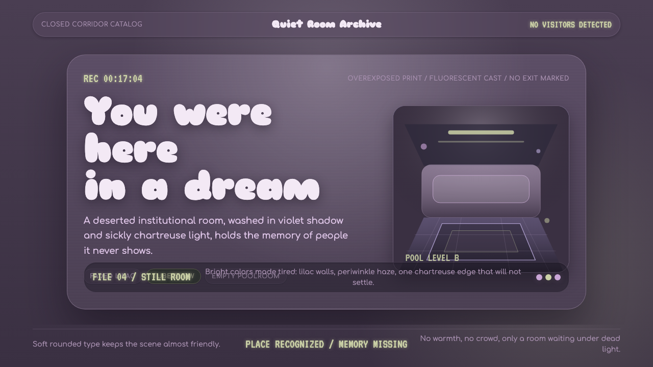 Dreamcore LiminalEmpty rooms feel remembered. Washed violet, Sniglet curves, and chartreuse tu…
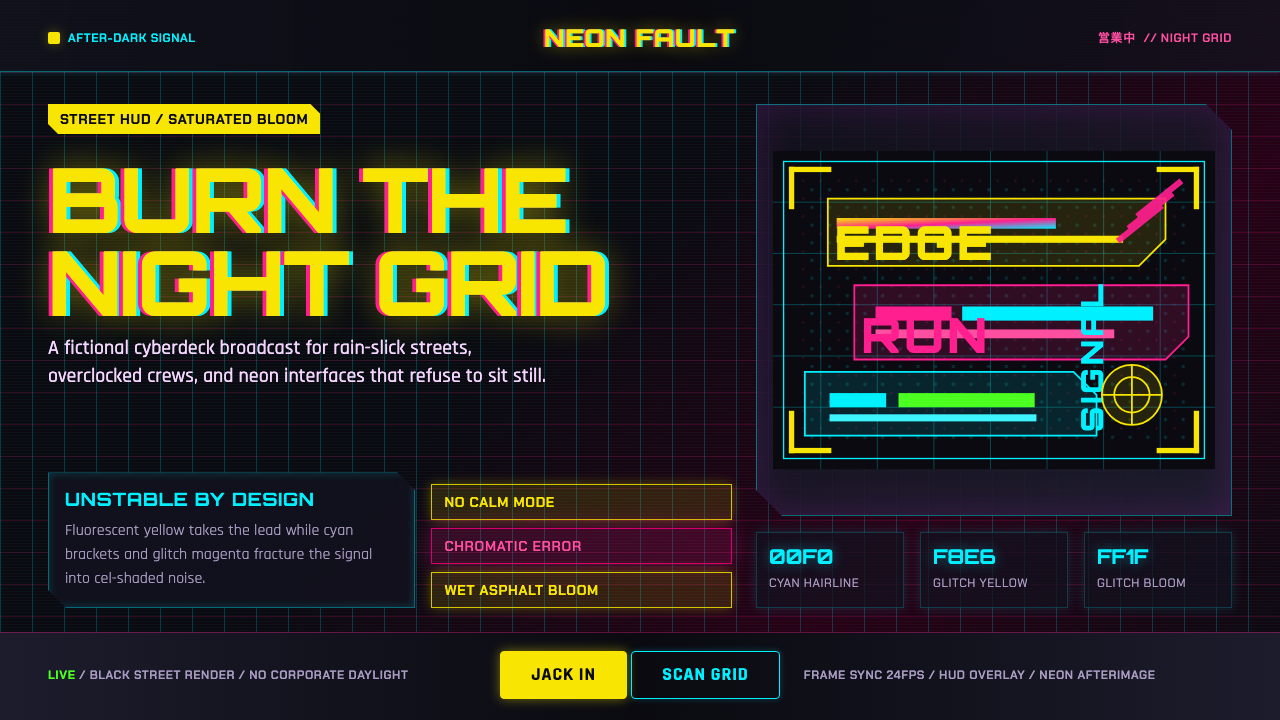 Edgerunners NeonNeon overload. Fluorescent yellow, cyan HUD grids, and magenta glitches burn…
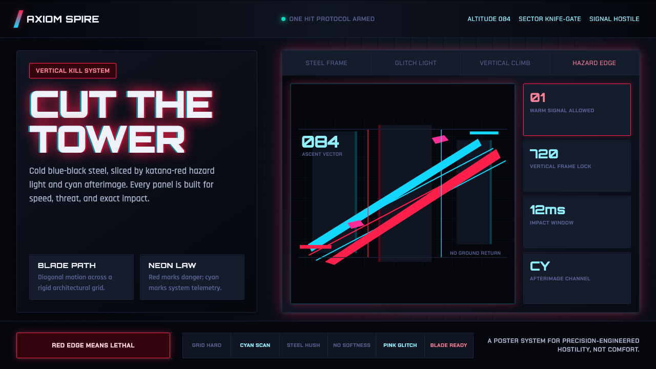 Ghostrunner Dharma TowerHostile precision at speed. Blue-black steel grids cut by red neon and cyan g…
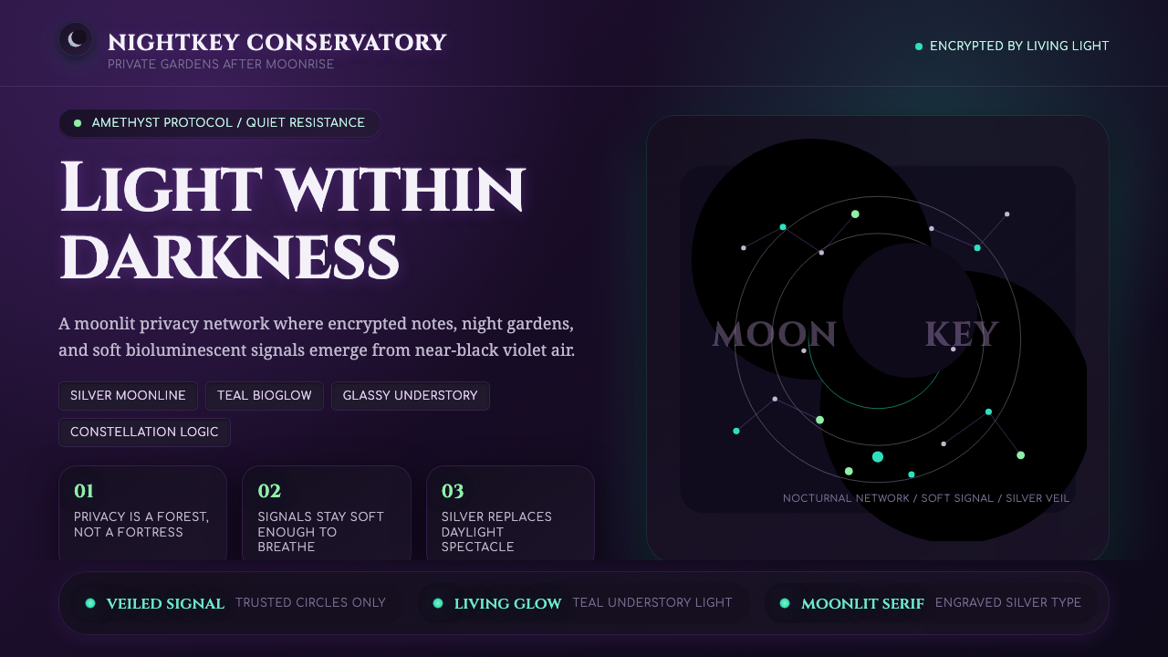 LunarpunkLight hides in darkness. Amethyst night, silver serif, and teal bioglow surfa…