What is Lunarpunk?
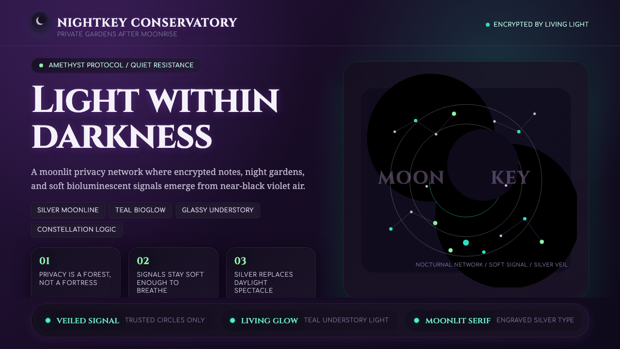
Lunarpunk lets light surface from the dark—amethyst night, silver serif, and bioluminescent teal turning privacy, encryption, and quiet resistance into a visual language.
Lunarpunk in brief
Lunarpunk is a 2020s speculative aesthetic that emerged as an online subcultural offshoot around 2021–2023. It is the nocturnal twin of solarpunk: instead of imagining a bright, openly utopian future in green and gold, it retreats into a moonlit dark forest shaped by privacy, encryption, introspection, and quiet resistance.
Its central visual idea is light within darkness. Near-black and deep-purple grounds create the surrounding night, while silver type and softly glowing teal or glow-green details suggest mushrooms, luminous flora, and hidden life beneath the canopy. Interfaces do not announce themselves through hard borders; components seem to surface gently from the dark through organic illumination.
Lunarpunk is both mystical and technologically fluent. Engraved serif titling evokes moon-goddess symbolism, while crescents, constellations, encrypted networks, and night-blooming gardens establish a world that is speculative without becoming purely fantastical. The result is inward-looking, atmospheric, and quietly oppositional rather than openly triumphant.

Where does Lunarpunk come from?
Lunarpunk belongs to the speculative design culture that developed around solarpunk, but it reverses the emotional temperature and visual conditions of that neighboring movement. Where solarpunk is associated with daylight, green-and-gold optimism, and open utopian possibility, Lunarpunk asks what resistance, community, and technological hope might look like after sunset.
The source material places its emergence in the 2020s, with the aesthetic taking shape as an online subculture offshoot around 2021–2023. Its region is global and digital rather than tied to a single city, school, or national design tradition. This online origin helps explain its hybrid vocabulary: ecological imagery, privacy culture, speculative fiction, and interface aesthetics can coexist without being reduced to one historical medium.
The proposed Lunarpunk flag offers a concise visual statement of the style. Its diagonal movement from purple in the upper-left toward black in the lower-right establishes a passage from visible color into profound night. Silver replaces the gold associated with solarpunk, while bioluminescent teal and glow-green provide the sense of living light that keeps the darkness from becoming empty.
Conceptually, Lunarpunk sits near several overlapping movements named in the source material: Lunarpunk itself, Solarpunk, Hopepunk, and crypto and privacy aesthetics. These affiliations do not create a fixed doctrine or a single authorial canon. Instead, they describe a shared field of ideas in which hope can be guarded, technology can be used fluently without being worshipped, and resistance can be deliberate, private, and difficult to detect.
What defines the Lunarpunk look?
Amethyst Night
The palette begins in deep purple and settles toward black, creating the impression of an amethyst sky dissolving into an unlit forest. Silver provides the principal contrast for type and quiet structure. Teal and glow-green appear as living accents rather than general decoration, associated with mushrooms, luminous flora, and the hidden understory.
Light Within Darkness
Lunarpunk treats darkness as the environment and glow as the event. Elements should feel discovered rather than displayed: a panel emerges from a near-black ground, a label catches silver light, and a teal mark suggests biological activity. The contrast is atmospheric and gradual in feeling, even when the underlying forms remain clear and controlled.
Engraved Serif
Serif titling gives the style its lunar and ritual character. The preferred impression is engraved, silvery, and slightly archaic, as though a title had been cut into a nocturnal artifact and caught by moonlight. Serif display type can carry mysticism without sacrificing technological fluency when paired with restrained supporting text.
Bioluminescent Surface
Glow is soft, organic, and selective. It belongs around living or secretive details rather than coating every surface: a teal trace, a green fungal form, or a silver edge can be enough to establish depth. The light should feel grown, diffused, and slightly mysterious, not like a hard electronic indicator or a glossy showroom effect.
Crescent and Constellation
Crescents and constellations are recurring motifs that organize the visual world without becoming ornamental wallpaper. A crescent can mark a threshold, a phase, or a quiet focal point; a constellation can connect scattered information across a dark field. Both motifs reinforce Lunarpunk's relationship with orientation, secrecy, and the patient rhythms of night.
Quiet Resistance
The mood is speculative, introspective, and technologically fluent rather than loud or celebratory. Privacy and encryption are not merely subject matter; they shape the sense of distance, selective visibility, and protected interior space. The style suggests networks that communicate beneath the surface and communities whose strength comes from discretion as much as from openness.

Who shaped Lunarpunk?
Solarpunk community writers form the neighboring intellectual context from which Lunarpunk's identity becomes legible. Their presence matters because the lunar aesthetic is defined partly through contrast with its solar counterpart: daylight becomes night, open utopianism becomes guarded possibility, and gold becomes silver.
Lunarpunk aesthetic artists are named in the source as one of the style's key figure groups. Their significance lies in giving the shared vocabulary a visible form: deep purple and black night, silver serif presence, bioluminescent teal and glow-green life, and the recurring language of crescents and constellations.
Solarpunk Station contributors are also identified as part of Lunarpunk's source community. The material does not assign them individual biographies or a single formal role, so they are best understood as contributors within the wider online conversation where solarpunk, Lunarpunk, hopepunk, and privacy aesthetics overlap.
How do you use Lunarpunk today?
For presentation slides, Lunarpunk is strongest when the cover establishes a deep nocturnal field with one luminous point of focus: a silver serif title, a crescent, or a restrained teal glow. Content slides should let information surface from that darkness in clear layers. Data slides can treat charts as constellations or illuminated pathways, using teal and glow-green selectively while preserving silver or pale type for reading.
For web interfaces, the style suits privacy tools, encrypted networks, reflective dashboards, and pricing pages that want to feel protected rather than aggressively commercial. Use a near-black ground, quiet silver hierarchy, and bioluminescent accents for active states, alerts, or meaningful changes. Panels should feel embedded in the night, with soft organic emergence instead of bright outlines everywhere.
For editorial and marketing work, Lunarpunk supports essays, speculative publications, cultural projects, and campaigns built around hidden systems or night ecology. A narrow reading column can sit inside generous darkness, while section openings use engraved serif titles, lunar motifs, and small areas of living color. Marketing pages should let the atmosphere carry the message, reserving glow for the moments that genuinely need attention.
For products and communities centered on privacy, encryption, or subcultural resistance, the visual language can make protected space feel intentional rather than defensive. Constellation structures can connect related ideas, crescent forms can mark transitions, and night-garden imagery can suggest growth that does not require public display. The tone works best when technology remains legible beneath the mysticism.
The common mistake is treating Lunarpunk as a generic dark interface with neon accents. Filling every surface with glow, using silver as a metallic effect, or scattering crescents and stars without hierarchy turns quiet resistance into spectacle. The style depends on darkness having real visual authority, with light appearing selectively and organically. Privacy should be felt through restraint and protected space, not announced through visual noise.

Lunarpunk — FAQ
Is Lunarpunk simply a dark version of Solarpunk?
No. The two share a speculative and ecological imagination, but Lunarpunk changes the emotional and political emphasis. Solarpunk is associated with daylight, green-and-gold optimism, and open utopianism. Lunarpunk turns toward moonlit darkness, silver, privacy, encryption, introspection, and quiet resistance. Its darkness is not merely a color choice; it represents a different relationship to visibility and hope.
Can Lunarpunk work on a light background?
It can be adapted, but a light background removes the style's central condition: light emerging from darkness. A successful variation would need to preserve the contrast through deep-purple structures, silver-like type treatment, and carefully limited bioluminescent accents. If the page becomes broadly bright, decorative, and openly cheerful, it has moved away from Lunarpunk's nocturnal identity.
How should glow be used without making the interface noisy?
Treat glow as a signal of life or significance, not as a default finish for every component. Let most of the surface remain quiet and near-black, then reserve teal, glow-green, or silver illumination for active states, focal information, and motifs that need to surface. The more darkness remains untouched, the more meaningful each luminous element becomes.
Is Lunarpunk mystical, technological, or ecological?
It is deliberately all three. Engraved serif titling and lunar motifs supply the mystical register; encryption and technologically fluent interfaces provide the contemporary register; mushrooms, luminous flora, and the dark forest supply the ecological register. Lunarpunk works because these elements are held in tension rather than flattened into a single genre.
What makes a Lunarpunk design feel authentic rather than decorative?
The visual choices must express the style's underlying values. Darkness should create protected space, glow should reveal selected life, silver should replace the solar association of gold, and lunar motifs should help orient meaning rather than fill empty areas. When privacy, encryption, introspection, and quiet resistance shape the hierarchy, the aesthetic becomes a coherent system instead of a collection of night-themed ornaments.
Related design styles
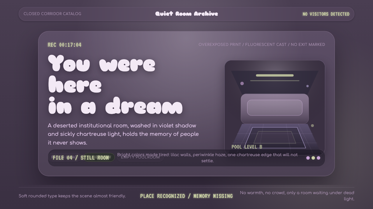 Dreamcore LiminalEmpty rooms feel remembered. Washed violet, Sniglet curves, and chartreuse tu…
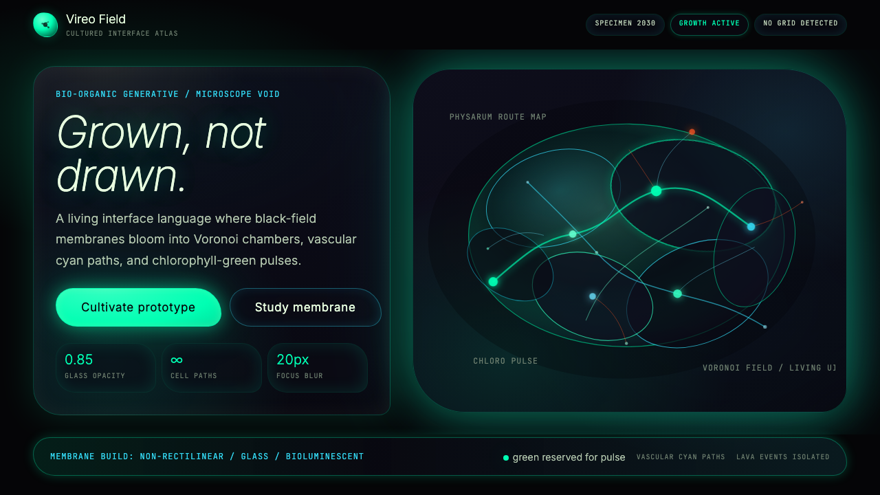 Bio-Organic GenerativeInterfaces feel cultured. Void black, Voronoi membranes, and neon chlorophyll…
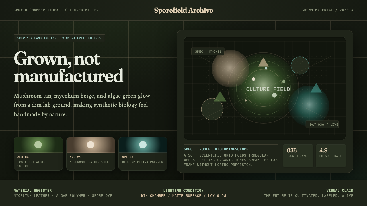 Biopunk GrownLife replaces industry. Algae green glows on chamber dark with serif voice an…
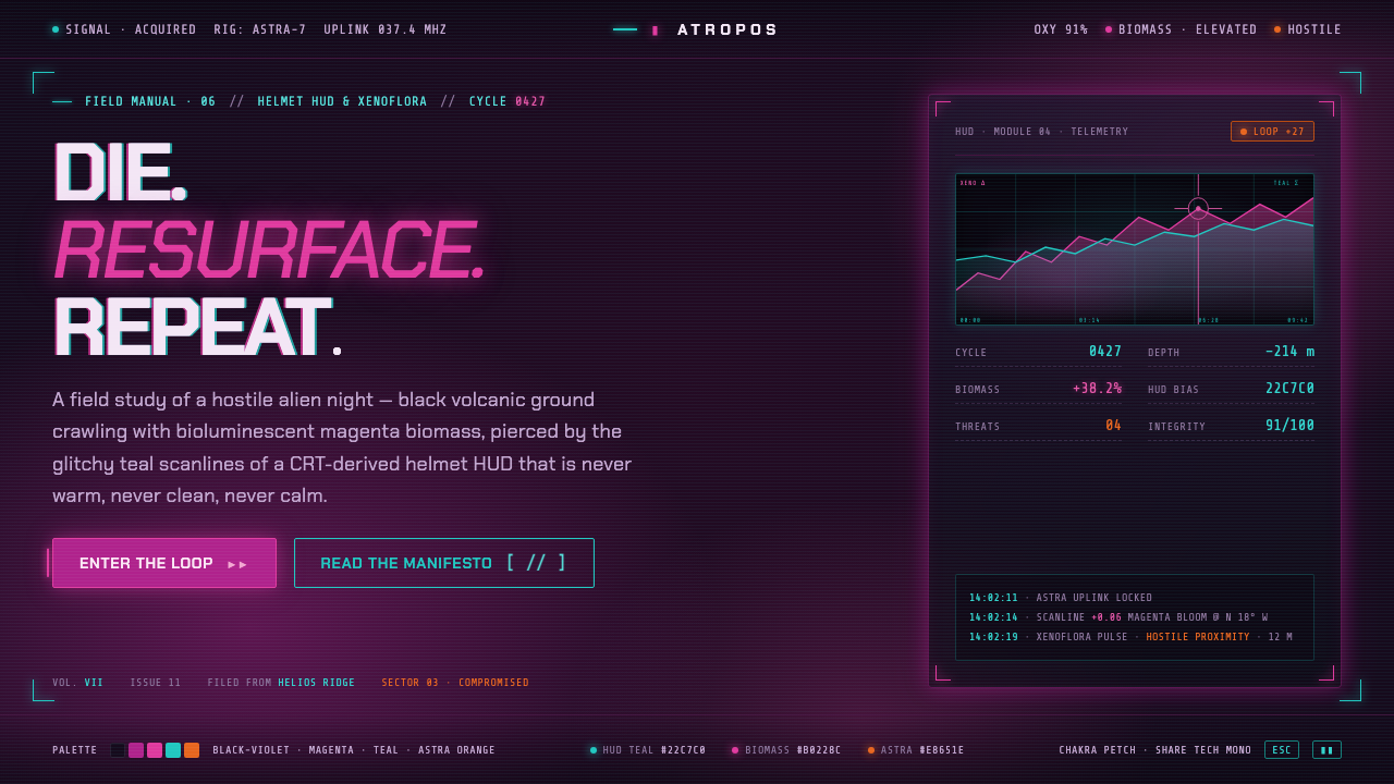 ReturnalNever warm, never clean, never calm. Magenta biomass on a violet night, pierc…
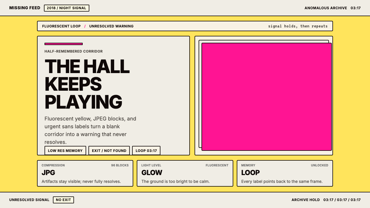 Weirdcore Internet (2018)Wrongness in fluorescent yellow. JPEG blocks and warning labels do the damage.
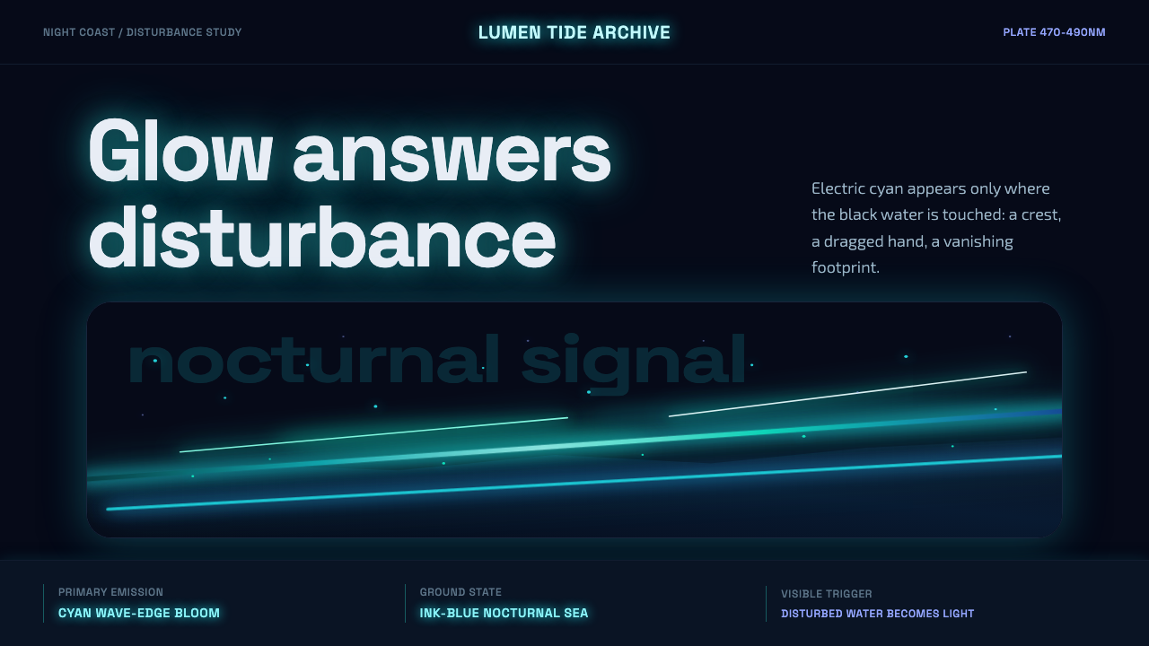 Bioluminescent ShoreDarkness becomes alive. Cyan wave-lines and specks ignite over an ink-blue se…