What is Biopunk Grown?
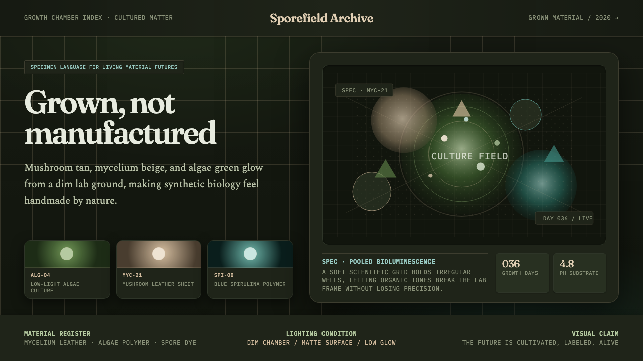
Biopunk Grown imagines a future assembled not by factories but by living organisms — mushroom leather, algae foam, and mycelium packaging quietly growing in the dark rather than being stamped out on a line.
Biopunk Grown in brief
Biopunk Grown is built around a single reversal of the usual industrial-design premise: instead of things being manufactured, they are grown. The palette follows directly from that premise — a warm, tannish mushroom-leather tone, a pale mycelium beige, and a cool, faintly glowing algae green, all of them colors that occur in living or recently living organic matter rather than in a paint chip or a plastics catalog. These tones sit against a dim, low-lit growth-chamber dark, the kind of enclosed, humidity-controlled dark a fungal culture or an algae tank actually needs in order to grow.
The system pairs two very different voices in its lettering: a literary, narrative register carries the sense of something being described or witnessed, while a clinical, specimen-label register tracks and identifies what is being grown, batch by batch. This split mirrors the two roles biodesign actually plays — half poetic manifesto about a different kind of future, half laboratory logbook tracking a living culture's progress — and the aesthetic keeps both voices visible rather than collapsing them into one tone.
The overall atmosphere favors soft, low-key lighting and close, almost macro-lens views of material texture — the fibrous grain of a mycelium sheet, the slightly tacky sheen of an algae-based foam, the visible irregularity of something that grew rather than something that was extruded to a fixed tolerance. Where a conventional tech aesthetic would show a product rendered in crisp, even studio light, this system prefers a dimmer, more intimate light that treats the material itself as the subject worth looking closely at.
Where does Biopunk Grown come from?
The word 'biopunk' descends from the same lineage as cyberpunk, but points its rebellious energy at biotechnology rather than computing. The subculture took shape around the turn of the twenty-first century among hobbyists and independent researchers running genetic-engineering experiments outside university and corporate labs, on the belief that biotechnology, like early home computing, should not remain the exclusive property of large institutions. That do-it-yourself, anti-institutional spirit is the root of the movement's aesthetic instinct: favor the handmade, the visibly organic, and the artisanal over the sterile and corporate.
Biopunk Grown as a design language belongs to a more recent and more commercially grounded chapter of that lineage — the wave of biodesign that gathered force from around 2020 onward, as material-science labs and startups worldwide began turning fungal mycelium, algae, and other living or bio-based substrates into genuine substitutes for leather, foam, and plastic packaging. Where earlier biopunk imagery was largely speculative and rebellious, this newer material-forward strand is closer to industrial design with a living supply chain: the aesthetic still carries the DIY-lab spirit, but the objects it depicts are increasingly real, sold, and shipped.
Several real ventures anchor this shift. Indonesian company Mycotech, working under the brand Mylea, grows sheets of mycelium leather as a direct substitute for tanned animal hide. Algix, in the United States, converts algae harvested from harmful blooms — a waste and environmental hazard in its raw form — into a flexible bioplastic foam sold under the Bloom name, turning an ecological problem into a manufacturing input. Earlier still, Ecovative Design pioneered growing mycelium into rigid, mold-shaped packaging and insulation, proving that a living organism could be directed to assume an engineered form rather than simply being harvested and processed after the fact.
Design schools and independent researchers filled out the aesthetic's other half — its narrative, speculative voice. Programs like the Netherlands' ArtEZ University of the Arts developed dedicated biodesign research tracks bridging fashion, product design, and laboratory science, while independent designers such as Suzanne Lee, working under the label BioCouture, grew garments directly from bacterial cellulose cultures years before the material-science industry caught up commercially. By the early 2020s these two threads — real, shippable grown materials and the speculative design language built around them — had converged into a single recognizable aesthetic.
What defines the Biopunk Grown look?
Color and Palette
The palette stays inside a narrow range of organic tones: mushroom-leather tan, mycelium beige, and a cooler algae green, deployed against a dim growth-chamber dark. Every tone reads as something taken from a living or once-living surface rather than mixed from a synthetic base — no bright plastic primaries, no neon outside the specific glow of the algae tone, and no cool industrial grays.
Bioluminescent Glow
The algae green in particular carries a faint sense of self-illumination rather than reflecting external light — treated less like a painted surface and more like a living thing giving off its own dim light in the dark. This glow should stay soft and localized, concentrated where a specimen or key element sits, rather than spread evenly as ambient brightness.
Macro Material Texture
Surfaces are treated at close range — the visible fiber of a mycelium sheet, the slightly uneven grain of a mushroom-leather panel — rather than smoothed into an idealized, flawless finish. This closeness is a deliberate signal that the material was grown under real biological conditions rather than manufactured to a uniform industrial tolerance.
Low-Key Lighting
Light in this system is dim, soft-edged, and often directional rather than flat and even — closer to the controlled low light of a growth chamber or specimen shelf than to bright studio product photography. Shadows are allowed to fall deep and soft around the edges of the frame, keeping attention concentrated on whatever is lit rather than illuminating the whole scene uniformly.
Literary Serif Voice
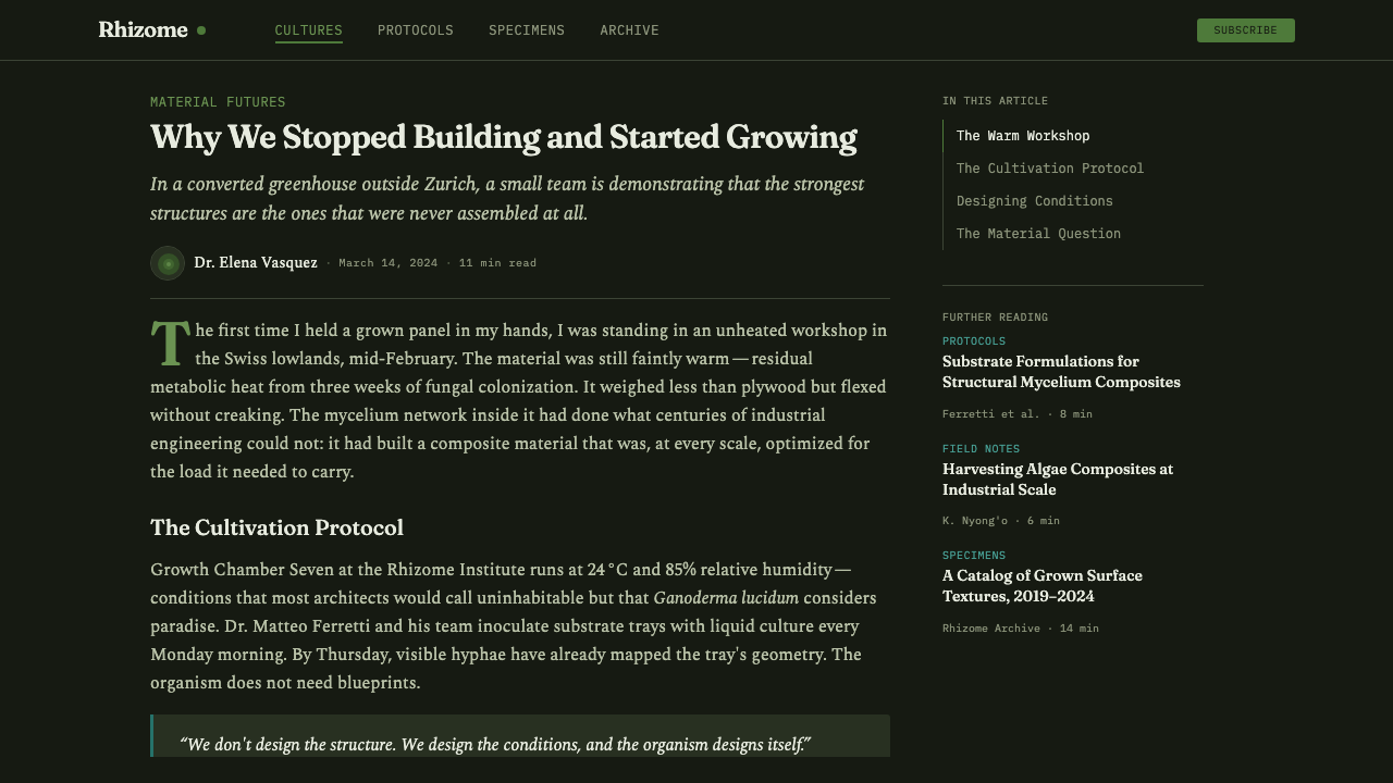
Narrative and descriptive text — the parts of the system speaking about what this future feels like — takes on a warm, book-like serif character, giving the writing a literary weight rather than a technical one. This voice is reserved for reflection and storytelling, never for labeling or data.
Scientific Mono Labeling
Specimen identifiers, batch numbers, and status readouts take on a plain, evenly spaced monospace character, mimicking the clinical labeling found on an actual culture vial or lab shelf. This register never carries emotional or narrative weight — its job is purely to document and identify, and it should read as neutral and procedural against the warmer serif voice.
Who shaped Biopunk Grown?
Founded in 2007, Ecovative Design pioneered growing mycelium into rigid, mold-shaped forms usable as packaging and insulation, proving that a fungal organism could be directed to take on an engineered shape rather than simply being harvested after growing freely. The company's early work is widely credited with launching grown-material design as a viable commercial category rather than a purely speculative one.
Mycotech, an Indonesian biomaterials company, grows sheets of mycelium leather under the brand name Mylea as a direct substitute for tanned animal hide. Its work represents the movement's ambition to replace an entire traditional material category — leather — with something grown rather than raised and processed.
Algix converts algae harvested from harmful algal blooms — an environmental hazard in its raw state — into a flexible bioplastic foam sold under the Bloom name, used in footwear and other flexible-foam applications. The company's work turns an ecological cleanup problem directly into a manufacturing input, a circular logic central to the biodesign movement's appeal.
Designer Suzanne Lee grew garments directly from bacterial cellulose cultures under the BioCouture label, years ahead of the broader material-science industry's commercial push into grown materials. Her work supplied much of the movement's early speculative, narrative imagery — the idea of clothing and objects grown rather than sewn or molded — that later, more commercial ventures would build on.
How do you use Biopunk Grown today?
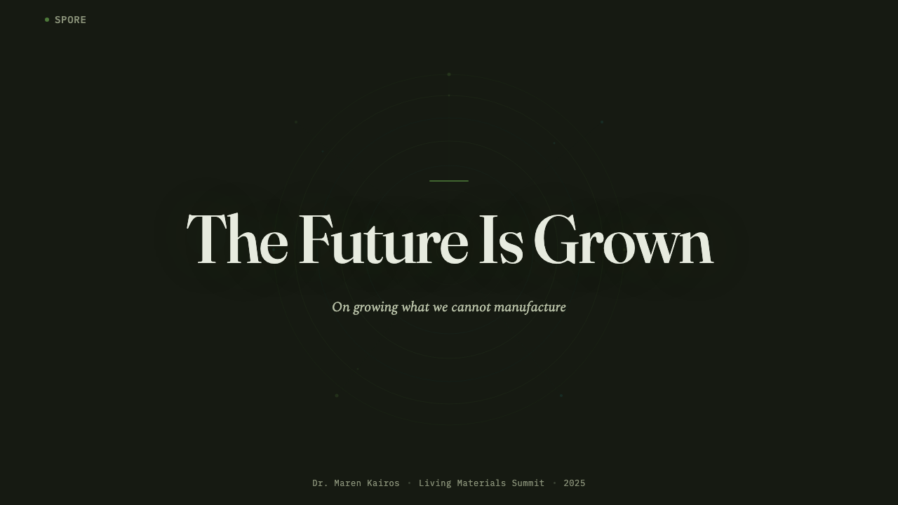
On presentation slides, this system works well for material that needs to make a speculative or research-driven case feel grounded and tangible. A cover slide can lean fully into the dark, low-key atmosphere with a single, closely lit texture image behind the title — mycelium fiber or algae sheen — rather than a bright hero graphic. Content slides should keep the literary serif for framing statements and switch to the mono register the moment any specific data, specimen name, or figure appears, so the shift in typeface itself signals a shift from narrative to evidence.
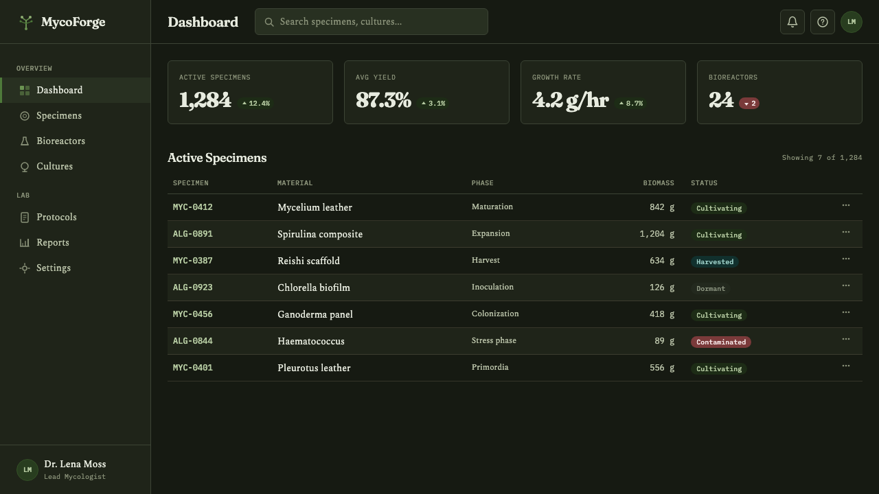
For web interfaces, the palette and low-key lighting suit dashboards or product pages for anything genuinely material- or science-adjacent — sustainability platforms, lab-management tools, biomaterial marketplaces. Dark surfaces throughout keep the growth-chamber mood intact; algae green works well as a status or 'active' indicator given its glow-like quality, while mycelium beige and mushroom tan carry card backgrounds and secondary surfaces. Pricing pages can differentiate tiers through the amount of macro-texture imagery used per card rather than through added color, keeping the restrained palette intact.
In editorial and marketing work, the system is well suited to any story about sustainability, biotechnology, material innovation, or a genuinely alternative vision of manufacturing — its two-voice typography does real work here, with the serif carrying the argument for why this future matters and the mono register grounding it in specific, verifiable specimens and figures. Full-bleed macro-texture photography works well as a section break, standing in for the close, tactile attention the whole aesthetic is built around.
The most common mistake is treating this as a generic 'earthy, organic' green-and-brown palette without the growth-chamber darkness or the close material texture that give it specificity — a bright, evenly lit version with the same three colors reads as a generic eco-friendly brand rather than as this particular vision of grown biotechnology. The dim lighting and the visible material grain are not optional atmosphere; they are what signal 'grown, not manufactured' in the first place.
Biopunk Grown — FAQ
Why does the palette avoid bright, saturated colors that most tech or startup brands use?
Because bright, evenly saturated color reads as synthetic and manufactured — exactly the association this system is built to avoid. The muted, organic tones and low-key lighting are what signal that something grew rather than being produced on a line; introducing a bright synthetic accent color would immediately contradict the premise the whole aesthetic depends on.
Is the dark growth-chamber background required, or can this system work on a light background?
The dark ground is close to essential to the concept, because it is what makes the algae green read as a glow rather than as a flat color and what gives the whole composition the enclosed, controlled-environment feeling of an actual growth chamber. A light-background adaptation is possible for practical reasons, but it should still preserve the sense of an enclosed, humid, low-light space through shadow and framing, or the 'grown in the dark' premise disappears.
How does this differ from a general 'sustainable' or 'eco-friendly' brand aesthetic?
Generic eco-friendly branding tends to use bright, cheerful greens on a white or cream background to signal freshness and optimism. Biopunk Grown instead treats living material as something observed under lab conditions — dim, close, specimen-focused — which reads as scientifically credible rather than simply cheerful. The difference is tone: one is a marketing gesture toward nature, the other stages an actual biological process.
Should the literary serif and the scientific mono ever be mixed within the same block of text?
They work best kept distinct rather than blended sentence by sentence — one register per block of content, with a clear visual handoff between them, such as a specimen label sitting beside a paragraph of narrative text rather than a sentence that switches typefaces mid-thought. Mixing the two too finely erodes the sense that they represent two different kinds of attention: reflection versus documentation.
What's the most common mistake when applying this system?
Making everything look too clean. Because the underlying subject is genuinely organic and irregular, a version of this system with crisp, machine-perfect edges, uniform gradients, and glossy surfaces undercuts its own premise. The material grain, the soft uneven lighting, and a degree of visible irregularity are not flaws to smooth over — they are the evidence that what's being shown was actually grown.
Related design styles
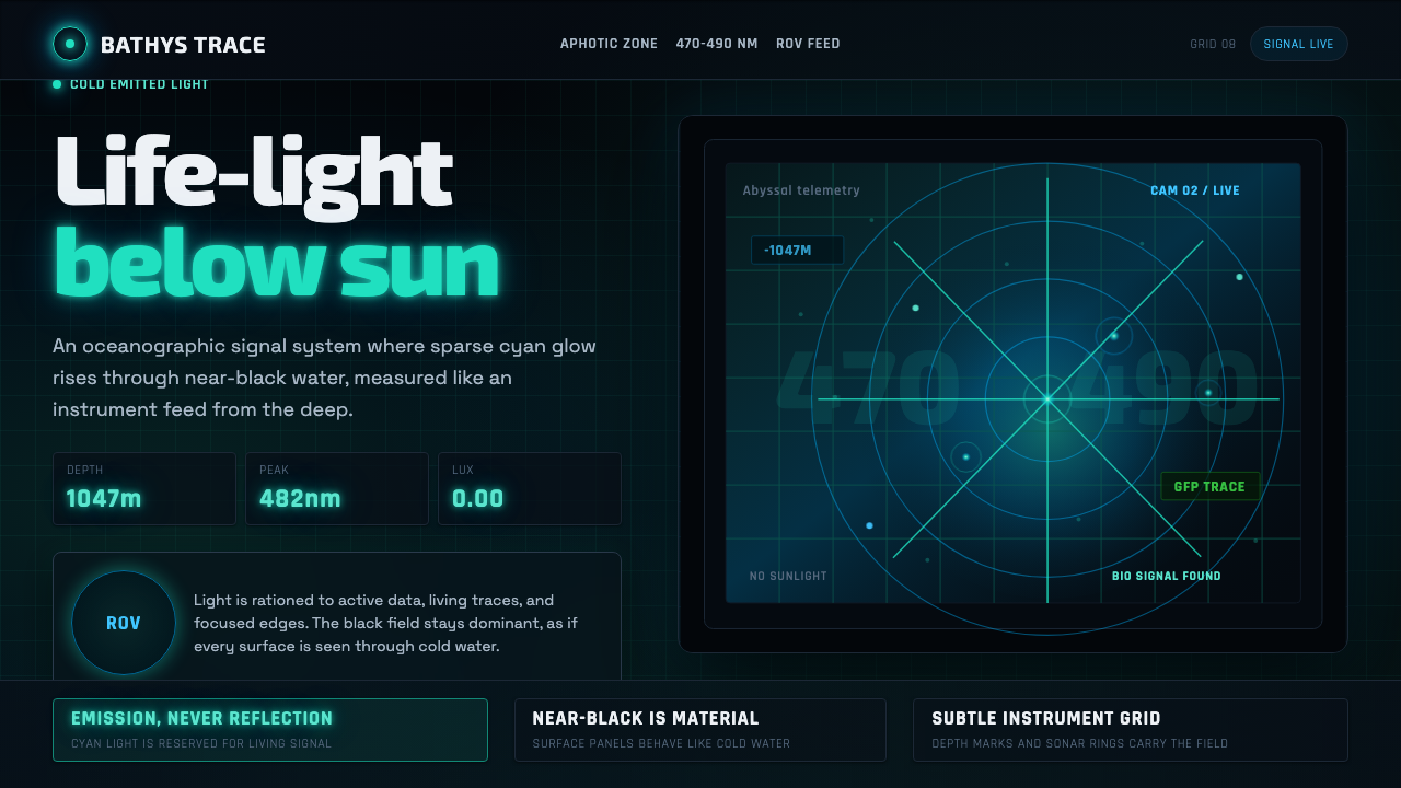 Abyssal BioluminescenceDark carries the signal. Electric cyan pins and Exo 2 readouts surface from a…
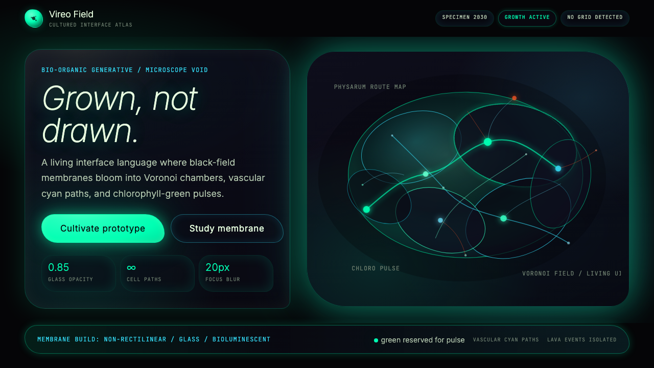 Bio-Organic GenerativeInterfaces feel cultured. Void black, Voronoi membranes, and neon chlorophyll…
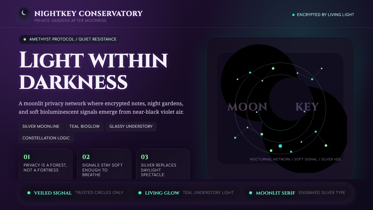 LunarpunkLight hides in darkness. Amethyst night, silver serif, and teal bioglow surfa…
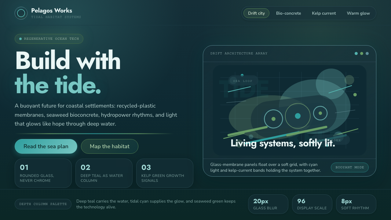 TidalpunkHope glows underwater. Deep teal glass, tidal cyan light, and kelp-green curr…
 Bioluminescent ShoreDarkness becomes alive. Cyan wave-lines and specks ignite over an ink-blue se…
 Luminol CSI GlowEvidence emits its own light. Cold cyan-green glow bloomed from pitch-black,…