What is Tidalpunk?
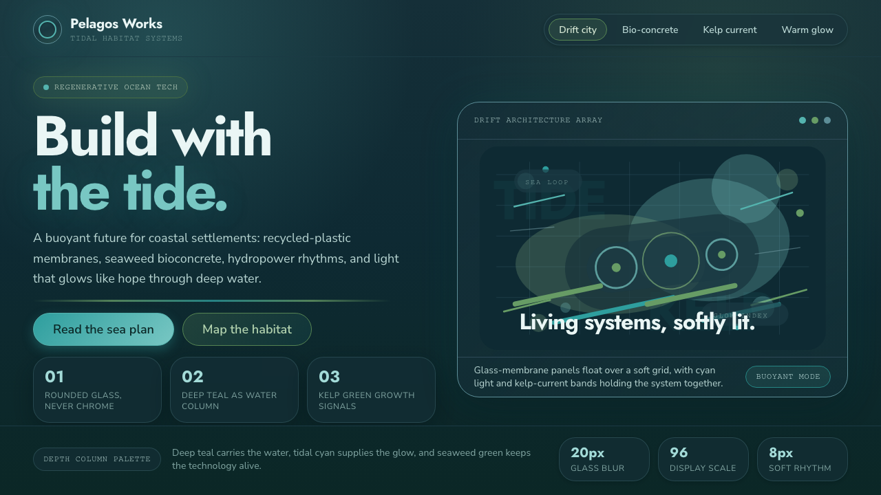
Tidalpunk imagines hope below the waterline — a living coastal future shaped by tides, seaweed, recycled matter, and technology designed to float with change.
Tidalpunk in brief
Tidalpunk is solarpunk’s ocean-facing offshoot: a speculative aesthetic concerned with seasteads, partially submerged coastal cities, and settlements powered by tides and water. Its central premise is neither heroic resistance to the sea nor apocalyptic surrender. Instead, it imagines people adapting their built environments to rising water, treating the ocean as a shared condition, source of energy, material system, and habitat.
The style visualizes technology as buoyant, rounded, and alive. Buildings feel grown, assembled, or gently moored rather than imposed as hard industrial objects. Structures may appear to emerge from water, sit within it, or be threaded through by it. This gives Tidalpunk a distinct emotional temperature: it is futuristic, but not detached; ecological, but not rustic; submerged, but never hopeless.
Its atmosphere is defined by a deep teal-to-navy water column illuminated from within by a warm human glow and crossed by kelp-green currents. In contrast with cyberpunk’s neon dread and solarpunk’s daylight optimism, Tidalpunk places optimism under pressure. Light has to travel through water, surfaces are softened by immersion, and every visible system suggests dependence on circulation, regeneration, and care.
Where does Tidalpunk come from?
Tidalpunk emerged as a speculative aesthetic during the 2010s and 2020s, with its current visual language taking shape most clearly from around 2018 to 2024. It belongs to a global, coastal online subculture rather than a single school, city, or manifesto. That distributed origin matters: the style is less a fixed historical doctrine than a shared way of picturing what coastal life might become as water, infrastructure, and ecology become inseparable.
Its closest parent movement is solarpunk, whose optimistic environmental imagination supplies Tidalpunk’s humanist and regenerative foundation. Tidalpunk redirects that outlook away from sunlit gardens and toward the sea. The resulting world is not defined by conquest of a hostile environment, but by coexistence with tides, submerged space, marine growth, and changing shorelines. Hope remains central, but it is rendered as something sustained collectively in difficult conditions.
The movement also draws its material imagination from sustainable and regenerative ocean design. Recycled ocean plastic and bioengineered seaweed are not incidental props in this visual world; they suggest that future construction could be assembled from recovered waste and cultivated biological matter. Studio Kathryn Larsen’s seaweed bioconcrete and Notpla’s algae-based packaging are named real-world reference points, connecting the speculative mood to experiments already exploring ocean-derived materials.
This relationship between fiction and material research distinguishes Tidalpunk from generic underwater futurism. Its images are not primarily about spectacle, militarized submarines, or sealed luxury habitats. They are about settlement, repair, energy, and the social texture of living with water. The ocean is therefore not a dark backdrop for technology; it is the active medium through which architecture, light, infrastructure, and community are understood.
What defines the Tidalpunk look?
Submerged Light
Tidalpunk begins with darkness, but not emptiness. Deep teal and navy establish the pressure and depth of a water column, while warm light appears from interiors, pathways, inhabited windows, and communal structures. The glow should feel held by the water rather than projected aggressively through it. Light is evidence of shelter, maintenance, and human presence.
Tidal Color Currents
The palette moves like water rather than behaving like a set of isolated brand swatches. Deep blue-green fields provide immersion, tidal cyan marks surfaces touched by light, and kelp green introduces biological movement. Warm illumination supplies contrast without turning the composition into neon spectacle. Color should suggest circulation: currents, reflections, growth, and energy passing through a shared environment.
Buoyant Form
Technology avoids the sharp, armored geometry often associated with industrial futurism. Tidalpunk favors rounded housings, softened edges, connected pods, fluid chambers, and forms that look capable of floating, flexing, or growing. Even when a structure is large, it should feel supported by a larger ecological system rather than dominating it.
Living Materials
Recycled ocean plastic and bioengineered seaweed give the aesthetic its ethical and tactile center. Materials should imply reuse, cultivation, translucency, and biological adaptation rather than disposable perfection. Seaweed-derived references introduce a sense that surfaces may be regenerative, responsive, or grown in relation to marine conditions. The result is futuristic material culture with visible ecological responsibility.
Humanist Infrastructure
Tidalpunk does not treat power systems and habitats as anonymous machinery. Hydropower, tidal energy, settlement structures, and water-facing circulation are pictured as supports for daily life. The visual emphasis belongs on inhabited thresholds, shared routes, protected interiors, and systems that make coexistence possible. Infrastructure is emotional because it allows a community to endure.
Immersion and Transparency
Glass-like depth and filtered visibility are central to the style. Transparent or translucent layers can suggest water, enclosures, membranes, and the distance between a viewer and a submerged world. These layers should create calm spatial depth, not digital gloss for its own sake. What matters is the sensation of looking through water and protective surfaces toward a living settlement.
Who shaped Tidalpunk?
Studio Kathryn Larsen is cited through its seaweed bioconcrete, a real-world material experiment that gives Tidalpunk a concrete point of reference. Within the aesthetic, seaweed bioconcrete matters because it makes the imagined relationship between marine biology and construction feel materially plausible rather than purely decorative.
Notpla is referenced for algae-based packaging. Its relevance to Tidalpunk lies in the idea that biological material can participate in everyday design and manufacturing. In a Tidalpunk context, this helps move the style beyond underwater scenery toward a broader culture of regenerative, ocean-connected material choices.
Solarpunk community writers provide the movement’s nearest conceptual context: an optimistic environmental imagination concerned with livable futures. Tidalpunk inherits that humanist orientation while relocating it to coastal and submerged conditions, where resilience is expressed through cooperation with water rather than separation from it.
How do you use Tidalpunk today?
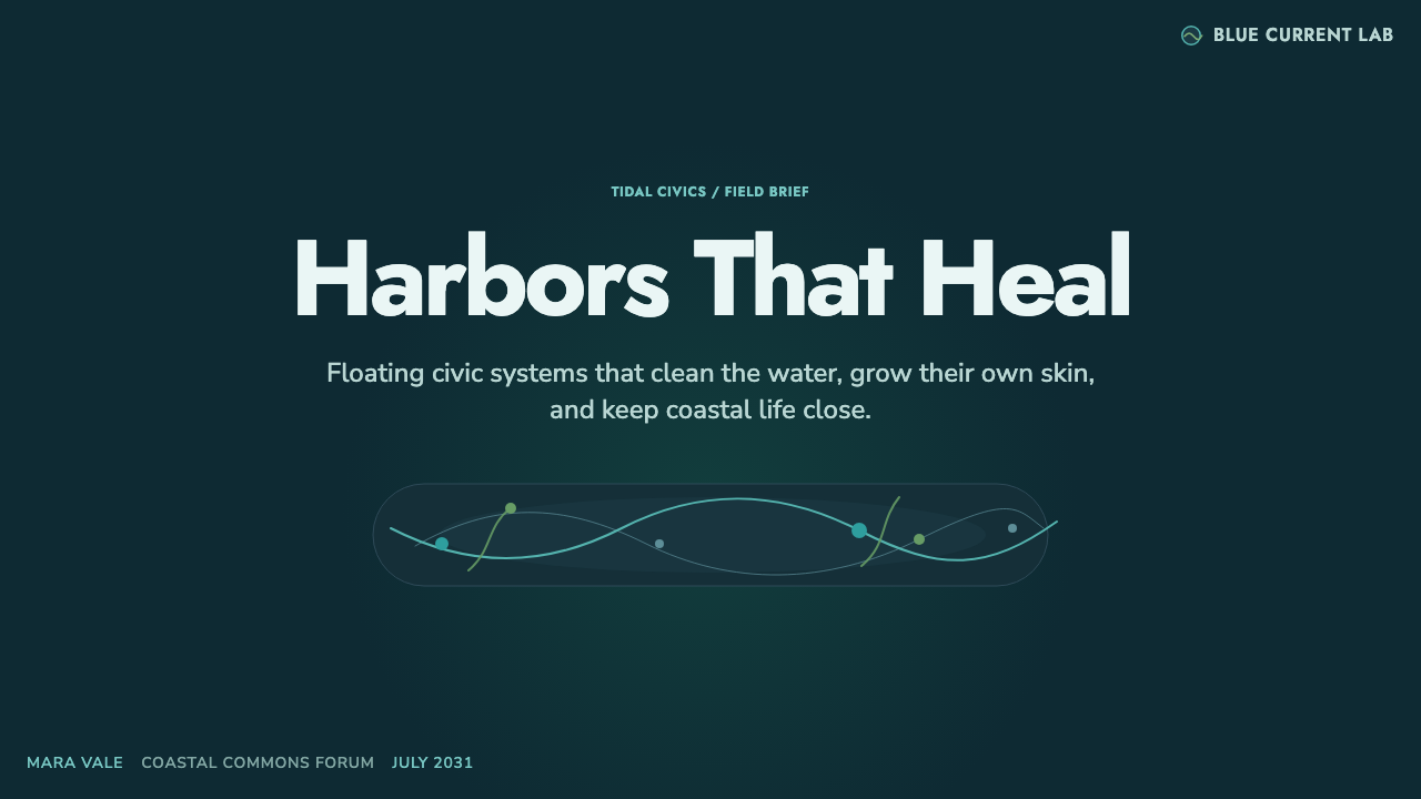
For presentation covers, Tidalpunk works best when a deep aquatic field carries one clear source of warm light: an inhabited structure, a glowing chamber, or a distant settlement held within the water. Keep the title calm and highly legible, allowing the scene’s depth to do the atmospheric work. Content slides should become navigable underwater environments, using translucent divisions, curved paths, and restrained biological accents to organize information without obscuring it.
Data slides can translate the style’s central metaphor into useful hierarchy. Treat flows, networks, energy systems, or changing conditions as currents moving through a dark field, with warm highlights reserved for the most consequential signal. Rounded diagrams and connected nodes can suggest circulation and interdependence. Avoid turning every data point into a glowing decorative object; the visual system should clarify what is flowing, where it gathers, and what sustains the whole.
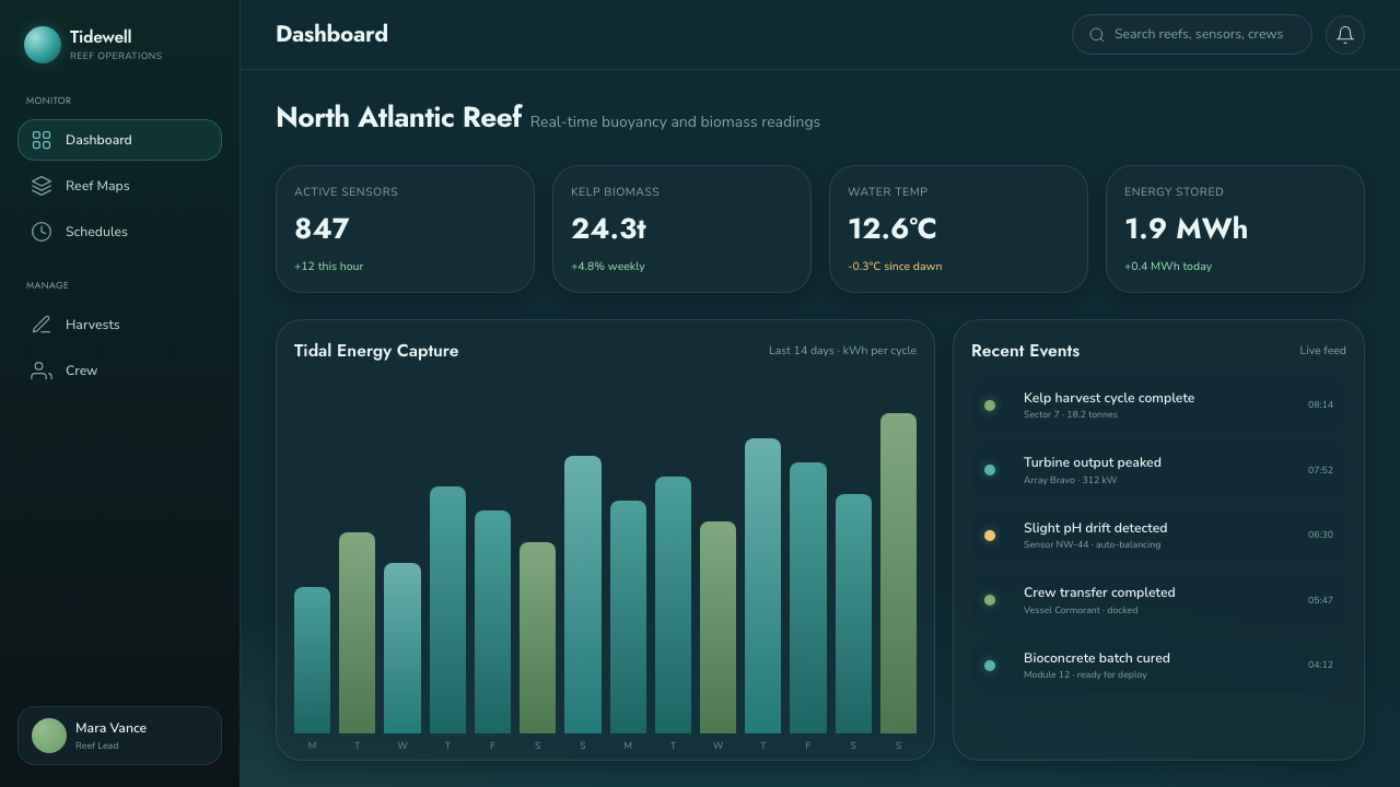
For web interfaces, Tidalpunk is particularly suited to dashboards, climate-oriented services, civic tools, marine research concepts, and platforms that need to make complex systems feel human. A dashboard can use deep backgrounds, layered glass-like panels, soft rounded containers, and carefully rationed warm status lights. On pricing or membership pages, the aesthetic can frame access as participation in a shared habitat: plans, benefits, and calls to action should feel sheltered and trustworthy rather than aggressively commercial.
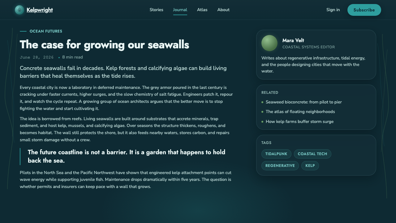
In editorial and marketing work, use the style to tell a story of adaptation rather than catastrophe. Long-form pages can alternate between submerged atmospheric sections and clearer reading surfaces, letting imagery of currents, seaweed, and illuminated habitats support the narrative. Product campaigns should foreground material choices, regeneration, and collective care. The common mistake is to borrow only the teal darkness, cyan shine, and watery glass effects; without buoyant forms, living materials, and a humanist relationship to infrastructure, the result becomes generic oceanic science fiction rather than Tidalpunk.
Tidalpunk — FAQ
Is Tidalpunk simply solarpunk underwater?
It is closely related to solarpunk, but its setting changes the visual and social logic. Solarpunk is often associated with daylight, land-based growth, and solar abundance. Tidalpunk shifts attention to tides, water pressure, submerged visibility, marine materials, and coastal adaptation. It keeps solarpunk’s humanist optimism while asking how that optimism survives and becomes practical in an ocean-facing world.
How is Tidalpunk different from cyberpunk?
The source distinction is emotional as much as visual. Cyberpunk is associated here with neon dread, sharp industrial technology, and a darker relationship to the future. Tidalpunk uses illumination too, but its warm glow signals shelter and hope within deep water. Its technology is rounded, buoyant, and alive, and its future is organized around coexistence, regenerative materials, and settlement rather than alienation.
What materials make a Tidalpunk design feel credible?
The strongest references are recycled ocean plastic and bioengineered seaweed, because both connect the aesthetic to sustainable and regenerative ocean design. Studio Kathryn Larsen’s seaweed bioconcrete and Notpla’s algae-based packaging show why such materials matter: they make biological and recovered matter part of a design proposition, not merely a visual texture. Use material cues to communicate reuse, cultivation, and marine connection.
Can Tidalpunk be used without an underwater illustration?
Yes. The style is not dependent on literal fish, divers, or submerged skylines. It can be expressed through a deep water-like atmosphere, internal warm illumination, rounded buoyant forms, translucent depth, kelp-green movement, and systems that suggest circulation and care. The essential question is whether the design feels built with water and ecological interdependence in mind, rather than merely decorated with marine imagery.
Related design styles
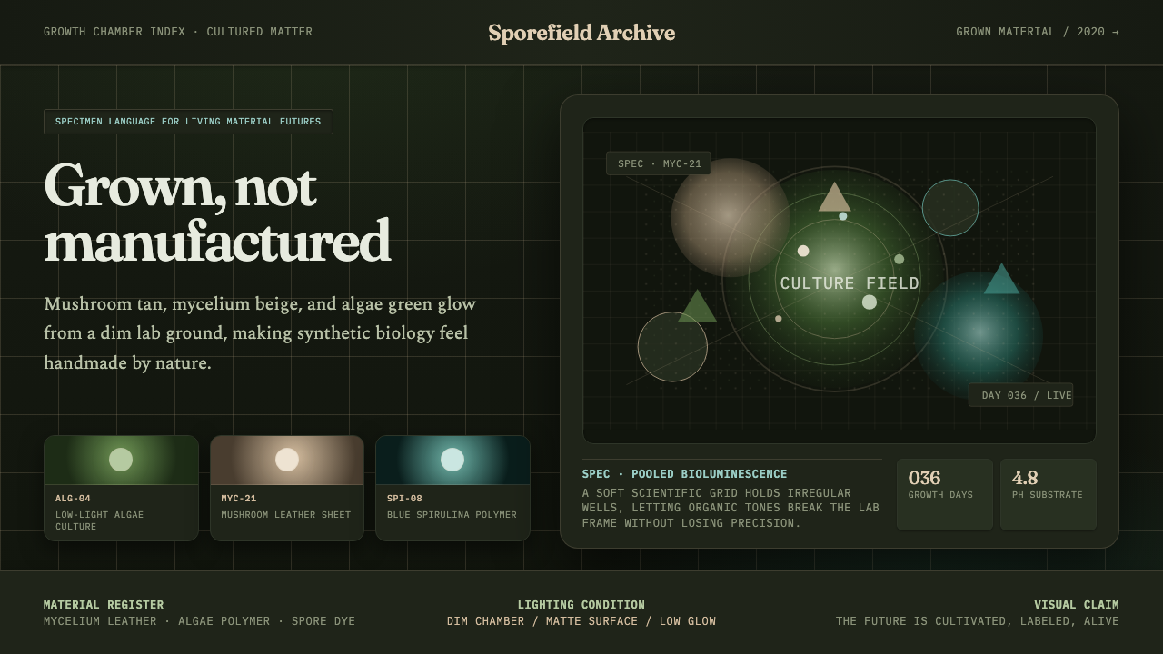 Biopunk GrownLife replaces industry. Algae green glows on chamber dark with serif voice an…
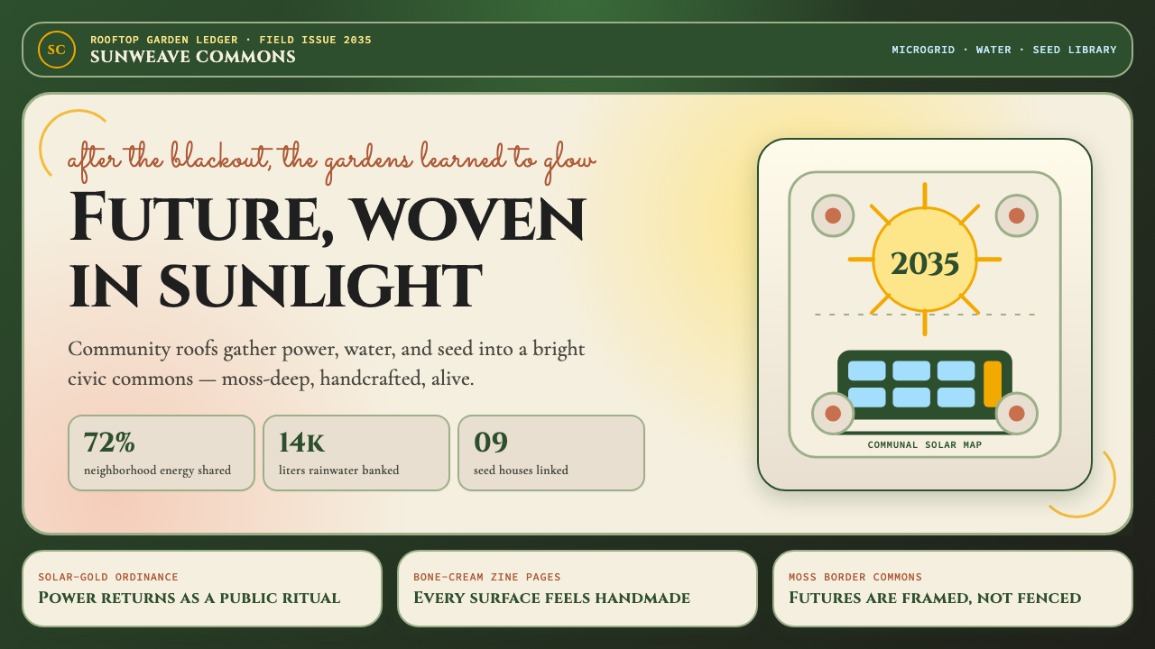 Solarpunk (2035)Climate optimism feels handmade. Moss ground, solar gold, and Art Nouveau bor…
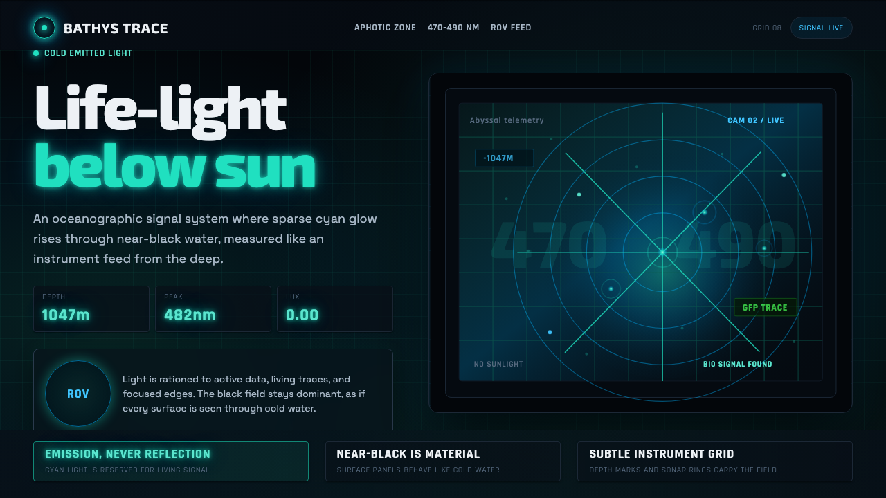 Abyssal BioluminescenceDark carries the signal. Electric cyan pins and Exo 2 readouts surface from a…
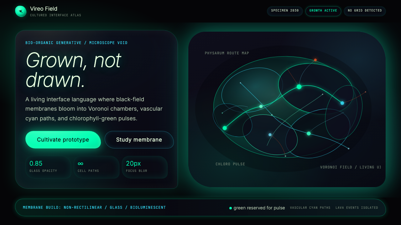 Bio-Organic GenerativeInterfaces feel cultured. Void black, Voronoi membranes, and neon chlorophyll…
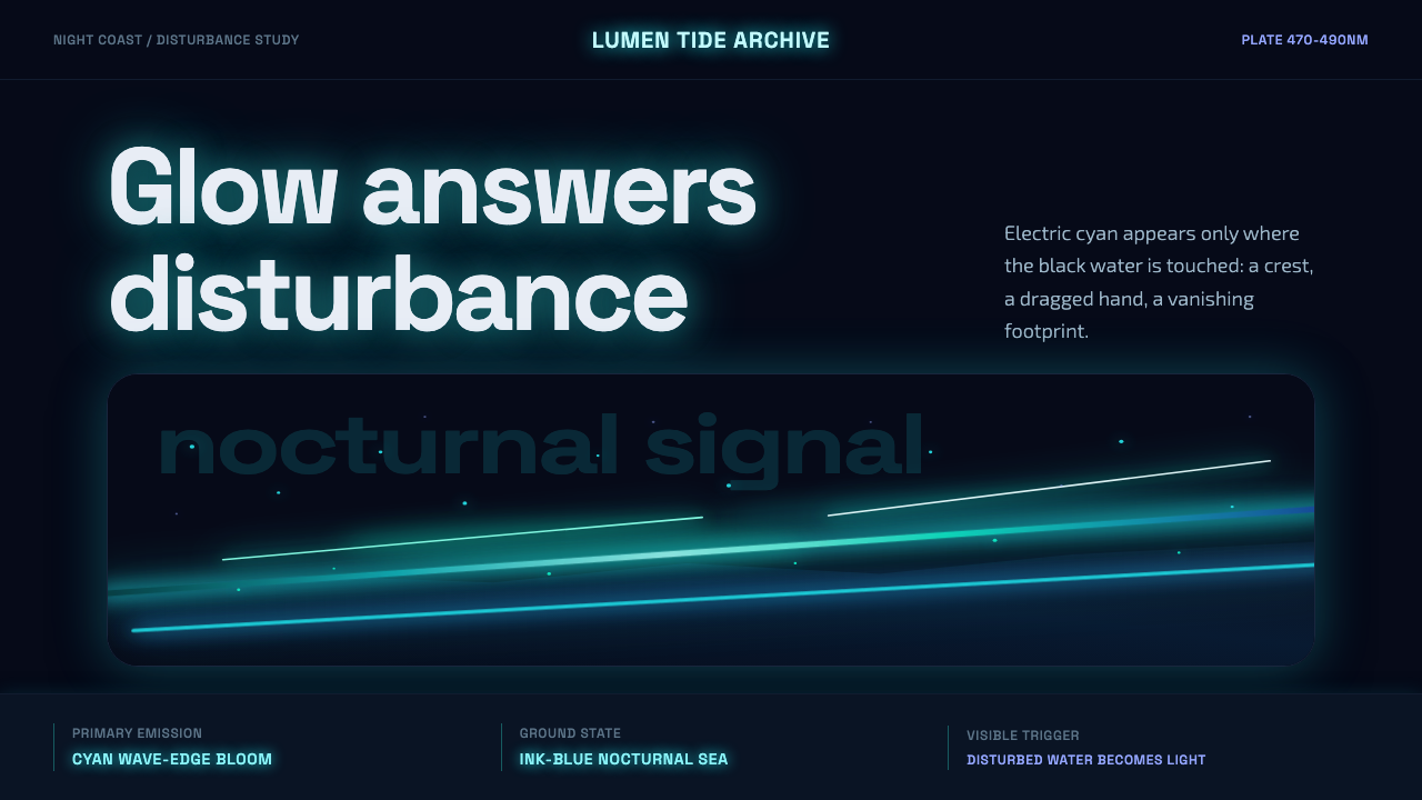 Bioluminescent ShoreDarkness becomes alive. Cyan wave-lines and specks ignite over an ink-blue se…
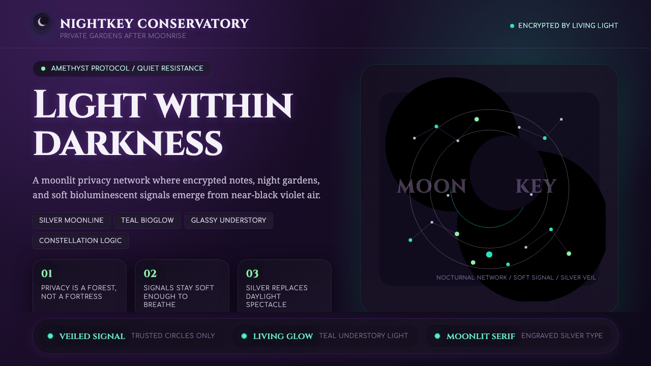 LunarpunkLight hides in darkness. Amethyst night, silver serif, and teal bioglow surfa…