What is Solarpunk (2035)?什么是 Solarpunk (2035)?
Solarpunk imagines the future as green, communal, and handmade — where solar-gold light spills over moss-covered rooftops and Art Nouveau curves reclaim the city.太阳朋克将未来想象为绿色的、社区的、手作的——日光金洒落苔藓屋顶,新艺术曲线重新攀上城市立面。
Solarpunk (2035) in briefSolarpunk (2035) 速览
Solarpunk is a speculative aesthetic and political movement that pictures a near-future in which the climate crisis has been met with creativity and communal solidarity rather than corporate collapse or military dystopia. Its visual language is warm and verdant: deep moss-green grounds, sun-gold accents, bone-cream surfaces, and organic silhouettes that echo vine tendrils, solar panel grids, and the curvilinear ornament of Art Nouveau revival architecture. Where cyberpunk offered neon-lit ruin, Solarpunk offers flowering abundance.太阳朋克是一场推测性美学与政治运动,它描绘了一个近未来:气候危机以创造力与社区团结来应对,而不是以企业崩溃或军事反乌托邦收场。它的视觉语言温暖而翠绿:深苔藓绿的底面、日光金的点缀、骨白色的内容面,以及呼应藤蔓、太阳能电池网格和新艺术复兴建筑曲线的有机轮廓。赛博朋克提供霓虹废墟,太阳朋克提供的是繁花盛放。
The aesthetic draws from several traditions simultaneously. Alphonse Mucha's decorative borders and flowing botanical motifs supply the ornamental vocabulary. Hayao Miyazaki's films — in particular Nausicaä of the Valley of the Wind and Castle in the Sky — provide a template for worlds where advanced technology and lush ecology coexist without contradiction. The natural pigments of terracotta, unbleached linen, amber resin, and sun-baked clay ground the palette in materials that feel grown rather than manufactured.这一美学同时汲取多种传统:阿尔丰斯·穆夏的装饰边框与流动植物母题提供了纹饰词汇;宫崎骏的电影——尤其是《风之谷》与《天空之城》——为先进技术与葱茏生态和谐共存的世界提供了范本;陶土、未漂白亚麻、琥珀树脂与日晒黏土的天然颜料,将调色板锚定于一种生长而非制造出来的质感。
Crucially, Solarpunk is not nostalgic. It does not mourn a pre-industrial past; it designs a post-carbon future. Solar panels nest inside Gothic arches. Wind turbines rise from community gardens. Handmade ceramics share shelf space with open-source electronics. The aesthetic insists that high technology and deep ecology are not opposites, and that beauty — particularly the ornate, nature-derived beauty of Art Nouveau — is itself a form of political argument against the grey utilitarian logic of extraction capitalism.至关重要的是,太阳朋克并不怀旧。它不哀悼前工业时代的过去;它设计一个后碳排放的未来。太阳能板嵌入哥特式拱券,风力涡轮机从社区花园升起,手工陶器与开源电子设备并排陈列。这套美学坚持认为:高科技与深生态并非对立,美——尤其是新艺术运动那种繁复的、源于自然的美——本身就是对采掘资本主义灰色功利逻辑的政治论辩。
See the Solarpunk (2035) design system查看 Solarpunk (2035) 完整设计系统
Where does Solarpunk (2035) come from?Solarpunk (2035) 从何而来?
Solarpunk's intellectual roots reach back to 2008, when the term first appeared in an online essay arguing that science fiction had exhausted its capacity for productive pessimism. The post-apocalyptic and corporate-dystopian modes had normalized catastrophe as inevitable; what was needed, the argument ran, was a speculative mode that treated ecological flourishing as a plausible outcome worth designing toward. The name fused the solar-energy optimism of the environmental movement with the 'punk' suffix that signals a counterculture operating outside mainstream institutional channels.太阳朋克的思想根源可追溯至2008年——这个词最早出现在一篇网络文章中,文章认为科幻小说已经耗尽了富有成效的悲观主义潜力。后末日与企业反乌托邦模式已将灾难正常化为不可避免之事;所需要的,文章主张,是一种将生态繁荣视为值得设计的可能结果的推测性思维模式。这个名称融合了环保运动中的太阳能乐观主义,与标志着在主流机构渠道之外运作的反文化的“朋克”后缀。
The movement's visual canon crystallized around 2012 to 2014, largely through the image-sharing culture of Tumblr and later Pinterest. Users began tagging and collecting images — Mucha lithographs, Ghibli concept art, photographs of Singapore's Gardens by the Bay, renders of vertical farms, pictures of community solar installations in rural cooperatives — under the emerging Solarpunk label. The act of collecting and captioning these images was itself a form of manifesto-writing: it defined a visual territory by accumulation rather than by formal declaration. By 2014, the first dedicated Solarpunk anthologies of speculative fiction were in preparation, and the aesthetic had a recognizable iconography.运动的视觉规范在2012至2014年间成形,主要通过Tumblr(以及后来的Pinterest)的图像分享文化得以凝聚。用户开始在“太阳朋克”这一新兴标签下标注和收集图像——穆夏的石版画、吉卜力的概念艺术、新加坡滨海湾花园的照片、垂直农场的渲染图、农村合作社太阳能装置的图片。收集和为这些图像撰写说明的行为本身就是一种宣言写作:它通过积累而非正式宣告来定义一片视觉领土。到2014年,第一批专门的太阳朋克推测小说选集已在筹备中,这一美学也有了可辨认的图像志。
Key intellectual architects of the movement include Adam Flynn, whose 2014 essay 'Solarpunk: Notes toward a manifesto' remains the most cited theoretical text; Andrew Dana Hudson, a fiction writer and essayist who developed the movement's political-economic dimensions; and Olivia Louise, whose visual curation work on Tumblr helped define the canonical image set. Justine Norton-Kertson has been influential in connecting Solarpunk to existing anarchist and degrowth traditions, arguing that the aesthetic must be inseparable from its political commitments or it becomes mere decoration.运动的关键思想建构者包括:亚当·弗林,其2014年文章《太阳朋克:迈向宣言的笔记》至今仍是被引用最多的理论文本;安德鲁·达纳·哈德森,小说作家兼散文家,发展了运动的政治经济学维度;以及奥利维亚·路易斯,其在Tumblr上的视觉策展工作帮助定义了规范图像集。贾斯汀·诺顿-科尔特森在将太阳朋克与现有的无政府主义和去增长传统联结方面颇具影响力,她论证说:美学必须与其政治承诺密不可分,否则它将沦为纯粹装饰。
The movement matured significantly through the 2020s as climate change moved from speculative concern to lived reality in much of the world. Architectural firms began producing buildings explicitly described as Solarpunk, incorporating living walls, integrated photovoltaic surfaces, communal food-growing spaces, and ornamental botanical motifs in facade design. By the early 2030s, the aesthetic had entered mainstream institutional culture — appearing in municipal planning documents, government green-transition communications, and the visual identity of renewable-energy cooperatives. The 2035 version of the design system reflects this maturation: it retains the movement's warmth and hand-crafted sensibility while codifying it into a deployable design language legible to contemporary digital interfaces.随着气候变化在2020年代从推测性忧虑变为世界许多地区的现实生活体验,这一运动显著走向成熟。建筑事务所开始建造明确标榜为太阳朋克的建筑,整合了绿植墙、集成光伏表面、社区食物种植空间,以及立面设计中的装饰性植物母题。到2030年代初,这一美学已进入主流机构文化——出现在市政规划文件、政府绿色转型传播材料,以及可再生能源合作社的视觉识别中。2035版本的设计系统反映了这种成熟:它保留了运动的温度与手工质感,同时将其编码为一套可部署的设计语言,对当代数字界面清晰可读。
What defines the Solarpunk (2035) look?Solarpunk (2035) 的视觉特征是什么?
Color Palette色彩调性
The Solarpunk palette is grounded in the natural world rather than the digital one. The dominant tone is a deep, saturated moss-green — the color of a living wall or a fern in dappled light — which serves as both background and atmospheric anchor. Against this, solar gold appears as a warm, generous accent: the color of mid-afternoon sun through amber glass rather than a harsh primary yellow. Bone cream and unbleached linen tones provide content surfaces that feel hand-pressed rather than screen-rendered. Earthy terracotta, amber, and warm ochre fill supporting roles. The overall effect is a palette that reads simultaneously as historical (recalling the natural dyes of Art Nouveau posters) and futuristic (invoking the warm glow of renewable energy abundance).太阳朋克的调色板根植于自然世界而非数字世界。主色调是深沉、饱和的苔藓绿——活植物墙或斑驳光影中蕨叶的颜色——既作为背景,也作为氛围锚点。与此相对,日光金作为温暖而慷慨的点缀出现:那是午后阳光透过琥珀色玻璃的颜色,而非刺目的纯黄。骨白色与未漂白亚麻色提供内容面,质感像手压纸张而非屏幕渲染。赭陶色、琥珀与温暖的黄赭色承担辅助角色。整体效果是一套调色板,同时读作历史性的(令人联想到新艺术海报的天然染料)与未来感的(唤起可再生能源丰足时代的温暖光晕)。
Organic Line and Botanical Ornament有机线条与植物纹饰
Where Bauhaus reduced form to geometry and Swiss Style to the grid, Solarpunk restores the curve. Borders are not ruled lines but vine stems; dividers are not horizontal bars but stylized leaf arrangements; frame elements grow from corners as if rooted there. This vocabulary is drawn directly from the Art Nouveau tradition — particularly the sinuous, nature-derived ornamental language of Mucha, Guimard, and Klimt — but it is deployed in contemporary digital contexts: as SVG illustrations, as decorative layer elements, as the curves that define card shapes and icon silhouettes. The ornament is never merely cosmetic; it is structural, providing rhythm and orientation within a layout.包豪斯将形态简化为几何,瑞士风格将其简化为网格——太阳朋克则恢复了曲线。边框不是直尺线而是藤蔓茎条;分割线不是水平横杠而是程式化的叶片排列;框架元素从角落生长而出,仿佛在那里扎根。这套词汇直接取自新艺术传统——尤其是穆夏、吉马尔和克里姆特那种蜿蜒的、源于自然的装饰语言——但部署于当代数字场景:作为SVG插图,作为装饰层元素,作为定义卡片形状与图标轮廓的曲线。这种装饰从不仅仅是化妆品;它是结构性的,在版面中提供节奏与方向。
Texture and Handcraft Warmth质感与手工温度
Solarpunk actively reintroduces the imperfection and tactility that modernist design traditions worked hard to eliminate. Paper grain, linen weave, watercolor wash, and ink-on-wood-block print textures appear as background treatments and overlay effects, softening what might otherwise be stark digital compositions. This is not a retreat from the digital medium; it is a deliberate cultural argument embedded in form — the assertion that the future should feel made by human hands, not extruded by machines. In practice, textures are applied subtly, working with the moss-green and bone-cream grounds rather than obscuring them.太阳朋克主动重新引入了现代主义设计传统费力消除的不完美与触感。纸张纹理、亚麻织纹、水彩晕染与木版水印质感,作为背景处理与叠加效果出现,柔化了可能本来生硬的数字构图。这不是对数字媒介的退却;这是嵌入形式中的一种刻意的文化论点——断言未来应该感觉像由人手制作,而非由机器挤压而出。在实践中,质感被微妙地应用,与苔藓绿和骨白色底面协作,而非将其遮蔽。
Typography with a Living Quality富有生命感的字体排印
Solarpunk typography resists the cold neutrality of purely geometric sans-serif faces. Preferred typeforms have slight humanist warmth — letterforms that retain traces of the hand, of calligraphic origin, of letters carved into stone rather than plotted by algorithm. Display type is often used at generous scales, allowing the organic quality of letterforms to read as texture in itself. Headlines may incorporate decorative botanical initial caps, in the tradition of illuminated manuscripts reinterpreted through Art Nouveau revival. Body text favors comfortable line spacing and generous measure, reinforcing the aesthetic's commitment to reading as a slow, pleasurable act rather than a rapid scan.太阳朋克排版抵制纯几何无衬线字体的冰冷中性。偏好的字形带有轻微的人文温度——保留手的痕迹、书法起源、石刻字迹而非算法描绘的字母形态。展示性字体通常以宽裕的尺度使用,让字母形态的有机品质本身就被读作质感。标题可以融入装饰性植物首字母,延续彩饰手稿经由新艺术复兴重新诠释的传统。正文字体偏好舒适的行距与宽裕的行宽,强化了这一美学对阅读作为缓慢愉悦行为而非快速扫描的承诺。
Solar and Radial Motifs太阳与放射状母题
The sun — as an actual celestial body and as a symbol of renewable energy abundance — is the movement's central icon, and its visual grammar pervades the design system. Sunburst patterns, radial gradients in solar-gold tones, circular compositions that echo the disc of the sun, and starburst dividers drawn in Art Nouveau line work all reinforce this solar orientation. In a layout, the radial motif provides an alternative organizational logic to the straight grid: things can radiate outward from a center, can be arranged in arcs, can speak the language of growth and expansion rather than of filing and containment.太阳——作为实际的天体,也作为可再生能源丰足的象征——是这一运动的核心图标,它的视觉语法贯穿整套设计系统。日晕图案、日光金调的放射状构图、呼应太阳圆盘的圆形构图,以及以新艺术线描绘制的星芒分割线,都在强化这种太阳朝向。在版面中,放射状母题提供了有别于直线网格的另一种组织逻辑:事物可以从中心向外辐射,可以弧线排列,可以说出生长与扩张的语言,而非归档与容纳的语言。
Community and Multiplicity社群性与多元共存
Unlike design systems derived from corporate modernism — which tend toward singular, authoritative voices — Solarpunk is compositionally generous. Multiple voices can coexist on a single page. Illustration styles can mix: a botanical engraving alongside a flat icon alongside a loose watercolor sketch. Pattern borders can frame diverse content without enforcing homogeneity. This visual democracy is not accidental; it mirrors the movement's political commitments to decentralization, cooperative governance, and the dignity of different cultural traditions. In practice, this means Solarpunk layouts feel curated and handpicked rather than manufactured to spec.与源自企业现代主义的设计系统——它们倾向于单一权威的声音——不同,太阳朋克在构图上是慷慨的。多种声音可以在同一页面共存。插图风格可以混搭:植物版画与扁平图标与松散水彩素描并置。图案边框可以框架多元内容而不强制同质化。这种视觉民主并非偶然;它映射了运动在政治上对去中心化、合作治理与不同文化传统尊严的承诺。在实践中,这意味着太阳朋克的版面感觉像是被精心挑选策划的,而非按规格批量生产的。
Dark Ground, Light Bloom深底浅放
The canonical Solarpunk color mode places warm content on a dark ground — bone-cream text and solar-gold accents against deep moss-green — inverting the bright-screen defaults of most digital interfaces. This dark-ground approach is not merely aesthetic; it carries meaning. The moss ground suggests soil, forest shade, the earth from which things grow. The light elements are what emerges from that ground: solar gold as sunlight breaking through leaves, cream as warm lamplight in a community workshop. The system can also function in a lighter mode, but the dark-ground mode is where the aesthetic is most itself.太阳朋克的规范色彩模式,是在深底上呈现温暖内容——骨白色文字与日光金点缀置于深苔藓绿之上——颠覆了大多数数字界面明亮屏幕的默认设定。这种深底处理不仅仅是美学选择;它承载意义。苔藓底色暗示土壤、林荫、万物从中生长的大地。浅色元素是从那片底色中浮现的事物:日光金如阳光穿透叶片,骨白色如社区工坊中温暖的灯光。这套系统也可以在较明亮的模式下运作,但深底模式是这套美学最能做自己的地方。
See the Solarpunk (2035) design system查看 Solarpunk (2035) 完整设计系统
Who shaped Solarpunk (2035)?谁塑造了 Solarpunk (2035)?
Flynn's 2014 essay 'Solarpunk: Notes toward a manifesto,' published in the anthology Sunvault and widely circulated online, is the foundational theoretical document of the movement. He argued that Solarpunk should be understood not as a genre but as a design and political orientation: a commitment to imagining futures that are both technologically sophisticated and ecologically embedded, governed by cooperative rather than extractive logics. His articulation of Solarpunk as a practice of 'infrastructure as culture' — the idea that the design of shared systems is itself a form of political expression — has been influential across architecture, urban planning, and speculative fiction.弗林2014年的文章《太阳朋克:迈向宣言的笔记》,发表于选集《向日葵保险库》并在网络广泛流传,是运动的基础理论文献。他论证说太阳朋克应被理解为不是一种类型而是一种设计与政治取向:对想象既技术复杂又生态嵌入、由合作逻辑而非采掘逻辑治理的未来的承诺。他将太阳朋克阐释为“基础设施作为文化”的实践——共享系统的设计本身是政治表达的一种形式——这一观点在建筑、城市规划与推测小说领域均颇具影响力。
Louise's curatorial work on Tumblr in the 2012–2015 period was instrumental in defining the movement's visual canon before any formal design system existed. By assembling and annotating image collections — mixing Mucha prints, Ghibli stills, community garden photographs, and architectural renders — she established the visual grammar that later formal articulations of the style would codify. Her contribution represents a broader pattern in Solarpunk's development: the aesthetic emerged through distributed collaborative curation rather than through the authorial declaration of a single designer or manifesto.路易斯在2012至2015年间在Tumblr上的策展工作,在任何正式设计系统存在之前,对定义运动的视觉规范起到了关键作用。通过汇集和注释图像集合——混合穆夏版画、吉卜力截图、社区花园照片和建筑渲染图——她建立了视觉语法,后来风格的正式表述将对其进行编码。她的贡献代表了太阳朋克发展中一个更广泛的模式:这种美学通过分布式协作策展而非单一设计师或宣言的作者性宣告而涌现。
Though Mucha (1860–1939) predates the Solarpunk movement by a century, his visual vocabulary is so thoroughly embedded in the aesthetic that he functions as a founding ancestor. His characteristic devices — botanical border panels, circular aureole frames, flowing hair merged with plant forms, organic letterforms emerging from root and branch structures, the warm golden-and-green palette of his later Slavic Epic — are all directly legible in Solarpunk design. Solarpunk designers invoke Mucha not as pastiche but as evidence of a longer tradition: the insistence that beauty derived from nature is a legitimate, politically resonant design choice.尽管穆夏(1860—1939年)比太阳朋克运动早了整整一个世纪,他的视觉词汇已如此彻底地嵌入这一美学,以至于他作为创始先祖发挥作用。他的标志性手法——植物边框面板、圆形光环框架、与植物形态融合的流动发丝、从根系与枝条结构中生长而出的有机字母形态、他晚期《斯拉夫史诗》中温暖的金绿色调色板——都在太阳朋克设计中直接可辨认。太阳朋克设计师援引穆夏不是作为仿制,而是作为一个更长传统的证据:源于自然的美是一种合理的、具有政治共鸣的设计选择的坚持。
Miyazaki's animated films, produced through Studio Ghibli from the 1980s onward, provide the most widely recognized visual template for a Solarpunk world before the movement had that name. Nausicaä of the Valley of the Wind (1984) imagines an ecology that is dangerous but generative, where humans survive by learning the logic of a non-human world. Castle in the Sky (1986) and Howl's Moving Castle (2004) place advanced technology inside organic and pastoral settings without irony. The Ghibli visual sensibility — soft afternoon light, hand-painted backgrounds with visible brushwork, human-scale architecture overgrown with plants — became a touchstone for Solarpunk visual culture precisely because it embodied the aesthetic before the political framework existed to articulate it.宫崎骏从1980年代起通过吉卜力工作室制作的动画电影,在太阳朋克运动尚未拥有这个名字之前,为太阳朋克世界提供了最广为人知的视觉模板。《风之谷》(1984年)想象了一种危险但充满生机的生态,人类通过学习非人类世界的逻辑而存活。《天空之城》(1986年)和《哈尔的移动城堡》(2004年)毫不讽刺地将先进技术置于有机与田园的环境中。吉卜力的视觉感性——柔和的午后光线、可见笔触的手绘背景、被植物覆盖的人类尺度建筑——成为太阳朋克视觉文化的试金石,恰恰是因为它在政治框架能够将其表述之前就已体现了这种美学。
Norton-Kertson has been one of the movement's most persistent voices arguing that Solarpunk aesthetics must remain inseparable from Solarpunk politics — that a visual style stripped of its commitment to degrowth, mutual aid, and indigenous ecological knowledge becomes merely another commodified design trend. As editor of the journal Solarpunk Magazine and contributor to numerous anthologies, Norton-Kertson has worked to ensure that the growing institutional adoption of Solarpunk imagery is accompanied by substantive engagement with the movement's political-economic critiques. This tension between aesthetic adoption and political integrity remains one of the movement's live debates.诺顿-科尔特森一直是运动中最持续发声的声音之一,论证太阳朋克美学必须与太阳朋克政治保持不可分割——一种剥离了对去增长、互助与原住民生态知识承诺的视觉风格,只会成为又一种被商品化的设计潮流。作为《太阳朋克杂志》的编辑和众多选集的撰稿人,诺顿-科尔特森致力于确保对太阳朋克图像日益增长的机构采用,伴随着对运动政治经济批判的实质性介入。美学采用与政治诚信之间的这种张力,仍然是运动内部正在进行的辩论之一。
How do you use Solarpunk (2035) today?今天怎么用 Solarpunk (2035)?
Solarpunk is one of the few contemporary design systems that is explicitly political in its aesthetic commitments, and applying it well requires understanding that its visual choices are not arbitrary — each one is a small argument about what the future should feel like. The practical implication is that Solarpunk works best for products and organizations whose values align with the movement's orientation: sustainability, community, craft, and optimism about collective human capability. Used cynically — as a green-washing visual veneer over extractive or surveillance-driven products — it reads as incoherent to audiences familiar with the aesthetic's cultural context.太阳朋克是少数在美学承诺上明确带有政治性的当代设计系统,出色地应用它需要理解:它的视觉选择并非任意——每一个选择都是对未来应该是什么感觉的一个小小论点。实践意义在于,太阳朋克最适合价值观与运动取向一致的产品和组织:可持续性、社群、手工艺,以及对人类集体能力的乐观。若出于投机目的使用——作为提取性或监控驱动产品的绿色包装视觉外衣——在熟悉这一美学文化语境的受众眼中,它会读起来语无伦次。
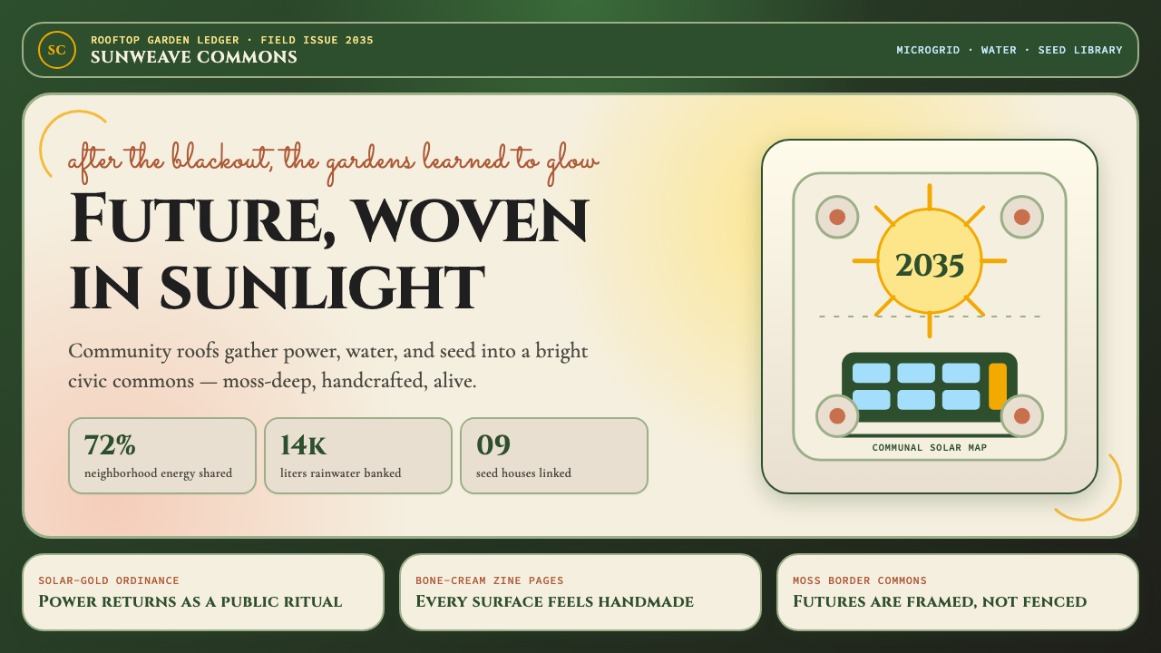
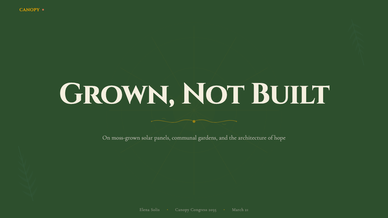
For presentation slides, Solarpunk offers a strong alternative to the sterile corporate defaults that dominate most professional decks. A cover slide built in this system typically anchors a large botanical border motif in the bottom-left and top-right corners, with the title set in a humanist display face at generous scale on a moss-green ground. Solar-gold is used for the headline or a single key phrase, never for multiple elements simultaneously. Content slides use bone-cream grounds with deep-moss-green type for body text, reserving solar-gold for data callouts or section labels. Data visualization slides adopt a warm, palette-consistent approach: charts and graphs use the moss-green and solar-gold as the primary data colors, with bone-cream as the neutral, and botanical dividers between sections replace ruled horizontal lines.在演示文稿中,太阳朋克为主导大多数专业幻灯片的无菌企业默认值提供了一个有力的替代方案。用这套系统构建的封面页,通常在左下和右上角锚定大型植物边框母题,标题以人文主义展示字体在苔藓绿底面上以宽裕尺度呈现。日光金用于标题或单个关键短语,绝不同时用于多个元素。内容页使用骨白色底面搭配深苔藓绿正文,日光金保留给数据标注或章节标签。数据可视化页面采用温暖、与调色板一致的方式:图表使用苔藓绿和日光金作为主要数据颜色,骨白色作为中性色,植物分割线替代各节之间的水平直线。
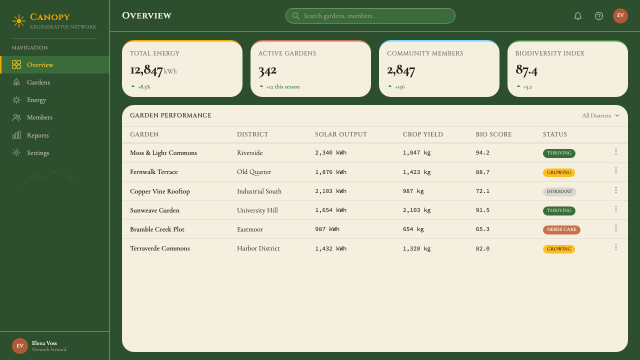
For web interfaces, Solarpunk is particularly well-suited to environmental, cooperative, community, and educational platforms where the visual language should communicate warmth and approachability alongside competence. Dashboard interfaces in this system organize information within organic card shapes with softly curved borders rather than hard rectangular containers, use solar-gold accents for interactive states and key metrics, and incorporate subtle botanical pattern overlays in sidebar or header areas. Pricing pages benefit from the aesthetic's natural tier differentiation: a community tier, a cooperative tier, and an enterprise tier translate well into the three earthy accent tones of terracotta, moss-green, and solar-gold. Navigation uses generous line spacing and is typographically clear rather than icon-heavy.在网页界面中,太阳朋克特别适合环境、合作、社区与教育平台,这些平台的视觉语言应在传达能力的同时传达温度与亲切感。这套系统中的仪表板界面,用软曲边框的有机卡片形状而非硬矩形容器组织信息,用日光金点缀交互状态与关键指标,并在侧边栏或标题区域融入微妙的植物图案叠加。定价页面受益于这种美学自然的层级区分:社区层、合作层与企业层很好地对应陶土色、苔藓绿与日光金三种大地系强调色。导航使用宽裕的行距,排版清晰而非图标密集。
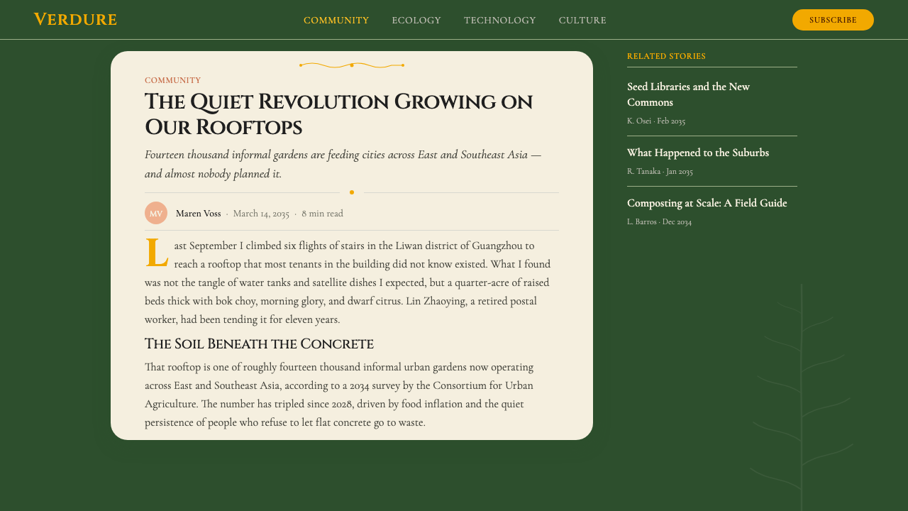
For editorial and marketing materials, Solarpunk supports both long-form reading experiences and high-impact visual communications. Article layouts in this system favor a moderate column width for body text, generous leading, and botanical drop-cap initials for section openings. Pull quotes are framed within thin Art Nouveau line borders rather than heavy blockquote bars. Marketing pages use the full-width botanical border system: decorative vine frames set the boundaries of feature sections, alternating between deep-moss-green and bone-cream grounds to create rhythm. Photography, where used, is treated warmly — desaturated toward the palette's earthy tones, never cold-processed or high-contrast in the cyberpunk manner.对于编辑与营销材料,太阳朋克同时支持长篇阅读体验与高影响力视觉传播。这套系统中的文章版面偏好正文适中的列宽、宽裕的行距,以及章节开头的植物装饰首字母下沉。引用语被框在细新艺术线条边框内,而非粗重的引用块横杠。营销页面使用全宽植物边框系统:装饰性藤蔓框架划定特性区块的边界,在深苔藓绿与骨白色底面之间交替以创造节奏。摄影(若使用)以温暖方式处理——向调色板的大地色调去饱和,绝不以赛博朋克方式冷处理或做高对比度。
The most common mistake when applying Solarpunk is conflating it with generic 'eco' aesthetics: stock photographs of leaves, flat green icons, and corporate sustainability reports. Solarpunk is not about being green in a metaphorical sense; it is about the specific visual vocabulary of Art Nouveau ornament, natural pigment warmth, handcraft texture, and solar motifs. A second common error is over-saturating the palette — pushing the moss-green so dark it becomes oppressive, or using solar-gold at such high intensity it loses its warmth and begins to read as warning-signal yellow. The system works through restraint and balance: deep grounds with light-toned content, warm accents used sparingly, organic decoration that breathes rather than crowds.应用太阳朋克时最常见的错误,是将其与通用“环保”美学混淆:叶片的素材照片、扁平绿色图标、企业可持续发展报告。太阳朋克的意义不在于隐喻意义上的绿色;它在于新艺术运动装饰、天然颜料温度、手工质感与太阳母题这一特定视觉词汇。第二个常见错误是过度饱和调色板——将苔藓绿压得太深以至于令人压抑,或将日光金用于过高强度以至于失去温度开始读作警告信号黄。这套系统通过克制与平衡发挥作用:深底搭配浅色内容,温暖点缀用得节省,有机装饰呼吸而不拥挤。
See the Solarpunk (2035) design system查看 Solarpunk (2035) 完整设计系统
Solarpunk (2035) — FAQSolarpunk (2035) · 常见问题
Is Solarpunk just Art Nouveau with solar panels?太阳朋克只是加了太阳能板的新艺术运动吗?
Art Nouveau is the most visible ancestor, but Solarpunk is a synthesis of several distinct traditions. From Art Nouveau it inherits the organic line, botanical ornament, and the conviction that everyday objects deserve beautiful design. From Studio Ghibli it borrows the template of a world where technology and ecology coexist without irony. From the degrowth and commons movements it takes its political-economic commitments. From craft traditions worldwide it derives its insistence on handmade texture and material honesty. The solar-panel element is not simply added on — it is the aesthetic's political core, the insistence that energy infrastructure can be generous and luminous rather than industrial and extractive. Solarpunk would not exist without Art Nouveau, but Art Nouveau would not recognize itself in Solarpunk.新艺术运动是最显眼的先祖,但太阳朋克是多个截然不同传统的综合。从新艺术运动中它继承了有机线条、植物装饰,以及日常物品值得美丽设计的信念。从吉卜力工作室它借用了技术与生态毫不讽刺地共存之世界的模板。从去增长与公地运动它汲取了政治经济学承诺。从全球各地的手工艺传统它衍生出对手工质感与材料诚实的坚持。太阳能板元素不是简单叠加的——它是这一美学的政治核心:对能源基础设施可以是慷慨而发光的而非工业而采掘性的坚持。没有新艺术运动就不会有太阳朋克,但新艺术运动在太阳朋克中认不出自己。
How does Solarpunk differ from Cottagecore?太阳朋克和村舍风(Cottagecore)有什么区别?
Cottagecore and Solarpunk share some visual territory — both embrace organic forms, handcraft aesthetics, and a rejection of industrial modernity — but their underlying politics and futures are different. Cottagecore is primarily nostalgic and escapist: it imagines a retreat from contemporary society into an idealized pre-industrial rural past. Solarpunk is explicitly future-oriented and politically engaged: it imagines not a retreat but a transformation, where the aesthetic of organic abundance is achieved through solar-powered cooperatives and community governance rather than through withdrawal. Practically, Solarpunk compositions are denser, more technologically explicit, and more politically legible than Cottagecore's soft, dreamy pastoral register.村舍风与太阳朋克共享一些视觉领地——两者都拥抱有机形态、手工美学,以及对工业现代性的拒绝——但它们的底层政治与想象未来不同。村舍风本质上是怀旧的和逃避主义的:它想象从当代社会撤退到一个理想化的前工业农村过去。太阳朋克是明确面向未来的和政治参与的:它想象的不是退却而是转型,有机丰盛的美学通过太阳能驱动的合作社与社区治理来实现,而非通过退出来实现。在实践上,太阳朋克的构图比村舍风柔和梦幻的田园腔调更密集、更明确地呈现技术、更具政治可读性。
Can Solarpunk work for a dark-themed interface, like a night-mode dashboard?太阳朋克能用于深色主题界面,比如夜间模式仪表板吗?
The canonical Solarpunk palette is already a dark-ground system — the deep moss-green is a dark background, and the aesthetic reads most naturally in this mode. What changes in a 'night mode' interpretation is the ground tone, which might shift from moss-green toward a deeper forest-dark or near-black while retaining the solar-gold and bone-cream as foreground elements. This is coherent with the aesthetic: it evokes a forest at night, lit from within by warm light. What should be avoided is a cold, blue-black night mode that imports the visual logic of a cyberpunk or corporate dark interface — that would undermine the warmth that the palette depends on. Botanical motifs and organic line work in a paler, moonlit tone can preserve the Solarpunk atmosphere even on a very dark ground.太阳朋克的规范调色板本身已经是一套深底系统——深苔藓绿就是深色背景,这一美学在这种模式下读起来最为自然。在“夜间模式”诠释中变化的是底色调,它可能从苔藓绿向更深的森林暗色或接近黑色偏移,同时保留日光金和骨白色作为前景元素。这与美学是一致的:它唤起一片夜间的森林,从内部被温暖的光点亮。应该避免的是一种冷冽的蓝黑夜间模式,那会引入赛博朋克或企业深色界面的视觉逻辑——那将破坏调色板所依赖的温度。以更浅淡月光色调呈现的植物母题与有机线描,即使在非常深的底色上也能保持太阳朋克的氛围。
What kinds of products is Solarpunk not well suited for?太阳朋克不适合哪些类型的产品?
Solarpunk struggles in contexts that demand urgency, authority, or sharp rational structure as primary values. Financial trading platforms, emergency response tools, and highly technical developer tooling benefit from visual systems that communicate precision and control — qualities that Solarpunk's organic warmth actively works against. The aesthetic also sits uneasily with luxury brands that rely on cold minimalism, scarcity signaling, and materials like polished metal and glass for their associations. And because Solarpunk is politically legible — it signals specific commitments to ecology, community, and anti-extraction — it can create cognitive dissonance when applied to products whose business models contradict those values. The most important diagnostic question is whether the organization's actual behavior aligns with what the aesthetic says about it.太阳朋克在将紧迫感、权威性或锐利理性结构作为主要价值的场景中力不从心。金融交易平台、应急响应工具与高度技术性的开发者工具,受益于传达精确与控制的视觉系统——而这些品质与太阳朋克的有机温度是对立的。这一美学也与依赖冷色极简主义、稀缺信号、以及抛光金属与玻璃材质联想的奢侈品牌格格不入。并且因为太阳朋克具有政治可读性——它传递对生态、社群与反采掘的特定承诺——当应用于商业模式与这些价值相悖的产品时,它可能制造认知失调。最重要的诊断问题是:组织的实际行为是否与这一美学对它的表述相符。
How should imagery and photography be handled in a Solarpunk design?在太阳朋克设计中应该如何处理图像与摄影?
Photography in a Solarpunk system is treated warmly and organically. Color grading should pull toward the palette's earthy warmth — boosting amber and green channels, cooling down blue channels — so that images feel consistent with the moss-and-gold ground rather than imported from a different visual register. Subject matter naturally gravitates toward community, cultivation, and the co-existence of built and natural environments: rooftop gardens, cooperative workshops, solar installations nestled in greenery, people working together on shared projects. Cold-processed, desaturated, or high-contrast photography in the editorial fashion or corporate stock style should be avoided entirely. Illustration — whether botanical engravings, watercolor sketches, or folk-art-influenced flat imagery — is an equal partner to photography in this system, not a fallback for when photos aren't available.太阳朋克系统中的摄影以温暖有机的方式处理。色彩分级应向调色板的大地温度拉取——提升琥珀色与绿色通道,压低蓝色通道——使图像感觉与苔藓绿和金色底面一致,而非从不同的视觉语域引入。题材自然倾向于社群、耕种,以及建造环境与自然环境的共存:屋顶花园、合作工坊、嵌在绿植中的太阳能装置、人们共同在共享项目上劳作。编辑时尚或企业素材风格的冷处理、去饱和或高对比度摄影应完全避免。插图——无论是植物版画、水彩素描还是受民间艺术影响的扁平图像——在这套系统中是摄影的平等伙伴,而非在没有照片时的退而求其次。
Related design styles相关设计风格
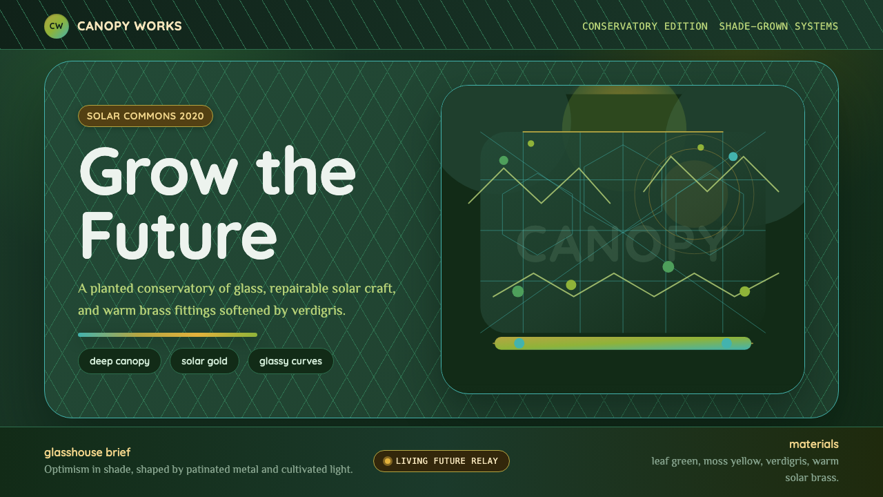 Solarpunk GreenhouseA grown future, not a sterile one. Deep canopy green, solar gold, and glassy…未来是可种植的:深冠绿、太阳金与玻璃曲线。
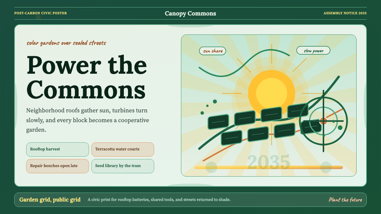 Solarpunk Utopia Poster (2014)Optimism has infrastructure. Emerald ground, saffron sunburst, humanist serif…乐观有基础设施。翡翠绿底、藏红花放射、人文衬线曲线。
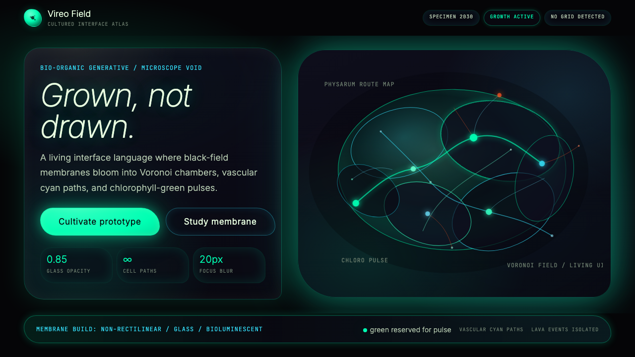 Bio-Organic GenerativeInterfaces feel cultured. Void black, Voronoi membranes, and neon chlorophyll…界面像被培育:黑场、维诺诺伊膜与叶绿素霓光一起呼吸。
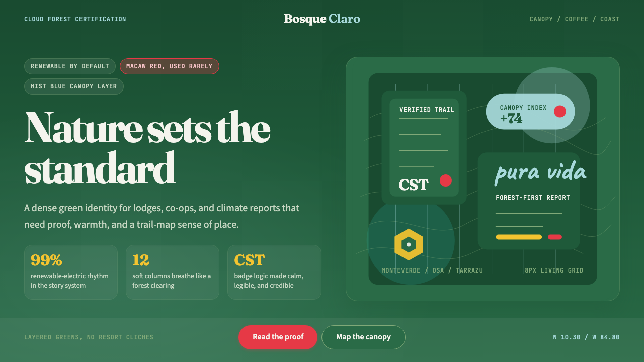 Costa Rica Pura Vida EcoAlive without greenwash. Cloud-forest green, Fraunces serif, and scarlet acce…拒绝漂绿:云雾森林绿、Fraunces衬线与猩红点缀撑起生机。
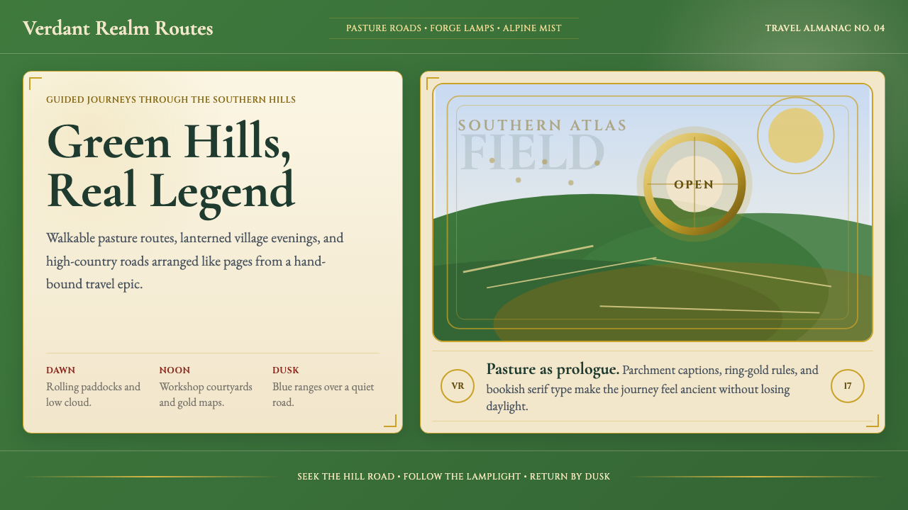 NZ Lord of the Rings TourismEpic feels approachable. Pasture green, ring-gold, and Garamond book frames.史诗却亲近:牧场绿、戒指金与Garamond书框。
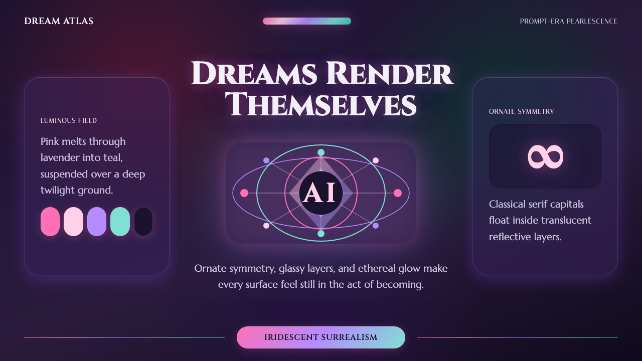 AI Diffusion ArtDreamlike, luminous, uncanny. Pink-to-teal gradients glow over twilight glass.梦幻、发光、诡谲。粉到青渐变在暮色玻璃上漫溢。