What is Solarpunk Utopia Poster (2014)?
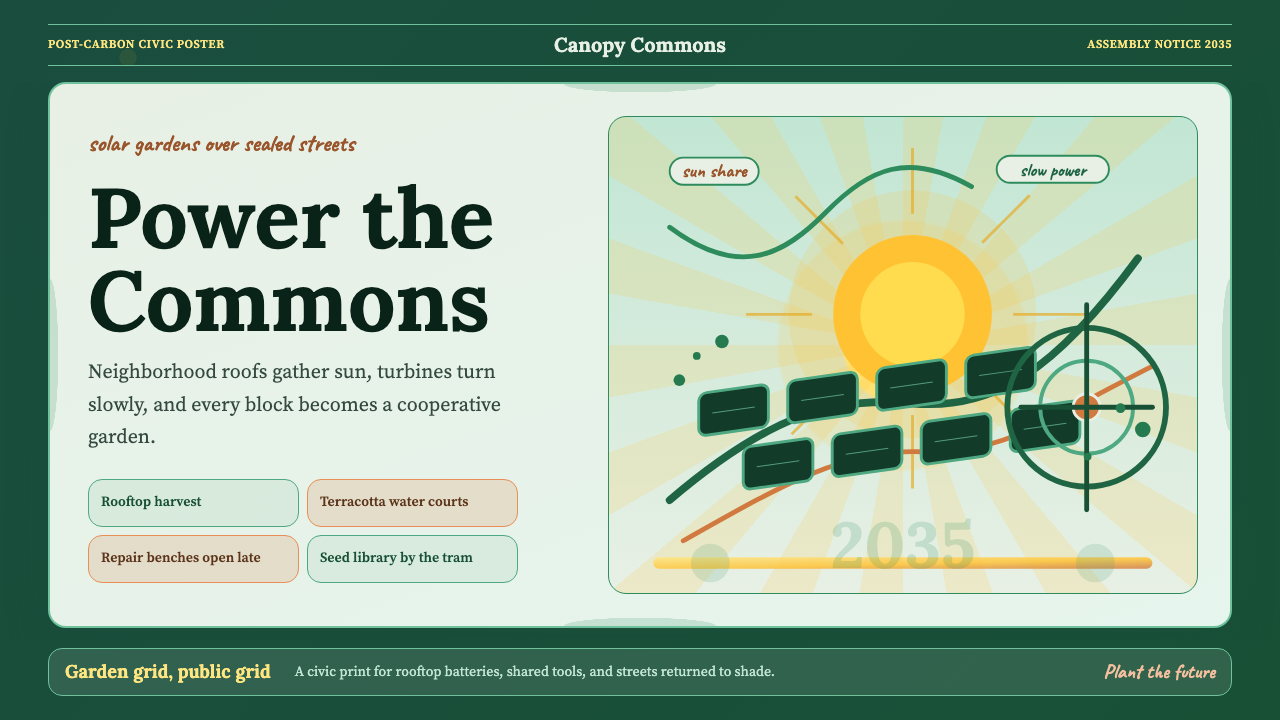
Solarpunk refuses the dystopia — it draws on Art Nouveau's organic exuberance and community-garden optimism to imagine cities where photovoltaic panels bloom alongside botanical murals.
Solarpunk Utopia Poster (2014) in brief
Solarpunk Utopia Poster style is a visual movement that fuses the ornamental lushness of Art Nouveau with ecological optimism and grassroots political energy. Where cyberpunk imagines a neon-soaked corporate dystopia, solarpunk counter-proposes something genuinely hopeful: cities ringed with vertical gardens, cooperative workshops humming with renewable energy, and streets that feel more like meadows than corridors. The poster aesthetic is this vision rendered into print culture — communal, hand-made in feeling, and unabashedly idealistic.
The visual language draws its warmth from a palette rooted in the natural world: deep emerald greens, saffron yellows, terracotta reds, and sky blues that read as abundant rather than industrial. Compositions lean on radial and botanical motifs — sunbursts, branching vines, seed-pod frames — borrowed from the decorative grammar of Alphonse Mucha and his peers, but recontextualized around wind turbines, solar arrays, and community rooftop farms. The result is a style that feels simultaneously historical and futurist, romantic and practical.
Typography in this tradition gravitates toward humanist serifs with rounded, calligraphic qualities — letterforms that echo the hand-lettered broadsheets and movement manifestos from which the aesthetic grew. Headlines carry weight through expressive curves rather than brute geometric mass. The overall impression is of a design culture that believes craft and politics belong together, that beauty is not a luxury but an argument for how life could be organized.

Where does Solarpunk Utopia Poster (2014) come from?
The word solarpunk appears to have entered circulation around 2008, in scattered blog posts and Tumblr threads seeking an alternative to the bleak tonalities of cyberpunk fiction. Early contributors were working in speculative fiction and visual art simultaneously, imagining what a genuinely optimistic science fiction might look like — one where technology served communities rather than corporations, and where ecological sustainability was a source of beauty rather than sacrifice. The Brazilian Portuguese online community was particularly active in these early years, producing zines, artwork, and critical essays that helped define the movement's visual and political character.
The pivotal text arrived in 2014, when Adam Flynn published his essay articulating what the scattered image-sharing and story-writing had been reaching toward: a coherent set of values linking renewable infrastructure, decentralized governance, cultural pluralism, and aesthetic richness. The manifesto gave the movement a name people could rally around and a set of design commitments — to organic forms, handcraft, community-scale technology — that could guide visual production. Artists began picturing not just a hopeful green blur but concrete technologies embedded in living communities.
The Art Nouveau connection was not accidental. Solarpunk artists found in the fin-de-siècle movement a precedent for treating natural form as the basis of all ornament, for insisting that everyday objects deserved beauty, and for fusing decorative and structural concerns into a single aesthetic stance. Mucha's botanical borders, Guimard's iron-vine Paris metro entrances, and the William Morris tradition of the printed page as a garden were all recognized as kindred impulses. The difference was ideological context: where Art Nouveau emerged from industrial prosperity, solarpunk emerged from ecological anxiety and a desire to imagine prosperity on different terms.
By the mid-2010s, the visual style had stabilized into a recognizable set of conventions: radial sunburst compositions, hand-lettered or humanist-serif typography, deep botanical color palettes, and the deliberate inclusion of recognizable clean-technology infrastructure alongside natural imagery. Anthologies published around 2017 gathered writing and visual work that consolidated the aesthetic. Berlin and New York art scenes began absorbing the style into exhibition and activist poster culture. By 2020, solarpunk had crossed from internet subculture into mainstream cultural conversation about climate, design, and political imagination.
What defines the Solarpunk Utopia Poster (2014) look?
Color Palette
The palette is grounded in the natural world rather than any industrial or digital color system. Deep emerald and forest greens dominate grounds and large fields, evoking living canopy and verdant abundance. These are paired with warm saffron and golden yellows that read as sunlight rather than caution — energy made visible. Terracotta and burnt ochre provide earthen mid-tones that keep the palette from floating into fantasy. Sky blue, used selectively, opens compositions and signals both air and possibility. The overall effect is warm, saturated, and ecological — a palette that feels like it was grown rather than manufactured.
Botanical and Radial Motifs
The compositional vocabulary is rooted in two complementary logics: the radial and the organic. Sunburst radiations emanate from central focal points — often a sun disc, a turbine hub, or a single luminous source — spreading outward in a gesture of generative energy. Around and through these radial structures, botanical forms proliferate: vines that climb and curl, seed pods that frame text, leaf shapes that fill negative space with the texture of growth. The combination creates compositions that feel alive, centrifugal, and optimistic — energy moving outward from a center rather than inward toward a vanishing point.
Typography
Humanist serifs with calligraphic warmth define the typographic character of the style. These are letterforms with bracketed serifs and gentle stroke contrast — type that carries the memory of the writing hand, echoing the broadsheet and manifesto culture from which the movement grew. Display type is often set large and centrally within radial compositions, treated as almost architectural — text that is also a structural element of the poster. Secondary text uses tighter setting and more restrained sizing, creating clear hierarchy without resorting to mechanical contrast. The effect is legible but craft-feeling: serious and handmade simultaneously.
Integration of Technology and Nature
One of the style's most distinctive commitments is the deliberate, non-ironic integration of clean-energy infrastructure into natural settings. Solar panels appear among flower borders. Wind turbines rise through botanical frames. Vertical farms and green roofs are rendered with the same loving detail as the vines that surround them. This is not greenwashing collage — it is a sincere compositional argument that technology and ecology belong in the same visual field, that the boundary between the built and the grown can be dissolved by design. The style refuses the opposition between the modern and the natural that characterizes so much industrial-era design.
Communal and Hand-Crafted Quality
Even at large scale, solarpunk poster work maintains a hand-crafted sensibility — textures that suggest screen printing, letterpress, or linocut rather than high-resolution digital output. Edges are slightly softened, ink appears to have been laid down with slight variation in pressure, botanical elements carry the wobble of observation rather than the perfection of digital symmetry. This is an aesthetic of making that values the trace of the hand. It communicates that the work comes from a community rather than a corporation, from a workshop rather than a render farm — which is exactly what the movement intends to say.
Poster Culture Hierarchy
The information architecture follows classic activist poster logic: a single dominant image or symbolic composition that can be read at a glance from across a room, a bold headline that functions as a slogan or call, and subsidiary text that rewards closer reading. This hierarchy is maintained even in digital applications. The style does not reward visual complexity for its own sake — it demands that every element earn its place in the hierarchy by contributing to a legible argument. A solarpunk poster should communicate its essential message in under two seconds at a distance, then unfold into detail on approach.
Optimism as Formal Principle
Perhaps most distinctively, solarpunk poster aesthetics treat optimism not as a mood but as a design decision. The upward and outward compositional vectors, the warm luminous palette, the abundance of botanical life, the integration of human craft and natural growth — all of these are formal choices that enact a world-view rather than merely illustrate one. This distinguishes the style from apocalyptic or dystopian aesthetics that use dark, fragmentary, or entropic visual languages. Solarpunk design argues through its form: this is what abundance looks like, this is what cooperation looks like, this is what a genuinely good future could feel like.

Who shaped Solarpunk Utopia Poster (2014)?
Flynn's 2014 essay on solarpunk was the movement's defining written statement. He articulated the connection between renewable infrastructure, decentralized community governance, and aesthetic choices, arguing that solarpunk was not escapist fantasy but a design practice for building the world it imagines. His framing of infrastructure as a form of utopian imagination became the conceptual foundation on which the visual style's integration of technology and nature rests.
The nineteenth-century Czech Art Nouveau master was not a solarpunk, but his visual grammar — botanical borders, radial halos, women intertwined with flowering vines, the poster as an object of communal beauty — was absorbed wholesale into the solarpunk visual tradition. Mucha's demonstration that commercial poster art could be a vehicle for genuine ornamental richness, and that natural form could structure an entire visual system, gave solarpunk artists a historical precedent and a technical vocabulary to adapt.
Among the earliest practitioners to synthesize the solarpunk visual aesthetic into a coherent style, Louise contributed artwork and critical writing that helped establish the movement's community-facing character. Her work demonstrated how solarpunk imagery could function simultaneously as political communication and aesthetic pleasure — posters that worked as arguments on walls and as decorative objects in homes — a duality that became central to the style's popular spread.
Wagner's editorial work on solarpunk anthologies was critical in consolidating the visual and literary aesthetic into a form legible to wider audiences. By curating visual art alongside speculative fiction, the anthologies she contributed to demonstrated that solarpunk was not a single style but a coherent sensibility — one that could accommodate diverse cultural voices while maintaining a recognizable commitment to ecological optimism and craft-based aesthetics.
A fiction writer and critic whose work repeatedly engaged with the design and infrastructure questions at the heart of solarpunk, Hudson articulated why aesthetic choices in the movement were inseparable from political ones. His essays on solarpunk's relationship to utopian design traditions — particularly his engagement with the William Morris and Arts and Crafts precedent — helped practitioners understand their work as part of a longer history of using beauty as a form of argument about how life could be organized.
How do you use Solarpunk Utopia Poster (2014) today?
Solarpunk Utopia Poster style is among the more demanding historical aesthetics to apply well in contemporary design contexts, because it requires genuine visual generosity. The style is not minimal — it is abundant. Applying it correctly means committing to decorative richness, botanical complexity, and warm color in ways that contemporary digital design culture often resists as excessive. The first practical test is whether you are willing to let the design breathe outward rather than contract inward.
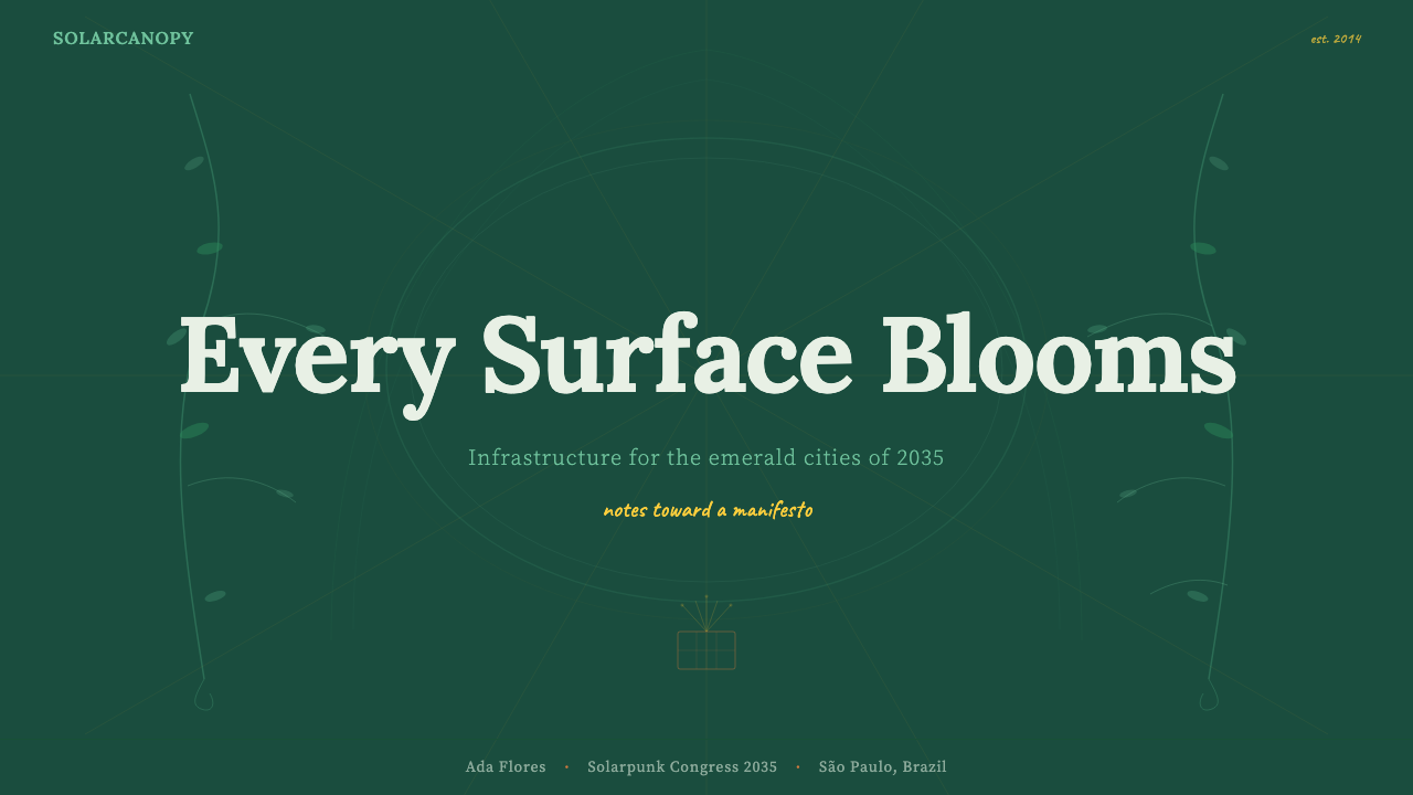
For presentation slides, the style excels on cover and section-break pages where a single powerful composition can carry the full emotional weight of the visual argument. A solarpunk cover slide might feature a radial sunburst anchored by a central image — a solar panel farm, a green-roofed city — framed by botanical border elements in the deep emerald and saffron palette, with a humanist-serif headline set large at the center. Content slides require discipline: carry the warm palette and the botanical corner accents, but simplify the composition radically so that the data or argument remains legible. Data slides work well when chart elements are colored according to the ecological palette — bars that read as living rather than mechanical.
For web interfaces, the style is best suited to advocacy platforms, environmental nonprofit sites, cooperative business homepages, and any context where the value proposition includes community, sustainability, or ethical production. The approach involves generous whitespace structured by organic curves rather than strict rectilinear grids, headline typography with humanist-serif warmth, and hero images that integrate botanical illustration with contemporary clean-technology photography. Avoid applying the style to transactional interfaces — checkout flows, data-dense dashboards, enterprise software — where the ornamental richness will compete with functional clarity.
For editorial and marketing work, solarpunk poster style produces particularly strong long-form layouts: feature articles about climate, food, urban design, or community economics that benefit from an aesthetic environment that feels both principled and pleasurable. A typical approach uses a botanical full-bleed cover illustration, pulls key quotations into decoratively bordered call-out boxes, and uses the radial compositional logic for section openers. Marketing materials for brands with genuine sustainability commitments can use the style powerfully — but only if the claim is authentic. The style's visual sincerity is very difficult to apply cynically without it reading as hollow.
A common mistake is reducing solarpunk aesthetics to the color palette alone — dropping emerald and saffron into an otherwise generic layout and calling it done. The style's power comes from the specific combination of radial composition, botanical ornament, humanist typography, and warm palette working together as an integrated system. Applying any one element without the others produces a result that feels decorative rather than argumentative. Similarly, using digitally precise symmetry and hard edges in botanical elements will undermine the hand-crafted warmth that makes the style communicate community rather than corporation.
Solarpunk Utopia Poster (2014) — FAQ
How does solarpunk aesthetics differ from general Art Nouveau revival?
Art Nouveau revival in contemporary design tends to focus on the ornamental repertoire — botanical borders, whiplash curves, jewel-toned palettes — without the ideological content that gave the original movement its cultural meaning. Solarpunk explicitly recruits Art Nouveau's decorative grammar into a political project: the integration of clean technology into botanical compositions is not nostalgic decoration but a formal argument about how technology and nature can coexist. The distinction is intentionality. A contemporary Art Nouveau revival poster might use similar visual elements to sell a luxury product; a solarpunk poster uses the same elements to argue for a cooperative future. The aesthetics overlap; the world-views are entirely different.
Is solarpunk poster style appropriate for corporate or commercial applications?
It can work, but only under specific conditions. The style's visual sincerity — its hand-crafted warmth, its communal-feeling aesthetic, its explicit integration of ecological imagery — creates a high bar of authenticity. Applied to a brand whose sustainability commitments are substantive and central to its identity, the style can communicate those values with unusual force and genuine resonance. Applied to a brand that is using sustainability as a marketing layer over conventional extractive practices, the style will read as greenwashing and may actively undermine trust. The aesthetic is well-developed enough by now that sophisticated audiences can tell the difference. Use it only if the claim is real.
Can this style work in dark-mode interfaces?
With care, yes. The solarpunk palette is warm and saturated enough that many of its hues — the deep emerald, the saffron yellow, the terracotta — read well against dark or near-black grounds. A dark-mode solarpunk interface might use a very deep forest green or a rich near-black as the primary ground, with saffron and cream as the dominant foreground tones. The botanical elements and radial compositions adapt naturally to this inversion. What to avoid: running all palette colors at maximum saturation simultaneously against a dark ground, which will produce a garish rather than lush result. The same restraint that governs the light-mode version — one dominant hue, supporting accents — applies in the dark variant.
How do you handle solarpunk aesthetics when working with photography rather than illustration?
Photography can work within the style, but it requires careful selection and treatment. Images should feature genuine ecological subjects — actual urban gardens, real renewable energy installations, working community spaces — rather than stock photography of nature untouched by human activity. Treatment should warm the color toward the palette's saffron and emerald character, pushing away from cool or neutral tones. Compositionally, photographs work best when cropped to emphasize the botanical or radial logic — a wide-angle shot of a green roof that becomes a texture field, or a close-up of a solar panel array that reads as an abstract geometric pattern. Overlaying botanical illustration elements on photographs can help bridge the gap between the photographic and the hand-made registers of the style.
What makes solarpunk different from general eco-design or green marketing aesthetics?
Conventional eco-design and green marketing tend toward clean-line minimalism, cool whites and forest greens, and photography of pristine nature — an aesthetic that communicates purity and withdrawal from the industrial. Solarpunk is warmer, more abundant, more craft-based, and more explicitly urban and communal. Where eco-minimalism says leave no trace, solarpunk says build something beautiful together. The presence of human community, technology, and craft activity is central to the style, not something to be minimized. This makes solarpunk aesthetics more politically specific — it is not about escaping civilization but about redesigning it — which is both its strength and its limitation as a commercial tool.
Related design styles
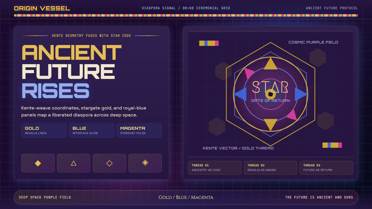 AfrofuturismAncient future, fully luminous. Gold kente grids cut through cosmic purple an…
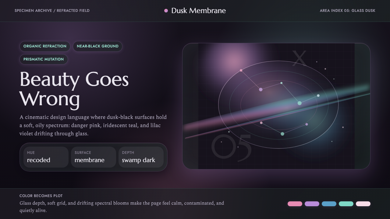 Annihilation (The Shimmer)Beautifully wrong. Dusk black carries pink, teal, and lilac refraction throug…
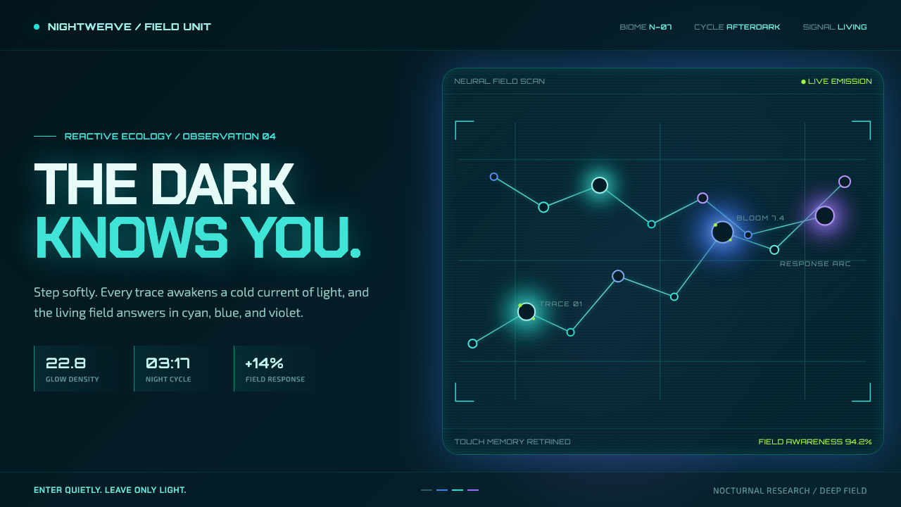 Avatar — Pandora Bioluminescence (2009)The forest knows you are there. Cyan light blooms across a deep-teal living f…
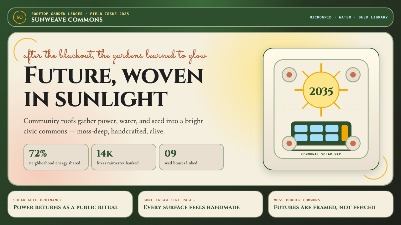 Solarpunk (2035)Climate optimism feels handmade. Moss ground, solar gold, and Art Nouveau bor…
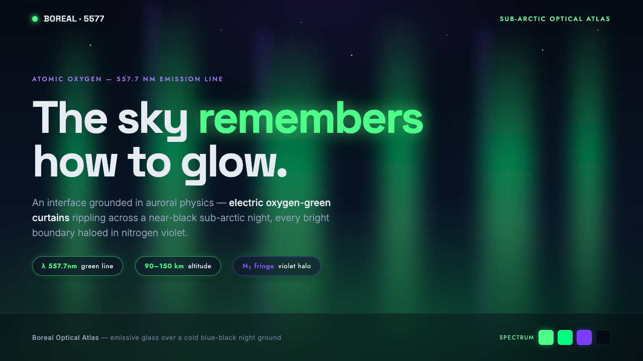 Yukon Northern LightsPhysics as interface. Electric oxygen-green curtains glow over blue-black nig…
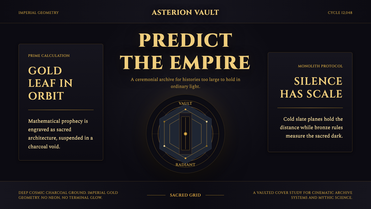 Foundation AppleSacred empire in shadow. Cinzel capitals and gold geometry float on cosmic ch…