What is Solarpunk Greenhouse?
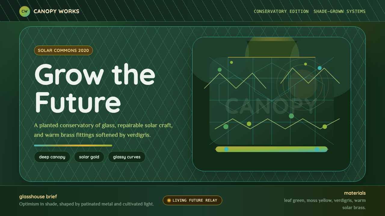
Solarpunk imagines a future you could grow yourself — glasshouse curves, patinated brass, and deep leaf-green lit by solar gold.
Solarpunk Greenhouse in brief
Solarpunk is a design and speculative-fiction movement that answers a simple question: what does a sustainable future actually look like, if it isn't grim? Where cyberpunk imagines neon corporate dystopia and steampunk looks backward to brass-and-steam Victoriana, solarpunk looks forward to a world that solved its ecological crisis and became more beautiful for it. The visual result is warm rather than sterile — a future built from glass, plants, and reclaimed metal rather than chrome and plastic.
The Greenhouse variant of solarpunk reads specifically as an interior: a sunlit conservatory laced with climbing vines, where deep foliage canopy sits in shade rather than open sky. Pine, leaf, and moss greens layer against patinated copper and brass fixtures gone soft with verdigris, and Art Nouveau curves — borrowed from the organic, plant-derived ornament of the 1890s — refuse the cold rectangle in favor of arches, tendrils, and glass panes bent into gentle bows.
What makes solarpunk cohere as a system rather than a mood board is its refusal of two adjacent aesthetics it could easily collapse into: the sterile white minimalism of corporate eco-marketing, and the grimy survivalist palette of post-apocalyptic fiction. Solarpunk insists the future can be both ecologically serious and visually lush — technology and nature are not opposites here but the same material, grown and built together.

Where does Solarpunk Greenhouse come from?
The term "solarpunk" crystallized online around 2008, coined in imitation of the -punk suffix pattern established by cyberpunk and steampunk — a shorthand for a speculative aesthetic paired with a political stance. It flourished as a recognizable visual movement roughly a decade later, spreading through art blogs, worldbuilding communities, and short-fiction anthologies rather than through any single manifesto or founding studio. This makes it unusual among design movements: it has no Gropius, no single founding school. It is internet-native, crowd-authored, and still actively being defined.
Solarpunk's visual grammar borrows heavily and deliberately from Art Nouveau, the decorative movement that swept Europe from the 1890s into the early twentieth century. Art Nouveau designers such as Alphonse Mucha and Hector Guimard rejected the straight lines of industrial-age architecture in favor of forms derived from plants — whiplash curves, vine tendrils, and structures that seemed to grow rather than be assembled. Guimard's Paris Métro entrances, with their cast-iron foliage arching over the stairs, are a direct ancestor of the glasshouse curves solarpunk reaches for.
The movement also draws on a much older thread: the appropriate technology movement of the 1960s and 1970s, which argued that technology should be scaled to human and ecological need rather than maximized for profit or spectacle. Solarpunk's brass fixtures gone green with verdigris and its emphasis on repair, reuse, and small-scale craft over disposable mass production both descend from this older skepticism of industrial excess.
Because solarpunk emerged from internet subcultures rather than an institution, its visual identity has stayed unusually fluid — closer to a shared vocabulary that different illustrators, architects, and game designers keep reinterpreting than to a fixed style guide. The Greenhouse cut represented here is one stable, recognizable crystallization of that vocabulary: interior, sunlit, patinated, and unmistakably alive.
What defines the Solarpunk Greenhouse look?
Color
The palette layers deep foliage greens — pine, leaf, moss — as the dominant field, rather than treating green as an accent on a neutral background. Solar gold appears as filtered light rather than a flat block: warm, low, and directional, as if passing through glass and leaves rather than sitting on a swatch. Patinated copper and brass introduce a muted blue-green undertone that keeps the overall mood soft rather than saturated.
Typography
Rounded humanist letterforms carry the warmth and hand-built optimism the style depends on — nothing angular or mechanical. Alongside them, Art-Nouveau-inflected serif or display type introduces the organic, plant-derived elegance of the era: letters with subtle curved terminals that echo the tendrils and vines elsewhere in the composition, rather than the geometric rigidity found in industrial-age type.
Line and Curve
The defining gesture is the refusal of the straight rectangle. Structural lines bow into glasshouse arches, tendrils spiral rather than branch at right angles, and framing elements curve the way a growing vine curves — asymmetric, unhurried, never mechanically repeated. This is the single clearest marker separating solarpunk from adjacent eco-minimalist styles, which tend to keep hard modern geometry and simply change the color palette to green.
Material
Surfaces read as glass, brass, copper, and living plant rather than plastic, chrome, or screen-glow. The metal is never pristine — it carries the soft blue-green patina of age and weather, signaling a future built to last and to weather gracefully rather than to be replaced. Glass is treated as something you look through into greenery, not as a hard reflective plane.
Light
Light in this system is filtered, not flat — it passes through canopy and glass before it reaches any surface, producing dappled warmth rather than even illumination. Because the vantage point sits inside a shaded conservatory rather than under open sky, the overall value range stays mid-to-dark, with solar gold reserved for the brightest accents rather than the whole field.
Ornament
Ornament is plant-derived and structural rather than applied — a vine that also functions as a railing, a leaf motif that also frames a panel edge. This distinguishes solarpunk decoration from purely cosmetic foliage patterns: every organic flourish in an authentic composition is doing double duty as both image and architecture.
Mood
Above all, the composition must read as hopeful and inhabitable, never as ruin or decay. A greenhouse reclaimed by nature after collapse is a different aesthetic — post-apocalyptic — from a greenhouse deliberately built and tended this way. Solarpunk is a future someone chose and is actively growing, not one nature took back after people left.

Who shaped Solarpunk Greenhouse?
The Czech Art Nouveau painter and decorative artist whose flowing, plant-haloed figures and ornamental borders defined the organic curve vocabulary that solarpunk draws on. Mucha's posters treated the human figure as inseparable from surrounding vegetal ornament — a fusion of body and botany that solarpunk's fusion of architecture and greenery directly echoes.
The French architect best known for the cast-iron Paris Métro entrances, whose arching foliage-derived frames turned functional urban infrastructure into organic sculpture. Guimard's willingness to let a structural necessity — a stair railing, a canopy — become a plant-like form is the direct architectural ancestor of solarpunk's glasshouse arches.
Author of the 1975 novel Ecotopia, an early work of ecological speculative fiction imagining a Pacific-Northwest society reorganized around sustainability. While predating the solarpunk label by decades, Callenbach's vision of a green future that was livable and appealing rather than austere or punitive set the tonal template solarpunk fiction and design later formalized.
How do you use Solarpunk Greenhouse today?
Solarpunk Greenhouse works best wherever a brand or product wants to signal an optimistic, ecologically serious future without resorting to the sterile white-and-mint palette that corporate sustainability marketing has worn thin. Applying it correctly means resisting the temptation to flatten it into a green color swap on an otherwise generic modern layout — the curves and the layered depth are doing as much work as the color.
For presentation slides, a cover page benefits from a single dominant curved frame — an arch or vine border — holding the title, with deep canopy green as the ground and solar gold reserved for the title text or a small accent shape. Content slides should keep the layered depth: a foreground element in patinated brass or copper tone, a mid-ground of leaf green, and a softly lit background, rather than a flat single-color fill. Data visualizations can use gold as the highlight color against green-toned bars or areas, echoing light breaking through canopy.
For web interfaces, the style suits dashboards and landing pages for sustainability, wellness, gardening, or slow-living products where warmth and craft credibility matter more than clinical efficiency. Cards can take rounded, organically uneven corners rather than uniform radii; buttons and interactive elements benefit from a soft brass or copper tone rather than a flat saturated green, which can otherwise read as generic "eco" branding rather than considered design.
For editorial and marketing work, Solarpunk Greenhouse suits long-form storytelling about climate solutions, regenerative design, or hopeful futurism. Pull quotes and section breaks can borrow the vine-and-frame motif as a recurring visual device, and photography or illustration should favor interior, shaded, plant-filled scenes over open, sunlit exteriors — the mood depends on that enclosed, conservatory quality.
A common mistake is treating solarpunk as simply "green futurism" and defaulting to hard geometric sci-fi shapes tinted green. Without the Art Nouveau curve vocabulary and the patinated, hand-built material quality, the result reads as generic tech-eco branding rather than the specific, lush, conservatory-interior mood the style is built on. Another mistake is over-brightening the palette into a daytime, open-sky feel — the Greenhouse variant specifically depends on shade and filtered light, not blue sky.

Solarpunk Greenhouse — FAQ
Is Solarpunk Greenhouse the same as general "eco-friendly" design?
No. Generic eco-friendly design usually means a neutral or white layout with a green accent color and a leaf icon — a color swap, not a system. Solarpunk Greenhouse is a full aesthetic built on Art Nouveau curves, layered canopy depth, patinated metal, and filtered interior light. The green is load-bearing, not decorative, and the composition depends on shape and material as much as color.
Does solarpunk have to be dark, or can it work with a bright palette?
The Greenhouse variant is specifically built around a shaded, interior mood — deep canopy greens and filtered gold light rather than open daylight. Other solarpunk variants set outdoors under open sky can run brighter. When applying the Greenhouse cut specifically, keeping the value range mid-to-dark and treating gold as a filtered highlight rather than a flat wash preserves the enclosed conservatory feeling the style depends on.
How is solarpunk different from steampunk, given both use brass?
Steampunk looks backward — an alternate Victorian era where steam power never gave way to electricity, full of gears, pressure gauges, and industrial brass machinery. Solarpunk looks forward — a future where humanity solved its ecological problems, and brass appears not as industrial machinery but as architectural fixtures gone soft with age, integrated with living plants rather than replacing them. The direction of time and the relationship to nature are the key differences.
What kind of imagery or photography suits this style?
Interior conservatory and greenhouse scenes work best: sunlight filtered through glass and leaves, brass or copper fixtures with visible patina, climbing vines against structural glass panes. Avoid open exterior sky-dominant shots, which shift the mood toward brighter, more generic solarpunk variants rather than the Greenhouse cut's enclosed, hand-tended feeling.
Related design styles
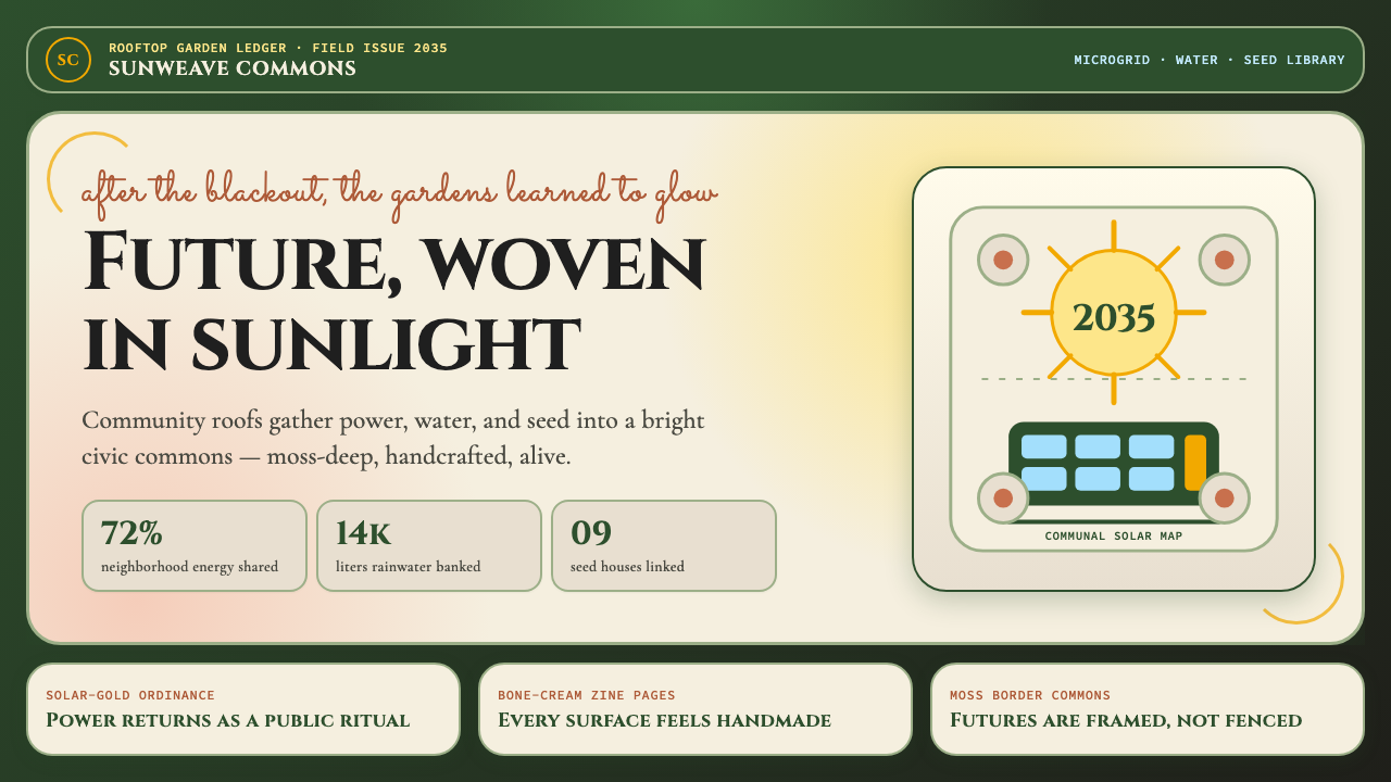 Solarpunk (2035)Climate optimism feels handmade. Moss ground, solar gold, and Art Nouveau bor…
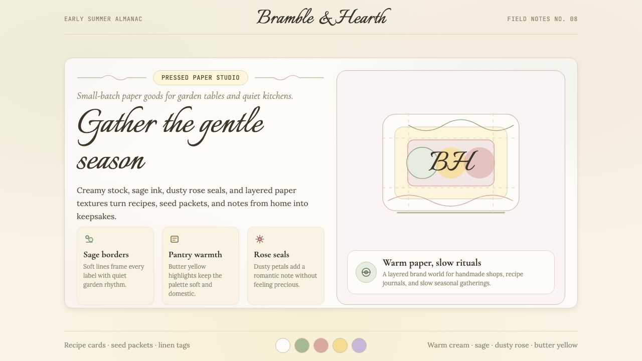 CottagecoreRural romance, hand-drawn. Sage and dusty rose, gingham textures, serif paire…
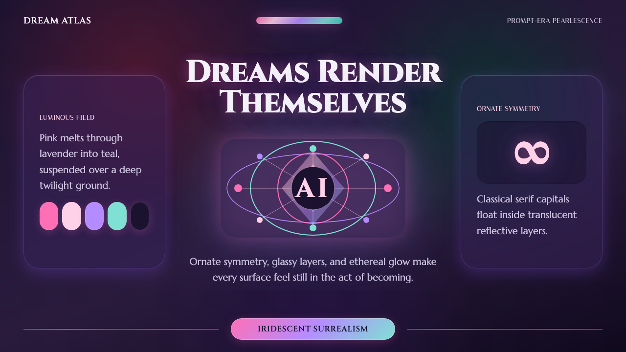 AI Diffusion ArtDreamlike, luminous, uncanny. Pink-to-teal gradients glow over twilight glass.
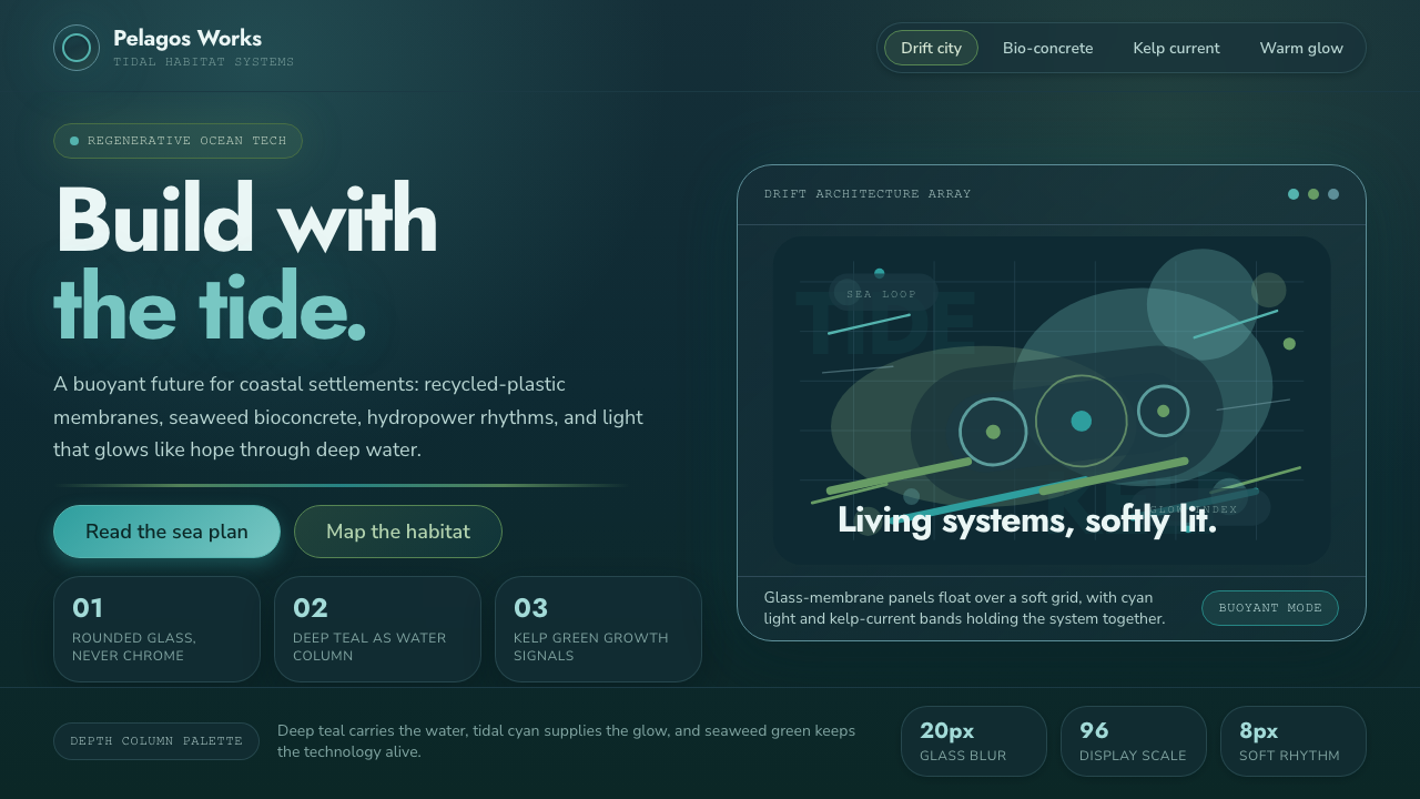 TidalpunkHope glows underwater. Deep teal glass, tidal cyan light, and kelp-green curr…
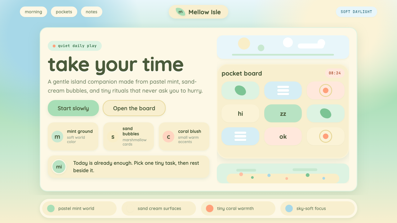 Animal Crossing — New HorizonsNo pressure, only daylight. Mint fields and sand bubbles soften every edge.
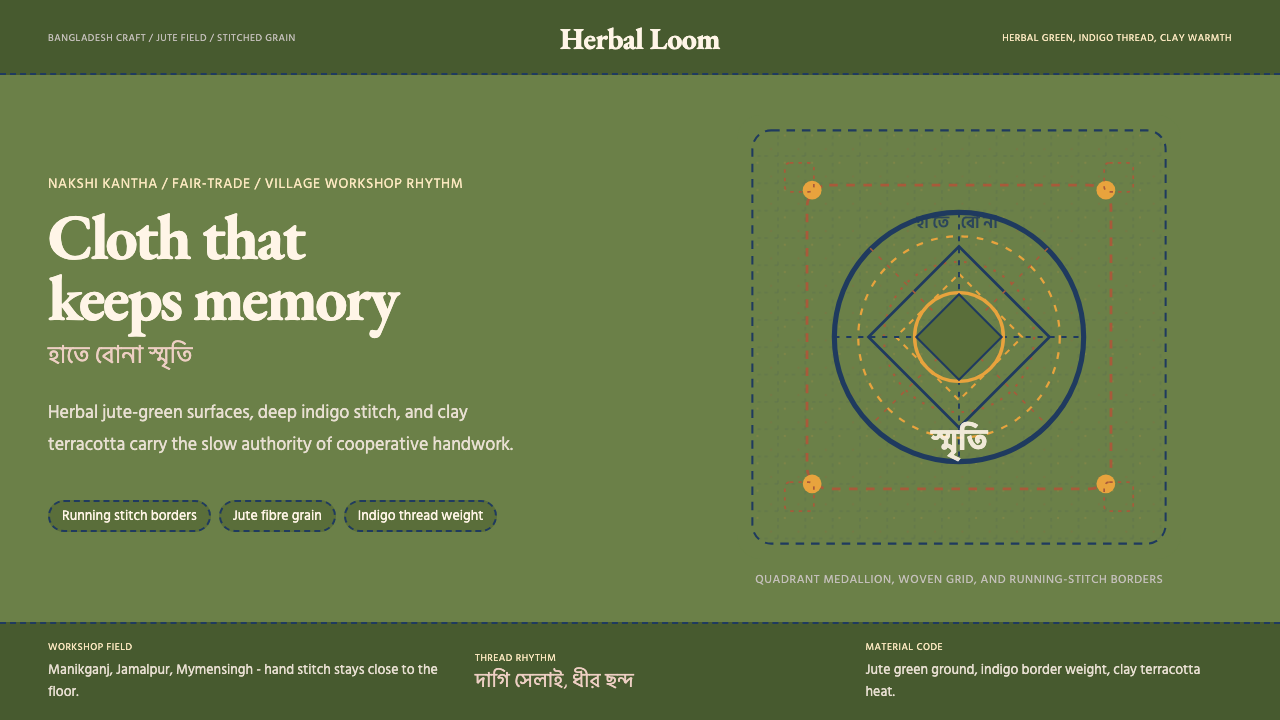 Bangladeshi Jute CraftMemory stays stitched. Jute green, indigo borders, terracotta warmth.