What is Prey (2017)?
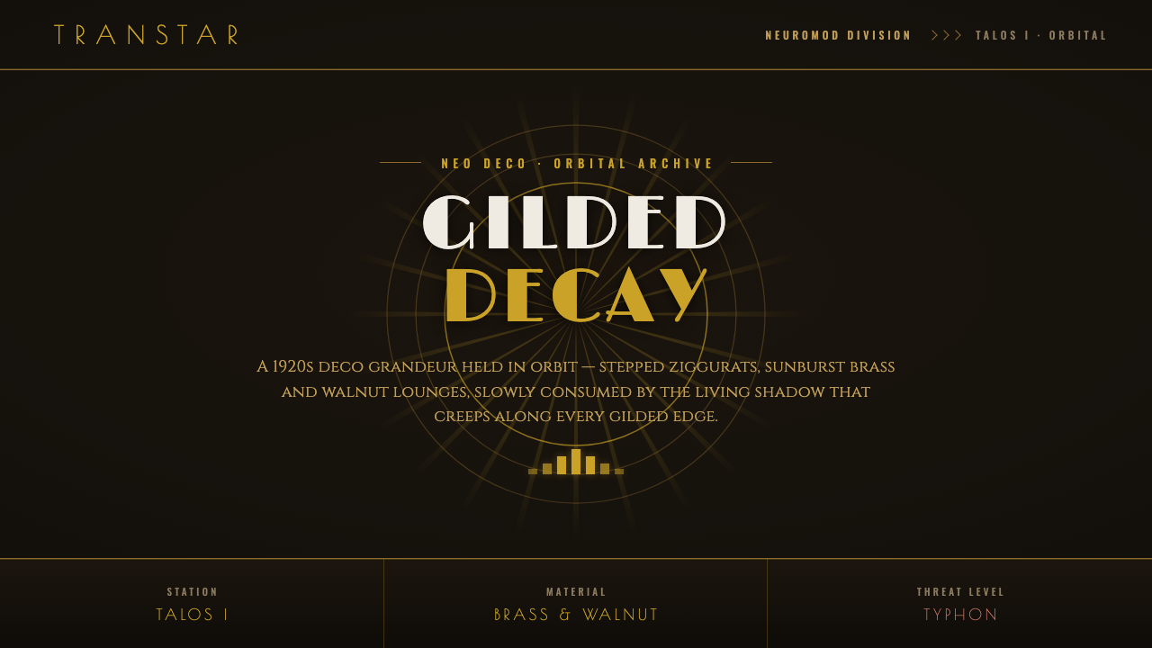
Prey turns Art Deco futurism into luxurious horror: gold grandeur, walnut warmth, and oxblood leather slowly swallowed by a living black shadow.
Prey (2017) in brief
Prey (2017) imagines the future as an opulent, decaying Art Deco environment rather than a landscape of cold chrome, exposed machinery, and neon. Its orbital setting, Talos I, is shaped by the geometry associated with the 1920s and 1930s: stepped ziggurat forms, radiating sunbursts, strong symmetry, engraved surfaces, and animal-like winged-lion motifs. These references are not presented as museum quotation. They are absorbed into a retrofuture world of brass, dark wood, leather, and polished architectural trim.
The central visual tension is between cultivated luxury and biological contamination. Warm gold details catch the eye against near-black Typhon ooze, while refined materials appear increasingly vulnerable to the shadow spreading over them. The style does not use decoration simply to make a science-fiction station look expensive. Ornament establishes a world that believes in permanence, ceremony, and human control; the encroaching darkness makes each of those promises feel fragile.
That contrast gives Prey its distinctive emotional register. Art Deco usually communicates optimism, progress, wealth, and the confidence of engineered order. Here, its repeated geometry and luxurious finishes become the setting for unease. A sunburst can read as an emblem of aspiration, but beside Typhon matter it can also resemble a warning flare. The station feels designed with care, then left exposed to something that does not recognize the value of care at all.
Where does Prey (2017) come from?
Prey was released in 2017 and developed by Arkane Studios in Austin, Texas, with Bethesda Softworks identified in its art direction. Its fiction is set in an alternate-history version of the 2030s, a choice that allows the visual world to be futuristic without becoming stylistically anonymous. Rather than treating the future as a clean break from the past, the design folds historical taste into speculative technology and makes the station feel like a cultural artifact as much as a technical one.
The principal historical source is Art Deco. The movement supplies the station with its stepped silhouettes, sunburst ornament, engraved typography, symmetrical emphasis, and monumental sense of display. In Prey, these familiar signals of early modern luxury are transferred into an orbital context. The result is not period architecture placed unchanged in space; it is Neo Deco speculative design, where an older vocabulary is made to carry the visual weight of an alternate future.
A second influence is mid-century brushed-aluminum modernism. This adds a more industrial and forward-looking note to the Deco inheritance, helping the world remain plausible as a technological environment rather than becoming purely nostalgic. Brass and walnut do not stand alone as antique signals. They are joined by metallic surfaces and retrofuture finishes that imply a future built from material confidence, craftsmanship, and visible construction.
The style becomes especially powerful because its alternate-history retrofuture is paired with decay. Talos I begins from a language of controlled surfaces and intentional ornament, then introduces Typhon ooze as a living interruption. The black substance does not harmonize with the station’s gilded order; it consumes it. That opposition turns historical influence into narrative atmosphere: the more carefully a surface is decorated, the more disturbing it becomes to see it overtaken.
What defines the Prey (2017) look?
Luxurious Darkness
The dominant atmosphere is dark, but never empty. Near-black Typhon ooze creates a heavy visual field against which warm metallic trim and polished materials become unusually vivid. Darkness functions as contamination and threat, while gold functions as a surviving trace of refinement. The effect is less industrial gloom than a grand interior after something alive has entered it.
Deco Geometry
Stepped ziggurats, sunbursts, and winged-lion motifs provide a vocabulary of deliberate, ceremonial geometry. Forms feel composed rather than incidental, with radiating lines and stacked planes directing attention toward focal points. The geometry gives even functional space a sense of occasion, as if circulation routes, doors, and furnishings belong to a larger architectural performance.
Brass and Walnut
Retrofuture brass and walnut prevent the station from feeling sterile. Brass catches warm highlights and reinforces the engraved, architectural quality of the world; walnut adds depth and domestic weight. Together they suggest a future that values crafted surfaces and long-lived objects, making the invasion of black ooze feel like damage to a lived-in inheritance rather than merely a technical malfunction.
Oxblood Leather
Oxblood leather introduces a deep, restrained red that sits naturally beside brass and dark timber. It is richer and more formal than an alarm color, bringing the language of upholstered lounges, executive interiors, and ceremonial furniture into orbit. Against the Typhon darkness, it reads as warmth under pressure: human comfort preserved, but never fully secure.
Engraved Type
The typography is described through an engraved Deco character, including Poiret One. Lettering should feel carved, formal, and integrated with the station’s decorative architecture rather than floating as neutral interface text. Its role is to extend the world’s material logic: labels and titles appear capable of belonging to plaques, trim, or carefully finished surfaces.
Living Contamination
Typhon ooze is not merely a dark background treatment. It is a living shadow that slowly consumes gilded surfaces, introducing organic menace into a system built from controlled geometry and refined material. This makes the horror spatial. The viewer is not only shown danger; they see an ordered environment losing its visual authority as the contamination advances.
Who shaped Prey (2017)?
The Arkane Studios design team established Prey’s defining collision between orbital science fiction and Art Deco decay. Their visual direction treats Talos I as an intentional, luxurious environment rather than a generic technological shell, allowing brass, walnut, leather, sunbursts, and monumental geometry to carry as much atmosphere as the station’s futuristic premise.
Bethesda Softworks art direction frames the world as a coherent retrofuture identity. The visual system holds together because its historic references are repeated across material, ornament, typography, and atmosphere. The station’s luxurious language is not a single decorative gesture; it is the condition that makes the black Typhon corruption emotionally legible.
Talos I is the visual stage on which Prey’s style becomes meaningful. Its Deco-derived architecture and richly finished interiors make it feel curated, protected, and culturally confident. Because the setting begins with such a strong material and ornamental identity, every spread of near-black ooze registers as a loss of order rather than a neutral environmental detail.
Typhon supplies the counterforce that transforms retrofuture luxury into horror. As a living black shadow, it is visually incompatible with gold trim, polished wood, leather, and geometric order. Its presence gives the style a narrative engine: decorative grandeur remains visible, but it is visibly being consumed.
How do you use Prey (2017) today?
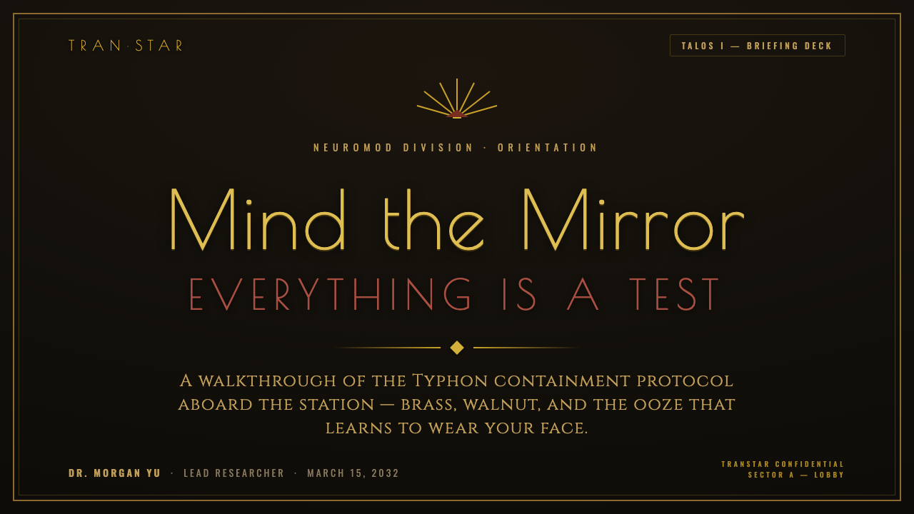
For presentation covers, use the Prey approach to make a future-facing topic feel prestigious and uneasy at once. Begin with a near-black field, then let a restrained gold sunburst, stepped frame, or engraved title treatment establish ceremonial focus. A single warm material cue, such as walnut-toned paneling or oxblood upholstery, can prevent the composition from becoming generic dark science fiction. Keep the dark intrusion visually active, as though it is pressing against an otherwise composed decorative order.
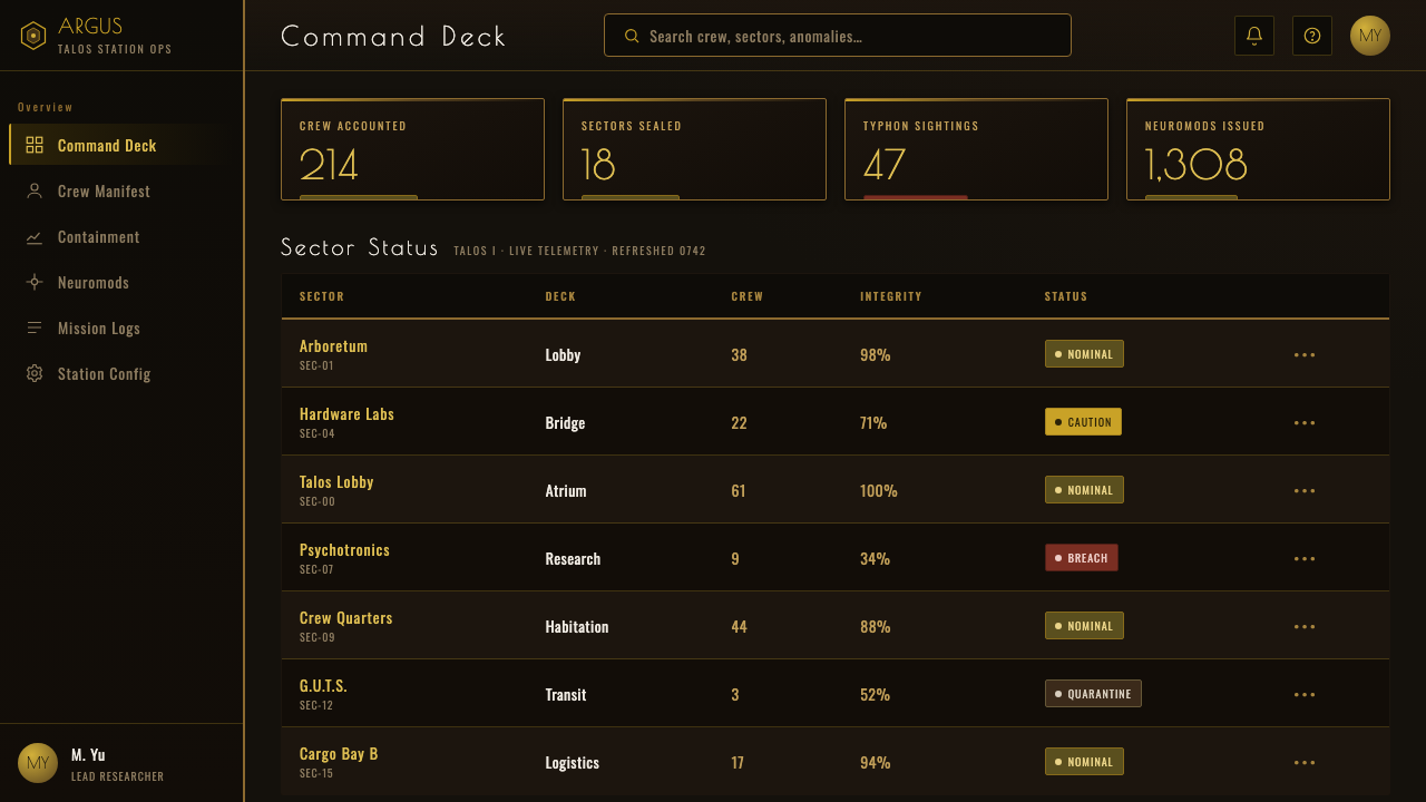
Content and data slides should retain Deco discipline rather than turning into ornate posters. Organize information through symmetrical axes, stepped groupings, radiating markers, and engraved-looking headings. A dashboard can use warm metallic accents to distinguish key metrics, while dark panels establish depth and risk. Charts work best when their geometry is treated as architecture: segments, bars, and directional lines should feel deliberate and monumental, not casually colorful.
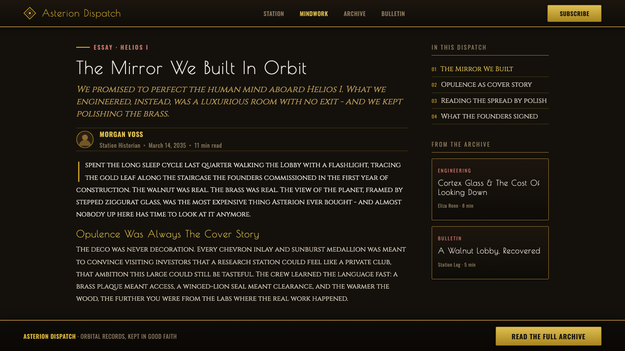
For web interfaces, this language suits dashboards, premium account areas, analytical tools, and pricing experiences that need a sense of exclusivity without abandoning clarity. Build the interface around deep dark grounds, carefully bounded panels, warm metallic separators, and formal display typography reserved for major moments. Everyday information should remain highly legible and comparatively quiet. The tension should come from the contrast between composed luxury and encroaching shadow, not from adding visual noise to every component.
Editorial and marketing pages can use the style’s strongest narrative asset: a beautiful surface under threat. Feature sections may alternate between near-black fields and warm, material-rich areas, with sunburst ornaments or winged-lion references used as framing devices rather than continuous wallpaper. Editorial layouts benefit from engraved chapter titles, formal dividers, and imagery that emphasizes gilded edges against darkness. Marketing copy should speak with confidence and restraint, allowing the visual atmosphere to supply the dread.
The common mistake is copying dark backgrounds, gold accents, and Deco motifs without preserving the conflict that makes them meaningful. A purely luxurious version becomes a hotel-lobby pastiche; a purely black version becomes ordinary horror. Prey’s identity depends on both forces remaining visible: cultivated human refinement and a living contaminant that threatens it. Avoid crowding every surface with sunbursts, leather, brass, and ooze simultaneously. Let elegance establish itself first, then let corruption interrupt it.
Prey (2017) — FAQ
Is the Prey style simply Art Deco in space?
No. Art Deco provides the visible vocabulary, but Prey changes its emotional function. Stepped forms, sunbursts, engraved lettering, brass, and leather no longer communicate uncomplicated optimism. In the orbital setting of Talos I, they become signs of a carefully authored human future. Typhon ooze then turns that confidence into vulnerability. The style is Art Deco filtered through alternate-history retrofuture design and luxurious horror.
Why are gold and near-black paired so effectively in this aesthetic?
They make the central conflict immediately readable. Gold implies polish, value, ceremony, and preserved human intention. Near-black Typhon matter implies absorption, contamination, and an absence that has become active. Their contrast is not merely decorative: it lets the viewer see luxury being threatened. If the gold were isolated from darkness, it would read as opulence; if darkness lacked gold, it would read as generic menace.
How should typography be handled in a Prey-inspired design?
Use type as part of the architecture. The source material identifies an engraved Deco character, including Poiret One, so display text should feel formal, carved, and materially connected to plaques, trim, or monumental interiors. Reserve the most expressive lettering for titles and key wayfinding moments. Supporting copy needs to remain calm and legible, otherwise the atmosphere loses the controlled contrast between ceremony and threat.
Can this style work for a bright interface?
It can borrow individual Deco elements in a bright setting, but it will no longer reproduce Prey’s full atmosphere. The source identity relies on warm gold trim glinting against near-black Typhon ooze and on the sense of a gilded surface being consumed. A brighter version may retain stepped geometry, walnut warmth, or engraved display type, yet it should be understood as Deco retrofuture rather than luxurious horror.
What makes a Prey-inspired layout feel inauthentic?
It feels inauthentic when its references become disconnected props. Random sunbursts, indiscriminate gold, and a dark backdrop are not enough if material, typography, geometry, and horror do not reinforce one another. The design needs a clear hierarchy between refined human order and invasive organic shadow. When every element is equally loud, neither luxury nor contamination can carry the scene.
Related design styles
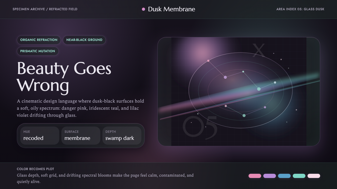 Annihilation (The Shimmer)Beautifully wrong. Dusk black carries pink, teal, and lilac refraction throug…
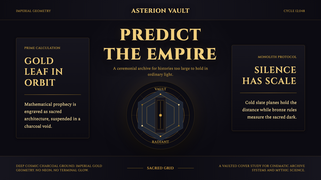 Foundation AppleSacred empire in shadow. Cinzel capitals and gold geometry float on cosmic ch…
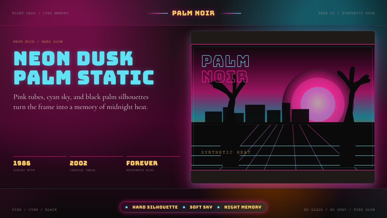 GTA Vice City (2002)Neon-noir nostalgia. Pink-cyan dusk, chunky type, and palm silhouettes.
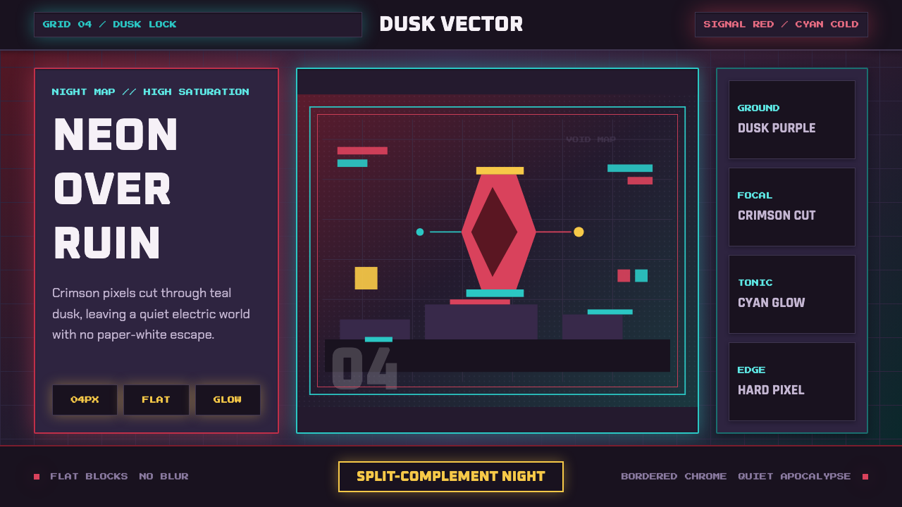 Hyper Light DrifterBeautiful ruin glows. Dusk purple holds crimson pixels and cyan grid light.
 Los Angeles LakersShowtime royalty. Forum Blue and metallic gold turn varsity type into arena g…
 Shrek Swamp (2001)Fairy-tale ceremony gets muddy. Gilt frames collide with moss green and candy…