What is Foundation (Apple TV+ 2021)?
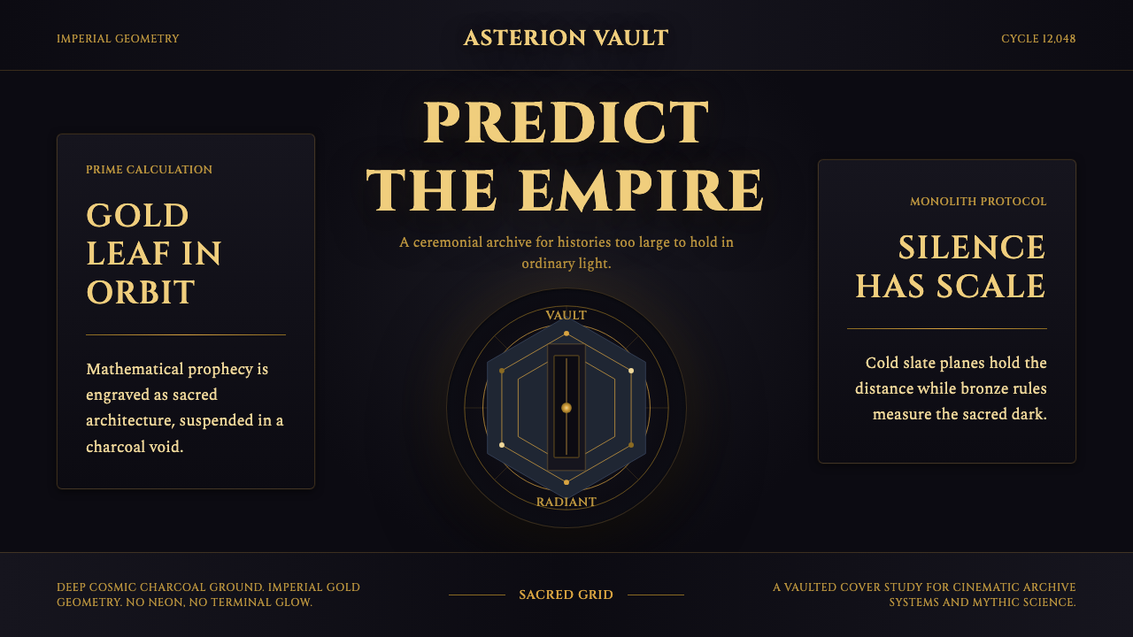
Foundation turns the far future into a sacred imperial dreamscape, where warm gold geometry glows against cosmic charcoal and brutalist monuments make power feel older than history.
Foundation (Apple TV+ 2021) in brief
Foundation is the visual language of the 2021 Apple TV+ series adapted from Isaac Asimov's Foundation: a dark, ceremonial form of science fiction built from warm gold pigment, mathematical spirals, monumental architecture, and immense fields of charcoal-black. Rather than presenting the future through bright screens or restless technological detail, it imagines a Galactic Empire whose machines, symbols, and buildings possess the gravity of religious artifacts.
Its central contrast is between human authority and cosmic scale. Cinzel capitals and imperial gold suggest dynasties, inscriptions, and sacred law, while cool slate-blue distance and nearly black space imply a universe indifferent to every throne. The Prime Radiant embodies this tension as nested geometry and spiraling mathematics: abstract knowledge becomes a luminous object that can be contemplated almost like a relic.
The architectural counterpart is Trantor's imperial palace, rendered through monolithic brutalist concrete. Vast, severe masses communicate permanence without decorative abundance. The Vault carries the same logic into a single enigmatic form, echoing the black monolith of 2001. Across these elements, Foundation avoids neon futurism and instead treats the future as excavated myth: mathematical, imperial, and solemn.
Where does Foundation (Apple TV+ 2021) come from?
The style originates in the visual world developed for Foundation, the Apple TV+ series released in 2021 and adapted from Isaac Asimov's Foundation. Its story concerns a far-future Galactic Empire and unfolds across millennia, so an ordinary near-future technology aesthetic would be too temporary and familiar. The design instead frames civilization through symbols that can plausibly outlast individuals: capitals resembling carved inscriptions, mathematical diagrams, precious-looking pigment, monoliths, and architecture conceived at the scale of institutions.
The source material describes this world as a galactic dreamscape. That phrase captures the design's unusual mixture of precision and unreality. Geometry is exact enough to imply mathematical law, yet it floats within darkness like a vision. Gold behaves less like a screen color than suspended pigment or leaf, carrying associations of ceremony, sacred objects, and imperial wealth. Cosmic charcoal provides the surrounding void, while slate-blue establishes remote depth without introducing the electric brightness associated with terminal screens or neon cities.
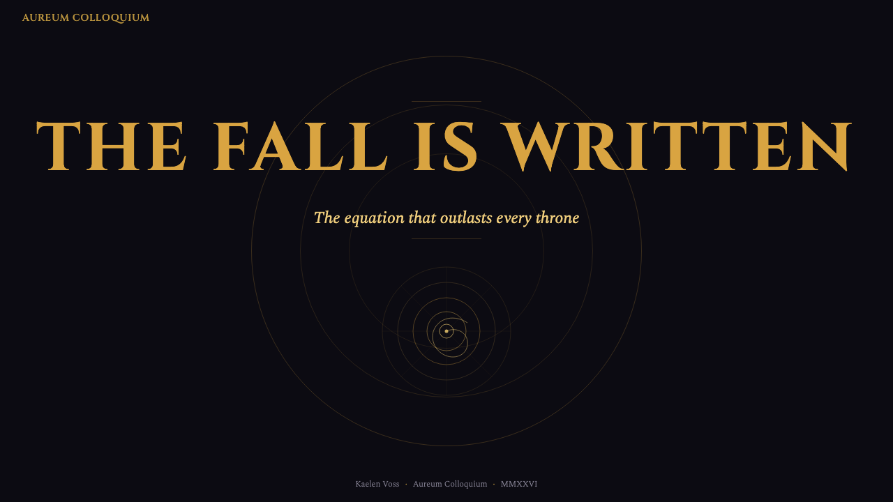
Imaginary Forces gives the Prime Radiant its defining expression through nested gold geometry and spiraling mathematics. This establishes sacred-geometry futurism as one of the style's main movements: knowledge is not merely displayed but staged as revelation. The radiant forms appear ordered yet potentially infinite, translating an immense historical and mathematical system into a comprehensible visual emblem. Rory Cheyne and Ronnie Koff are also identified among the key figures associated with the theme's formation.
Architecture completes the system. Trantor's imperial palace rises in monolithic brutalist concrete, turning government into physical mass, while the Vault condenses mystery into an isolated dark object that recalls the black monolith of 2001. These references do not make the series visually nostalgic. Instead, ancient monumentality, modern brutalism, and abstract cosmic mathematics are fused into a future that seems to contain the accumulated memory of many eras.
What defines the Foundation (Apple TV+ 2021) look?
Cosmic Charcoal
The dominant ground is a deep charcoal-black that feels spatial rather than merely dark. It removes ordinary environmental cues and allows objects to appear suspended in an immeasurable void. Large uninterrupted dark fields are essential: they give gold forms ceremonial isolation, make slate-blue feel distant, and prevent the composition from becoming a conventional luxury palette.
Imperial Gold
Gold is warm, material, and sacred rather than glossy or electronic. It should suggest pigment, engraved ornament, or leaf catching restrained light. Used against charcoal, it marks knowledge, authority, and ritual importance. Its power depends on scarcity: concentrated lines, symbols, and focal forms feel imperial, whereas broad indiscriminate coverage would reduce it to decoration.
Sacred Geometry
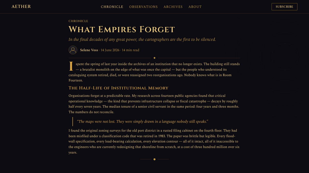
Nested forms, orbital curves, mathematical spirals, and repeated structural lines make abstraction feel devotional. Geometry is neither playful pattern nor neutral diagram; it represents systems larger than any single observer. Compositions often imply continuation beyond the visible field, allowing a finite image to suggest an immense calculation unfolding through space and historical time.
Monolithic Architecture
Brutalist mass replaces intricate futuristic engineering. Concrete planes, severe silhouettes, and overwhelming scale make institutions appear permanent and individuals comparatively fragile. Architectural detail is subordinated to the reading of the whole volume. A structure should first register as a single weight or cut in space, only later revealing entrances, divisions, or signs of habitation.
Inscriptional Typography
Cinzel capitals give language the voice of a decree carved for posterity. Titles are stately, widely composed, and allowed generous darkness around them. Supporting text should remain quieter so the capital forms retain their ceremonial authority. The effect depends on restraint and hierarchy, not on filling every label or paragraph with the same monumental character.
Remote Slate Depth
Cool slate-blue mediates between black space and warm gold. It describes distance, atmosphere, and secondary information without competing with the imperial focal color. Because it is subdued rather than luminous, it keeps the world cosmic and contemplative. Brighter technological blues would shift the mood toward interfaces and machinery, weakening the sense of ancient futurity.
Ceremonial Restraint
The style creates grandeur through isolation, silence, and deliberate pacing of visual events. Few elements occupy the field, but each carries symbolic weight. Empty darkness is therefore active composition, not unused space. Crowded star fields, abundant interface marks, or constant gold embellishment would dissolve the solemnity by making every moment equally emphatic.

Who shaped Foundation (Apple TV+ 2021)?
Rory Cheyne is identified in the source material as one of the key figures associated with Foundation's visual theme. Within the style's broader vocabulary, that association belongs to a system that joins imperial typography, cosmic darkness, sacred geometry, and brutalist architectural mass. The significance is collective rather than reducible to a single motif: the world gains coherence because symbols, space, and structures all express the same conception of enduring power.
Ronnie Koff is likewise named among the theme's key figures. The associated visual world resists the familiar shorthand of futuristic brightness and instead gives advanced civilization the atmosphere of an ancient institution. Gold behaves as ceremonial matter, darkness becomes cosmic architecture, and mathematical form acquires the authority of scripture. This unified tone is central to the series' identity.
Imaginary Forces is credited in the source material with rendering the Prime Radiant as nested gold geometry and spiraling mathematics. That treatment provides the clearest emblem of Foundation's sacred-geometry futurism. Instead of illustrating prediction through ordinary charts or screens, it makes mathematical knowledge luminous, spatial, and almost devotional, allowing an abstract system concerned with history across millennia to be perceived as a singular symbolic object.
How do you use Foundation (Apple TV+ 2021) today?
For presentation slides, the style is strongest when the cover behaves like an imperial threshold. Place a restrained gold title in a large charcoal field, accompanied by one fragment of geometry or a distant monolithic silhouette. Content slides should preserve the same hierarchy: inscriptional capitals for decisive headings, quieter supporting text, and generous darkness between ideas. The goal is not to decorate information with science-fiction motifs but to make each statement arrive with ceremonial weight.
Data slides can translate the Prime Radiant's logic into nested rings, orbital paths, layered timelines, or sparse relational diagrams. Warm gold should identify the governing argument or principal series, while slate-blue carries context and secondary comparisons. Keep charts isolated and legible; mathematical mystery must never become analytical confusion. When several measures compete for attention, reduce the visual system to a clear focal structure rather than multiplying glowing marks.
For web interfaces, Foundation suits dashboards, archives, analytical tools, and pricing pages that need authority and distance. Dashboards can place a small number of important measures within deep charcoal panels, using gold for primary states and slate-blue for supporting history. Pricing pages benefit from monolithic plan blocks and inscription-like tier names, but practical labels and controls should remain calm. Interaction must feel deliberate and legible, not hidden inside cinematic atmosphere.
Editorial and marketing layouts can use the style to frame long historical narratives, institutional announcements, or products positioned as consequential and enduring. Begin with an expansive dark opening, then alternate dense explanatory passages with isolated diagrams, quotations, or monumental imagery. Marketing calls to action should use one consistent gold emphasis rather than repeated spectacle. The visual rhetoric works best when the message genuinely concerns scale, knowledge, legacy, or authority.
The common mistake is to confuse dark backgrounds plus gold ornament with Foundation. That produces generic luxury branding and loses the theme's cosmic and mathematical tension. Another error is filling every surface with spirals, stars, interface traces, and monumental capitals. Authentic application requires hierarchy: charcoal is the spatial foundation, gold is a scarce sacred signal, slate-blue creates distance, geometry expresses systems, and brutalist mass anchors the abstraction in physical power.
Foundation (Apple TV+ 2021) — FAQ
Is the Foundation style simply a dark luxury aesthetic?
No. Dark grounds and gold accents are only the visible surface. The style's identity comes from the relationship among cosmic emptiness, mathematical order, sacred authority, and brutalist mass. Generic luxury design usually emphasizes polish, abundance, and possession. Foundation emphasizes distance, historical scale, and systems that exceed the individual. Gold must therefore function as a sign of knowledge or imperial ritual, not as decoration applied everywhere.
Why is the Prime Radiant so important to the visual language?
It unites the theme's major ideas in one object. Nested geometry provides mathematical order, spiraling motion suggests processes unfolding across immense time, gold gives the system sacred and imperial value, and surrounding darkness makes knowledge appear suspended within the cosmos. The Prime Radiant is therefore more than a decorative prop: it is a compact visual model of how Foundation imagines history, prediction, and power.
Can the style use brighter colors or neon accents?
They should be approached cautiously because the approved palette depends on warm gold, cosmic charcoal, and remote slate-blue. Neon accents introduce the language of terminals, nightlife, and immediate technological activity, whereas Foundation seeks an older and more sacred future. If additional color is necessary for communication, it should remain subordinate and atmospheric. The principal contrast must continue to read as imperial warmth held within vast darkness.
How should typography be balanced with the cinematic imagery?
Use Cinzel capitals as ceremonial voices rather than universal body text. They are most effective for titles, chapter markers, institutional names, and brief declarations that need the force of an inscription. Supporting copy should be quieter and easier to sustain across longer reading. Give important language ample darkness around it, and avoid placing monumental titles over visually busy geometry. Both image and type need isolation to retain authority.
What kinds of products are poorly suited to this style?
It can struggle when friendliness, spontaneity, domestic warmth, or playful abundance is the primary value. The charcoal void, monumental scale, and inscriptional voice naturally create distance and solemnity. They suit analytical systems, institutional narratives, archives, and products concerned with knowledge or long horizons, but may overwhelm casual social tools or lighthearted services. The deciding question is whether users should feel invited into intimacy or confronted by something larger than themselves.
Related design styles
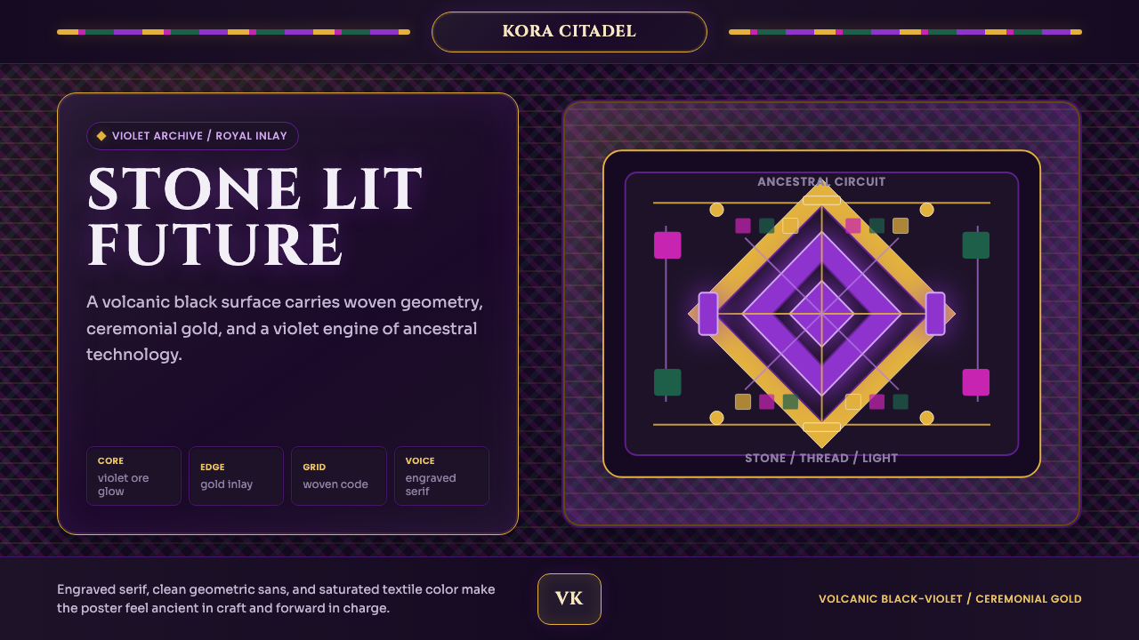 Africanfuturism VibraniumCeremony goes electric. Violet glow and gold inlay thread a volcanic textile…
 miHoYo Game UIFantasy UI feels ceremonial. Indigo starfields, gold frames, and jewel chips…
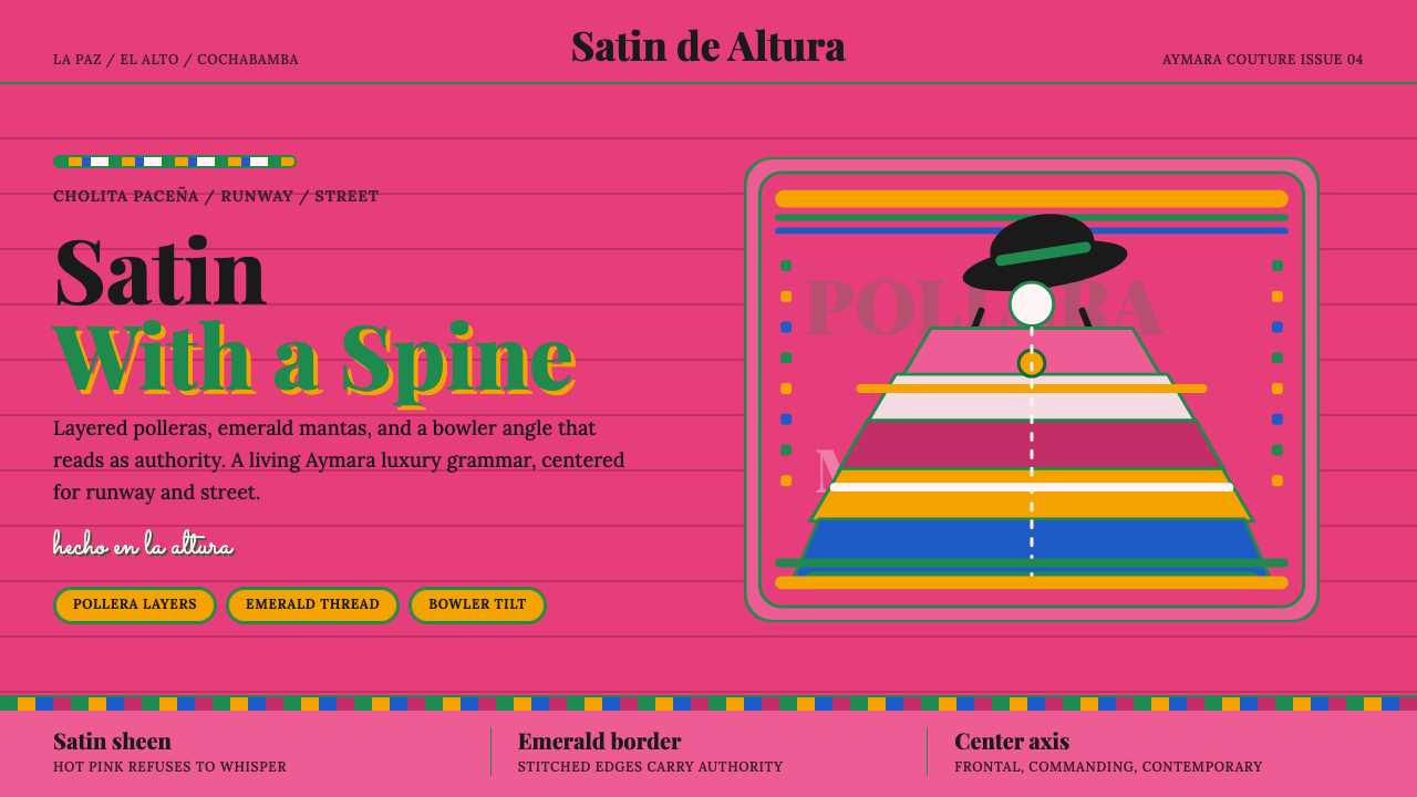 Bolivian Cholita FashionUnapologetic satin power. Hot pink fields, emerald stitches, centered pollera…
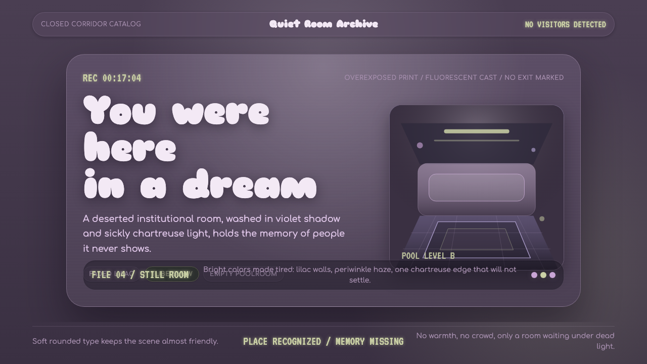 Dreamcore LiminalEmpty rooms feel remembered. Washed violet, Sniglet curves, and chartreuse tu…
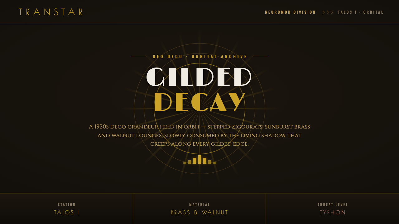 Prey (2017)Luxurious horror in orbit. Gold Deco sunbursts glint out of near-black Typhon…
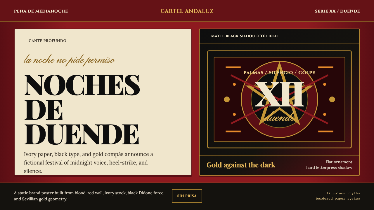 Spanish Flamenco PosterPassion printed as ritual. Blood red, ivory paper, Didone type, and flat gold…