What is miHoYo Game UI?什么是 miHoYo Game UI?
miHoYo turned the gacha inventory screen into a ceremonial act — indigo starfields, gold-leaf frames, and jewel-chip element badges that make every pull feel like opening a reliquary.米哈游把抽卡背包界面变成了一场仪式——靛蓝星海、金箔边框、宝石色元素徽章,让每一次拉取都像开启圣物匣。
miHoYo Game UI in briefmiHoYo Game UI 速览
miHoYo Game UI is the visual language developed by Shanghai studio miHoYo across its flagship titles Genshin Impact (2020), Honkai: Star Rail (2023), and Zenless Zone Zero. It is the most widely imitated Chinese-originated interface aesthetic in contemporary gaming, and the first gacha-game design system to achieve global design-press recognition as a coherent, intentional style rather than a genre convention.米哈游游戏 UI 是上海米哈游工作室在《原神》(2020)、《崩坏:星穹铁道》(2023)与《绝区零》三部旗舰作品中发展出的视觉语言。它是当代游戏行业影响力最大的中国原创界面美学,也是第一套被全球设计媒体作为完整、自觉风格体系而非类型惯例加以认可的抽卡游戏设计系统。
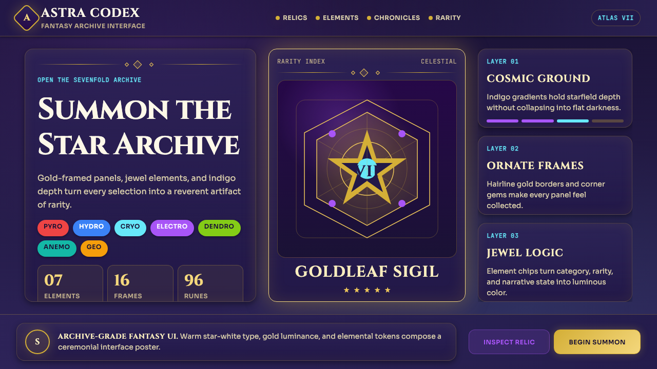
The system is built around a dark indigo canvas that evokes a night sky or deep-sea archive. Over this ground, ornamental card frames — with corner flourishes echoing classical Chinese border motifs and Art Nouveau scroll work — contain character portraits, ability descriptions, and equipment stats. A seven-color element palette (Pyro, Hydro, Cryo, Electro, Dendro, Anemo, Geo) provides the primary accent vocabulary, each hue corresponding to one of the game's elemental affinities and appearing in consistent roles: icon chip, progress ring, active-state glow.这套系统建立在暗夜靛紫画布之上,令人联想到星空或深海档案馆。在这片底色之上,带角隅花饰的华丽卡片边框——呼应中式古典纹样与新艺术主义卷草纹——容纳着角色立绘、技能描述与装备属性。七色元素调色板(火、水、冰、雷、草、风、岩)提供了主要强调词汇,每种色相对应游戏内的一种元素属性,并在固定角色中重复出现:图标芯片、进度环、激活态发光。
Typography in this system pairs fantasy-inflected serif display faces — used for character names, chapter titles, and gacha banner headlines — with warm geometric body text for menus, stat values, and tutorial copy. The result deliberately rejects the corporate minimalism that dominates Western game UI, proposing instead a scroll-archive grandeur where information density and decorative richness coexist without visual chaos.这套排版系统以带幻想气质的衬线展示字体——用于角色名、章节标题与祈愿横幅标题——搭配温暖的几何体正文,承担菜单、属性数值与教程文字的任务。这种搭配刻意拒绝了统治西方游戏 UI 的企业极简主义,转而提出一种卷轴典籍式的宏大感:信息密度与装饰丰富性共存,却不产生视觉混乱。
See the miHoYo Game UI design system查看 miHoYo Game UI 完整设计系统
Where does miHoYo Game UI come from?miHoYo Game UI 从何而来?
miHoYo was founded in Shanghai in 2012 by three Shanghai Jiao Tong University graduates — Cai Haoyu, Liu Wei, and Luo Yuhao — who began by making mobile games inspired by Japanese anime aesthetics. The studio's early work, including the Honkai Impact series starting in 2016, established an internal visual grammar centered on high-contrast character art, dramatic lighting effects, and dense information panels. These early titles were commercially successful across East and Southeast Asia but remained largely invisible to Western design discourse.米哈游由蔡浩宇、刘伟和罗宇皓三位上海交通大学毕业生于2012年在上海创立,最初以制作受日本动漫美学启发的手机游戏起家。工作室的早期作品——包括2016年开始的《崩坏》系列——建立起以高对比度角色立绘、戏剧性光照效果和信息密集面板为核心的内部视觉语法。这些早期作品在东亚和东南亚取得了商业成功,但在西方设计圈几乎不为人知。
The design language crystallized with the development of Genshin Impact, which launched globally in September 2020. The Genshin UI team drew from a wider and more eclectic set of references than any prior miHoYo project: traditional Chinese decorative arts contributed the corner bracket motifs and gold-leaf frame vocabulary; Japanese RPG UI conventions provided the model for stat panels and ability layouts; and the aesthetic of celestial and alchemical manuscripts — European and East Asian alike — informed the starfield backdrop and ornamental flourishes. The decision to make the UI feel archival and precious, rather than slick and modern, was a deliberate counter-positioning against the flat, neutral UI common in Western mobile games of the period.这套设计语言随《原神》的开发而趋于成熟。《原神》于2020年9月全球上线,其 UI 团队参考的资料来源比此前任何米哈游项目都更广泛、更兼收并蓄:中国传统装饰艺术贡献了角隅括号纹样与金箔边框词汇;日式 RPG 界面惯例提供了属性面板与技能排布的模型;天文与炼金手稿的美学——无论欧洲还是东亚——则赋予了星域背景与装饰花饰以灵感。将 UI 做得像档案典籍般珍重,而非光滑现代,是一个刻意的反向定位——对抗当时西方手机游戏中流行的平面、中性界面。
Between 2020 and 2023, the system matured through Genshin's update cadence — approximately six weeks between major version releases — which forced the UI team to extend and reapply the design language across hundreds of new characters, event screens, and seasonal banner compositions without losing coherence. This production discipline imposed a rigorous internal consistency: the ornamental frame vocabulary, element color system, and typographic hierarchy became load-bearing, not decorative, because they were the only constants across an enormous surface area of content.2020年至2023年间,这套系统随《原神》的版本节奏——大约每六周一次大版本更新——在数百个新角色、活动界面和季节性祈愿组合中被不断延伸与复用,同时保持视觉连贯性。这种生产纪律催生了严格的内部一致性:装饰边框词汇、元素配色体系和排版层级成为承重结构,而非装饰点缀——因为在海量内容的庞大表面上,它们是唯一不变的常量。
Honkai: Star Rail, launched in April 2023, demonstrated that the core visual vocabulary could be transposed to a science-fantasy setting — replacing the open-world scroll aesthetic with a space-opera register — while remaining unmistakably miHoYo. The UI team shifted the dominant frame motifs from botanical scroll work toward mechanical and circuit-board geometries, substituted a cooler, more violet-leaning indigo for Genshin's warmer blue-indigo, and introduced new interface metaphors drawn from train timetables and transit maps. The adaptation confirmed that the system was genuinely architectural — a flexible grammar — rather than a fixed visual formula.2023年4月上线的《崩坏:星穹铁道》证明了这套核心视觉词汇可以被移植到科幻奇幻背景中——以太空歌剧的调性替代开放世界的卷轴感——同时保持鲜明的米哈游标识。UI 团队将主导框架纹样从植物卷草纹转向机械几何与电路板纹理,以更冷、更偏紫的靛蓝替代《原神》偏暖的蓝靛,并引入来自列车时刻表与交通地图的新界面隐喻。这次适配证明这套体系是真正具有建筑性的——一套灵活的语法——而非固定的视觉公式。
What defines the miHoYo Game UI look?miHoYo Game UI 的视觉特征是什么?
Deep Indigo Canvas深靛底色
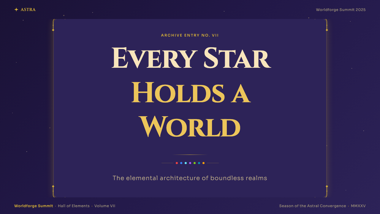
The foundational ground is a deep indigo that reads simultaneously as a night sky, a deep ocean, and the cover of an arcane manuscript. This is not a neutral dark mode: it has perceptible warmth at the blue-violet boundary that prevents it from feeling cold or corporate. All other elements — frames, text, element chips — are layered above it, creating a sense that the interface inhabits a dimensional depth rather than sitting flat on a screen. The indigo never competes with the accent colors because it occupies a distinct luminosity register, dark enough to make even moderately bright hues appear to glow.基底底色是一种深邃的靛蓝,同时令人联想到夜空、深海与神秘典籍封面。这并非中性的深色模式:它在蓝紫交界处带有可感知的温度,使其不显得冷漠或企业化。其他所有元素——边框、文字、元素芯片——都层叠其上,营造出界面置身于某种立体深度而非平铺屏幕的感受。靛蓝不会与强调色竞争,因为它处于截然不同的亮度层级,深度足以使中等亮度的色相也显现出发光效果。
Ornamental Frame Language华丽边框语言
Card and panel borders are never plain rectangles. Corners carry flourishes — small bracket shapes, floral terminals, or geometric rosettes — that echo both classical Chinese decorative borders and European Art Nouveau frame vocabulary. These corner treatments serve a structural function: they establish the boundary of a panel at a glance and create a visual hierarchy between container and content. The frames are rendered in gold or gilt tones that contrast warmly against the indigo ground, and they vary in complexity according to rarity — common items receive simpler borders, five-star characters receive the most elaborate treatment.卡片与面板的边框从不是简单的矩形。角隅带有花饰——小括号形、花卉末梢或几何玫瑰花纹——既呼应中式古典装饰边框,也借鉴欧洲新艺术主义框架词汇。这些角隅处理具有结构功能:使人一眼即能确定面板边界,并在容器与内容之间建立视觉层级。边框以金色或镀金色调呈现,与靛蓝底色形成温暖对比;其复杂程度随稀有度变化——普通道具边框较为简洁,五星角色则获得最繁复的处理。
Seven-Element Color System七元素配色体系
The seven elemental affinities — Pyro, Hydro, Cryo, Electro, Dendro, Anemo, and Geo — each map to a distinct accent hue: a warm amber-red for fire, a deep teal for water, a pale icy blue-white for ice, a vivid violet for lightning, a fresh leafy green for nature, a soft sage-grey for wind, and a warm ochre-gold for earth. These hues appear consistently across icon chips, ability highlights, and elemental reaction indicators. The system functions like a semantic palette: once learned, color alone communicates element type at a glance, reducing the cognitive load of parsing icon shapes in fast-paced gameplay.七种元素属性——火、水、冰、雷、草、风、岩——各自对应一种独特的强调色:火对应温暖的琥珀红,水对应深青蓝,冰对应冷白带蓝的浅冰色,雷对应鲜艳的紫色,草对应清新的叶绿,风对应柔和的灰绿,岩对应温暖的赭金。这些色相在图标芯片、技能高亮和元素反应指示器中保持一致。这套系统如同语义调色板:一经学习,色彩本身即可在瞬间传达元素类型,降低快节奏游戏中解读图标形状的认知负担。
Cosmic Gradient and Glow宇宙渐变与发光
Unlike flat design systems, miHoYo UI embraces luminous gradients as a primary tool for conveying rarity and importance. Background panels shift subtly from a deeper indigo at the edges to a slightly lighter or more violet-tinted center, creating a sense of depth without hard geometry. Five-star character reveal animations and gacha pull screens intensify this with radial starfield effects — the canvas itself seems to breathe. Glows around element chip colors and active-state borders are soft enough to suggest internal light source rather than screen backlight, reinforcing the impression that every high-rarity item is emitting rather than reflecting light.与平面设计系统不同,米哈游 UI 将发光渐变作为传达稀有度与重要性的主要手段。背景面板从边缘较深的靛蓝向中心稍浅或更偏紫的色调微妙过渡,创造出不依赖硬边几何的深度感。五星角色揭示动画与祈愿拉取界面则将这一效果强化为放射状星域效果——画布本身仿佛在呼吸。元素芯片色与激活态边框周围的发光足够柔和,令人联想到内部光源而非屏幕背光,强化了每件高稀有度道具是在发光而非反光的印象。
Fantasy Serif Display Type幻想衬线展示字体
Display type — used for character names, banner headlines, chapter titles, and system UI headers — is set in typefaces with perceptible calligraphic or historical serif qualities that evoke manuscript culture rather than contemporary digital interfaces. These faces carry implied weight and ceremony: a character name in the Genshin header style reads as a title rather than a label. Body text and numerical values shift to geometric or humanist faces with higher legibility at small sizes, creating a clear typographic split between the ceremonial and the functional.展示字体——用于角色名、横幅标题、章节标题与系统界面标头——采用具有可感知书法感或历史衬线品质的字体,令人联想到手抄本文化而非当代数字界面。这些字体自带分量感与仪式感:以《原神》标头风格排列的角色名读起来是一个称号,而非一个标签。正文与数值则转向可读性更高的几何体或人文主义字体,清晰划分了仪式性文字与功能性文字之间的排版边界。
Information Density as Richness以密度为丰富感
Western mobile game UI after 2015 trended toward sparse, card-based layouts with generous whitespace and single-focus screens. miHoYo's system explicitly rejects this convention, treating density as a positive quality rather than a problem to be solved. A typical character detail screen contains the portrait, a constellation diagram, six ability icons with expandable descriptions, equipment slots, and a stat breakdown — all visible simultaneously without scrolling. The visual system prevents this density from becoming cluttered by using the frame language and color hierarchy to group related elements and create clear regions of visual weight.2015年后,西方手机游戏 UI 趋向稀疏的卡片式排版,以充裕留白和单焦点界面为主流。米哈游的系统明确拒绝了这一惯例,将密度视为正面品质而非待解决的问题。一个典型的角色详情界面同时呈现立绘、命之座星图、六个可展开说明的技能图标、装备槽与属性明细——无需滚动即可全部看到。视觉系统通过边框语言与色彩层级对相关元素进行分组、创建清晰的视觉重量区域,防止这种密度演变为杂乱。
Rarity as Visual Grammar稀有度即视觉语法
Perhaps the most structurally significant aspect of the system is its formalization of rarity as a design variable. Three-star items, four-star items, and five-star items are not merely distinguished by a star count: they exist in entirely different visual registers. Three-star backgrounds are muted and their frames simple; four-star adds a secondary border detail and increases glow intensity; five-star borders are fully ornamental with gold leaf, complex corner treatments, and the most saturated elemental color expression. This graduation means that rarity is legible before any text is read — the visual hierarchy carries semantic meaning independently of language.这套系统在结构上最为重要的方面,或许是将稀有度正式化为设计变量。三星、四星、五星道具不仅以星数区分:它们存在于完全不同的视觉层级之中。三星背景色调低沉,边框简洁;四星增加了次级边框细节并提升发光强度;五星边框则完全装饰化,带有金箔、复杂角隅处理与最高饱和度的元素色表达。这种渐进关系意味着稀有度在任何文字被阅读之前便已可辨——视觉层级独立于语言之外承载着语义意义。
See the miHoYo Game UI design system查看 miHoYo Game UI 完整设计系统
Who shaped miHoYo Game UI?谁塑造了 miHoYo Game UI?
Cai Haoyu is a co-founder and long-serving president of miHoYo. While his public role is primarily organizational, he has been identified in industry reporting as a driving creative force behind the studio's aesthetic ambition — particularly the insistence on combining high production-value character art with dense, lore-saturated world-building. His leadership through the multi-year development of Genshin Impact established the studio's practice of investing in UI polish at a level more typically associated with console-first titles, not mobile games.蔡浩宇是米哈游联合创始人和长期担任总裁。尽管其公开角色主要是管理层面,但行业报道将他认定为工作室美学雄心背后的重要创意驱动力——尤其是坚持将高制作价值角色立绘与密集的世界观叙事相结合。他在《原神》多年开发周期中的领导使工作室确立了在 UI 打磨上投入远超手游惯例、更接近主机级别的实践标准。
The broader UI design team — working under the HoYoverse brand that miHoYo adopted for international operations — is responsible for developing and extending the visual system across multiple simultaneous live-service titles, each with different genre settings and tonal registers. The team's most significant achievement is maintaining visual coherence across Genshin Impact's enormous volume of ongoing content while simultaneously designing distinct but family-related systems for Honkai: Star Rail and Zenless Zone Zero. Industry observers have noted that the team's work represents a new benchmark for UI artisanship in live-service games.米哈游在国际业务中采用 HoYoverse 品牌,旗下 UI 设计团队负责在多款同时运营的活体服务游戏中开发与延伸视觉体系,每款游戏有着不同的类型背景和调性。该团队最重要的成就是在《原神》持续产出的海量内容中维持视觉连贯性,同时为《崩坏:星穹铁道》和《绝区零》设计出与母体相关但各具特色的独立系统。业界观察人士指出,该团队的工作为活体服务游戏的界面工艺树立了新基准。
The character art directors — whose individual names are not consistently credited in public-facing communications — define the visual identity of each playable character through concept art and final model direction. Their work is inseparable from the UI system because characters are not only game assets but the primary organizing metaphor of the entire interface: banner screens, profile pages, equipment menus, and gacha results are all built around the character portrait as the central design element. The art direction decisions made at the character level — pose, color temperature, elemental expression — propagate directly into UI color and compositional choices.角色美术总监——其个人姓名在面向公众的传播中并不总是署名——通过概念艺术与最终模型方向界定每位可操控角色的视觉身份。他们的工作与 UI 系统密不可分,因为角色不仅是游戏资产,更是整个界面的核心组织隐喻:横幅界面、档案页面、装备菜单与祈愿结果均以角色立绘为中心设计元素。在角色层面做出的美术方向决策——姿态、色温、元素表达——直接传导至 UI 配色与构图选择。
The writers and narrative designers who built Genshin Impact's seven-nation world — each nation corresponding to one element and drawing from a distinct real-world cultural tradition — created the conceptual framework that made the element color system meaningful rather than arbitrary. The decision to tie element identity to nation identity, and to express both through consistent visual language, transformed what could have been a mechanical taxonomy into a lore-saturated chromatic system. This deep integration of narrative and visual design is one reason the interface resonates so strongly with players who have no prior design training.构建《原神》七国世界的编剧与叙事设计师——每个国家对应一种元素并借鉴一种真实的文化传统——创建了使元素配色体系具有意义而非随意的概念框架。将元素身份与国家身份相绑定、并通过一致的视觉语言同时表达两者的决策,将原本可能只是机械分类学的东西转化为充满世界观内涵的色彩系统。叙事与视觉设计的深度整合,是这套界面在没有设计背景的玩家中也能产生强烈共鸣的原因之一。
How do you use miHoYo Game UI today?今天怎么用 miHoYo Game UI?
miHoYo Game UI is most effective when applied to contexts that benefit from a sense of ceremony, rarity hierarchy, and immersive darkness — settings where the interface should feel like a window into a curated world rather than a tool for completing tasks. The style translates well to presentation contexts including game pitch decks, fantasy product launches, and entertainment brand identity systems. Applied to a slide deck, it works best when the dark indigo canvas is established as the consistent ground across all slides, the ornamental frame vocabulary is used to demarcate content sections rather than every individual element, and the element color system is repurposed as a category-coding device for data or content types.米哈游游戏 UI 最适合应用于能从仪式感、稀有度层级与沉浸式暗色中受益的场景——那些界面应当像通往精心策划世界的窗口,而非完成任务的工具的设定。这种风格在演示场景中表现良好,包括游戏项目提案、幻想类产品发布和娱乐品牌视觉识别系统。应用于幻灯片时,最佳做法是将深靛画布确立为所有页面的一致底色,用装饰边框词汇划定内容区块而非每个单独元素,并将元素配色体系重新用作数据或内容类型的分类编码工具。
For cover and hero slides, the style supports bold portrait-centered compositions: a character illustration or product hero image occupies the upper two-thirds, framed by corner flourishes, while the title sits in display type below on a subtly lighter panel. Section divider slides can lean into the archival aesthetic with chapter-title type at large scale against the bare indigo field, evoking the opening scroll of a game chapter. Data slides require restraint — the ornamental frame should surround the entire data region rather than individual data points, and the element palette should be limited to two or three hues for categorical distinction, avoiding the full seven-color spectrum which would be visually overwhelming in a chart context.对于封面与主视觉页面,这种风格支持以人物立绘为中心的大胆构图:角色插画或产品主图占据上方三分之二,由角隅花饰加以框定,标题则以展示字体置于下方稍浅的面板上。章节分隔页面可充分发挥档案美学——在纯靛蓝底面上以大尺度展示章节标题字体,唤起游戏章节开幕卷轴的意象。数据页面需要克制——装饰边框应围绕整个数据区域而非单个数据点,元素调色板应限制为两到三种色相用于分类区分,避免在图表场景中使用会造成视觉过载的完整七色。
For web UI applications — particularly dashboards, gaming platform interfaces, membership tier pages, and entertainment subscription products — the system translates well when the dark canvas is used as the primary background, card components adopt simplified versions of the ornamental border treatment, and interactive states are expressed through the element-glow convention. Membership or pricing tier pages benefit specifically from the rarity graduation logic: visually differentiating tiers through border complexity and background luminosity, rather than only through color or icon count, makes premium tiers feel genuinely elevated rather than merely labeled differently. Navigation should use the typographic hierarchy conventions — larger, display-weight wordmarks for top-level categories, smaller geometric body text for subcategories.对于网页 UI 应用——尤其是仪表板、游戏平台界面、会员等级页面与娱乐订阅产品——当以暗色画布作为主背景、卡片组件采用简化的装饰边框处理、交互状态通过元素发光惯例表达时,这套系统移植效果良好。会员或定价等级页面尤其受益于稀有度渐进逻辑:通过边框复杂度与背景亮度视觉区分等级,而非仅靠颜色或图标数量,使高级等级真正感觉提升,而非仅仅标签不同。导航应遵循排版层级惯例——一级分类使用较大展示字重,二级分类使用较小的几何体正文。
For editorial and marketing applications — event posters, game announcements, brand campaign collateral, and social media cards — the style is at its most expressive when composition is asymmetric, the indigo field bleeds to all edges, and a single element-color accent is used for the primary call to action or featured product highlight. Fantasy-genre publishing, music releases with otherworldly themes, and luxury product launches in categories that benefit from mystique (fragrance, collector editions, limited drops) are natural applications. The system should be adapted rather than copied literally: using the frame language and color logic while replacing the game-specific element icons with contextually appropriate symbols.对于编辑与营销应用——活动海报、游戏公告、品牌推广物料与社交媒体卡片——当构图非对称、靛蓝底色延伸至所有边缘、单一元素色强调主要行动号召或主打产品亮点时,这种风格最具表现力。幻想类出版物、带有异世界主题的音乐发行,以及神秘感本身即是卖点的高端产品发布(香水、收藏版、限量发售)均是自然的应用场景。这套系统应被适配而非字面照搬:使用边框语言与配色逻辑,同时将游戏专属元素图标替换为语境适配的符号。
The most common mistake when applying this style is treating the ornamental elements as decoration to be added after the layout is complete. In authentic miHoYo UI, the frame language is structural — it defines spatial regions and content hierarchy. If the ornamental borders are applied as a surface treatment over an existing neutral layout, the result feels costumed rather than coherent. Start with the dark canvas and the frame architecture, then place content within those regions. A second common mistake is using the full element palette indiscriminately: the seven-color system was designed to be learned progressively in a gameplay context, not encountered all at once. In non-game applications, select two or three element hues that are harmonically compatible and assign each a consistent semantic role before introducing any further accent color.应用这种风格时最常见的错误,是将装饰元素视为在版面完成后再叠加的点缀。在真正的米哈游 UI 中,边框语言是结构性的——它界定空间区域与内容层级。若将装饰边框作为表面处理叠加在既有中性版面上,结果会显得像换了套装而非融为一体。应从暗色画布与边框架构出发,再将内容置于这些区域之内。第二个常见错误是不加区分地使用全套元素调色板:七色系统的设计是在游戏场景中被逐渐习得,而非一次性全部呈现。在非游戏应用中,从中选择两到三种和谐兼容的元素色相,在引入任何其他强调色之前为每种色相分配固定的语义角色。
See the miHoYo Game UI design system查看 miHoYo Game UI 完整设计系统
miHoYo Game UI — FAQmiHoYo Game UI · 常见问题
Is this style appropriate for non-gaming products?这种风格适合非游戏产品吗?
Yes, with adaptation. The core visual grammar — dark canvas, ornamental framing, luminous accents, rarity hierarchy — transfers well to entertainment, luxury, and collector-culture contexts where ceremony and desirability are core brand values. It is less appropriate for productivity tools, enterprise software, healthcare products, or any context where the interface should feel efficient and neutral rather than immersive and precious. The key test is whether your product benefits from making users feel they are engaging with something rare and curated, rather than completing a task. If that emotional register is right, the style can work outside gaming.可以,但需要适配。核心视觉语法——暗色画布、装饰边框、发光强调、稀有度层级——能够很好地移植至娱乐、奢侈品与收藏文化场景,这些领域以仪式感和稀缺感作为核心品牌价值。它不适合生产力工具、企业软件、医疗产品,或任何界面应感觉高效中立而非沉浸珍稀的场景。关键的判断标准是:你的产品是否能从让用户感到自己在接触某种稀有而精心策划之物中获益,而非仅仅完成一项任务。如果这种情感基调是对的,这套风格在游戏之外同样可行。
How does this style handle light backgrounds?这种风格如何处理浅色背景?
It does so with significant difficulty. The entire visual system is engineered for dark ground: the ornamental gold frames depend on the indigo contrast to read as precious rather than garish, the element color glows require darkness to appear luminous, and the sense of archival depth is fundamentally a property of the dark canvas. A light-background version is possible in principle — Genshin's loading screens and some promotional materials use brighter fields — but it tends to flatten the system, making the ornamental borders feel heavy and the element colors feel saturated rather than glowing. If a light background is a hard requirement, the ornament vocabulary should be significantly simplified and the element colors desaturated to work in ambient light conditions.处理起来相当困难。整套视觉系统是为深色底面而设计的:装饰性金框依赖靛蓝对比才能呈现珍贵感而非俗气感,元素色的发光效果需要黑暗背景才能显现,档案式的深度感从根本上是暗色画布的属性。浅色背景版本在原则上是可行的——《原神》的加载界面与部分宣传物料使用了较亮的底面——但这往往会使系统趋于平坦,使装饰边框显得厚重,元素色显得高饱和而非发光。若浅色背景是硬性要求,装饰词汇应大幅简化,元素色应降低饱和度以适应环境光条件。
What makes miHoYo UI distinct from other dark fantasy game interfaces?米哈游 UI 与其他黑暗幻想类游戏界面有何区别?
Most dark fantasy game UIs — including those from Western RPG titles in the same era — use darkness as atmosphere without systematizing it into a design grammar. They apply rough textures, desaturated earth tones, and aggressive distressing effects that evoke ruggedness or menace. miHoYo's approach is the opposite: the darkness is elegant and aspirational, closer to a jewel box or an astronomical atlas than a dungeon. The gold frame vocabulary, the jewel-toned element chips, and the smooth starfield gradients all position the darkness as a backdrop for preciousness rather than threat. This is fundamentally a luxury-object aesthetic applied to game UI, and that distinction is what makes it genuinely new rather than merely genre-conventional.大多数黑暗幻想类游戏 UI——包括同一时代的西方 RPG 作品——以黑暗营造氛围,却未将其系统化为设计语法。它们使用粗糙纹理、去饱和的土色调和激进的做旧效果,以唤起粗犷感或威胁感。米哈游的做法截然相反:这里的黑暗是优雅而令人向往的,更接近珠宝盒或天文图册,而非地牢。金框词汇、宝石色元素芯片与流畅的星域渐变,将黑暗定位为珍贵事物的背景而非威胁的氛围。这从根本上是将奢侈品美学应用于游戏 UI,正是这一区分使它真正具有创新性,而非仅仅遵循类型惯例。
Can the element color system be used without the rest of the miHoYo visual vocabulary?元素配色体系能脱离其余米哈游视觉词汇单独使用吗?
Partially. The semantic logic of assigning a distinct, consistently applied hue to each category or type — and using that hue across icon, highlight, and active-state expressions — is a transferable principle that works in any sufficiently complex categorization system: skill taxonomies, asset classes, content genres, user segments. However, the specific hues of the element palette were designed to work against deep indigo and to complement the gold frame vocabulary. Transplanted into a neutral or light-background system without those supporting elements, the colors can feel arbitrary or overly saturated. Use the logic, not the specific colors, unless you are also committing to the full dark-canvas context.部分可以。为每个类别或类型分配一种独特、持续应用的色相——并在图标、高亮与激活态表达中统一使用该色相——的语义逻辑是可移植原则,适用于任何足够复杂的分类系统:技能分类、资产类别、内容类型、用户群体。但元素调色板的具体色相是为深靛蓝底面、搭配金框词汇而设计的。在缺乏这些支撑元素的中性或浅色背景系统中,这些颜色可能显得随意或过度饱和。应借鉴其逻辑而非其具体色彩——除非同时承诺采用完整的暗色画布语境。
How should the ornamental frame vocabulary be scaled down for small components like mobile cards?在移动端卡片等小尺寸组件中,如何缩减装饰边框词汇?
miHoYo itself demonstrates the answer across its own interfaces: the corner flourish is the minimum viable unit of the frame vocabulary. Full borders with mid-edge decorations, complex corner rosettes, and multi-layer treatments are reserved for hero moments — five-star character reveals, main menu panels, event landing screens. Smaller components — inventory thumbnails, party selection cards, buff icons — retain only the corner treatment at reduced scale, sometimes simplified to a single geometric bracket rather than a full flourish. At the smallest sizes, even the corner treatment disappears and only the color register (the gold or element-tinted border stroke) signals membership in the system. Apply the same progressive simplification logic in any adapted context: full ornament for hero components, bracket-only for mid-scale cards, color-stroke-only for small elements.米哈游自己在各界面中已经给出了答案:角隅花饰是边框词汇的最小可行单元。带有中段装饰、复杂角隅玫瑰花纹与多层处理的完整边框,保留给英雄时刻——五星角色揭示、主菜单面板、活动落地界面。较小的组件——背包缩略图、队伍选择卡片、增益图标——仅在缩小尺寸下保留角隅处理,有时简化为单一几何括号而非完整花饰。在最小尺寸下,甚至角隅处理也消失,仅剩色彩层级(金色或元素色调的边框描边)来标示其属于这套系统的成员身份。在任何适配场景中应用同样的渐进简化逻辑:英雄组件用完整装饰,中等尺寸卡片仅用括号,小元素仅用色彩描边。
Related design styles相关设计风格
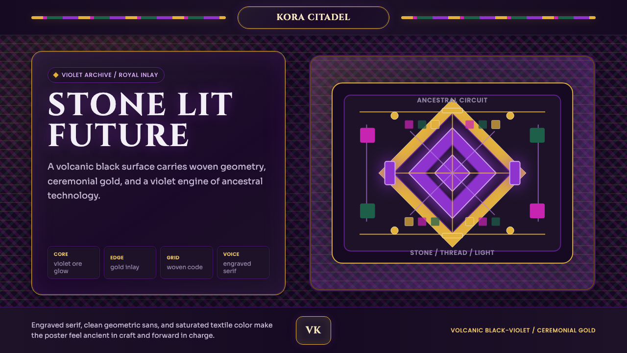 Africanfuturism VibraniumCeremony goes electric. Violet glow and gold inlay thread a volcanic textile…仪式感通电:紫光与金线织入火山黑几何网格。
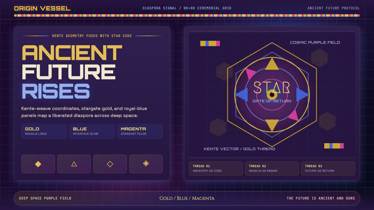 AfrofuturismAncient future, fully luminous. Gold kente grids cut through cosmic purple an…古老未来自带光芒:金色肯特网格切开宇宙紫与蓝色辉光。
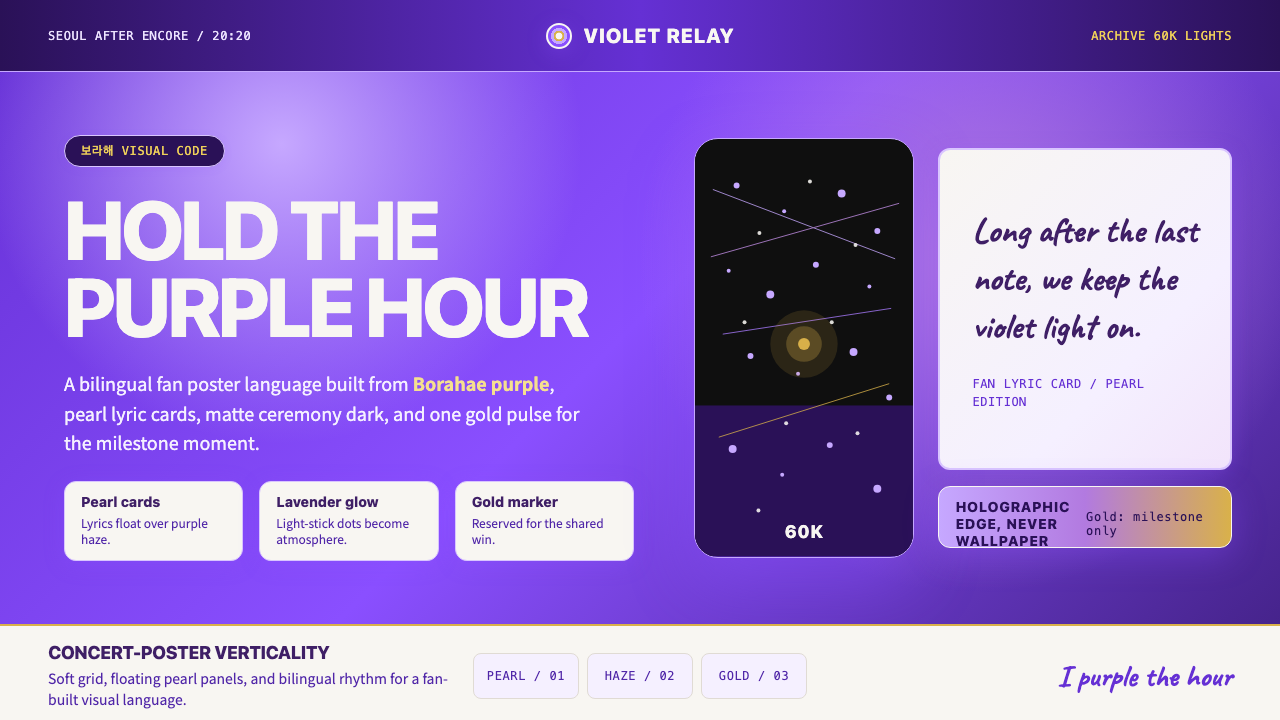 BTS Army Purple 2020Fandom becomes atmosphere. Borahae purple, pearl cards, lavender glow, one go…粉丝成为气氛:Borahae紫、珍珠歌词卡、薰衣草光晕与一束金光。
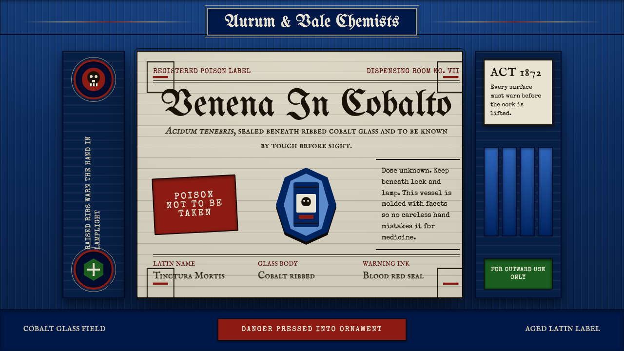 Apothecary Poison LabelDanger made ornate. Cobalt ribs, aged paper, and red POISON rules make fear t…危险被做成装饰:钴蓝凸棱、旧纸标签与红色警示让恐惧可触。
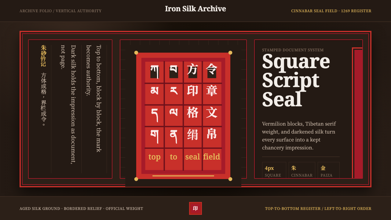 Phags-pa Seal ScriptAuthority, stamped vertical. Cinnabar borders press Tibetan serif blocks into…权威如印:朱砂界栏把藏式衬线方块压入暗绢。
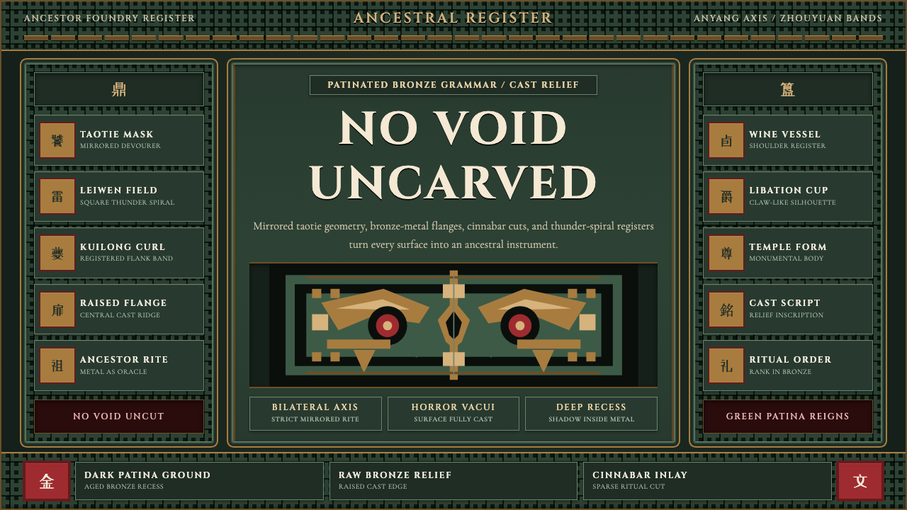 Shang-Zhou Ritual BronzeAncient terror fills every surface. Patina green, bronze relief, mirrored tao…古老森严填满表面:铜绿底、青铜浮雕与镜像饕餮锁住网格。