About miHoYo Game UI
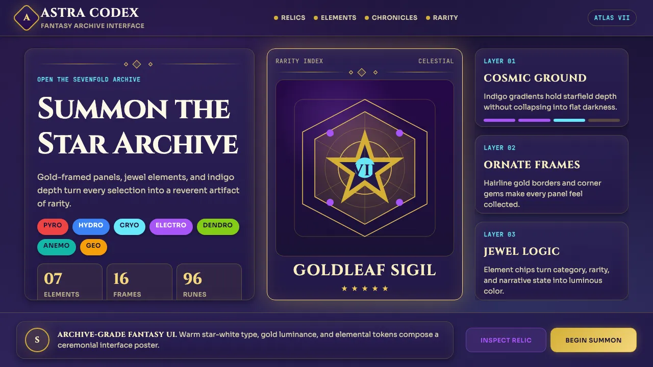
miHoYo's interface design — perfected across Genshin Impact (2020), Honkai: Star Rail (2023), and Zenless Zone Zero — is the most influential Chinese-led visual language in modern gaming. Every panel feels like an opened scroll from a fantasy archive: deep starfield indigo grounds, gold-leaf ornamental frames, and jewel-toned element chips that pulse with cosmic reverence.
This design system distills that gacha-game aesthetic into a reusable vocabulary of cosmic gradients, ornate card borders with corner flourishes, and a seven-element color palette (Pyro, Hydro, Cryo, Electro, Dendro, Anemo, Geo) layered over a dark indigo canvas. The typography pairs fantasy serif display faces with warm geometric body text, rejecting corporate minimalism in favor of scroll-archive grandeur.
- Origin
- Shanghai, China
- Era
- 2020–present (Genshin Impact launch onwards)
- Key figures
- Cai Haoyu · miHoYo character art directors · HoYoverse UI team
- Movements
- contemporary Chinese game design · modern gacha UI vocabulary · anime fantasy interface design
miHoYo Game UI design spec
Colors
Typography
The other 11 sections — buttons, cards, spacing, motion, techniques and more — open once you unlock. Download the DESIGN.md or send it to your AI in one click. Unlock once, yours forever.
Sign up nowStyles similar to miHoYo Game UI
Also inspired by brands & products, with a close feel.
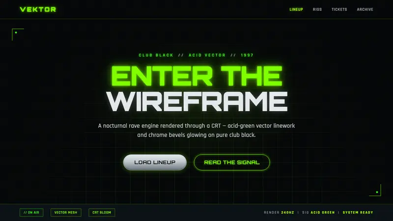 Playstation Rave Green 1997Enter the wireframe. Acid-green vector lines and chrome glow on club black, a rave through a CRT.
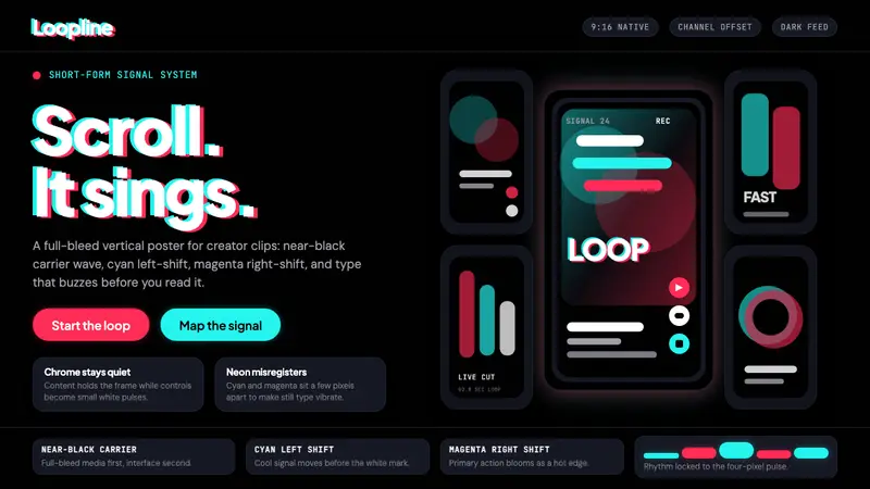 TikTok 2024Attention vibrates. Near-black feed, cyan-magenta offsets, and vertical frames buzz.
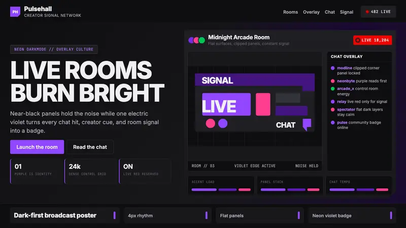 TwitchPurple is tribal signal. Neon violet cuts through flat dark panels and chat grids.
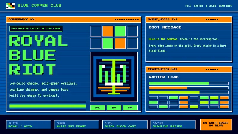 Commodore Amiga WorkbenchBlue desktop gets hijacked. Acid-green bitmap type, white chrome, and copper bars collide.