What is Glow-in-Dark Ceiling Stars?
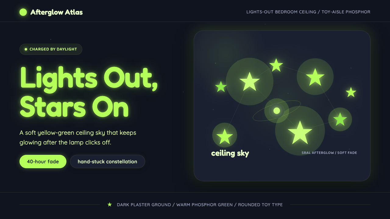
Glow-in-Dark Ceiling Stars turns the ordinary act of switching off a bedroom light into a private cosmic reveal.
Glow-in-Dark Ceiling Stars in brief
Glow-in-Dark Ceiling Stars is a nostalgic visual language derived from North American children's-room decor of the 1990s and 2000s. Its defining image is a dark blue-gray ceiling scattered with inexpensive plastic stars that awaken after lights-out, replacing the familiar room above the bed with a handmade constellation.
The effect depends on strontium-aluminate phosphor doped with europium and dysprosium. The material absorbs daylight and then releases the stored energy gradually as a yellow-green afterglow. That hue is both bright and highly receptive to human vision, allowing the stars to remain perceptible long after the room has gone dark, with the afterglow capable of lasting up to forty hours.
As a design system, the style combines a nocturnal blue-gray ground, rounded and approachable typography, irregular star placement, and soft luminous halos. Its emotional register is wonder rather than scientific precision. This is not an astronomical chart or a polished digital galaxy; it is the remembered ceiling of a child's bedroom, assembled by hand from toy-aisle objects and transformed by darkness.
Where does Glow-in-Dark Ceiling Stars come from?
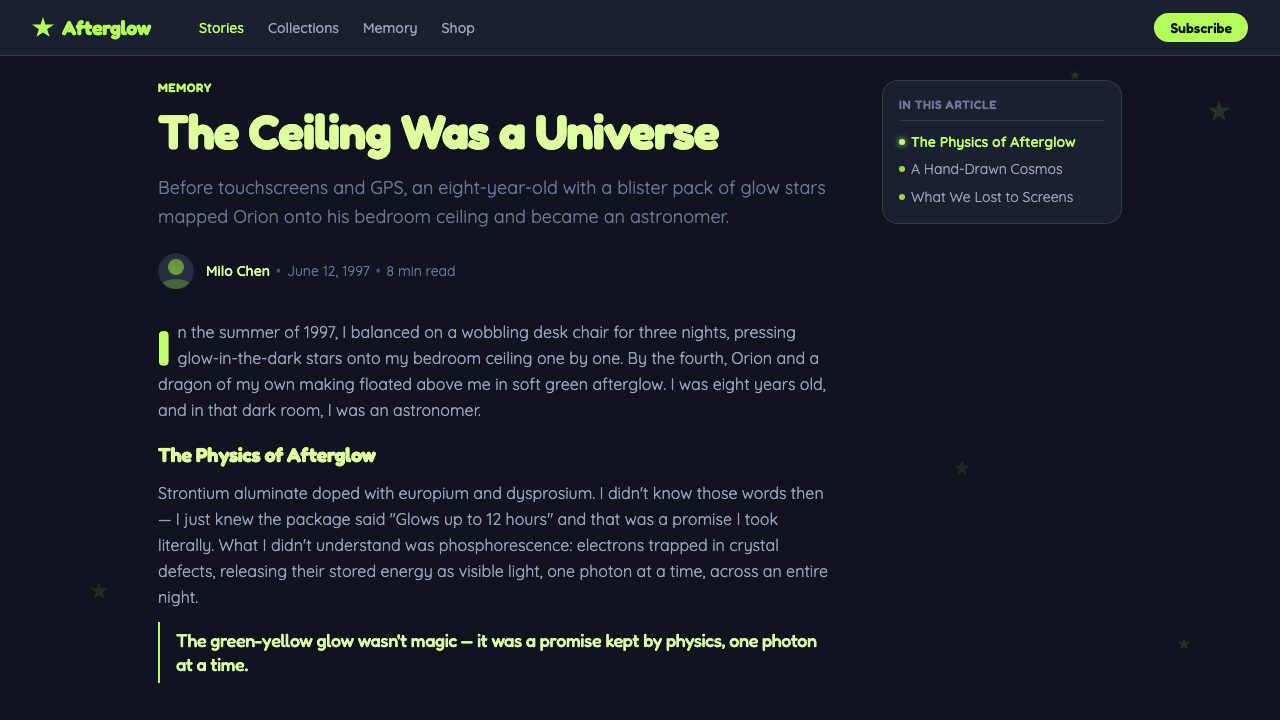
The style belongs to the North American kids'-bedroom toy era spanning roughly 1990 to 2010. Glow stars were small novelty objects rather than precious decor: lightweight pieces bought as sets, attached overhead, and arranged according to a child's patience, imagination, or available ceiling space. Their accessibility was essential to their appeal. A bedroom could acquire its own night sky without specialized equipment or permanent architectural work.
The visual experience was structured around a daily cycle. During daylight or under the bedroom lamp, the phosphorescent material absorbed energy. When the light clicked off, the stars appeared suddenly brighter against the darkened ceiling and then faded gradually into a softer afterglow. That transition made the room itself feel active: illumination was not supplied continuously but collected, stored, and released.
Strontium-aluminate phosphor developers, working with europium and dysprosium doping, provided the material foundation for the familiar yellow-green glow. Glow-star toy manufacturers translated that photoluminescent capability into inexpensive bedroom products. The resulting objects stood at the meeting point of materials development, novelty-toy production, and domestic decoration, even though children encountered them simply as stars that seemed to remember the light.
From this history emerged a recognizable aesthetic independent of the physical toys. The dark ceiling became a visual field; irregular placement became a compositional method; the charged halo became a sign of stored energy; and rounded lettering inherited the friendliness of children's packaging. What began as a lights-out bedroom experience can therefore be transferred to slides, interfaces, and editorial layouts without losing its central narrative: darkness reveals what daylight has prepared.
What defines the Glow-in-Dark Ceiling Stars look?
Nocturnal Ground
The foundation is a dark blue-gray field resembling a bedroom ceiling after the lights have been switched off. It should feel deep enough to support luminous contrast but softer and more domestic than absolute black. The ground is not empty space; it is the quiet surface from which the charged stars become visible.
Yellow-Green Afterglow
Yellow-green is the dominant luminous accent because it reflects the characteristic afterglow of the strontium-aluminate material and remains highly receptive to human vision. It should appear concentrated at the star and diffuse gently outward, suggesting stored light being released rather than a lamp projecting a beam.
Hand-Stuck Constellations
Stars are scattered with intentional irregularity. Some gather into loose clusters while others sit alone across broad dark areas. The composition should suggest a child placing each piece by reach and instinct, not an astronomer plotting a verified constellation or a software tool distributing identical objects evenly.
Soft Halos
Each important star carries a restrained halo that widens the impression of light without obscuring its simple silhouette. Halos may vary with the apparent charge of each star, creating a gentle hierarchy of brightness. The atmosphere should remain hushed and phosphorescent rather than glossy, electric, or theatrical.
Rounded Typography
Typography is rounded, friendly, and immediately legible. It echoes the approachable character of children's toys without becoming childish decoration. Headlines can feel buoyant and curious, while supporting text should remain calm enough to read against the dark ground. Severe geometric lettering would weaken the bedroom warmth.
Lights-Out Reveal
The style is organized around transformation. A dim or ordinary state gives way to a luminous one, mirroring the instant when the bedroom light clicks off. Even in static work, hierarchy should imply that something has just been revealed: a title emerging from darkness, data points glowing into recognition, or a call to action appearing like the brightest star.

Who shaped Glow-in-Dark Ceiling Stars?
The developers of strontium-aluminate phosphor established the material basis of the style. By creating a substance that absorbs available light and releases it gradually, they enabled the unusually persistent afterglow associated with ceiling stars. Their contribution transformed stored illumination from a material behavior into an everyday domestic experience.
Researchers working with europium and dysprosium doping shaped the distinctive yellow-green performance described by the theme. Their role belongs to materials development rather than visual styling, yet the resulting color, brightness, and persistence determine nearly every aesthetic decision in the system, from the luminous accent to the fading halo.
Glow-star toy manufacturers carried photoluminescent material into the children's bedroom. By turning it into inexpensive, recognizable star shapes, they created a repeatable ritual of charging, placing, switching off, and watching. The products' modest construction and informal arrangement are central to the style's authenticity and nostalgic force.
How do you use Glow-in-Dark Ceiling Stars today?
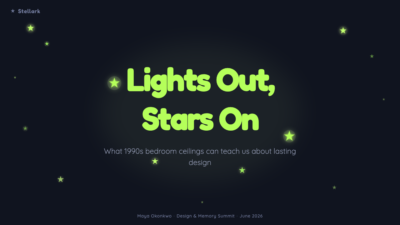
For presentation covers, begin with a broad dark blue-gray field and allow only a few luminous stars to establish scale and mood. The title can appear as the brightest object, surrounded by a restrained afterglow, while secondary information sits quietly near the edge. The composition should feel like the first seconds after lights-out: sparse, expectant, and gradually legible.
Content slides should preserve the nocturnal atmosphere without scattering stars behind every sentence. Use rounded type, clear text groups, and generous dark intervals between ideas. A small cluster can identify a section, while a single glowing star can mark an important statement. The visual metaphor works best when illumination corresponds to meaning rather than serving as constant decoration.
For data slides, treat values as points emerging across a dark ceiling. The strongest result, current state, or selected category may receive the clearest yellow-green glow, while supporting values remain quieter. Charts should stay readable before they become atmospheric. A loose constellation can communicate relationships, but irregular placement must never distort comparisons or imply false precision.
In web interfaces, the style suits focused dashboards, onboarding sequences, and pricing pages built around discovery. Cards can read as calm areas within the night field, with luminous accents reserved for active states, key metrics, and primary actions. Pricing tiers may be differentiated through brightness and star grouping, but body copy and controls need stable contrast so the interface remains usable rather than becoming a decorative star field.
Editorial and marketing layouts can use the lights-out reveal as a narrative device: begin with restrained darkness, then introduce brighter constellations around benefits, quotations, or calls to action. The common mistake is confusing nostalgia with visual clutter. Too many equally bright stars, oversized halos, or aggressively glowing text erase the quiet darkness that makes the effect believable. The style needs empty ceiling as much as it needs light.
Glow-in-Dark Ceiling Stars — FAQ
Is this style simply a generic space theme?
No. A generic space theme may emphasize planets, galaxies, scientific imagery, or spectacular cosmic depth. Glow-in-Dark Ceiling Stars is specifically rooted in a North American child's bedroom and the experience of inexpensive phosphorescent toys after lights-out. Its sky is domestic, shallow, handmade, and emotionally remembered. Removing the ceiling context, yellow-green afterglow, and informal placement turns it into a different kind of cosmic design.
Why is the glow yellow-green rather than blue or white?
The yellow-green glow comes from the strontium-aluminate phosphor system doped with europium and dysprosium described in the source material. It is also the brightest, most eye-receptive glow in this context, which helps the stars remain visible as their stored energy is released. Replacing it with blue or white may preserve a night-sky association, but it loses the material identity and toy-bedroom memory central to the theme.
Must the stars form real constellations?
No. The characteristic arrangement is hand-stuck and intuitive rather than astronomically verified. Loose clusters, uneven gaps, and isolated stars communicate the human act of decorating a ceiling. A recognizable constellation may be included if the composition benefits, but scientific correctness is not the system's defining value. Its authenticity comes from personal placement and the imperfect geography of a bedroom ceiling.
Can the style be used on a light background?
A light state can represent the charging phase, but the defining reveal requires a dark blue-gray ground. Against a light background, the yellow-green stars lose the contrast that makes afterglow perceptible, and the design begins to resemble daytime children's decor. If both states are needed, use the lighter version as a before condition and the nocturnal version as the moment in which the system reaches its full identity.
How can the style feel nostalgic without becoming childish?
Preserve the sensory memory rather than copying toy packaging literally. Use the dark ceiling field, the restrained yellow-green afterglow, rounded but composed typography, and a few imperfectly placed stars. Avoid filling every area with novelty shapes or turning all text into glowing display lettering. Nostalgia comes from the recognizable lights-out ritual and modest materials; maturity comes from disciplined hierarchy and quiet space.
Related design styles
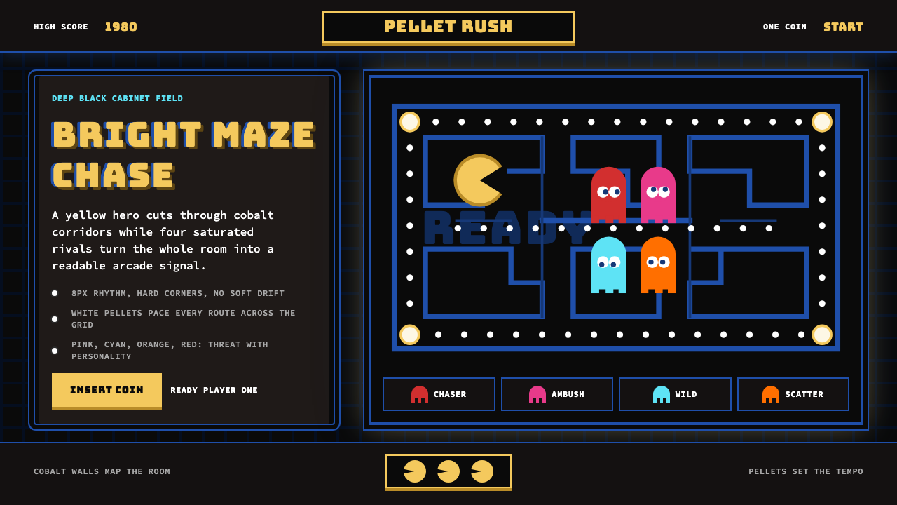 Pac-Man (Namco 1980)Arcade joy burns bright. Yellow disc, cobalt maze, and four ghost hues snap o…
 SpongeBob Bikini Bottom (1999)Undersea suburbia shouts with joy. Banana yellow and cyan bounce inside fat,…
 Aardman ClaymationHandmade warmth, visibly touched. Clay-orange panels, Caveat notes, thumbprin…
 Pokémon Game BoyKawaii meets cartridge logic. Capsule red, LCD green, Anton heft, and 8px gri…
 Shrek Swamp (2001)Fairy-tale ceremony gets muddy. Gilt frames collide with moss green and candy…
 Sonic the Hedgehog (1991)Velocity has teeth. Sky-cyan, cobalt slant type, gold rings, checkerboard tur…