What is SpongeBob Bikini Bottom (1999)?
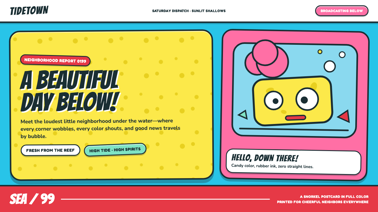
Bikini Bottom turns undersea suburbia into a buoyant cartoon postcard, where banana yellow, cyan water, and wobbly ink make every ordinary errand feel like a celebration.
SpongeBob Bikini Bottom (1999) in brief
SpongeBob Bikini Bottom is the visual world introduced with the 1999 Nickelodeon series: an undersea neighborhood rendered at maximum saturation, where a fry cook lives in a pineapple and the sky is a rippling cyan wall of water. Its setting feels recognizably suburban despite being submerged. Homes, streets, and familiar routines establish a neighborhood logic, while marine imagery makes that logic delightfully strange.
The style combines hand-drawn cartoon energy with a sun-faded leisure-world vocabulary. Turquoise grounds, a banana-yellow sponge, and double-lobed pink flower-clouds recall mid-century tiki lounges, 1960s Hawaiian barkcloth, surf culture, and aquarium display. Rather than treating the ocean as dark, vast, or naturalistic, Bikini Bottom presents it as a bright decorative environment designed for play.
Its most recognizable visual quality is its refusal of rigid precision. Forms are swollen, bent, irregular, and outlined with fat rubbery ink. Eyes are large and asymmetrical; architecture has the comic character of found objects; nothing appears to have been ruled into strict alignment. The result is not careless. It is an organized looseness that makes the setting feel handmade, friendly, and continuously in motion.
Where does SpongeBob Bikini Bottom (1999) come from?
Bikini Bottom emerged from the 1999 series premiere of SpongeBob SquarePants, developed between 1996 and 1999 in Burbank, California. Its classic first three-season period extended through 2004. The setting was built as a place rather than a neutral backdrop: a neighborhood at the bottom of the ocean, complete with domestic absurdity, civic familiarity, and a visual atmosphere that can hold both routine and cartoon escalation.
Stephen Hillenburg brought an unusual point of view to that world as a marine biologist turned animator. The undersea setting is therefore not simply an interchangeable fantasy location. It provides the style with its basic materials: water as a luminous field, marine forms as elastic architecture, and the logic of a tidepool transformed into neighborhood life. The premise lets ordinary suburban structures become playful ocean objects without abandoning their legibility.
The series belongs to the hand-drawn animation culture of 1990s Nicktoons, but its visual references reach into tiki and exotica revival kitsch, surf imagery, and aquarium pop. Mid-century tiki lounges and 1960s Hawaiian barkcloth supply the decorative mood: stylized flower forms, tropical color, aquatic cheerfulness, and a deliberately artificial sense of vacation. These references are not presented as historical reconstruction; they are remixed into a cartoon environment whose exaggeration is central to the appeal.
The credited creative constellation includes Derek Drymon, Tim Hill, Nick Jennings, and Alan Smart alongside Hillenburg. Within the supplied visual language, their shared terrain is clear: thick hand-drawn contour, heightened color, wobbly geometry, and a setting that behaves like a snorkel postcard painted onto animation cels. The style’s lasting coherence comes from how these ingredients reinforce one another. Every visual choice makes Bikini Bottom feel submerged, suburban, sunny, and a little ridiculous at once.
What defines the SpongeBob Bikini Bottom (1999) look?
Aquatic Color Field
Cyan and turquoise establish the world’s enveloping field, functioning as water, sky, distance, and emotional temperature at the same time. Against that cool aquatic ground, banana yellow becomes immediately buoyant, while pink flower-clouds create decorative interruptions. The palette is exuberant without aiming for natural underwater realism; it is designed to feel sunlit, graphic, and cheerful.
Rubbery Contour
Fat ink lines give characters, objects, and buildings a pliant outer edge. The contour does not merely separate forms; it makes them seem soft enough to squash, stretch, wobble, or bounce. A consistent sense of elastic drawing keeps even static scenes charged with cartoon potential and prevents the bright palette from becoming sterile or overly polished.
Wobbly Geometry
The style uses recognizable simple forms but resists mechanical geometry. Walls curve, edges drift, and silhouettes have the small irregularities of a hand-held brush. This wobble is essential: it turns a neighborhood from a diagram into a living cartoon habitat. Straightness is the exception, so any comparatively stable shape can become a comic anchor.
Asymmetric Expression
Googly, asymmetric eyes are a concise statement of the style’s emotional logic. Symmetry would make faces composed and controlled; imbalance makes them alert, silly, and immediately readable. This principle extends beyond characters into the environment, where mismatched forms and off-kilter details sustain a sense that the entire town is reacting to the joke.
Tropical Decorative Motifs
Double-lobed pink flower-clouds, tiki associations, and barkcloth-like pattern memory give the aquatic setting a vacation-postcard atmosphere. These motifs are broad and graphic rather than delicate. They sit comfortably behind action because they describe mood and place without competing with the characters, offering a decorative layer that remains legible at a glance.
Cel-Postcard Flatness
The world reads as a snorkel postcard painted as a cartoon cel. Water, architecture, clouds, and characters occupy distinct graphic layers rather than a deep naturalistic scene. This flatness makes the setting easy to scan and gives color and outline room to do the descriptive work. It is an illustrative environment, not an attempt to simulate a photographed ocean.
Who shaped SpongeBob Bikini Bottom (1999)?
Hillenburg is identified in the supplied material as a marine biologist turned animator and the central originating figure of the series world. That combination explains Bikini Bottom’s unusual balance: it is fundamentally a cartoon neighborhood, yet its water, tidepool logic, and marine imagery give it a distinct undersea identity rather than a generic fantasy setting.
Drymon is named among the key figures associated with the Burbank-based development and classic era. Within Bikini Bottom’s visual system, the important point is collective coherence: hand-drawn looseness, comic irregularity, tropical decoration, and cheerful underwater suburbia operate as one language rather than as separate stylistic references.
Hill is included among the key creative figures for the style’s formative period. The supplied material places the series inside a hand-drawn Nicktoons context, where expressive contour and broad visual readability carry as much character as the setting itself. Bikini Bottom depends on that directness: forms announce their comic identity before detail accumulates.
Jennings is one of the named figures attached to the Bikini Bottom visual world. The environment’s effectiveness comes from treating homes, streets, water, and decorative motifs as equally expressive components. A pineapple house or cyan horizon is not background information alone; it contributes directly to the setting’s friendly, absurd, and saturated personality.
Smart is also listed among the key figures of the originating period. The supplied description of fat rubbery ink, unstable straightness, and animated-looking forms captures the craft premise of this world: its visual identity is inseparable from hand-drawn movement, even when an image is held still.
How do you use SpongeBob Bikini Bottom (1999) today?
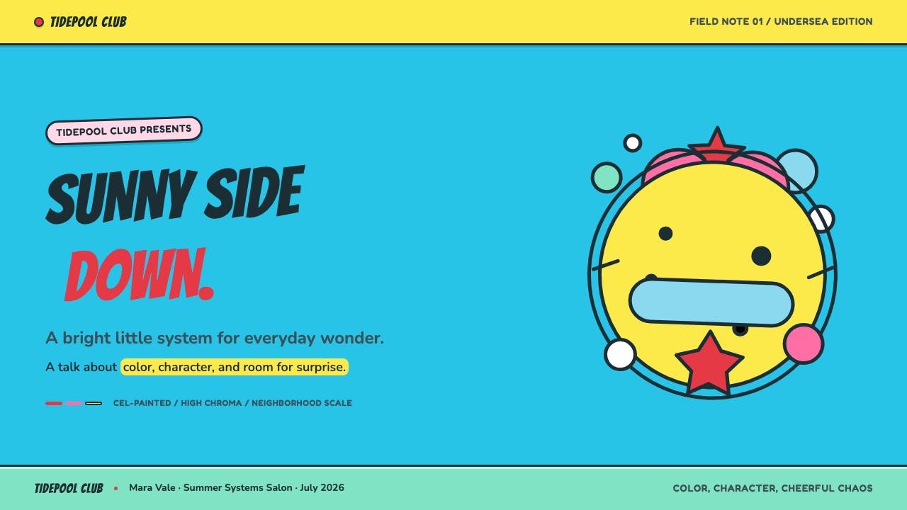
For presentation covers, Bikini Bottom works best when the scene has one immediate visual premise: a broad cyan aquatic field, a large cheerful yellow focal form, and a small cluster of tropical decorative marks. Let the title feel buoyant rather than formal, with hand-drawn irregularity supporting the hierarchy. Content slides should preserve generous open water around information, using wobble and contour as framing devices rather than filling every area with character art.
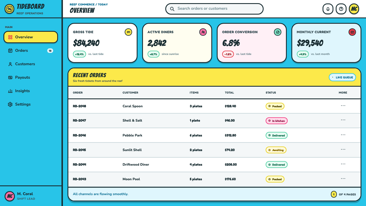
For content and data slides, turn the style’s graphic layers into a readable information system. Use aquatic grounds to establish sections, thick dark contours to separate categories, and the yellow, pink, and turquoise family to distinguish ideas with a playful but consistent rhythm. Charts should behave like cartoon objects: clear silhouettes, broad labels, and a few expressive environmental motifs at the margins. The data must remain the strongest signal; the joke is in the setting, not in obscuring the values.
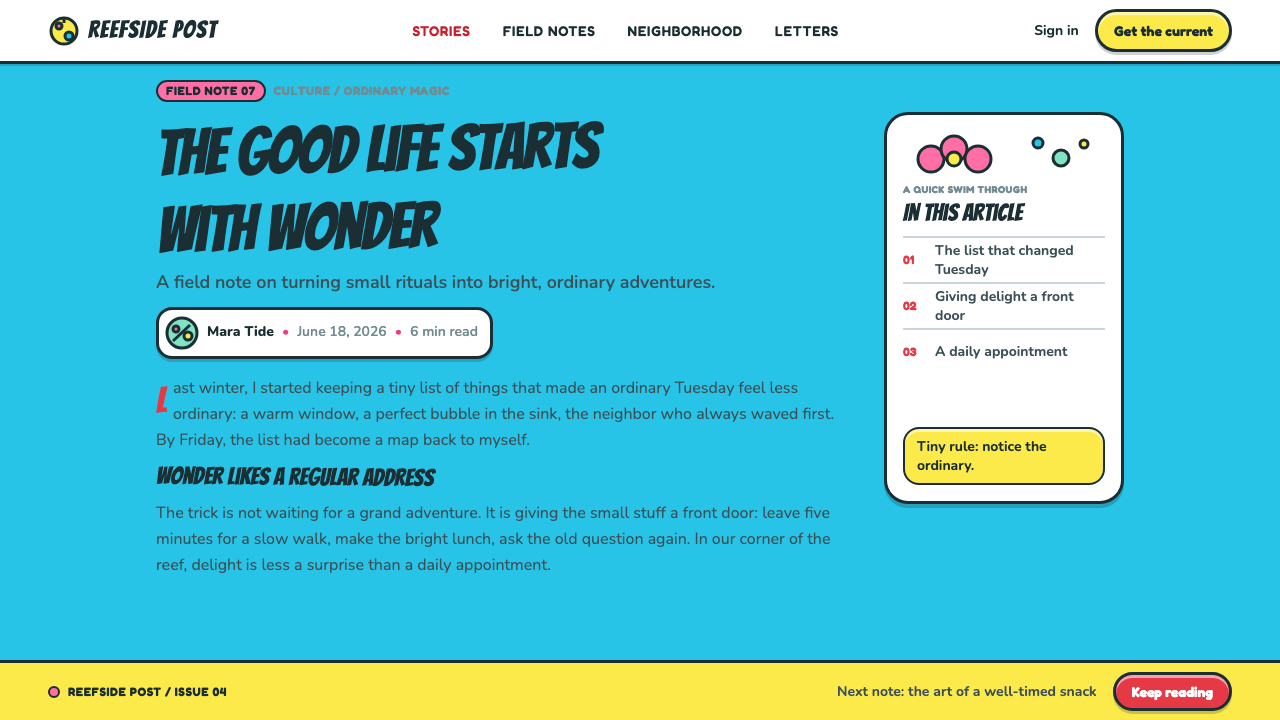
For web interfaces, the style is particularly suitable for youth-oriented dashboards, playful onboarding, learning spaces, event pages, or community tools that benefit from visible optimism. Treat the interface as an undersea neighborhood: navigation can be direct and friendly, panels can feel like distinct locations, and alerts can borrow the expressive force of thick contour and bright color. Interaction should remain predictable, because visual silliness works only when users still know where to go next.
For pricing and product-marketing pages, use the style to make choices feel inviting rather than severe. A prominent illustrated focal object can introduce a plan or feature area, while decorative flower-clouds and water fields establish continuity between sections. Keep explanatory copy unusually clear and let the tropical visual language provide warmth around it. The approach is strongest when the product genuinely has a social, educational, entertainment, or beginner-friendly character.
The common mistake is treating Bikini Bottom as permission to add random bright color, generic sea creatures, and noisy cartoon decoration everywhere. The style needs a disciplined balance between broad color fields, thick wobbly outline, asymmetric expression, and a coherent undersea-suburb setting. Avoid making every component equally loud. One clear focal gag, open visual water, and a limited family of recurring motifs will feel much closer to the world than a crowded collection of unrelated cartoon assets.
SpongeBob Bikini Bottom (1999) — FAQ
Is Bikini Bottom simply a generic underwater cartoon style?
No. Its identity comes from the collision of several specific ideas in the supplied material: undersea suburbia, a pineapple home, cyan water treated as sky, hand-drawn Nicktoons energy, and tropical references drawn from tiki lounges and Hawaiian barkcloth. An underwater setting without that suburban and decorative logic will usually read as a different kind of cartoon world.
Why do the outlines need to feel wobbly?
The wobble is what keeps the saturated setting elastic and alive. Fat rubbery ink lines make forms look ready to bend, bounce, or react, while perfectly ruled edges would push the image toward signage, technical illustration, or a more static graphic style. The irregularity should be purposeful enough to preserve recognition, not so random that objects lose their readable silhouette.
Can this style support information-heavy design?
Yes, provided the information system stays more disciplined than the illustration. Bikini Bottom already separates large aquatic fields, outlined forms, focal characters, and decorative flower-clouds into distinct visual layers. That makes it adaptable to presentations and dashboards when labels, categories, and primary actions retain clear prominence and the playful material remains secondary to the task.
What makes the tropical motifs feel connected rather than pasted on?
Use them as environmental memory, not as isolated embellishment. The flower-clouds, tiki mood, barkcloth associations, surf references, and aquarium-pop brightness all support the same postcard-like aquatic atmosphere. Repeating a small family of broad, recognizable marks within the water field will feel integrated; adding many unrelated tropical symbols will weaken the setting’s graphic coherence.
Where does Bikini Bottom style work less well?
It is less convincing when a product needs restrained authority, solemnity, or an unobtrusive neutral atmosphere. Its value comes from visible joy, comic instability, and decorative aquatic warmth, so applying it to every context can make serious information feel flippant or make dense work harder to scan. Use its energy where friendliness and imaginative place-making support the message.
Related design styles
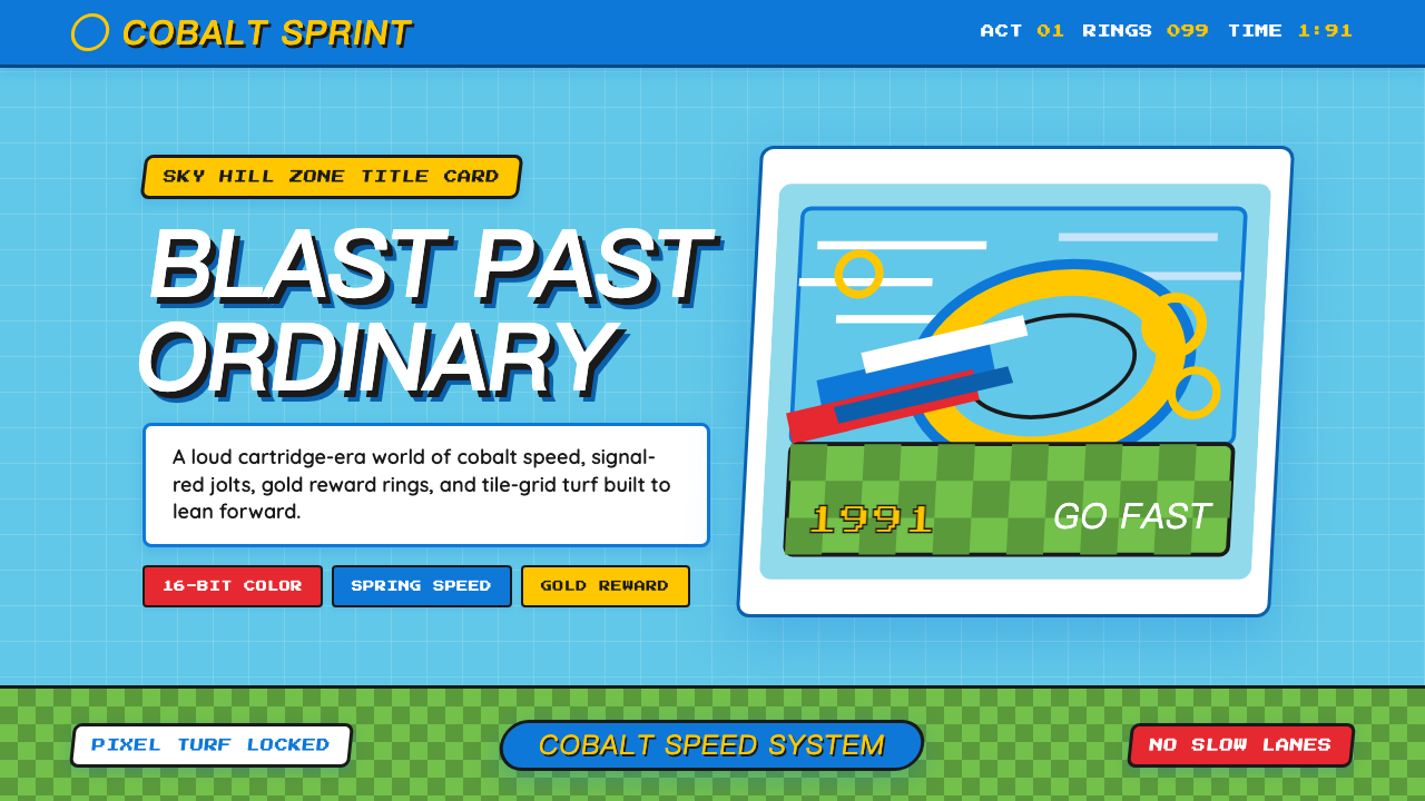 Sonic the Hedgehog (1991)Velocity has teeth. Sky-cyan, cobalt slant type, gold rings, checkerboard tur…
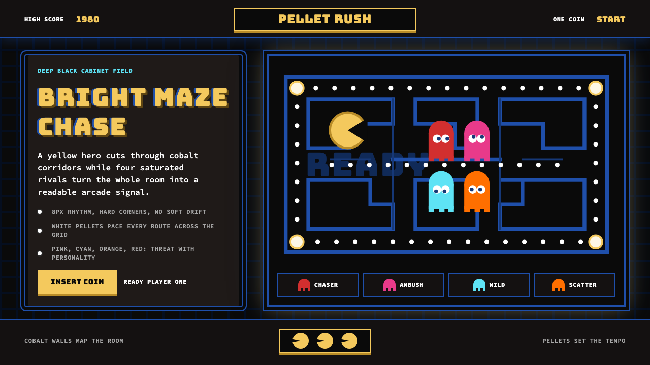 Pac-Man (Namco 1980)Arcade joy burns bright. Yellow disc, cobalt maze, and four ghost hues snap o…
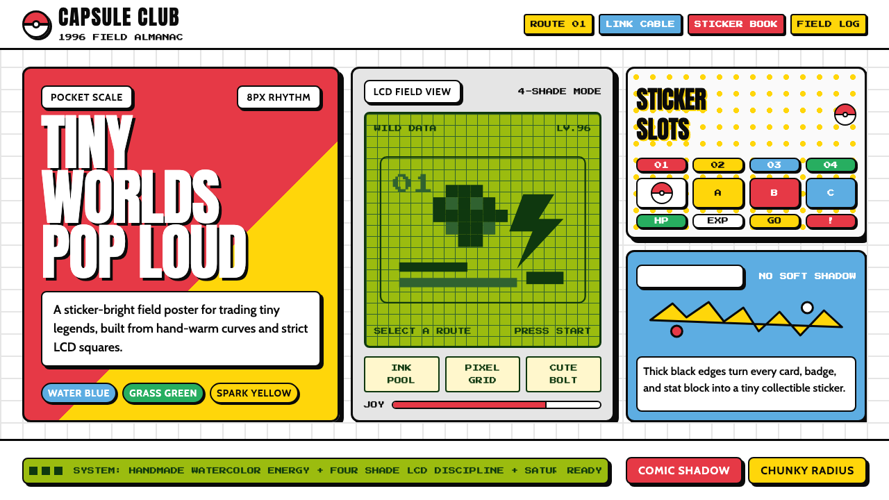 Pokémon Game BoyKawaii meets cartridge logic. Capsule red, LCD green, Anton heft, and 8px gri…
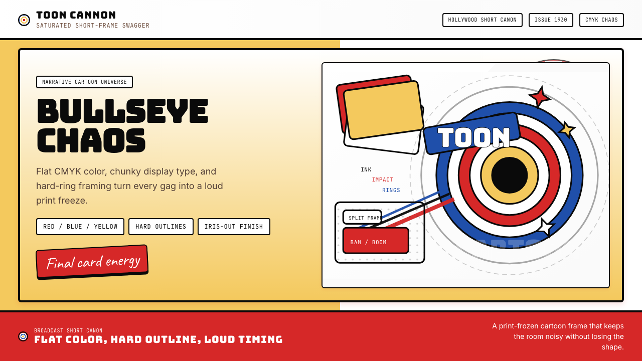 Looney Tunes (Warner Bros.)Pure cartoon chaos. Bull's-eye rings, Bungee type, and red-blue-yellow blocks.
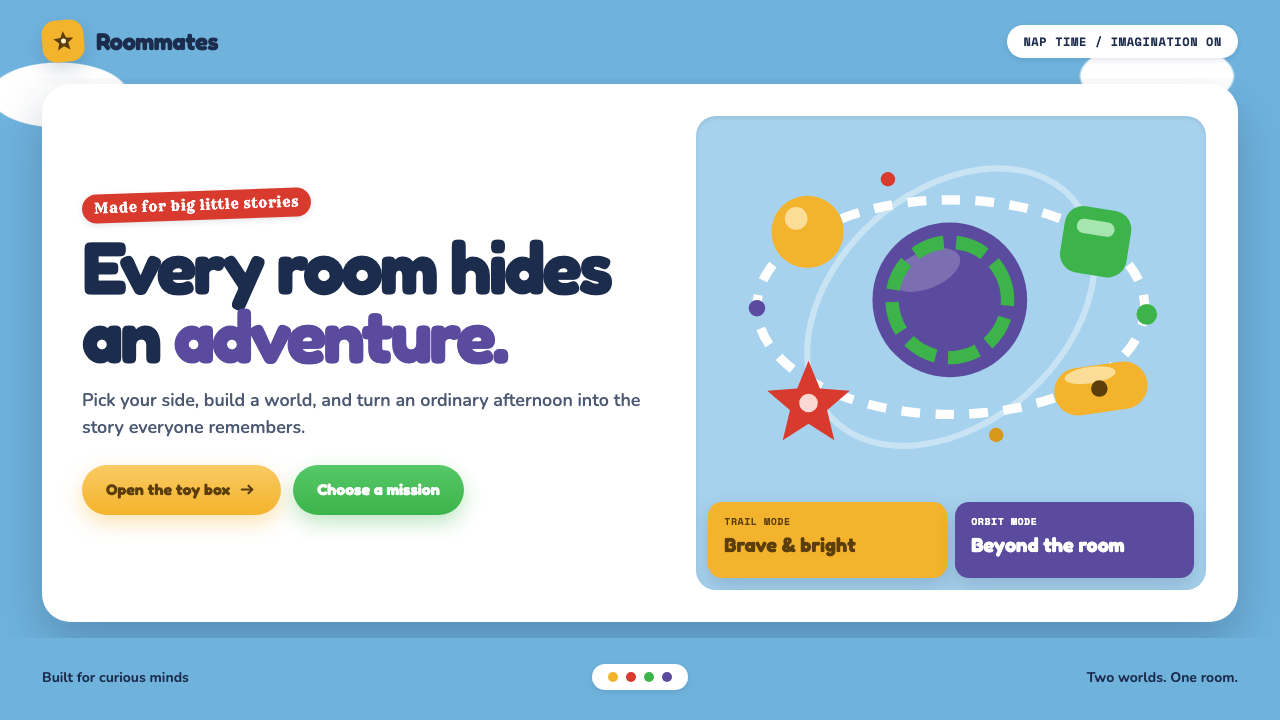 Toy Story (1995)Playtime becomes a whole world. Cloud blue, chunky type, and glossy two-tone…
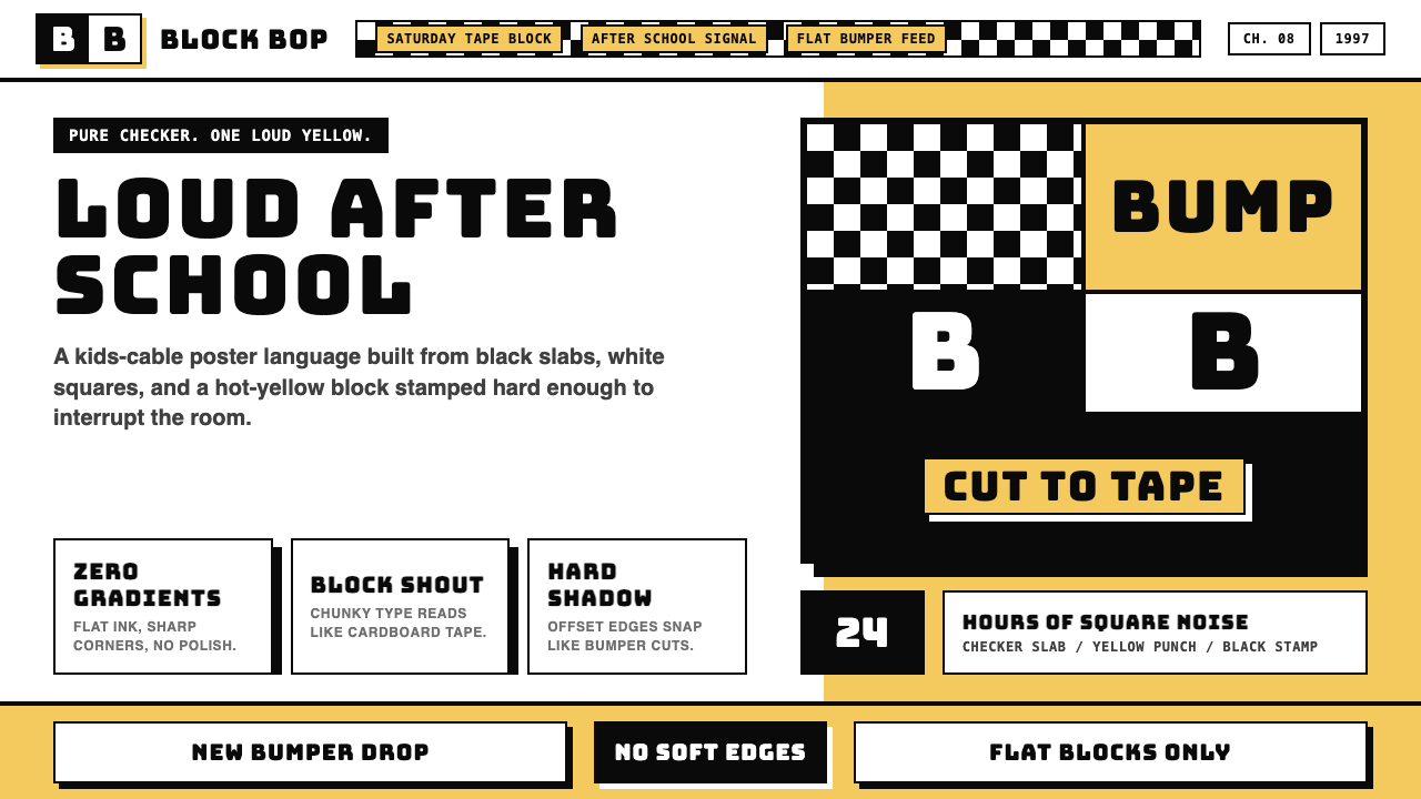 Cartoon Network 90s BlocksKids-cable noise, squared. Black-white checkerboards crash into hot-yellow Bu…