What is Toy Story (1995)?
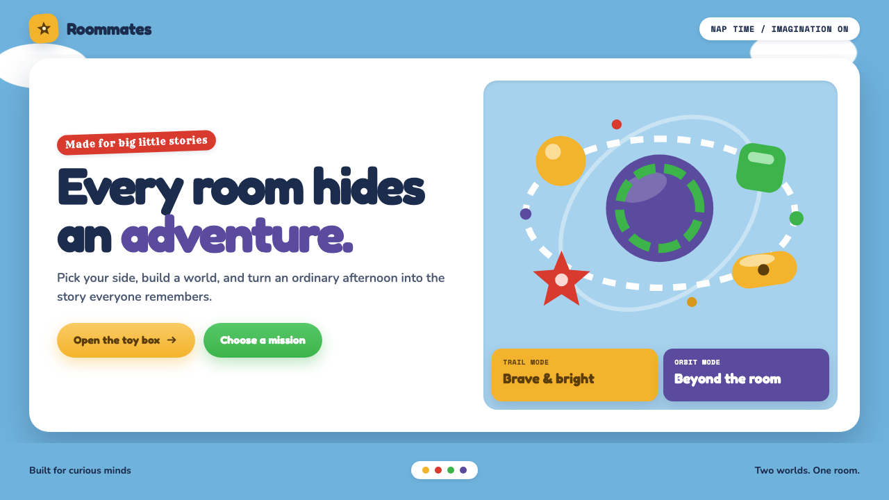
Toy Story turns a child’s bedroom into a complete visual universe: cloud-blue walls, buoyant lettering, and shiny toy forms where cowboy nostalgia meets space-age optimism.
Toy Story (1995) in brief
Toy Story is the visual world associated with Pixar’s 1995 feature film, built around the premise that playtime can transform an ordinary bedroom into an enormous stage. Andy’s-room wallpaper supplies the foundational field: a flat, open sky blue scattered with soft, chunky clouds. It is not merely a backdrop. It establishes the room’s emotional climate before a character, prop, or line of text arrives: safe, sunny, domestic, and large enough for imagination to expand inside it.
Everything placed over that sky-like ground should feel as if it belongs to a toy collection emptied onto a carpet. Forms are rounded, substantial, and visibly manufactured. They carry the polished confidence of plastic objects made to be held, pushed, stacked, and admired. Surfaces read as glossy rather than delicate; silhouettes are simple enough to recognize immediately, yet dimensional enough to suggest a toy with real weight and a friendly, touchable finish.
The style is held together by two deliberately separate registers. The cowboy register brings denim, rawhide brown, sheriff gold, and the warmth of a familiar bedroom adventure. The space-ranger register brings glossy pale armor, laser green, and deep-space purple, with a more futuristic and theatrical energy. They share the same room but do not dissolve into a neutral middle. That tension is central: the visual world feels playful because different kinds of childhood fantasy are allowed to stand side by side.
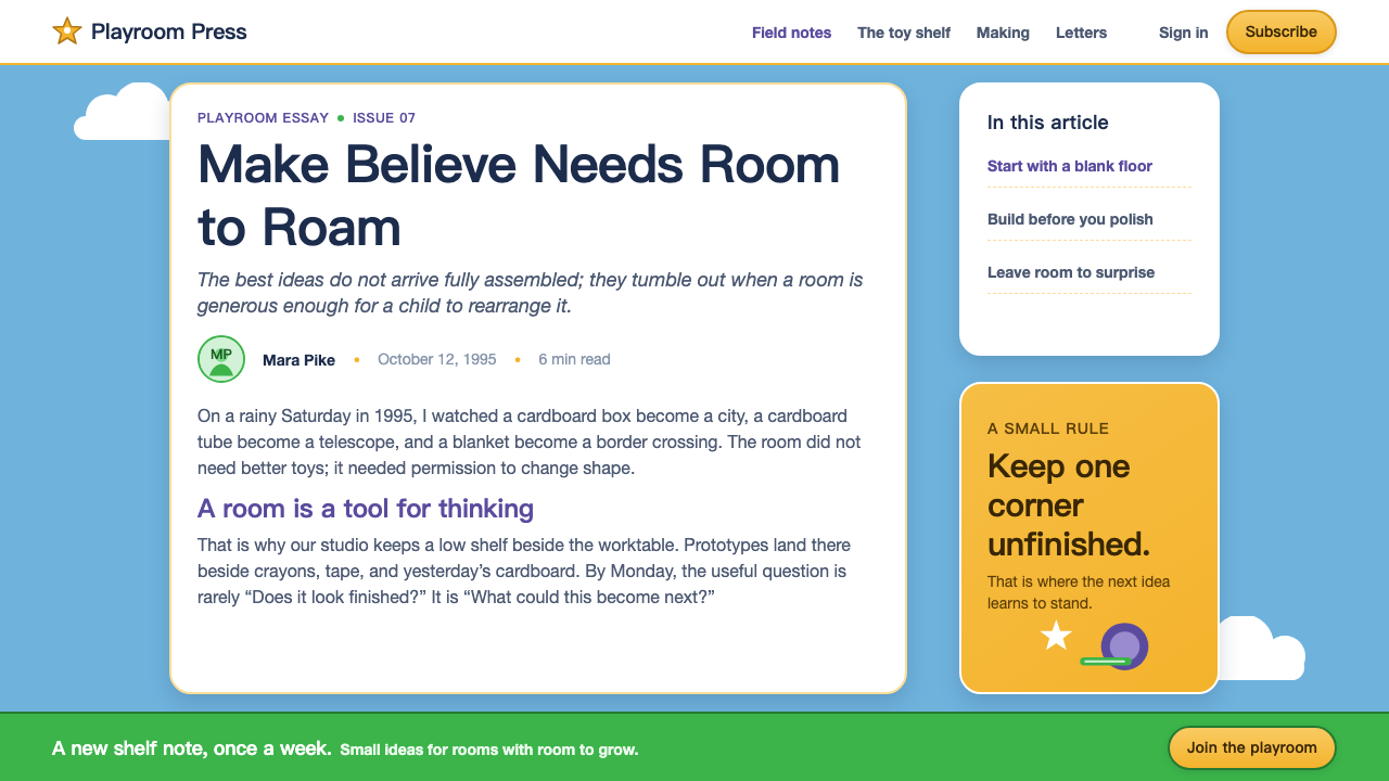
Where does Toy Story (1995) come from?
Toy Story emerged from Pixar’s production period between 1991 and 1995 and arrived in 1995 as the first fully computer-animated feature. Its visual language belongs to an early moment in feature CGI, when computer-generated imagery could announce its novelty without needing to hide it. Rather than pursuing a weightless digital abstraction, the film’s world makes that technical newness feel friendly through a bedroom-scale environment, familiar toys, rounded surfaces, and objects whose manufactured character is part of their appeal.
The geographic setting named in the source material is Emeryville and Point Richmond, California, identified with Pixar Animation Studios. That studio setting matters to the style’s identity because the look is not a historical design movement transplanted unchanged into animation. It is a house style formed around early CGI feature animation: bright, legible, materially expressive, and willing to make plastic shine. The visual language treats computer animation as capable of making objects feel cuddly and handmade in spirit even when their construction is unmistakably digital.
The source identifies John Lasseter, Ralph Eggleston, Bob Pauley, William Cone, and Randy Newman as key figures. Together, those names anchor Toy Story in a collaborative studio process rather than in a single graphic signature. The style’s force comes from alignment across world-building, image-making, tone, and musical identity: a room must feel like a room, toys must feel like toys, and the emotional scale must remain generous enough for a child’s everyday surroundings to become mythic.
Its broader context combines early CGI feature animation, the Pixar house style, and the material realism of 1990s plastic. This was not realism for realism’s sake. The gloss, saturation, and dimensionality serve the central imaginative proposition: toys are ordinary household objects until the viewer accepts their inner life. The result is a visual system that feels technically historic but emotionally immediate, balancing the excitement of newly possible computer imagery with the comfort of clouds, bedrooms, cowboy gear, and play.
What defines the Toy Story (1995) look?
Cloud-Wall Ground
The base is a flat sky-blue room-wall field tiled with soft, chunky clouds. It should feel domestic rather than meteorological: this is wallpaper, not an open landscape. The clouds create an immediately recognizable sense of childhood scale and leave enough open ground for toys, titles, badges, and character-like forms to appear as if they have been placed directly on the room around them.
Toy Materiality
Forms read as molded, glossy, and substantial. Their appeal comes from the visual promise of touch: smooth curves, broad highlights, sturdy edges, and volumes that seem made for a child’s hand. The aim is not luxury polish or futuristic minimalism. It is the cheerful certainty of a toy designed to survive play, to catch light across a plastic surface, and to remain legible from across a cluttered room.
Buoyant Type
Typography is rounded, bouncy, and self-assured. It should announce rather than whisper, carrying the friendly confidence associated with mid-1990s CGI logos. Lettering has a compact, inflated presence that can sit comfortably among clouds and toy forms. Its energy comes from shape and placement, not from fragile ornament or austere restraint; the words should feel ready to join the game.
Cowboy Register
The cowboy side uses denim, rawhide brown, and sheriff gold to introduce warmth, familiarity, and hand-me-down adventure. Its materials suggest clothing, leather-like gear, badges, and the storytelling comfort of a bedroom western. This register should retain a tactile, earthly quality. It is the visual counterweight to the space-ranger world: less sleek, more rooted, and closely tied to the idea of a beloved toy with history.
Space-Ranger Register
The space-ranger side uses glossy pale armor, laser green, and deep-space purple to introduce spectacle and technological optimism. It is polished, theatrical, and slightly larger than life, but it remains a toy fantasy rather than industrial science fiction. This distinction matters: the futuristic elements should feel wearable, collectible, and proudly plastic, as if heroic space travel were being performed on a bedroom floor.
Bright Emotional Contrast
The palette is bright, saturated, and unapologetically childlike, yet its meaning depends on contrast. The sky wall softens the scene; cowboy materials warm it; green and purple introduce speed and cosmic drama; gloss turns static forms into toys with a sense of life. The visual system succeeds when these signals remain distinct and cheerful rather than blending into a generic rainbow surface.

Who shaped Toy Story (1995)?
Lasseter is identified in the source material as a key figure in Toy Story’s creative context. His inclusion situates the style within Pixar’s collaborative early-feature period, when the film’s bedroom world, toy characters, and computer-animated material presence had to operate as one coherent imaginative proposition.
Eggleston appears among the key figures named for the film. In the context of this style, that shared creative credit points to the importance of environment: the cloud wallpaper, room-scale setting, and clearly separated cowboy and space-ranger worlds are not incidental decoration but the system that makes play feel expansive.
Pauley is listed as a key figure in the approved material. Toy Story’s visual identity depends on the discipline implied by such a collaborative production: everyday objects must remain recognizable as toys while being expressive enough to carry character, action, and emotional stakes inside a child’s familiar room.
Cone is another of the source material’s key figures. The visual world associated with the film relies on a careful balance between simple graphic readability and dimensional material appeal: clouds must read instantly, type must feel buoyant, and glossy plastic surfaces must support rather than overwhelm the emotional warmth of the room.
Newman is named among Toy Story’s key figures, underscoring that its identity is broader than a palette or a rendering technique. The style is a whole-world proposition: visual brightness, toy-scale materiality, cowboy warmth, space-ranger spectacle, and a sense that a child’s room contains an entire emotional universe.
How do you use Toy Story (1995) today?
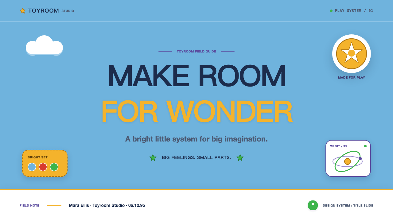
For presentation cover slides, start with the cloud-wall field and give the title the confidence of a toy-package announcement. Use one large rounded wordmark or title block, then let a cowboy or space-ranger cue establish the direction. The cover should not attempt to tell every story at once. A sheriff-like badge, denim-adjacent texture, or warm rawhide detail signals one register; glossy pale forms, green flashes, and deep purple space cues signal the other. Keep the scene open enough that it still feels like a bedroom wall waiting for play to begin.
Content and data slides benefit from treating toy forms as organizational devices rather than mere mascots. Use rounded containers, playful directional markers, and cloud breaks to group ideas. For data, preserve clear comparison and labeling first; then use the cowboy and space-ranger registers to distinguish categories or narrative phases. A chart can feel at home in this world when its parts retain the simple, manufactured clarity of toy pieces. Avoid turning every bar, label, or annotation into a novelty object, or the childlike mood will undermine the information.
For web interfaces, this style works best where discovery, onboarding, family-friendly participation, or a sense of collectible progress matters. Dashboards can use the cloud field sparingly behind a clear content surface, while rounded cards and glossy toy-like controls give feedback a satisfying physical presence. Pricing pages can use the two registers to frame different product stories, but the hierarchy must remain direct: plan names, benefits, and decisions need the same instant readability as a toy seen across a room.
For editorial and marketing work, use the bedroom world as a narrative frame. A page can open with clouds and broad, confident type, then shift between cowboy warmth and space-ranger spectacle as sections change subject. Marketing imagery should feel placed, collected, or discovered rather than composed with adult luxury-brand severity. The strongest campaigns preserve the sense that objects have been arranged by a child with a vivid inner logic: cheerful, purposeful, slightly unruly, and emotionally sincere.
The common mistake is blending every signal into a single generic children’s aesthetic. Toy Story depends on contrast: the cloud wall is calm, plastic is glossy, cowboy materials are tactile and warm, while space-ranger elements are polished and cosmic. If every component uses the same bright treatment, the room loses its internal story. Another mistake is making the style too retro or distressed. Its charm comes from clean early-CGI optimism and toy freshness, not from nostalgia piled on as surface noise.
Toy Story (1995) — FAQ
Is the Toy Story look simply a generic children’s design style?
No. Its childlike quality is highly structured. The cloud wallpaper establishes Andy’s room, toy materiality establishes scale and touch, and the cowboy and space-ranger registers introduce a specific conflict between two kinds of fantasy. A generic children’s design may use bright color and rounded type, but it lacks this room-based world-building and the deliberate separation between rawhide warmth and glossy cosmic spectacle.
Can cowboy and space-ranger cues appear in the same layout?
Yes, but they should remain legible as separate dialects. The source material describes them as sharing a room without blending. Let one register lead the composition and let the other provide contrast, a supporting object, or a narrative interruption. When denim, rawhide brown, sheriff gold, glossy pale armor, laser green, and deep-space purple all receive equal emphasis, the distinction that gives the style its personality disappears.
How should glossy plastic be used without making a design feel sterile?
Use gloss to communicate that an object is a toy, not to make every surface look expensive. Rounded silhouettes, broad reflective areas, and sturdy volumes work best when they are balanced by the domestic softness of clouds and the tactile warmth of cowboy materials. The emotional goal is an object that seems made for play. If shine becomes the dominant message, the result shifts from a child’s bedroom imagination toward a detached product render.
Does the style work on a dark interface?
It can, particularly when the space-ranger register is the intended lead, but the cloud-wall foundation is inherently light and domestic. A dark treatment should preserve the distinction between deep-space drama and the rest of the toy world rather than making the entire interface uniformly cosmic. Use darkness as a stage for selected space-ranger moments, while keeping key information and playful material cues clear enough to retain the welcoming bedroom-world feeling.
What makes the typography feel faithful to the style?
The essential qualities are roundedness, bounce, confidence, and immediate readability. Type should feel like it belongs beside clouds and molded toys: substantial enough to occupy space, cheerful enough to speak directly, and simple enough to remain clear. Avoid making it overly delicate, editorially austere, or distressed. The point is not to imitate a historical type specimen; it is to preserve the mid-1990s CGI promise that digital forms can feel handmade, cuddly, and full of play.
Related design styles
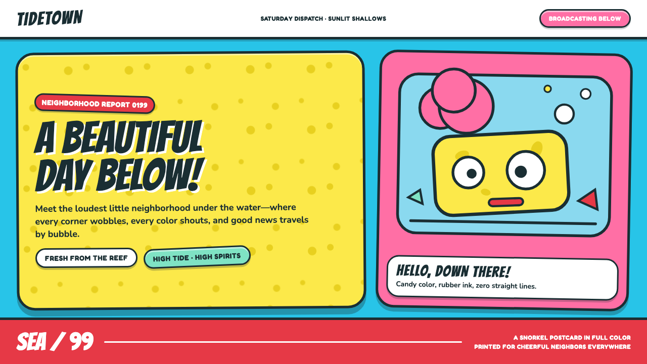 SpongeBob Bikini Bottom (1999)Undersea suburbia shouts with joy. Banana yellow and cyan bounce inside fat,…
 Friends Central Perk (1994)Sitcom warmth, turned TV-bright. Grape walls, couch orange, and bouncing colo…
 Pixar LuxoSincere story warmth. Cream paper, deep navy serif, and blue lamp geometry ho…
 Sonic the Hedgehog (1991)Velocity has teeth. Sky-cyan, cobalt slant type, gold rings, checkerboard tur…
 Pac-Man (Namco 1980)Arcade joy burns bright. Yellow disc, cobalt maze, and four ghost hues snap o…
 Pokémon Game BoyKawaii meets cartridge logic. Capsule red, LCD green, Anton heft, and 8px gri…