What is Friends Central Perk (1994)?
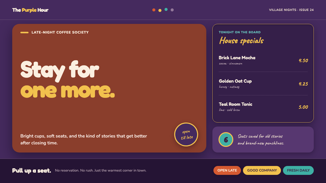
Friends Central Perk turns mid-90s sitcom comfort into a TV-bright interior language: grape walls, orange seating, warm café color, and cheerful dots that seem to bounce between every line.
Friends Central Perk (1994) in brief
Friends Central Perk is a design style drawn from the coffeehouse-sitcom atmosphere associated with Friends during its 1994–2004 NBC run. It combines the remembered intimacy of a Manhattan gathering place with the deliberately heightened visual clarity of multi-camera television. The result is not a literal recreation of a café set. It is a graphic system that makes digital spaces feel sociable, familiar, and ready for conversation.
The visual foundation is a deep grape-to-aubergine field, recalling Monica’s painted wall, warmed by brick, mustard, teal, and couch-orange accents. These colors do not aim for restraint or naturalism. They behave like the carefully arranged color of a sitcom set: each surface must read quickly, survive a bright television image, and help a room feel inhabited before anyone says a word. Small colored dots act as punctuation rather than information, scattering around titles, dividers, and portraits with the loose rhythm of the Friends title-card motif.
Forms are chunky, rounded, and openly friendly. Buttons become pills, cards sit on soft dropped shadows, and avatars are held inside circular frames that recall a peephole or a decorative café fixture. Hand-warm menu lettering gives labels, prices, and special notes the feeling of chalk written for regulars. Nothing here tries to look sleek, distant, or corporate. The style wants the interface to feel like a familiar couch has been left open for one more person.
Where does Friends Central Perk (1994) come from?
The style belongs to the cultural frame of Friends, the NBC sitcom that ran from 1994 to 2004 and reached its peak cultural visibility from 1995 to 1999. Its reference world is split between Greenwich Village in New York City and the Warner Bros. studio environment in Burbank, California. That split matters: Central Perk is remembered as an urban coffeehouse, but its visual warmth was also shaped for the clarity, consistency, and immediate legibility of studio television.
The relevant television tradition is the 90s multi-camera sitcom. In that format, interiors must support recurring scenes, recognizable entrances, group conversation, and a broad audience reading the setting at a glance. A coffeehouse therefore becomes more than background scenery. It becomes a dependable social stage, recognizable through color, furniture, decorative framing, and the visual cues that tell viewers they have returned to a known place.
Central Perk also sits within coffeehouse third-place culture: the idea of a shared location outside home and work where people can gather without ceremony. Its orange couch, warm café accents, menu-like lettering, and soft decorative details carry that function into the style. The room is designed less as a private refuge than as a place where friends can arrive, linger, interrupt each other, and remain visible to one another.
The supplied source places David Crane, Marta Kauffman, Kevin S. Bright, and John Shaffner among the key figures connected to this origin. It also identifies NBC Must See TV branding as part of the surrounding visual culture. For a contemporary designer, that context explains why the style is so overtly readable: it is grounded in a television world where familiarity, instant recognition, and the promise of weekly return are central to the experience.
What defines the Friends Central Perk (1994) look?
TV-Bright Color
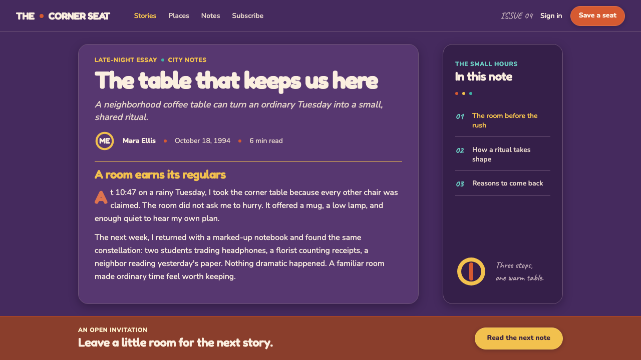
A saturated grape or aubergine ground gives the style its unmistakable evening-café atmosphere. Brick, mustard, teal, and orange enter as warm companions, not as quiet neutrals. The palette should feel arranged for a camera: broad, legible color areas create mood immediately, while small bright accents keep the scene lively. The effect is cozy without becoming muted.
Orange-Couch Warmth
The orange couch is the style’s emotional anchor. Orange is used as an invitation: a prominent seat, a primary action, a featured card, or a highlight that makes the interface feel occupied rather than merely organized. It works best against the deep purple field, where its warmth reads as social energy. This is color with the feeling of someone saving you a seat.
Bouncing Dots
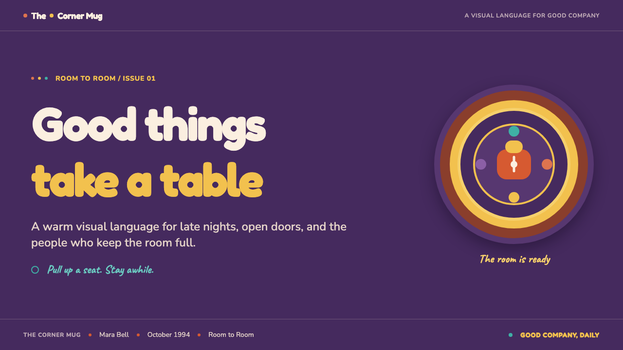
Small colored circles are scattered as pure punctuation, echoing the title-card dot motif rather than functioning as a data system. They can sit between words, animate a divider, orbit an avatar, or punctuate a heading. Their purpose is rhythm. Used sparingly, they make a layout feel musical and recognizable; used everywhere, they turn the interface into confetti and erase the calm that lets the main content breathe.
Rounded Social Forms
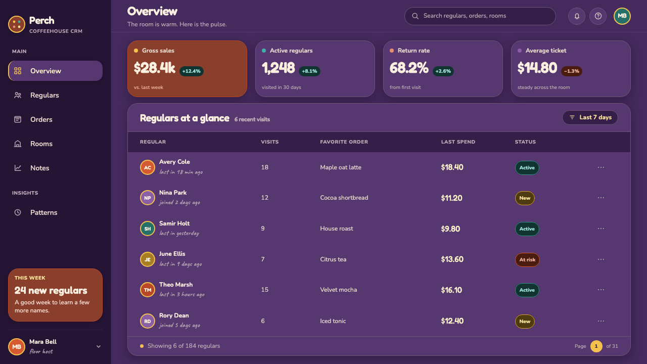
Hard edges are softened into pills, rounded containers, circular portraits, and generously curved seating-like surfaces. These forms make interaction feel low-pressure and conversational. A circular avatar framed like a peephole is especially effective because it turns a profile image into a small theatrical entrance. The geometry should feel substantial and friendly, never delicate or technical.
Soft Set Depth
Cards and controls use soft dropped shadows to lift gently from the dark ground. The shadow is not meant to simulate luxury material or dramatic lighting; it creates the shallow, friendly depth of layered sitcom scenery. Surfaces should seem placed in a welcoming room, not floating in an abstract product space. Keeping the depth consistent preserves the style’s calm, upholstered feeling.
Hand-Warm Menu Type
Marker- and chalk-like menu lettering brings a handwritten layer to names, specials, prices, and small moments of personality. It should be used as an accent alongside clear, sturdy text for navigation and reading. The contrast is essential: the practical type keeps the interface usable, while the hand-warm type suggests that someone has updated the board just before the regulars arrive.
Who shaped Friends Central Perk (1994)?
David Crane is listed in the supplied origin material as a key figure connected to Friends Central Perk. Within this style’s educational context, his name anchors the design language to the Friends reference world rather than treating the coffeehouse look as a generic 90s café aesthetic.
Marta Kauffman appears in the supplied source as a key figure associated with the style’s origin. Her inclusion helps locate Central Perk inside the social, recurring world of Friends: a setting remembered through shared presence, familiar rituals, and an atmosphere of easy return.
Kevin S. Bright is named among the source material’s key figures. For the visual language, that supplied association reinforces the connection between Central Perk and the production-aware clarity of the 90s multi-camera sitcom environment.
John Shaffner is also identified as a key figure in the provided origin record. His presence in that record points designers back toward the spatial identity of the coffeehouse: a memorable room defined by its purple ground, orange couch, warm accents, and decorative detail.
How do you use Friends Central Perk (1994) today?
For presentation covers, Central Perk works best when the page feels like an invitation into a room. Begin with a deep grape ground, let an orange sofa-like shape or warm featured panel establish the focal point, then place the title in clear, high-contrast type. A few colored dots can punctuate the title area, but they should feel like a laugh-track beat rather than a pattern. Content slides should preserve the same warmth through rounded containers, readable text, and small handwritten accents reserved for side notes or section labels.
For data slides, the style should remain legible before it becomes nostalgic. Use the dark ground to make simple charts and figures stand forward, reserving orange, mustard, teal, and brick accents for meaningful distinctions. Rounded chart containers and soft depth can make information feel approachable, while the dots can mark transitions between sections rather than compete with the data. Avoid turning every data point into decoration; the visual promise of this style is friendly clarity, not visual noise.
For web interfaces, the strongest applications are community dashboards, member spaces, event hubs, café-inspired loyalty tools, and pricing pages that need warmth without losing hierarchy. A dashboard can use purple as its environmental field, orange for the most welcoming action, and teal or mustard for secondary states. Pill controls, peephole-framed profile images, and soft-shadow cards make routine actions feel less administrative. Navigation should remain direct and readable, with playful marks used to humanize the journey rather than obscure it.
For editorial and marketing work, treat the page like a lively café wall. Feature stories can begin with a dark, saturated hero area, then open into warm cards, menu-style pull quotes, and circular portraits. Campaign pages benefit from the style’s sense of belonging: a featured offer can read like a daily special, while testimonials can feel like conversations overheard from nearby tables. The central design task is to preserve the social energy of the reference without relying on literal scene recreation.
The common mistake is to reduce Friends Central Perk to purple backgrounds plus random colored dots. That produces a generic retro collage instead of a coherent sitcom environment. The style depends on an intentional balance: deep color must be warmed by orange and café accents, rounded forms must be supported by clear information hierarchy, handwritten type must remain an accent, and dots must punctuate rather than decorate every empty area. If the design stops feeling like a place where people would linger, it has missed the point.
Friends Central Perk (1994) — FAQ
Is Friends Central Perk simply a generic 90s retro style?
No. It overlaps with 90s nostalgia, but its identity is more specific: it combines the 90s multi-camera sitcom, coffeehouse third-place culture, the Friends reference world, and TV-bright set readability. A generic retro layout may use loud color or playful type. Central Perk needs the social logic of a shared café, the purple-and-orange warmth of a remembered room, and decorative details that support a recurring sense of return.
Can the style work outside a coffee or entertainment product?
Yes, if the product benefits from friendliness, familiarity, and visible community. It can suit member programs, event spaces, social learning tools, local guides, collaborative dashboards, and welcome-oriented pricing pages. It is less suitable where the brand must feel austere, highly technical, ceremonial, or emotionally distant. The useful question is whether the product wants users to feel like regulars rather than visitors.
How should the colored dots be used without becoming distracting?
Give them a punctuation role. Place them around a title, between navigation groups, beside a profile, or at a transition where the page needs a small release of energy. Keep them away from dense reading areas, controls that already have strong emphasis, and data that requires comparison. Their value comes from surprise and rhythm. When they appear with restraint, they recall the title-card motif; when they form a wallpaper, they lose that recognition.
Does the dark purple ground make accessibility difficult?
It can if warmth is prioritized over reading contrast. The solution is not to abandon the dark ground, but to keep primary text clear and high-contrast, use warm accent colors selectively, and avoid placing handwritten menu lettering in passages that require sustained reading. Treat the purple field as an environmental surface. Important content should remain as direct and legible as the visual language of television set design requires.
What most quickly makes an application feel inauthentic?
Over-decoration is the fastest failure. If every card has dots, every label uses chalk lettering, every action is orange, and every object competes for attention, the result loses the relaxed sitcom warmth of the reference. Central Perk works through a clear cast of roles: the purple field sets the room, orange welcomes, café colors add companionship, rounded forms soften interaction, and dots provide a brief beat of playfulness.
Related design styles
 Philippines Jollibee Bee MascotJoy shouts first. Red ground, Fredoka curves, yellow pills, chunky grid.
 Nickelodeon Orange Splat (1984)Kids own the screen. Orange fields, slime-green pops, and wobble borders do t…
 Pac-Man (Namco 1980)Arcade joy burns bright. Yellow disc, cobalt maze, and four ghost hues snap o…
 Cooper Black DisplayShouts softly. Burnt-orange Cooper type sinks into deep chipboard brown with…
 Pokémon Game BoyKawaii meets cartridge logic. Capsule red, LCD green, Anton heft, and 8px gri…
 Sonic the Hedgehog (1991)Velocity has teeth. Sky-cyan, cobalt slant type, gold rings, checkerboard tur…