What is Pixar Luxo?什么是 Pixar Luxo?
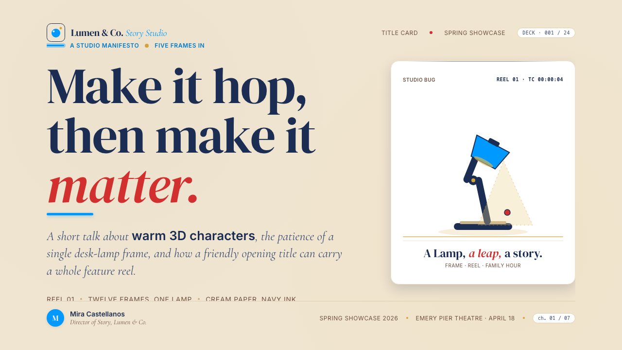
Pixar's Luxo Jr. lamp taught the world that a circle of warm light and a bouncing silhouette could carry more emotional weight than any photorealistic blockbuster.皮克斯的 Luxo Jr. 台灯告诉世界:一圈暖光与一个跳跃的剪影,能承载比任何写实大片都更重的情感份量。
Pixar Luxo in briefPixar Luxo 速览
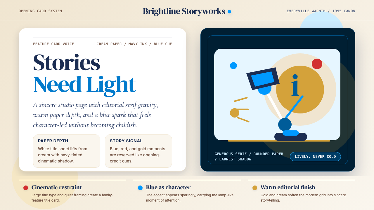
Pixar Luxo is the design language built around the studio's most recognizable symbol: the hopping desk lamp that has introduced every Pixar film since 1986. The visual system translates the warmth, sincerity, and narrative weight of that lamp into a communicable aesthetic — cream paper grounds, deep navy serif headlines, saturated brand reds and golds, soft-rounded shapes, and a cinematic shadow vocabulary that makes any surface feel like a film's end-credit card.皮克斯 Luxo 风格,是围绕那盏自1986年起出现在每部皮克斯电影片头的跳跃台灯所建立的设计语言。它将那盏灯所代表的温度、真诚与叙事重量,转化为一套可传达的美学体系:奶油纸底面、深海军蓝衬线标题、饱和的品牌红与金、柔和圆角造型,以及电影感的阴影语言——让任何页面都读起来像一张片尾字幕卡。
At its core, the style is a marriage of editorial gravitas and animated storytelling. It borrows the unhurried confidence of classic American book and poster design — generous leading, wide margins, ink-dark type — and fuses it with the rounded, approachable geometry of computer-generated character animation. The result sits at an unusual cultural intersection: it feels both institutional enough for a Fortune 500 annual report and warm enough for a children's bedtime story.从本质上看,这种风格是编辑庄重感与动画叙事温度的联姻。它借鉴了美国经典书籍与海报设计的从容自信——宽松的行距、宽阔的边距、近乎墨色的深重字体——并将其与计算机生成角色动画的圆润亲切几何形相融合。结果停留在一个罕见的文化交叉点:它既有足够的机构感,适用于《财富》500强年报,又足够温暖,可以陪伴孩子入睡前的故事时间。
The palette is built around restraint and contrast. A cream or warm-white field anchors everything. Deep navy — not pure black — carries the typographic weight. Pixar's signature blue, a clear saturated mid-blue, appears as a directional accent. Brand reds and warm golds punctuate sparingly, carrying the emotional temperature of a lit stage rather than the aggression of a marketing color. The overall effect is cinematic warmth with editorial precision.色板建立在克制与对比之上。奶油色或暖白色底面锚定一切。深海军蓝——而非纯黑——承载文字的重量。皮克斯的标志性蓝,一种清澈饱和的中蓝,作为方向性强调色出现。品牌红与暖金色点缀节制,传递的是舞台灯光的情感温度,而非营销色彩的攻击性。整体效果是电影感的温暖与编辑级的精准相融。
Where does Pixar Luxo come from?Pixar Luxo 从何而来?
Pixar Animation Studios was born in 1986 as a spinoff from Lucasfilm's Computer Division, when Steve Jobs purchased the unit for ten million dollars. The company's first public creation was not a feature film but a short: Luxo Jr., directed by John Lasseter and released the same year. Running less than two minutes, it depicted two desk lamps — a large one and a small one — playing with a ball. The short was the first computer-animated film ever nominated for an Academy Award. It also established, in a single piece of work, the entire emotional vocabulary that would define Pixar for the next four decades: simple geometry, expressive motion, and the conviction that audiences will project full humanity onto any object that moves with intention.皮克斯动画工作室于1986年从卢卡斯影业的计算机部门分拆独立,由史蒂夫·乔布斯以一千万美元收购。公司的第一件公开作品不是长片,而是一部短片:由约翰·拉赛特执导、同年发布的《Luxo Jr.》。这部不到两分钟的短片描绘了一大一小两盏台灯玩球的故事。它是史上第一部获奥斯卡提名的计算机动画影片,也在一件单一作品中确立了将在此后四十年间定义皮克斯的全部情感词汇:简洁的几何形、富有表现力的运动,以及一种确信——观众会将完整的人性投射到任何以意图移动的物体上。
The Luxo lamp became the studio's logo almost by accident — Lasseter's short had used the Luxo brand of adjustable desk lamps as its subject, and the resulting character was so beloved that the studio adopted it as its mark. From 1995's Toy Story onward, a computer-animated Luxo Jr. lamp would hop across the screen and squash the letter 'i' in 'Pixar' at the start of every theatrical release. This opening ritual gave the studio its most consistent visual asset: a piece of animated brand identity that communicated warmth, playfulness, and technical ambition simultaneously — long before the feature had shown a single frame.Luxo 台灯几乎是意外成为工作室商标的——拉赛特的短片以 Luxo 品牌可调节台灯为主角,由此诞生的角色如此深入人心,以至于工作室将其采纳为标志。自1995年《玩具总动员》起,每一部皮克斯院线电影片头,都会出现一盏计算机动画的 Luxo Jr. 台灯跳过屏幕、踩扁「Pixar」中字母「i」的画面。这个开场仪式赋予了工作室其最具持续性的视觉资产:一段动态品牌标识,在还未放映一帧正片之前,就同时传达出温度、趣味与技术抱负。
The visual language of Pixar's corporate and marketing materials grew in dialogue with the films themselves. The studio's Emeryville, California campus — designed with input from Steve Jobs, who served as chairman after the acquisition by Disney in 2006 — emphasized open collaboration, natural light, and warm materials. The design systems that accompanied early Pixar home-video releases, theatrical one-sheets, and press materials drew on classic American editorial traditions: the deep navy and cream of vintage book jacket design, the broad-shouldered serif type of golden-era Hollywood title cards, and the saturated but never garish color sense of mid-century American illustration.皮克斯企业与营销材料的视觉语言,是在与影片本身的对话中生长起来的。工作室位于加利福尼亚州爱莫利维尔的园区——在2006年被迪士尼收购后,仍在担任董事长的史蒂夫·乔布斯参与了设计——强调开放协作、自然采光与温暖材质。早期皮克斯家用视频发行、院线单页海报与新闻材料所伴随的设计体系,汲取了美国经典编辑传统的养分:老式书籍封面设计的深海军蓝与奶油色、好莱坞黄金时代片名字幕卡的宽肩衬线字体,以及二十世纪中叶美国插画那种饱和却不刺目的色彩感知。
Toy Story (1995) was the watershed moment not just for Pixar but for the entire animation industry. As the first fully computer-animated feature film, it demonstrated that 3D rendering could achieve emotional resonance rather than merely technical spectacle. The film's visual warmth — soft volumetric light, rounded character forms, a palette that referenced both the plastic of actual toys and the warm grain of childhood memory — established the aesthetic benchmark that subsequent Pixar films would iterate on. The Pixar Story Brain Trust, a creative feedback group established by Ed Catmull and John Lasseter in the late 1990s, became the institutional guardian of this aesthetic consistency, ensuring that visual warmth and narrative sincerity remained inseparable across dozens of productions.1995年的《玩具总动员》是皮克斯乃至整个动画产业的分水岭时刻。作为第一部全计算机动画长片,它证明了三维渲染可以实现情感共鸣,而不仅仅是技术奇观。影片的视觉温度——柔和的体积光、圆润的角色形态、既参照了真实玩具的塑料质感又唤起童年记忆的暖粒感色板——确立了此后皮克斯影片持续迭代的美学基准。由艾德·卡特莫尔和约翰·拉赛特在1990年代末建立的「皮克斯故事智囊团」,成为这种美学一致性的机构守护者,确保视觉温度与叙事真诚在数十部作品中始终密不可分。
What defines the Pixar Luxo look?Pixar Luxo 的视觉特征是什么?
Warm Ground Palette暖底色板
The foundational ground is cream or warm white — never a stark, blue-tinted white. This warmth is not accidental; it evokes the physical texture of paper, the glow of a practical lamp, and the grain of film stock. Against this ground, deep navy and warm black carry typographic mass, while the signature Pixar blue and occasional warm gold function as accents. The overall temperature reads as dusk-lit rather than daylight-clinical.基础底色是奶油色或暖白色——绝不是刺目的蓝调白。这种温度并非偶然:它唤起纸张的物质质感、实体灯具的光晕,以及胶片的颗粒感。在这个底面上,深海军蓝与暖黑色承载文字的质量,标志性的皮克斯蓝与偶尔出现的暖金色作为强调色运作。整体色温读来更像黄昏灯光,而非日光诊所。
Generous Serif Headlines慷慨的衬线标题
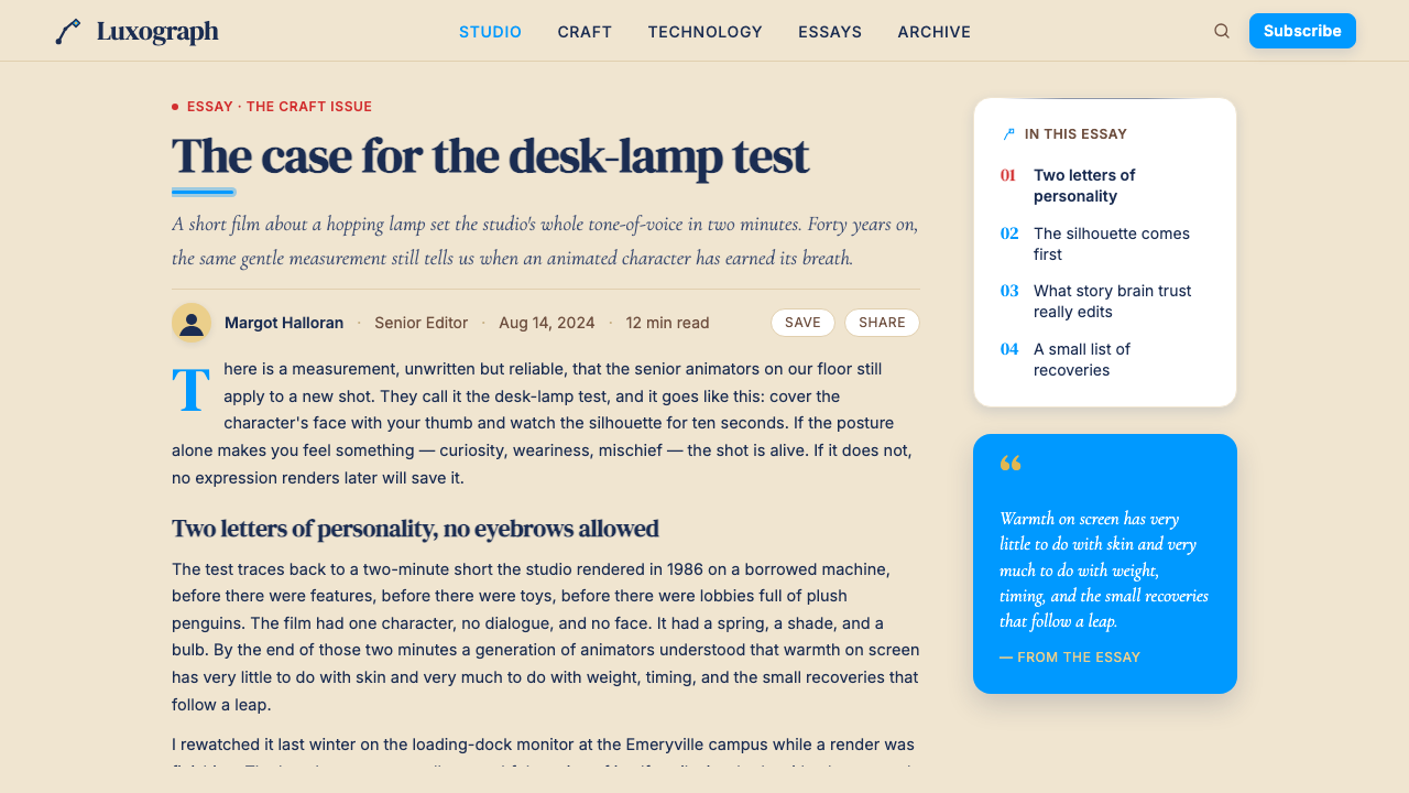
Headline type is set in broad, confident serif letterforms — the kind associated with classic editorial publishing and theatrical title cards rather than corporate sans-serifs. Letters are given room to breathe: wide tracking, comfortable leading, and generous scale differentials between heading levels. The effect communicates authority without coldness — the same tone as a hardcover book jacket or a film's opening title sequence.标题字采用宽博、自信的衬线字形——与经典编辑出版和戏剧片名字幕卡相关联,而非企业无衬线字体。字母被给予充分呼吸的空间:宽松的字间距、舒适的行距,以及各标题级别之间充裕的大小差异。效果传达权威而不冷漠——与精装书封面或电影片头序列相同的语气。
Soft-Rounded Geometry柔和圆角几何
Shapes in this system carry visible corner rounding — not as a UI trend but as a direct echo of the Luxo lamp's own silhouette and of the rounded, volumetric characters that define Pixar's 3D aesthetic. Cards, containers, and illustrative shapes avoid sharp ninety-degree corners. This roundedness is calibrated: enough to read as friendly and approachable, not so extreme as to appear soft or unserious.这个体系中的形状带有可见的圆角——不是作为一种界面潮流,而是对 Luxo 台灯自身轮廓、以及定义皮克斯三维美学的圆润体积感角色的直接回响。卡片、容器与插图形状回避锐利的直角。这种圆润度经过校准:足以读作友善亲切,却不至于显得软弱或不严肃。
Cinematic Shadow Language电影感阴影语言
Shadows in this system simulate the warm, directional cast light of a practical lamp — soft-edged but with clear directionality, suggesting a single warm source above and slightly to one side. This is the opposite of the Bauhaus hard-offset drop shadow: rather than treating shadow as a geometric decision, Pixar Luxo treats it as a lighting narrative. The effect gives flat interface elements a gentle dimensionality, as though they exist under stage lighting rather than on an LCD panel.这个体系中的阴影模拟实体台灯的暖色方向性投射光——边缘柔和但方向明确,暗示一个位于上方略偏一侧的单一暖光源。这与包豪斯的硬边偏移投影截然相反:皮克斯 Luxo 不将阴影视为几何决定,而是将其视为一段灯光叙事。效果赋予平面界面元素一种轻柔的维度感,仿佛它们存在于舞台灯光之下,而非液晶面板之上。
Saturated Brand Accents饱和的品牌强调色
While the ground palette is warm and restrained, the accent colors are unapologetically saturated. Pixar's brand red and warm gold are used sparingly but at full saturation when they appear — never desaturated, never tinted toward pastels. This creates a clear emotional hierarchy: the cream ground is resting, the navy is working, and the saturated accents are performing. The analogy is theatrical: warm ambient light, dark stage, spotlit focal points.虽然底色色板温暖克制,强调色却是毫不掩饰的高饱和度。皮克斯的品牌红与暖金色出现时节制但始终保持全饱和——从不去饱和,也不向粉彩方向偏移。这创造出清晰的情感层级:奶油底面在休息,海军蓝在工作,饱和强调色在表演。类比是戏剧化的:暖调环境光、深色舞台、聚光焦点。
Narrative Illustration Style叙事插画风格
When illustration appears in this system, it echoes the character design principles of Pixar's films: clearly silhouetted forms, volumetric but not hyper-realistic shading, warm local color, and an emphasis on readable expression over anatomical detail. Figures and objects are designed to communicate at a glance — the same principle that makes a Pixar character readable from a cinema seat fifty rows back. Flat icon sets clash with this language; the appropriate illustration approach has weight and warmth.当插画出现在这个体系中时,它回响着皮克斯影片角色设计的原则:清晰可辨的剪影形态、体积感而非超写实的明暗处理、温暖的固有色,以及对可读表情胜于解剖细节的强调。人物与物体被设计为一目了然——与让皮克斯角色在五十排开外的影院座位上仍可辨读的原则相同。扁平图标组与这种语言相冲突;恰当的插画方式应当有重量、有温度。
Emotional Legibility情感可读性
The deepest principle of the Pixar Luxo aesthetic is that every visual decision should reinforce emotional legibility — the sense that the audience immediately understands not just what they are looking at but how they are supposed to feel about it. This principle governs color temperature, type choice, illustration style, and shadow language simultaneously. A layout in this style should feel like a story about to begin, not a specification about to be executed.皮克斯 Luxo 美学最深层的原则是:每一个视觉决定都应强化情感可读性——让观众不仅立即理解他们在看什么,也立即理解他们应该对此有何感受。这一原则同时支配色温、字体选择、插画风格与阴影语言。以这种风格排版的页面,感觉应像一个故事即将开始,而不是一份规格即将被执行。
Who shaped Pixar Luxo?谁塑造了 Pixar Luxo?
Lasseter directed Luxo Jr. in 1986, establishing both the lamp as a character and the principle — warmth through simple geometry — that would define Pixar's visual identity. He went on to direct Toy Story (1995) and A Bug's Life (1998), and served as Chief Creative Officer of Pixar and Walt Disney Animation Studios from 2006 until 2018. His insistence that every technical advance must serve an emotional story rather than display itself as spectacle is the philosophical root of the entire Pixar Luxo design language.拉赛特于1986年执导《Luxo Jr.》,既确立了台灯作为角色的地位,也确立了将定义皮克斯视觉身份的原则——通过简洁几何传递温度。他此后执导了《玩具总动员》(1995)和《虫虫危机》(1998),并于2006年至2018年担任皮克斯与华特迪士尼动画工作室首席创意官。他坚持每一项技术进步都必须服务于情感叙事而非将自身作为奇观展示的态度,是整个皮克斯 Luxo 设计语言的哲学根基。
Catmull co-founded Pixar and served as its president until 2019. As the computer scientist who developed many of the foundational algorithms of 3D rendering, he represents the technical half of Pixar's identity — but his most significant contribution to the studio's design culture was organizational: the Story Brain Trust, which he and Lasseter established, became the mechanism through which aesthetic consistency was maintained across directors, productions, and decades. His book Creativity Inc. (2014) documents how the studio's culture of creative feedback protected visual and narrative quality.卡特莫尔共同创立了皮克斯并担任其总裁直至2019年。作为开发了许多三维渲染基础算法的计算机科学家,他代表了皮克斯身份的技术面——但他对工作室设计文化最重要的贡献是组织性的:他与拉赛特创立的「故事智囊团」,成为跨导演、跨制作、跨数十年维系美学一致性的机制。他的著作《创新公司》(2014)记录了工作室的创意反馈文化如何保护了视觉与叙事质量。
Jobs purchased the Pixar computer division from Lucasfilm in 1986 and served as chairman through the Disney acquisition in 2006. His influence on the studio's visual culture was not primarily about film aesthetics but about brand presentation: the insistence on physical quality in packaging, the preference for warm materials and natural light in the Emeryville campus design, and the conviction — shared with his work at Apple — that a company's visual face should communicate values rather than merely announce products. The Pixar Luxo design language carries his fingerprints in its editorial restraint and its refusal of visual noise.乔布斯于1986年从卢卡斯影业购入皮克斯计算机部门,并在2006年被迪士尼收购后继续担任董事长。他对工作室视觉文化的影响不主要在电影美学,而在品牌呈现:对包装实体质量的坚持、对爱莫利维尔园区设计中温暖材质与自然采光的偏好,以及一种与他在苹果的工作共享的信念——一家公司的视觉面孔应当传达价值观,而不仅仅是宣告产品。皮克斯 Luxo 设计语言在其编辑克制与对视觉噪音的拒绝中留有他的指纹。
The Brain Trust is not a single individual but a standing creative council — a group of experienced Pixar directors and storytellers who provide candid, non-hierarchical feedback on films in production. Established by Catmull and Lasseter in the late 1990s, it operates on the principle that good notes improve the work without dictating solutions. As a design force, the Brain Trust is responsible for the consistent emotional register of Pixar's visual output: no film looks like its predecessor, but all of them share the same warmth of address, the same commitment to readable character, and the same resistance to visual coldness.智囊团并非单一个人,而是一个常设创意委员会——一群经验丰富的皮克斯导演和故事创作者,为制作中的影片提供坦诚的、非层级式的反馈。由卡特莫尔和拉赛特在1990年代末建立,其运作原则是:好的意见改进作品,而不是强制解决方案。作为一股设计力量,智囊团负责皮克斯视觉产出一致的情感基调:没有哪部影片看起来像前作,但所有影片共享相同的亲切温度、对可读角色形态的相同承诺,以及对视觉冷漠感的相同抵制。
How do you use Pixar Luxo today?今天怎么用 Pixar Luxo?
Pixar Luxo translates most naturally into contexts that need to feel both authoritative and human — where the audience must trust the content and also feel welcomed by it. The core discipline is temperature management: every layout decision should either hold the warmth of the cream ground or punctuate it with the controlled fire of a saturated accent. Anything that reads as cold, clinical, or purely geometric will break the system's promise.皮克斯 Luxo 风格最自然地适用于那些需要同时让人感到权威与亲近的场景——观众必须信任内容,同时也必须感受到被欢迎。核心纪律是温度管理:每一个版面决定都应当或维持奶油底面的温暖,或以饱和强调色的可控热度来点缀它。任何读来冰冷、临床或纯粹几何化的东西都会打破这个体系的承诺。
For presentation decks, the style excels on cover slides that need to stop a room. A full-bleed cream or warm-white field, a Luxo-blue or deep navy geometric mark in one corner, and a large serif headline in navy with a single gold or red word highlighted in the title — this composition has the weight of a theatrical one-sheet without any of a film poster's visual clutter. Content slides should be treated as editorial pages: generous margins, a clear typographic hierarchy built on size and weight rather than decorative rules, and any data visualizations rendered as warm, rounded chart forms rather than clinical sharp-edged graphs. The chart palette follows the brand sequence — navy for primary data, Pixar-blue for secondary, warm gold for emphasis — so the data reads as story rather than spreadsheet.在演示文稿方面,这种风格在需要震慑全场的封面页上表现卓越。一个满铺的奶油色或暖白色底面,一角置以 Luxo 蓝或深海军蓝几何标志,一行大号海军蓝衬线标题中有一个词以金色或红色高亮——这种构图拥有戏剧单页海报的重量,却没有电影海报的任何视觉杂乱。内容页应被视为编辑页面:充裕的边距,依靠大小与字重而非装饰性线条建立的清晰文字层级,以及以温暖圆润的图表形式而非临床锐利折线渲染的数据可视化。图表色板遵循品牌顺序——海军蓝用于主数据,皮克斯蓝用于次要数据,暖金色用于强调——使数据读来像故事而非电子表格。
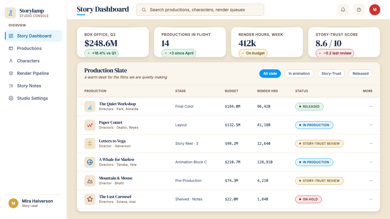
For web interfaces and dashboards, the Pixar Luxo approach requires resisting the temptation toward flat minimalism. The style works best when cards have visible but soft rounding, shadows carry the warmth of a lamp rather than the neutrality of a grey drop, and interactive states use the saturated brand accents at their full intensity. Pricing pages benefit from a deliberate narrative structure: each tier should feel like a chapter in a story, with the recommended option marked by a warm accent frame rather than a harsh contrast block. Navigation should be typographically led — wordmarks and labels in confident serif or complementary sans-serif — without icon-first visual pollution.对于网页界面与仪表板,皮克斯 Luxo 的应用需要抵制平面极简主义的诱惑。这种风格在卡片有可见但柔和的圆角、阴影携带台灯的温度而非中性灰调漫射、交互状态以全饱和度使用品牌强调色时效果最佳。定价页面受益于刻意的叙事结构:每个档位都应感觉像故事中的一个章节,推荐选项以温暖强调色边框而非刺眼对比色块标注。导航应以文字为主导——以自信的衬线或配套无衬线字体呈现的文字标识和标签——避免图标优先的视觉污染。
For editorial and marketing applications, the style supports strong feature storytelling. A Luxo-influenced article layout gives the body text room to breathe with wide margins and generous leading, uses pull-quote type set in the same confident serif at a much larger scale, and breaks sections with a warm-toned horizontal rule rather than a cold geometric line. Marketing pages work best when they honor the theatrical metaphor: alternating full-width sections between navy-on-cream and cream-on-navy, with the Pixar-blue or warm gold reserved exclusively for calls to action, creates the visual rhythm of a film's act structure — tension and release, dark and light.对于编辑与营销应用,这种风格支持强有力的特性故事叙述。受 Luxo 影响的文章版面给正文以充裕的呼吸空间——宽阔边距与慷慨行距——将引用文字以同款自信衬线字体设置于更大的比例,以暖调水平线而非冰冷几何线条区隔段落。营销页面在尊重戏剧性隐喻时效果最佳:全宽区块在「奶油底海军蓝字」与「海军蓝底奶油字」之间交替,将皮克斯蓝或暖金色专门保留给行动号召,创造出影片幕次结构般的视觉节奏——张力与释放,暗与明。
The most common mistake when applying Pixar Luxo is importing the warmth as sentimentality rather than precision. Warm does not mean soft, loose, or decoratively busy. Authentic Pixar visual work is highly disciplined: the warmth is delivered through palette and shadow temperature, not through decorative flourishes, gradient washes, or illustrative excess. A layout that multiplies rounded shapes, fills every surface with warm texture, and stacks script typefaces on top of serif headlines is not Pixar Luxo — it is a pastiche of warmth with none of the system's structural intelligence. Keep the geometry clean, keep the type hierarchy rigorous, and let the color temperature do the emotional work.应用皮克斯 Luxo 时最常见的错误,是将温度引入为感伤而非精准。温暖不意味着松散、随意或装饰繁复。真实的皮克斯视觉作品高度自律:温度通过色板与阴影温度传递,而非通过装饰花体、渐变色洗或插画过剩来实现。一个堆叠了大量圆角形状、在每个表面铺满暖色纹理、并将手写字体叠加在衬线标题之上的版面,不是皮克斯 Luxo——它是温度的仿制品,却没有这个体系任何的结构智识。保持几何形的清洁,保持文字层级的严谨,让色温来完成情感工作。
Pixar Luxo — FAQPixar Luxo · 常见问题
Is Pixar Luxo appropriate for B2B SaaS products, or is it too playful?皮克斯 Luxo 适合 B2B SaaS 产品吗,还是显得太过活泼?
The style is more versatile than the Pixar name suggests. When applied with editorial restraint — leading with the deep navy and cream rather than the brand red and gold, keeping type hierarchies rigorous, and limiting soft-rounded shapes to cards and containers rather than every element — Pixar Luxo reads as warm and trustworthy rather than playful. It is well-suited to products in categories where emotional connection and institutional credibility must coexist: HR platforms, education technology, family-facing financial products, and healthcare communications all benefit from a design language that communicates both authority and approachability. Where the style fails in B2B is when the warmth is overdone and the discipline collapses — the result reads as unserious.这种风格比皮克斯这个名字所暗示的更具适应性。当以编辑式克制应用时——以深海军蓝和奶油色为主导而非品牌红与金,保持严谨的文字层级,将柔和圆角形状限制在卡片与容器而非每个元素上——皮克斯 Luxo 读来是温暖可信而非活泼可爱。它非常适合那些情感连接与机构可信度必须并存的产品类别:人力资源平台、教育科技、面向家庭的金融产品,以及医疗健康传播,都受益于一种同时传达权威与亲切感的设计语言。该风格在 B2B 中失败的情况,是温度过度而纪律崩溃——结果读来不够严肃。
How does Pixar Luxo differ from Disney's broader visual identity?皮克斯 Luxo 与迪士尼更广泛的视觉身份有何不同?
Disney's visual identity is rooted in hand-drawn animation, fairy-tale iconography, and a decorative warmth built on scrollwork, ornate type, and the castle silhouette. Pixar Luxo is built on 3D volumetric form, editorial typography, and a warmth that comes from light temperature and shadow direction rather than ornament. Disney is associative and nostalgic; Pixar Luxo is precise and cinematic. When Disney acquired Pixar in 2006, the studio was specifically allowed to maintain its own visual and creative culture — the distinction was considered a competitive asset. In practical design terms, Disney's palette trends toward richer purples, magentas, and fantasy blues, while Pixar Luxo anchors on navy, cream, and that specific mid-blue of the Luxo lamp.迪士尼的视觉身份根植于手绘动画、童话图标语言,以及建立在涡卷装饰、华丽字体与城堡剪影之上的装饰性温度。皮克斯 Luxo 建立在三维体积形态、编辑级排印,以及来自光线温度与阴影方向而非装饰元素的温度之上。迪士尼是联想性和怀旧性的;皮克斯 Luxo 是精准和电影感的。2006年迪士尼收购皮克斯时,工作室被特别允许保持自身的视觉与创意文化——这种区别被视为竞争资产。在实际设计层面,迪士尼的色板趋向更丰富的紫色、品红与幻想蓝,而皮克斯 Luxo 锚定于海军蓝、奶油色,以及 Luxo 台灯那特定的中蓝色。
Can this style work in dark mode or on dark-background layouts?这种风格能在深色模式或深底色版面上使用吗?
Dark mode is possible but requires careful rebalancing. The canonical Pixar Luxo palette is light-ground — removing the cream base removes the single element that unifies all the warmth signals. On a dark ground, the Pixar-blue accent can read as cold, and the warm gold can tip into garish. A successful dark variant commits to a very deep, slightly warm navy as the ground rather than pure black, and treats the cream as a foreground type color rather than a background. The saturated accents appear only at key moments — primary call-to-action, active navigation state, hero headline emphasis. The cinematic shadow language reverses: glows and inner light replace cast shadows, as though the source of illumination is within the content rather than above it.深色模式是可能的,但需要仔细重新平衡。皮克斯 Luxo 的经典色板是浅底色——移除奶油色底面,就移除了统一所有温度信号的那个单一元素。在深色底面上,皮克斯蓝强调色可能读来冰冷,暖金色可能滑向俗艳。成功的深色变体以非常深但略带暖意的海军蓝作为底面,而非纯黑,并将奶油色视为前景文字色而非背景色。饱和强调色只在关键时刻出现——主要行动号召、激活导航状态、英雄标题强调。电影感阴影语言随之反转:发光与内透光取代投射阴影,仿佛光源在内容之内而非之上。
What makes Pixar Luxo feel cinematic rather than just warm?是什么让皮克斯 Luxo 感觉像电影感而不仅仅是温暖?
The cinematic quality comes from three specific decisions that most warm design systems do not make. First, the shadow direction is consistent and purposeful — all shadows in a layout point toward the same implied light source, creating a unified sense of space rather than elements floating independently. Second, the typographic scale differentials are theatrical rather than modest: a hero headline might be many times the size of body copy, creating the kind of visual drama that a film's title card achieves against an opening scene. Third, there is always a clear focal point — one element that the composition is organized to deliver the eye to, the way a film director stages a scene so the audience knows what to look at. Without these three elements, warmth is just coziness. With them, it becomes a designed experience with a beginning, a middle, and an end.电影感来自大多数温暖设计体系不会做的三个具体决定。第一,阴影方向是一致且有意为之的——版面中所有阴影都指向同一隐含光源,创造出统一的空间感,而非各元素各自漂浮。第二,文字尺度差异是戏剧性的而非谦逊的:主标题可能是正文的许多倍大,创造出电影片名字幕卡在开场场景前所实现的那种视觉张力。第三,总有一个清晰的焦点——构图被组织来将视线引向的那一个元素,如同电影导演为一个场景调度,让观众知道该看哪里。没有这三个元素,温暖只是舒适感。有了它们,便成为一段有开始、中间与结尾的被设计的体验。
Does the style require character illustration, or can it work with photography?这种风格需要角色插画吗,还是可以与摄影配合使用?
Photography is compatible with Pixar Luxo but requires specific treatment. The canonical Pixar aesthetic is illustrated — volumetric character art with readable expression and warm local color — but photography that is color-graded toward the same warmth (golden hour light, shallow depth of field that softens backgrounds toward the cream palette ground) integrates well. The key constraint is that photography must carry the same light-temperature story as the rest of the layout. A cold, high-contrast, or editorial-documentary photograph will conflict directly with the warmth of the typographic and color system. When in doubt, apply a warm grade, crop to emphasize human expression over environment, and treat the photograph as a light source within the composition rather than a window to a separate visual world.摄影与皮克斯 Luxo 兼容,但需要特定处理。皮克斯的经典美学是插画性的——具有可读表情与温暖固有色的体积感角色艺术——但经过相同温度调色的摄影(黄金时段光线、将背景柔化至与奶油色板底面契合的浅景深)能够良好融合。关键限制是摄影必须承载与版面其余部分相同的光线温度叙事。一张冰冷、高对比度或编辑纪录片风格的照片将与排印和色彩体系的温度直接冲突。拿不准时,应用暖色调,裁切以强调人物表情而非环境,并将照片视为构图中的一个光源,而非通向另一个视觉世界的窗口。
Related design styles相关设计风格
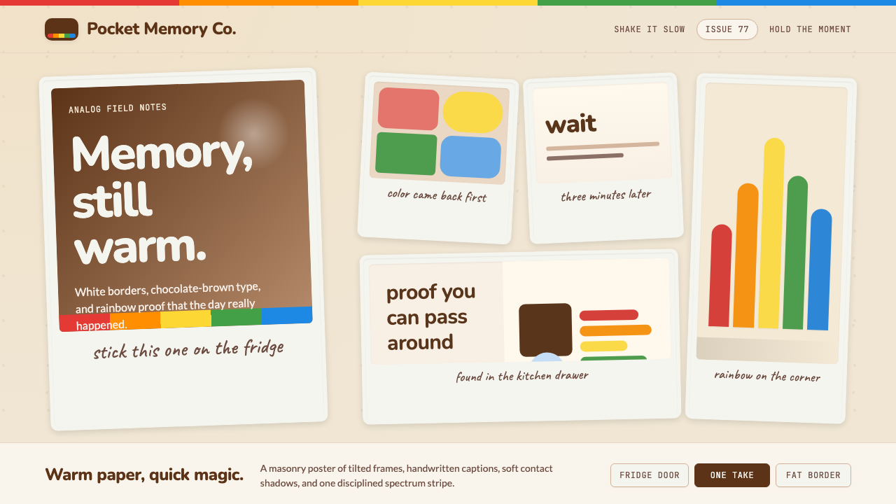 Polaroid InstantMemory made tangible. Photo-white frames tilt on aged paper with a warm rainb…记忆变得可触:相纸白边倾斜在旧纸底上,彩虹条点亮温度。
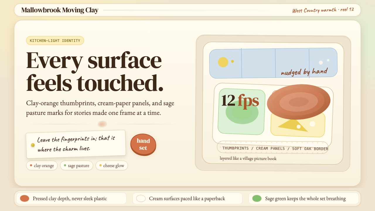 Aardman ClaymationHandmade warmth, visibly touched. Clay-orange panels, Caveat notes, thumbprin…手作温度可见:陶土橙面板、手写便签与指纹几何。
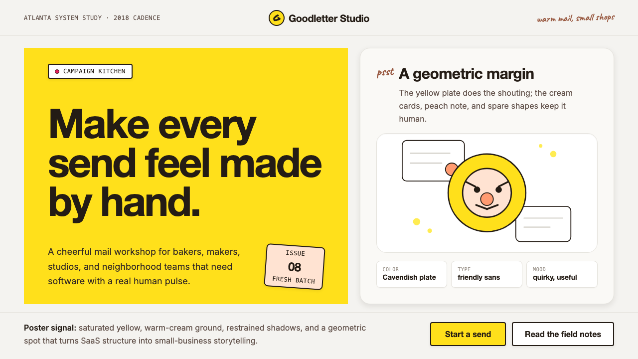 Mailchimp Freddie-YellowFriendly software, handmade. Cavendish yellow blocks and warm geometric masco…友善而手作。卡文迪许黄块与几何吉祥物撑起温暖版面。
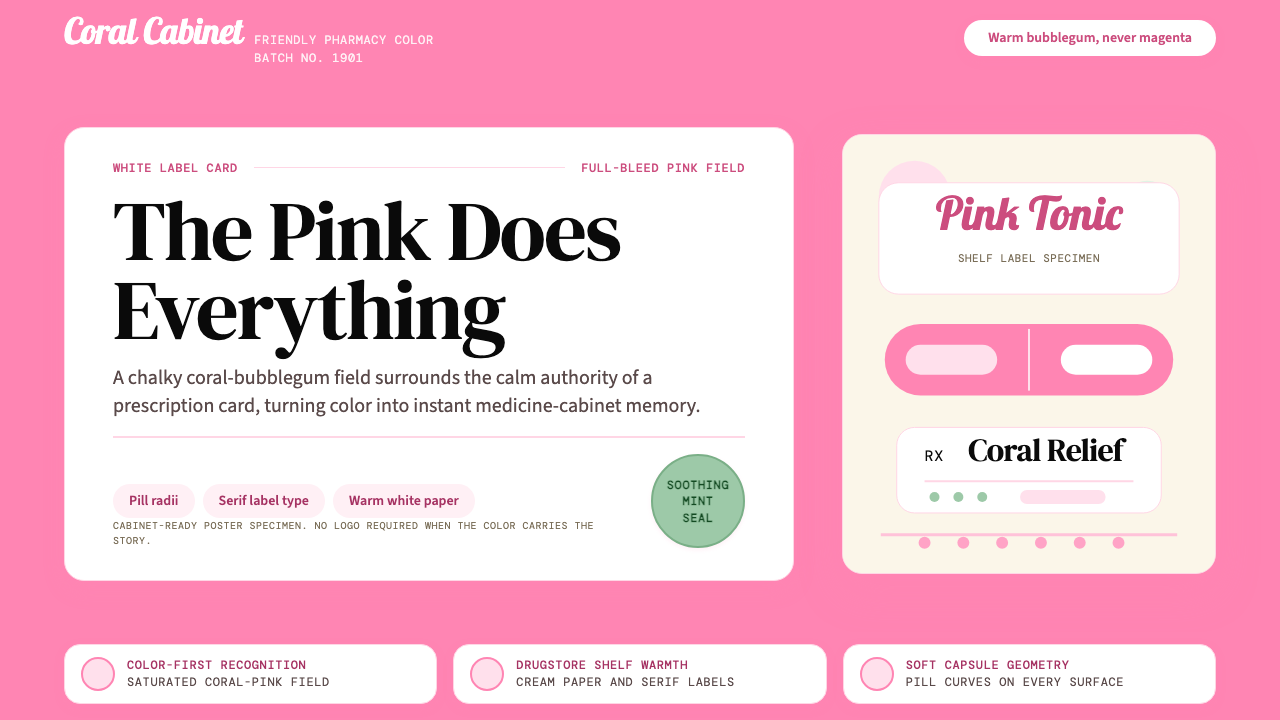 Pepto-Bismol Pink (1901)Color is the cure. Bubblegum pink floods the field; white label cards and pil…颜色就是招牌:泡泡糖粉铺满画面,白色标签卡和药丸弧度稳住信任。
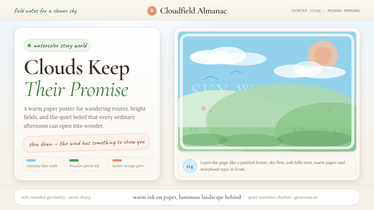 Studio Ghibli (Miyazaki)Hand-painted wonder breathes. Cumulus blue, meadow green, and Cormorant type…手绘奇境会呼吸:积云蓝、草甸绿与Cormorant字体让页面放慢。
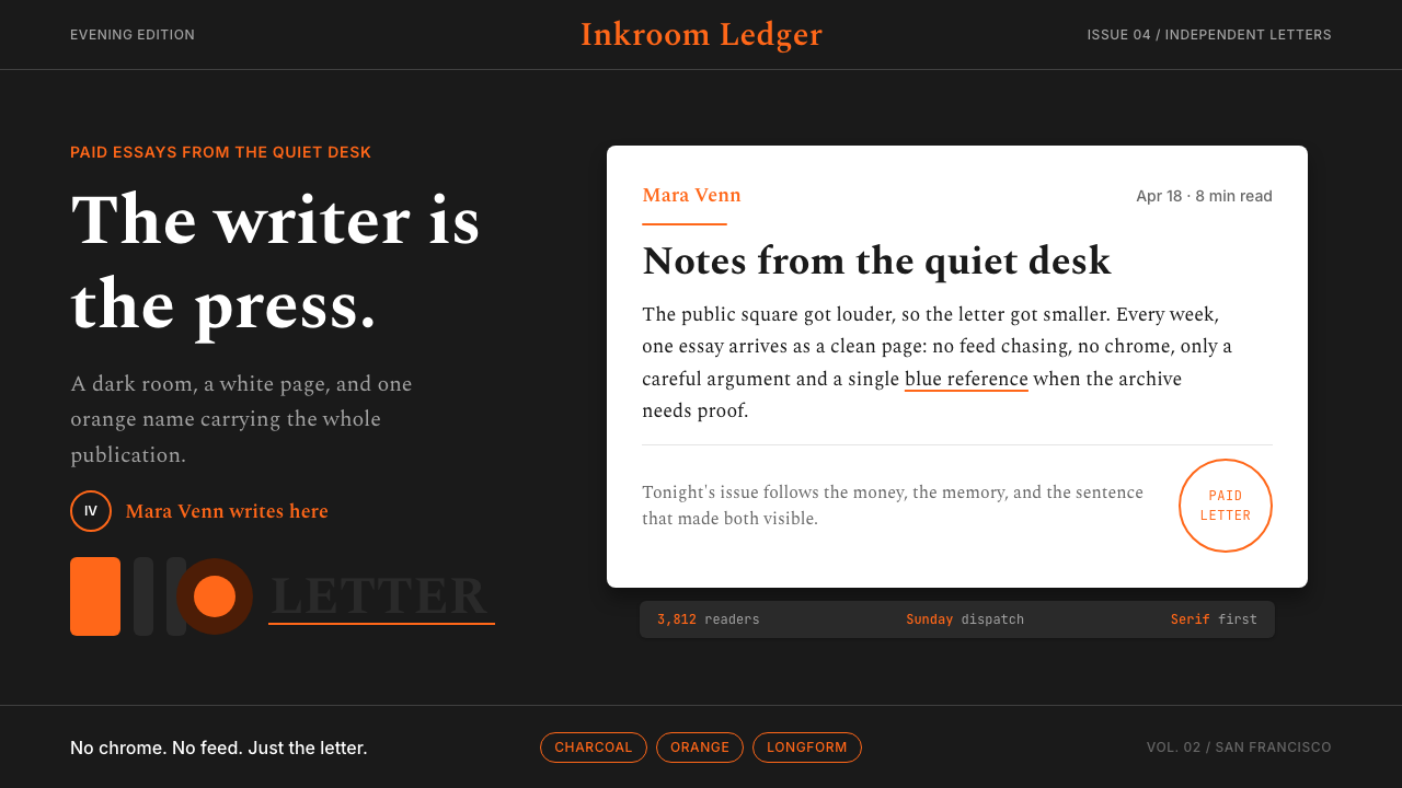 Substack Orange NewsletterLit page, dark room. Orange serif bylines ignite white cards on charcoal.暗室里的亮页。橙色衬线署名点燃炭黑上的白卡。