What is One Piece (Grand Line Adventure)?
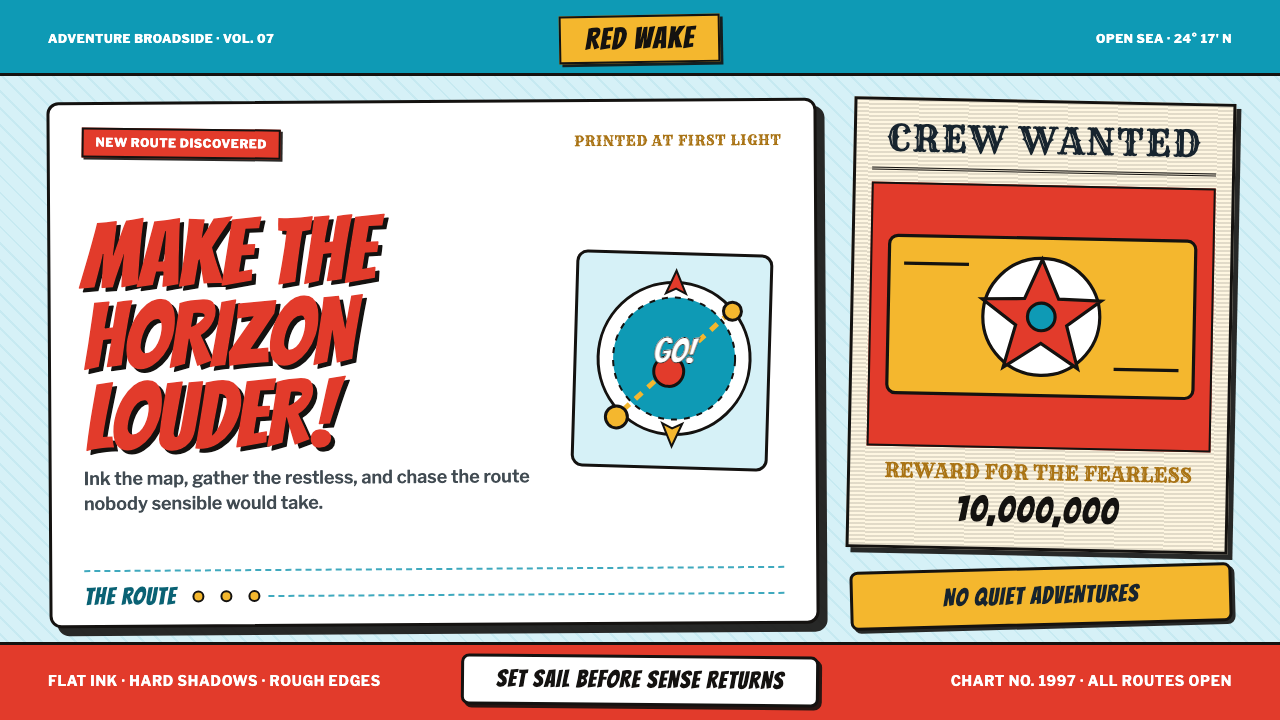
One Piece turns the high-seas adventure into a roaring pinboard of vermilion hats, black flags, gold treasure, and cyan charts that never quite hold still.
One Piece (Grand Line Adventure) in brief
One Piece is Eiichiro Oda’s high-seas epic, first reduced here to its most emphatic visual signals: straw-hat vermilion, jolly-roger black, treasure gold, and cyan nautical charts scattered with small islands. The style does not pursue quiet refinement. It stages adventure as an interruption, with large hand-inked marks, comic impact, and a sense that every surface has already survived rough weather.
Its visual language draws on shōnen manga, high-seas adventure serials, Golden-Age-of-Piracy pastiche, and hand-lettered comic sound effects. These references combine into a world where information is announced rather than politely presented. Headlines behave like shouts, bounty figures feel stamped rather than typeset, and decorative objects appear as evidence of a crew’s ongoing voyage rather than as neutral interface furniture.
Nothing in this style is expected to sit perfectly straight. Borders wobble, poster corners tear and curl, maps drift toward unstable horizons, and black outlines give every object the force of a brushstroke. The result is deliberately unruly, but not random: vermilion catches attention, black establishes graphic force, gold signals treasure, and cyan keeps the imagined sea visibly present beneath the noise.
Where does One Piece (Grand Line Adventure) come from?
The source point is Tokyo, Japan, where One Piece began as a manga in Weekly Shōnen Jump in July 1997. Its anime adaptation followed from 1999. The design language belongs to an ongoing adventure serial rather than a closed historical movement: it accumulates signs, posters, maps, flags, and marks as if each new episode has added another object to the crew’s visual archive.
Shōnen manga supplies the style’s forward charge. It favors immediate readability, exaggerated gesture, expressive headline energy, and marks that can carry excitement before the reader has processed every word. In a One Piece-inspired layout, this becomes splash-scale typography, emphatic punctuation, dense black contouring, and compositions designed to feel as though they have burst into the frame.
High-seas adventure serials and Golden-Age-of-Piracy pastiche provide the material vocabulary: jolly rogers, bounty notices, treasure cues, rough paper-like poster behavior, and hand-drawn maps marked by islands and an unsettled horizon. The style borrows the romance of pirate ephemera without becoming a museum reconstruction. Its world is comic, loud, and visibly assembled by hand.
Hand-lettered comic sound effects complete the system. They make words behave as physical events, capable of crashing, stamping, stretching, or exploding across a surface. This is why the style can sustain both detailed maps and oversized headlines: the map establishes a voyage, while the lettering supplies the immediate sensation that something dramatic has just happened.
What defines the One Piece (Grand Line Adventure) look?
Adventure Palette
Vermilion, jolly-roger black, treasure gold, and chart cyan form the core palette. Vermilion should arrive first and loudly; black gives marks their inked authority; gold acts as a reward signal; cyan opens a route through the composition. These colors work as narrative cues, not as neutral decoration.
Ink and Outline
Hard black ink defines the style. Forms are enclosed by fat brush-like outlines that make type, icons, posters, and map fragments feel cut from the same illustrated world. A clean, delicate contour weakens the effect; the line should look energetic, visible, and willing to wobble.
Splash Typography
Headlines should feel like manga splash moments: oversized, emphatic, and charged by exclamation-mark energy. Lettering may lean, swell, or collide with nearby objects, but it must remain legible. The point is not disorder for its own sake; it is to make a message arrive with the force of an adventure announcement.
Battered Ephemera
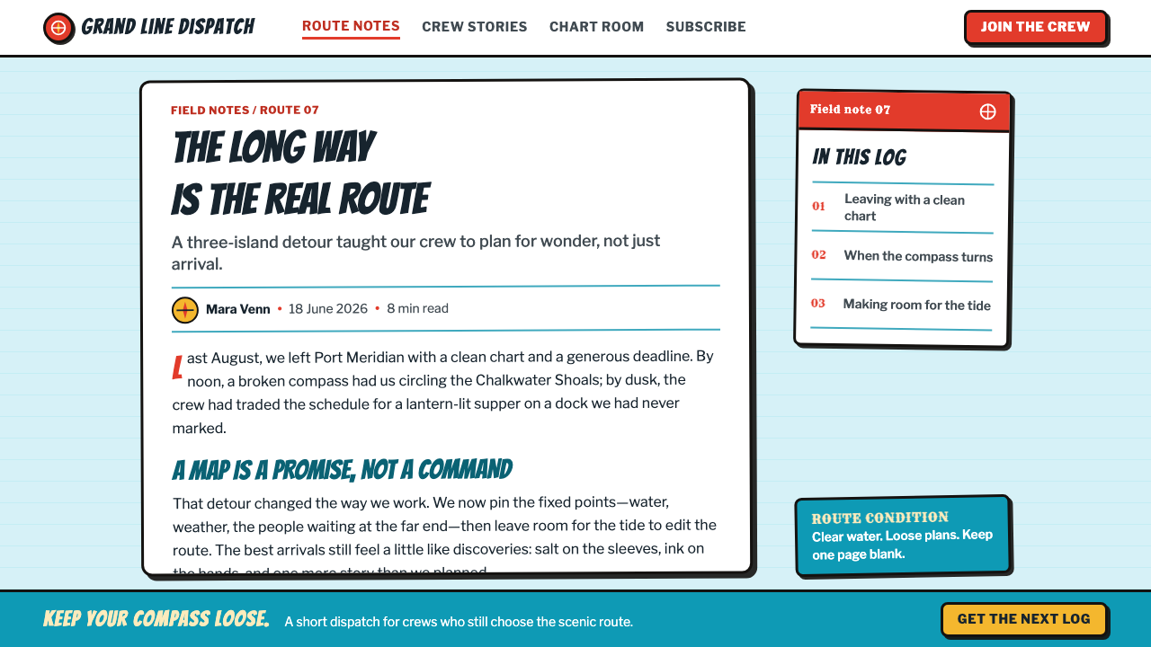
WANTED posters, stamped bounty figures, torn corners, and curled edges make the page feel handled and travelled. These details should suggest a pirate crew’s pinboard rather than generic vintage decoration. Wear belongs at the perimeter and in the printed marks, preserving a clear center for the primary message.
Cyan Charts
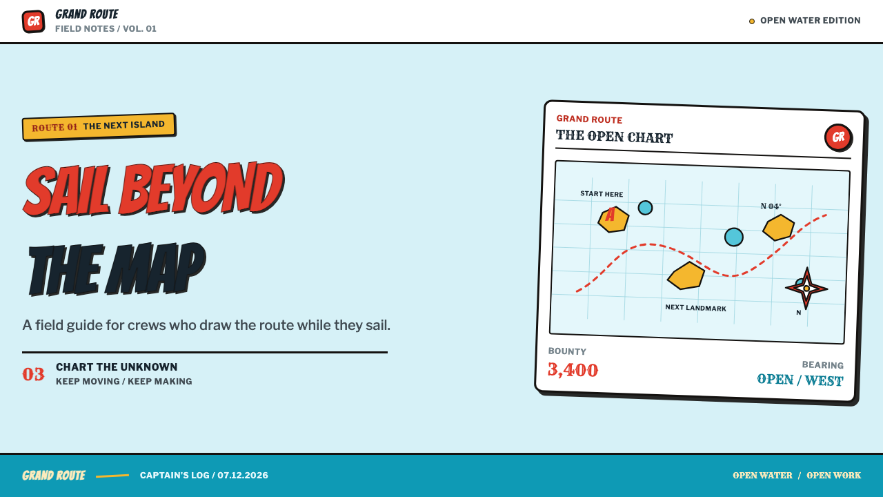
Hand-inked cyan charts provide the quiet countercurrent beneath the louder marks. Small islands, routes, and shifting horizons give backgrounds a navigational purpose. They should read as a chart first and a texture second, with enough open water that the red, black, and gold elements can remain decisive.
Unsettled Composition
Straightness is intentionally refused. Borders wobble, posters tilt, and the horizon does not settle into a calm baseline. This instability creates motion and comic tension. It works when one element still anchors the page, such as a dominant headline, a flag-like black mass, or a clearly framed bounty notice.
Who shaped One Piece (Grand Line Adventure)?
Oda is identified in the source material as the creator of One Piece’s high-seas epic. The style begins with the visual signals attached to that epic: the straw hat, pirate flag, treasure, island chart, hand-inked contour, and restless adventure atmosphere.
Nakashima is listed among the source material’s key figures. Within this educational theme, that listing places the name alongside the broader One Piece visual world, whose public-facing language is built from manga-scale energy, pirate motifs, and forceful hand-drawn marks.
Shimizu is listed among the key figures provided for the theme. The available material connects the theme to an anime that has continued from 1999, extending the manga’s loud adventure signals into a long-running visual environment.
Tanaka is included in the supplied key-figure list. The source material frames the One Piece world as an emphatic adventure serial, where the energy of a headline, a stamp, a flag, or a chart contributes to a shared sense of forward motion.
How do you use One Piece (Grand Line Adventure) today?
For presentation covers, use the style as a single explosive entrance. Let a vermilion headline or straw-hat-like accent establish the first read, then support it with a black flag mass, a gold treasure cue, or a cyan map field. Keep the title dominant enough that the collage remains an announcement rather than becoming a pile of props.
Content and data slides benefit from assigning distinct jobs to the visual vocabulary. Use cyan charts or route lines as a background structure, black ink for labels and dividers, vermilion for the central claim, and gold for a highlighted reward, milestone, or finding. Data should still be readable at a glance; comic energy must sharpen the story rather than conceal the values.
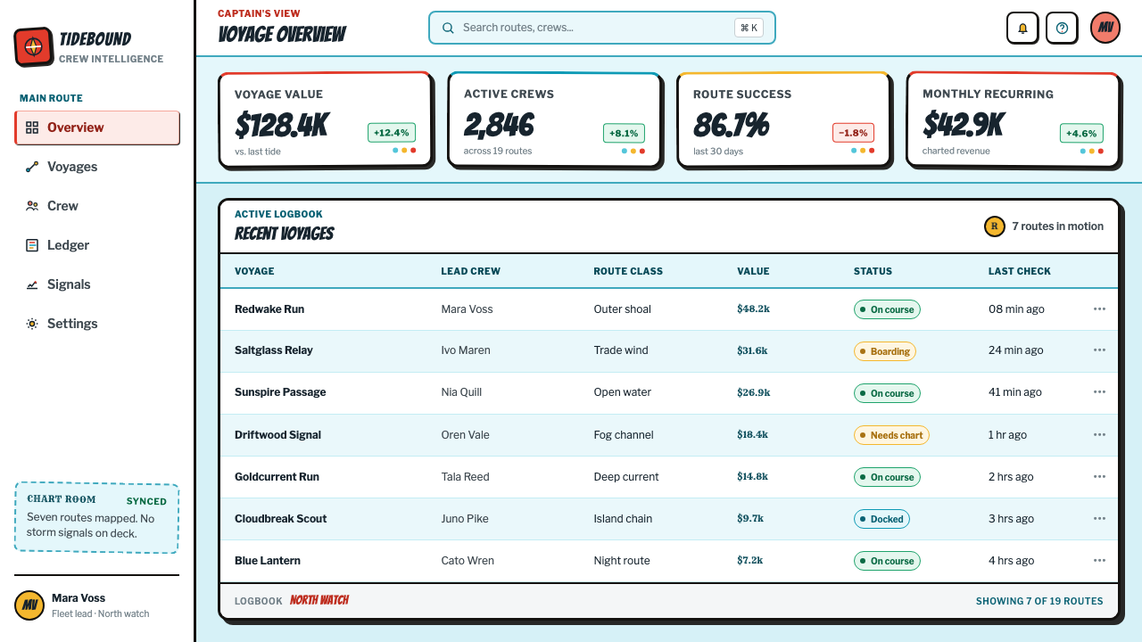
For web interfaces, the style suits dashboards, progress views, collection pages, and pricing experiences that can credibly frame action as a voyage. Navigation can borrow the clarity of map routes and bounty notices, while alerts and key calls to action can carry the impact of a vermilion splash. Preserve generous quiet areas around operational information so the interface remains usable.
For editorial and marketing work, build pages as a crew pinboard. Layer a hero statement with a tilted poster, a map fragment, a stamped figure, and a few island-like details, then let subsequent sections alternate between dense illustrated moments and calmer reading zones. The best compositions feel assembled during a journey, not arranged in a pristine showroom.
The common mistake is to treat every element as a shout. If vermilion, gold, black ink, cyan charts, torn posters, giant lettering, and comic marks all compete at once, the adventure becomes visual fatigue. Choose one primary dramatic event per section, then let the remaining motifs establish place, texture, and direction.
One Piece (Grand Line Adventure) — FAQ
Is this style simply pirate-themed vintage design?
No. Pirate ephemera is important, but the defining combination is manga-splash energy plus nautical adventure. A generic old-paper treatment misses the forceful outlines, shouted typography, cyan chart logic, and unstable composition that make the theme feel like One Piece rather than a period display.
Can the style work without a map?
Yes, provided the composition retains a clear sense of voyage through other signals: a flag, bounty poster, treasure cue, island silhouette, or directional comic mark. A cyan chart is especially useful because it gives the visual noise a navigational layer, but it is not the only route into the style.
How should typography behave in a more practical interface?
Reserve the loudest splash behavior for titles, major actions, and pivotal moments. Routine labels, tables, controls, and explanatory copy should remain direct and stable, supported by black ink contrast and clear grouping. The style succeeds when excitement is concentrated at decision points rather than spread across every word.
What makes the distressed poster treatment feel convincing?
Damage should imply use: pinned, stamped, carried, folded, or weathered during a voyage. Keep it attached to meaningful objects such as WANTED notices and bounty figures. Random tears and wear across every surface turn the style into a generic texture exercise and weaken the narrative purpose.
Related design styles
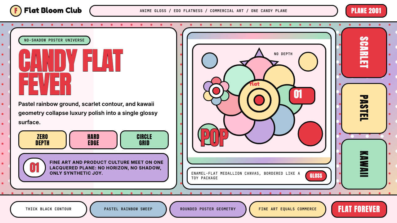 Takashi Murakami SuperflatJoy has no depth. Pastel rainbow, scarlet accents, and black contours flatten…
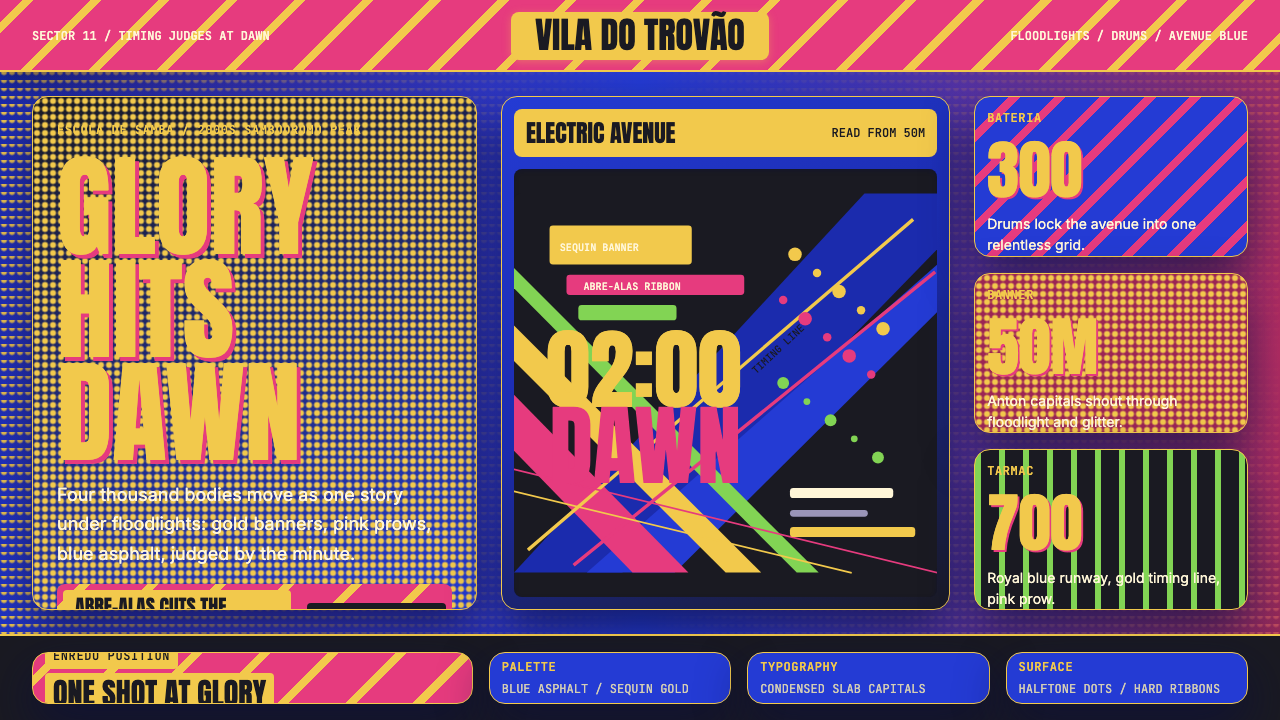 Brazilian Samba School (2000s Carnaval)Parade at floodlight volume. Royal blue asphalt, sequin gold type, pink ribbo…
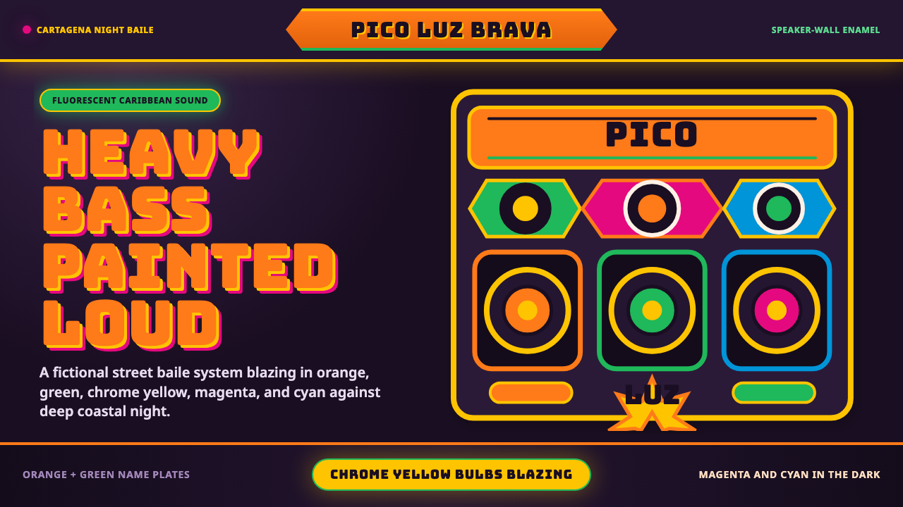 Champeta Picó SoundLoud after dark. Orange-green banners and fat Bungee type glow like a speaker…
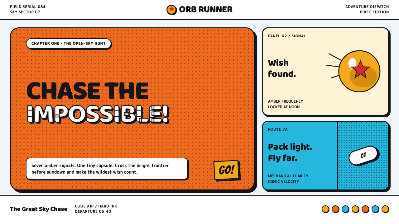 Dragon Ball (1984)Adventure lands with comic force. Gi-orange panels, amber spheres and crisp h…
 The Grinch Green Fur 2000Green that glows in the dark. Kelly-to-lime fur on blue-black Whoville night,…
 Behance Maximalist PortfolioPortfolio volume at max. Electric blue, coral and lime stack into a full-blee…