What is Crayola (1903)?
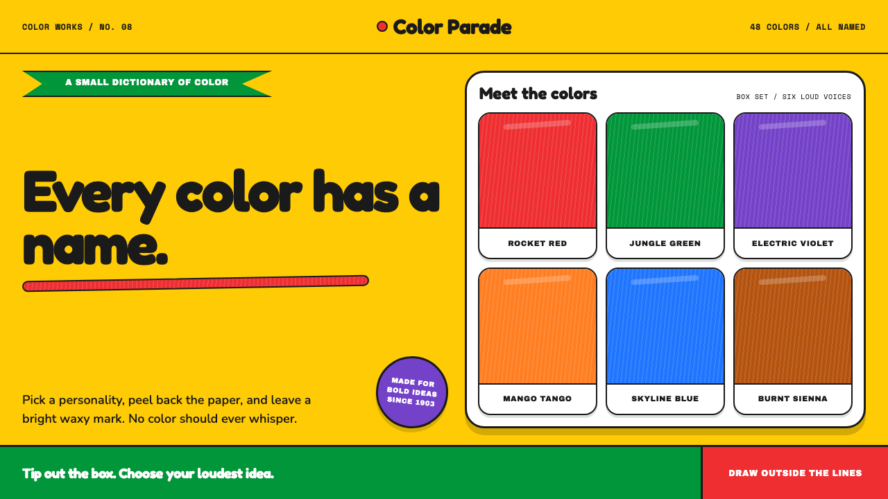
Crayola turns color into an invitation: a golden box, a green slash, waxy marks, and names vivid enough to feel like characters.
Crayola (1903) in brief
Crayola is a childhood design system built around a yellow-and-green box. Its visual identity is immediate: a saturated golden field, a bold green chevron crossing the package, and orderly rows of wax sticks wrapped in paper labels. The package does not treat color as a neutral supply. It presents color as something to collect, choose, name, and use.
The character of the style comes from material as much as layout. A Crayola stroke is slightly translucent and visibly streaky, allowing the grain of the paper to remain part of the image. Big rounded forms, thick assured outlines, hand-labeled color chips, and emphatic swatches make the work feel direct rather than polished into abstraction. The visual language wants the hand to be present.
Naming is central to the system. Colors such as Burnt Sienna, Periwinkle, and Macaroni and Cheese do more than identify hues: they give each stick a small personality. The result is a design language that refuses restraint. Color does not sit quietly in the background; it speaks first, carries mood, and makes drawing feel like play.
Where does Crayola (1903) come from?
Crayola’s first box appeared in 1903, with its origin rooted in Easton, Pennsylvania, in the United States. The source material places the brand within American consumer-product packaging, mid-century childhood design, and retail color-branding. This is important because the style is not simply an illustration look applied afterward: the box is the organizing object from which its colors, labels, marks, and emotional tone extend.
The golden-box era, continuing through the 1950s and 1960s, established the package as the system’s most recognizable stage. Golden yellow provides the broad field; green cuts decisively across it; the colored sticks form a visible inventory inside. The combination gives an ordinary retail object a compact visual drama. It can be recognized as packaging before it needs to explain itself in words.
Edwin Binney, C. Harold Smith, and Alice Stead Binney are identified in the source material as key figures in Crayola’s origin. Their presence grounds the style in a named product history rather than an anonymous generic idea of childhood. The theme’s enduring force comes from this particular combination of package, material, and naming: color is made tangible as a stick, legible as a label, and memorable as a phrase.
As a public-facing design language, Crayola belongs to a retail world in which the product must be visible, appealing, and easy to choose. Yet its strongest quality is not sales polish. The package preserves the anticipation of tipping a box onto a table and selecting a color by instinct. Its visual cues make that moment feel abundant: a field of color, a green directional gesture, and many distinct names waiting to become marks.
What defines the Crayola (1903) look?
Golden Field and Green Slash
The signature composition begins with a saturated golden field interrupted by a strong green chevron. The yellow feels open, sunny, and product-like; the green supplies direction and contrast. Together they create an immediate package signal that is more energetic than a quiet neutral ground and more graphic than a conventional decorative border.
Named Color Personalities
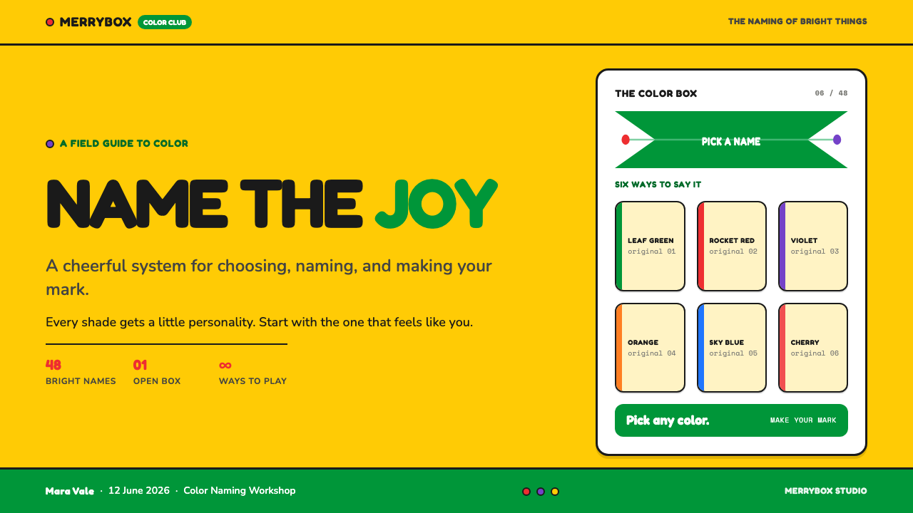
Each color should be treated as a character rather than a faceless swatch. Specific names make the palette conversational and memorable, transforming selection into a small act of imagination. The label is therefore not secondary packaging copy; it is part of the visual experience, as necessary to the style as the color itself.
Waxy Mark-Making
The ideal mark is not perfectly opaque or mechanically smooth. It is slightly translucent, streaked, and willing to reveal the paper beneath it. This material imperfection carries warmth: the image records pressure, direction, overlap, and the physical movement of drawing rather than disguising them.
Rounded Confidence
Forms are large, rounded, and easy to recognize at a glance. Their friendliness does not mean timidity. Thick, confident outlines give soft shapes an assertive presence, making them suitable for playful icons, labels, illustrations, and display moments that need to feel immediately approachable.
Visible Labels and Chips
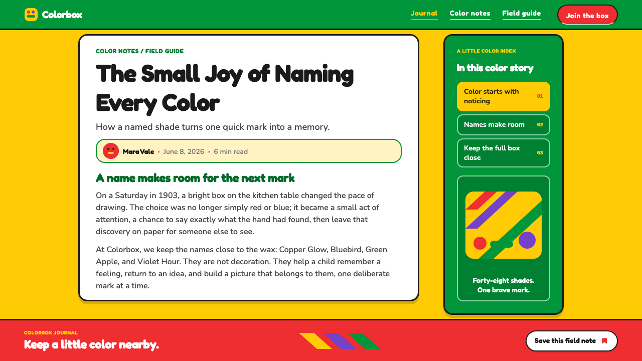
Paper labels and color chips should remain visibly descriptive rather than disappearing into an invisible interface. They make the palette feel handled and sortable. A swatch can function as evidence of a real drawing tool, while its accompanying name turns the color into a piece of language with its own mood.
Unquiet Palette
Crayola color is saturated and unapologetic. The palette is designed to be noticed, not merely to support content from a distance. Its power comes from letting a few strong colors occupy clear roles, while preserving enough open space for individual swatches, labels, and strokes to retain their separate identities.
Who shaped Crayola (1903)?
Edwin Binney is listed as a key figure in Crayola’s origin. Within this theme, that association points back to the product’s beginnings in Easton and to a system where a retail box, its color sticks, and their labels are designed as one coherent experience.
C. Harold Smith is identified among the key figures connected with Crayola’s origin. The name belongs to a history defined here by American consumer-product packaging and retail color-branding, where the way color is presented is inseparable from the pleasure of choosing it.
Alice Stead Binney is also named as a key figure in the origin material. Her inclusion helps locate the style in a specific product story: not color in the abstract, but a box of labeled wax sticks whose distinct names and marks invite a childlike, hands-on response.
How do you use Crayola (1903) today?
For presentation covers, use the golden-and-green package logic as a single decisive opening gesture. Let one broad warm field establish the stage, then introduce a green directional form and a compact cluster of waxy color marks. The title should feel labeled rather than ceremonially typeset. On content slides, retain generous room around short ideas, using rounded callouts, visible color chips, and thick outline motifs to keep information tactile.
Data slides work best when they preserve the sense that colors are individual tools rather than anonymous categories. Give series memorable verbal labels, keep forms broad and readily distinguishable, and let strokes or fills retain a slight handmade quality. The goal is not a literal reconstruction of a crayon drawing; it is to make comparison feel friendly, legible, and physically graspable.
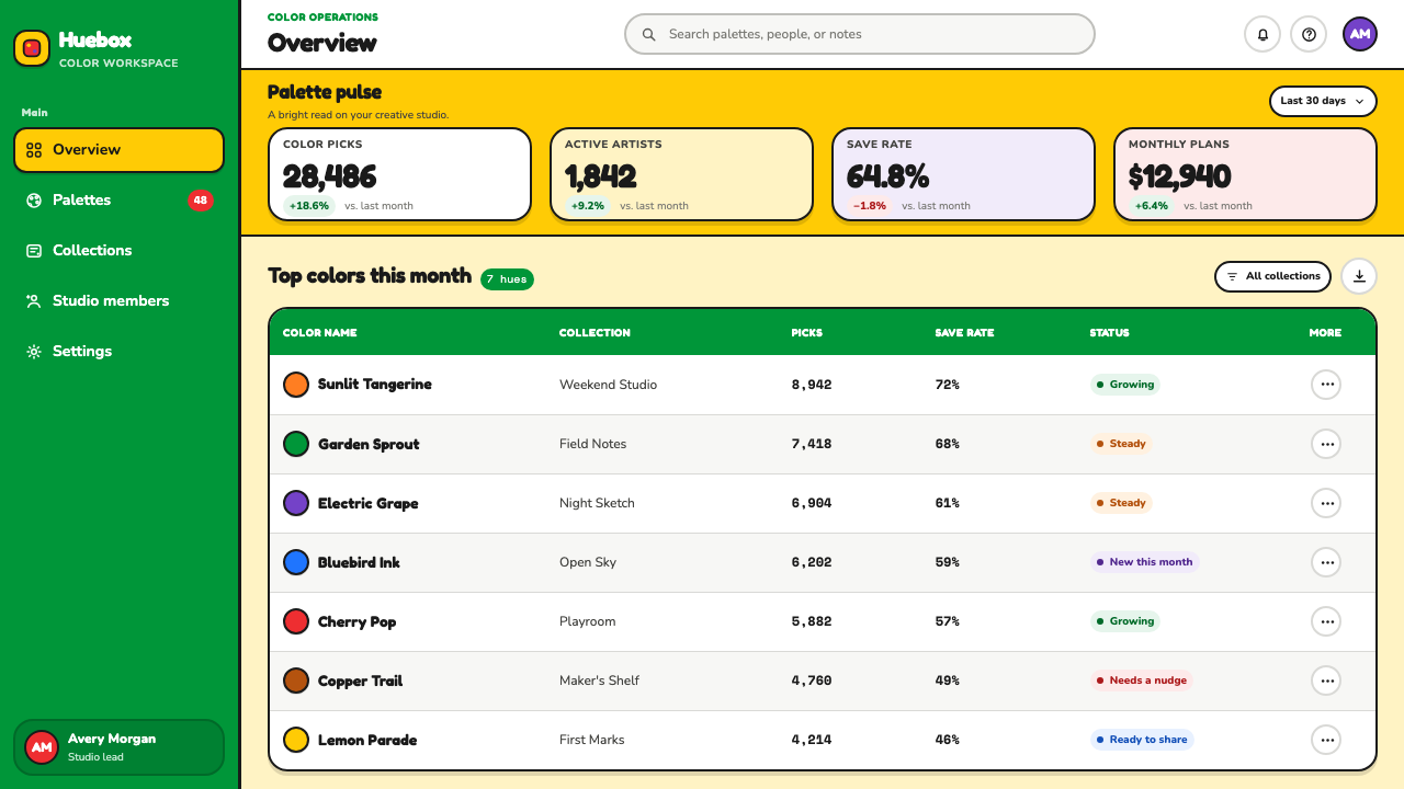
For web interfaces, the style suits creative dashboards, educational tools, color pickers, and product pages where choosing and exploring are central actions. A golden field can establish brand presence, while a green diagonal gesture can guide attention through a section. Color names deserve prominent treatment in filters, cards, states, and detail views, especially when the interface asks people to browse, compare, or save visual options.
On pricing pages and marketing surfaces, use the packaging idea as an organizing metaphor. A bold field frames the offer, named options appear as distinct sticks or chips, and rounded outlined panels make choices feel tangible. Editorial pages can use hand-labeled callouts, waxy underline marks, and generous color swatches to introduce sections without losing reading clarity. The strongest applications preserve the invitation to pick something up and begin.
The common mistake is reducing Crayola to random bright colors. Saturation alone does not create the style. Without named personalities, a visible material mark, the yellow-and-green package tension, and room for each hue to stand apart, the result becomes noisy generic childhood graphics. Avoid making every surface compete. Choose a clear leading field, allow a few colors to speak loudly, and let labels make them memorable.
Crayola (1903) — FAQ
Is Crayola style just a bright-color palette?
No. Bright color is necessary but insufficient. The style also depends on the golden field and green chevron, named color personalities, waxy and slightly streaky marks, bold rounded forms, and labels that remain visibly part of the composition. Color becomes distinctive because it is handled as material and language at once.
Does the style need to look like a literal crayon drawing?
Not necessarily. A faithful application can borrow the visible wax quality, confident outline, labeling behavior, and playful selection logic without imitating every mark literally. The essential point is to preserve tactility and choice: viewers should feel that colors are things they can recognize, name, and reach for.
Why are color names so important in this visual language?
The names turn a palette into a cast of personalities. Burnt Sienna, Periwinkle, and Macaroni and Cheese suggest that color is not merely a technical attribute. A memorable label creates mood before a mark is even made, and it makes the product’s visual system feel more conversational, collectible, and imaginative.
Where does Crayola-inspired design work best?
It works best where discovery, learning, making, and selection should feel welcoming: creative tools, educational products, color-focused experiences, playful dashboards, presentations, and expressive marketing. It is less suited to contexts that require a hushed or highly formal tone, because the source language is intentionally vivid, tactile, and unwilling to whisper.
Related design styles
 Haribo Goldbears (1922)Childhood joy, precision-molded. Glossy fruit colors tumble across a foil-gol…
 Oreo (1912)Contrast you can feel. Cocoa-black discs and milk-white rings turn every surf…
 Pink Flamingo Lawn OrnamentLoud on purpose. Hot flamingo pink staked into lawn green, glossy molded plas…
 Populuxe Atomic AgeThe future grins. Mint Formica, tomato-red pills, Cooper Black, and atomic st…
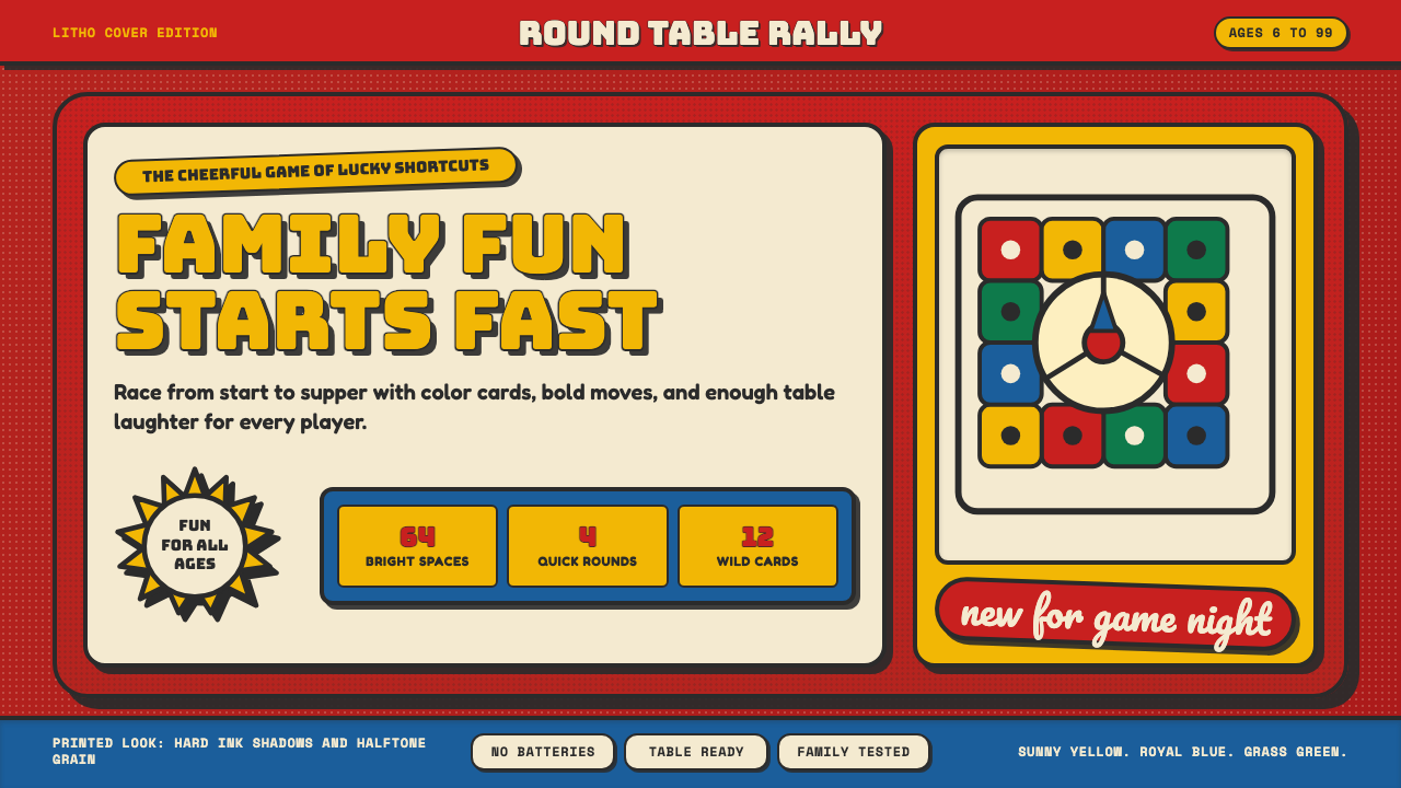 Vintage Board Game BoxShelf appeal shouts. Fire-engine red, Bungee lockups, yellow bursts, and ink…
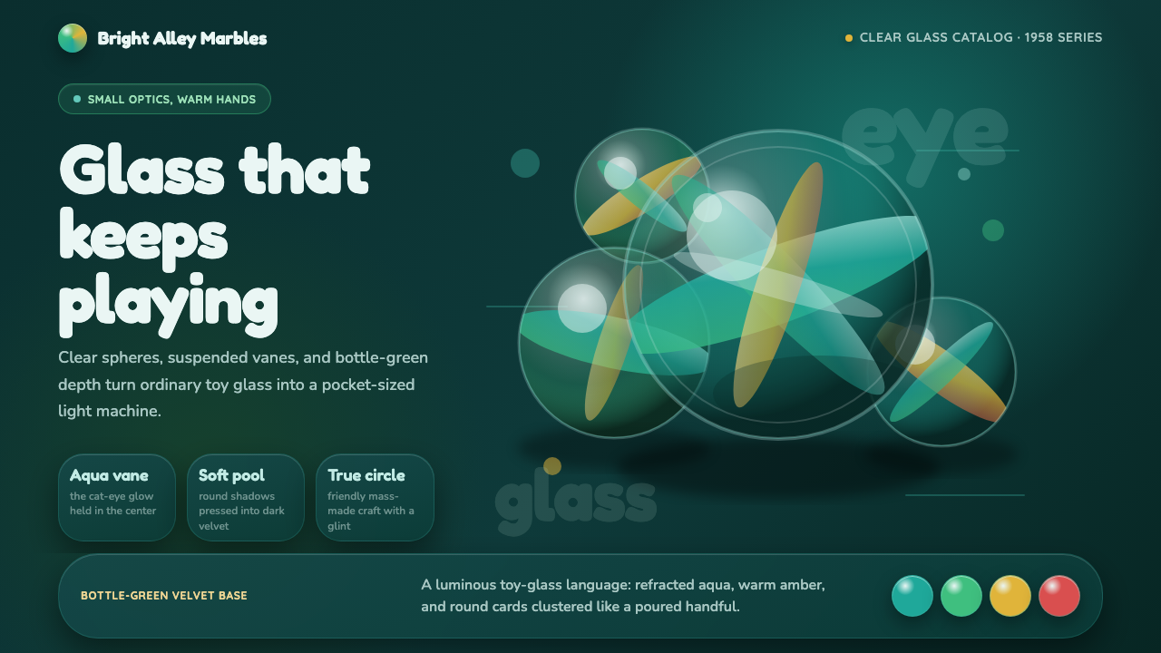 Cat's Eye MarblesMass-made glass feels magical. Aqua vanes glow inside round forms on bottle-g…