What is Haribo Goldbears (1922)?
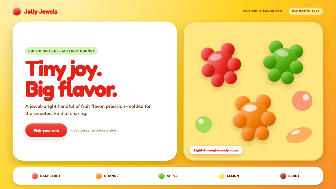
Haribo Goldbears turns a torn-open golden candy bag into a design language: translucent fruit color, rounded forms, and a grin built into every surface.
Haribo Goldbears (1922) in brief
Haribo Goldbears is a brand-derived visual language built around the sensation of opening the familiar golden pouch. A warm foil-like gold field provides the stage, while fruit-colored elements feel as if light is passing through candy rather than resting on an opaque printed surface. The result is bright, tactile, and immediately edible in mood.
Its central visual promise is softness. Buttons behave like pills, cards swell into rounded blobs, and interface elements should appear poured onto the page rather than mechanically arranged. Gloss is gentle and localized, catching an edge or curved face like moisture on a gummy bear. Hard corners, severe shadows, and brittle geometry work against the premise.
Typography supplies the personality. Display lettering is chunky, inflated, rounded, and cheerful, with raspberry-red letterforms gaining unusual energy against the gold ground. The style does not pursue restraint or cool distance. It pursues the precise, manufactured delight of candy: polished enough to feel iconic, playful enough to feel instantly approachable.
Where does Haribo Goldbears (1922) come from?
The language begins with Haribo’s first Tanzbär gummy bear in 1922. Its stated place of origin is Bonn, specifically Kessenich, Germany, and the source frames the product’s beginning in Hans Riegel’s Bonn kitchen. That origin matters visually: the design is not abstract confectionery luxury, but a compact promise of childhood pleasure made repeatable through molding, color, and packaging.
Hans Riegel Sr., Gertrud Riegel, and Hans Riegel Jr. are identified as the key figures connected to this history. Their presence anchors the theme in a family-name brand rather than an anonymous candy category. For a designer, that gives the style a useful distinction: it should feel recognizable and consistent, as though every cheerful element belongs to the same bag, rather than merely borrowing generic sweet-shop decoration.
The source places Goldbears within German Wirtschaftswunder consumer branding, mid-century mascot advertising, and candy-shelf pop packaging. These references explain the style’s directness. It wants immediate shelf recognition, vivid emotional recall, and a mascot-like friendliness that can be understood before any body copy is read.
The Goldbears wordmark was modernized across the 1960s and 1970s, while the current visual language continues through today. This is why the theme can combine nostalgic warmth with clean contemporary interface behavior. It should not imitate an old package as a museum object; it should preserve the pouch’s gold, fruit translucency, rounded lettering, and scattered-candy joy in a living system.
What defines the Haribo Goldbears (1922) look?
Foil-Gold Ground
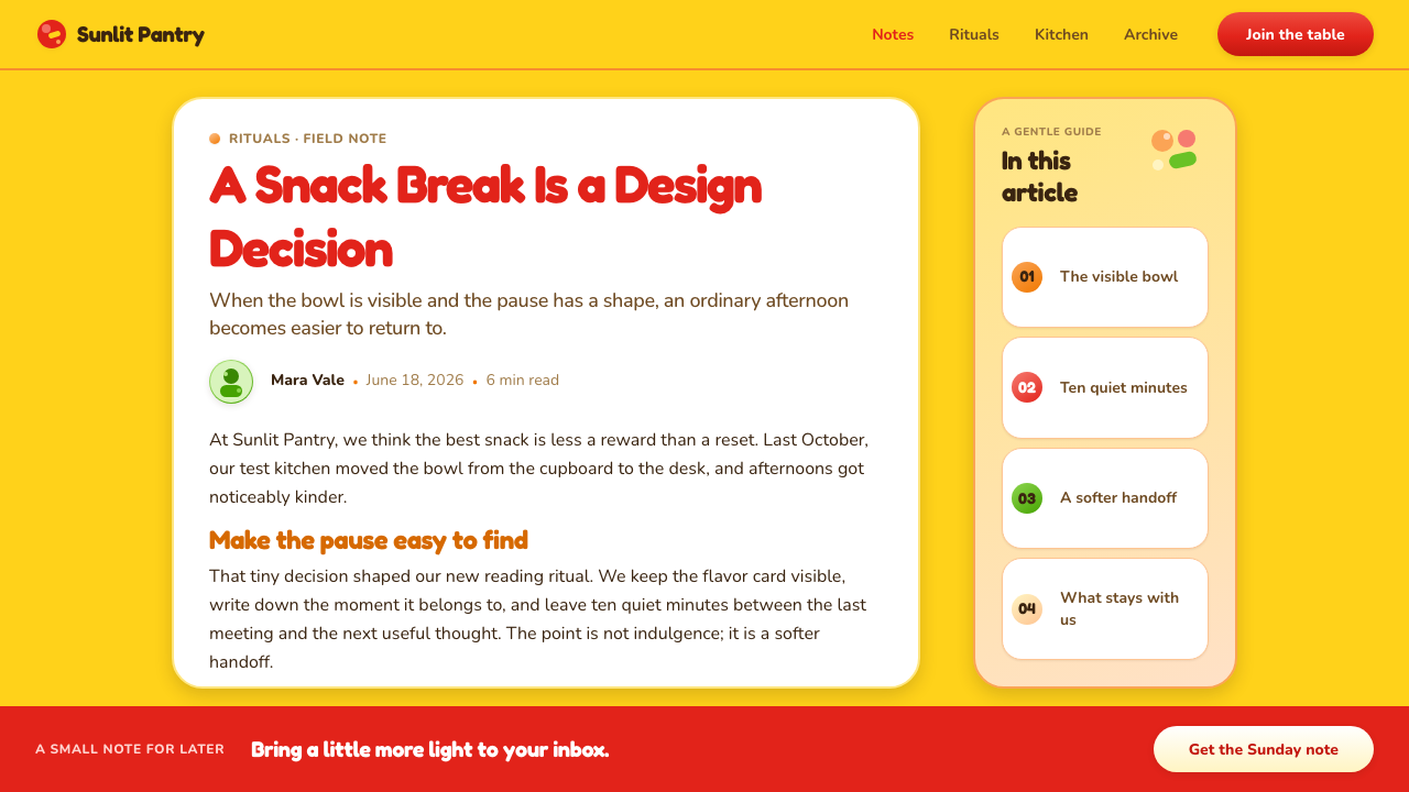
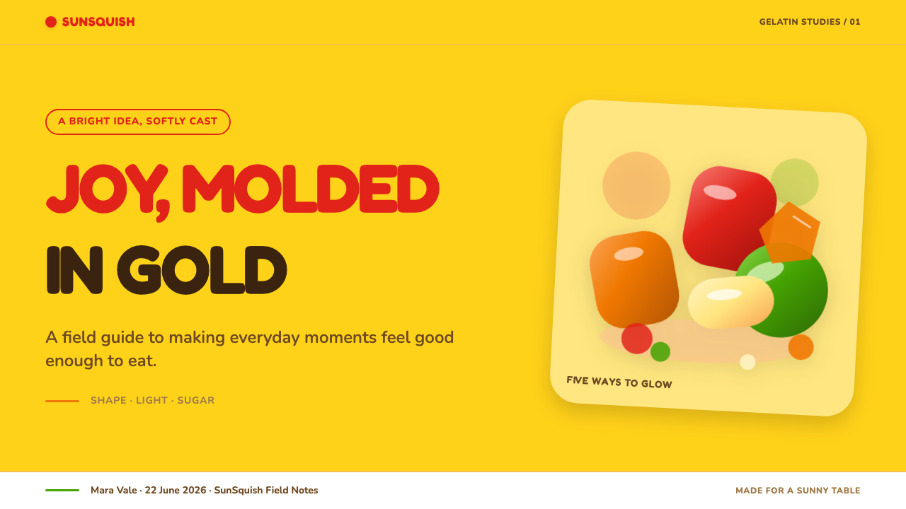
Gold is the environmental color, not a small luxury accent. It should recall the warm, slightly reflective ground of the iconic pouch, giving red type and fruit-colored candy forms an immediate stage. Keep the field warm and generous so the page feels like packaging opened toward the viewer.
Light-Through-Candy Color
Fruit colors are never dead-flat. They should suggest translucent candy with depth created by soft internal variation, a brighter rim, or a restrained highlight. The effect is juicy rather than glassy: light appears to travel through a soft gummy body, not bounce off a hard plastic object.
Rounded, Inflated Type
Display type is chunky, rounded, and visibly cheerful. Its forms should feel inflated, especially in broad vowels and generous curves, as though the letters themselves have been molded from candy. Raspberry-red lettering on gold is the clearest expression of the theme’s familiar wordmark energy.
Squishy Components
Pill controls, blobby cards, and swollen badges establish the physical metaphor. Curves should be confident and continuous rather than merely rounded at the corners. Every component needs to feel pressable, squeezable, and friendly, while still keeping labels and actions easy to recognize.
Poured-From-the-Bag Layout
Elements may tilt, overlap, and scatter with the loose rhythm of candy tumbling from a bag. This is controlled playfulness, not disorder. A dominant message still needs a clear resting place, while smaller bears, badges, or fruit forms can create peripheral motion and surprise.
Soft Gloss, No Hardness
Highlights are soft, close to the form, and used to make candy appear moist and freshly molded. Depth comes from rounded volume and gentle sheen rather than sharp bevels, dramatic reflections, or severe cast shadows. A hard corner is especially disruptive because it contradicts the promise that everything is squishy.
Who shaped Haribo Goldbears (1922)?
Hans Riegel Sr. is identified as a key figure in the Goldbears origin story. The source locates the beginning of the first Tanzbär gummy bear in his Bonn kitchen in 1922, making that small-scale confectionery origin central to the theme’s sense of molded, bagged childhood joy.
Gertrud Riegel is named among the key figures associated with the brand’s origin. Her inclusion reinforces that the Goldbears story is rooted in a recognizable family-name history, a quality the design language translates into familiarity, continuity, and a warm sense of belonging.
Hans Riegel Jr. is also listed as a key figure in the Goldbears history. Alongside the later modernization of the wordmark, his place in the source supports the idea of a brand language that carries its recognizable character forward instead of treating nostalgia as a fixed historical costume.
How do you use Haribo Goldbears (1922) today?
For presentation covers, begin with the pouch logic: a broad gold field, one inflated red title, and a small cluster of translucent fruit forms that feels freshly poured into view. Keep the message direct. On content slides, use rounded containers to group ideas, but let the reading order remain obvious; sweetness should never obscure the argument. Data slides can turn categories into gummy-like bars, bubbles, or badges, provided labels remain more important than the candy metaphor.
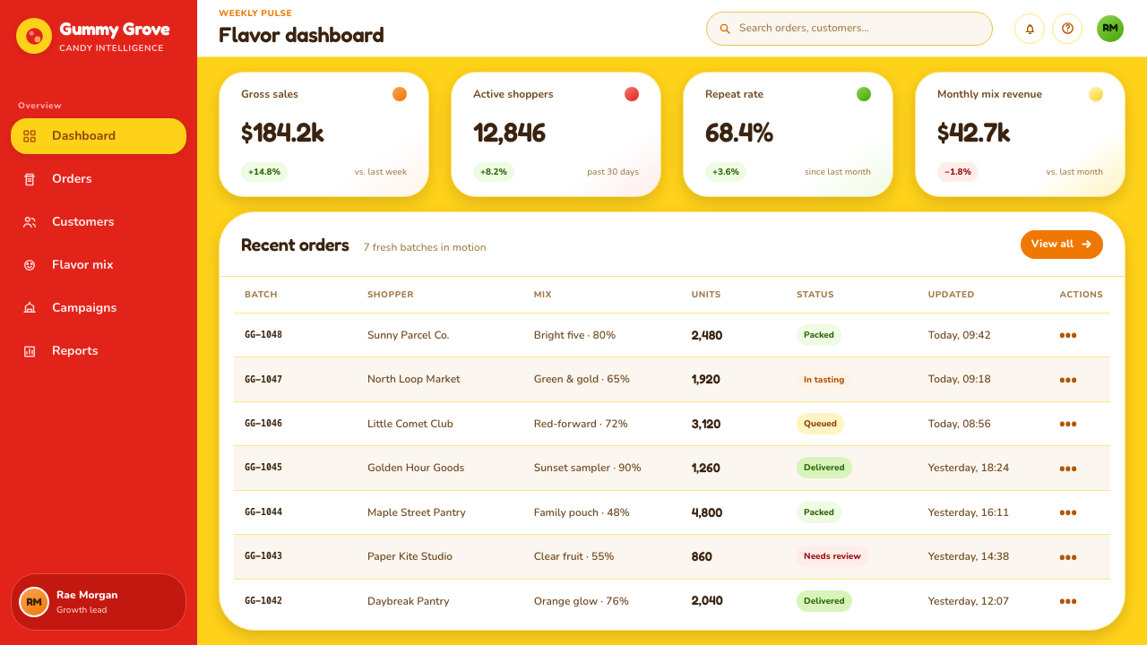
For web interfaces, the language suits playful dashboards, reward systems, family-oriented products, promotional experiences, and pricing pages that need warmth without losing hierarchy. Gold can unify the shell while fruit colors distinguish states, plans, or progress. Use pill-shaped actions and rounded cards where touchable behavior matters, but reserve the most expressive gloss and scattered elements for moments that benefit from delight.
For editorial and marketing work, treat the page as a candy bag with a story spilling out of it. Large rounded headlines can establish the voice, while smaller candy forms become cues for sections, calls to action, or product details. The strongest campaigns balance a tidy information core with looser decorative movement at the edges, allowing the brand’s exuberance to frame rather than overwhelm the message.
The common mistake is confusing this style with arbitrary rainbow decoration. Goldbears works because its color, translucency, typography, and rounded geometry all describe the same physical idea: fruit gummy candy in a golden pouch. Flat rainbow blocks, sharp generic cards, overly glossy plastic effects, or too many tilted objects weaken that coherence. Make the experience feel edible and cheerful, but keep the interface legible and the composition intentional.
Haribo Goldbears (1922) — FAQ
Is this style only appropriate for children’s products?
No. Its emotional register is childlike joy, but its useful qualities are broader: friendliness, reward, abundance, and immediate recognition. It can work for any experience that benefits from warmth and playful optimism. The deciding question is whether an edible, soft, cheerful metaphor supports the product’s message rather than trivializing it.
How should gold be used without making the result feel luxurious or formal?
Treat it as packaging material rather than precious metal. The gold ground should feel warm, approachable, and pouch-like, especially when paired with rounded red display type and juicy fruit colors. Avoid using it as a distant premium signal; the intended association is opened candy packaging, not ceremonial luxury.
Can the layout be playful without becoming chaotic?
Yes. The scattered-candy effect works when one message, action, or content block remains visually dominant. Let secondary forms tilt and tumble around that anchor, and use their movement to lead attention back toward the important content. Playfulness belongs at the edges of a clear hierarchy, not in place of one.
What makes a candy color feel gummy rather than plastic?
A gummy effect comes from translucency, softness, and restrained gloss. Color should seem to carry light through a moist rounded body, with a subtle highlight near an edge or curve. Plastic usually looks harder, more reflective, and more sharply defined. Keep the visual material soft enough to suggest gelatin rather than a polished toy.
Related design styles
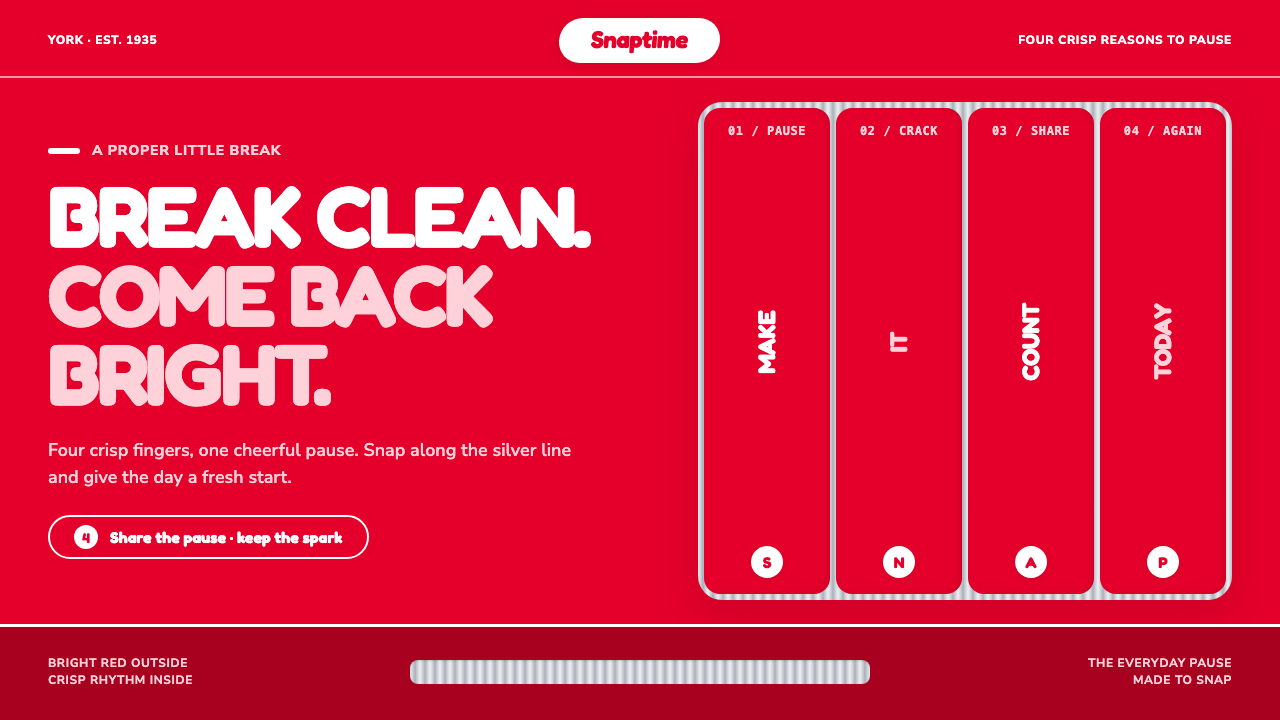 KitKat (1935)A break you can hear. Pillar-box red, plump white type, and silver grooves se…
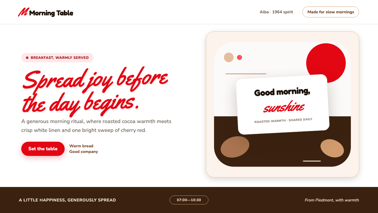 Nutella (1964)Breakfast feels brighter. Cherry script and roasted-hazelnut brown warm a cri…
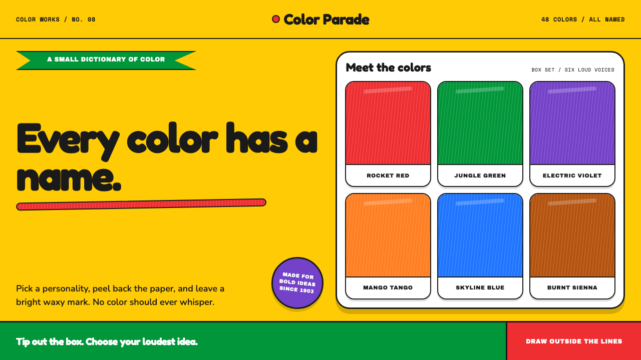 Crayola (1903)Color never whispers. Golden yellow, a green slash, and waxy swatches make ev…
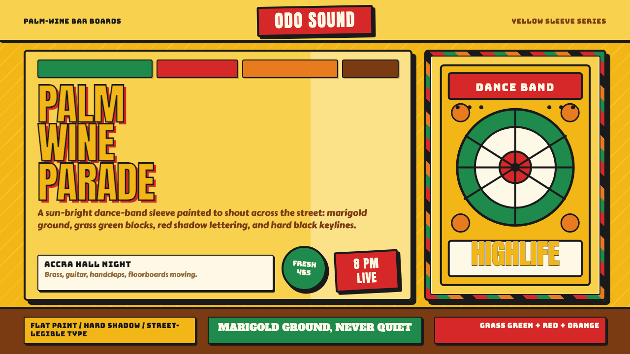 Ghanaian HighlifeMusic before words. Marigold ground, black keylines, red-green signboard bloc…
 HeinekenEmerald owns the field. White label, red star, gold line, and condensed type…
 VW Kombi BusSunny steel optimism. Turquoise-and-white belt lines, Fredoka curves, warm go…