What is KitKat (1935)?
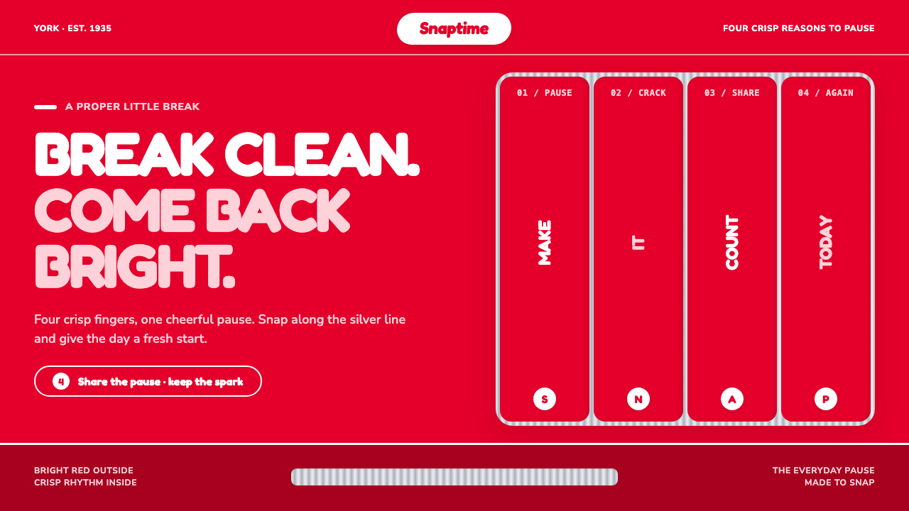
KitKat turns a break into a visible rhythm: pillar-box red, plump white lettering, silver grooves, and the satisfying promise of a clean snap.
KitKat (1935) in brief
KitKat is mass-market confectionery branding expressed as a compact visual system. Its defining scene is immediate: the loudest red in the aisle, a white oval logo held firmly at the center, and a segmented bar whose shape makes the act of breaking part of the identity. The package does not ask to be discovered slowly. It announces itself from a distance, then rewards a closer look with a rhythm of ridges, rounded forms, and repeated divisions.
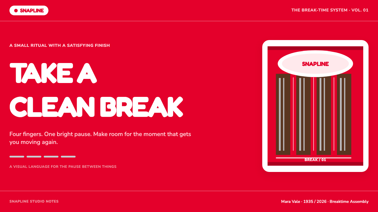
The system rests on three linked gestures: a saturated red field, crisp white type reversed against it, and parallel groove lines derived from the foil-ridge rhythm of the bar. Together they make the product feel direct, cheerful, and physical. The red creates confidence, the white logo creates instant recognition, and the grooves suggest exactly where motion should happen. The design does not merely depict a snack; it stages the small ritual of stopping and snapping.
Its tone is proudly commercial rather than restrained or precious. There is no attempt to simulate luxury through soft transitions, hushed neutrals, or elaborate ornament. Instead, KitKat uses rounded branding, decisive contrast, and repeated structure to make an ordinary break feel upbeat and memorable. The oval becomes a badge, the grooves become dividers or progress markers, and equal vertical sections evoke pieces waiting to be separated.
Where does KitKat (1935) come from?
The style begins with Rowntree’s Chocolate Crisp, launched in 1935 in York, England. Its origin is inseparable from British mass-market confectionery branding: a product made to be recognized quickly in a crowded retail environment, remembered easily, and associated with a repeatable everyday occasion. The visual language therefore favors forceful recognition over subtle atmosphere. Red, white, and the segmented bar all make the product legible before a shopper needs to read much copy.
The product was renamed KitKat in 1937. That shorter name supports the design system’s compactness: it is brief, percussive, and well suited to a central logo treatment. The brand’s visual identity grew around the relationship between name, oval badge, and bar structure. Rather than relying on illustrative scenes or a complicated narrative, it lets the package’s color field and the object’s recognizable division carry much of the communication.
The phrase Have a Break became central from 1957, giving the existing visual vocabulary a clear human purpose. A break is a small interruption, and the design translates that interruption into form: separate sections, a visible line of action, and a snap imagined through parallel grooves. This connection helps explain why the style feels active even when the layout is still. The viewer can almost hear the bar being broken.
The brand later became global under Nestlé from 1988, while retaining the visual cues rooted in York and in mid-century packaging design. Its aesthetic also belongs to the broader language of poster advertising: broad fields of color, a central emblem, large readable type, and a message that can be understood in a glance. The result is an identity that can scale across packaging, promotion, and interfaces without losing the original idea of a bright, audible pause.
What defines the KitKat (1935) look?
Pillar-Box Red
The red ground is the system’s loudest decision. It fills space with confidence and gives every white element an immediate stage. Rather than functioning as a decorative accent, red is the atmosphere, the shelf signal, and the emotional baseline. A KitKat-inspired composition should feel as though the red arrived first and everything else was placed on top of it with purpose.
White Oval Mark
The white oval is a soft counterpoint to the force of the red field. Its rounded contour makes the identity friendly and edible rather than severe, while its central placement gives it badge-like authority. The oval can recur as a label, callout, status marker, or framing device, but it works best when it remains visibly simple and uncluttered.
Plump Reversed Type
Type is crisp in contrast but generous in personality. White lettering reversed from red has the directness of a poster headline, while rounded, plump forms keep that directness from becoming cold. The wordmark-like treatment favors broad, confident silhouettes over delicate detail. Text should read as a graphic shape as well as language: cheerful, compact, and ready to be seen quickly.
Snap Rhythm
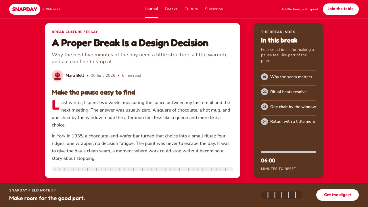
Parallel grooves are the style’s most useful structural motif. They refer to the ridged foil and segmented bar, but their value is broader: they create a rhythm of pause, division, and forward movement. Used as rules, dividers, progress indicators, or repeated background marks, they make an otherwise flat composition feel tactile. Their strength comes from regularity, not from visual complexity.
Equal Breakable Sections
The four-finger bar supplies a compositional metaphor: adjacent vertical areas can feel like connected pieces that invite separation. Equal sections create order without becoming austere because the underlying association is playful and physical. This structure suits comparisons, steps, product tiers, or short sequences. The key is to make divisions feel like part of one bar, not like unrelated boxes placed beside each other.
Mass-Market Swagger
KitKat does not perform scarcity, restraint, or private luxury. Its visual confidence is open, public, and cheerful. Strong color, large type, and obvious symbolism make the message available to everyone at once. When adapting the style, the tone should remain inviting rather than exclusive: a familiar wink, not an insider code; a bright interruption, not a carefully guarded premium experience.
No Pretended Premium
The style avoids the familiar signals used to make everyday products appear artificially luxurious. Its visual pleasure comes from clean contrast, rounded marks, and a recognizable physical rhythm rather than from atmospheric softness. This is not an anti-quality position; it is an anti-pretension position. The design succeeds when it looks honest about being a cheerful, accessible treat and refuses to dilute that clarity.
Who shaped KitKat (1935)?
Joseph Rowntree is named among the key figures connected to the York origin of this design story. Within the KitKat narrative, York matters because it anchors the identity in Rowntree’s confectionery context before the brand became global under Nestlé. The name helps locate the style in a tradition of British mass-market confectionery branding rather than in a later, purely digital branding exercise.
Henry Isaac Rowntree is also listed as a key figure in the York-based origin of KitKat. His presence keeps attention on the company setting behind the 1935 launch of Rowntree’s Chocolate Crisp. For the visual system, that setting is important: packaging had to work as public communication, using an unmistakable field, a concise name, and a product form that could explain itself quickly.
Donald Gilles appears among the key figures provided for the theme. In an account focused on design language, the significance of that named connection is the continuity between product, package, and advertising voice. KitKat’s identity does not depend on a single isolated image; it depends on a coordinated public presence in which red, white, oval form, and snap rhythm repeat with unusual consistency.
How do you use KitKat (1935) today?
For presentation covers, use the red field as a decisive opening rather than a small accent. Place a rounded white badge or a short, plump headline in a central or strongly anchored position, then let a small set of grooves establish the snap motif. The cover should communicate one idea at a glance: this is a pause, an announcement, or a bright invitation. Avoid filling the space with secondary messages that weaken the poster-like impact.
On presentation content pages, translate the segmented bar into a clear sequence of adjacent sections. A narrow run of parallel rules can divide topics, while white panels or oval labels can identify major moments without making the page feel corporate or sterile. For data pages, treat charts as part of the snap rhythm: repeated bars, stacked sections, and clearly separated categories fit naturally. Keep labels bold and brief, and let the red field appear as a unifying signal rather than a blanket placed behind every number.
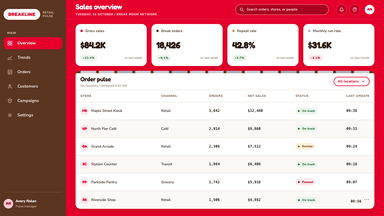
For web interfaces, the style is especially effective for dashboards, progress views, onboarding flows, promotional modules, and pricing pages that need fast comprehension. Use the groove motif to show stages or completion, and use connected vertical sections to organize comparable information. Red should establish presence, while white surfaces and oval badges create readable resting points. Interactive elements should feel unmistakable and generous, as though they belong to the same friendly package rather than to an abstract utility interface.
For editorial and marketing work, KitKat-inspired design works best when a campaign has a single simple proposition. A feature story can use red section openers, white oval pullouts, and repeated ridges to carry readers from one portion to the next. Marketing pages can frame offers, product moments, or short messages as breakable units within one continuous composition. The strongest results retain the style’s public warmth: broad, legible statements and a visible sense that taking a break is permitted.
The common mistake is to borrow only the red and call the result KitKat-inspired. Without the white oval counterweight, the rounded typographic character, and the rhythm of separable grooves, red alone becomes generic urgency. Another mistake is making the system look luxurious, sparse, or overly polished. The style is strongest when it remains cheerful, tactile, obvious, and coordinated around the simple action of snapping a break into the day.
KitKat (1935) — FAQ
Is KitKat style simply red packaging with white lettering?
No. Red and white establish recognition, but the complete system also needs the oval badge, rounded visual character, and a groove-based rhythm that refers to the segmented bar. Those elements turn color contrast into a specific experience of snapping, pausing, and returning. Without that physical rhythm, a red-and-white layout may be bold but will not carry the same identity.
Why are grooves so important to the aesthetic?
The grooves connect the graphic system to the product’s central action. They visually suggest where the bar separates and make the idea of a snap readable even on a flat surface. In contemporary layouts, that makes them more than decoration: they can organize steps, signal progress, divide content, and create a repeating tempo that feels tactile and unmistakably connected to the brand’s break ritual.
Can the style work for a serious dashboard or pricing page?
Yes, when the product benefits from speed, clarity, and an approachable tone. Connected sections can organize comparable information, groove rhythms can communicate stages, and the oval can identify important statuses or choices. The challenge is restraint in the right places: preserve the energetic public-facing character, but do not let large red areas compete with detailed information that users need to scan carefully.
How does KitKat style differ from minimalism?
Both can simplify a composition, but their values differ. Minimalism often lowers visual volume and removes overt personality. KitKat concentrates personality into a few unmistakable signs: loud red, plump white type, the oval badge, and the snap rhythm. It is simple in structure but not quiet in attitude. Its goal is cheerful recognition, not visual disappearance.
What is the biggest risk when adapting the style outside confectionery?
The biggest risk is turning a lively mass-market language into a superficial costume. If the application uses the colors and logo-like forms without a meaningful rhythm of pause, division, choice, or progress, it can feel arbitrary. The adaptation works when the product genuinely has moments that can be framed as a break, a sequence, or a satisfying completion. Structure should carry the metaphor, not merely decorate it.
Related design styles
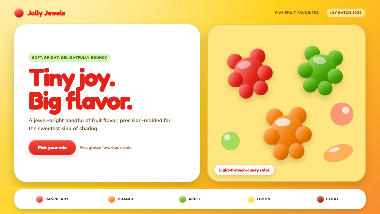 Haribo Goldbears (1922)Childhood joy, precision-molded. Glossy fruit colors tumble across a foil-gol…
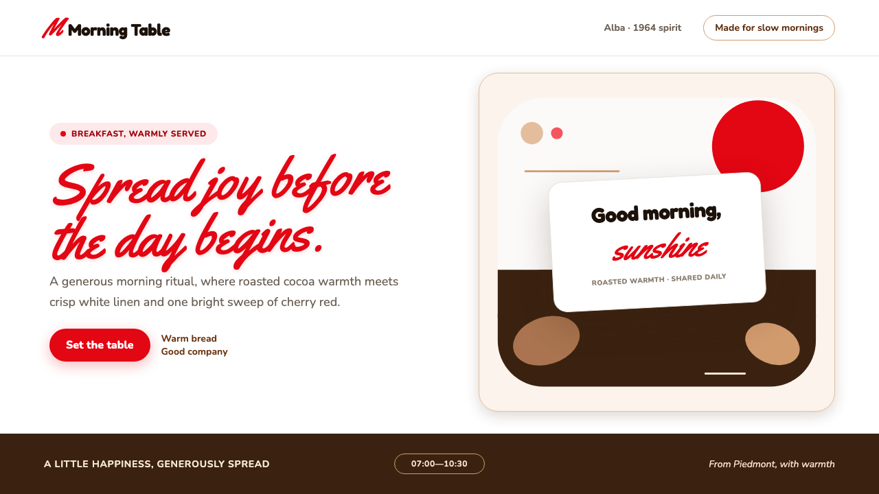 Nutella (1964)Breakfast feels brighter. Cherry script and roasted-hazelnut brown warm a cri…
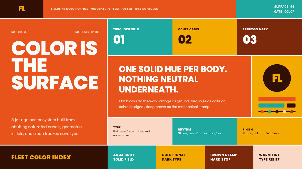 Braniff (Girard)Color becomes fuselage. Jellybean orange, turquoise blocks, and geometric san…
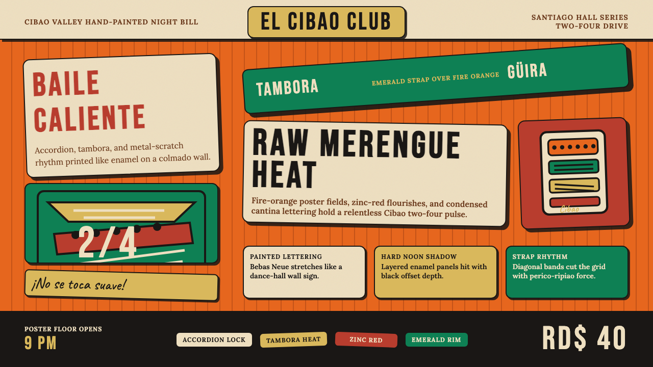 Dominican Merengue Perico RipiaoMaximalism keeps time. Fire-orange fields, Bebas Neue, and diagonal emerald s…
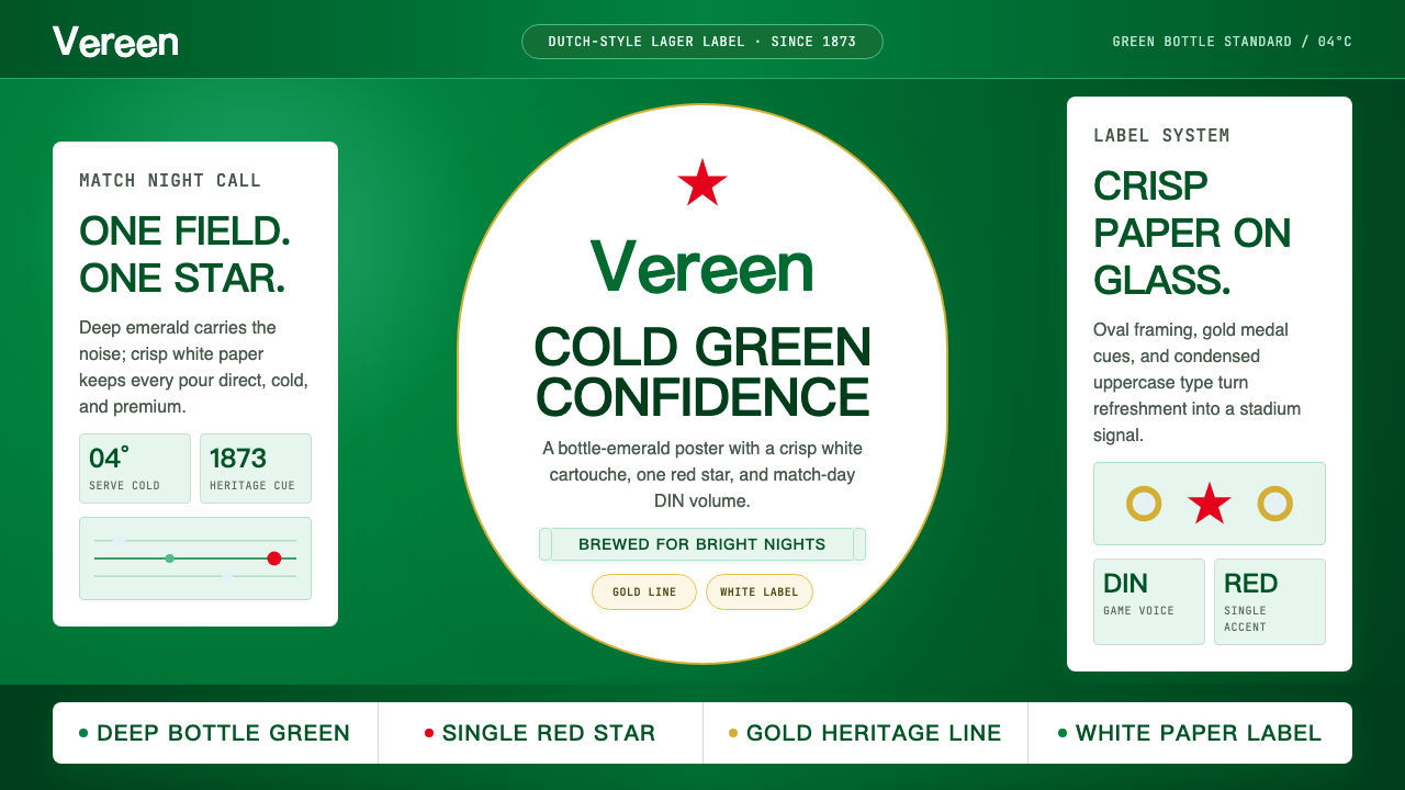 HeinekenEmerald owns the field. White label, red star, gold line, and condensed type…
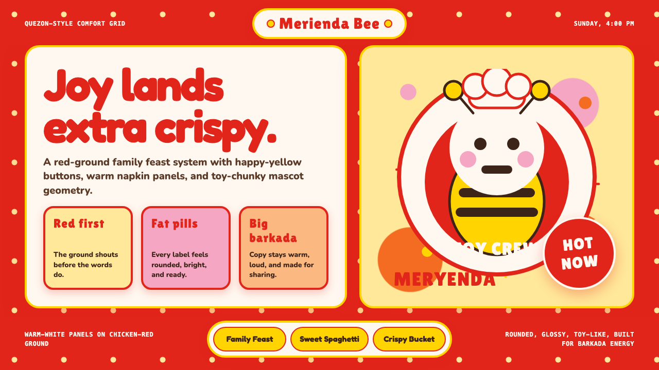 Philippines Jollibee Bee MascotJoy shouts first. Red ground, Fredoka curves, yellow pills, chunky grid.