What is Nutella (1964)?
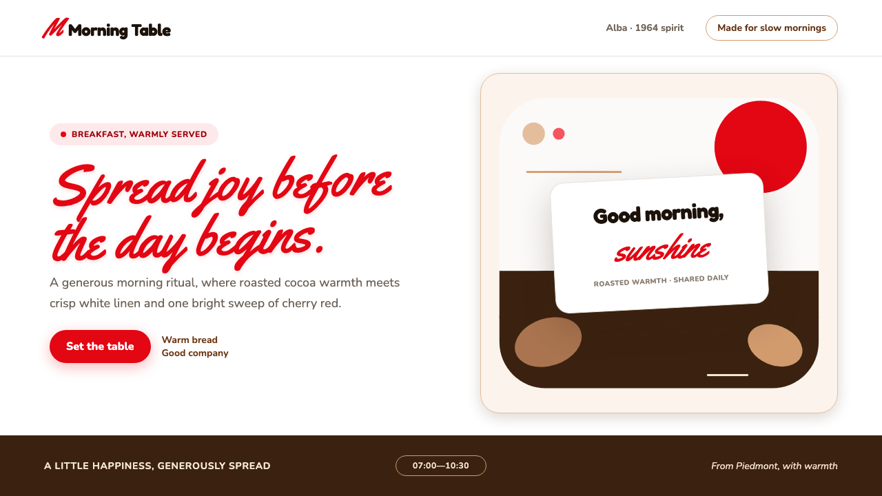
Nutella turns breakfast into a small act of optimism: a clean white label, joyful cherry script, and the comforting depth of roasted-hazelnut brown.
Nutella (1964) in brief
Nutella is a food-branding language rooted in the 1964 launch of the familiar glass jar in Alba, Piedmont. Its identity is compact but unusually expressive: a white label creates immediate clarity, a sweeping red wordmark supplies motion and warmth, and the dark brown of the spread provides a rich visual base. The result feels less like a formal food package than a friendly object already at home on the breakfast table.
The central visual tension is between crispness and abundance. White space keeps the label open and legible, while the red script behaves like a spontaneous gesture across that ordered field. Beneath it, cocoa-and-hazelnut brown gives the system weight, suggesting the spread itself without requiring elaborate illustration. The isolated black lowercase n within the wordmark creates a small interruption that makes the name especially memorable.
This is not a severe mid-century package language. Its geometry is softened by jar-like curves, rounded edges, and approachable sans-serif supporting type. The style uses contrast to make appetite and hospitality visible: bright against deep, handwritten against orderly, light label against dense chocolate color. It is designed to feel cheerful at first glance and reassuring after repeated use.
Where does Nutella (1964) come from?
Nutella entered the market in 1964 in Alba, Piedmont, Italy, but its stated lineage reaches back to Giandujot in 1946 and Supercrema in 1951. That sequence matters because it frames the identity as an evolution of a familiar spread rather than an isolated packaging invention. The 1964 jar condenses this lineage into a more direct, portable breakfast object: glass, rounded closure, milk-and-cocoa promise, and a label meant to be recognized quickly.
Its cultural setting is Italian postwar consumer branding and the optimism of the dopoguerra period. In this context, food packaging does more than identify a product. It gives everyday abundance a visible form. Nutella’s white, red, and brown system communicates brightness, appetite, and domestic ease without appearing luxurious or distant. The emotional proposition is modest but powerful: a warm breakfast can improve the beginning of an ordinary day.
The supplied lineage identifies Pietro Ferrero, Michele Ferrero, and Giovanni Ferrero as key figures. Their presence places the brand within a continuing Ferrero story rather than a single anonymous design event. For a design reader, the important point is continuity: the package is built to carry recognition across generations, preserving a few strong cues instead of constantly replacing its visual vocabulary.
The global rollout of the 1970s and 1980s gives the identity another useful design lesson. A food package traveling beyond its original Italian setting needs elements that remain understandable at a glance. Nutella’s system relies on an immediately recognizable wordmark, broad emotional color contrasts, and friendly forms rather than dense local symbolism. Its visual character can travel because its promise is legible before any detailed explanation is read.
What defines the Nutella (1964) look?
White Label Ground
A crisp white ground is the system’s clearing. It creates freshness around the wordmark and lets the darker food cues feel rich rather than heavy. The white space should remain active and open, not be crowded with decorative detail.
Cherry Script
The red wordmark is a gesture rather than a rigid label. Its brush-like movement introduces joy and appetite, making the brand feel personal even when reproduced at scale. It should retain confidence, sweep, and a sense of immediate welcome.
The Black n
The lone black lowercase n is a deliberate visual interruption inside the red wordmark. It adds contrast without adding complexity, turning one character into a recognition cue. This small irregularity keeps the mark from becoming merely decorative script.
Roasted-Hazelnut Brown
The deep brown acts as the edible foundation of the palette. It evokes cocoa, roasted hazelnut, and the spread pooling beneath the label’s brightness. Used in broad, grounded areas, it gives the cheerful red something substantial to stand against.
Rounded Hospitality
Curves echo the glass jar and rounded lid, preventing the identity from feeling clinical. Rounded forms suggest spreadability, ease, and domestic familiarity. They work best when they support the product’s object-like character instead of becoming playful ornament for its own sake.
Friendly Supporting Type
A soft rounded sans-serif supports the expressive wordmark with clarity. The supporting type should not imitate the script; its role is to make information calm, readable, and trustworthy. The contrast between emotional lettering and orderly text is essential to the style.
Who shaped Nutella (1964)?
Pietro Ferrero is identified as a key figure in the brand’s stated lineage, which begins with Giandujot in 1946. Within the Nutella story, that early point matters because it establishes the spread as part of a longer product and packaging evolution rather than a design language invented only at the 1964 launch.
Michele Ferrero is named as a key figure associated with the 1964 Nutella launch in Alba. The launch established the glass-jar breakfast object around which the identity is still understood: rounded, approachable, visually bright, and anchored by the contrast between white label space, red script, and deep brown food color.
Giovanni Ferrero is also listed among the key figures in the supplied brand context. His inclusion reinforces the sense of continuity surrounding Nutella: its identity is not presented as a short-lived campaign look, but as a recognizable family of enduring cues that carried through its later global rollout.
How do you use Nutella (1964) today?
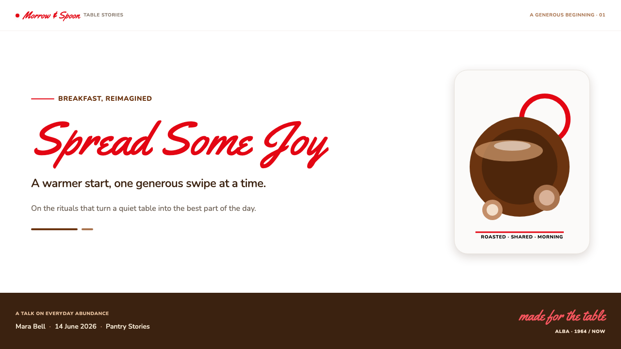
For presentation covers, use the style as a breakfast-table invitation rather than a generic retro treatment. Let a broad white field carry an expressive red title treatment, then place a deep brown shape or product-related image low in the composition to create appetite and stability. Curves should feel object-derived, as if they belong to a jar, lid, or spoon, while the title remains the emotional center.
For content and data slides, keep the cheerful identity disciplined. Supporting information belongs in a rounded sans-serif with ample white space, while brown can establish section anchors and red can draw attention to a decisive insight. Data visuals should prioritize legibility over confectionery decoration: use the food palette to distinguish importance, not to coat every bar, line, or label in competing color.
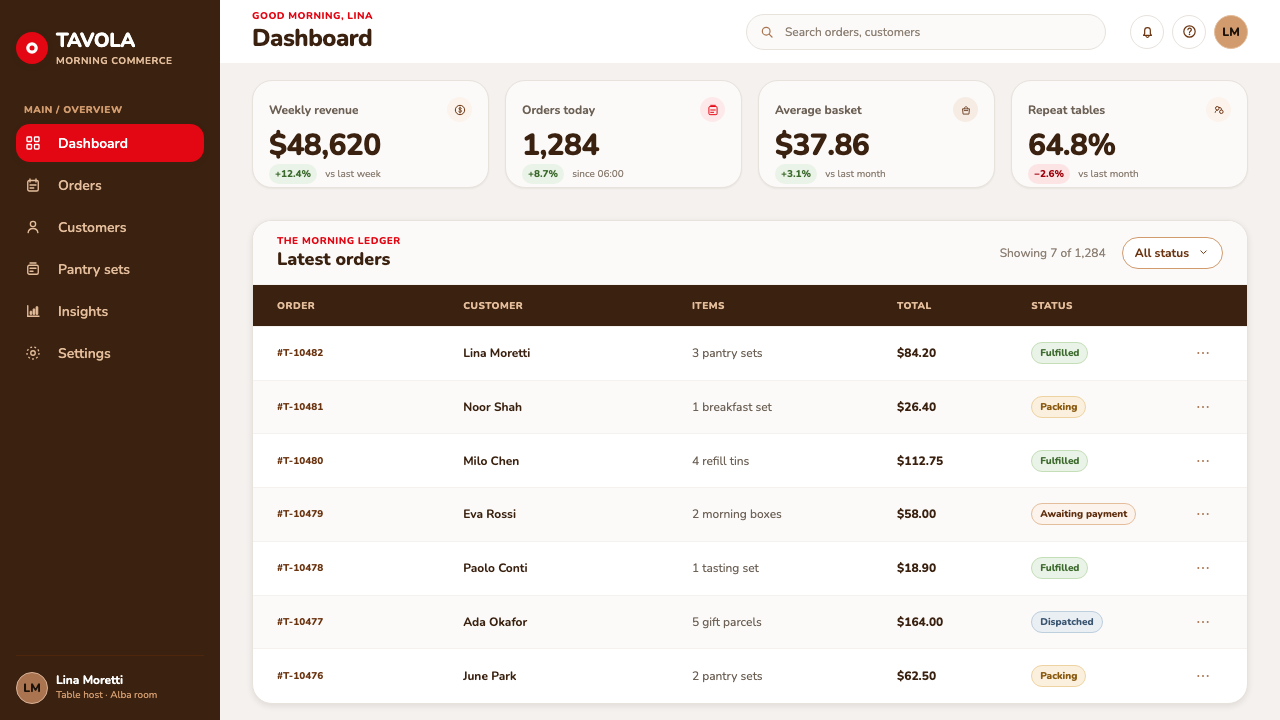
For web interfaces, this language suits recipe collections, family-oriented food experiences, loyalty spaces, and product storytelling more naturally than dense operational dashboards. A dashboard or pricing-like comparison page can still borrow its hierarchy: white surfaces for reading, brown for durable grouping, red for moments that ask for attention, and rounded modules that make functional tasks feel less transactional.
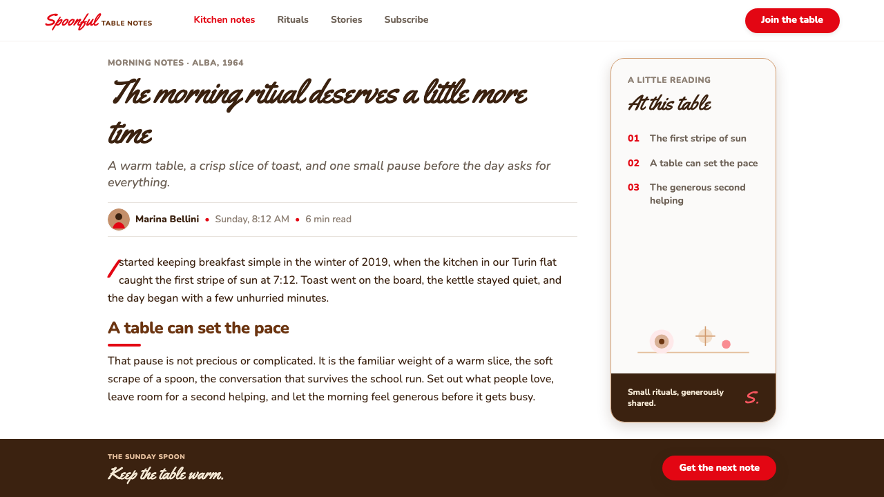
Editorial and marketing pages benefit from the contrast between a bright label-like canvas and richer brown feature areas. Use the red script treatment sparingly for the most emotional phrase, campaign title, or product name; reserve the rounded sans-serif for everything explanatory. Photography or food imagery should feel warm and tangible, but the layout should preserve enough white space that the page retains the crispness of a label.
The common mistake is to treat Nutella as a license for indiscriminate sweetness: too much red, too many rounded badges, or brown used as a heavy background everywhere. The identity works because each element has a distinct job. White supplies freshness, red supplies delight, brown supplies appetite and grounding, and the black n supplies memorability. Remove that division of labor and the result becomes noisy rather than welcoming.
Nutella (1964) — FAQ
Is Nutella’s identity mainly a retro Italian style?
Its roots are unmistakably tied to 1964 Italy, postwar consumer branding, and mid-century food packaging, but reducing it to retro styling misses its practical strength. The system remains legible because it uses a few direct signals: a memorable wordmark, a clean label ground, edible brown depth, and rounded friendliness. Those are durable packaging decisions, not merely period decoration.
Why is the black lowercase n so important?
The black n creates a purposeful break inside the cherry-red wordmark. It gives the eye a place to pause and helps the name remain distinctive when seen quickly on a shelf, in a layout, or at a small scale. Its value is structural: one contrasting character organizes recognition without requiring another symbol or decorative device.
Can this style work without the Nutella wordmark?
Yes, if the underlying relationships are preserved rather than copied literally. A bright white ground, one expressive warm accent, a deep food-like anchor, rounded object cues, and calm supporting type can create the same atmosphere. The goal is not to imitate a protected mark, but to understand how clarity and hospitality are held in balance.
Where does the style become less suitable?
It becomes less suitable when a product needs restraint, technical neutrality, or a premium sense of distance. The handwritten warmth and edible brown grounding can make serious financial tools, clinical services, or austere luxury goods feel too familiar. It is strongest where warmth, daily ritual, and approachable abundance are genuine parts of the product promise.
Related design styles
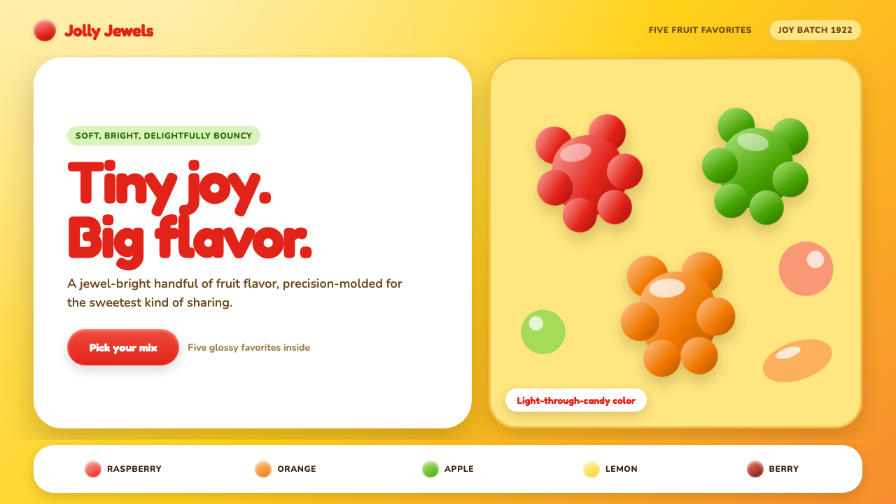 Haribo Goldbears (1922)Childhood joy, precision-molded. Glossy fruit colors tumble across a foil-gol…
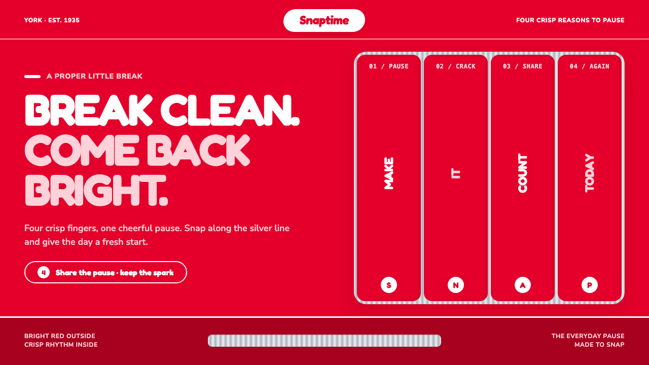 KitKat (1935)A break you can hear. Pillar-box red, plump white type, and silver grooves se…
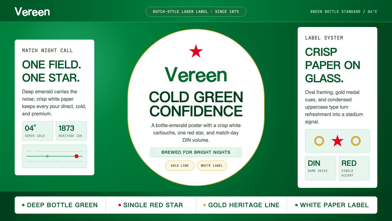 HeinekenEmerald owns the field. White label, red star, gold line, and condensed type…
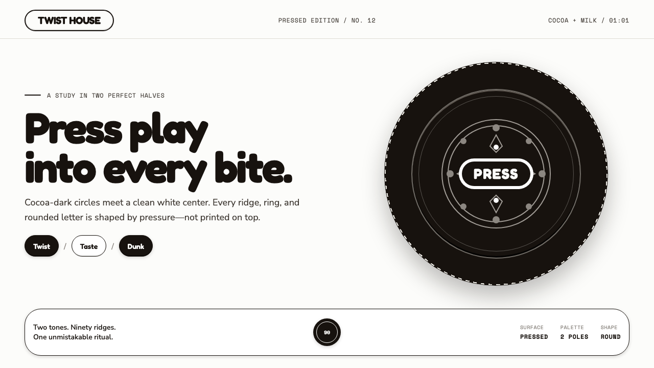 Oreo (1912)Contrast you can feel. Cocoa-black discs and milk-white rings turn every surf…
 VW Kombi BusSunny steel optimism. Turquoise-and-white belt lines, Fredoka curves, warm go…
 1950s Brush Script AdSells tomorrow in one swoop. Turkey red script, tan paper, starbursts, and ha…