What is Oreo (1912)?
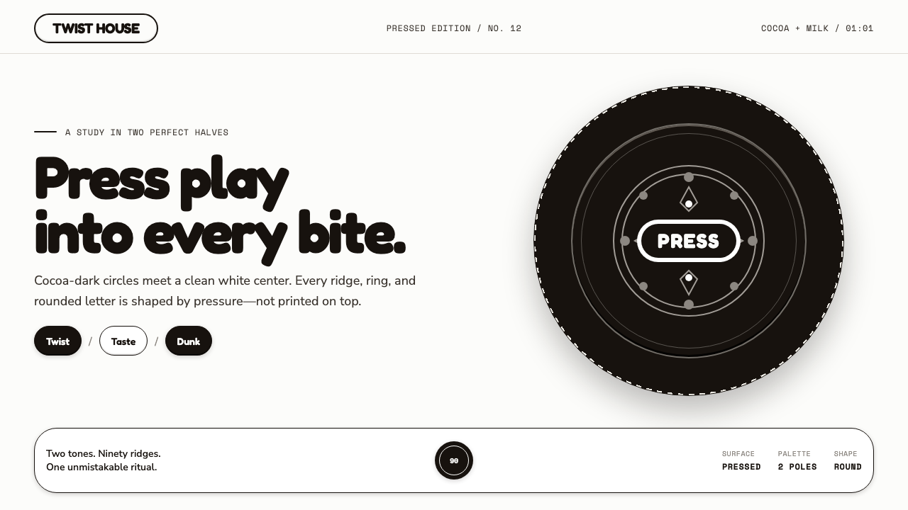
Oreo turns a familiar cookie ritual into an interface of tactile black-and-white relief: twistable layers, pressed edges, and contrast that feels edible.
Oreo (1912) in brief
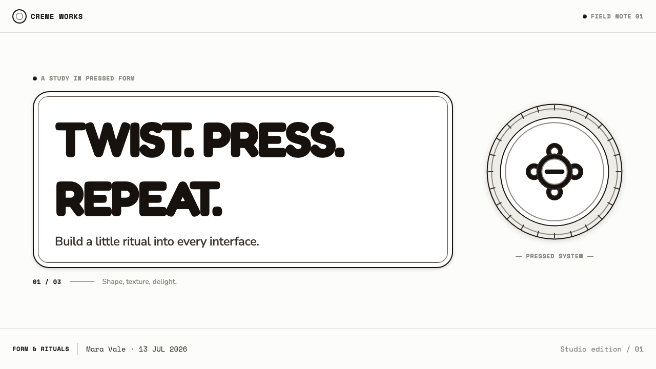
Oreo (1912) rebuilds a globally recognizable cookie as a UI system. Cocoa-near-black wafers, milk-white creme, and the embossed perimeter supply the entire vocabulary. Buttons, cards, separators, and controls should feel as though they were pressed into dough or lifted from a stamping die, rather than printed as flat marks on a neutral screen.
Its visual force comes from polarity. Cocoa-near-black creates mass, depth, and a sense of baked material; milk-white creates exposed creme, breathing room, and sharp legibility. There is no competing accent color asking for attention. The system relies on the immediate tension between dark disc and pale filling, with restrained gray transitions available only to clarify layers or states.
The style is decorative in the way a manufactured object can be decorative: through repetition, compression, and relief. Dense edge ridges, four-petal florets, circular framing, and raised stamp-like motifs make surfaces feel made rather than merely styled. Motion borrows the cookie ritual itself: twist, lick, dunk. Interaction should carry that same small sense of reveal and separation.

Where does Oreo (1912) come from?
The theme begins with Oreo’s introduction in 1912 in Hoboken, New Jersey, within the larger geography of New York and New Jersey. That setting matters because the style is rooted in an American mass-market object rather than in an art-school manifesto. Its identity is inseparable from repetition: a familiar dark wafer, pale filling, and a stamped face designed to be recognized at a glance and encountered again and again.
The source places Oreo (1912) at the intersection of American mass-market packaging design, industrial food stamping, and mid-century brand identity. These are not separate visual references to collage together. They describe one production logic: a small consumer object gains authority when its silhouette, surface, packaging presence, and repeated marks work as a single recognizable system.
A definitive embossed die arrived in 1952. For this theme, that milestone establishes relief as more than a nostalgic detail. The raised rim, floral elements, and pressed surface become structural devices for digital work: borders can feel stamped, cards can feel layered, and dividers can read as grooves rather than abstract lines. The interface takes its order from a manufactured surface.
William A. Turnbull, Sam J. Porcello, and Adolphus Green are identified in the source as key figures. The material does not assign individual contributions, so the style should not invent biographies for them. Their presence instead anchors the theme to a real brand history while keeping the design interpretation focused on the approved visual facts: cocoa-dark discs, white creme, embossed relief, and ritualized handling.
What defines the Oreo (1912) look?
Cocoa and Creme
The palette is deliberately binary. Cocoa-near-black should carry the heavy, baked, enclosing surfaces, while milk-white acts as filling, field, and release. Gray is not a third personality; it is a quiet bridge between pressed planes. The result should feel rich without becoming colorful, and high-contrast without becoming visually harsh.
Embossed Relief
Flat graphics are translated into shallow relief. A control may appear pressed inward, a badge may appear raised, and a card may feel like a wafer surface with a formed edge. Depth should be crisp and deliberate, never atmospheric. The aim is not realistic lighting; it is the readable evidence of a stamp meeting dough.
Rim and Ridge
The cookie perimeter supplies a useful model for containment. Repeated ridges can define a boundary more vividly than a plain rule, while circular or rounded enclosures make content feel held within a stamped object. Use repetition with discipline: the rim should frame hierarchy, not turn every surface into a noisy pattern.
Floral Stamp
Four-petal florets introduce softness into an otherwise severe black-and-white system. They are compact, symmetrical marks suited to small moments: a section marker, a loading emblem, an empty-state seal, or a quiet divider. Their value comes from being stamped motifs, not from behaving like loose botanical illustration.
Disc Geometry
The disc is the governing shape. It suggests the wafer, the creme layer, the act of twisting, and the view from above. Circular elements work best when they signify a contained action or a featured object. Rectangular content areas can still exist, but they should be softened by rims, rounded corners, or inset relief that keeps the system connected to the cookie.
Ritual Motion
Movement should communicate handling rather than spectacle. Layers can separate as if twisted apart; a panel can reveal itself like creme beneath a wafer; a transition can briefly suggest dunking or absorption. These gestures must remain brief and purposeful. The ritual is memorable because it is familiar, not because the interface performs it theatrically.

Who shaped Oreo (1912)?
William A. Turnbull is named as a key figure in the approved Oreo source. No individual role is specified there, so an accurate public account should retain that attribution without assigning unsupported authorship. In this theme, the name belongs to the historical anchor behind a system built from stamped recognition and repeatable form.
Sam J. Porcello is likewise identified as a key figure in the source material. The available record does not separate his contribution from the other named figures. His inclusion supports a disciplined reading of Oreo as a designed industrial object, where surface, contrast, and recognizable ritual belong to the same public-facing identity.
Adolphus Green appears among the source’s key figures. Because no further biographical detail is approved, the useful design lesson is one of continuity rather than personal attribution: Oreo (1912) is treated as a long-lived identity whose cocoa-dark disc, white creme, and embossed surface remain mutually reinforcing signs.
How do you use Oreo (1912) today?
For presentation covers, build around a single dominant disc or a cropped embossed rim on a milk-white field. Let the title sit like a stamped label rather than a floating headline. On content slides, use layered panels sparingly: dark wafer-like sections can hold major ideas, while white fields give explanatory text room to breathe. Maintain a clear distinction between the enclosing wafer and the revealed creme.
Data slides benefit from the style when charts are treated as molded objects instead of generic graphics. Use dark masses for the primary comparison and white cutouts for contrast or absence. Circular diagrams can echo the cookie directly, but only when the data actually supports a radial reading. Tables should rely on inset separators and relief-like groupings, keeping labels crisp and the information more important than the motif.
For web interfaces, the system suits dashboards, account areas, catalog views, and pricing pages that need immediate hierarchy. A dark navigation shell can act as the wafer around a pale working surface; selected controls can feel pressed or lifted; status areas can use the contrast of dark disc and white center. Keep interaction cues consistent so the relief language explains what can be opened, changed, or dismissed.
Editorial and marketing pages can use the style’s recognizability without turning into product packaging. Begin with a broad pale field, introduce cocoa-dark feature blocks at meaningful intervals, and use stamped floral or ridge details to mark transitions. Product stories, recipes, campaigns, and playful brand announcements benefit from the tactile cadence, especially when copy is concise enough to leave room for the surface language.
The common mistake is treating Oreo as a license for random black-and-white ornament. A screen covered in cookies, scallops, shadows, and decorative flourishes loses the disciplined contrast that makes the reference effective. Do not add unrelated bright accents, generic luxury effects, or soft confectionery pastels. Use relief to establish hierarchy, and use the twist, lick, dunk ritual only where it clarifies an action or adds a genuinely relevant moment of delight.
Oreo (1912) — FAQ
Is this style only appropriate for food-related projects?
No. Its source is a cookie, but its transferable principles are contrast, containment, repeated relief, and familiar handling. It can work for playful dashboards, membership spaces, product catalogs, education tools, or campaigns that need a memorable tactile identity. It is less suitable where quiet neutrality, broad color expression, or highly formal institutional distance is the central requirement.
How should black and white be balanced without making the interface feel heavy?
Treat cocoa-near-black as material, not as wallpaper. Give it a job: framing navigation, containing a major choice, or establishing a feature block. Let milk-white remain the primary place for reading and working. The balance succeeds when the dark areas feel like wafers holding the experience together and the pale areas feel like exposed creme rather than empty space.
Can the embossed motifs be used everywhere?
They should be concentrated at meaningful boundaries and moments of recognition. A rim can establish a featured card, a floret can mark a transition, and relief can make a selected control intelligible. If every element receives the same embossed treatment, hierarchy collapses and the interface begins to resemble texture without purpose. Preserve plain areas so the stamped areas retain their force.
What kind of motion fits Oreo (1912)?
Motion should suggest separation, reveal, and absorption. A layered control can part as if twisted; a hidden detail can emerge like creme beneath a wafer; a completed action can settle with the softness of a dunk. Avoid unrelated elastic spectacle or aggressive mechanical effects. The best motion feels like a small continuation of handling the object, not a separate animation style added afterward.
What is the quickest way to lose the Oreo reference?
Adding a crowded palette and treating relief as a generic retro filter will do it quickly. The theme depends on cocoa-dark and milk-white poles, plus a clear relationship between circular form, embossed edge, and layered filling. Once unrelated colors, arbitrary shapes, or decorative effects take over, the interface may remain playful but no longer communicates the particular tactile logic of Oreo (1912).
Related design styles
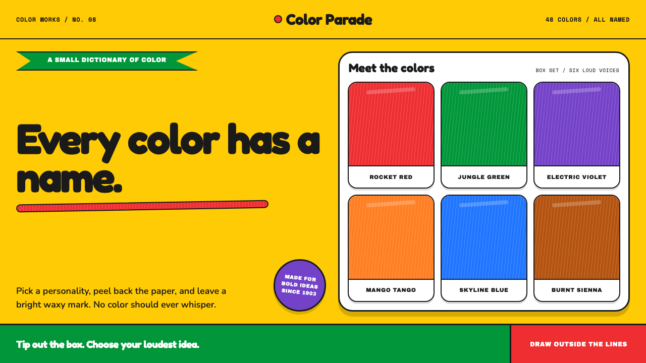 Crayola (1903)Color never whispers. Golden yellow, a green slash, and waxy swatches make ev…
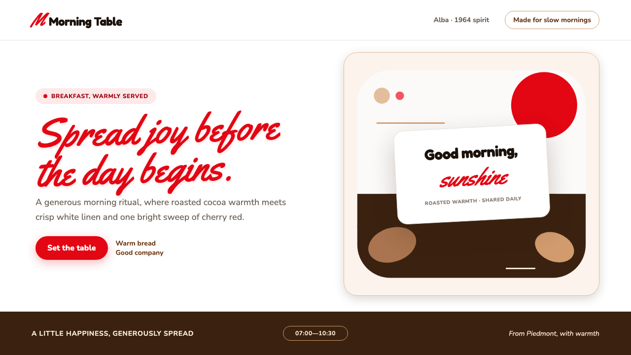 Nutella (1964)Breakfast feels brighter. Cherry script and roasted-hazelnut brown warm a cri…
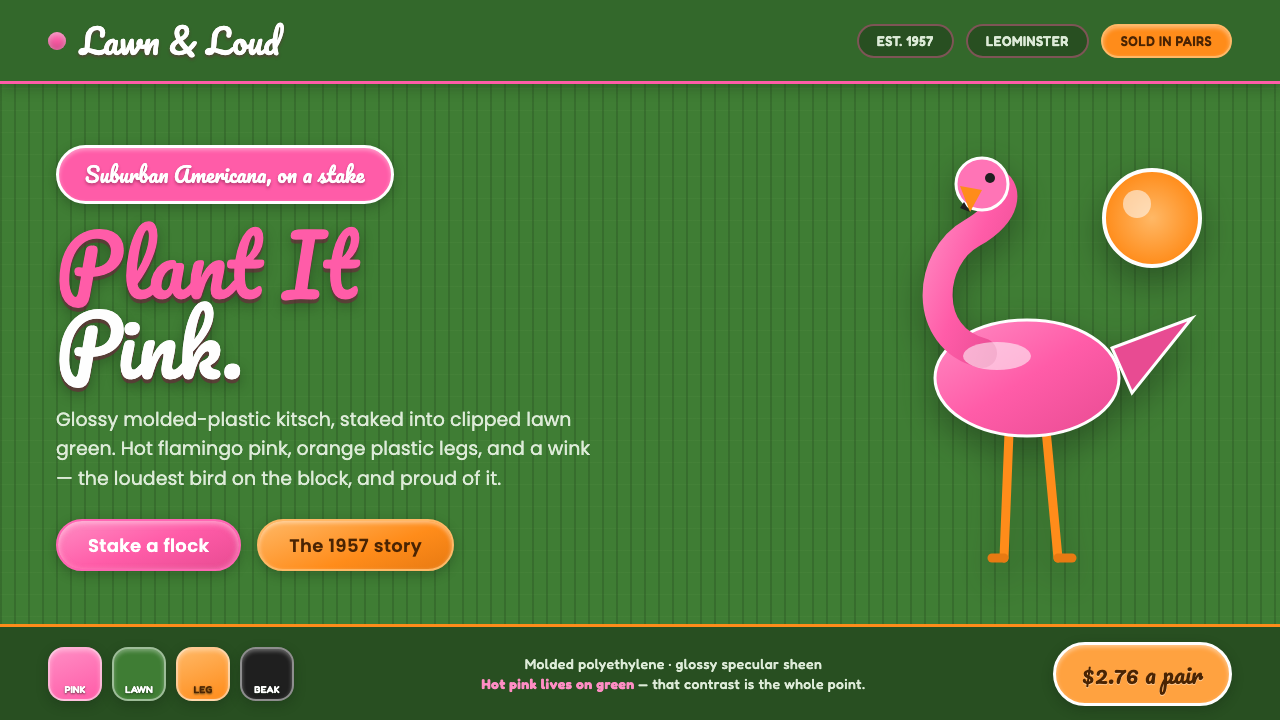 Pink Flamingo Lawn OrnamentLoud on purpose. Hot flamingo pink staked into lawn green, glossy molded plas…
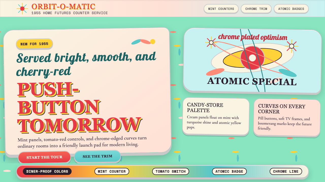 Populuxe Atomic AgeThe future grins. Mint Formica, tomato-red pills, Cooper Black, and atomic st…
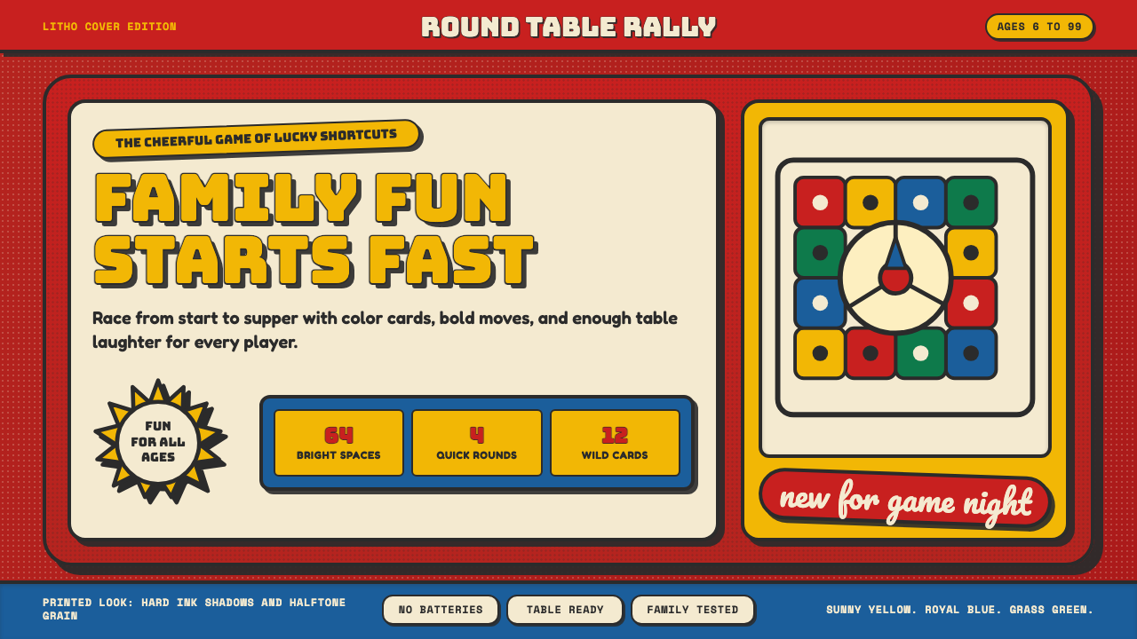 Vintage Board Game BoxShelf appeal shouts. Fire-engine red, Bungee lockups, yellow bursts, and ink…
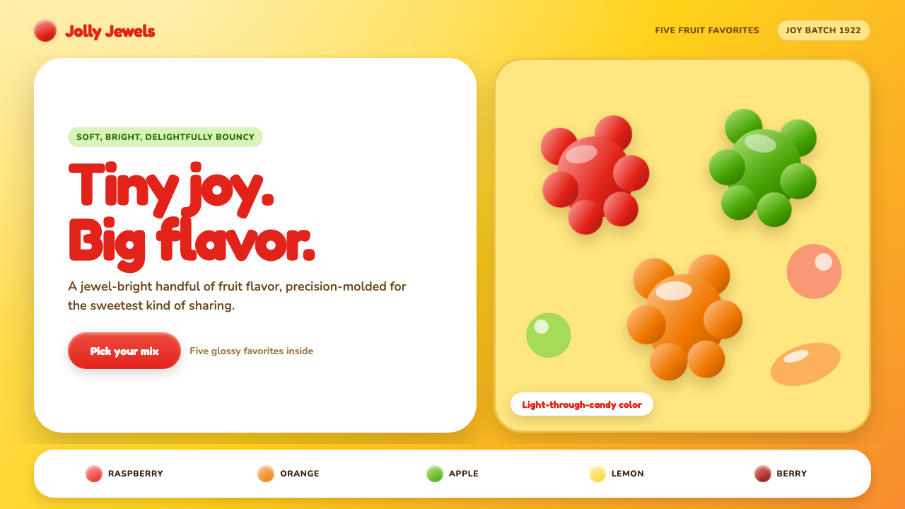 Haribo Goldbears (1922)Childhood joy, precision-molded. Glossy fruit colors tumble across a foil-gol…