What is Buzzy Bee Toy?
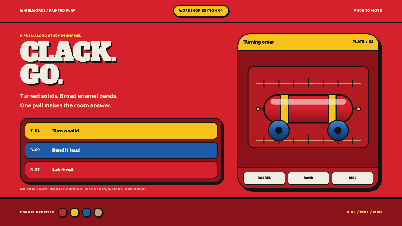
Buzzy Bee is design made by a lathe and a tin of enamel — cylinders, discs and wide bands of saturated colour, thick gloss, and not a single cartoon face.
Buzzy Bee Toy in brief
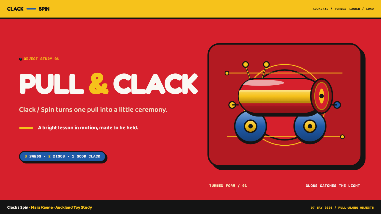
The Buzzy Bee is a pull-along wooden toy turned on a lathe in Auckland, New Zealand, from around 1940. It has a red barrel body, blue wheels, yellow wings, a black-and-yellow banded head and two red-tipped spring antennae. Pull it along and the wings rotate and clack. After the war it went back into production on a large scale and became a toy that almost every New Zealand child has played with.
Its design language is simply what a lathe and a tin of enamel can do together. A lathe spins wood against a blade, so everything it makes is round: cylinders, discs and spheres. Enamel goes on thick and dries hard and glossy, so colour arrives in wide bands that ring a body, with one soft highlight running along each turned form. Nothing is thin, nothing is pale, nothing is subtle.
There is no cartoon face anywhere on it. The toy speaks through volume and shine rather than expression, and that is the discipline that carries over into design: saturated enamel colour, hard black outlines to separate forms, and a mechanical, clacking sense of play. In its dark presentation in the library, the glossy reds, blues and yellows sit like lit objects on a dark shelf.
Where does Buzzy Bee Toy come from?
The toy was designed in the late 1930s and first made about 1940 in Auckland, in the districts of Newton and New Lynn. The design shows its workshop origins: every part can be turned, drilled, painted and assembled by a small team with a few machines. It was a product of a country where many everyday things were still made locally, and where a wooden toy could be designed, turned, painted and sold within a short distance.
The lathe is the key to understanding the shapes. A turned workpiece rotates about its axis, so every part has a circular cross-section, and the profile is made by cutting away material as it spins. That is why the Buzzy Bee has no sharp corners, no flat cut-outs and no sculpted features. A barrel, a handful of discs, a ball for the head and two beads on springs are what a turner can produce quickly and repeatably. The design is a case of constraint becoming style.
Mass production came after the war, when the toy went back into production and became a staple of New Zealand childhoods. The names attached to its story are Maurice Schlesinger and Hec Ramsey, together with two company names, Playcraft Products and Buzzy Bee Toys Limited. The second of those is telling: a business named after the product is a business that has recognised the toy itself as the brand.
In later decades the toy gathered a second life as a national icon. It appears as a souvenir, a baby gift and a shorthand for New Zealand childhood, which places it at the meeting point of three threads: wooden pull-along toys, postwar New Zealand manufacturing, and national-icon souvenir design. For a designer, the interesting point is that the style was never meant as a style. It is vernacular industrial design, the visual result of a workshop's tools and paints, and it is trusted because it is so unselfconscious.
What defines the Buzzy Bee Toy look?
Turned Geometry
Every part is a body of revolution: cylinders for the barrel, discs for the wheels and wings, spheres for the head and antenna tips. Corners are rare, and where they occur they are the clean ends of a cylinder. In a layout this means circles, capsules and rounded rectangles built from simple geometry, stacked and ringed rather than irregularly drawn.
Wide Colour Bands
Colour arrives in broad bands that ring a form, like the black-and-yellow stripes around the head. Each band is a single, fully saturated hue: red, blue, yellow and black. There is no pale undercoat, no tint, no pastel, and no gradient between bands. The palette is the full-strength enamel you could buy in a tin, and the boundaries between bands are hard.
Thick Gloss, One Highlight
Enamel gives the surface a thick, glassy gloss, and each turned form carries a single soft highlight running along its length, as if one lamp were lighting everything from the same side. The highlight is soft but the form beneath it is hard. One light direction, one highlight per form: that restraint is what keeps the gloss looking toy-like rather than glamorous.
Hard Black Outline
Forms are separated by firm black outlines and dark dividing lines, which is how the barrel body, banded head and discs stay distinct even when their colours sit close together. The outline is not a delicate hairline; it is a line with weight, like a cut in the paint. It also keeps the toy legible at small sizes and from a distance.
Mechanical Play
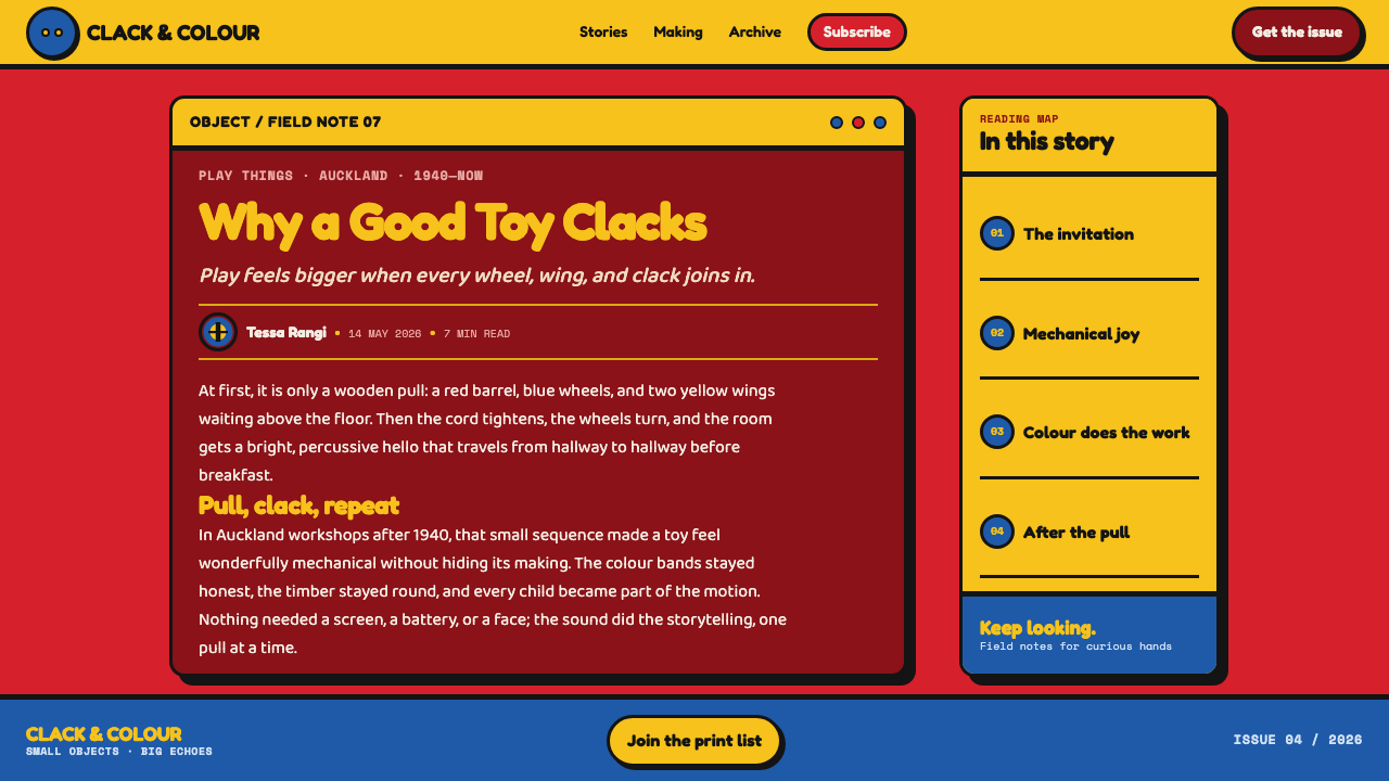
The toy has moving parts that announce themselves: wings that rotate and clack as it is pulled, antennae on springs that bob. Motion is rhythmic and mechanical, a ratchet-like turn rather than a smooth fade. In an interface, this translates into crisp, stepped transitions, spring-loaded button presses, and discs that rotate, not into languid easing.
No Face, Only Volume
There is no cartoon smile, no eyes drawn on, no expressive character. The toy's appeal comes from the weight of its shapes and the shine of its paint. In design terms, avoid mascots with faces, emoji-style expressions and illustrated characters; let size, colour and form do the work of personality.
Chunky, Child-Scale Weight
Nothing is thin. Parts are thick enough to survive a pulled string and a dropped toy, and generous in size for small hands. Interface elements follow the same scale: large buttons, bold type, thick strokes and wide touch targets. Fine hairlines, light weights and delicate spacing all contradict the toy's logic.
Who shaped Buzzy Bee Toy?
Maurice Schlesinger is one of the two people whose names are tied to the Buzzy Bee's Auckland history, from the late-1930s design to the postwar production runs. His name stands for the step that matters most to this style: an idea for a pull-along toy becoming a repeatable, buildable object.
Hec Ramsey is the other personal name tied to the toy's story. What a designer can take from that story is that the toy's simple turned parts are what made volume possible: a design a lathe can repeat is a design a factory can scale.
Playcraft Products is one of the two companies named in the toy's history. It stands for the small-manufacturer world of postwar New Zealand: local workshops, simple tooling and bright enamel. The company is a reminder that this look was a product of manufacturing conditions rather than of a designer's mood board.
Buzzy Bee Toys Limited is the other company name, and the name itself is the telling thing: a firm named after the toy it makes has accepted that the product is the brand. It points to the toy's later status as a national icon, and to the way the look has come to be read as a symbol, not just a finish.
How do you use Buzzy Bee Toy today?
Buzzy Bee is a style for products that want to feel physical, friendly and unmistakable. Its rules are easy to state: round and turned shapes, wide bands of full-strength colour, hard dark outlines, and gloss kept to one soft highlight per form. Applied with discipline, it makes digital work feel as if it were made of real, painted objects.
For presentation slides, a cover can be built from a few oversized turned shapes — a big disc, a banded cylinder, a ball — in saturated colour on a dark field, with a heavy title beside them. Content slides work as stacked horizontal bands, each a full-strength colour with a thick outline, one idea per band. Data slides suit chunky bar charts that look like turned cylinders with a single soft highlight, and donut or pie charts built as discs with hard outlines between segments.
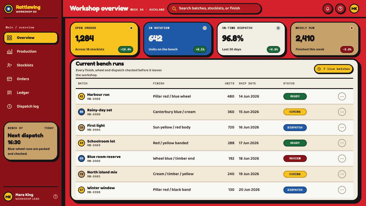
For web interfaces, the style suits children's education, family and parenting products, toy and gift retail, casual games, and any product that wants playfulness without cuteness. Use large pill and disc-shaped buttons, thick outlines, big type, and bold coloured bands as section headers. Pricing tiers can be three chunky cards in different band colours. Dashboards should stay readable: restrict saturated colour to categories and status, and keep the dark field calm.
For editorial and marketing work, the style gives heritage retail, New Zealand and Pacific brands, nostalgic toy and gift campaigns, and children's publishing a warm, tactile identity. Layouts benefit from large, simple object illustrations drawn as turned forms, headlines in heavy sans-serif type, and borders formed from repeating colour bands. Photography of real wooden toys, shot sharply against a plain ground, reinforces the material truth.
The most common mistake is to soften it. Pastel tints, thin outlines and gentle gradients turn the style into generic baby-product design and erase its force. A second mistake is adding a smiling face or mascot, which the toy deliberately avoids. A third is scattering highlights from several directions, which makes the gloss look like plastic rather than turned and enamelled wood. Keep one light direction, one highlight per form, and let the saturated colour and the hard outline carry the personality.
Buzzy Bee Toy — FAQ
Is this just a children's style?
It is derived from a toy, and it carries real playfulness, but its principles are general design principles: saturation, strong volume, firm outlines, and mechanical rhythm in motion. Those travel well to education, consumer apps and retail brands for adults who want warmth and clarity. What it does not travel to is anything that needs to feel austere, hushed or luxurious.
Why does the toy have no face?
The toy was shaped by what a lathe can make, and a turned bee has volume, banding and movement rather than features. Leaving the face out is part of its appeal: it keeps the object an object, and the personality comes from weight, colour and sound. For a design system, this means avoiding mascots and expressive illustrations, and letting form and colour do the talking.
Which colours does the style use?
The working set is red, blue, yellow and black, each at full strength and applied in wide bands, with red also used as small tips. There is no pastel version and no tint ladder. Variety comes from how bands are arranged and which forms they ring, not from adding more hues. If you need a fifth colour, treat it as an exception and keep it equally saturated.
Does it work on a light background?
The library presents it on a dark ground, where the saturated enamel colours read as lit objects. On a light ground it can work if the black outlines stay heavy and the colours stay full strength; the risk is that pale surroundings make the saturated hues feel loud rather than glossy. Whichever ground you choose, keep it plain so the turned shapes stay the subject.
Where does the style struggle?
It struggles where seriousness, subtlety or refinement are the value: legal and financial products, high-end luxury, quiet editorial writing, and dense data with many close categories that need a restrained palette. Its strength, a loud and physical clarity, becomes a liability when the product needs to whisper. Match the style to products that benefit from being friendly and immediate.
Related design styles
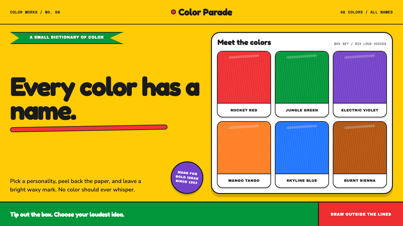 Crayola (1903)Color never whispers. Golden yellow, a green slash, and waxy swatches make ev…
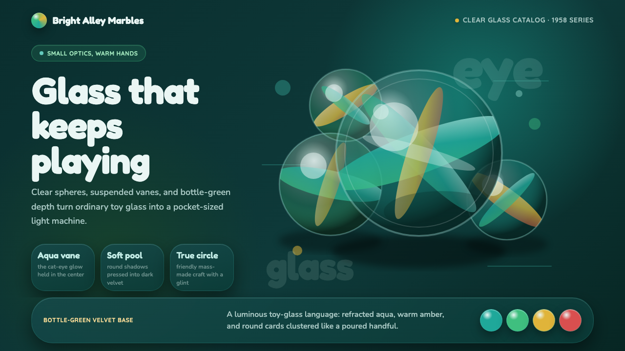 Cat's Eye MarblesMass-made glass feels magical. Aqua vanes glow inside round forms on bottle-g…
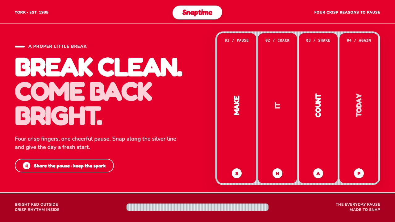 KitKat (1935)A break you can hear. Pillar-box red, plump white type, and silver grooves se…
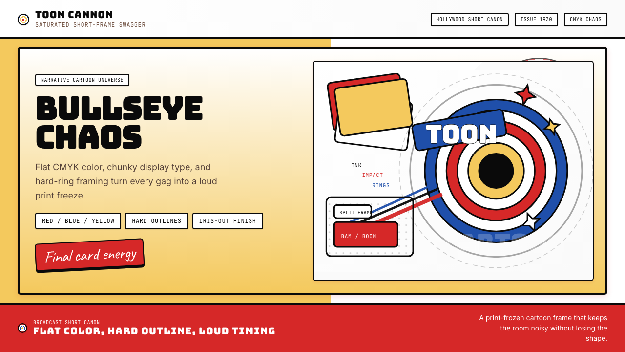 Looney Tunes (Warner Bros.)Pure cartoon chaos. Bull's-eye rings, Bungee type, and red-blue-yellow blocks.
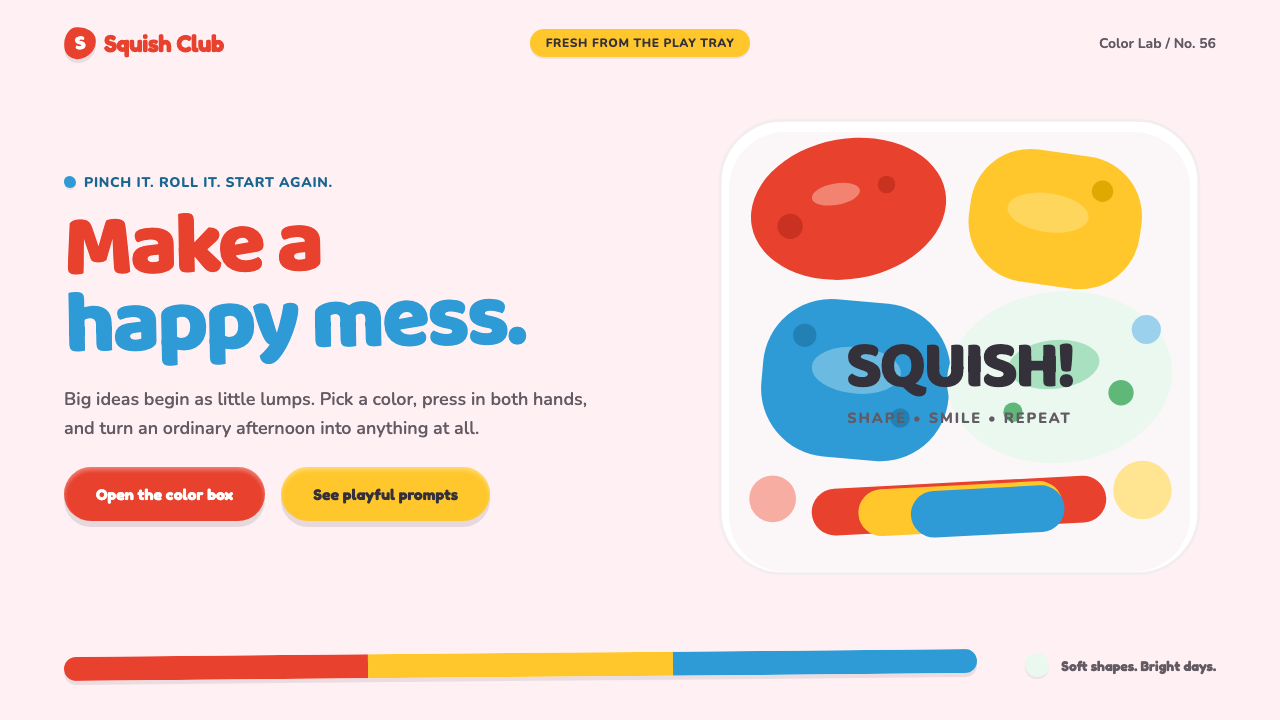 Play-Doh (1956)Joy you can squish. Candy primaries, chunky type, and pinched clay forms make…
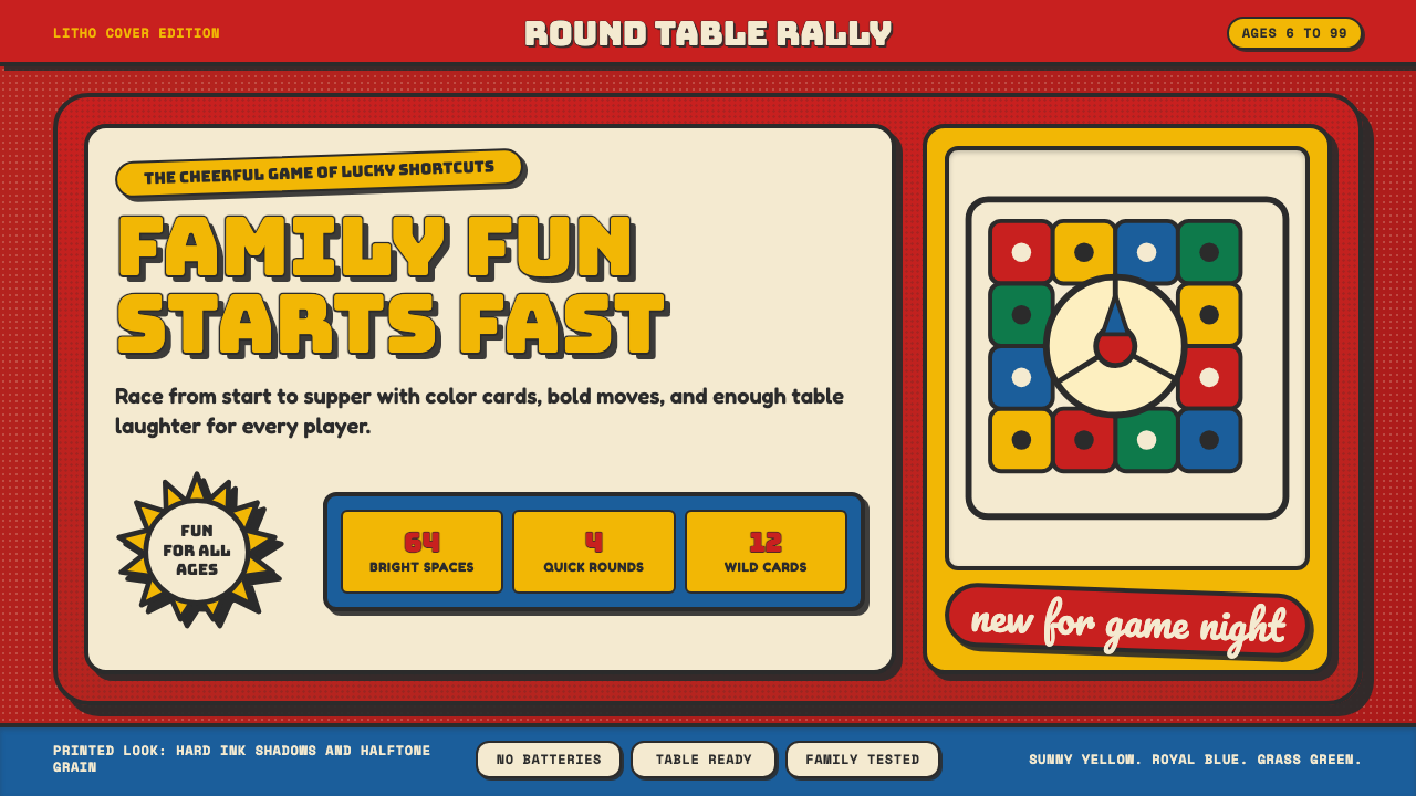 Vintage Board Game BoxShelf appeal shouts. Fire-engine red, Bungee lockups, yellow bursts, and ink…