What is Play-Doh (1956)?
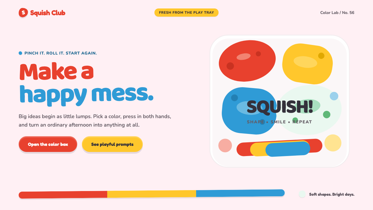
Play-Doh turns touch into a visual language: candy-bright color, chunky lettering, and soft forms that look as if they were just pinched by a small hand.
Play-Doh (1956) in brief
Play-Doh is a modeling compound launched in 1956 after being repurposed from a Cincinnati wallpaper cleaner. Its identity grew from the physical experience of the material itself: rolling, pressing, pinching, flattening, and reshaping a soft mass. Rather than treating those marks as imperfections, the visual system treats them as proof of play. A dent, an uneven edge, or a slightly lopsided blob makes an object feel more inviting because it suggests that someone has already touched it and another person may join in.
The style belongs to a distinctly American toybox world: bright primary color chips, chalky pastel lumps, friendly plastic packaging, and forms made to survive energetic handling. Its yellow-lidded tub and rainbow arc logo provide familiar brand cues, but the larger design vocabulary is broader than packaging. It is a system of matte, rounded, cheerful objects that resist sharpness, gloss, and adult seriousness.
Visually, Play-Doh-inspired work makes digital surfaces feel moldable. Buttons resemble compressed bits of clay; cards feel like dough tiles resting on a play tray; fields can suggest thumbprints pressed into a soft surface. The objective is not realistic clay simulation. It is an emotional translation of clay: forgiving, immediate, colorful, and open to alteration.
Where does Play-Doh (1956) come from?
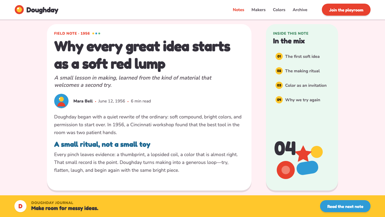
Play-Doh entered the market in 1956 in Cincinnati, Ohio, during a period associated here with mid-century American toy design, tactile early-childhood play, and supermarket-era plastic branding. Its unusual origin matters to the aesthetic. A practical household cleaner became a children’s material, and that conversion gave the product a personality unlike a polished manufactured toy. It was soft, hand-worked, and defined by repeatable transformation rather than by a fixed final form.
The peak toybox era identified for the brand runs from 1956 to 1975. In this context, Play-Doh’s visual language developed around accessibility and immediate recognition: vivid color, rounded packaging cues, and a product whose purpose could be understood before instructions were read. The material’s appeal was inseparable from its behavior. It invited children to make temporary things, undo them, and begin again without treating the first result as precious.
A rainbow logo was introduced during the 1960s, adding an arc-shaped sign to the brand’s vocabulary of color and curve. Alongside the yellow lid and the soft modeling compound, it helped make Play-Doh feel like a complete play environment rather than a single object. The named figures associated with this origin are Joseph McVicker, Noah McVicker, Kay Zufall, and Bill Rhodenbaugh. Their presence situates the theme within the brand’s documented launch-era story without requiring the visual system to imitate nostalgia literally.
For contemporary designers, the historical lesson is that Play-Doh is not merely a retro palette. Its strongest qualities come from the relationship between hand action and visible form. A surface should seem pressed rather than mechanically beveled; a color area should feel deposited rather than illuminated; a composition should leave room for surprise. The style works when it preserves that sense of low-stakes making.
What defines the Play-Doh (1956) look?
Candy Color
Color is bright, flat, matte, and immediately legible. Primary hues establish the toybox energy, while chalky pastels keep the system gentle enough for early-childhood play. Color should arrive in clear areas rather than atmospheric washes. It behaves like a lump of colored compound placed on a tray: cheerful, tangible, and separate from the surrounding surface.
Pinched Form
Nothing should look perfectly cut. Corners swell, edges wobble, and small dents imply that the form was made by pressure rather than drawn by a rigid tool. This irregularity must remain controlled enough to preserve usability. The goal is a friendly handmade signal, not visual noise or accidental-looking damage.
Chunky Type
Typography should feel broad, rounded, and easy to grasp. Headlines can carry the playful mass of a clay stamp, while supporting copy remains plain enough to read without effort. The important contrast is between expressive display type and calm information text. Lettering should contribute warmth, never turn language into a toy that users must decode.
Pressed Depth
Depth is suggested through compression and layering, not through polished realism. A raised control can feel as though it was rolled and placed on top; an inset area can resemble a thumbprint in dough. Shadows, if used, should reinforce the idea of a physical play tray and retain the soft, matte character of the material.
Rounded Resilience
The forms should feel unbreakable. Hard corners, brittle-looking outlines, and delicate decorative details conflict with the brand’s physical promise. Rounded shapes communicate safety and repeat use, while generous empty space prevents the page from becoming a crowded pile of colorful pieces.
Play-Tray Composition
A Play-Doh layout works best when elements appear placed rather than aligned with sterile precision. Cards, labels, and illustrations can occupy their own soft territories, like separate pieces of dough on a tray. The composition still needs hierarchy, but it should feel assembled through play rather than imposed by an impersonal machine.
Who shaped Play-Doh (1956)?
Joseph McVicker is named among the key figures in the Play-Doh origin story supplied for this theme. His inclusion anchors the style in the 1956 launch context, where a repurposed practical material became a vehicle for tactile play.
Noah McVicker is included in the source’s group of key Play-Doh figures. Within this theme, that association connects the recognizable brand language to its Cincinnati origin and to the shift from household utility toward children’s creative play.
Kay Zufall appears among the source material’s named key figures. Her inclusion belongs to the launch-era account that frames Play-Doh as a material made meaningful by direct handling, imaginative reuse, and the freedom to remake a form.
Bill Rhodenbaugh is named as a key figure in the supplied Play-Doh history. The association reinforces the theme’s central move: treating softness, color, and hand-made irregularity as the basis of a durable public-facing visual identity.
How do you use Play-Doh (1956) today?
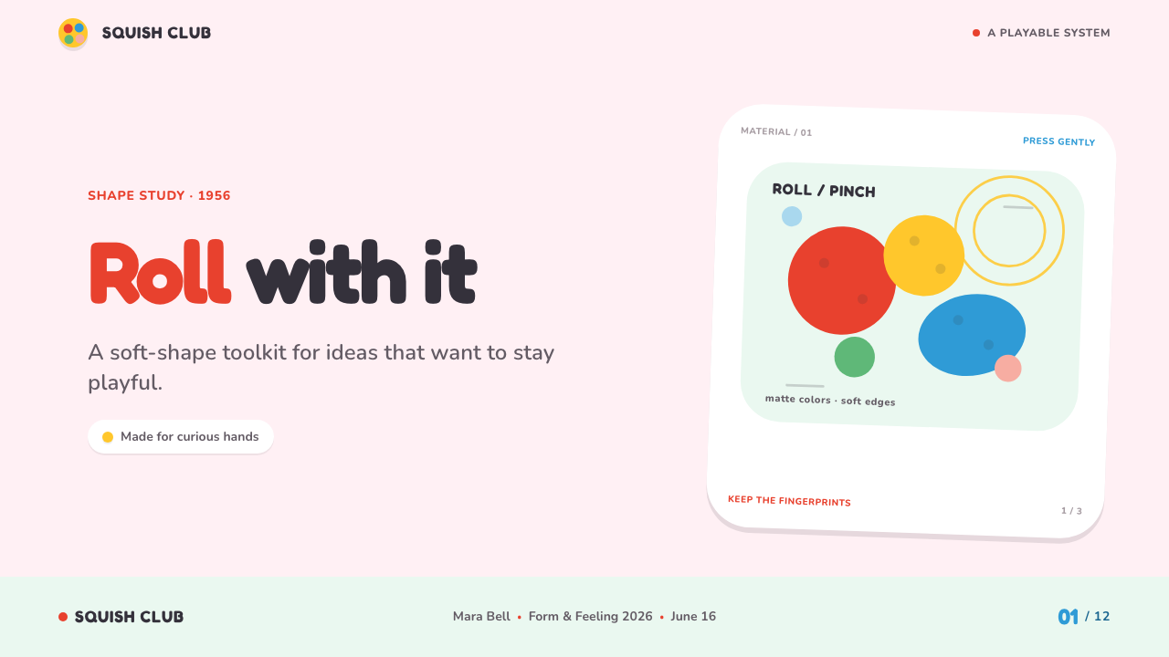
For presentation covers, use one large soft form as the immediate invitation: a pinched title plaque, a rolled color strip, or a clay-like badge sitting in open space. Keep the title short and highly readable. The cover should feel like a play tray prepared for an activity, not like a scrapbook crowded with every available color and shape.
Content slides benefit from a stable informational frame with playful containers inside it. Use rounded labels for section names, soft cards for grouped ideas, and clear type for explanations. On data slides, let bars, markers, and legends take on the character of separate colored pieces, while preserving conventional reading order and unambiguous labels. The style can make a dense topic feel less intimidating, but it cannot replace honest structure.
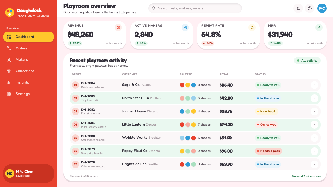
For web interfaces, Play-Doh works especially well for family-oriented learning products, creative tools, playful onboarding, and child-friendly activity spaces. Dashboards can use soft cards and tactile status markers to make progress feel encouraging. Pricing pages can distinguish plans with cheerful color territories and clear plan names, but important comparisons should remain calm and easy to scan rather than becoming decorative clay scenery.
Editorial and marketing work can use the style to turn a campaign into an invitation to participate. A feature story may pair straightforward body copy with hand-pressed callouts, rounded image frames, and colorful section markers. Landing pages work when their primary action feels physically welcoming, as though a visitor is being asked to press, shape, or begin. Matte surfaces and generous breathing room keep the result from becoming sugary or exhausting.
The common mistake is mistaking Play-Doh for random wobbliness. If every edge is distorted, every word uses expressive type, and every color competes at once, the experience becomes noisy and tiring. Let one or two handmade gestures carry a section; keep instructions, navigation, and data disciplined. The strongest applications preserve the brand’s freedom to play while giving users confidence that nothing important will get lost in the mess.
Play-Doh (1956) — FAQ
Is Play-Doh style only appropriate for children’s products?
No, but its emotional signal must match the product. It naturally suits early-childhood learning, family activities, creativity tools, playful events, and approachable onboarding. It is less suitable when a product must project restraint, luxury, technical severity, or high-stakes authority. The question is whether softness and remakeability support the user’s state of mind.
How handmade should the shapes look?
They should look touched, not broken. A few pressed dents, softened corners, and gently uneven outlines are enough to establish the material cue. Repeating one controlled family of irregularities is more convincing than giving every element a different exaggerated deformation. Usability still depends on recognizable buttons, readable type, and dependable layout boundaries.
Can this style handle data-heavy dashboards?
Yes, when playfulness is assigned to grouping and emphasis rather than to the data itself. Soft cards can separate tasks, colored markers can clarify status, and rounded charts can make the environment friendlier. Labels, comparisons, and key values must remain direct. If the clay treatment obscures a trend or makes categories difficult to compare, it has exceeded its useful role.
Why should the surfaces remain matte?
Matte color supports the source material’s image of soft compound, chalky pastel lumps, and cheerful unreflective play objects. Strong shine makes a surface feel hard, wet, metallic, or highly manufactured, which changes the emotional material entirely. A matte treatment lets color and form do the expressive work without turning the design into a glossy toy advertisement.
Related design styles
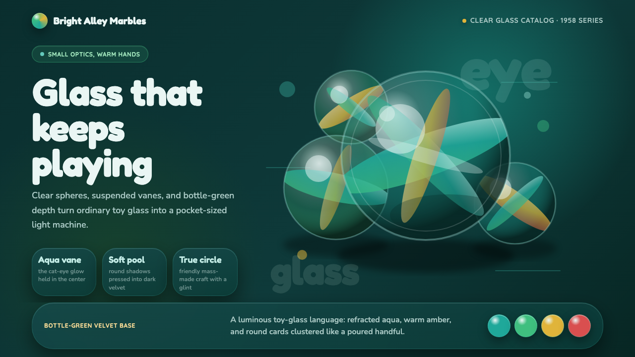 Cat's Eye MarblesMass-made glass feels magical. Aqua vanes glow inside round forms on bottle-g…
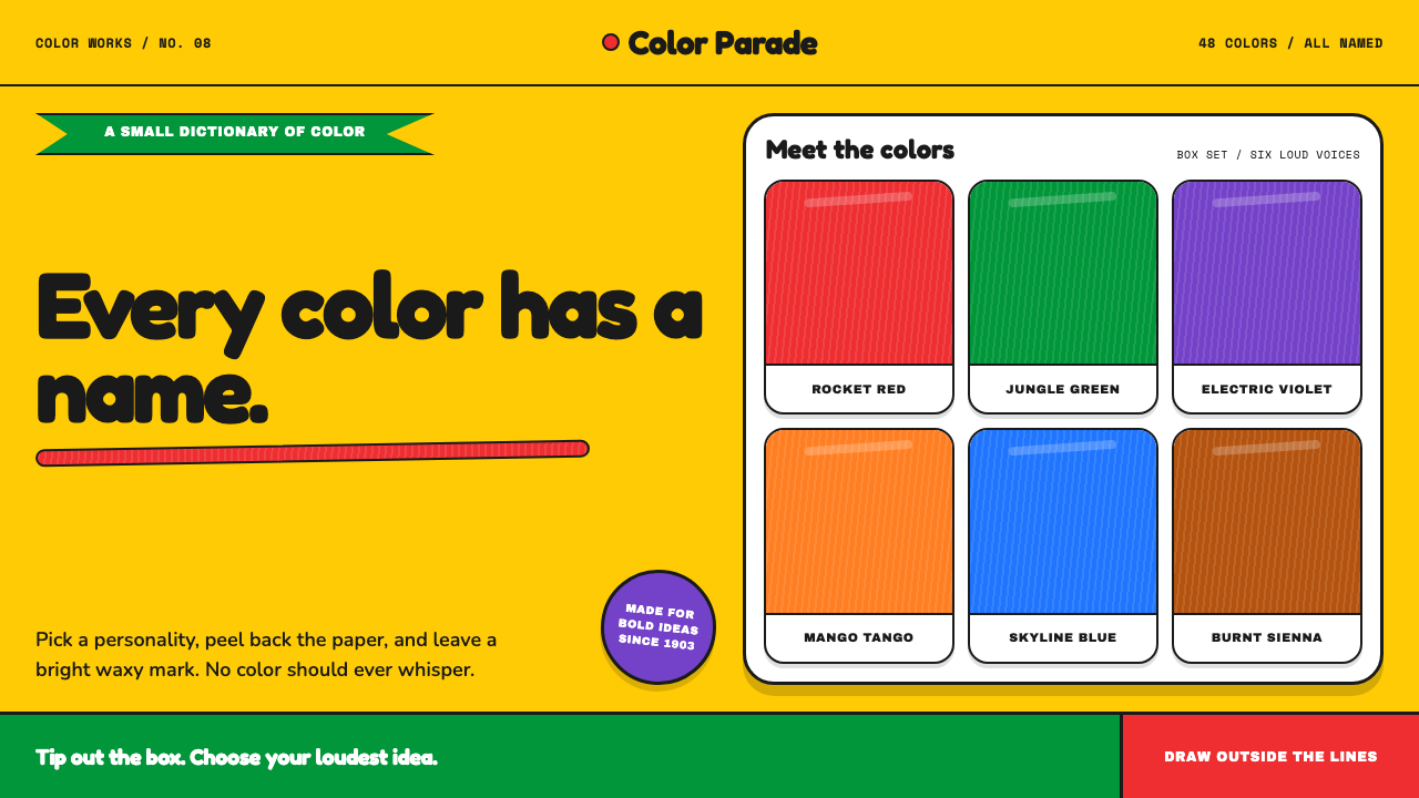 Crayola (1903)Color never whispers. Golden yellow, a green slash, and waxy swatches make ev…
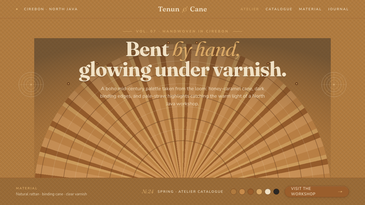 Indonesian Rattan WeaveBent by hand, varnished warm. Honey-caramel cane and dark binding edges over…
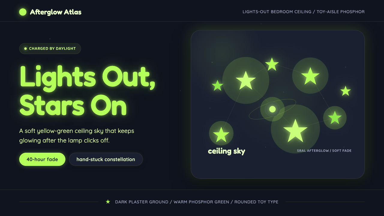 Glow-in-Dark Ceiling StarsTurns lights-out into wonder. Yellow-green stars glow across a dark blue-gray…
 Instagram 2010s FilterWhen photos felt like memories. Faded warmth, dark vignettes, cream-tinted Po…
 Macramé Fiber ArtSlow craft, hand to fiber. Undyed ecru cotton on raw-jute walnut, square knot…