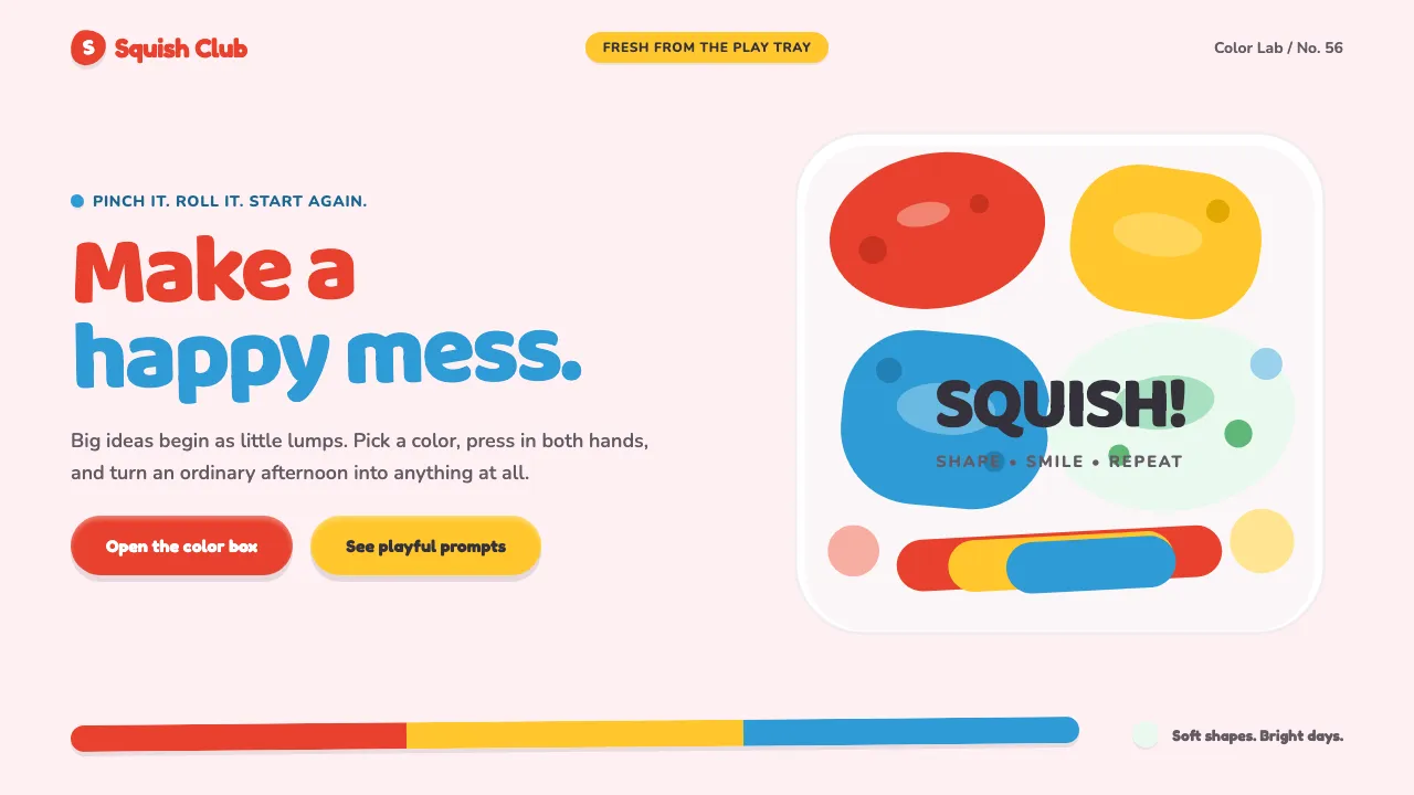
About Play-Doh (1956)
Play-Doh is the squishiest brand a child ever held — a 1956 modeling compound (a repurposed Cincinnati wallpaper cleaner) that turned primary color chips and chalky pastel lumps into a whole language of pinch, roll, and squash. This system takes that vocabulary literally. Everything is a soft blobby lump with pressed-in dents: buttons look pinched from clay, cards sit like dough tiles on a play-tray, and nothing owns a straight edge. Colors stay bright, flat, and matte — cheerful, rounded, unbreakable.
- Origin
- Cincinnati, Ohio, USA
- Era
- 1956 launch; peak toybox era 1956–1975 (Rainbow logo introduced 1960s)
- Key figures
- Joseph McVicker · Noah McVicker · Kay Zufall · Bill Rhodenbaugh
- Movements
- mid-century American toy design · tactile early-childhood play · supermarket-era plastic branding
Play-Doh (1956) design spec
Colors
Background
Surface
Primary
Secondary
Accent
Text
Typography
FredokaHeadings
NunitoBody
Unlock for 1 credit
The other 11 sections — buttons, cards, spacing, motion, techniques and more — open once you unlock. Download the DESIGN.md or send it to your AI in one click. Unlock once, yours forever.
Sign up nowHave an account? Sign in
Styles similar to Play-Doh (1956)
Also inspired by brands & products, with a close feel.
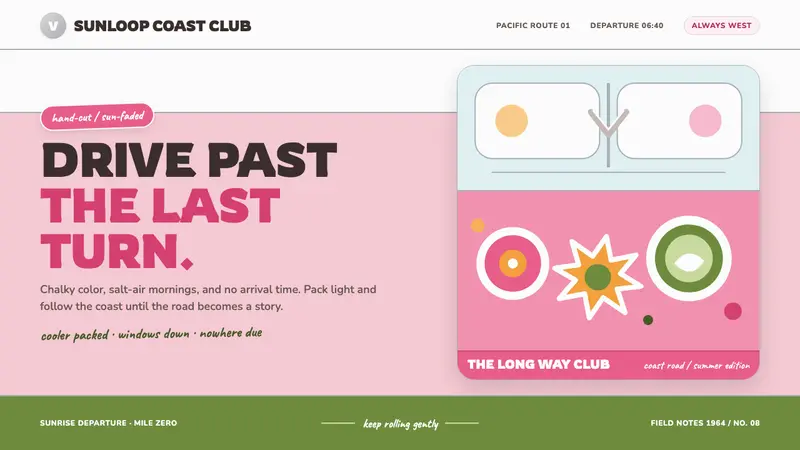 VW Bus Flower-Power (1964)Road-trip optimism in chalky pastels. Rounded type rides pink, white, and chrome bands.
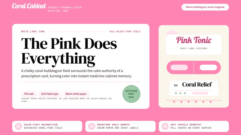 Pepto-Bismol Pink (1901)Color is the cure. Bubblegum pink floods the field; white label cards and pill curves anchor trust.
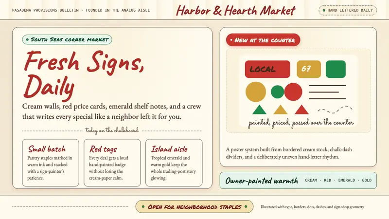 Trader Joe's Hand-LetteredHandmade grocery warmth. Cream chalkboards, red price tags, emerald accents.
 Orange Crush Soda (1906)Syrupy nostalgia. Tangerine, cream, and script make it a postcard label.