What is Indonesian Rattan Weave?
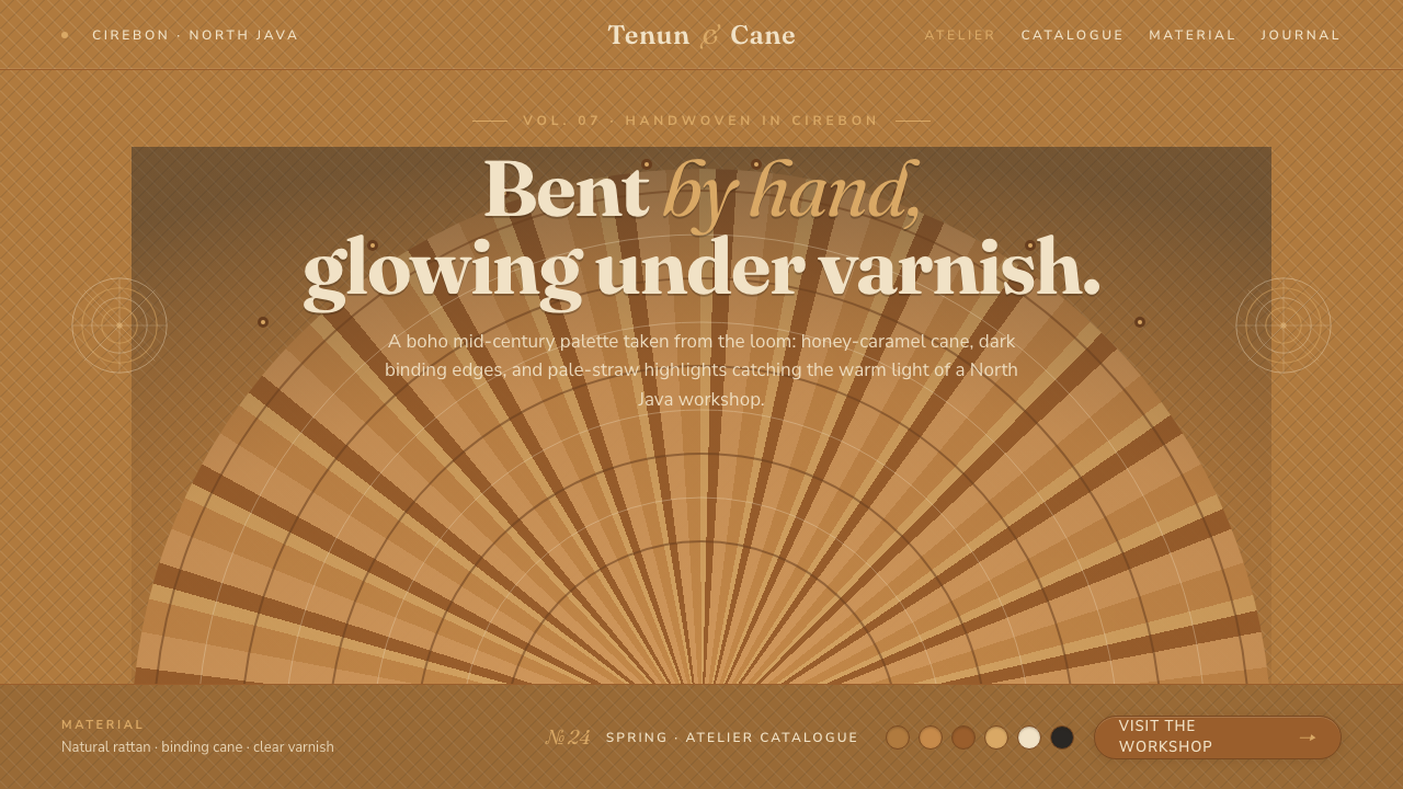
Indonesian Rattan Weave turns hand-bent cane into a warm digital language of honeyed color, fan-shaped rhythm, and dark binding lines.
Indonesian Rattan Weave in brief
Indonesian Rattan Weave is drawn from the peacock chair, a handwoven rattan form associated with the workshops of Cirebon, Indonesia. Its defining image is a towering fan back built from natural cane, with fan and spiral weaves creating an open lattice beneath clear varnish. The material is never treated as a neutral support; the cane itself becomes the visual ground.
The palette is warm and saturated rather than pale: honey-caramel, golden brown, caramel, straw, and dark binding-cane accents. These colors suggest varnished natural fiber and the subtle variation of a handmade surface. The result feels tactile without becoming rustic illustration, because the weave supplies rhythm, structure, and texture at the same time.
As a digital design system, the style combines that material language with friendly humanist sans type. Interfaces and layouts should feel made rather than manufactured: rounded where the weave calls for softness, clearly bounded where binding edges create structure, and generous enough to let the pattern breathe. Everything should evoke the experience of running a hand across woven rattan.
Where does Indonesian Rattan Weave come from?
The style originates in the Indonesian peacock chair, a form handwoven in the rattan workshops of Cirebon. Its identity comes from the relationship between bent cane and an expanding fan back: the silhouette rises vertically, while the interior surface is articulated by repeating fan and spiral patterns. The chair is therefore both furniture and woven image.
Cirebon is presented as part of the Southeast Asian rattan weaving centers, and the style is grounded in the work of local rattan weavers and Indonesian furniture artisans. Their contribution is not a decorative afterthought. Hand bending, weaving, binding, and varnishing determine the character of the object, so the visual language begins with making rather than with a later graphic treatment.
The source places the form within the history of mid-century rattan furniture and its renewed visibility as a 1970s boho icon. Across that period, natural cane remained central: its golden-brown tone, open lattice, and fan-backed silhouette carried the appeal. The style belongs to a lineage of natural cane weaving, where material and construction remain visible in the finished object.
The digital system distills those qualities into a coherent visual vocabulary. A honey-caramel ground stands in for the varnished cane, caramel-to-straw strands suggest the weave, and dark binding accents clarify edges and joins. Friendly humanist sans type completes the translation, keeping the system approachable while allowing the material-inspired structure to remain dominant.
What defines the Indonesian Rattan Weave look?
Honeyed Material Color
The ground is a saturated honey-caramel or golden-brown tone, warm enough to feel varnished and substantial rather than pale or washed out. Caramel and straw may appear as neighboring strands, creating the impression of natural variation. Dark binding-cane color is reserved for edges, joins, and moments that need firm definition.
Fan and Spiral Rhythm
The core pattern language comes from fan and spiral weaves. Fans create radiating direction and a sense of lift; spirals introduce softer continuity and keep the lattice from feeling mechanical. Patterns should repeat with visible rhythm but retain enough irregularity to suggest handwork rather than a perfectly uniform industrial grid.
Open Lattice
Negative space is part of the weave, not an empty afterthought. Open intervals between strands allow the honeyed ground to remain visible and give the composition a light, breathable quality. Dense areas can anchor a card or panel, while more open areas create pause and prevent the material reference from becoming visually heavy.
Binding-Cane Structure
Dark binding edges provide the system's strongest structural cue. They can frame a surface, mark a seam, or gather several lighter strands into a readable unit. The contrast should feel like an actual binding action: firm and tactile, never like a decorative outline pasted on top of the design.
Friendly Humanist Type
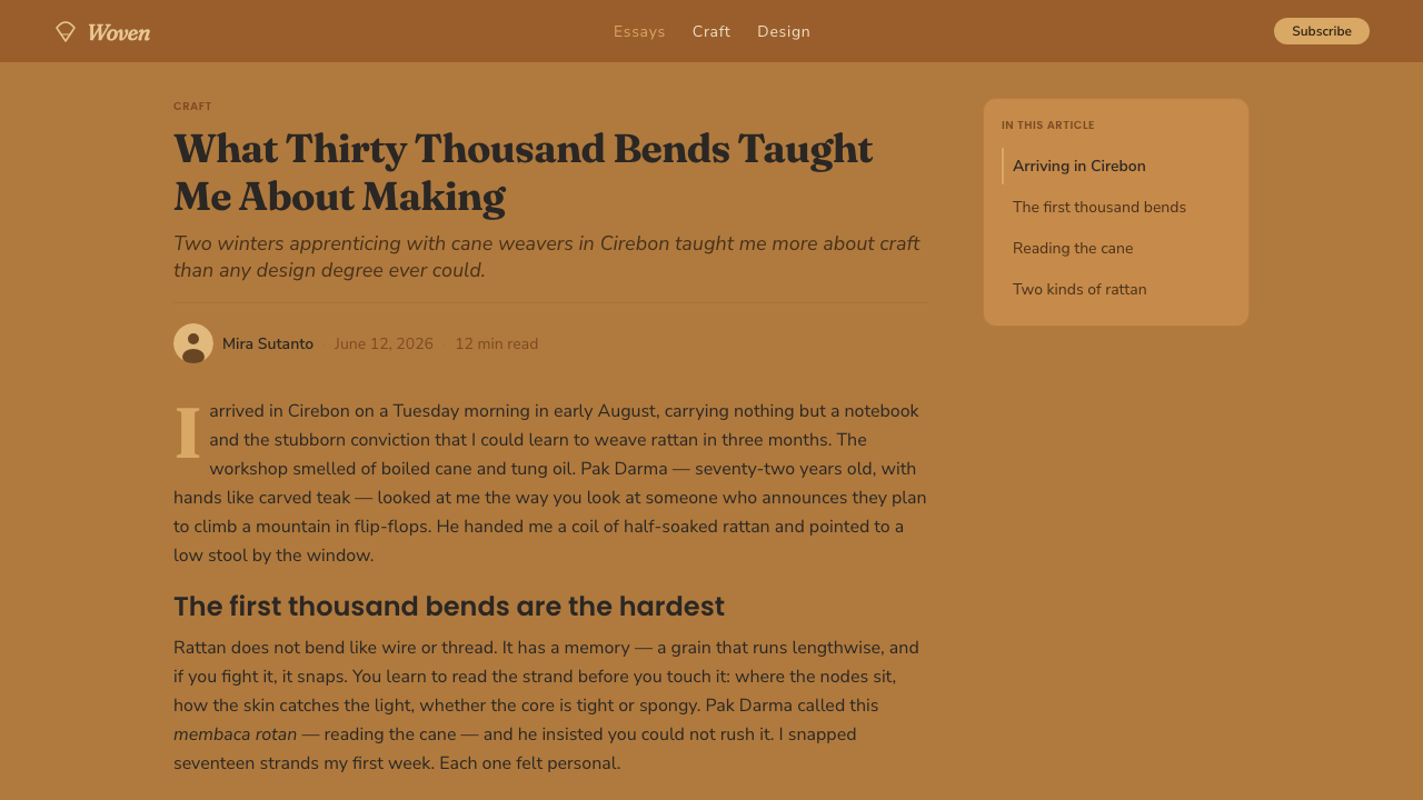
Typography uses a friendly humanist sans with open, approachable forms. It should support the woven material without competing with it: readable in dense information areas, relaxed in headings, and warm enough to soften the strong verticality of the fan back. Contrast comes through scale, spacing, and placement rather than elaborate typographic ornament.
Warm Organic Finish
Surfaces should feel gently finished, like cane beneath clear varnish: warm, smooth, and tactile without looking glossy or synthetic. Corners may be softened, panels may carry subtle woven rhythm, and transitions should feel assembled from material relationships. The overall impression is handmade and organic, with enough order to remain useful.
Who shaped Indonesian Rattan Weave?
The weavers of Cirebon are the central creative presence behind the style. Their handwork is expressed through the bending of cane, the construction of fan and spiral lattices, and the visible relationship between strand, opening, and binding edge. In the design system, they represent making as the source of visual character.
Indonesian furniture artisans carry the broader tradition of natural cane weaving into furniture. Their work connects material, structure, and use, allowing a chair to remain visibly woven rather than disguising its construction. The digital interpretation follows the same principle by keeping its warm ground and binding logic legible.
The peacock chair is the defining object of the reference style: a tall fan-backed form whose woven surface became a mid-century and 1970s boho icon. Its silhouette supplies the system's vertical lift, while its lattice supplies the repeating rhythm and open space that make the material immediately recognizable.
How do you use Indonesian Rattan Weave today?
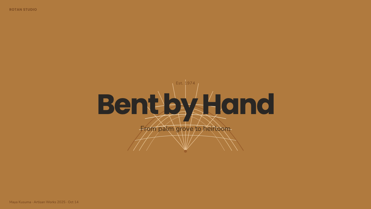
For presentation covers, use the fan-back idea as a strong framing gesture: a broad radiating weave can rise behind the title or occupy one side of the composition, while the honey-caramel ground keeps the page warm. Content slides should remain calmer. Use dark binding accents to separate sections, humanist sans type for hierarchy, and open woven intervals around text so the material language supports reading instead of crowding it.
Data slides can translate charts into woven structures. A bar chart may use caramel-to-straw strands with dark binding marks at important boundaries; a process diagram can borrow the radial logic of a fan; a comparison page can use alternating open and dense fields to create visual rhythm. Keep the color family close and let the structure carry the explanation. The goal is a diagram that feels assembled from cane, not a chart decorated with a texture.
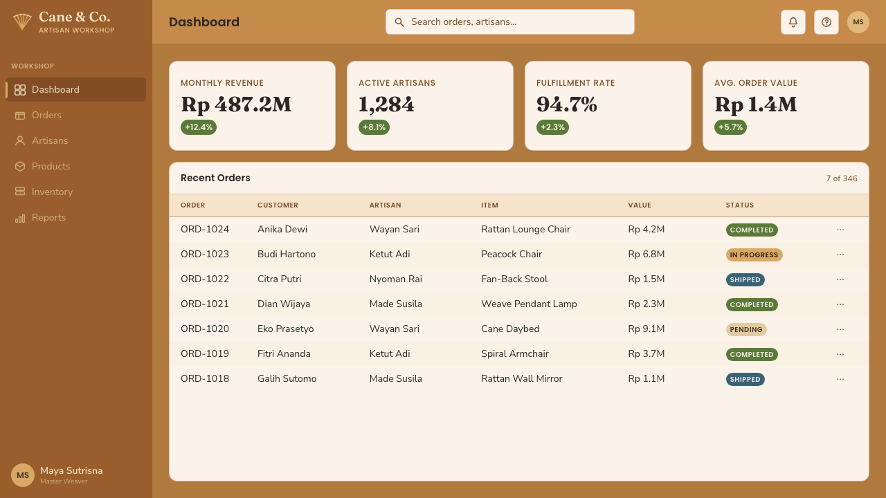
For web interfaces, the style suits dashboards and pricing pages that want to feel welcoming, crafted, and grounded. Use the honey-caramel family as the visual field, keep body text in a clear dark tone, and reserve binding-cane contrast for active states, selected plans, borders, and essential actions. Cards can feel softly shaped, but their edges should still be legible. Weave-inspired patterning works best as a quiet surface or directional cue rather than a full-screen background.
Editorial and marketing layouts benefit from the contrast between a warm material field and a clearly organized reading path. A feature story can pair a large fan-like image or radial pattern with a narrow text measure and generous surrounding space. Product pages can emphasize the handmade origin through alternating caramel and straw surfaces, with dark binding lines marking calls to action or content groupings. The tone should be tactile and approachable, never overly polished or sterile.
The most common mistake is treating rattan as a generic beige theme. A successful application needs the specific relationships that make the reference recognizable: saturated honey-caramel rather than pale tan, visible fan and spiral rhythm rather than random texture, dark binding edges rather than arbitrary outlines, and humanist type rather than a cold geometric sans. Another mistake is covering every surface with weave. The pattern needs open space around it, just as a real lattice needs openings to remain readable.
Indonesian Rattan Weave — FAQ
What makes Indonesian Rattan Weave different from a generic natural or boho style?
Its identity depends on a specific material and construction vocabulary: saturated honey-caramel cane, golden-brown warmth, fan and spiral weaves, open lattice, and dark binding edges. A generic natural style may use muted beige and organic decoration, but this system is more precise. The structure must feel woven, bent, gathered, and varnished, with the peacock chair supplying the recognizable vertical silhouette.
Does the style require using a literal rattan texture or photograph?
No. The essential qualities can be expressed through color relationships, open intervals, radiating forms, spiral rhythm, and binding-like edges. A literal texture can help establish tactility, but it should remain subordinate to hierarchy and readability. If the surface becomes noisy, the system loses the calm clarity that comes from a well-ordered lattice.
Can Indonesian Rattan Weave work with a dark background?
It can, but the material reference is strongest on a warm light ground because the cane itself is the visual field. A dark variation should keep the honey, caramel, or straw tones prominent and use binding-cane contrast carefully to preserve the sense of woven structure. If the background becomes dominant, the design can start to feel like a dark decorative theme rather than varnished natural cane.
How should typography behave in this style?
Typography should use a friendly humanist sans with clear, open forms. It needs to feel comfortable beside the warm cane palette and the organic weave rhythm. Hierarchy should come from scale, spacing, and placement, while dark text provides dependable contrast. Highly rigid or ornamental type can fight the material language; a single approachable family used with discipline will usually feel more coherent.
Where does the style struggle?
It struggles when a product needs severe neutrality, cold precision, or an intentionally synthetic atmosphere. Its strengths are warmth, tactility, approachability, and visible craft. It can also fail when every component receives the same weave treatment, because repetition without quiet space becomes visual clutter. The most convincing applications let the material vocabulary establish personality while the layout remains disciplined and easy to use.
Related design styles
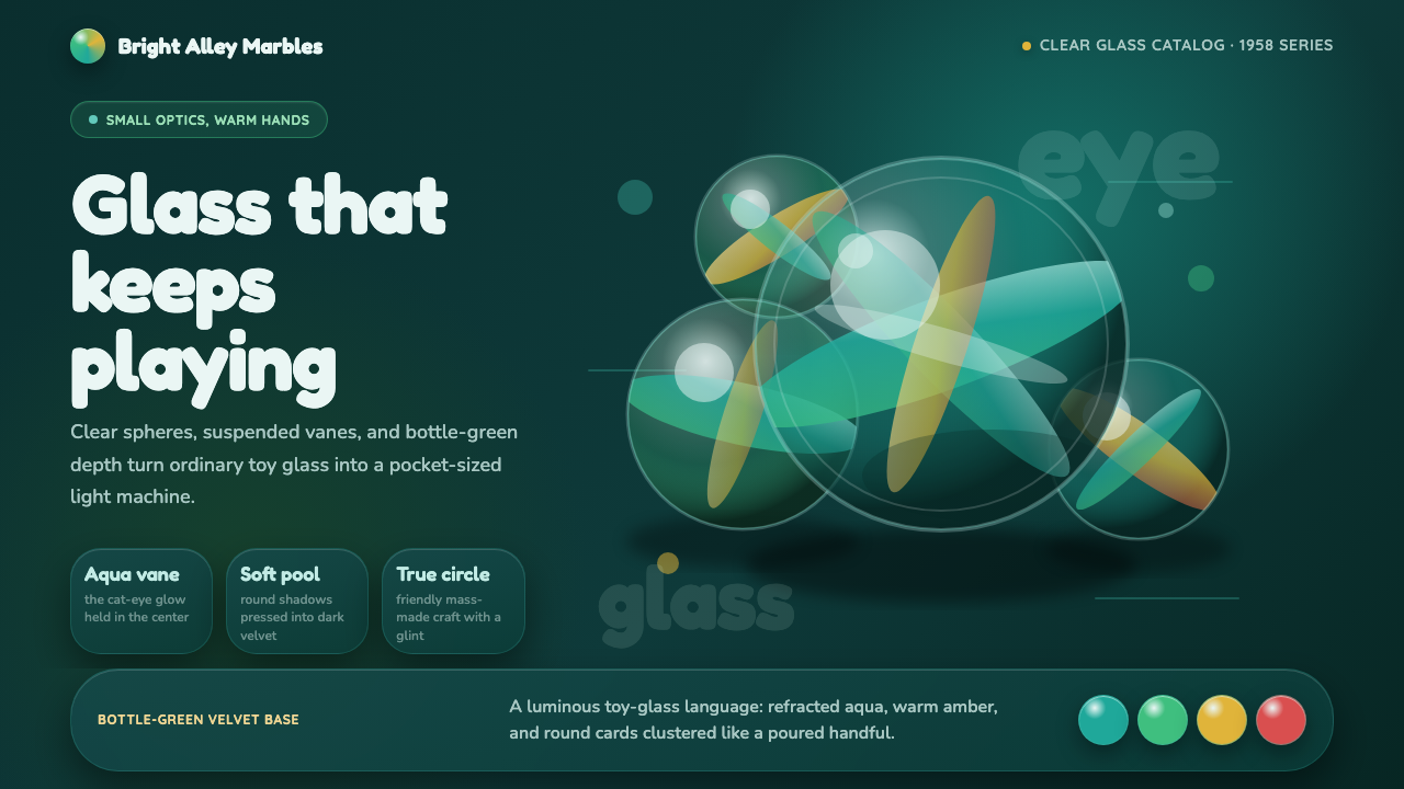 Cat's Eye MarblesMass-made glass feels magical. Aqua vanes glow inside round forms on bottle-g…
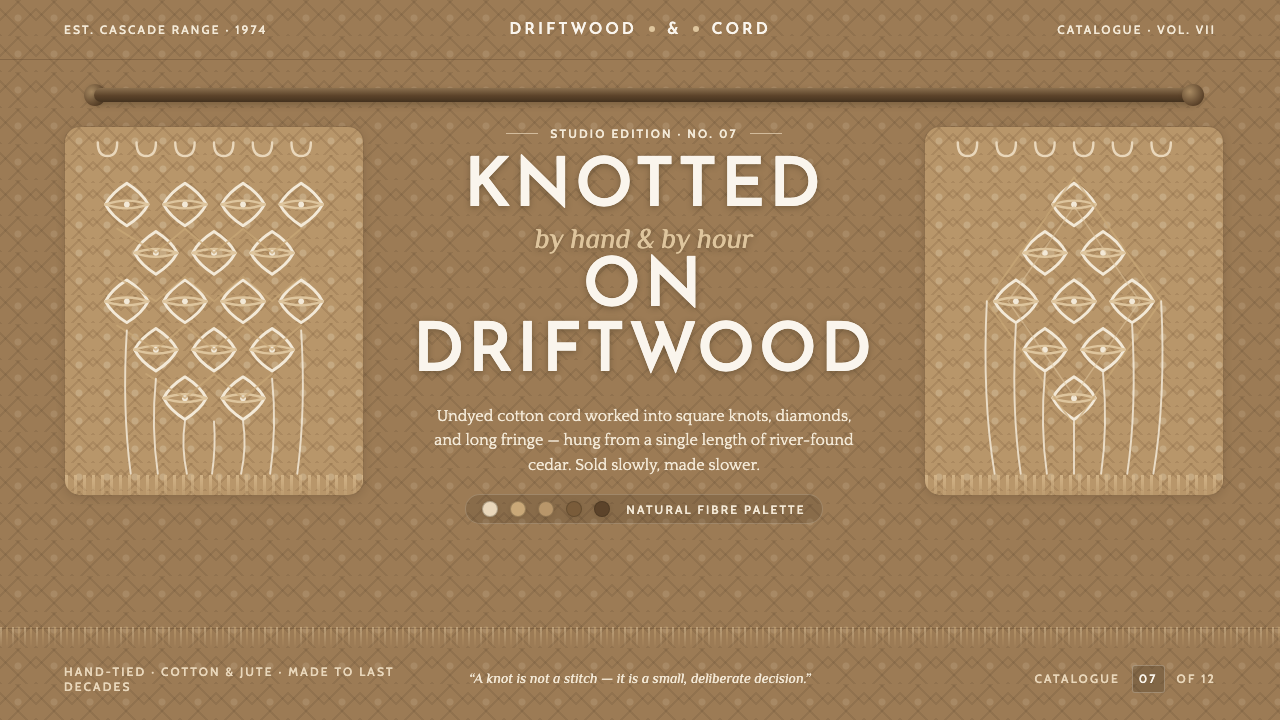 Macramé Fiber ArtSlow craft, hand to fiber. Undyed ecru cotton on raw-jute walnut, square knot…
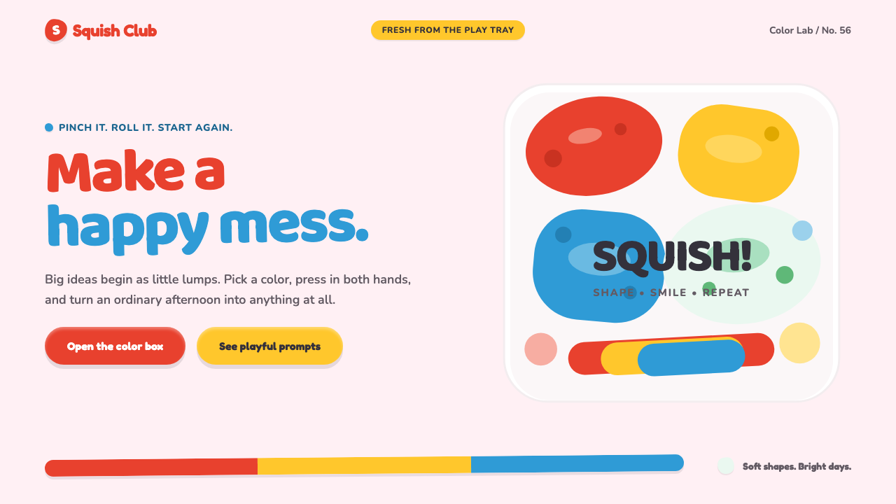 Play-Doh (1956)Joy you can squish. Candy primaries, chunky type, and pinched clay forms make…
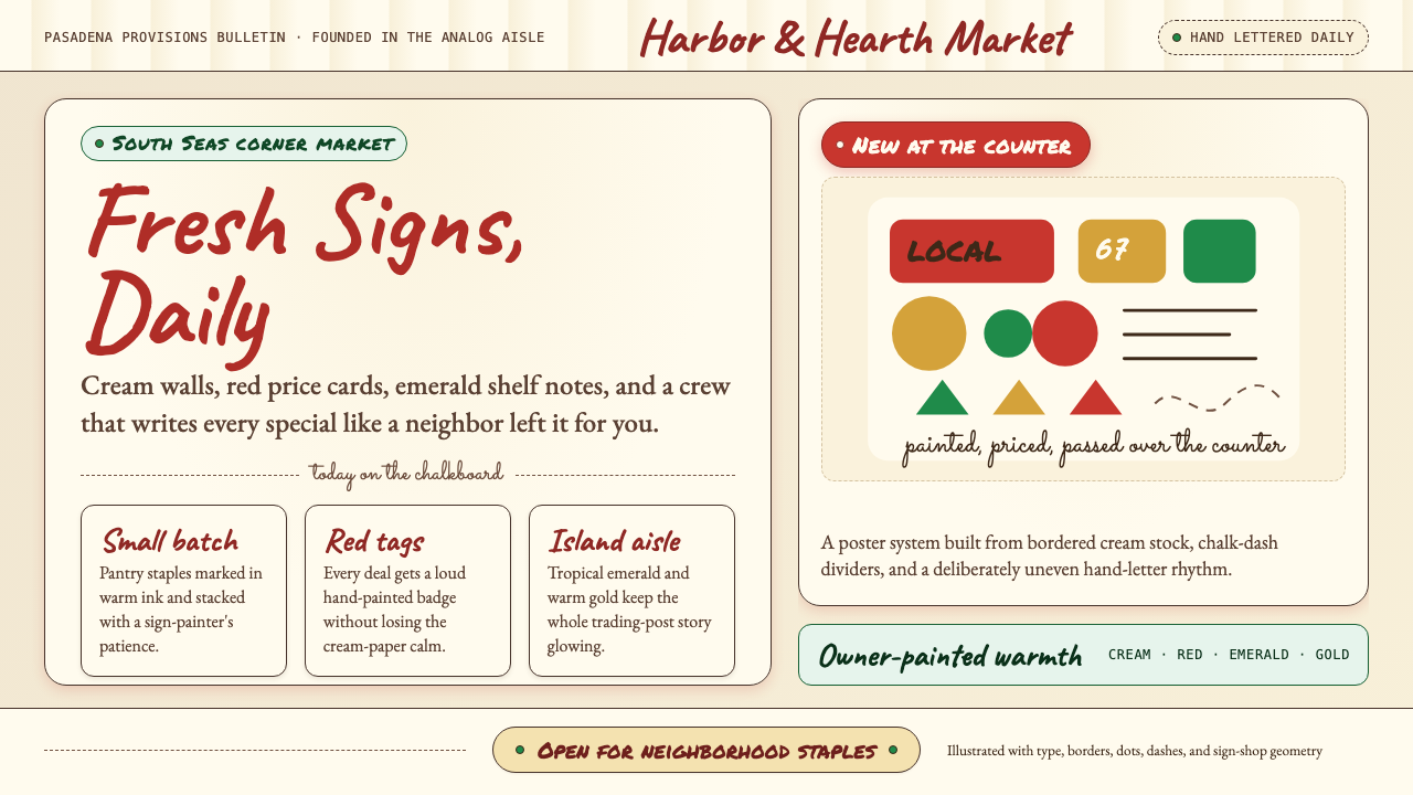 Trader Joe's Hand-LetteredHandmade grocery warmth. Cream chalkboards, red price tags, emerald accents.
 Cambodian Krama CheckPlain cloth has authority. Madder red, indigo bands, and cotton grid lines do…
 Channapatna Lacquered ToysGloss feels handmade. Lac-red ground and turmeric-indigo bands turn pixels in…