What is Cambodian Krama Check?
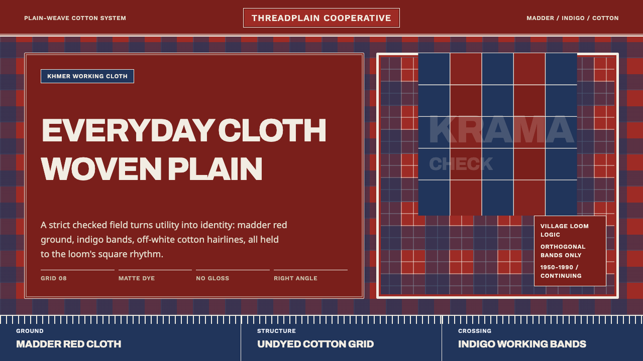
The krama is Cambodia's everyday cloth — a plain-weave cotton check worn as headwrap, towel, and identity marker — and its entire design language is nothing more than the woven grid itself.
Cambodian Krama Check in brief
Cambodian Krama Check translates one of Southeast Asia's most ubiquitous textiles into a design system: the krama, Cambodia's national all-purpose scarf, a plain-weave cotton cloth woven in simple gingham checks. Traditionally the crossing threads are dyed madder-red or indigo against an undyed, off-white cotton ground, producing a grid pattern that comes entirely from the structure of the weave rather than from any printed or painted surface.
The system reads as saturated and grounded rather than pale, because it foregrounds the dyed-cloth field itself: a deep, matte madder-red ground carries off-white cotton grid lines, with overlapping bands of red and indigo layered across it like threads crossing at a loom. Nothing in this vocabulary is glossy, gradient, or soft-edged — every line is straight, every intersection is a right angle, and the surface reads as woven cotton rather than printed pattern.
What makes the krama distinctive as a design reference is its total lack of pretension. It was never created as art or as branding; it is plain cloth, made for hard daily use, and its authority comes from repetition and ubiquity rather than novelty. A design system drawn from it inherits that same quality — sturdy, matter-of-fact, and legible at a glance, with no ornament beyond the grid it's built from.
Where does Cambodian Krama Check come from?
The krama has no single inventor and no dated founding moment; it belongs to a long-standing tradition of Khmer handloom weaving practiced at the household and village level across Cambodia, most closely associated in later decades with the mid-twentieth century through the present. Cotton was grown, spun, and dyed locally, and the cloth was woven on simple handlooms by village weavers, overwhelmingly women, passing the craft down within families rather than through any formal school or workshop.
The check pattern itself is a direct product of the weaving technique rather than a decorative addition afterward. In a plain weave, warp and weft threads cross at right angles one over, one under; by alternating dyed and undyed threads in both directions, the crossing points naturally produce a grid of solid color, mixed color, and open ground — the same structural logic that produces gingham and tartan checks in textile traditions worldwide, arrived at independently through the same simple loom mechanics.
The cloth's uses go far beyond dress. A krama serves as a headwrap against sun and dust, a towel, a sling for carrying an infant or produce, a hammock, a sunshade rigged over a market stall, and a gift exchanged at weddings and courtships. Its sheer functional range — the same plain cotton square doing the job of a dozen different specialized objects — is precisely what has made it a durable marker of everyday Khmer identity across regions and social classes, worn by rural farmers and government officials alike.
That everyday ubiquity took on a darker, more complicated dimension during the mid-1970s, when the Khmer Rouge regime imposed plain checked scarves, often in red-and-white or black-and-white, as part of the mandated collective attire for laborers under Angkar during the Democratic Kampuchea period — a somber chapter that is inseparable from any serious account of the cloth's modern history. After 1979, in the difficult work of rebuilding, village and cooperative weaving revived, and the krama re-emerged as an openly worn symbol of resilience and national identity, later adopted in government and tourism imagery as visual shorthand for Cambodia itself.
What defines the Cambodian Krama Check look?
Color
A saturated madder-red dyed-cloth ground carries most of the visual weight, with indigo used as a secondary banded color and off-white or undyed cotton reserved for the grid lines and negative space. The palette is drawn entirely from natural dye traditions rather than synthetic brightness — warm, earthy, and slightly muted rather than crisp or neon.
Weave and Grid
The defining structural feature is a gingham-style check produced by the weave itself, not by printing: two colors of thread crossing at right angles create solid blocks, mixed-tone overlaps, and open ground in a strictly repeating pattern. Every line in the system is orthogonal — there are no curves, no diagonals, and no deviations from the grid.
Texture and Surface
The surface reads as plain, matte, hand-loomed cotton — no sheen, no synthetic gloss, and a faint visible thread texture rather than a flat, uniform digital fill. This tactile quality is central to the cloth's identity as a working textile rather than a decorative one, and any faithful digital treatment needs to preserve that sense of woven grain.
Pattern Scale
Check size and band width vary across genuine kramas — some woven in tight, small grids, others in larger, bolder blocks — but the proportion stays consistent: squares read as roughly even in width and height, never stretched into rectangles, keeping the pattern recognizably a check rather than a stripe.
Layering
Overlapping bands of red and indigo, crossing over the base grid, create a secondary rhythm on top of the primary check — a design move that mirrors how real kramas layer more than one dyed thread color into a single cloth. This layering is what keeps the pattern from reading as flat or monotonous despite its strict geometric limits.
Typography
Type is sturdy and utilitarian rather than delicate or decorative, echoing the cloth's no-nonsense, working-textile character. Bold, evenly weighted letterforms with minimal embellishment suit the system far better than a light, ornamental, or script-like typeface would.
Multipurpose Application
A real krama's defining trait is that the same plain cloth serves a dozen different functions — headwrap, towel, sling, sunshade. A design system built from it should carry the same flexibility: the same grid and palette need to hold up equally well as a bold cover treatment, a quiet background texture, or a structural accent, without ever needing decorative variation to stay interesting.
Who shaped Cambodian Krama Check?
The uncredited backbone of the krama tradition: generations of largely female weavers working at the household and village level across Cambodia, who grew and spun cotton, mixed natural dyes, and wove the cloth on simple handlooms, passing the craft down within families rather than through formal institutions.
Organized weaving groups that scaled krama production beyond individual households, particularly important in the difficult postwar rebuilding period after 1979, when village and cooperative-level weaving helped revive both the domestic supply of everyday cloth and, later, an export and tourism market for the textile.
Several provinces along the Mekong, most often cited as Kampong Cham, are long associated with concentrated krama weaving activity, though — as with most household-level craft traditions — production has never been centralized in any single official workshop or school.
How do you use Cambodian Krama Check today?
Applying Cambodian Krama Check well means respecting its origin as plain, functional cloth rather than treating it as generic 'ethnic pattern' decoration. The grid, the palette, and the matte woven texture need to stay legible as a real weaving structure, not be flattened into an arbitrary print.
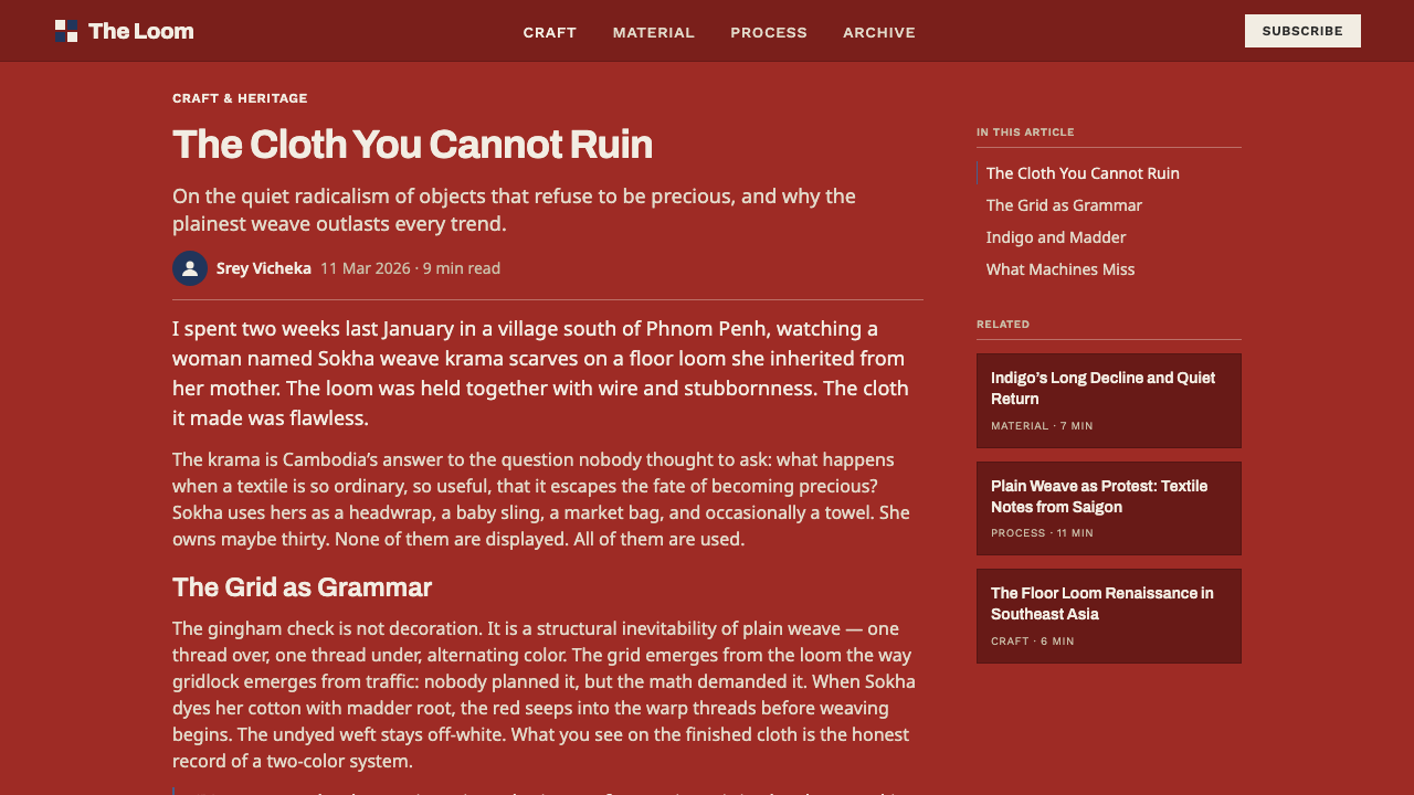
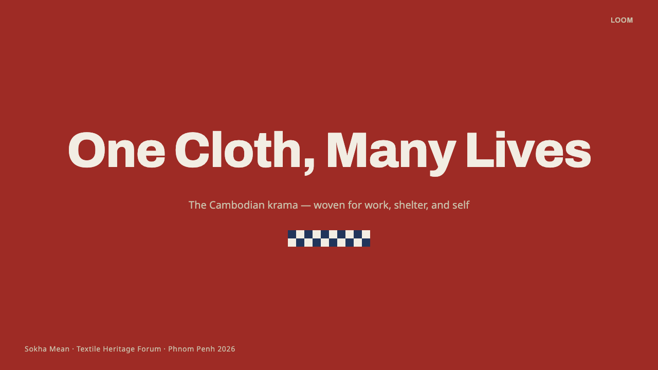
For presentation slides, the style suits cover pages built as bold color-blocked fields — a full madder-red ground with an off-white grid line or two, echoing a folded corner of real cloth — while content slides work best using the grid sparingly, as a thin border treatment or a section divider rather than a busy full-bleed background that would compete with text. Data slides can borrow the layered-band motif to differentiate categories, using red and indigo bands the way the cloth uses overlapping dye colors.
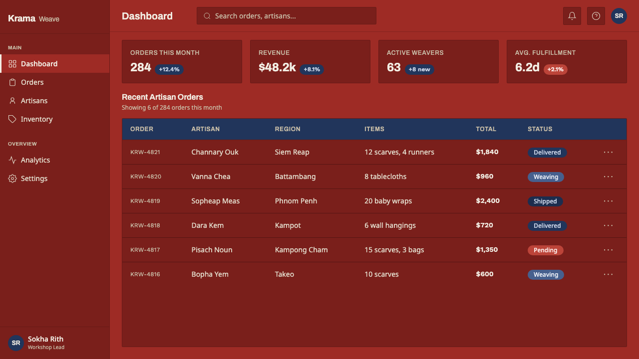
For web interfaces, the palette and texture translate well to craft marketplaces, cultural heritage platforms, textile and fashion ecommerce, and travel or tourism products connected to Cambodia or Southeast Asia more broadly. It is a poorer fit for a dense enterprise dashboard, where the boldness of a saturated red ground competes with data legibility; if used there at all, it works best restrained to accents, borders, and section dividers rather than full backgrounds.
For editorial and marketing content, the system is strong for storytelling around craft, heritage, sustainable and artisan-made fashion, and travel writing, where the cloth's texture and provenance are part of the narrative rather than incidental decoration. It should be paired with real attribution and context rather than used as an anonymous 'exotic textile' backdrop.
A common mistake is over-complicating the grid into a busy plaid or tartan-style print with many colors and irregular line weights; the krama's authority comes from restraint — essentially two dye colors against an undyed ground, in a strict, repeating square check. A second mistake is softening the palette into pastel or synthetic-bright versions of red and indigo, which erases the natural-dye, hand-loomed register that gives the style its grounded, earthy weight in the first place.
Cambodian Krama Check — FAQ
What's the difference between krama check and generic gingham or plaid patterns?
The underlying weave structure — two thread colors crossing at right angles to produce solid, mixed, and open squares — is shared with gingham and many check traditions worldwide, since it's simply what happens when a loom alternates dyed and undyed threads. What makes krama check specific is its particular color story (madder-red and indigo against undyed cotton), its scale and proportion as woven in Cambodia, and its cultural association with a single specific everyday object rather than a general textile category.
Is the madder red a specific natural dye, and does that matter for the design?
Madder is a plant-derived red dye with a long history across many textile cultures, and it produces a warmer, earthier, slightly muted red than a synthetic dye would — a red with visible depth rather than flat uniform saturation. Treating the color as 'a natural-dye red' rather than an arbitrary bright red keeps the design honest to the cloth's material origin and avoids flattening it into a generic bold red that could belong to any unrelated system.
How is krama check different from Scottish tartan or other national plaid traditions?
Tartan traditions typically use several distinct colors woven into complex, clan- or region-specific sett patterns with varying line widths. The krama, by contrast, is structurally simpler — usually two colors against an undyed ground, in a more uniform, evenly repeating check — and its cultural role is different: it is everyday utility cloth worn across an entire nation, not a marker distinguishing one clan or region from another.
Does this design suit professional or business products, or only cultural and craft brands?
Its natural home is cultural, craft, textile, and travel contexts where the fabric's real-world origin is part of the story. It can extend to broader consumer or lifestyle products that want to signal warmth, handmade authenticity, or a connection to Southeast Asian material culture, but it is a poor match for enterprise software, financial products, or anything where a bold saturated-red field would undercut a need for calm, data-dense legibility.
Why is this system tagged as a dark theme when the cloth is often described as off-white or light?
The off-white cotton only appears as the grid lines and negative space within the pattern — the field itself, the part that dominates any given surface, is the saturated madder-red dyed cloth. At scale, a deep, matte red reads visually closer to a dark tone than a light one, especially set beside pure white interface chrome, which is why the system is built and used as a dark-toned theme even though undyed cotton is genuinely part of its palette.
Related design styles
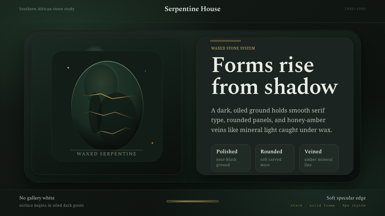 Shona Serpentine SculptureStone breathes in shadow. Oiled green surfaces and honey-amber veins catch th…
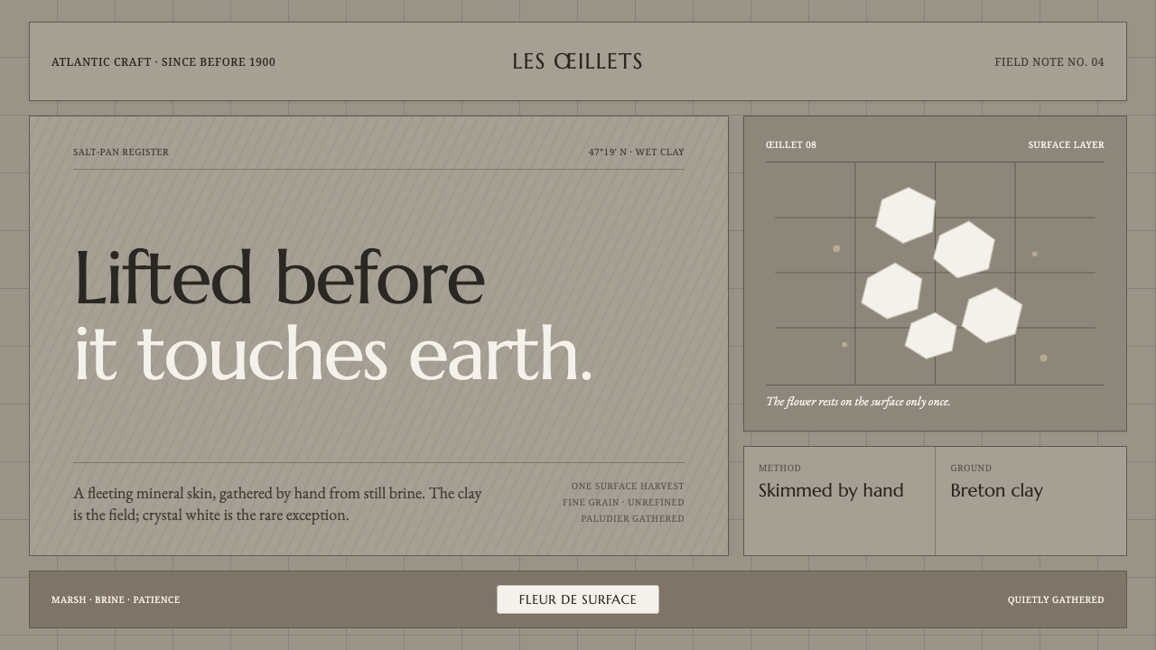 Guérande Fleur de SelCrystal white is the exception. Mineral serif and hairline grids rise from we…
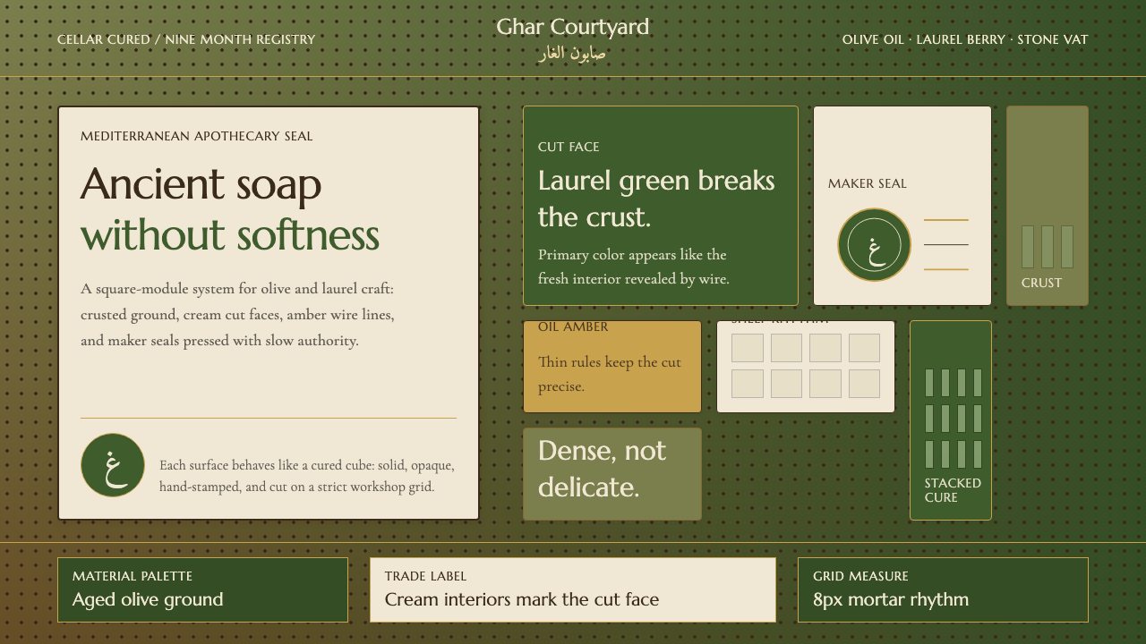 Syrian Aleppo Laurel SoapAncient without softness. Olive crust, laurel green, and stamped circles hold…
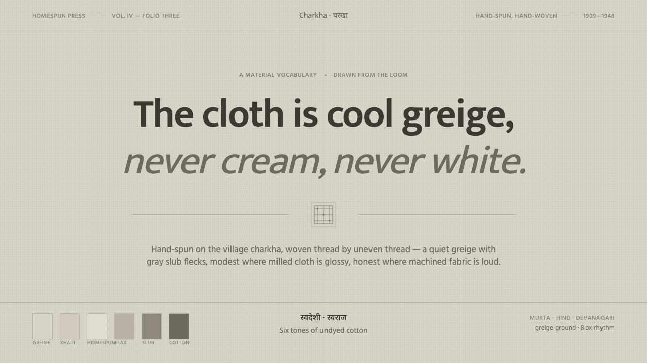 Undyed Khadi WhiteModest, never cream. Greige homespun cotton with gray slub flecks and plain h…
 Wool FeltingHandmade stillness. Oatmeal-gray felt, humanist serifs, and soft rolled panel…
 Bangladeshi Nakshi Pitha MotifsWarm relief, never print. Galada type and tan lattice press rice-flour craft…