What is Mo Hom Indigo?
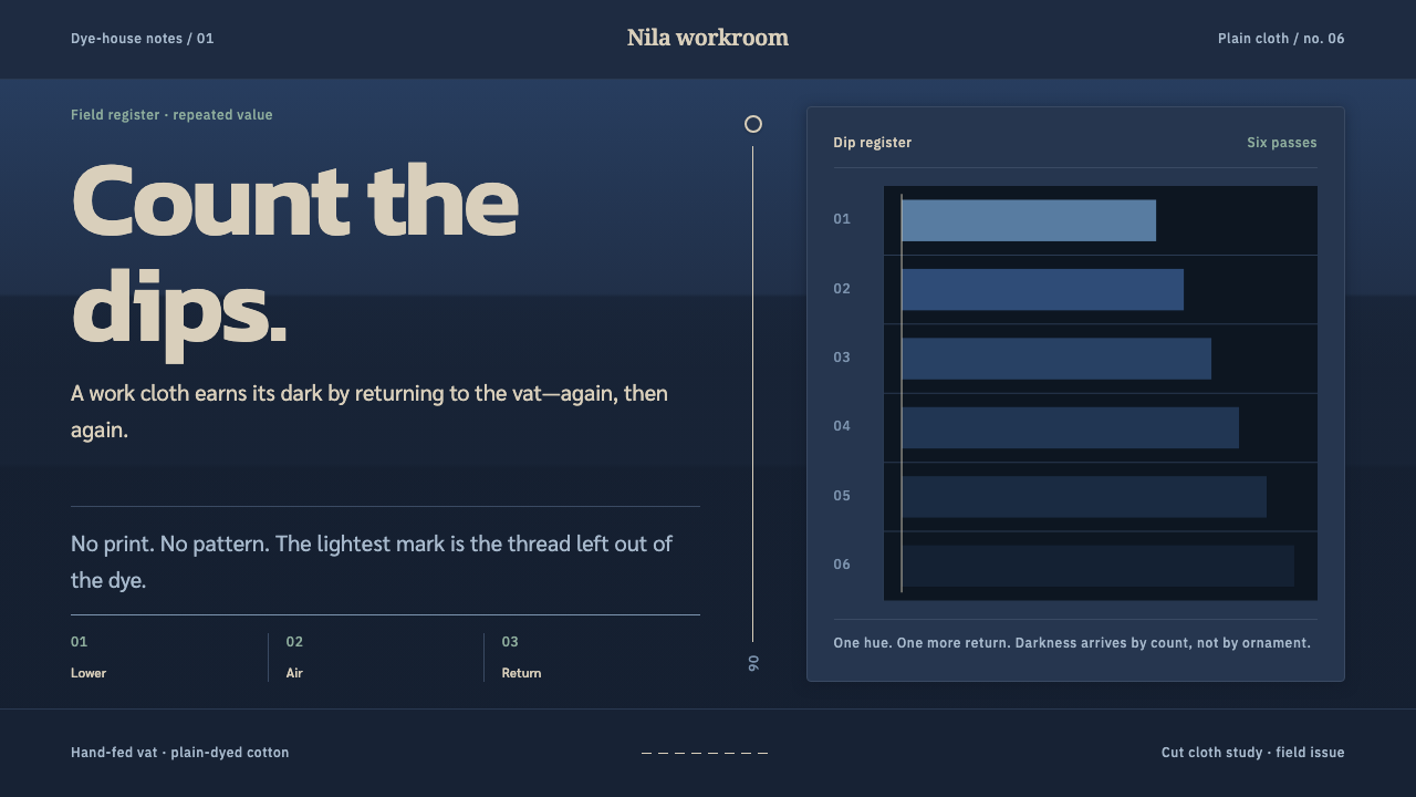
Mo hom is a design language of earned depth — one indigo hue stacked into darker and darker values by repeated dipping, with a single undyed seam thread left as the only bright thing in the room.
Mo Hom Indigo in brief
Mo hom is the indigo work shirt of Phrae, a province in northern Thailand: mo is the earthen fermentation pot, hom is the indigo plant. The cloth is never patterned and never printed. Its depth is arithmetic. A length of cotton goes into the vat, comes out, dries and oxidises in the air, and goes in again, repeating until the fabric sits just short of black. Colour is the record of how many times the cloth was dipped.
The design system inherits that logic directly. Everything is built from stacked value on a single hue: the page, the panels, the borders and the type are all steps on one indigo scale, from the lightest wash to the darkest near-black. There is no second hue to compete with it. The only true contrast in the room is the undyed seam thread, a thin line of natural cotton colour that never went into the vat and so stays bright.
Layout follows the garment. The structure is rectilinear and plain, like a cut shirt: a collarless neckline, a straight placket, square patch pockets. Nothing is ornamental, and nothing needs to be. The result is a quiet, dark, dignified interface whose richness is in depth, not decoration, and in which a single pale stitch reads as the most important thing on the page.

Where does Mo Hom Indigo come from?
Mo hom belongs to Phrae province in northern Thailand, and specifically to the village of Ban Thung Hong, where the craft has been the centre of a dyeing industry. Curio's source describes it as part of Lanna–Phuan natural indigo dyeing and as a form of Thai regional workwear. The shirt began as practical field clothing, not as a showpiece, and its aesthetic reads as the product of usefulness: dark enough to be forgiving of work, plain enough to cut and sew quickly, and sturdy enough to last.
The technique was carried from Laos in the eighteenth and nineteenth centuries by the Phuan people, whose dyeing families settled in Ban Thung Hong. Natural indigo dyeing relies on fermentation: leaves of the hom plant are processed in a pot, the mo, to make a dye bath. Cloth lifted from the bath is at first a greenish colour and turns blue as it meets the air, which is why oxidising between dips is built into the working rhythm. Each cycle adds depth to the colour and the process cannot be hurried.
A historical turn explains the scale of the craft today. After the Second World War the teak trade, which had been central to the province, collapsed, and indigo dyeing grew into Phrae's main trade, with the Ban Thung Hong industry continuing to the present. The work shirt then travelled well beyond the fields. Curio's source lists the movement as farm dress to student uniform: the same indigo garment came to be worn daily by students, including at university, and became a regional identity as well as a working garment.
The recorded key figures are collective rather than individual: the Phuan dyeing families of Ban Thung Hong. The authority of the style lies in an unbroken family practice rather than in any named designer, and its restraint reflects that. There is no signature motif to copy. What remains is a method, repeated until the colour is deep enough, and a habit of leaving one thread undyed to mark the seam.
What defines the Mo Hom Indigo look?
Single-Hue Value Stacking
The whole palette is one hue, indigo, expressed as a ladder of values rather than a spread of colours. Lighter steps are used for text and highlights, mid steps for panels and dividers, darker steps for grounds. Depth comes from stacking: each layer sits one step darker or lighter than the one beneath it. Because there is only one hue, contrast is judged purely by value, and a design in this style should be checked by squinting at it in greyscale.
Near-Black Without Black
The deepest value sits just short of black, the colour of cotton that has been dipped many times. It is dark enough to feel substantial but never reaches a pure black, and it keeps a faint blue cast. This is what separates the style from a generic dark mode: the background is a dyed colour with a hue, not the absence of light. Pure black should be avoided entirely, since it flattens the layers.
The Undyed Seam Thread
The one bright element is the thread left undyed, a thin warm off-white line that stands against the indigo. It appears as stitching along seams, and it is the only true contrast in the composition. In a layout it becomes a hairline rule, a focus line, a selected state or a key figure. Its power comes from rarity: if the pale tone is spread across large areas, it stops being a stitch and becomes a competing field.
Garment-Cut Layout
Layouts are assembled like a cut shirt: straight edges, square patch pockets, a plain placket running down the centre, a neckline without a collar. Blocks are rectangular and modest, with plain borders and few corner treatments. The proportions are practical, shaped by use rather than by display. Cards read as patches sewn onto a ground, and columns read as panels of cloth joined by a seam.
No Pattern, No Print
The cloth carries no printed motif and no woven pattern, so the surfaces in this system stay unpatterned. Interest comes from quiet variation: the soft mottling that natural dyeing leaves, the slight step between one value and the next, the weave of the cotton. Imagery should be minimal or monochrome, and ornament is replaced by structure. A page of this style should feel like cloth, not like wallpaper.
Thai-Script Serif Typography
Type pairs a Thai-script serif with a restrained Latin companion, set in the pale thread tone against the dark ground. Thai letters stack vowels and tone marks above and below the line, so generous line spacing is essential. Text is set quietly: moderate size, even rhythm, no decorative emphasis, with hierarchy built from value and scale rather than from colour. The serif gives the dark ground a printed, bookish dignity.

Who shaped Mo Hom Indigo?
The only key figures in Curio's source are collective: the Phuan dyeing families of Ban Thung Hong. They are the bearers of a craft carried from Laos and turned into a village industry, and they work by repetition. For designers, the lesson is that depth can be a process rather than an effect, and that a style can have authority without any famous author.
The shirt's wearers are part of the story. It began as farm clothing and later became a student and university uniform, so the style carries associations of work, schooling and local belonging. That double life explains its mix of plainness and dignity: it is dressed up simply because it was made to be worn every day by ordinary people.
The name of the garment holds its whole method: the mo is the fermentation pot and the hom is the indigo plant. Plant, pot, air and time are the real authors of the colour. The pot ferments the dye, the plant supplies it, and the exposure to air between dips turns it blue. Treating them as collaborators gives the design system its patient, process-driven character.
How do you use Mo Hom Indigo today?
Mo hom is a quiet, dark and considered system, and it works best when the content matters more than the container. Because it uses a single hue, it rewards discipline: get the value steps right, protect the one bright element, and let everything else recede.
For presentation slides, the cover can be a deep indigo field with the title in a pale thread tone and a thin undyed line along one edge or beneath the heading. Content slides stack panels in slightly different indigo values, like patches on cloth, and use the pale thread colour only for the heading and the one line that matters. Data slides suit bar and area charts drawn in steps of one hue, with the thread tone highlighting a single series or the key number.
On the web, it is well suited to dashboards, documentation, reading apps and tools used for long sessions, because layered values give hierarchy without borders or colour noise. Surfaces rise and fall by value, cards sit as square patches, and the pale line marks focus, selection or the primary action. Pricing pages can express tiers as steps on the indigo scale, with one pale seam line around the recommended plan. Keep corners square or nearly so, and avoid drop shadows.
In editorial and marketing work, the system fits textiles, craft, regional culture, education, uniforms and any story about work that earns its quality over time. Thai-language and bilingual layouts benefit from the serif pairing and generous leading. Photography should be restrained and, where possible, monochrome or indigo-toned; a single unpatterned image of cloth, a seam or a dyeing pot is enough to anchor a page.
The most common mistake is introducing a second hue. A red button, a green success state or a gold highlight breaks the single-hue logic and takes away the meaning of the pale thread. Other errors include using pure black, which flattens the value ladder; filling large areas with the thread colour; adding patterns or textures that the cloth itself never has; using glossy gradients or heavy shadows; and setting type in bright white, which overpowers the one warm line the system relies on. When in doubt, add another dip, not another colour.

Mo Hom Indigo — FAQ
What does mo hom mean?
Mo hom is the name of the indigo work shirt of Phrae, a province in northern Thailand. Mo refers to the earthen fermentation pot used to make the dye bath, and hom refers to the indigo plant. In design terms the name tells you the method: a process of fermentation and repeated dipping, not of printing or patterning. The system is named for that process.
Why are there no patterns in this style?
Because the cloth has none. Mo hom is never patterned and never printed; its interest comes from depth of colour, built up through repeated dipping, and from small features of construction such as seams and pockets. A design system in this spirit puts its effort into value, proportion and structure. If a layout needs visual interest, it should come from the arrangement of plain panels and the placement of the single pale line, not from ornament.
Why is the darkest tone not pure black?
Because indigo cotton, however many times it is dipped, stays a deep blue rather than becoming black. The darkest step in the system keeps a faint blue cast, which preserves the sense of dyed cloth and lets the value ladder keep its steps. Pure black would collapse the lower layers into a single flat mass and make the pale thread look harsh. The depth should feel earned and warm, not empty.
How should the undyed thread colour be used in a product?
As the single high-contrast element, in small amounts. Good uses are a thin divider, a focus ring, a selected tab, an underline, a key number or the main call to action. It can also carry body text, since it is the lightest tone available, as long as the surrounding areas stay in indigo values. Avoid filling large panels with it, and avoid adding other bright colours alongside it; its meaning depends on being the only thing that never went into the vat.
Does the system work for Thai-language and bilingual content?
Yes, and it was conceived with that in mind. It pairs a Thai-script serif with a restrained Latin companion. Thai text needs more vertical room than Latin, because vowels and tone marks stack above and below the line, so leave generous line spacing and avoid tight headings. In bilingual layouts, keep both scripts in the same pale tone and rely on size and position, not colour, to separate them.
Related design styles
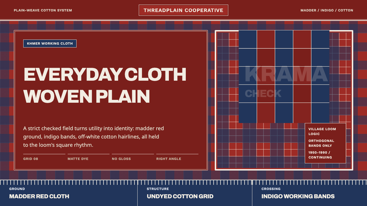 Cambodian Krama CheckPlain cloth has authority. Madder red, indigo bands, and cotton grid lines do…
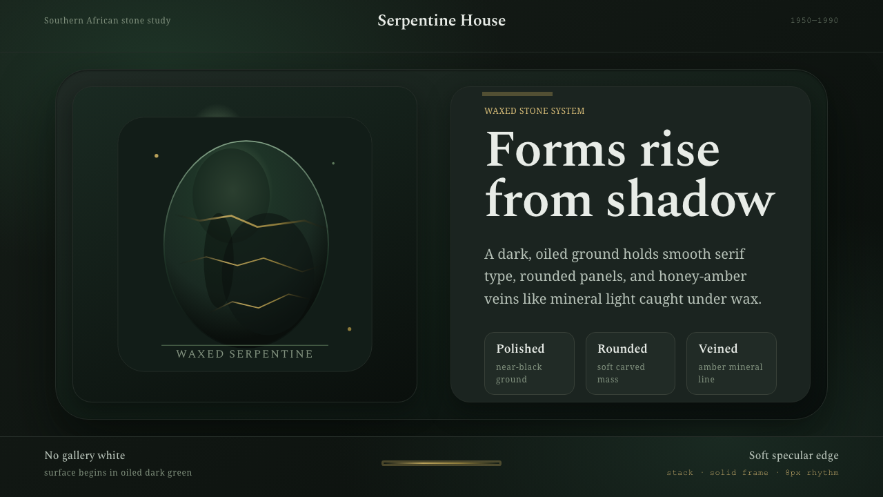 Shona Serpentine SculptureStone breathes in shadow. Oiled green surfaces and honey-amber veins catch th…
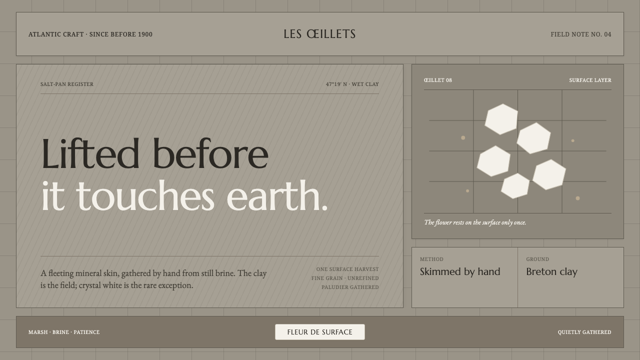 Guérande Fleur de SelCrystal white is the exception. Mineral serif and hairline grids rise from we…
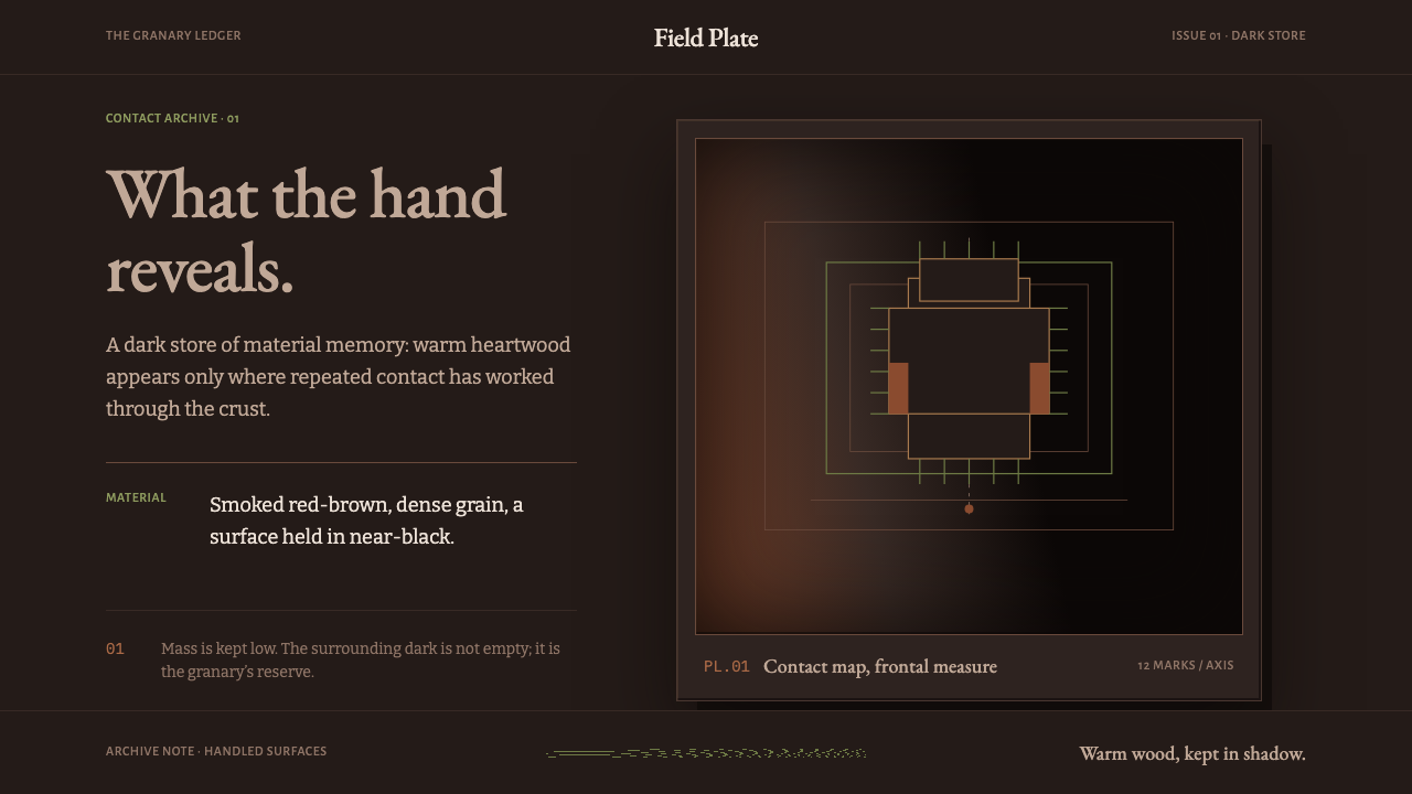 Ifugao BululTouch reveals the archive. Narra red breaks through near-black patina in a qu…
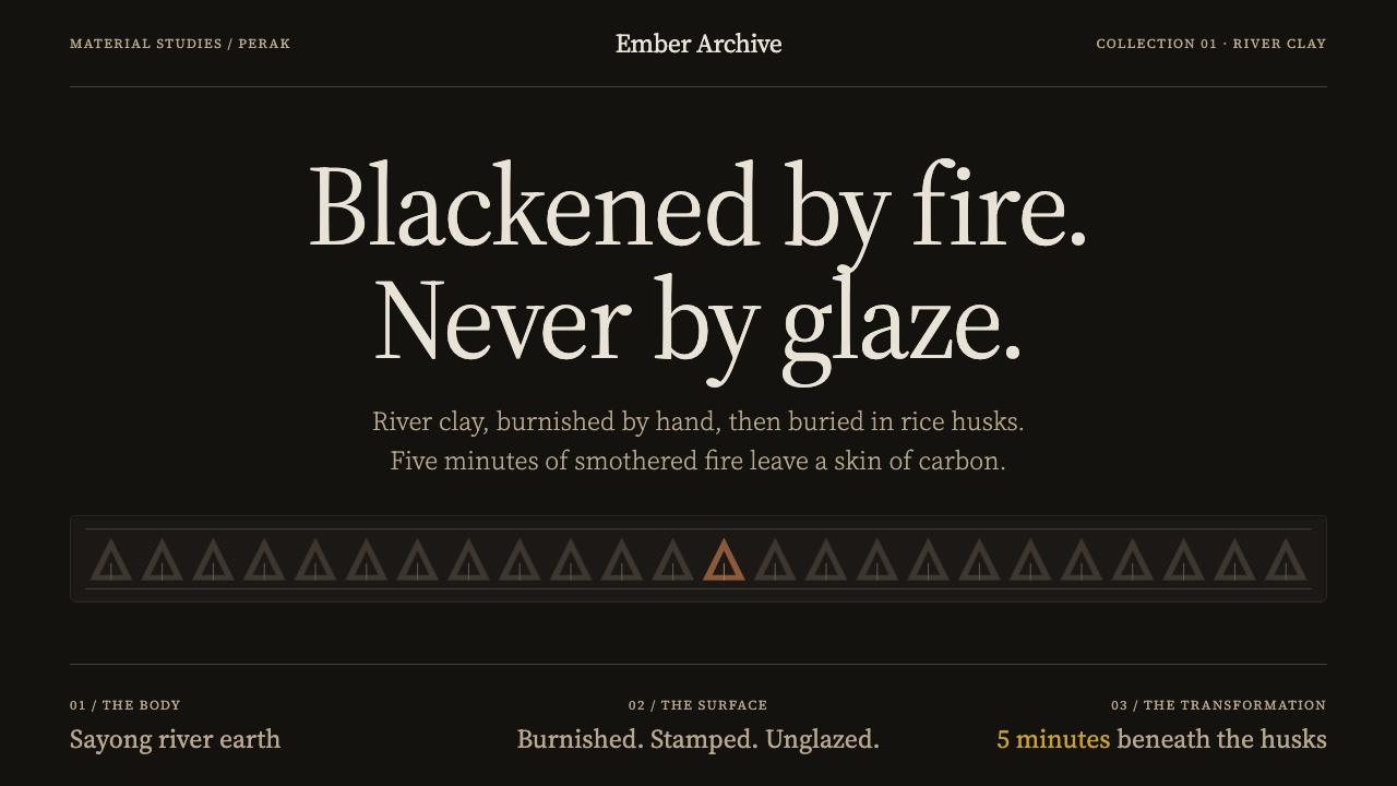 Labu Sayong Black ClayBlack by fire, not glaze. Matte carbon, warm clay and pressed triangles in qu…
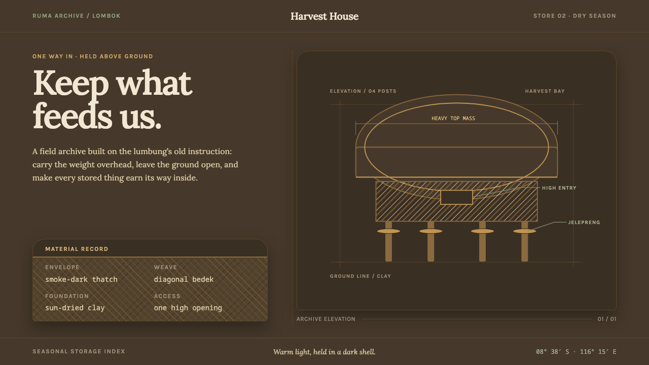 Sasak Lumbung GranaryStorage carries its weight. Smoke-dark ground, warm Lora type, and a four-pos…