What is Guérande Fleur de Sel?
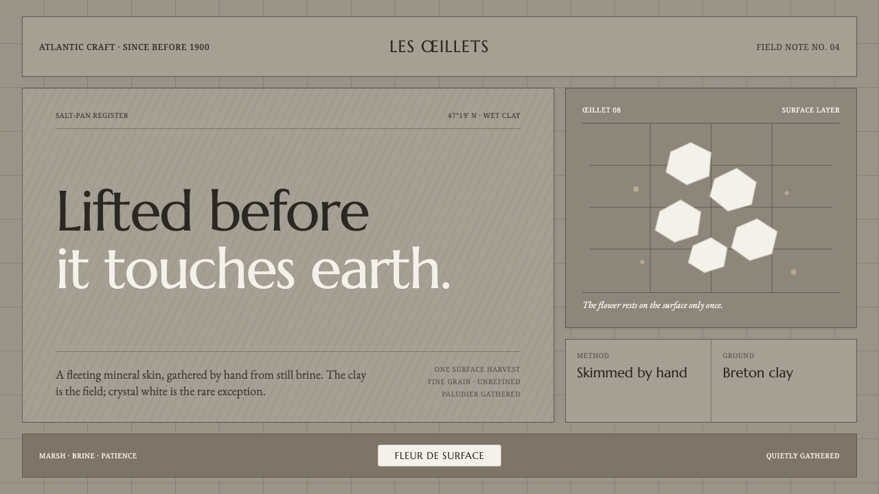
Guérande Fleur de Sel treats salt as a landscape before it treats it as a seasoning — wet clay-grey, mineral serif, hairline structure, and one carefully guarded bloom of crystal white.
Guérande Fleur de Sel in brief
Guérande Fleur de Sel is a design language drawn from the salt marshes of the Guérande peninsula in Brittany, France. Its ground is not table salt white but the damp clay-grey of the œillet salt pan: a muddy, worked surface marked by shovel and rake. The visual effect is quiet, mineral, and materially specific. It feels cultivated rather than manufactured, with every line suggesting a tool mark, a boundary, or a channel through wet ground.
The system depends on a disciplined contrast between field and exception. Clay-grey carries the panels, surfaces, and broad spatial structure. Hairline rules articulate the composition without becoming ornament. Against this subdued terrain appears a single precious highlight: the faintly warm, snow-white skin of fleur de sel skimmed by hand before the crystals touch the clay. White is therefore not a default background. It is a scarce material, reserved for emphasis.
Typography gives the style its sense of provenance. Period French serifs bring refinement without gloss, while the restrained palette keeps the work matte and tactile. The result is neither rustic nostalgia nor luxury minimalism. It is an artisanal identity built from process: wet earth, gridded evaporation beds, hand tools, patient gathering, and a fragile surface bloom.

Where does Guérande Fleur de Sel come from?
The style belongs to the Guérande peninsula in Brittany, France, and takes its historical character from a hand-harvest tradition established before 1900 and still practised. Its origin is not a decorative interpretation of salt but an observation of the place where salt is made. The marsh supplies the palette, the œillet supplies the geometry, and the work of the paludiers supplies the human measure.
An œillet salt pan is read visually as a gridded field of wet clay-grey. Its surface is shaped and maintained through shovel and rake, so the grid is both spatial and practical. Lines divide, guide, and control the working ground. In the design language, this becomes a preference for quiet panels, fine rules, measured compartments, and boundaries that feel drawn from use rather than imposed as graphic decoration.
Fleur de sel provides the central act of selection. The salt flower forms at the surface and is skimmed by hand before it reaches the clay. That sequence explains why crystal white is treated as an exception: it represents the most delicate, elevated moment in a process otherwise rooted in mud, water, and labour. White carries value because it has been gathered, not because it fills the page.
The broader source is French artisanal salt-making and the œillet salt-pan craft. Both contribute a balance of precision and patience. The style is orderly without becoming industrial, refined without becoming glossy, and historical without relying on nostalgia. Its authority comes from continuity: a centuries-old practice remains legible in the tools, surfaces, and roles that shape the visual system.
What defines the Guérande Fleur de Sel look?
Clay-Grey Ground
The dominant field is a wet clay-grey, neither neutral white nor polished stone. It should feel dense, damp, and slightly opaque, like the floor of a working salt pan after water has receded. This ground gives the style its gravity and keeps every lighter element visibly precious.
Crystal White
White is deployed as a rare material accent rather than a universal field. Its ideal character is softly warm, matte, and almost granular, recalling the thin skin of salt gathered from the water's surface. Used sparingly, it becomes a marker of purity, harvest, and attention.
Mineral Serif
Period French serifs establish provenance and cultivated restraint. Letterforms should feel carved, settled, and quietly authoritative rather than fashionable or theatrical. The typography carries the voice of an old regional craft, with contrast used to distinguish title, explanation, and annotation without decorative display effects.
Hairline Grid
The grid is fine, continuous, and structural. It recalls the divisions of the œillet and the marks made by shovel and rake, so lines should organize panels and channels rather than frame content theatrically. Their delicacy creates tension with the heavy clay-grey ground.
Matte Materiality
Surfaces should appear absorbent and mineral, never glossy or artificially polished. The style gains credibility when panels feel like damp earth, paper, or fired clay rather than digital glass. Texture remains implied and quiet; it supports the sense of touch without becoming a literal illustration of mud.
Selective Bloom
The composition needs a moment of emergence: a white label, surface mark, title field, or quiet highlight that feels lifted from the grey field. This accent should read as gathered and fragile, not as a broad decorative contrast. Restraint is what makes the bloom legible.

Who shaped Guérande Fleur de Sel?
The paludiers are the human presence within the system: salt workers who maintain the marsh and skim fleur de sel by hand before it touches the clay. Their practice gives the style its measured scale and explains why the visual language feels attentive rather than automated. Every fine line and restrained highlight should suggest care exercised through repetition.
The œillet is the spatial figure of the style: a gridded, wet clay-grey working field shaped by shovel and rake. It supplies the panels, divisions, and grounded geometry. Its importance is practical rather than ornamental; the design should feel organized because the place itself is organized through use.
French artisanal salt-making provides the broader cultural frame. It joins regional provenance to patient manual work, allowing the style to be refined without becoming luxurious in a generic way. The visual language should preserve that balance: precise enough to feel trustworthy, tactile enough to feel made by people.
How do you use Guérande Fleur de Sel today?
Guérande Fleur de Sel is most transferable when its visual logic is preserved: let the clay-grey field do the structural work, let the hairline grid establish order, and reserve crystal white for the moments that deserve attention. The style should communicate provenance through restraint, not through literal salt imagery or decorative rustic motifs.
For presentation slides, the cover should feel like a quiet salt-pan surface interrupted by one gathered bloom. A mineral serif title can sit within a grey panel, while a small white field or mark establishes the focal point. Content slides should use hairline divisions and generous breathing room to separate context, process, and conclusion. Data slides can treat charts as marsh compartments: pale marks emerge from the grey field, with the brightest white reserved for the decisive comparison or final figure.
For web interfaces, the style suits dashboards and pricing pages that need calm authority rather than technological spectacle. Grey panels can hold navigation, metrics, or plan details; fine rules can separate related information; crystal white can identify the active state, selected plan, or most important action. Buttons and controls should feel like gathered objects within the field, not glowing elements floating above it.
For editorial and marketing work, the system supports origin stories, craft narratives, food brands, and products whose value depends on patience and place. A narrow reading measure, mineral serif headings, and quiet marginal notes can create a sense of provenance. Marketing compositions work best when they alternate dense clay-grey fields with rare white interventions, allowing the product or message to appear as something carefully surfaced.
The common mistake is turning the style into generic coastal luxury: covering everything in white, adding glossy highlights, or scattering rustic textures across every surface. Another mistake is making the grid too assertive, so it reads as technical decoration rather than a working salt-pan structure. Keep the grey dominant, keep white scarce, keep lines fine, and let material restraint carry the identity.

Guérande Fleur de Sel — FAQ
Why is the background grey instead of salt white?
Because the style takes its palette from the salt marsh rather than the salt cellar. The wet clay-grey floor of the œillet is the larger, working landscape; crystal white is the rare surface bloom skimmed from the water. Making white the background would reverse that hierarchy and remove the sense of scarcity that gives fleur de sel its visual importance.
Is this style rustic or luxurious?
It is neither in a simple sense. Its materials and origins are artisanal, but its typography and line work are refined. The tension is intentional: the clay-grey field keeps the system grounded in labour and landscape, while the mineral serif and selective white highlight give it quiet distinction. It should feel considered, not decorated.
How should the hairline grid be used?
Use it to express structure, division, and movement through the working field. It can organize panels, separate notes, or define channels of information, but it should remain quiet enough for the clay-grey ground to dominate. If the lines become the main image, they stop recalling the œillet and begin to look like graphic ornament.
Can the style use imagery beyond salt marshes?
Yes, provided the imagery respects the same material and editorial logic. Images should feel observed, tactile, and connected to origin or process rather than inserted as generic decoration. Cropped tools, worked surfaces, quiet landscapes, or details of gathered material can belong naturally. The key is to preserve the relationship between a subdued field and one carefully selected point of attention.
Related design styles
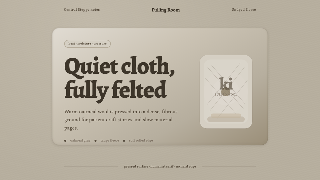 Wool FeltingHandmade stillness. Oatmeal-gray felt, humanist serifs, and soft rolled panel…
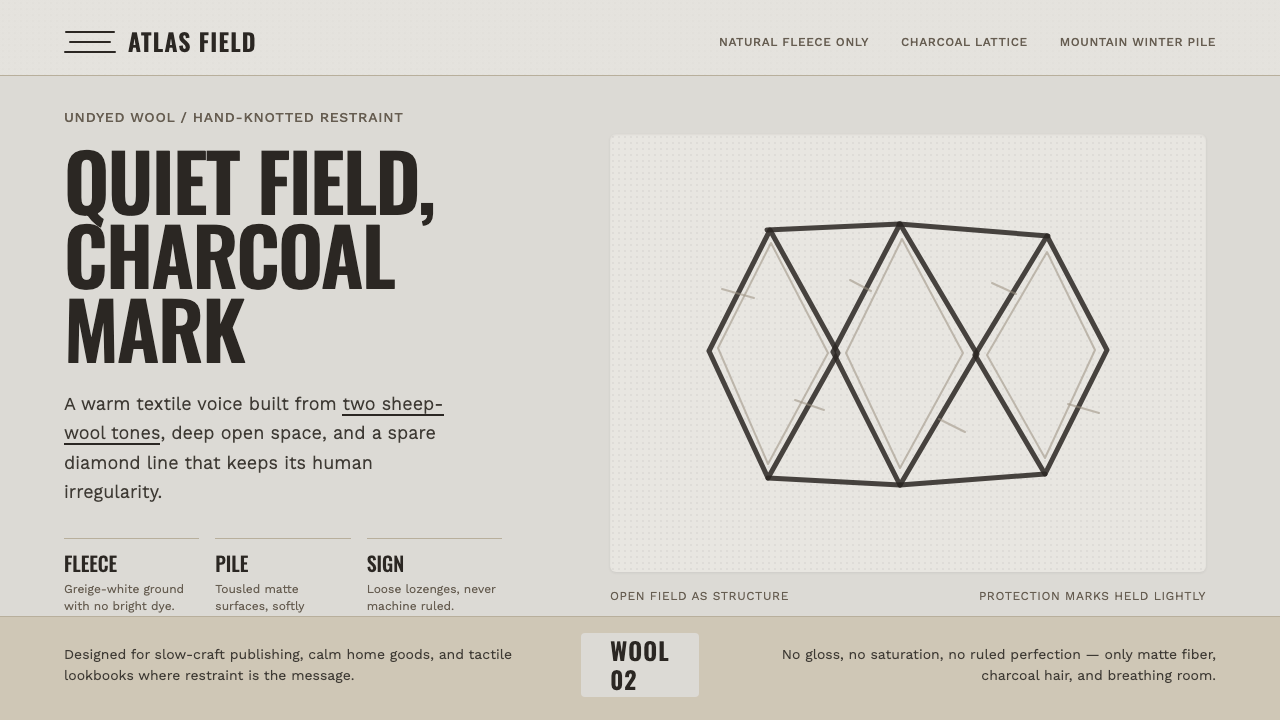 Beni Ourain Berber CarpetRestraint feels tactile. Greige wool field, Oswald type, and a loose charcoal…
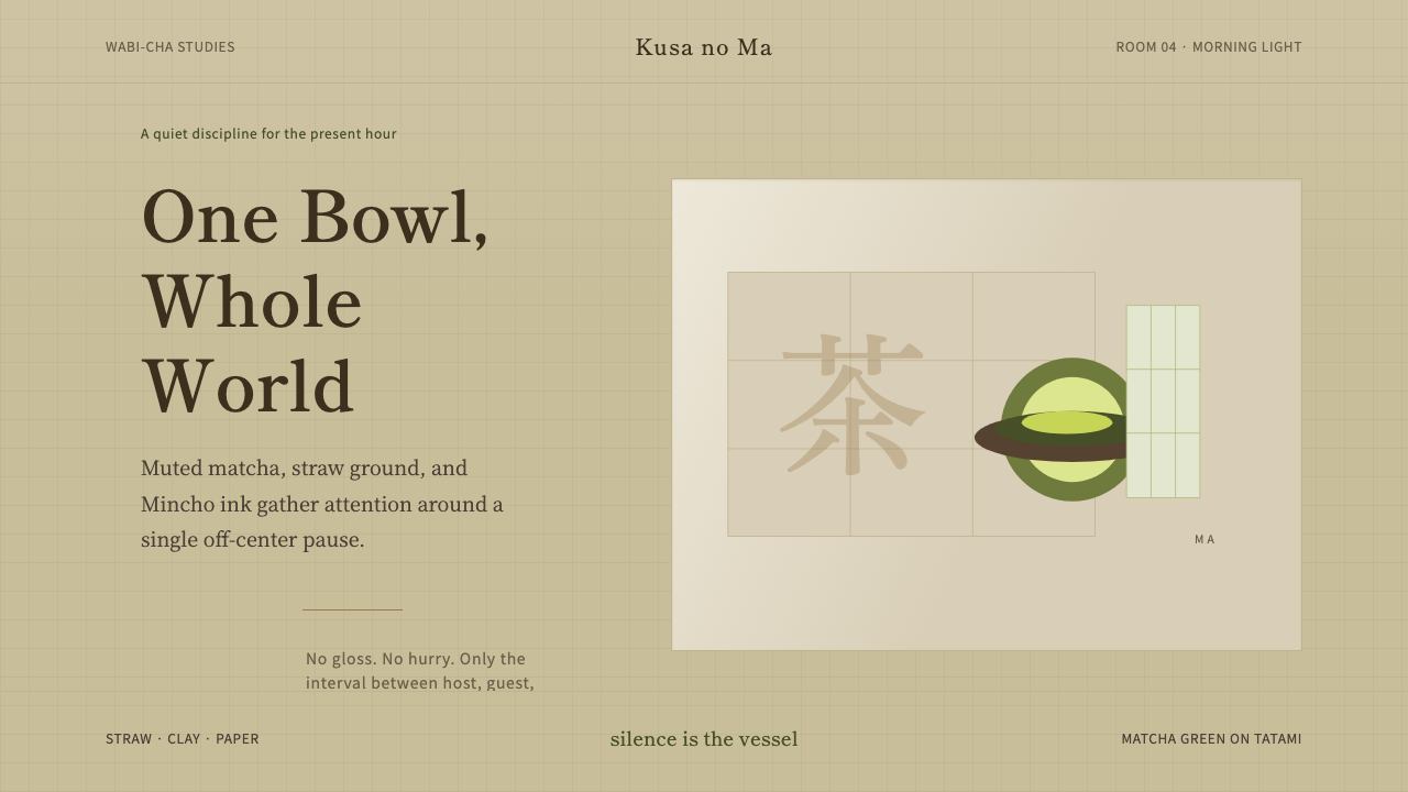 Japanese Tea CeremonyStillness has weight. Tatami straw, matcha green, and Mincho type leave room…
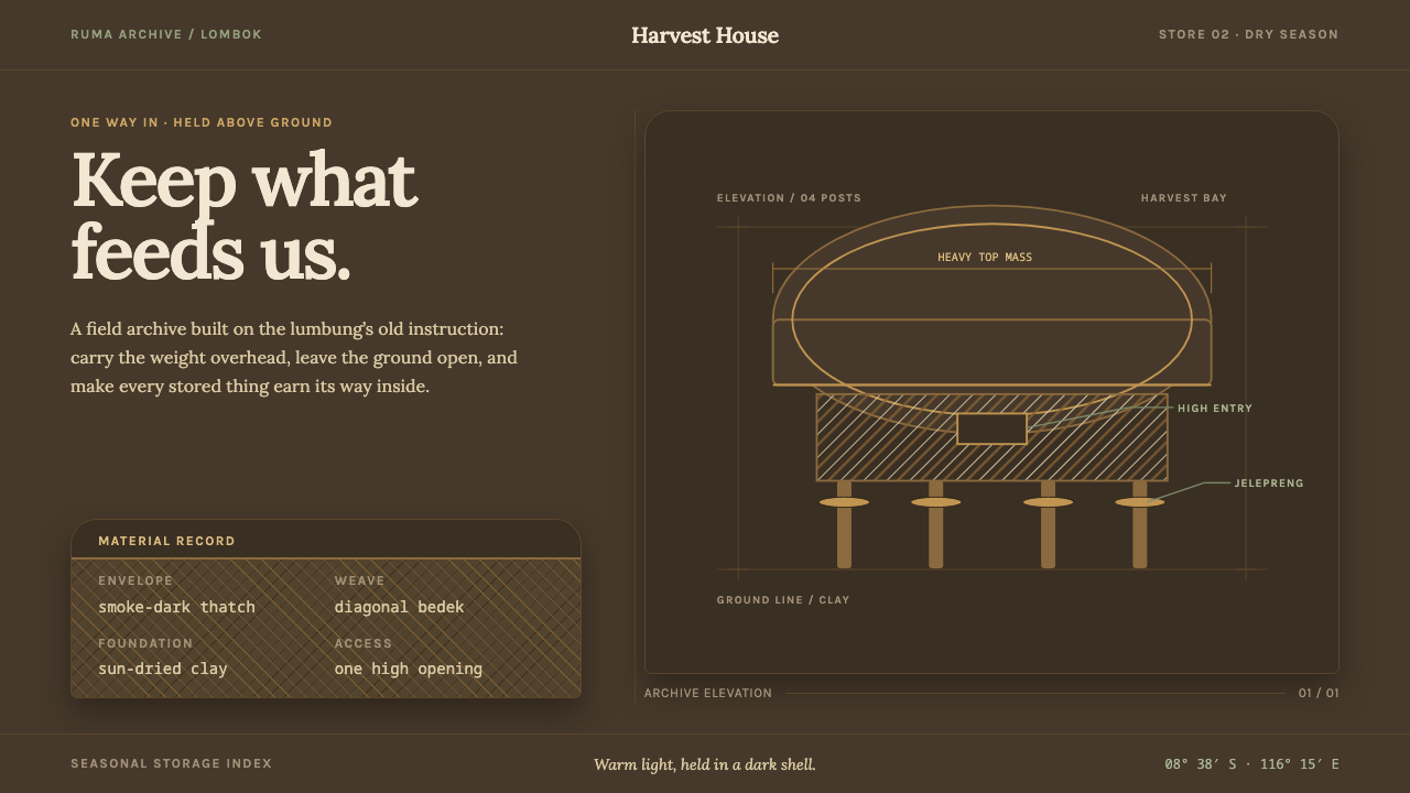 Sasak Lumbung GranaryStorage carries its weight. Smoke-dark ground, warm Lora type, and a four-pos…
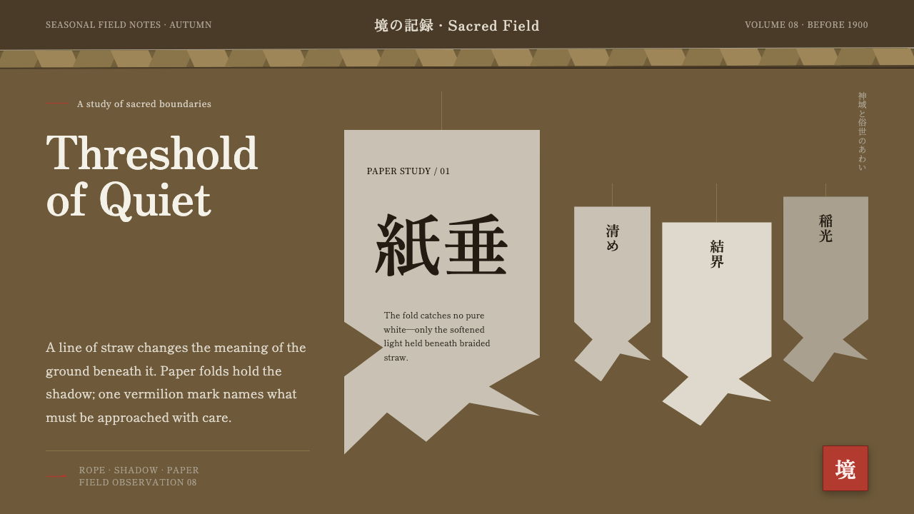 Shinto Shide Paper StreamerQuiet becomes sacred. Shadowed washi hangs from a straw-gold line, marked onc…
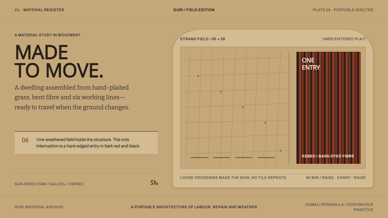 Somali AqalA house made to move. Sun-dried mat fields yield once to a bark-red, black en…