What is Wool Felting?
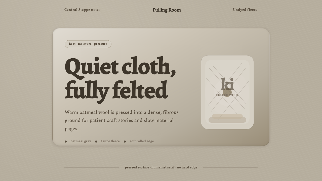
Wool Felting turns the ancient pressure of hand, heat, and moisture into visual quiet — fleece-soft color, humanist type, and forms that seem gently compressed rather than mechanically drawn.
Wool Felting in brief
Wool Felting is a material-led design style derived from the felt traditions of Central Asian nomadic peoples. Its source is raw sheep fleece transformed through heat, moisture, pressure, and repeated fulling into a dense, hairy cloth. Rather than borrowing decorative motifs from pastoral textiles, the style translates the physical behavior of felt itself: muted natural color, compressed softness, irregular fiber, rounded mass, and a sense of warmth without polish.
The visual field usually begins with an undyed oatmeal-to-stone-gray ground, accompanied by taupe, fleece brown, and other quiet variations within the material’s natural range. Humanist serif typography introduces the trace of the hand: letters feel literary and approachable rather than engineered. Panels resemble layered or rolled felt, with softened edges and shallow depth. Nothing should look sharply cut, lacquered, metallic, or optically perfect.
Its restraint differs from clinical minimalism. Empty space feels sheltered rather than vacant, surfaces retain tactile presence, and hierarchy develops through tonal contrast, scale, layering, and density instead of bright color or rigid geometry. The result is calm but not anonymous: a pre-industrial material language adapted to interfaces, presentations, and editorial systems without losing its pastoral origin.
Where does Wool Felting come from?
The style begins with the ancient felt-making practices of the Great Steppe, especially among Kazakh, Kyrgyz, and Mongol nomadic peoples. Sheep supplied a renewable material already adapted to severe pastoral environments. By matting fleece under heat, moisture, and pressure, makers created a cloth that was dense, insulating, portable, and capable of being formed without conventional weaving. Felt therefore belonged not to a specialized decorative category but to the practical fabric of nomadic life.
Before 1900, pastoral communities used felt to cover yurts, line interiors, make carpets, and construct clothing. These uses explain the material’s visual character. A yurt covering required broad, joined planes; a floor covering needed thickness and resilience; clothing demanded pliability. Rolled borders, compressed seams, layered surfaces, and softly uneven contours emerged from making and use rather than from an abstract theory of style.
The traditions often identified as kiyiz or koshma were sustained by anonymous herders, steppe felt-makers, and yurt-builders rather than by named designers. Knowledge passed through communal labor and repeated physical judgment: how wet the fleece should become, how firmly it should be rolled, and when loose fiber had consolidated into cloth. The material preserved evidence of this process in its nap, density, and small irregularities.
As a contemporary design system, Wool Felting does not claim to reproduce the full cultural vocabulary of these traditions. It isolates a narrower set of transferable qualities from the pre-industrial material: undyed warmth, compressed fiber, rounded construction, quiet layering, and human-scale imperfection. Its historical responsibility is therefore one of clear attribution. The aesthetic begins in Central Asian pastoral textile culture, even when its modern application appears on a screen rather than in a dwelling.
What defines the Wool Felting look?
Natural Fleece Color
The palette stays close to undyed fleece: warm oatmeal gray, stone gray, taupe, and fleece brown. Contrast is tonal and restrained, as though every role had been mixed from neighboring fibers. Darker browns provide emphasis without becoming severe black, while lighter grounds should remain warm enough to suggest cloth rather than blank paper.
Humanist Typography
Humanist serifs give the system its literary warmth. Their gently modulated strokes and familiar proportions feel shaped by reading and handwriting rather than mechanical construction. A limited typographic family should carry the hierarchy through changes of scale, emphasis, and spacing. Extremely geometric faces or aggressively compressed lettering introduce a hardness alien to the material.
Compressed Edges
Corners and boundaries appear rounded through pressure, not inflated like plastic bubbles. The ideal edge suggests fibers compacted into a stable mass: soft to the eye but structurally dependable. Panels may curl, overlap, or terminate in a rolled lip, yet they should retain the weight of thick cloth rather than float like translucent sheets.
Fibrous Surface
Texture is quiet and close-grained. Fine nap, subtle mottling, and small density changes imply hand-worked fleece without turning the surface into rustic spectacle. Texture should support material recognition at a glance and then recede. Coarse noise, dramatic scratches, or repetitive synthetic patterns make the interface feel distressed rather than felted.
Layered Soft Depth
Depth comes from one felt plane resting over another. Separation is expressed through gentle tonal shifts, compressed rims, and narrow areas of sheltered shade rather than glossy highlights or dramatic floating shadows. This produces a low, upholstered relief: content feels placed within a tactile landscape, not suspended above a digital void.
Organic Restraint
Composition avoids hard geometric interruption. Shapes can be broad and orderly, but their transitions remain forgiving, with generous breathing room and few competing accents. The system is not decorative craft collage; it is disciplined material quiet. Every additional badge, rule, or ornament must justify the disturbance it causes on the calm felt field.
Who shaped Wool Felting?
Nomadic herders supplied the material knowledge at the foundation of the tradition. Their lives linked sheep, seasonal movement, shelter, clothing, and floor coverings into one pastoral system. Felt’s durability, warmth, portability, and natural color were practical facts before they became aesthetic qualities, and the contemporary style remains indebted to that lived relationship with fleece.
Steppe felt-makers transformed loose fleece into coherent cloth through wet-felting and fulling. Their expertise lay in touch, rhythm, pressure, and collective coordination rather than written specification. The dense nap, softened contour, and slight irregularity now associated with the visual style are records of those physical decisions, not arbitrary surface effects.
Yurt-builders applied felt at architectural scale, joining portable textile planes into protective enclosures for steppe life. Their work demonstrates that softness can be structural: a flexible fiber surface may define shelter, boundary, insulation, and interior atmosphere at once. Contemporary felt-inspired panels inherit this union of enclosure and comfort.
How do you use Wool Felting today?
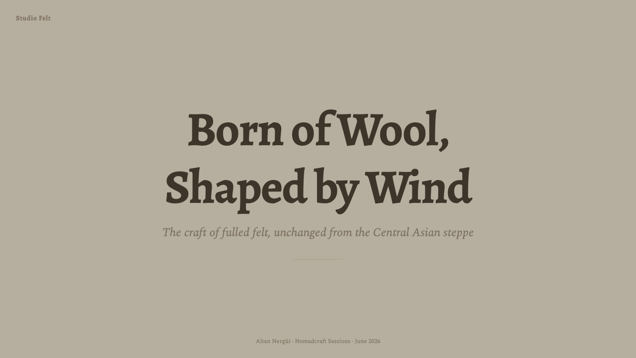
For presentation covers, use one broad felt field and a title with calm, literary authority. A rolled or layered panel can hold the subtitle, date, or speaker information without becoming a decorative ribbon. Content slides benefit from generous margins, short text blocks, and restrained tonal grouping. Hierarchy should feel assembled from pieces of the same material rather than separated by sharp boxes.
Data slides require firmer differentiation while preserving softness. Use neighboring fleece tones for secondary series and the deepest brown for the most important comparison. Bars, areas, and markers should appear substantial and matte, with rounded or gently compressed ends. Keep grid guidance quiet and let direct labels do most of the explanatory work; excessive rules turn a tactile composition into an accounting form.
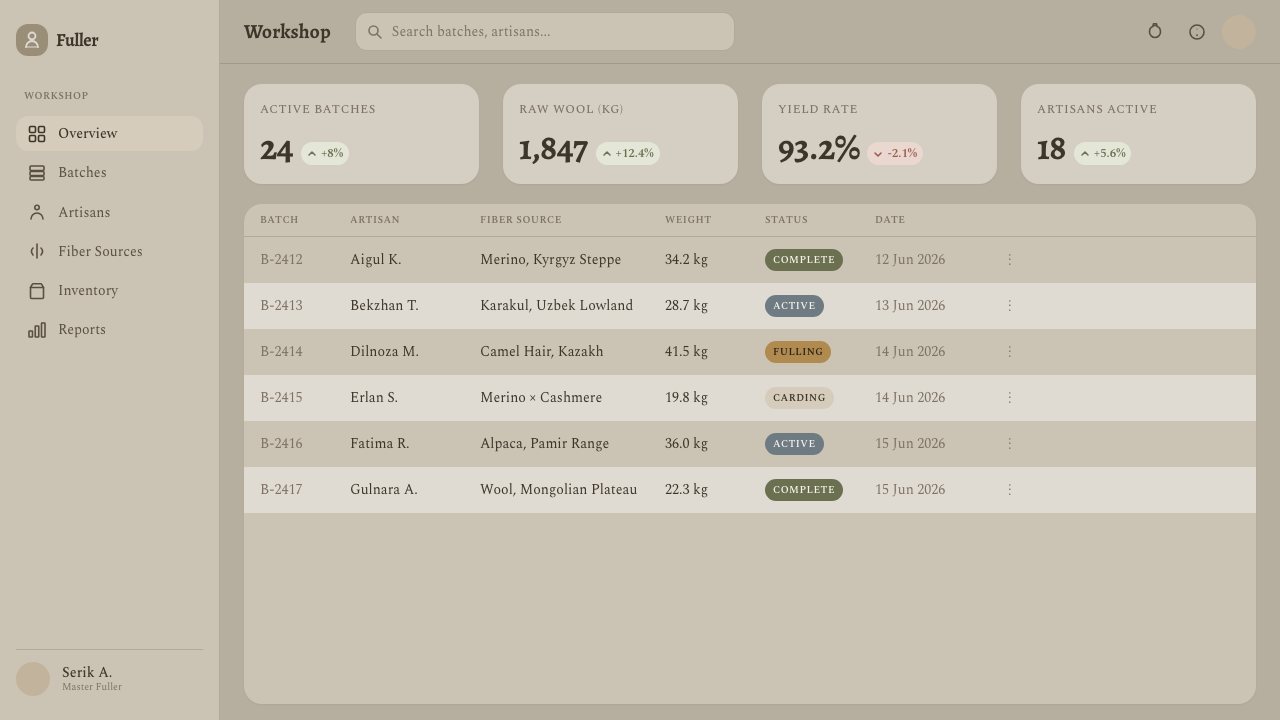
For web dashboards and pricing pages, treat major regions as layered felt panels resting on a warm ground. Status, navigation, and calls to action can gain priority through deeper tone, stronger type, or a more pronounced rolled edge. Pricing tiers should differ through hierarchy and content rather than loud color coding. Controls need clear boundaries, but those boundaries should feel pressed and sewn into the system, not stamped onto it.
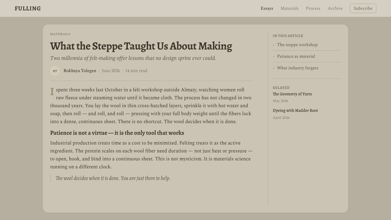
Editorial and marketing applications work best when the material supports a story of care, shelter, craft, or considered slowness. An article may pair a narrow reading column with broad tactile margins and softly inset quotations. A marketing page can alternate open felt fields with denser product panels, using close photography of fibers or hand-worked surfaces only when such imagery is available within the subject’s cultural context.
The common mistake is to equate softness with an abundance of rounded cards, beige color, and blurred shadow. That produces generic comfort rather than wool felt. Authentic application depends on material logic: compressed edges instead of inflated capsules, fibrous matte surfaces instead of smooth gradients, restrained fleece variation instead of decorative pastels, and enough visual weight for every panel to feel made from dense cloth.
Wool Felting — FAQ
Is Wool Felting simply a rustic or handmade style?
No. Handmade irregularity is present, but the style is defined more precisely by the behavior of felt: matted fiber, compressed mass, natural fleece color, insulating layers, and softened structural edges. Rustic styling often collects many nostalgic objects and textures. Wool Felting is quieter and more disciplined, using a limited material vocabulary to organize contemporary information.
Does the style require visible wool texture everywhere?
No. Continuous heavy texture reduces legibility and quickly becomes theatrical. The material can be communicated through warm tonal relationships, matte surfaces, compressed edges, and layered construction even where individual fibers are barely visible. Stronger nap is best reserved for broad backgrounds, illustrations, or focal panels, while reading areas remain comparatively calm.
Can Wool Felting support dense dashboards and technical information?
Yes, provided softness does not erase hierarchy. Dense information should be organized through consistent panel families, clear typographic levels, restrained separators, and strong tonal emphasis for exceptions. The felt metaphor belongs mainly to surfaces and edges; labels, numbers, and controls still need decisive alignment. Calm material treatment can make a complex dashboard feel sheltered rather than cluttered.
How should the style acknowledge its Central Asian origins?
Attribution should be explicit: the material language comes from the felt traditions of Kazakh, Kyrgyz, and Mongol nomadic peoples of the Great Steppe. Designers should avoid presenting it as an anonymous contemporary trend or casually borrowing culturally specific motifs without context. A respectful adaptation can focus on shared material principles while naming the pastoral traditions that made those principles visible.
Where does Wool Felting struggle as a design language?
It struggles when a product must communicate speed, metallic precision, sharp urgency, or spectacular luxury. The palette and tactile restraint can also make weak hierarchy disappear if everything is rendered in similar fleece tones. It is strongest where warmth, reflection, craft, shelter, and patient attention align with the subject; elsewhere, its stillness may feel slow or overly domestic.
Related design styles
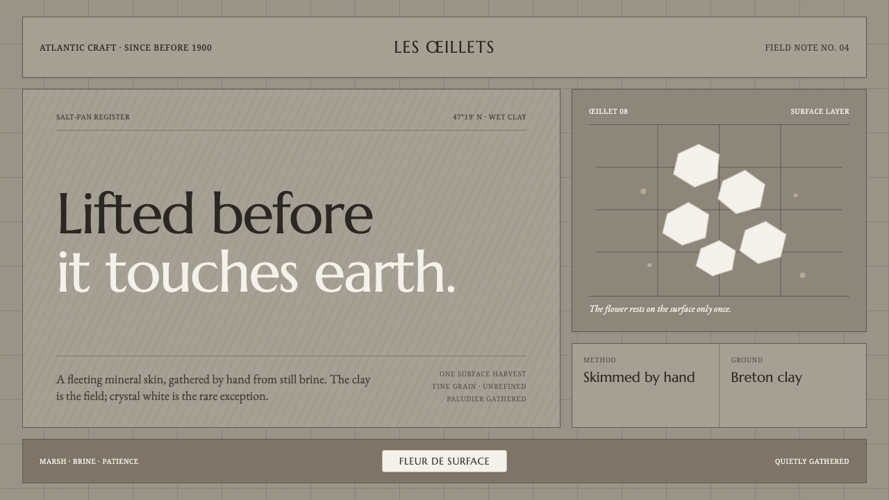 Guérande Fleur de SelCrystal white is the exception. Mineral serif and hairline grids rise from we…
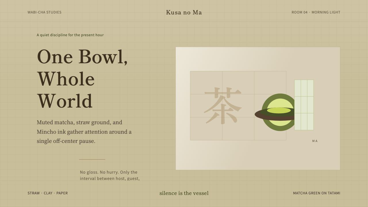 Japanese Tea CeremonyStillness has weight. Tatami straw, matcha green, and Mincho type leave room…
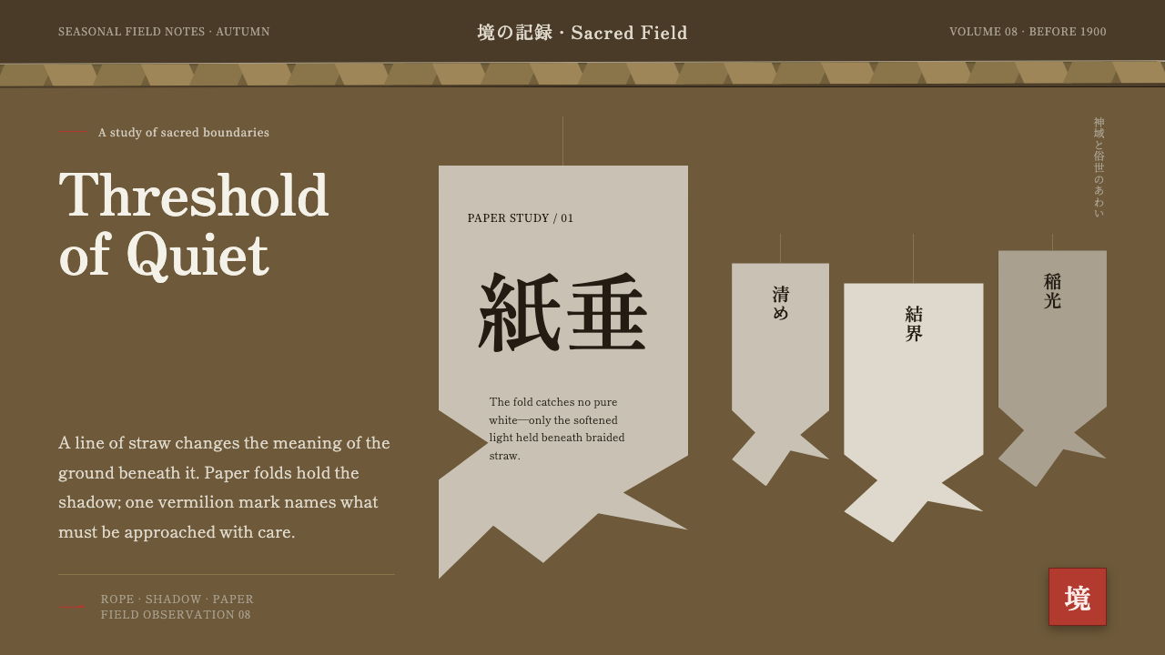 Shinto Shide Paper StreamerQuiet becomes sacred. Shadowed washi hangs from a straw-gold line, marked onc…
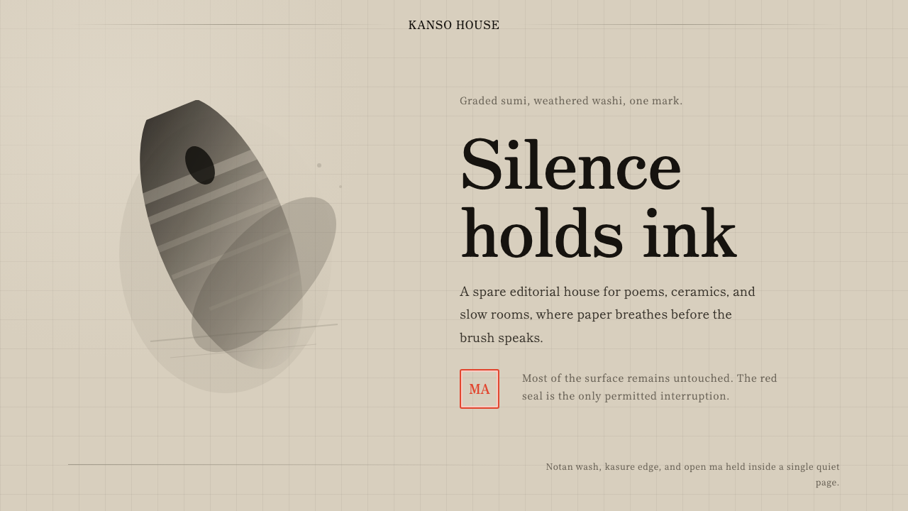 Sumi-e Ink WashRestraint carries weight. Washed black ink floats on oatmeal washi, anchored…
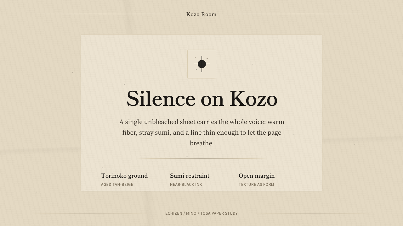 Washi Paper MinimalQuiet is material. Warm kozo grain, sumi specks, and hairline rules hold the…
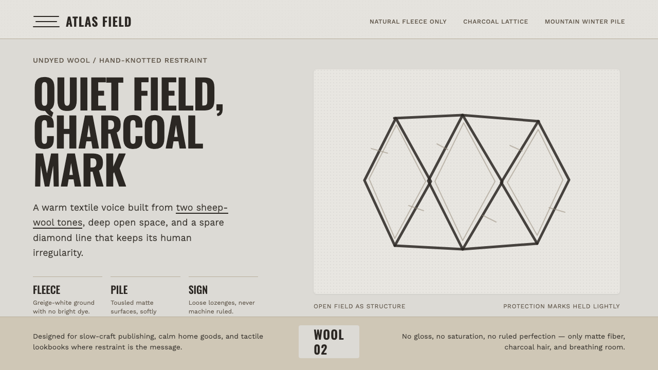 Beni Ourain Berber CarpetRestraint feels tactile. Greige wool field, Oswald type, and a loose charcoal…