What is Falu Red Cottage?
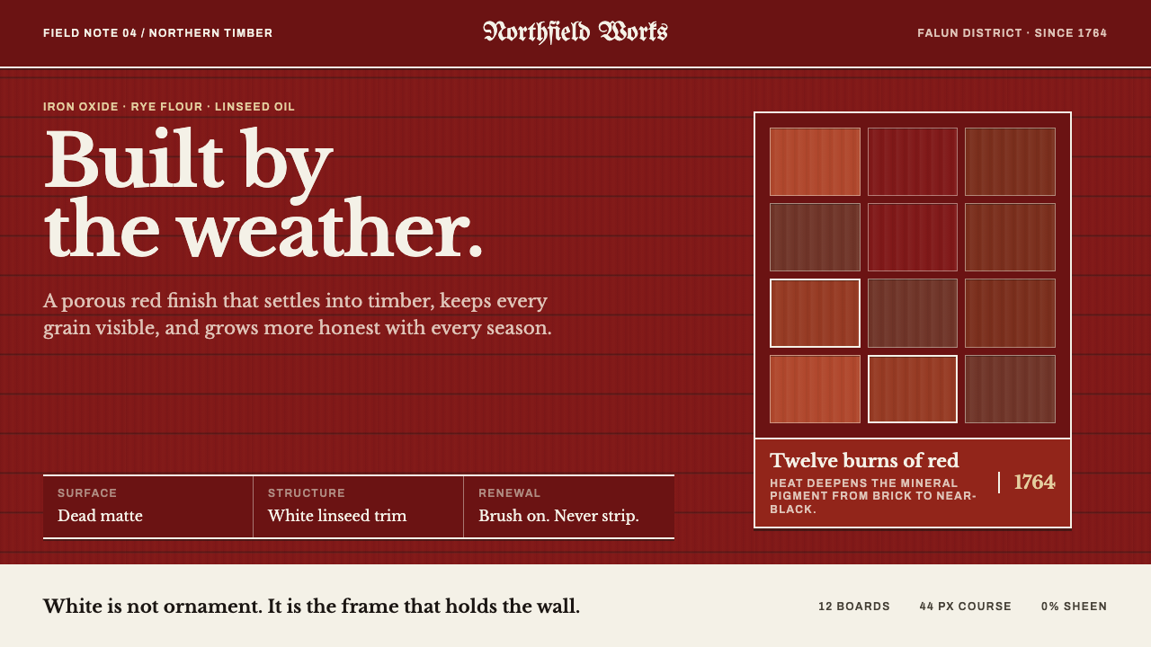
Falu Red Cottage builds a page the way a Swedish cottage is built: a dead-matte red field of horizontal boards, squared at every edge by white trim that holds the whole thing up.
Falu Red Cottage in brief
Falu Red Cottage is a design language drawn from the red timber cottages of rural Sweden, painted with Falu red, the iron-oxide paint named after the town of Falun in Dalarna. The idea behind it can be put in four words: built, not decorated. The page is assembled like a house rather than dressed like a poster. There is a large flat red field, there is white trim at every corner, window and edge, and there is nothing in between that exists only to look pretty.
The look of the style follows the chemistry of the paint. Falu rödfärg is made from water, rye flour, linseed oil and iron oxide. It does not form a film on the wood; it soaks into planed pine, so the grain and knots still read through the colour, and it dries dead matte, porous and chalky, never glossy. A page in this style inherits those qualities: colour that sits flat and absorbed, a surface with a faint physical grain behind it, and no shine of any kind.
Structurally, the system is a field and a frame. The field is the red wall, divided only by the horizontal courses of its boards. The frame is the white trim that cuts that wall at the corners, around windows and at doors, painted with linseed-oil white. The white is structural, not decorative: take it away and the composition no longer stands. Type is a transitional serif for reading, with fraktur kept for short carved strings. Nothing is rounded, nothing is blurred and nothing shines.

Where does Falu Red Cottage come from?
The story begins underground at Falun, Dalarna, where the great copper mountain known as Stora Kopparberget was worked from the ninth century. Its apogee came in the seventeenth century, when the mine supplied roughly two-thirds of the copper used in Western Europe. Mining at that scale leaves waste, and the waste of the Falun mine was rich in iron oxide, a pigment that was nearly free and nearly permanent. The red that covers so much of the Swedish countryside is, in a literal sense, what remained after the copper had been taken.
The paint itself is simple. Water, rye flour, linseed oil and iron oxide are cooked together into something that behaves very differently from a modern film-forming paint. It sinks into planed pine rather than sitting on top of it, which is why the timber's grain and knots stay visible beneath the colour, and it dries dead matte, with a porous, chalky face that lets the wood breathe. The commercial paint was being produced from 1764, and the name Falu Rödfärg has been attached to it since. White trim, painted in linseed-oil white, was the natural companion: a pale frame on a deep red wall.
Falu red became a national colour in the way an everyday thing becomes a symbol. It was already the ordinary finish of Swedish vernacular timber building, the colour of farmhouses, barns and cottages, and in the early 1900s it was actively promoted as a national type. The source record places the style within three overlapping currents: Swedish vernacular timber building, the elevation of Falun red as the national colour, and what it calls the Sundborn domestic idiom, the homely red-and-white register associated with a village in Dalarna.
The Sundborn idiom is linked to the painter Carl Larsson, who is best known for pictures of home and family life, and who helped fix the red cottage in the Swedish imagination as a place of warmth rather than merely of labour. A design system built on this tradition therefore draws on both sides of it: the hard practical logic of a timber house, with its boards and trim and matte paint, and the soft domestic feeling that the red-and-white cottage came to carry. The two meet in a page that is plain in construction and welcoming in tone.
What defines the Falu Red Cottage look?
Absorbed colour
The paint sinks into the timber instead of forming a skin on it, so the colour never feels like a coating. Grain and knots read through the red, and the surface keeps a faint physical texture behind its colour. In a layout this means flat colour with a hint of material underneath, not a perfectly uniform digital fill, and it argues against anything that suggests a layer of lacquer or plastic.
Dead matte
Falu red dries porous and chalky, with no sheen at all. Nothing on the page is allowed to catch the light: no gloss, no highlights, no glassy edges. The matte surface gives the style its calm and its dignity, and it makes the white trim read more strongly by contrast, since the only brightness comes from the pale linseed-oil white and not from any reflection.
Horizontal board coursing
The large red field is divided only by the horizontal lines of its boards. These seams are the page's rhythm: regular, quiet and structural, they replace patterns, textures and decorative dividers. They give long vertical stretches of colour a measure and a direction without adding any ornament, and they let a wall of red feel built rather than simply filled.
Structural white trim
White trim, painted in linseed-oil white, appears at every corner, window and edge. It is not an accent. It squares the red field, frames the openings and holds the composition together, in the way corner boards and window casings do on a real cottage. If a piece of white does not frame something or finish an edge, it does not belong in the layout.
Deep iron-oxide red
The colour is a deep, earthy red of the iron-oxide family, closer to a brick or a rust than to any bright signal red. It is the dominant colour, covering large areas, and it reads as dark in the context of a page. It is warm without being loud, and it gives the style its sense of weather, wood and long use.
Serif text, carved fraktur
Reading text is set in a transitional serif, the kind of sober book face that suits long copy. Fraktur is reserved for very short strings, in the manner of a few characters cut above a door. This pairing keeps the page legible while giving it one historical flourish, and it keeps the blackletter in the role it plays on a real building: a name or a date, not a paragraph.
Square, unblurred, unshining
Corners are square, edges are sharp and there are no soft glows. Nothing is rounded, nothing is blurred and nothing shines. This is less a set of prohibitions than a description of a timber building: boards are cut square, trim is fixed in straight lines, and a matte paint has nothing to reflect. Everything on the page should look like it could be nailed into place.

Who shaped Falu Red Cottage?
Stora Kopparberget is the copper mine at Falun, worked from the ninth century and at its height in the seventeenth, when it supplied roughly two-thirds of the copper used in Western Europe. It is the style's literal source: the iron-oxide waste of the mine became the pigment of the paint. It is not a person but a place, and the colour of the Swedish countryside is in a real sense its by-product.
Falu Rödfärg is the paint and the name under which it has been sold since commercial production began in 1764. It is a deliberately simple recipe of water, rye flour, linseed oil and iron oxide, and its behaviour is the style's behaviour: it soaks in, it lets the grain show and it dries dead matte. The design system treats the paint as a design philosophy as much as a product.
Carl Larsson is the painter the source record connects with the Sundborn domestic idiom, the homely red-and-white register associated with a village in Dalarna. He is best known for pictures of home and family life. His place in the story is that of an image-maker: he helped fix the red cottage in the Swedish imagination as a place of warmth, which is the softer half of what this design system borrows.
How do you use Falu Red Cottage today?
Falu Red Cottage is a style about construction, so it rewards layouts that are built from a few honest parts: a large red field, white trim that frames and finishes, and plain type. It suits subjects that want to feel grounded, warm and unpretentious, and it works best when the page is simple enough for its structure to show. The more a layout tries to decorate, the less it resembles the cottage it is drawn from.
For presentation slides, a cover can be a full red field with faint horizontal board seams and a thin white frame set inside the edges, with the title in a sober serif and, if the deck calls for it, a short fraktur string, such as a name or a year, placed like a few characters above a door. Content slides can keep the red field and use white lines to separate regions, as trim separates a window from a wall. Data slides can put each chart inside a white-trimmed opening, like a window in the red wall.
For web interfaces, the red should cover large structural surfaces, such as the hero, the header or the side navigation, with white trim used as dividers and frames. A dashboard can treat each panel as an opening in the wall, with square corners and a clean white frame. On a pricing page, tiers can each sit in a white-framed window, with the recommended tier distinguished by a heavier frame, not by a glow or a shadow. Keep text in the serif and avoid anything that looks glossy.
For editorial and marketing work, the style suits Nordic and outdoor brands, cabins and home building, sustainable and natural materials, food, tourism and heritage stories. A feature layout can open on a large red field with a single serif headline and a white-trimmed image, and long-form text can run in a plain serif on a calm ground. The mood is warm and hospitable, which is why it works for places and products people are meant to want to enter.
The most common mistake is to treat the style as a red colour scheme and forget the construction. Adding gloss, gradients, rounded corners or soft shadows destroys the matte, built character. Using white as decoration instead of structure, so that it floats without framing anything, empties it of meaning, and setting long paragraphs in fraktur defeats the idea that blackletter is a short carved string. Keep the red absorbed, the white load-bearing and the corners square.

Falu Red Cottage — FAQ
What is Falu red made of, and why does that matter to the design?
Falu rödfärg is made from water, rye flour, linseed oil and iron oxide, the last of which was originally milled from the waste of the Falun copper mine. It matters because the recipe explains the look. The paint soaks into planed pine instead of forming a film, so grain and knots stay visible, and it dries dead matte, porous and chalky. The design system turns these material facts into visual rules: absorbed colour, no gloss and a faint physical texture behind the red.
Why is the white trim called structural?
Because on a real cottage the white trim does a job: it finishes the corners, frames the windows and doors, and squares off the edges of the red wall. In the design system the white works the same way. It marks where one part of the layout ends and another begins, and it frames openings for content. If you remove it, the composition falls apart, which is the test of whether a visual element is structure or decoration.
Can Falu Red Cottage work on a light background?
It is built as a dark-field style, with the deep red wall as the main surface, and it works best that way. A light version is possible if the red is confined to bands, headers or panels and the white trim does the work of the ground, but the balance changes: the red stops being the wall and becomes an accent, and the sense of a built structure is weaker. If you go that route, keep the matte finish and the square, framed construction so the character survives.
Why is fraktur limited to short strings?
On a real cottage, fraktur appears as a few characters cut above a door, a name or a date. It is a carved inscription, not running text. The design system keeps it in that role, partly for historical truth and partly for readability, since blackletter is hard to read at length. Use it for a name, a year or a short motto, and leave paragraphs to the transitional serif.
What does the style suit, and where does it struggle?
It suits grounded, warm and unpretentious subjects: Nordic and outdoor brands, cabins and home building, natural materials, food, tourism and heritage. It struggles where the brief calls for glossy tech, high-gloss luxury or playful roundness, since its whole character depends on matte, square, built surfaces. It can also feel heavy in very dense interfaces if the red is applied everywhere, so the field should be kept to large structural areas and the trim used to give the content room.
Related design styles
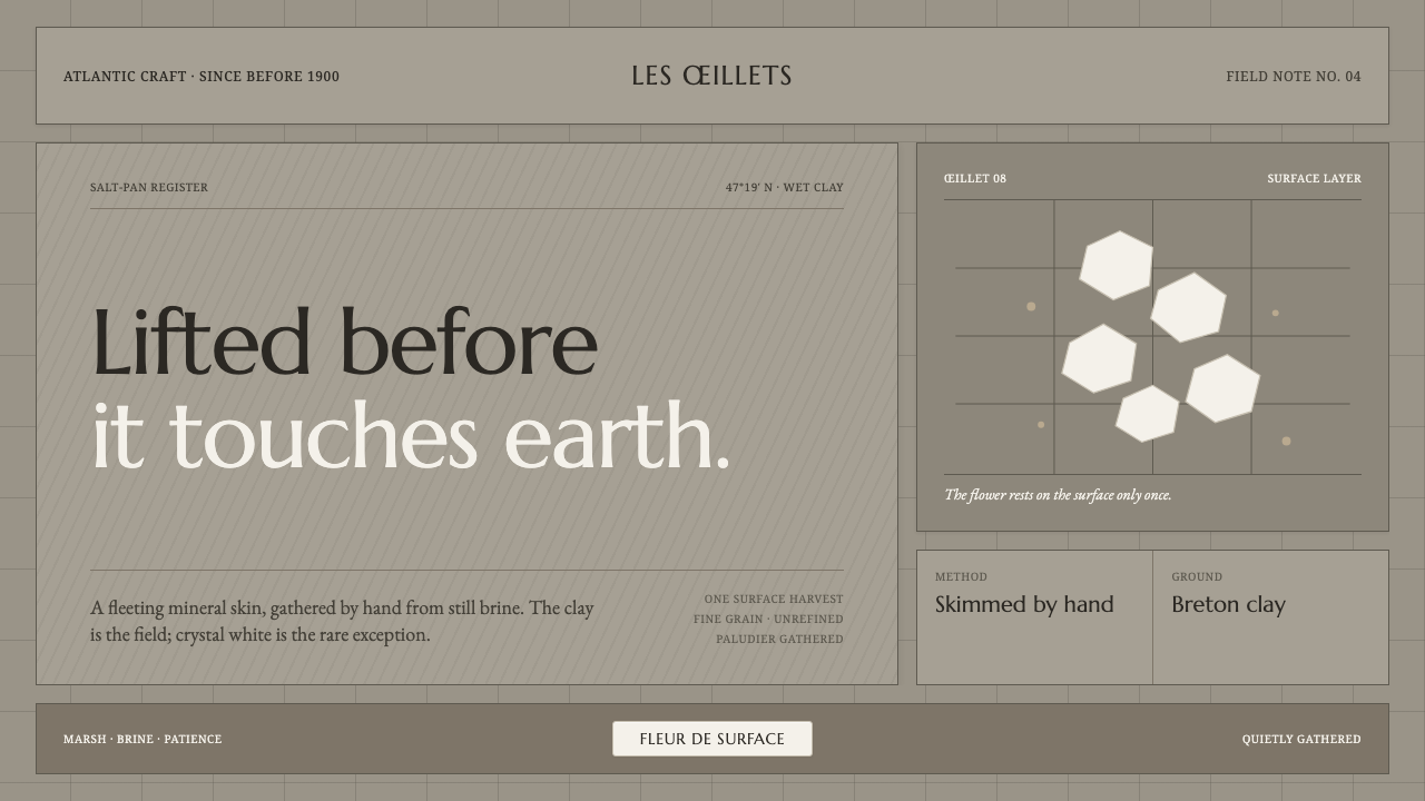 Guérande Fleur de SelCrystal white is the exception. Mineral serif and hairline grids rise from we…
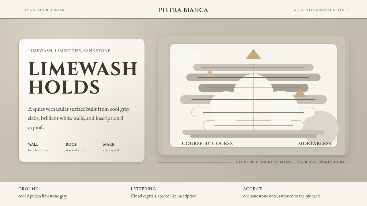 Trulli AlberobelloQuietly monumental. Cool limestone, limewash fields, and Cinzel capitals stac…
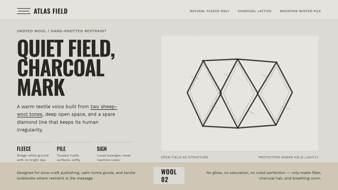 Beni Ourain Berber CarpetRestraint feels tactile. Greige wool field, Oswald type, and a loose charcoal…
 Ifugao BululTouch reveals the archive. Narra red breaks through near-black patina in a qu…
 Japanese Tea CeremonyStillness has weight. Tatami straw, matcha green, and Mincho type leave room…
 Labu Sayong Black ClayBlack by fire, not glaze. Matte carbon, warm clay and pressed triangles in qu…