What is Cup Noodle?
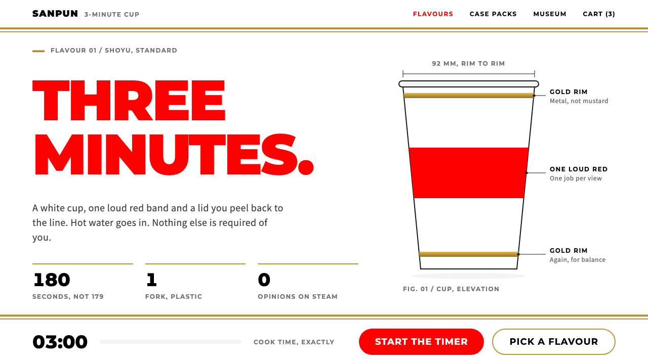
Cup Noodle is the design language of a single object: a white tapered cup, one loud red, two thin gold bands, and the deadpan confidence of a product that has barely changed since 1971.
Cup Noodle in brief
The Cup Noodle style is a packaging-derived design language built from one of Japan's most recognisable consumer objects: the tapered white paper cup Nissin put on sale on 18 September 1971. Its visual vocabulary is tiny on purpose. A white ground, a single saturated red, thin metallic gold rules, and heavy capital letters for names and numbers. Nothing else is invited in.
What makes the style distinctive is discipline rather than decoration. The red does the shouting, so everything around it stays quiet. The gold lines are borrowed from the rims of good dinner plates, a small joke about elevating a cheap, fast meal into something that deserves a proper place setting. White leaves room for the red to read from across a convenience-store aisle, and the layout never tries to be cleverer than the cup itself.
The tone is as much a part of the system as the colour. Japanese instant-noodle advertising has long leaned on absurdist, straight-faced humour, and the Cup Noodle look inherits that. Copy is dry, a three-minute timer becomes a recurring motif, and the humour lives in what is said rather than in ornament. The result is a style that is instantly recognisable, friendly without being cute, and well suited to anything that needs a confident, slightly funny identity.

Where does Cup Noodle come from?
Cup Noodle goes on sale on 18 September 1971 in Japan, the work of Momofuku Ando, the founder of Nissin. The product grew out of an observation made abroad: in an American supermarket, buyers broke blocks of chicken ramen into paper cups and ate them with forks. Ando took that improvisation home and turned it into a purpose-built object, a cup wider at the top than at the bottom, a container meant to be filled with hot water and left for a short wait.
The look of the cup was settled early. The red CUP NOODLE wordmark, drawn by hand by Takeshi Otaka, wraps around a white body, and two gold bands echo the rim of a dinner plate. That combination is the origin of the entire system, and the remarkable thing is how little it has moved. Packaging systems around the world are redesigned every few years; this one has been adjusted, refined and re-lettered while keeping the same recognisable skeleton for more than five decades.
The cultural context is Osaka and Yokohama in the early 1970s, when convenience food and vending-machine culture were reshaping everyday eating in Japan. A meal you could make with hot water and a three-minute wait fit that moment perfectly, and the cup's design had to survive being stacked on shelves, handled in bulk, and recognised in half a second. The strong red and white came from that practical pressure as much as from any aesthetic ambition.
The current packaging system dates from 2008 and onward, a period associated with the art director Kashiwa Sato, who is among the key figures linked to this era of the brand. Alongside the packaging, Nissin's advertising built a second tradition: absurdist Japanese TV commercials that treat an instant meal with mock solemnity. Together the object and the attitude form the two halves of the style.
What defines the Cup Noodle look?
Color
A white ground carries a single loud red, and that is almost the whole palette. The red is saturated and flat, never gradient, so it reads as a printed mark rather than a glow. Thin metallic gold is the only second voice, used for hairline rules and rim-like bands. Small touches of orange appear in supporting graphics, but they stay minor. The effect is a calm page with one unmistakable shout.
Typography
Names, numbers and headings are set in heavy geometric capitals, with Montserrat as the Latin voice, which gives them a stamped, label-like authority. Running text and Japanese copy are handed to a plainer sans, Noto Sans JP, so reading stays easy. The contrast between loud capitals and quiet body text is the main typographic move. Letters feel printed on a lid, not drawn in a notebook.
Gold rules
Two thin gold bands are the signature detail, borrowed from the rims of good dinner plates. In an interface they become dividers, section edges and underlines, always fine and always in pairs or short runs. They give the white page a faint sense of ceremony and keep the red from feeling cheap. Overuse would ruin the joke, so they are kept sparse.
Form and layout
The tapered cup is the master shape, and layouts often echo it: a central product, wide at the top, narrowing downward, with copy arranged around it. Corners are kept tight and restrained rather than bubbly. Blocks of white space are generous because the cup, not the page, is meant to be the loudest thing. Composition is centred and frontal, like a product photographed against a clean shelf.
Deadpan voice
Humour is a design material here. Copy is delivered with a straight face, especially around the three-minute wait, which turns a timer into a character. Absurdist Japanese TV advertising is the model: seriousness applied to something trivial. The style never relies on emoji, mascots or exclamation marks to be funny; the restraint is the joke.
Consistency over time
The style carries an unusual idea: the formula should barely move. Refinements happen at the edges, such as lettering, packaging structure and the arrangement of small print, while the cup, the red and the gold stay fixed. For a designer this means recognition comes from repetition, not novelty. Anything added to the page should be able to survive being seen thousands of times.

Who shaped Cup Noodle?
Ando founded Nissin and is credited with bringing Cup Noodle to market in 1971. The idea came from watching American buyers break ramen into paper cups and eat it with forks, which he then turned into a purpose-built tapered container. His thinking set the template for everything visual that followed: the product had to be understood at a glance, work as its own packaging and be eaten anywhere.
Otaka drew the red CUP NOODLE wordmark by hand. That lettering is the single most recognisable element of the style, and its warm, slightly irregular energy is the reason the red reads as a human mark rather than a corporate stamp. Later designers have refined around it rather than replacing it.
Sato is linked to the current packaging system, which dates from 2008 onward. This phase tightened the brand's graphic language into the clean white, red and gold structure that the style now draws on. His association with the brand shows how a very old product can keep a modern, minimal face without losing its original character.
Koki Ando is listed among the key figures connected to the brand. His name appears in the line of people who carried Nissin's identity forward after the founding generation, a reminder that the longevity of this style depended on continuity of stewardship as much as on the original design.
How do you use Cup Noodle today?
On slides, the Cup Noodle style works best on covers and section dividers. Put a single bold name in heavy capitals on a white slide, add one band of red, and let two thin gold rules frame the title. Resist filling the rest of the page. A cover that feels like the lid of a cup is stronger than one packed with graphics. For content slides, keep text in a plain sans, use red only for the one thing you want the audience to remember, and place the gold rules sparingly as dividers.
For data slides, treat the red as the highlight colour and everything else as neutral. A chart with one red series against greys and white reads instantly, and a big number in heavy capitals beside a short deadpan caption is exactly the kind of stat card the style was made for. Avoid using more than one accent; the whole idea is that the red is the only loud voice on the page.
In web interfaces, the style suits food e-commerce, brand campaign pages and booking or ticketing flows where a confident, slightly humorous identity helps. Primary buttons in red with white labels, secondary actions in outline, and thin gold dividers between sections give a clean, trustworthy structure. Product imagery should sit centred on white with generous space, as if on a shelf. A countdown or timer element is a natural place to lean into the deadpan personality.
For editorial and marketing work, let the copy do the humour. Short, dry headlines, a strong product shot and a restrained layout will carry the style better than illustrations or mascots. Posters and landing pages benefit from a single red block that anchors the composition, with the gold lines acting as quiet punctuation. Keep the tone straight-faced; the more seriously the page treats a trivial thing, the better it lands.
The most common mistake is adding a second loud colour or filling the white with decoration. Once the page has a green banner, a gradient or a pile of stickers, the red stops being special and the cup disappears. A second mistake is overusing the gold lines until they stop looking like an accent and start looking like a pattern. Stay with one red, one white, a few fine lines and heavy capitals, and let restraint do the work.

Cup Noodle — FAQ
What is the Cup Noodle design style?
It is a design language derived from Nissin's Cup Noodle packaging, first sold on 18 September 1971. It combines a white ground, one loud red, thin metallic gold rules and heavy capital letters, with a straight-faced, humorous tone drawn from Japanese TV advertising. It suits any page that needs a recognisable, confident and slightly funny identity.
Who created the Cup Noodle look?
The product was created by Momofuku Ando, the founder of Nissin. The red CUP NOODLE wordmark was drawn by hand by Takeshi Otaka, and the current packaging system from 2008 onward is associated with art director Kashiwa Sato. The core look, though, has stayed remarkably stable across decades.
Why are there gold lines on a noodle cup?
The two thin gold bands are borrowed from the rims of good dinner plates. It is a small visual joke that dresses a cheap, fast meal as something worth a proper place setting, and in the design system the lines become dividers and underlines that add a quiet sense of ceremony.
Can I use more than one accent color with this style?
It is better not to. The whole system relies on one saturated red against white, with thin gold as the only second voice. Small touches of orange can appear in supporting graphics, but adding extra loud colours dilutes the red and makes the page feel like generic packaging rather than a confident, single-minded identity.
What kinds of projects suit the Cup Noodle style?
Food e-commerce, brand campaign pages, museum or event booking flows and any project that benefits from a bold, humorous but tidy identity. It is less suited to dense dashboards or very quiet, luxury positioning, where a single loud red and deadpan copy would feel out of place.
Related design styles
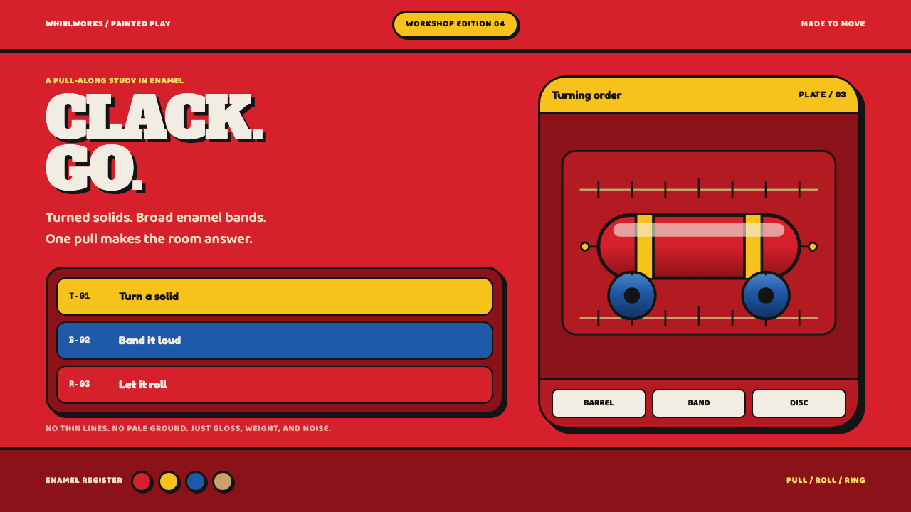 Buzzy Bee ToyPlay is mechanical. Gloss-red barrels, blue discs, and yellow bands clack in…
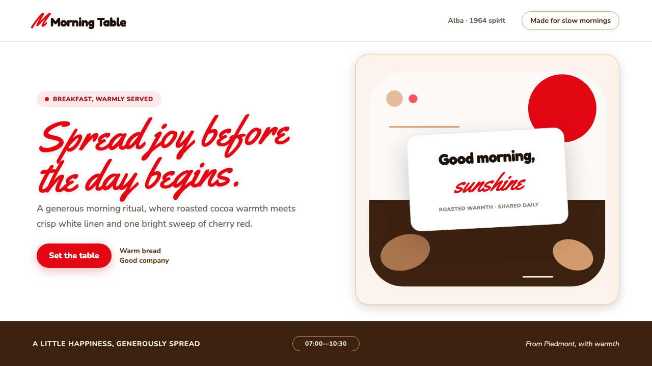 Nutella (1964)Breakfast feels brighter. Cherry script and roasted-hazelnut brown warm a cri…
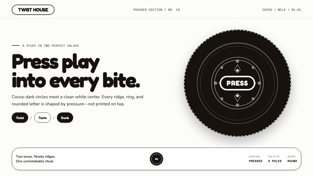 Oreo (1912)Contrast you can feel. Cocoa-black discs and milk-white rings turn every surf…
 CluelessCandy colour on white. Yellow plaid, a bouncing magenta ellipse, bevelled 199…
 Crayola (1903)Color never whispers. Golden yellow, a green slash, and waxy swatches make ev…
 eBayThe dot-com flea market. Four off-baseline letters in web-safe colours over d…