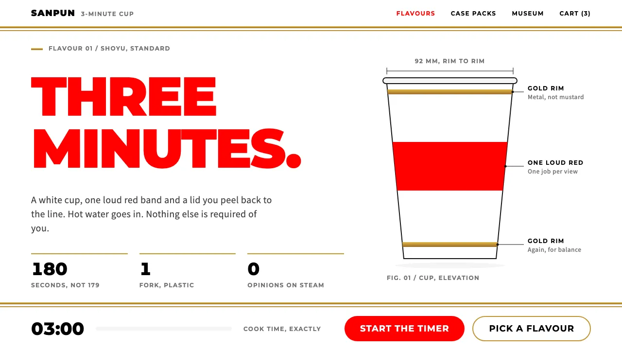
About Cup Noodle
Cup Noodle is a design system built from a single object: a tapered white cup with a red CUP NOODLE logo wrapped around it and two gold bands borrowed from the rims of good dinner plates. Nissin put it on sale in 1971 and has barely touched the formula since.
The system keeps that discipline. White ground, one loud red, thin metallic gold rules, Montserrat capitals for numbers and Noto Sans JP for everything else. The humour comes from deadpan copy and a three-minute timer, not from decoration.
- Origin
- Japan (Osaka and Yokohama)
- Era
- Launched 18 September 1971; paper cup and current packaging system 2008–present
- Key figures
- Momofuku Ando · Takeshi Otaka · Koki Ando · Kashiwa Sato
- Movements
- Japanese convenience food and vending-machine culture of the 1970s · Absurdist Japanese TV advertising
Cup Noodle design spec
Colors
Background
Surface
Primary
Secondary
Accent
Text
Typography
MontserratHeadings
Noto Sans JPBody
Unlock for 1 credit
The other 11 sections — buttons, cards, spacing, motion, techniques and more — open once you unlock. Download the DESIGN.md or send it to your AI in one click. Unlock once, yours forever.
Sign up nowHave an account? Sign in
Styles similar to Cup Noodle
Also inspired by brands & products, with a close feel.
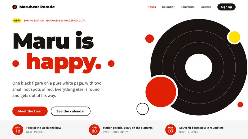 KumamonA black circle on pure white. Official red lands only on cheeks, buttons and date badges.
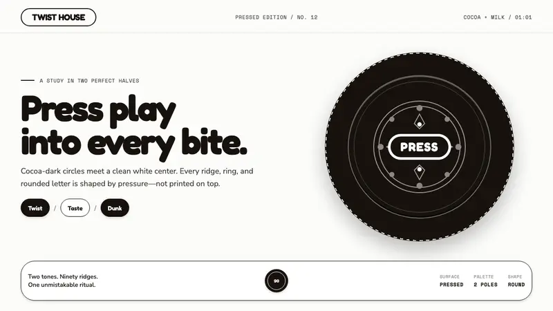 Oreo (1912)Contrast you can feel. Cocoa-black discs and milk-white rings turn every surface into relief.
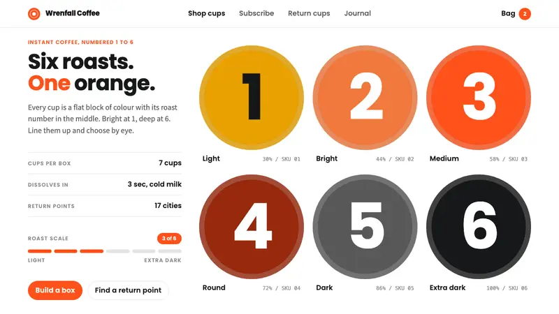 Saturnbird CoffeeRoast numbers as the picture. Flat colour cups, giant Poppins numerals, one orange on white.
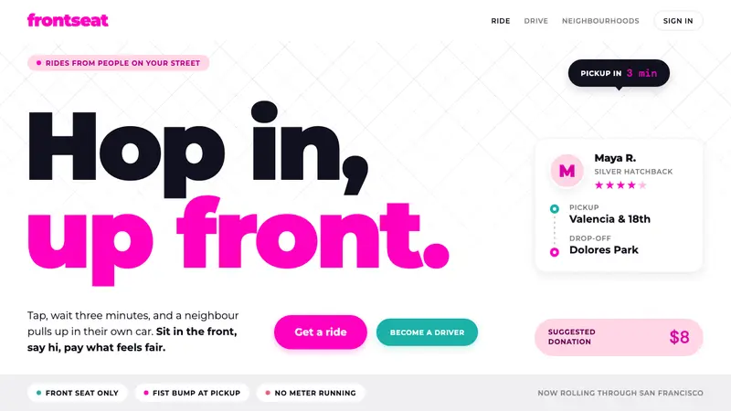 LyftA friend's car, not a taxi. Neon pink on white, heavy Montserrat, pill shapes everywhere.