About Saturnbird Coffee
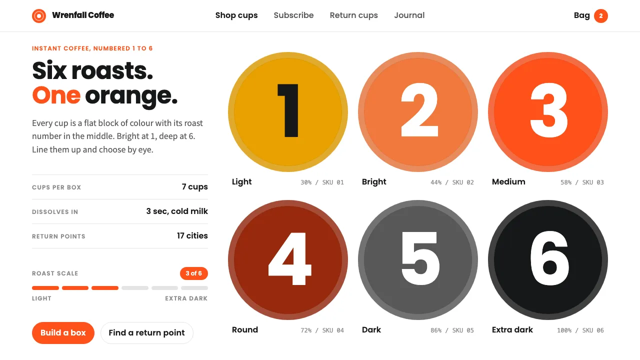
Saturnbird puts specialty instant coffee into mini takeaway cups and gives each roast a number, from 1 (light) to 6 (extra dark). The cup is the brand's main graphic: a flat block of colour with a heavy numeral in the middle, lined up in rows on a white page.
This system uses that grammar. Saturnbird orange marks actions and number badges, big Poppins numerals carry each card, and greys and near-black stand in for the darker roasts. It should feel like a tidy product shelf.
- Origin
- Changsha, Hunan, China
- Era
- 2015 founded; mini-cup instant coffee from 2018; current visual ~2020–2024
- Key figures
- Wu Jun (吴骏) · Saturnbird in-house design team
- Movements
- New-consumer (新消费) D2C brands · Specialty instant coffee · Circular recycling programmes
Saturnbird Coffee design spec
Colors
Background
Surface
Primary
Secondary
Accent
Text
Typography
PoppinsHeadings
Noto Sans SCBody
ui-monospaceMono
Unlock for 1 credit
The other 11 sections — buttons, cards, spacing, motion, techniques and more — open once you unlock. Download the DESIGN.md or send it to your AI in one click. Unlock once, yours forever.
Sign up nowHave an account? Sign in
Styles similar to Saturnbird Coffee
Also inspired by brands & products, with a close feel.
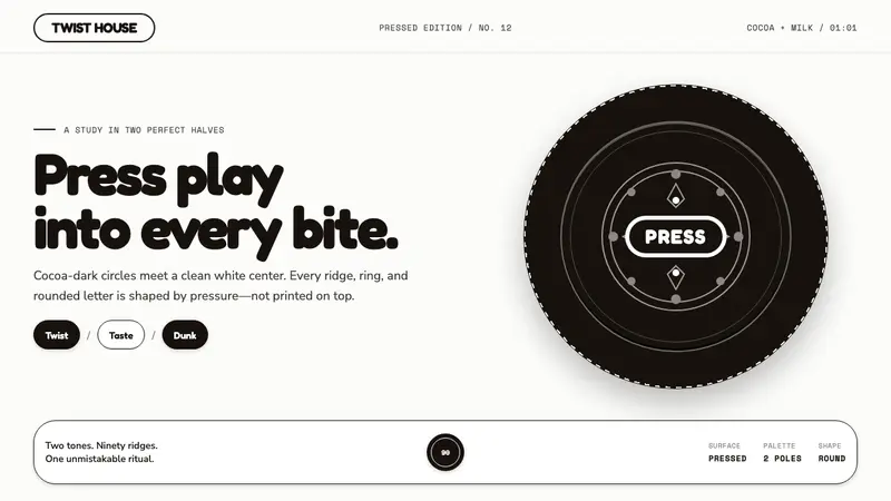 Oreo (1912)Contrast you can feel. Cocoa-black discs and milk-white rings turn every surface into relief.
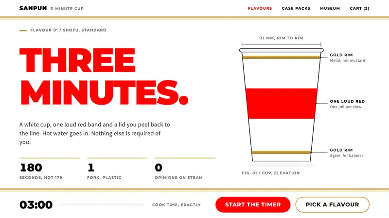 Cup NoodleA straight face on a three-minute meal. White cup, one loud red, gold rim bands, Montserrat caps.
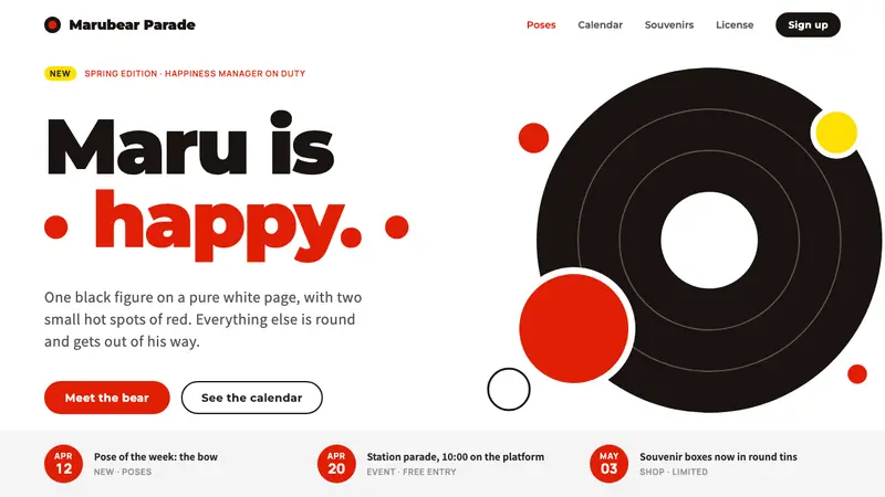 KumamonA black circle on pure white. Official red lands only on cheeks, buttons and date badges.
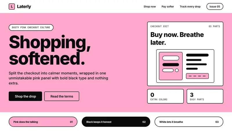 KlarnaFintech turns fashion-editorial. Dusty bubblegum pink, black Inter, and white space do all.