What is Saturnbird Coffee?
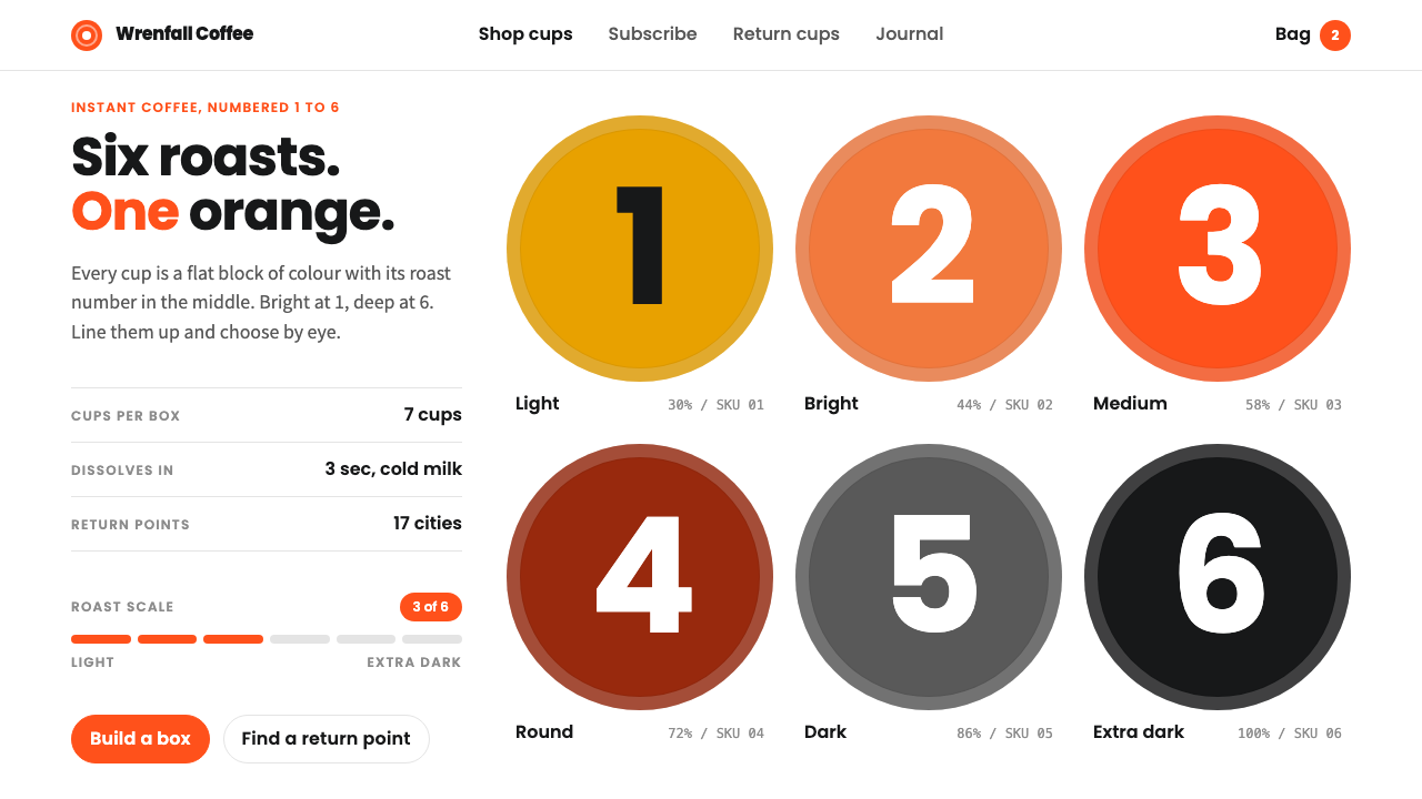
Saturnbird turned roast numbers into the picture: a tidy shelf of flat-colour cups, each stamped with a giant numeral, on a clean white page with a single orange.
Saturnbird Coffee in brief
The Saturnbird Coffee style is a clean, product-shelf visual language drawn from the Chinese specialty instant coffee brand of the same name. Its core graphic is the mini takeaway cup: a flat block of colour with a heavy numeral in the middle, repeated in neat rows on a white page. Each numeral corresponds to a roast level, from 1 for the lightest to 6 for the darkest, and the cup colour follows the flavour of that roast.
In interface terms, this becomes a white e-commerce stage on which large, bold numerals do the work that photography and decoration do elsewhere. A single brand orange marks actions and number badges, while greys and near-black stand in for the darker roasts. Everything is flat, evenly spaced and legible at a glance, so the page feels like a tidy, well-lit shelf rather than a busy shop window.
The style belongs to the generation of new-consumer brands that treat a product system, not just a product, as the identity. By making a simple code — numbers and colours — instantly understandable, it lets a customer choose without reading much, and it gives a brand site a calm, confident, almost scientific order.

Where does Saturnbird Coffee come from?
Saturnbird, known in Chinese as Sandunban, began in 2015 in Changsha, the capital of Hunan province in central China. It started as a specialty coffee brand in a market where instant coffee was widely associated with low quality, and set out to show that soluble coffee could carry the flavour and character of freshly brewed specialty beans. Wu Jun is named as a key figure in the brand's story, alongside the company's in-house design team.
The decisive move came in 2018, when the brand introduced its mini-cup format. Small takeaway-style cups of single-serve coffee were sold in sets, and each cup carried a roast number from 1 to 6, running from light to extra dark. The colour of the cup followed the flavour profile: lighter roasts leaned toward bright orange and warm yellow, while darker roasts moved into greys and coffee black. The numbering turned a tasting scale into a graphic system, and the system became the brand.
A second idea added meaning to the graphic. The brand's returning-cups programme, known in Chinese as Fanhang Jihua, invited customers to send back empty cups, which were then recycled and remade into household objects. The small cups, already designed as a collectible, modular set, became part of a circular story, which gave the clean, tidy visual language an additional sense of purpose.
In design history terms, the style belongs to the wave of new-consumer direct-to-consumer brands that emerged in China during the 2010s and 2020s, which favoured disciplined, minimal brand systems, white-space-rich web stores and product-led communication. It also connects to a wider tradition of numeric and colour-coded product ranges, in which the packaging itself is the interface. The visual direction referenced in this design system corresponds roughly to the brand's look in the early 2020s.
What defines the Saturnbird Coffee look?
Colour
The stage is pure, clean white, the kind of e-commerce white that makes every colour block feel crisp. A single saturated brand orange handles buttons, links and number badges, and it is deliberately used once per region rather than everywhere. Beyond it, a ladder of warm yellows, soft oranges, mid greys and coffee-black stands for the roast levels, so colour itself becomes information.
Numerals as imagery
Oversized, heavy geometric numerals are the signature graphic. They sit in the centre of each colour block and are often the largest element on the page, replacing icons and decorative illustration. The numerals must be bold enough to read from across a room, and set in a friendly, round-leaning sans-serif so that the system feels approachable rather than technical.
Cup blocks
Products are presented as flat shapes rather than photographs: a simplified cup silhouette filled with a single colour, with no gradients, highlights or realistic shading. They are lined up in rows with equal gaps, like a tidy display shelf. The repetition is part of the appeal; a row of similar objects in a graded sequence is immediately understood.
Layout
Layouts are airy and orderly. Content sits on a clear grid with generous white space around each group, and rows or grids of equal cards dominate. Alignment is strict and spacing consistent, which gives the page a calm, well-organised rhythm. Nothing overlaps or competes for attention; the numerals provide hierarchy by themselves.
Buttons and badges
Actions use the brand orange, usually as solid, softly rounded buttons with white text. Number badges echo the cup numerals in small, circular or squared forms. Secondary actions are quiet outlines or greyscale. Nothing flashes or pulses; the call to action is visible because it is the only saturated thing nearby.
Tone
The overall feeling is tidy, friendly and quietly confident, closer to a well-run product shelf than to a lifestyle magazine. There is a hint of craft and care without any rustic styling. The recycling story adds a gentle sense of responsibility that can be hinted at in copy but is never allowed to override the clarity of the system.

Who shaped Saturnbird Coffee?
Wu Jun is named as a key figure in the Saturnbird story and is associated with the founding of the brand in Changsha in 2015. His role in the narrative is that of a founder who set out to prove instant coffee could be specialty coffee, and whose product thinking led to the mini-cup system that now defines the brand's look.
The brand's own design team is credited with the colour-and-number system, the cup graphics and the consistent web and packaging language. Their contribution is a case study in how a small, disciplined set of elements — a numeral, a colour block, an orange accent — can hold together a whole brand across products, packaging and screens.
Saturnbird is often discussed alongside other direct-to-consumer brands of China's new-consumer wave, which emphasised product-led design, minimal identities and online-first retail. This movement provides the commercial and cultural context for the style, and explains why white-space-rich, system-driven web stores became a recognisable look.
How do you use Saturnbird Coffee today?
For slide decks, the style suits product launches, brand overviews, range comparisons and anything that benefits from a graded, numbered system. Use a white slide with a row of equally sized colour blocks, each carrying a large numeral, to show tiers, stages or categories. Keep text short and let the orange mark the one thing you want the audience to act on. Avoid photography unless it is clean and product-focused.
For web interfaces and e-commerce, this is a ready-made pattern for product listings. Present each variant as a flat colour card with a big number, arrange them in a clean grid and let filters and sort controls stay quiet in grey. Subscription pages and bundle builders benefit especially, because the numerals make a sequence of choices easy to scan. Use the orange for add-to-cart and confirmation and nowhere else.
For editorial and marketing work, the style works for brand microsites, launch pages, catalogues and recycling or sustainability stories. A circular-programme page can reuse the cup block as a repeating motif that changes state — full, empty, returned, reborn — while staying inside the same flat vocabulary. Copy should be warm but brief; the graphics already say most of what needs to be said.
For product-led startups more broadly, the lesson of the style is to turn your range into a code. If you sell several versions, grades or levels of something, give each a number and a colour and let those carry the identity. It reduces the reading burden on customers and gives your site a consistency that photography rarely achieves on its own.
The common mistake is to dilute the system by adding gradients, drop shadows, glossy cup illustrations or many accent colours. Each of these breaks the flat, shelf-like clarity and turns the page into a generic shopping template. A second mistake is shrinking the numerals to fit more content; the oversized numeral is the whole point, so reduce the amount of content instead, and keep the orange to a single role.

Saturnbird Coffee — FAQ
What do the numbers on the cups mean?
They are roast levels. The brand numbers its single-serve cups from 1, the lightest roast, to 6, the extra dark roast, and the cup colour follows the flavour profile. In the design system this becomes a general pattern: a number plus a colour block used to label any ordered range, such as tiers, intensities or versions.
Is the orange required, or can I swap the colour?
The orange is the brand's identifying accent, so keeping it preserves the recognisable look. If you adapt the system for another product, you can substitute a different single accent, but keep the discipline: one saturated colour for actions and badges, with the rest of the palette supporting the graded scale. Using several competing accents would undermine the clarity that defines the style.
Does this style only work for coffee?
No. It works for any product range that can be sorted into numbered or colour-graded levels: teas, skincare strengths, plans and tiers, subscription boxes, even software editions. The common requirement is a small set of comparable items that benefit from being displayed side by side on a calm, white, well-lit page.
What is the returning-cups programme?
It is the brand's recycling initiative, known in Chinese as Fanhang Jihua, in which customers send back empty cups so that they can be recycled and remade into household objects. It adds a circular dimension to the visual system, and design work can reflect it with before-and-after states of the cup block, as long as the clean flat language is preserved.
How do I avoid it looking like a generic template?
Commit to the numerals. Make them genuinely large, give them real meaning in your own product range, and let colour carry the same logic. Keep spacing consistent, avoid decorative extras and restrain the accent to one role. The distinctiveness comes from a clear system, applied without exception, rather than from any single ornament.
Related design styles
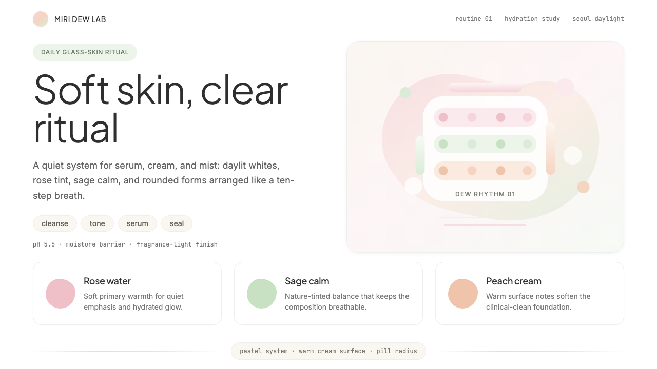 K-Beauty CleanCalm arrives dewy. Rose, sage, and peach pastels float through airy rounded f…
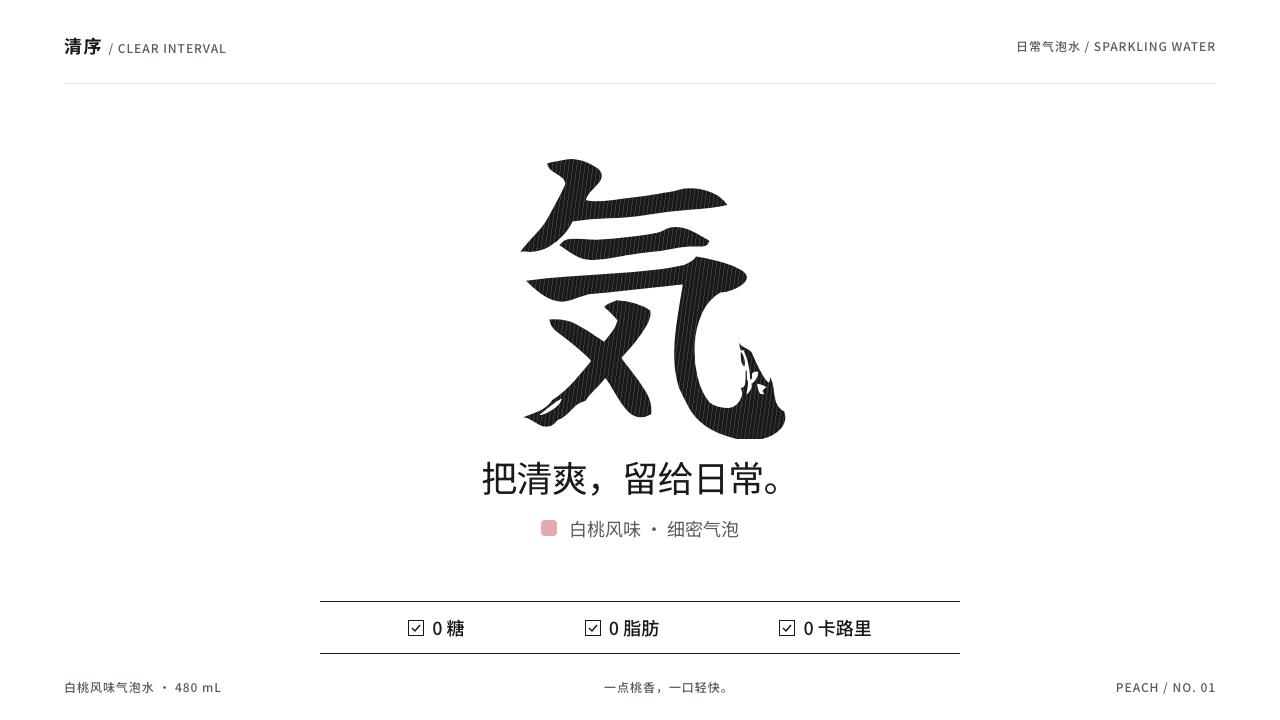 Genki ForestOne brush mark does it all. Black Yuji Boku on white, tidy zero claims and a…
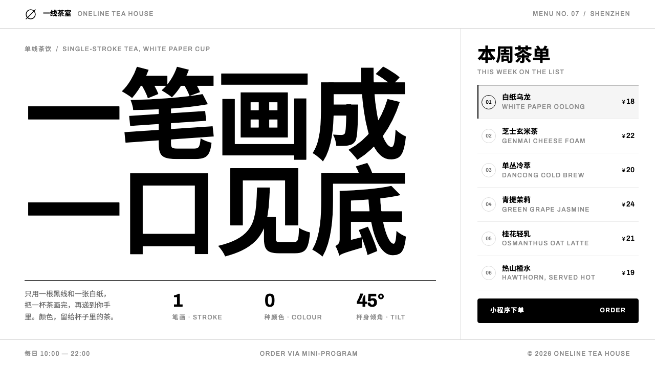 HEYTEANo colour at all. One black line on white cup paper, Chinese-first type, mini…
 Nintendo SwitchQuiet meets playful. Neon blue and red bookend rounded tiles on a light-grey…
 POP MARTA white shelf with one red signal. Twelve-cell blind-box grid, one dashed hid…
 Bing Dwen DwenHuggable ice-gloss. One concentric halo in cyan and stripes, over capsule-rou…