What is Bing Dwen Dwen?
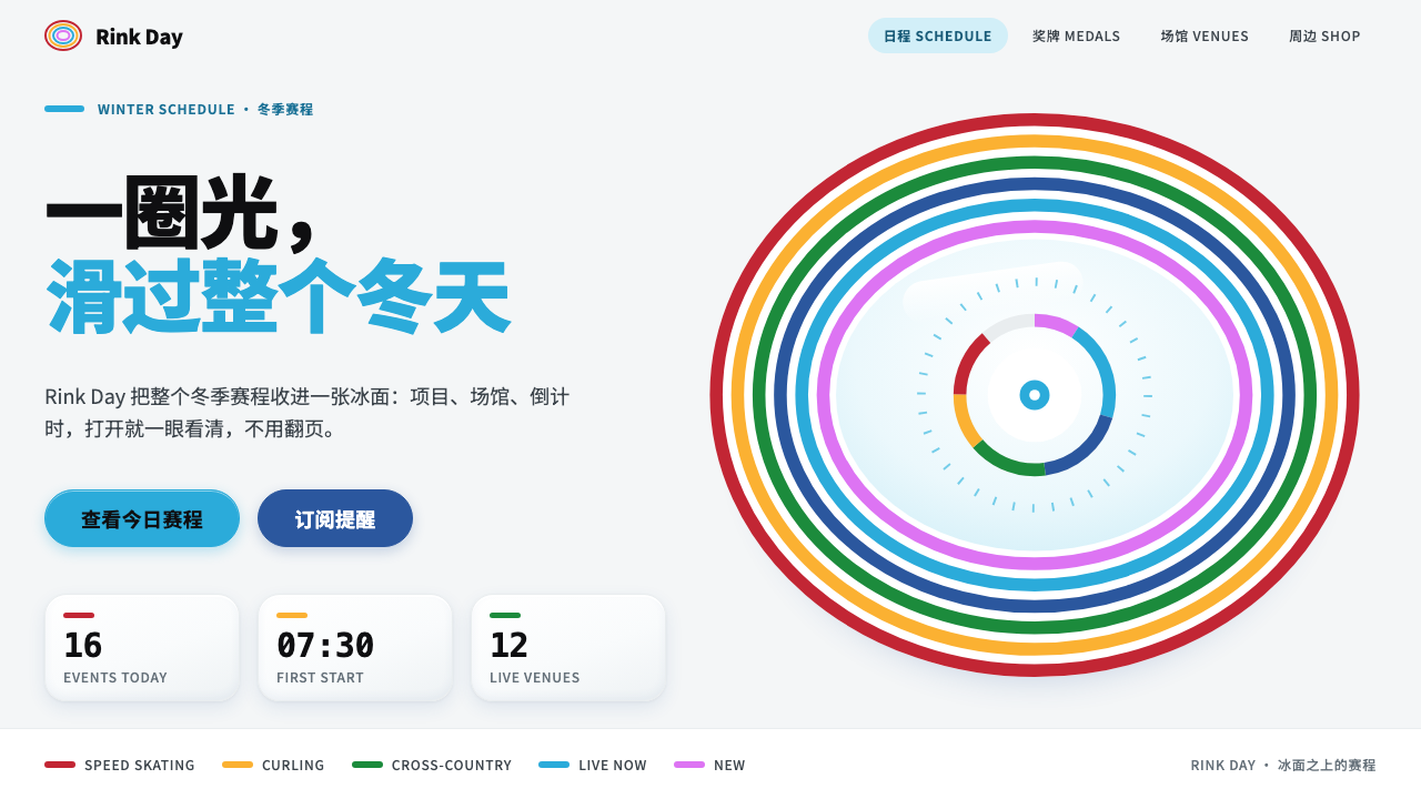
Bing Dwen Dwen is the Beijing 2022 panda in a shell of ice: glossy cool white, one concentric halo of colored lines, and shapes as round as a capsule.
Bing Dwen Dwen in brief
The Bing Dwen Dwen style is an interface language drawn from the mascot of the Beijing 2022 Winter Olympics: a panda sealed inside a glossy shell of ice, with a face circled by a stacked halo of coloured lines. The halo was borrowed from the flowing 'ice ribbon' of the National Speed Skating Oval, and the shell recalls the sugar glaze on a candied fruit skewer. Together they give the character its distinctive look: soft, bright, friendly and slightly precious, like a toy that has been dipped in glass.
Translated into design, the style starts from a cool glossy white that feels like fresh snow, not paper. A single halo cyan leads, used for headings and active states. The warm stripes of the halo, in red, yellow and green, are reserved for marking categories and drawing chart lines. Panda black carries every line of text, which keeps reading comfortable against all that brightness. Shapes stay round, with cards made into capsule forms, and shadows stay light and slightly cool.
What makes the style coherent is restraint around its one big idea. The halo appears as a single concentric motif at the places that matter, rather than as wallpaper. There are no lanterns, no cut-paper snowflakes and no Olympic rings used as decoration. The result is a friendly, high-clarity look that suits products wanting to feel approachable without turning childish.

Where does Bing Dwen Dwen come from?
Bing Dwen Dwen was unveiled in 2019 as the mascot of the Beijing Winter Olympics, which took place in February 2022. The name combines 'bing', meaning ice, with 'dwen dwen', a sound that suggests something sturdy, chubby and cheerful. The character was designed in Guangzhou by Cao Xue, whose proposal was chosen to represent a Games hosted in Beijing, a city that was becoming the first to stage both the summer and the winter Olympics.
The design drew on three sources. The first is the giant panda, China's best-known animal ambassador, familiar and loved well beyond its borders. The second is the ice itself: the character wears a transparent shell, like a suit of ice that doubles as a space helmet, so that the sport and the future could both be read in a single silhouette. The third is the halo of colored lines around the face, inspired by the ribbon-like curves of the National Speed Skating Oval, the venue known as the Ice Ribbon.
The halo also fits the larger visual identity of the Games. The Beijing 2022 Look of the Games used a colour system built on the cool tones of ice and snow, brightened by warmer accents, and the mascot's stripes belong to that family. In design terms, the halo is a simple, scalable device: a few concentric curves that can be reduced to a badge, stretched into a banner or repeated as a loading ring without losing recognisability.
Public reaction made the character a phenomenon. During the Games, plush versions sold out almost as soon as they reached shelves, and a phrase about how hard it was to get one, roughly 'one Dwen is hard to find', became a popular saying that February. Few Olympic mascots have crossed from merchandise into everyday conversation so quickly. That emotional warmth is what the interface style tries to keep: a rounded, bright system whose first impression is affection, not authority.
What defines the Bing Dwen Dwen look?
Ice-gloss white ground
The base is a cool, slightly blue-leaning white that reads as snow and glazed ice rather than paper. Surfaces feel polished and clean. Because the ground is bright and cool, warm colors pop without needing to be loud, and large areas stay calm.
Halo cyan as the lead
A single cyan, taken from the halo, handles headings, links and active states. It is cold enough to feel like ice yet bright enough to feel friendly. Using one lead color gives pages a clear hierarchy and a recognisable identity.
Warm stripes as categories
The red, yellow and green stripes of the halo do not decorate; they sort. They tag categories, label filters and draw lines in charts. This gives data-rich pages a cheerful but disciplined palette where every warm color has a defined role.
Panda black text
All body copy and key labels are set in a deep, neutral black. This is the panda's own color, and it keeps contrast high against the ice-white ground. Secondary text steps down in softness without turning washed out.
Capsule-round shapes
Cards, buttons, tags and inputs use generous, pill-like rounding that echoes the character's body. Corners are never sharp. The softness makes the interface feel safe to touch and gives it a toy-like warmth.
One concentric halo
The halo motif appears as a stack of concentric colored lines, but only at key moments: a hero, a progress ring, a badge. It is a signature, not a pattern. Letting it appear once per view preserves its charm.
Soft, cool shadows
Shadows are light, diffuse and tinted slightly cool, suggesting frosted glass rather than a heavy drop. They separate layers gently and never muddy the white.

Who shaped Bing Dwen Dwen?
Cao Xue designed Bing Dwen Dwen in Guangzhou, and her design was chosen as the mascot of the Beijing 2022 Winter Olympics. The character's mix of panda, ice shell and colored halo is the foundation on which the interface style is built.
The Games held in February 2022 gave the mascot its stage and its visual context. The Look of the Games color system, built on ice and snow tones, shaped how the character's halo and palette were read by the public.
Known as the Ice Ribbon, this venue's flowing curved lines are the inspiration for the colored halo around the panda's face. It is the architectural source of the single most reusable graphic device in the style.
How do you use Bing Dwen Dwen today?
For slides, the Bing Dwen Dwen style suits cheerful, high-clarity decks: product launches for consumer brands, community and education talks, sports and wellness content. A cover can place a cool white ground with one concentric halo ring behind the title. Content slides should use capsule-shaped cards on the white ground, with panda black text and halo cyan for headings. Keep the red, yellow and green stripes for agenda markers and chart series.
For data slides and dashboards, the warm stripes are a ready-made categorical palette, with cyan as the primary series. Round markers and capsule legend chips echo the character. Because the ground is bright, charts remain legible on projectors and in daylight, which is a practical advantage for presentations in lit rooms.
For web interfaces, consumer apps, learning platforms, ticketing and event pages are natural homes. Buttons and inputs take capsule shapes, active tabs use halo cyan, and category filters use the warm stripes. Place the halo motif as a loading ring, an empty-state illustration frame or a profile avatar border, and nowhere else on the same screen.
For editorial and marketing work, the look works for campaigns that celebrate people and moments rather than technology. It pairs with friendly photography, simple icons and short, warm copy. It is a good fit for seasonal campaigns, family products and brand collaborations that want freshness without heavy decoration.
The most common mistake is to treat the halo as wallpaper, repeating it across every card until it loses meaning. Another is to mix in cultural props such as lanterns, snowflake clip-art or Olympic rings; the style deliberately avoids all of these. Keep the white clean, the cyan singular and the halo rare.

Bing Dwen Dwen — FAQ
What inspired the Bing Dwen Dwen design?
It combines the giant panda, a glossy ice shell that recalls the sugar glaze on candied fruit, and a halo of colored lines taken from the curved lines of the National Speed Skating Oval, known as the Ice Ribbon. Together they express Chinese national character, winter sport and a sense of the future.
Who designed Bing Dwen Dwen?
The mascot was designed in Guangzhou by Cao Xue and unveiled in 2019 for the Beijing Winter Olympics, held in February 2022.
What colors does this style use?
A cool glossy white as the ground, halo cyan as the lead for headings and active states, red, yellow and green stripes for categories and chart lines, and panda black for text. Each color has a defined role.
Why is the halo used only once per view?
The halo is the signature of the style. Repeated everywhere, it becomes wallpaper and loses its charm. Using it once, as a hero ring, badge or progress indicator, keeps it special and keeps the rest of the page calm.
Is this style suitable for serious products?
It is best for friendly, consumer-facing products. For serious work, keep the white ground, the black text and the single cyan, and use the warm stripes sparingly. The rounded shapes still read as approachable, so avoid it where a severe or authoritative tone is needed.
Related design styles
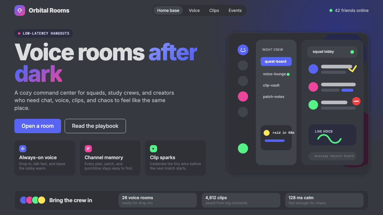 Discord 2024Blurple cozy. Charcoal grounds, illustrated characters — every surface says '…
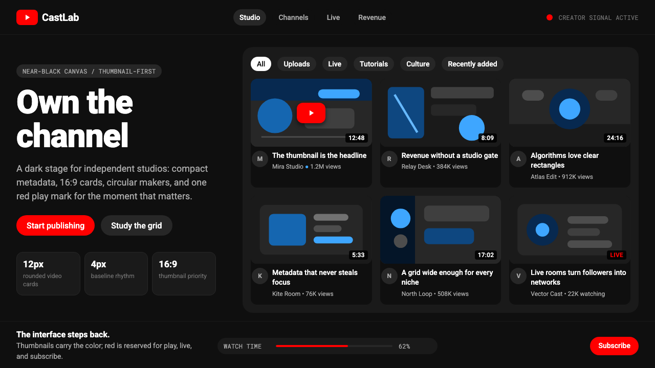 YouTube Creator EconomyThe UI disappears. Near-black Roboto grids let thumbnails shout; red only mea…
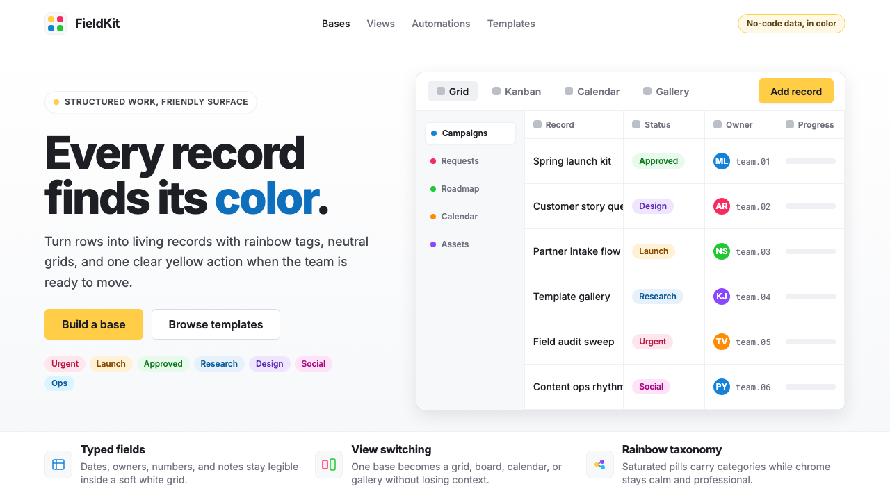 Airtable Spreadsheet-RainbowWork becomes celebratory. Inter grids stay white while rainbow pills and yell…
 Bluesky AT Protocol 2024Open tech feels warm. Pale sky, cloud cards, Inter, and one cobalt accent car…
 Bun JS Runtime Pink 2023Dev speed gets bakery-bright. Hot pink grounds white slabs, mono bars, and wa…
 Canva 2024Confidence feels draggable. Purple-blue gradients and floating white template…