What is Genki Forest?
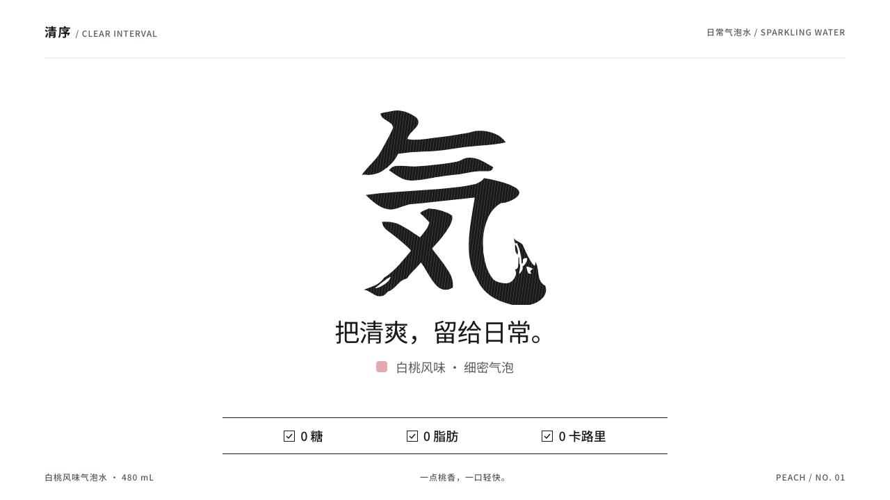
Genki Forest proved that a drinks label can be almost blank: one black brushed character on white, a tidy zero-claims checklist, and a soft flavor color are enough to own a shelf.
Genki Forest in brief
Genki Forest is the visual language of the Beijing drinks brand of the same name, built around a minimal, near-empty label. A transparent bottle is wrapped in a white shrink sleeve; at the center sits a single black brushed character, 気, accompanied by a few lines of small type and a ticked checklist of zero sugar, zero fat and zero calories. There are no fruit illustrations and no explosive stickers.
As a design style, it translates that bottle onto the screen. Large areas of white leave room for one hero mark. Label copy is set in a crisp sans-serif and arranged with strict tidiness. Flavors are told apart by a soft, desaturated accent color rather than by decoration, and product cards are kept simple enough to be read in a second on an e-commerce feed.
Its power comes from restraint. In a category where competitors shout with bright colors and busy graphics, an almost blank label reads as confident, clean and honest. The style carries the same promise onto interfaces: less noise, clearer claims and a single mark doing most of the work.

Where does Genki Forest come from?
The brand was founded in Beijing in 2016, and its sparkling water arrived around 2018. It belongs to a wave of Chinese new-consumer brands, usually called xin xiaofei in Chinese, that grew up on e-commerce platforms and social media and competed on design as much as on product. These brands treated packaging as the main advertisement, because on a phone screen the bottle photograph is often the first and only thing a shopper sees.
The look that the style captures belongs to the period of 2019 to 2021, when the label settled into its present form. It draws on Japanese-style minimal packaging, a tradition of generous white space, careful typography and a single confident mark, and it adapts that tradition for a Chinese mass market. The brushed 気 character, in a typeface of the Yuji Boku kind, gives the white label a human hand without adding clutter.
The second pillar is the language of zero-sugar health labelling. As consumers in China became more concerned with sugar intake, a clear, checkable claim became the main selling point. Genki Forest placed those claims on the front of the bottle as a tidy, ticked checklist rather than hiding them in fine print, and the interface style inherits this habit of putting the proof right next to the product.
Tang Binsen is named in the source material as the key figure behind the brand. The style that grew out of his company's work has since been echoed by many imitators, which is one measure of its influence: a plain white, one-mark, one-accent approach became a recognizable template for the whole category of light, healthy drinks and snacks.
What defines the Genki Forest look?
White as the main material
White is not a background here; it is the main material. Large, calm fields of white give the single mark room to breathe, and they communicate cleanliness and lightness directly. Panels, cards and sections are separated by space rather than by lines and boxes, so the page stays quiet from top to bottom.
One hero mark
A single bold brushed character carries the identity. It is placed at the center, large enough to be recognized at thumbnail size, and nothing competes with it. The contrast between its expressive, hand-made stroke and the rigid, tidy text around it is what gives the whole system its tension and charm.
Tidy zero-claims checklist
Product claims are presented as a short, ticked checklist in small, crisp sans-serif type. Each line is aligned and evenly spaced, and the claims are phrased as simple facts. This turns marketing into something verifiable at a glance, and it is the style's way of building trust without exclamation marks.
Soft flavor accent
Each product or flavor receives one soft, muted accent color, such as a gentle peach, used on a small area like a band, a tint or a label corner. The accent is just enough to tell variants apart. Because the colors are gentle, a row of different flavors still looks like one family rather than a rainbow of competing items.
Crisp sans-serif label copy
Supporting text is set in a clean sans-serif, small but sharply legible, with consistent alignment and generous line spacing. It reads like the back of a well-designed package. The restraint of the typography is what allows the brushed mark to feel like the only voice raised on the page.
Scannable product cards
Product cards are built for rapid scanning in a feed: a clear image, a name, a short claim line and a price or action, all on white with a lot of room around them. Nothing needs to be decoded. A shopper can compare several products in a second without any element asking for attention it does not deserve.

Who shaped Genki Forest?
Named in the source material as the key figure behind Genki Forest. As the founder of the Beijing company established in 2016, he is associated with the brand's strategy of leading with design and a clear zero-sugar promise, which in turn produced the minimal visual identity this style describes.
The Beijing drinks brand itself, whose white shrink-sleeve bottle with a single black brushed 気 is the origin of the whole style. Its label demonstrated that an almost empty design could stand out on a crowded shelf and on a crowded e-commerce feed.
The brushed typeface style that gives the central character its hand-made look. Its natural, slightly rough strokes supply the human warmth in a system otherwise made of white space and clean sans-serif text, and it links the brand to Japanese-style minimal packaging.
How do you use Genki Forest today?
For slide decks, the style suits product launches, brand introductions and health or lifestyle pitches. A cover can be as simple as one large mark on white, with a short line below. Content slides should keep the same calm: one idea per slide, a lot of white space, and a ticked list of facts when a claim needs proof. A soft accent color can mark each section or product variant so that the deck feels like a well-organized range.
In e-commerce and web interfaces, it excels. Flagship-store banners, new-product pages and category listings all benefit from a white canvas, a single hero image or mark, and tidy product cards that can be scanned in a second. Pricing or comparison tables can use the same checklist language, with ticks for the benefits each option includes, and the soft accent can distinguish variants without resorting to heavy badges.
For editorial and marketing work, the style fits beverages, light meals, no-sugar health products, skincare and other categories where clean, honest and light are the desired qualities. Posters and social cards can place one mark and one claim on a white field. The limited elements make the style easy to repeat consistently across many channels, which is crucial for brand recognition.
Discipline matters more than ornament. Keep the hero mark truly singular, keep the claims short and aligned, and let the accent color stay soft. If something needs emphasis, make it larger or give it more space instead of adding effects. The style rewards patience: the emptiness is the design, and it only works if the remaining elements are perfectly aligned.
The most common mistake is to fill the white space. Adding extra badges, gradients, illustrations or multiple accent colors destroys the very calm that gives the style its value. Another mistake is to use a weak, generic logo as the hero mark, which leaves a blank page with nothing to hold it together. A third is to use bright, saturated flavor colors, which turn a quiet system into a loud one. Choose one strong mark, keep the accent gentle, and resist the urge to decorate.

Genki Forest — FAQ
What is the Genki Forest design style?
It is a minimal e-commerce and packaging style drawn from the Beijing drinks brand. A white ground, one hero brushed mark, crisp sans-serif label copy, a ticked checklist of zero-sugar style claims and a soft flavor accent color define it. Product cards are kept tidy enough to scan in a second.
Where does the style come from?
It comes from Genki Forest, founded in Beijing in 2016, whose sparkling water launched around 2018 and whose current visual identity took shape between 2019 and 2021. It draws on Japanese-style minimal packaging and on the Chinese new-consumer brand wave, along with the language of zero-sugar health labelling.
Can I use a different character or logo as the hero mark?
Yes, and you should use your own. The style depends on one strong, expressive mark placed alone on white. Choose something with a distinctive hand-made or confident shape, keep it large and central, and let every other element stay small, tidy and quiet around it.
Which products does it suit?
It suits drinks, light meals, no-sugar and health products, skincare and e-commerce brands that want to feel clean, honest and modern. It is less suited to products that rely on excitement, abundance or intense color, because its calm depends on restraint and empty space.
How do I show multiple flavors or variants?
Give each variant one soft accent color used on a small area, such as a band or tint, and keep everything else identical. The family resemblance then holds across the range, and the accent is enough to tell the products apart at a glance without breaking the quiet of the page.
Related design styles
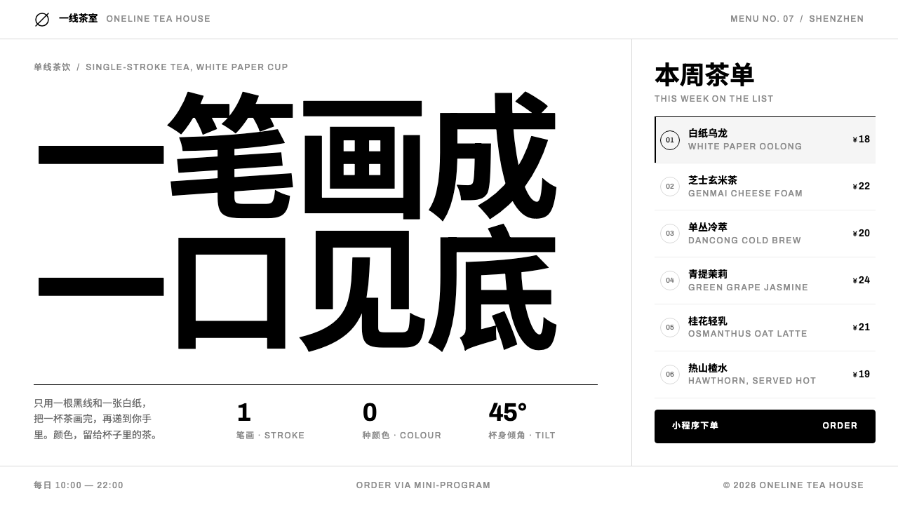 HEYTEANo colour at all. One black line on white cup paper, Chinese-first type, mini…
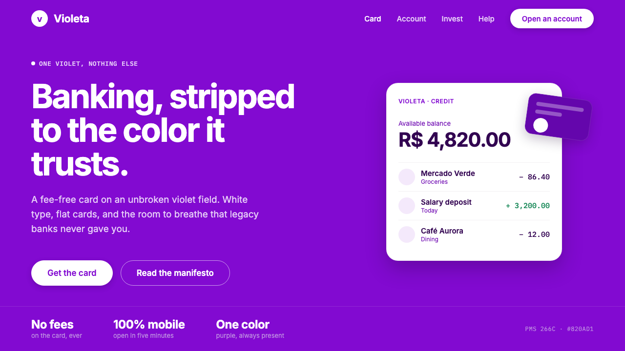 Nubank PurpleBanking stripped to one color. Full-bleed Nupurple ground, white type, genero…
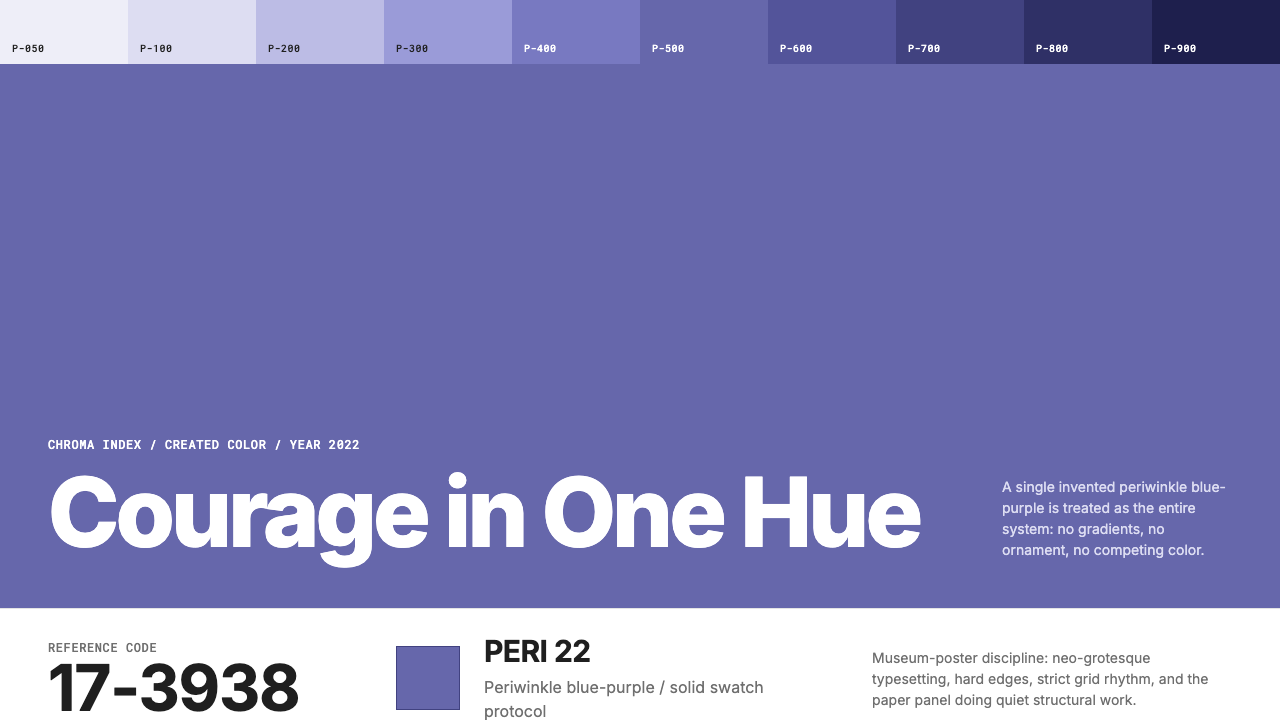 Pantone Very Peri (2022)Color becomes authority. Periwinkle field, reference codes, and white paper i…
 POP MARTA white shelf with one red signal. Twelve-cell blind-box grid, one dashed hid…
 Singapore Merlion BrandPrecision with civic warmth. Flag red and geometric sans lock into a four-scr…
 Coupang Rocket DeliveryUrgency made trustworthy. Rocket red, flash yellow, mono prices and packed gr…